|
Hello Patchy Days with little squares and flying geese from Jackie McDonald! I just got to see Jackie in person at Quilt Market in Houston and it was SO nice. We have connected through phone calls and zoom so this was the next step...an actual meeting! I have enjoyed making Jackie's block this month AND I caught up with last week's Tussy Mussy sewing. But first, color studies! 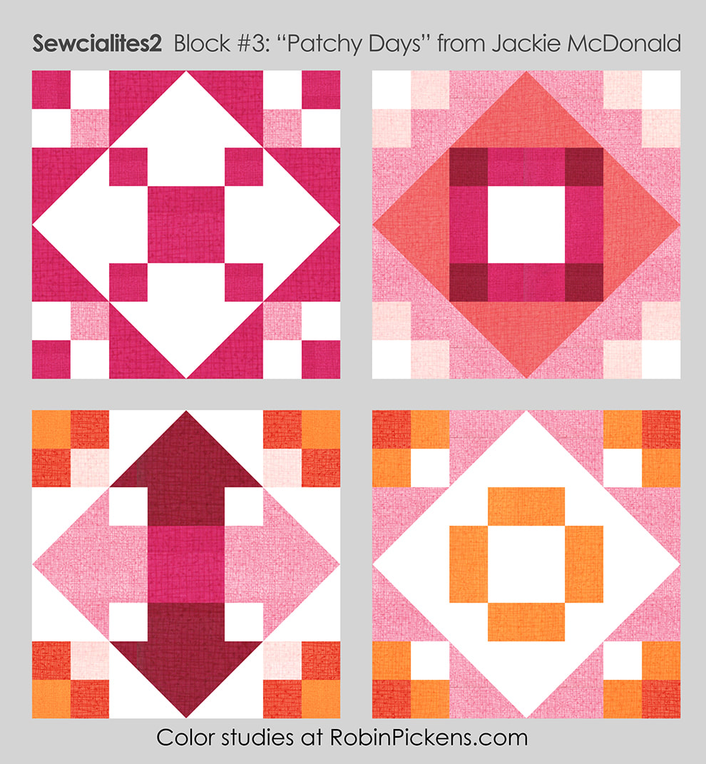 You can emphasize the diamond made from flying geese or the square in the center or make the flying geese and their joining rectangles into arrows pointing out. Those 4-patch corners can be one color plus background or play with gradations and place the lightest parts to the inside or outside. I like the arrow idea and decided to apply that to my sewn block.  I'm using blues from my new Wild Blossoms collection (the one showing at Quilt Market last weekend). The arrows are out of the blue bonnet floral print with corners in the diagonal sketchy plaid. Mist Thatched flipped to the back side for a lighter shade makes the center square. 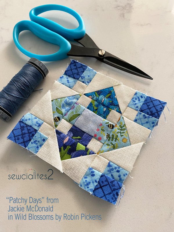 I am thinking about combining these blocks in a variety of colors with the big width-of-fabric rainbow print of all the wildflowers. Perhaps in a tote...I'm working on my plan and will share when it is solid. 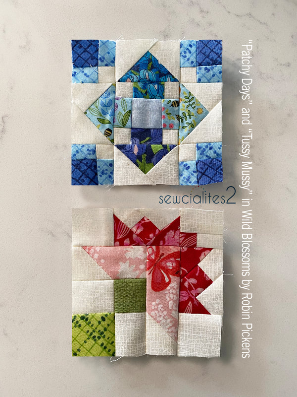 For my Tussy Mussy block, I used the pink Queen Anne's Lace print with a butterfly in the center part of the block, fluttering towards those outer dark petals. These small blocks are so much fun to make. Last year I did all the small 3" ones and fell in love with doing this sweet small size. 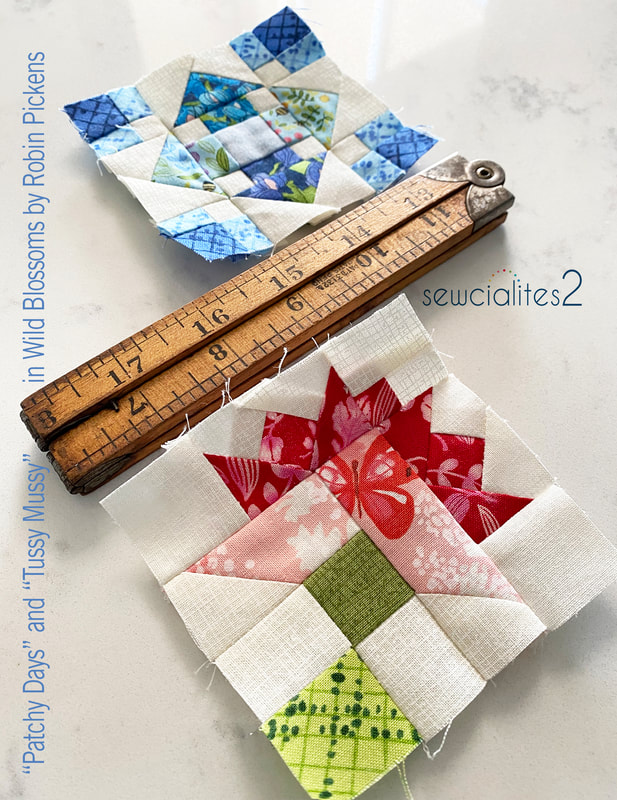 Now I've got a red, pink and blue block and have got to plan out next week's color. Orange, yellow, green? Sewing with the range of colors in Wild Blossoms has so many possibilities. 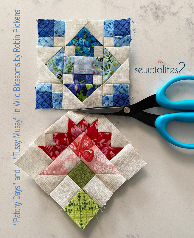 Check out the Fat Quarter Shop blog and shop for the free weekly patterns for this Sewcialites 2 Quilt Along!
0 Comments
Week 2 of Sewcialites with a block from Susan Ache called Tussy Mussy. This traditional nosegay block is adorable as a floral bouquet with pretty colors. Since it is a fairly definite shape and easier to "see" as a bouquet, I thought it would be fun to explore how else it could evolve. 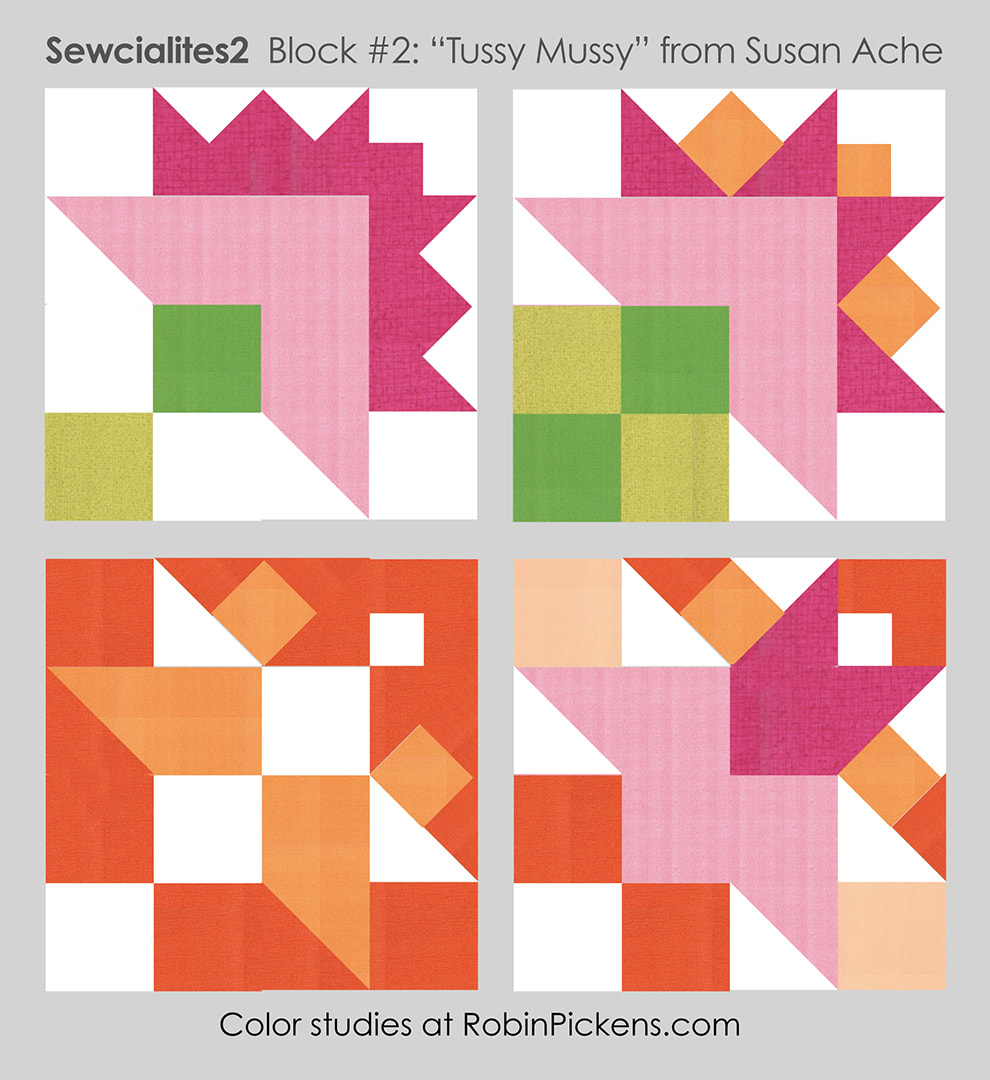 First I have my traditional nosegay of flowers with a little modern feel by keeping the solid colors for the base of the flowers and all the outer fringy ring in the darker pink. Then I went for a blocky stand of greens and mixing apricot into the outer petals to give it a more explosive feel. But what if it is not a nosegay at all? I had to throw a little orange in there in honor of Halloween and that one just plays with shapes and switching up the white into the inner parts of the block and letting some background come in on the outer triangles. That last one was more shape exploration and I keep seeing a little red-haired paper doll girl with a pink skirt. Do you see her? 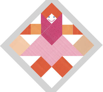 She's wearing a big pink scarf and orange mittens...she might be doing jumping jacks while carrying her grocery bags home. I can't help it! Sometimes the funniest little things jump out! Due to QUILT MARKET happening, my block will have to be sewn when I get back. But I look forward to seeing all your fun Tussy Mussy blocks!
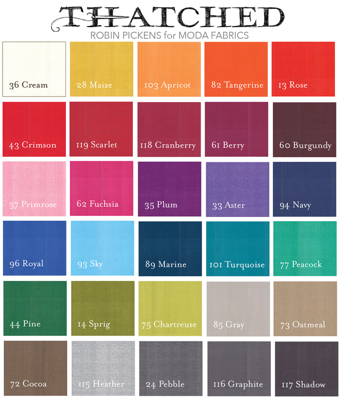
DAY ONE of the new Sewcialites 2 Quilt Along! My Moda Blockheads quilt is pieced and patiently waiting for longarming so what better time to start in with a new sampler sew-along. I was very happy to be a part of last year's first Sewcialites quilt and was thrilled when Fat Quarter Shop asked me back for this one. Each Friday the Fat Quarter Shop will be releasing a new FREE block from one of the 24 designers. You can check the Fat Quarter Shop blog and join the Sewcialites Facebook group to join in the fun! At the shop, there are coordinating items to keep you organized and info about the sew-along too...visit HERE. A couple weeks will be off for holidays and a couple weeks at the end for assembly. Kimberly shows more detail on how she joins the blocks through her youtube channel each Friday. If you followed me on Moda Blockheads, you might know that I like to play around on my computer and do some color studies of the blocks. I (almost) always leave the pieces as they are in the diagram but change up the colors and light and dark placements to see what variations I might get. I can't promise every week, but I'll try! 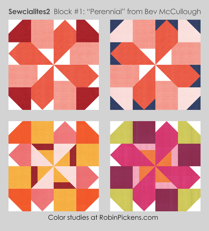 Our block #1 comes from Bev McCullough of Flamingo Toes and is called "Perennial." I was really intrigued by the little extra line from the rail block and how it makes that center pinwheel smaller. OR it could give an opportunity to have an accent stripe within the flower center. I think it is fun to treat the outside corner blocks either as leaves or as another layer of flower, suggesting the ways that petals overlap and are layered underneath other petals. Thank you Bev for giving us such a lovely, interesting block to start this Quilt-Along! 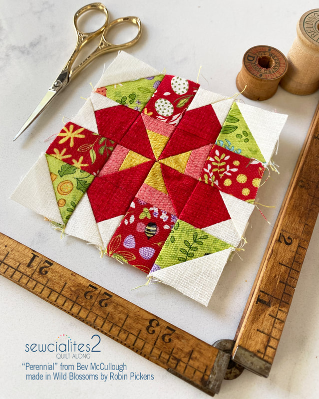 I've been getting ready for Quilt Market so I've been busy making quilts with my newest line that is showing to shops now...Wild Blossoms. This fabric will ship in March 2023 but since I have some sample fabric, I'm planning on making my blocks with it and mix it with my basic line from Moda, Thatched. Here is my Perennial block made with the Little Wild Things print in red and green and Crimson, Maize and Sugar Rose Thatched. I'm making the 3" blocks for this project, which is the same size I sewed last time. That is when I learned that I really like to make these littler blocks. They are so cute! 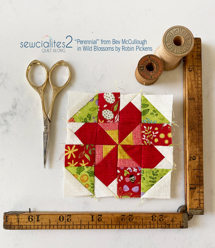 Wouldn't it be lovely to do a whole Christmas quilt with this block? It feels like a festive holiday flower and those pointed ends of petals are reminiscent of Poinsettias. 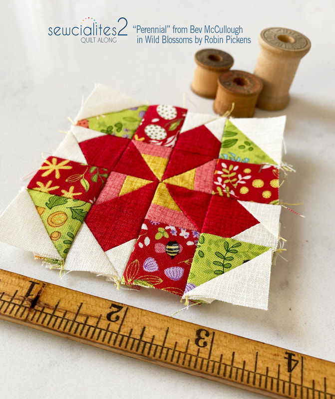 Tune in next Friday for the next Socialites block.
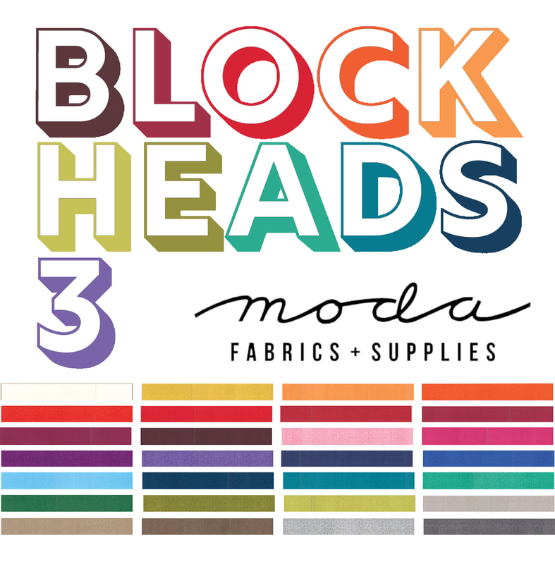
Happy sewing! Last week of Moda Blockheads 4 with block 28 from Joanna Figueroa of Fig Tree & Co. Her free quilt block pattern can be found at the Fig Tree & Co blog: For color studies I went with the cheery bloom suggested in the block layout and then played with the center band, the negative space, diagonal colors, a 3d look to the little triangles and a color quad with different color families in each quarter. 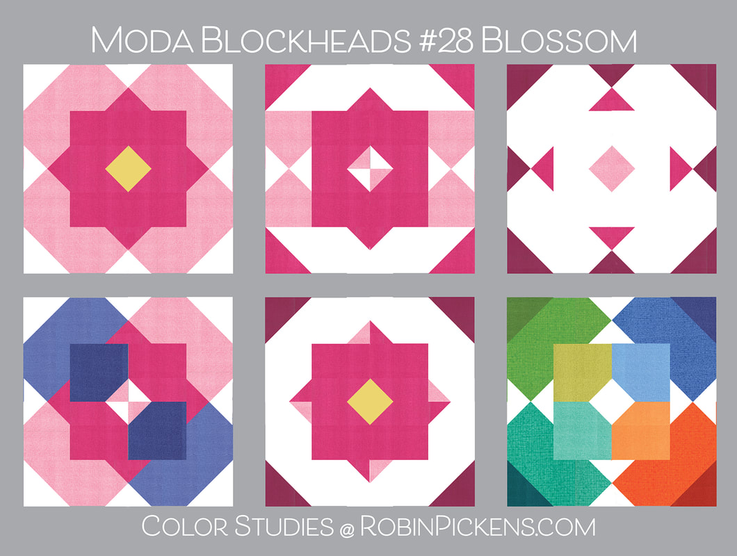 And my sewn block is the last of the big pink blocks. Sigh. Although I am happy to get to the finish line, I also am sad since this has been something I have looked forward to each week. Which makes me think about why I like sewalongs...skill building, trying new things and community. Because Quilty friends are the best. Thank you for the wonderful comments on the facebook and instagram posts each week. You have made me smile. 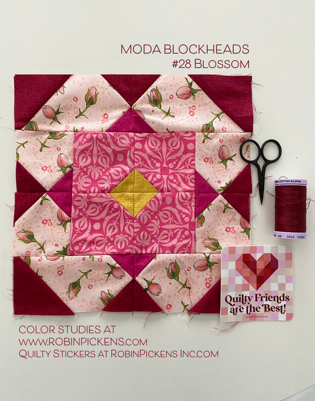 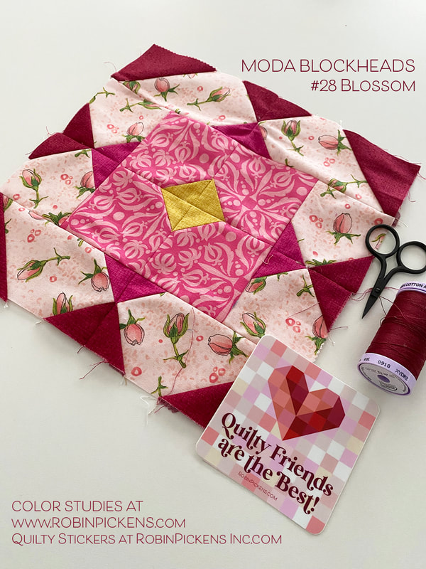 Till next time...happy sewing!
Happy Wednesday and Moda Blockheads day! Today Michelle White from Moda brings us "Threaded" for our free quilt block pattern! Visit Michelle on instagram @MichelleWhiteMakes and get your THREADED quilt block pattern at Moda's site: https://my.modafabrics.com/tags/blockheads-4 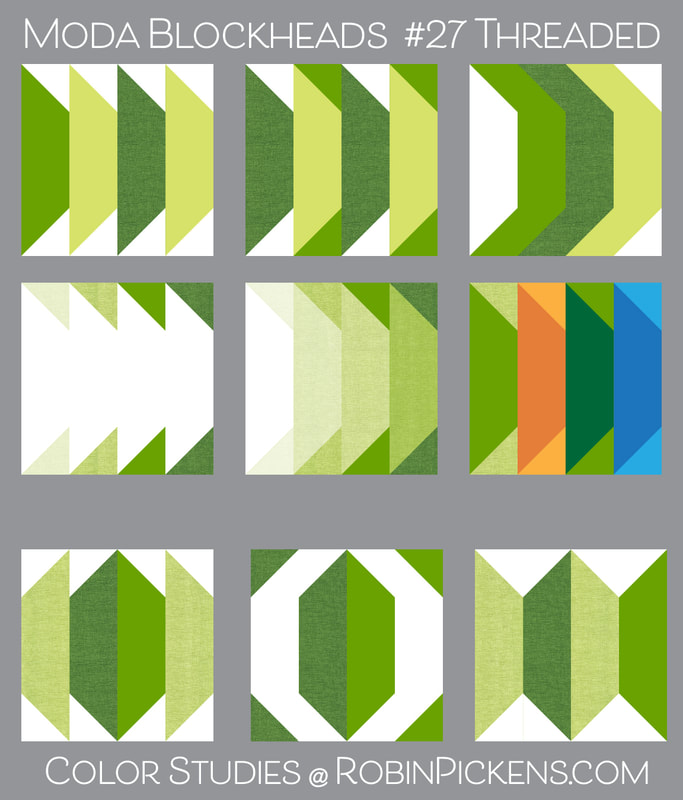 Michelle's design is shown with the angled ends all going in one direction, however the pattern also showed an alternate that faced the angles together, so I did some in the last row with that and took some liberties of flipping the last one as two mirrored angles. I like how treating the ends with the middle color of the bar next to it creates a bulging line. Or only playing the outer ends, having graduated shades of colors in the bars, or play with different colors. The bottom middle really plays with negative and positive space to form a strong O shape. Thanks for this versatile block Michelle! 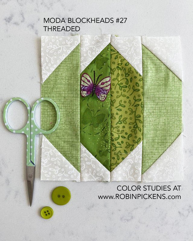 My block is living in a green corner of my small row so I'm treating the shapes as a leaf idea. Two of the other green corners have leafy blocks with Autumnal and Clover. 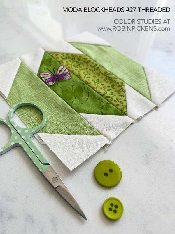 My little butterfly that has rested on the leaf is from Sweet Pea & Lily with the little drawings next to it from Carolina Lilies. Thatched greens bookend the leaf. 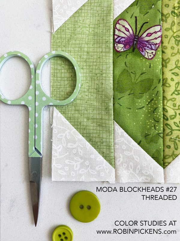 Last week I had not blogged about my color studies. There was just a lot to catch up with at home plus needing more naps from Covid. Feeling much better but I'm behind on a couple of things. So this was my color study that I shared on the Moda Blockheads Facebook group for Block #26, POSTAGE STAMP! 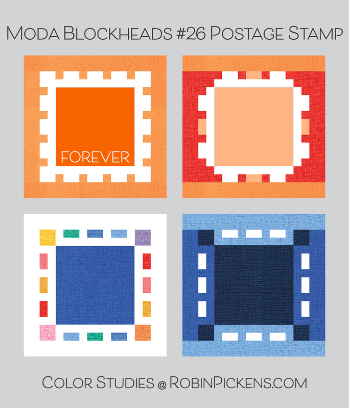 This weet Postage Stamp is from Corey Yoder! The link is through her blog @CorianderQuilts. I think this would look adorable with "Forever" embroidered on it. Those little dashed edges would be cute as colored lines of playful hues. Corners the same color as the background make it round off the shape more. 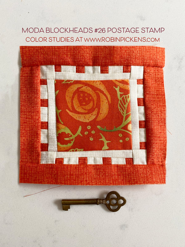 A little orange stamp for my orange row. Abby Rose has a bud for the center! 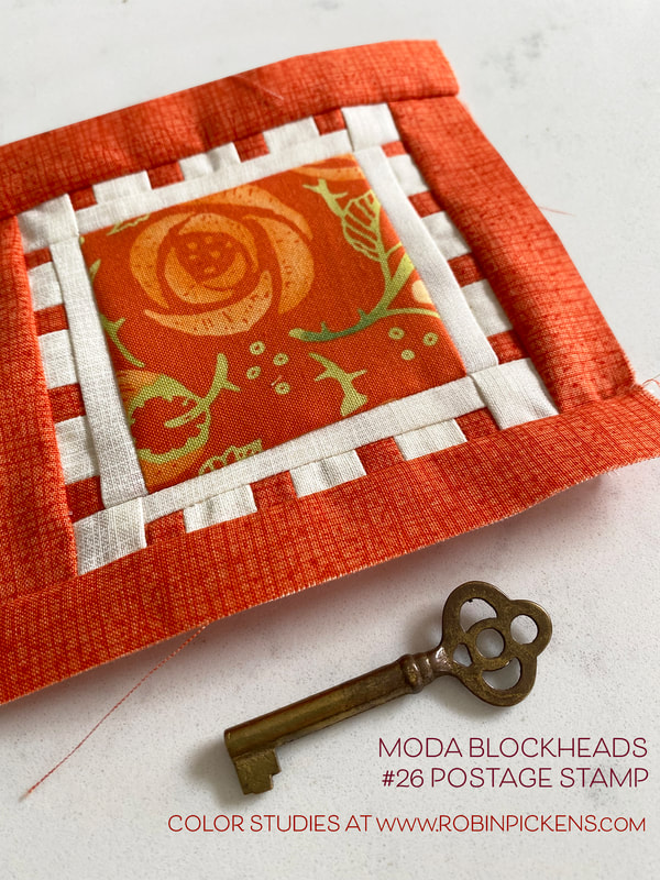 And I've got a couple more small orange blocks from the bonus blocks that I had not posted yet. These are bonus block 6 STEP TO IT and bonus block 7 STAR TURN. 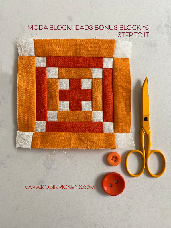 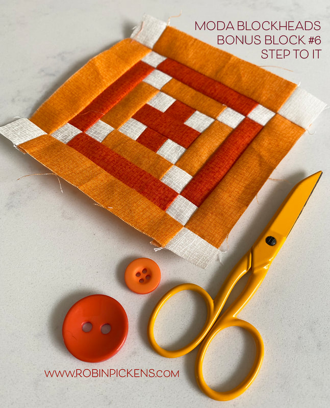 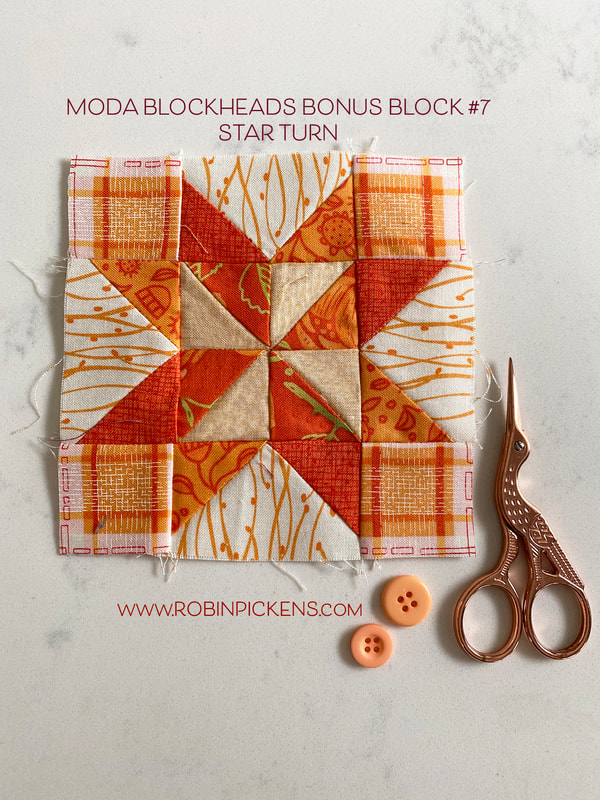 All of my orange and yellow blocks are made so I can start joining them. ONE MORE BLOCK TO GO! I have one space left in my big pink outer ring. Till next week...happy sewing!! 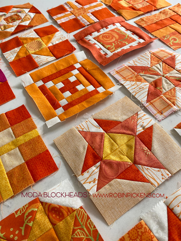 Ready to show some love? Well, Vanessa Goertzen's HEART quilt block will help you do just that! Visit Vanessa at https://blog.lellaboutique.com for the pattern and follow all her pretty Lellaboutique images on instagram https://www.instagram.com/lellaboutique/ 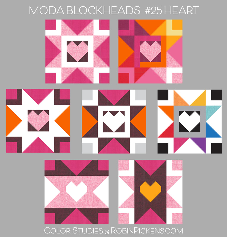 This week's block just seemed to scream out for some pop-inspired colors with some super-graphics 70s vibe. I think of the roller skating rink with Donna Summers singing "I feel love" with those star points beaming out light around the heart. This would make the cutest tshirts! 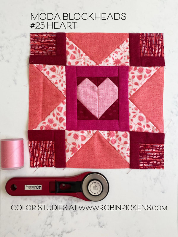 My block for my sampler is in the large pink row and I've used a Mix of a print from Abby Rose with corners using broken lines from Painted Meadow. Four colors of Thatched (fuchsia, primrose, cranberry and sugar rose) mix in with the other pink blocks in the row. 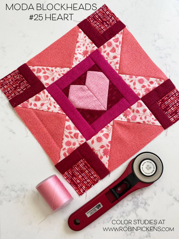 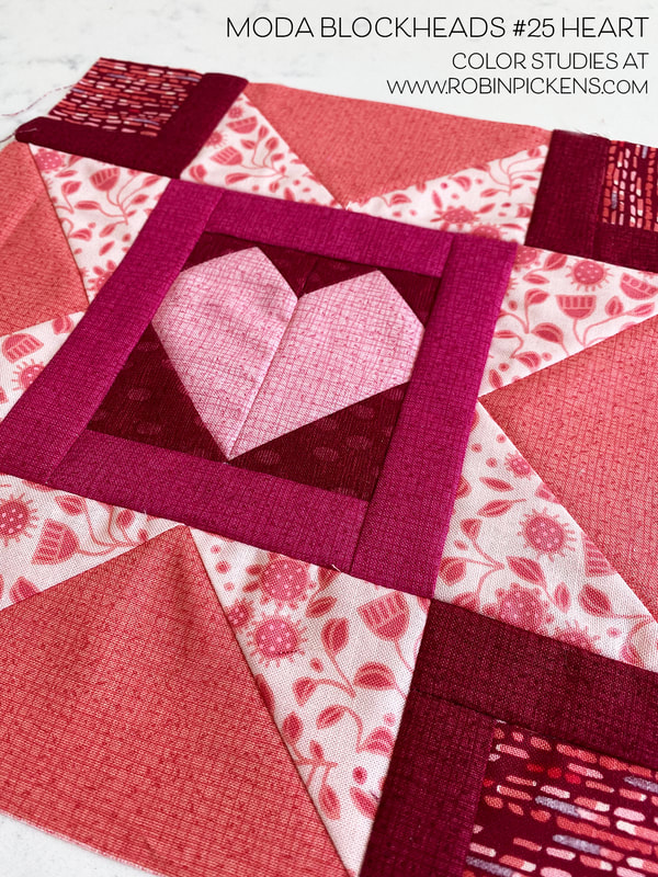 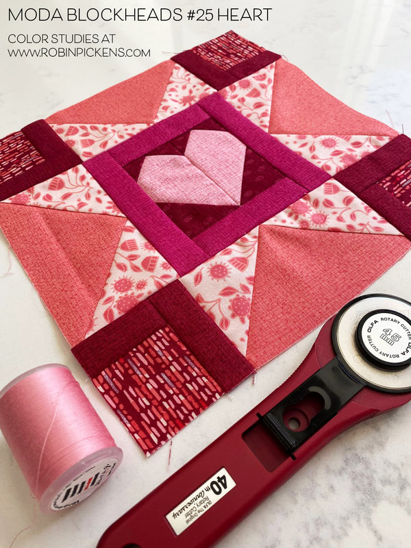 Four spaces left to go! Based on what I have sewn so far, I have one big block left to go and 3 small ones (two orange and one green corner). When we get near the end of a sewalong I am so happy to finish, but also sad since the journey and sharing is so fun. Guess that means it will be time to start thinking about another one, right?  A little late here with my Blockheads post but I do have a legit excuse. Blame it on the Covid I contracted and my needing lots of naps. Doing better now and thought sharing late was better than never! Last week's block was Outtakes from Vanessa Christenson of V&Co. Vanessa creates those beautiful ombre fabrics with luscious colors! I think her fabrics would be so pretty in the block she designed. Visit Vanessa at https://vanessachristenson.com/blog/ or check out her feed on instagram https://www.instagram.com/vchristenson/ 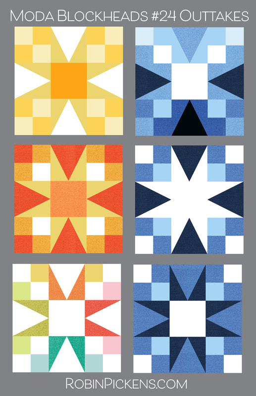 I like to squint my eyes to see what is popping out as the strongest element or is an overall feel in each of these. That all white center star really pops to me. I also like how it can also look like a visual illusion of corners zooming out at you. Such a fun block! 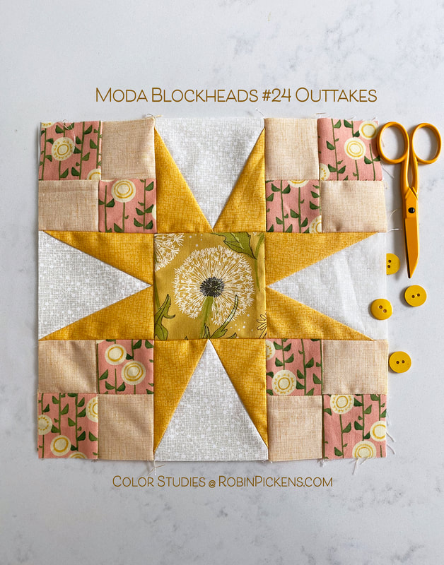 My Outtakes block will be the last of the four for my yellow center! I did not have the specialty ruler so I used the paper piecing for the star points, which worked well. I thought a little Dandi Annie puff ball was a fun center to use for this! 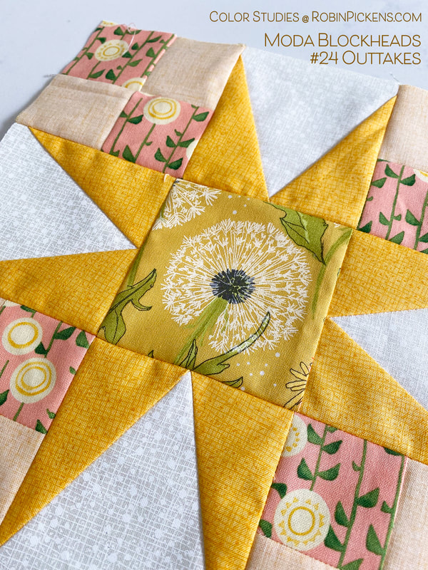 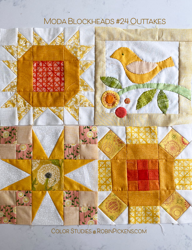 Here are my 4 yellow blocks together. I'm looking forward to getting this all joined! 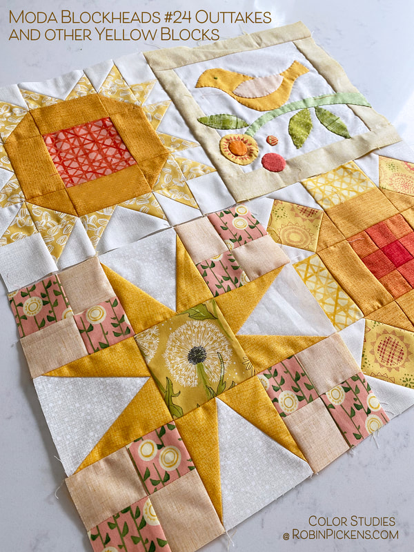 Brenda Riddle brings us Gentleman's Fancy this week. Click the gray bar to be taken to her blog to see her lovely fabrics and designs! Gentleman's Fancy has numerous angles, which is always lots of fun for color play. I can think of it like petals of a flower or have one dark and one light on the flying geese units to make more of a spinning/pinwheel look. Number 4 just draws you in to that dark center. And the last row plays with switching it up in the triangle corners to get a diagonal look or one that looks like a mouth open with teeth and tongue to me! 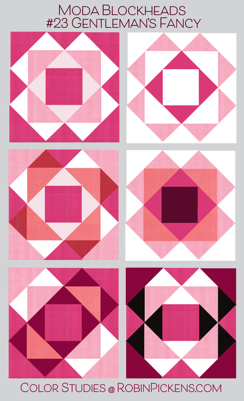 I usually don't sew blocks that I divide corner to corner first then sew on a side. I seem to be a little challenged when I do this with getting my corners lined up. This is probably one of my more wonky blocks but since it is the SECOND time I made it...I figured I'd live with the imperfections. 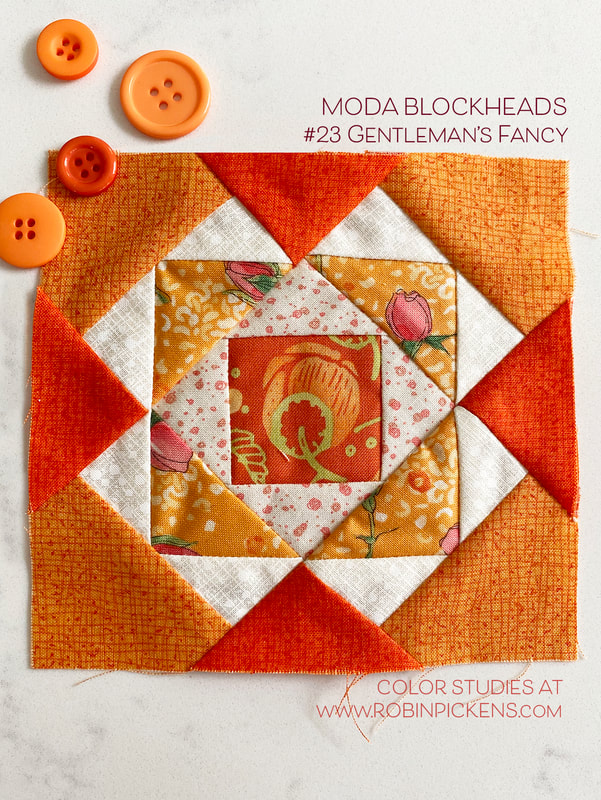 That's right...second time. The first time I made my orange block in a 9" size. Hmmmm. My orange row is all 4.5" sized blocks. So I thought, I'll just use it in the 9" row. Nope, those are pink/red/cranberry. So making the block again was the answer. Here's my duo: 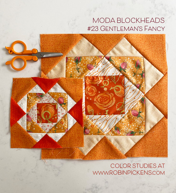 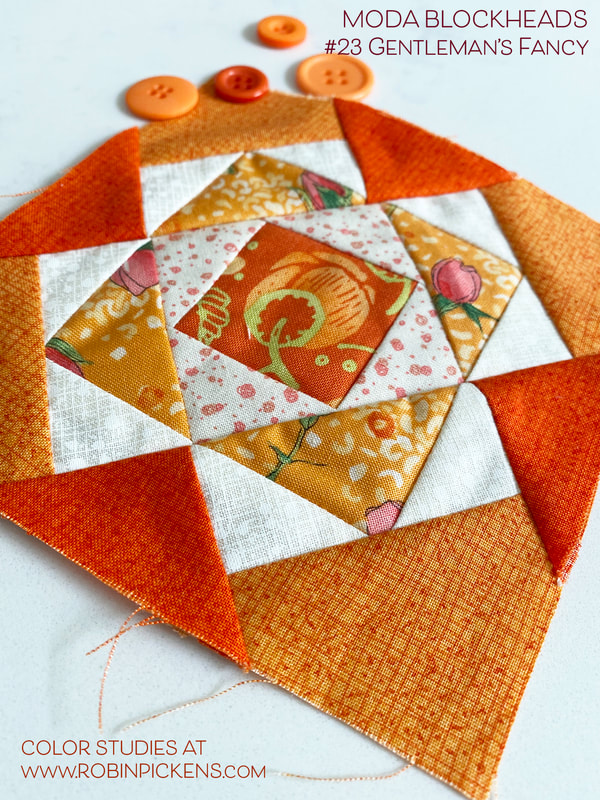 Sherri McConnell brings us STAR PATCH for block #22 for Moda Blockheads. Visit Sherri's blog for the pattern and see all her wonderful tips and quilts. The little 9-patch center can be a cute little checkerboards, a cross, radiating center. Corners look interesting in background white or carrying color out to the points. Emphasize the star points or the corners. I love the options on this block. 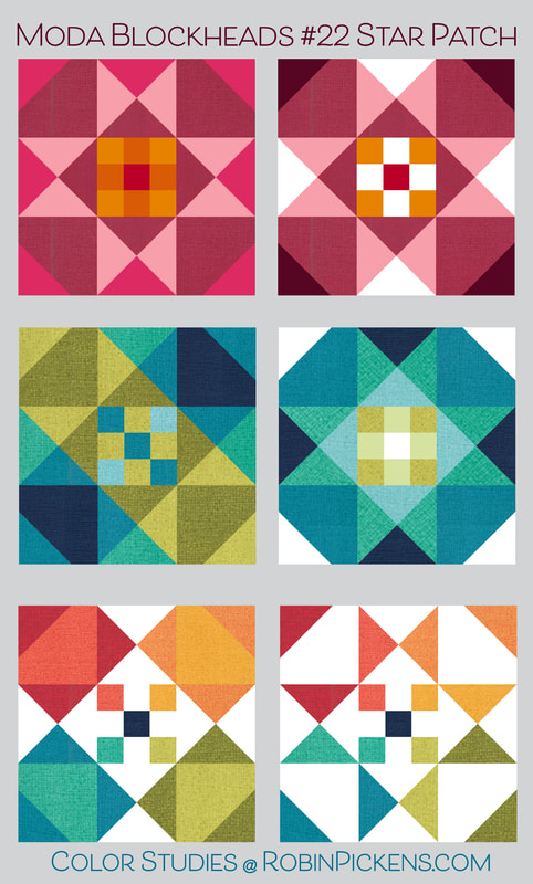 Another 9" block for the red/pink row with a little orange in the center to tie in with the orange row next to it. Painted Meadoww paisley makes the star points with fuchsia corner points. 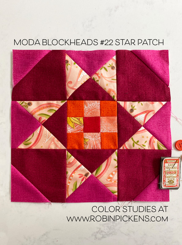 I like combining the soft pinks with those stronger cranberry and fuchsia colors. A little print, a little Thatched and some Solana in the center. 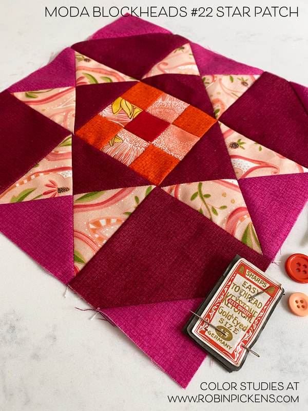 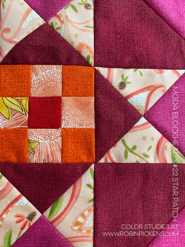 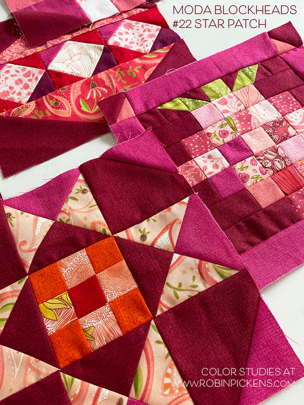 Baubles, ornaments, pretty shiny things that twirl and spin...hello week 21 with "Shiny Bauble" from Janet Clare! Some paper piecing helps to make the top and bottom angles. Get the pattern through Janet. I just played a little with the bauble this week and tried different colors for corners of interior blocks or making them the color of the top and bottom. Maybe a dark light combo like the last ones to look like a shadow is cast. 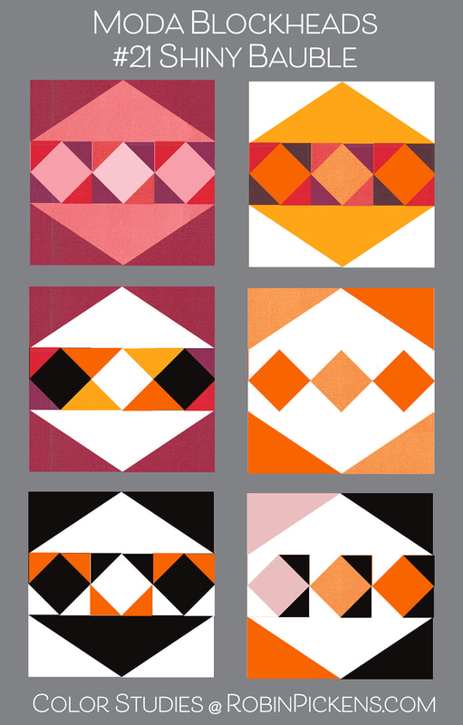 Red row for me with a 9" block. I went for scrappy happy energetic reds. 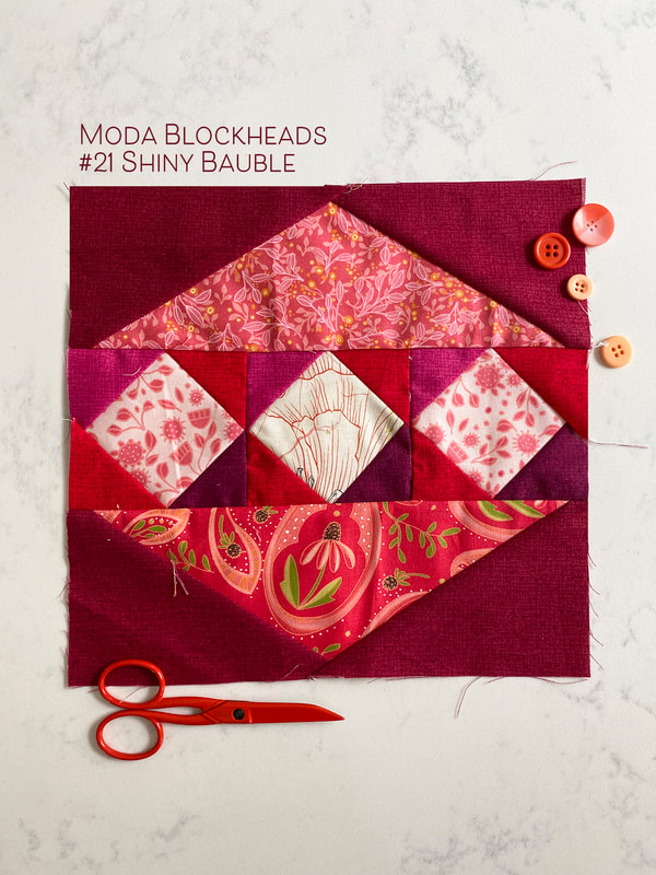 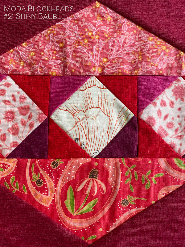 Will you make holiday ornaments? Or a court jester's playful object? Or colorful kid's top? Have fun with Shiny Bauble. We are nearing the end...keep on sewing!
|
About ROBINDesigner of colorful florals for Moda fabrics. Modern to transitional quilt designer. Illustrator, sewist, crafter. I am proud to be a designer for Moda Fabrics!
Shop Robin's Designs
 I am an affiliate for Fat Quarter Shop and may earn a small commission through my links. Thank you for your support!
Check the March 6, 2017 Episode!
Categories
All
Archives
November 2023
© Robin Pickens Inc. All rights reserved. No images may be reproduced without permission.
|
 RSS Feed