|
First, a big thank you to Fat Quarter Shop for putting on another Sewcialites Sew Along, and to all of the talented designers who shared their creativity to bring us these beautiful blocks. It has been such a pleasure to see how each designer’s style comes through while still creating a collection that works beautifully as a whole.  After twenty-five weeks of stitching, we’ve reached the assembly stage of the Sewcialites 3 Sew Along. We’ve spent the past several weeks exploring color placement and considering how each block works within the overall design. Now all of those decisions come together. I’m making a 27 ½" × 27 ½" wall hanging. The twenty-five blocks are arranged in the center, moving from light to dark, creating a gentle progression of color across the design.  The top and bottom borders frame the blocks beautifully. The top border is Buttermilk and the bottom border is Burgundy, and each measures 27 ½" × 6 ½". The side borders are made up of smaller solid blocks measuring 6 ½" x 3 ½". Left Side - From top to bottom:
 There’s something special about reaching assembly week. Each block has been stitched separately, but once they’re placed together, the color relationships really start to shine. And yes, I did turn one of the stars the wrong way in the first picture—now all fixed! The light-to-dark arrangement gives the center a beautiful flow, while the borders provide a strong framework for the finished piece.
Here’s the finished quilted project—a little snapshot of twenty-five weeks of Sewcialites 3. Thank you for stitching along with me. It’s been a wonderful project to share, and I hope you’ve enjoyed watching it come together as much as I have. -Robin
1 Comment
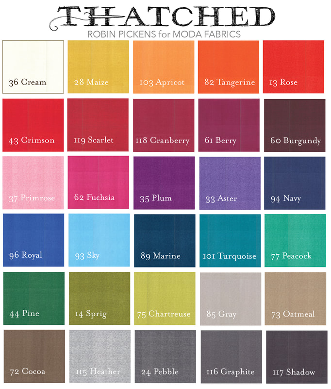
This week's Sewcialites 3 block is Gazebo, designed by Doug Leko of Antler Quilt Design. I'm not sure Doug envisioned this block dressed entirely in shades of pink, but I have to say—it is absolutely delicious! This palette gives the design a fresh, unexpected look while allowing the striking geometry of the block to take center stage.  The Gazebo block is perfect for playing with color. With just a few different shades of pink, it takes on an entirely different personality—from bold and dramatic to soft and understated. Whether you choose a soft palette, high contrast, or a rainbow of prints, the design offers endless possibilities for creative expression.  The Thatched fabrics used this week are Early Dawn, Sugar Rose, Fuchsia, and Primrose. By working within a single color family, the focus shifts from color to value, allowing the varying shades to define the design. From the soft, delicate Early Dawn presented as the background fabric to the bold Fuchsia at the center of the block, each fabric plays an important role. Sugar Rose provides a medium value that gently frames the center, while Primrose creates a soft outer border, bringing the entire composition together. This block is a wonderful example of how subtle shifts in value can create depth, and visual interest without relying on contrasting colors.  One of the fun parts of making a sampler quilt is watching the larger composition unfold. Each completed block contributes its own character, while the collection gradually comes together as a unified design. There are still a few weeks ahead, and I'm looking forward to seeing the final composition take shape.
Happy Sewing! -Robin Week 19 of Sewcialites 3 is here, and this week we're sewing Pinwheel Dash, designed by Bev McCullough of Flamingo Toes. As the name suggests, Pinwheel Dash is a delightful combination of two classic quilt blocks—a pinwheel and a churn dash. It's always fun to see familiar elements reimagined into something fresh, and Bev's design does just that.  For my version, I used Thatched in Fuchsia, Burgundy, Masala Spice, and Caramel. The construction is a bit more involved than it first appears, requiring careful piecing and accurate seam allowances. Bev's design is a wonderful example of how color placement can completely change the character of a quilt block.  The pops of Fuchsia naturally draw your eye to the pinwheel, making it the focal point of the block. I chose to use more Burgundy than the pattern suggests, rather than introducing additional colors, and it completely changed the overall look. The larger areas of Burgundy give the block a more unified appearance while allowing the pinwheel to shine without overwhelming the design. By simply moving color around you can transform a quilt block without changing a single seam. A different color choice or value placement can give the very same block an entirely different personality.  It's fun when a block surprises me, and Pinwheel Dash did just that. It's a wonderful example of how experimenting with color placement can create an unexpected and beautiful result.
Happy sewing! - Robin It’s Friday block release day for Sewcialites 3 and this week’s Block 15 is the beautiful Split Star Block designed by Lissa Alexander of ModaLissa. This design is delivering the look of two blocks in one, as the background becomes a design element itself in addition to the main sawtooth star motif. The layered illusion is the diagonal half-square triangle divide that creates a two-tone background, allowing your eye to move between foreground and background depending on fabric placement. One moment the star shines forward, and the next the background creates a striking secondary pattern.  Color placement becomes especially important in creating contrast and depth within this block. Strong value differences between medium, and dark fabrics, chosen here, help separate the look of “overlapping” shapes and emphasize the layered effect. When the background has good contrasts with the star, the sawtooth star feels bold and dimensional. But when similar tones are placed beside each other, the secondary patterns begin to emerge more subtly, creating a softer and more intricate visual texture. It’s a block that completely changes personality depending on how colors are arranged.  The colors I used this week, from top to bottom, are Sugar Rose, Cranberry, Burgundy, Smoked Paprika, and Pink Grapefruit. Together, this combination paired with the Split Star Block feels like the epitome of warmth and depth. The darker Smoked Paprika, Cranberry, and Burgundy tones pull the design forward, while the softer Sugar Rose and Pink Grapefruit create an almost glowing background that lifts the block. It’s tempting to make an entire quilt using this palette — perhaps with the background split diagonally throughout the whole design to frame the star blocks!? So many ideas, so little time!  Every week of sewing along has been inspiring and fun, and I always love seeing how different fabric and color choices completely transform each block. This one especially feels like it could go in so many directions depending on the fabrics you choose. It is becoming a fast favorite, like so many of the others!
Happy Sewing! -Robin Sewcialites 3 Week 14 is here, and this week’s block is the lovely Criss-Cross Star Block designed by Lori Holt of Bee in My Bonnet Co. One of my favorite details about the Criss-Cross Star block is the floating point construction, which helps those star points come out perfectly every time — and we all love perfect points! This block has a unique classic star design very in tune with Lori Holt’s charming signature style, and it comes together in a way that feels both fun and satisfying to sew.  From a quilt construction standpoint, this method is such a smart design choice. Instead of forcing bulky seams right at the tip of the star, the floating point technique lets the points “breathe” slightly within the seam allowance, which reduces bulk and gives you much cleaner, sharper results when the block is pressed and set into the quilt. It also makes alignment a bit more forgiving during piecing, while still delivering that crisp, polished star shape we all aim for. It’s one of those thoughtful construction details that really shows why this block works so beautifully in a sampler setting.  The colors I used this week are Buttermilk, Caramel, Smoked Paprika, Pink Grapefruit, and Primrose, which gives this block such a warm and cozy feel. This palette would make a beautiful fall-inspired combination too — just add a touch of green!  The Criss- Cross Star points are made with Buttermilk and Primrose, which keeps them light and airy so they really pop against the Pink Grapefruit, this makes the whole star feel soft and glowing.
The corners in Smoked Paprika add a deeper, spiced contrast that frames the block and gives it a grounded, slightly dramatic edge, while the Caramel center pulls everything together with a warm, honeyed focal point. Week by week, Sewcialites 3 continues to bring together gorgeous blocks, creative techniques, and so much quilting inspiration. Happy Sewing Robin Week 11 of Sewcialites 3 brings us the Snuggle Patch Block, designed by Edita Sitar of Laundry Basket Quilts. This block leans into a more traditional quilt block, making it a wonderful nod to classic patchwork. It’s labeled as a beginner skill level, but don’t let that simplicity fool you--Snuggle Patch offers a lot of versatility. From playful color combinations to more refined, tonal palettes, it can easily shift its personality depending on your fabric choices.  Beyond color, the block also shines in how it can be arranged within a full quilt layout. Whether repeated in a structured grid or mixed with other blocks in the Sewcialites series, it creates opportunities for a variety of finished looks. A timeless block with flexible possibilities, the Snuggle Patch block can offer endless creative potential.  This week’s Thatched color picks are especially rich and inviting: Pink Grapefruit and Burgundy—two of my personal favorites—paired with Masala Spice and Caramel. Together, these shades create a warm, layered palette that adds depth and a slightly sophisticated feel to this classic style block. It’s a beautiful example of how thoughtful color choices can elevate a classic design and give it a completely fresh look.  Seeing all of the blocks we’ve made so far come together is so satisfying. We’re almost halfway—what a fun sew-along this is! I’m already looking forward to next week.
Happy Sewing! Robin This week’s Sewcialites 3 block is almost too cute to resist. Block 10, the Little Berry Block, designed by Pat Sloan, adds a sweet and playful touch to the overall quilt with its charming patchwork berry motif. I’m working with the 3" finished size, which makes everything feel delightfully tiny—and definitely calls for a bit more care and precision. The smaller scale really highlights the patchwork details for this block, especially in the berry itself, where the two colors come together to create that classic berry look.  I couldn’t resist leaning fully into the theme, pulling from my Thatched fabrics of the rich Fuchsia and warm Sugar Rose for the berry itself, Caramel for the leaf unit, and Early Dawn as the background. The subtle texture of Thatched really enhances the block, giving the berry a soft, almost fuzzy texture that fits the theme perfectly.  This block is a fun make, and it delivers big on personality. It’s definitely one of those designs that would be adorable repeated across an entire quilt or even turned into smaller projects. Straight piecing combined with stitch-and-flip corners and half-square triangles, makes up this fun berry block.  A few notes from this week: Keeping a consistent seam allowance is especially important when working with pieces this small, as even slight variations can affect the final block. Pressing carefully made a big difference in reducing bulk, I pressed the seams open for this one.
Until next week, happy sewing! Robin We’ve made it to Week 8 of Sewcialites 3, and this week’s block is the Beacon Block, designed by Amy Smart of Diary of a Quilter. This block has a lovely, slightly traditional feel and comes together with a combination of half square triangles and flying geese. It’s a fun mix of techniques that keeps things interesting while still being very approachable even when the tiny HSTs in the 3" blocks finish at just 3/4" square!  For this block, I chose to use more of the Burgundy Thatched fabric as the background - similar to how I approached the color placement for last week’s block, keeping in mind where it will sit in the overall quilt layout. The block has to blend in while still being noticeable, a subtle balance when playing with color placement.  This week’s colors are Pink Grapefruit, Burgundy, Cranberry, Sugar Rose, and Fuchsia. Keeping the background really dark allows the other rich berry tones to stand out in such a striking way, almost like a Beacon!  I really enjoyed how this one came together—the shapes create such a statement, and it feels like a little classic tucked into the quilt. More next week!
Happy Sewing, Robin |

About ROBINDesigner of colorful florals and Thatched basics for Moda Fabrics . Modern to transitional quilt designer, cross stitch designer, sewist, crafter. I am proud to be a designer for Moda Fabrics!
Shop Robin's Designs
 I am an affiliate for Fat Quarter Shop and may earn a small commission through my links. Thank you for your support!
Check the March 6, 2017 Episode!
Categories
All
Archives
October 2026
© Robin Pickens Inc. All rights reserved. No images may be reproduced without permission.
|
 RSS Feed