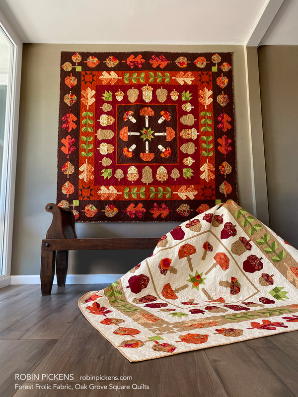
 Hello September! It is time for my OAK GROVE SQUARE sew along to start soon! I feel like the weeks have been rushing by so quickly and I'm still trying to catch up. I originally hoped to start Oak Grove in the beginning of September, but due to me being a little delayed getting this info out, I'm starting further into the month. Just like I did for LEAF PRESS, I've played around with some alternative Thatched palettes. My pattern is written to the Forest Frolic fabric and I've made the quilt in Forest Frolic and have both the light and dark version. Because of that, I'll be sewing for the sew along with one of the Thatched versions. 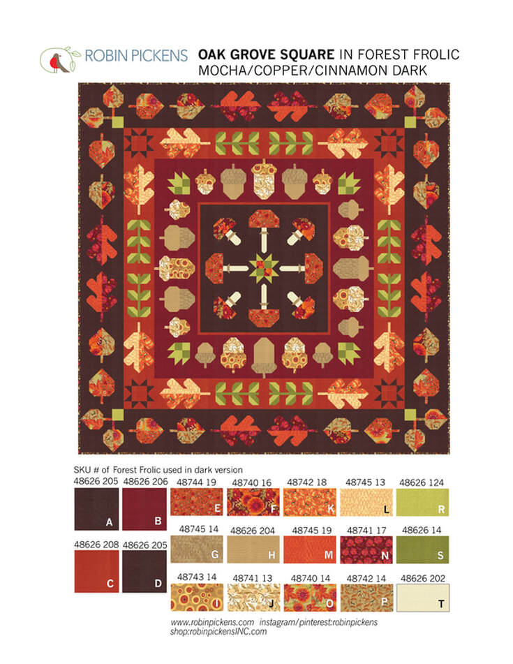 A couple explanations about the quilt first. Finished size is 72 1/2" square. The motifs are of fall leaves and acorns and mushrooms with some leafy stalks and corner stars and patchwork center star. It is a medallion quilt that has a center square and radiating "rings" (or square borders) surrounding it. You can make this quilt with all one background color or make every row/border/ring a different color. On this dark version I've used the new Thatched Mocha for the center and outer row. The Acorns are on a Cinnamon border and the green leaf stalks and some Oak Leaves are on a Copper border. 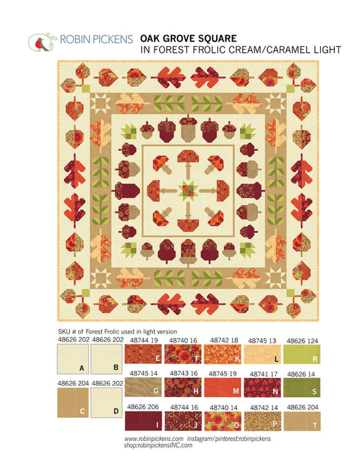 This light version uses Thatched Buttermilk for three of the backgrounds and Caramel for one of the rows. Because of the options to use different background colors, the sections are cut and written in the pattern according to the rows. If you decided to use 4 different backgrounds, you'd need: Background A..... 3/4 yard (you can use 2/3 yard but it is tight so 3/4 gives you more room for play) Background B..... 1 and 1/3 yard Background C..... 1 and 1/2 yard Background D...... 2 and 1/3 yard The prints needed are 12 Fat Quarters of prints (Fabrics E-P) and a couple additional accent fabrics of greens for leaves (1/2 yard for Fabric R and 3/8 yard for Fabric S) and 1/8 yard or Fat Eighth for Fabric T used for mushroom stalks. The blocks all use construction for half square triangles, flying geese and stitch and flip corners. It is regular piecing and not foundation paper piecing. No applique (although feel free to add any embellishments to your own quilt with an applique addition). 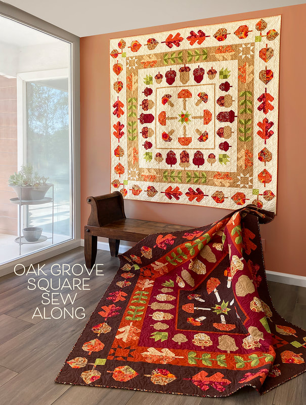 As I worked on the Thatched color studies, I wanted to try versions that felt like they went with the fall season but were not ONLY about fall. I liked this version on Cream Thatched with a Pink Grapefruit border C. This feels light and playful on the crisp cream background, thus the "Lighthearted Fall" name. 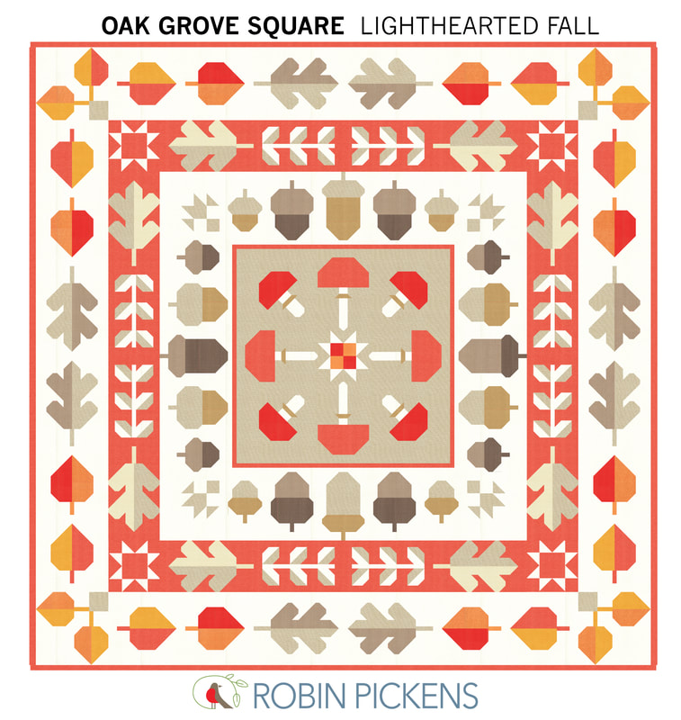 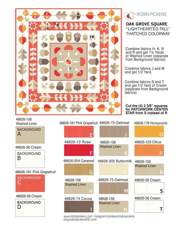 And by simply changing the outer Background D to Smoked Paprika and Background B for acorns to Buttermilk, the feeling evolved to a richer color scheme for "Colorful Fall". 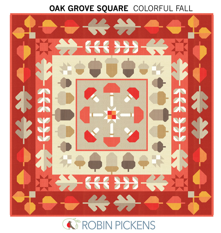 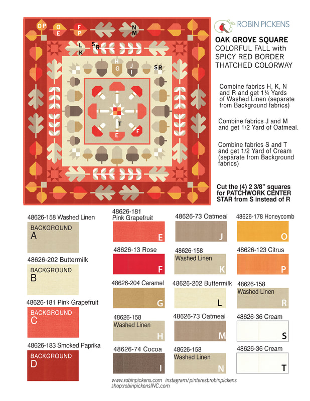 Lets go darker and more dramatic! "Dark Drama" uses Thatched Soft Black with a row of Olive. Lively Passion, Honeycomb, Cranberry and Tangerine give a sparkle of warm bright colors. 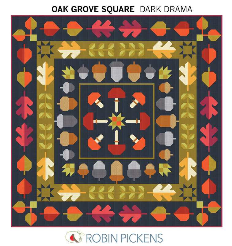 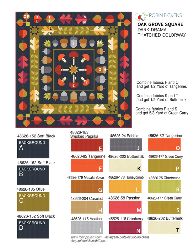 And one more...using colors that stray more from fall and have "Cheery Brights" to make an Oak Grove Square that is fit for year-round fun. 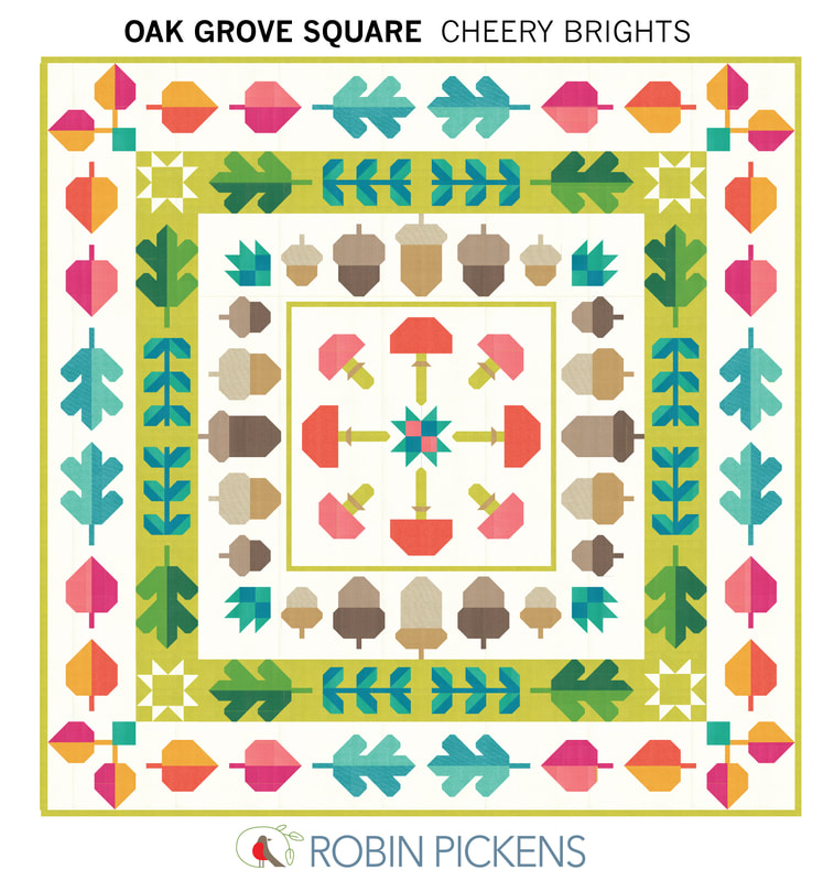 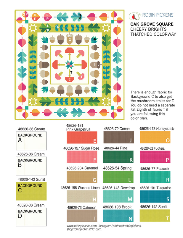 What about the details of sewing along? Where and when? Where: Share your progress and watch videos through Robin's facebook group. Join the facebook group "Robin Pickens Sew Happy Community" at www.facebook.com/groups/762206228564958 For those of you who don't do facebook, I'll be sending the videos to youtube but there is a delay till my video helper (Mr P) can do it on the weekend. Youtube channel is www.youtube.com/channel/UCNFGL95Mw4YSj98_k5RakqQ Oak Grove Square will be a monthly sew along with a group of blocks each month. This is the schedule and I'll be doing my first video on preparing on Friday, September 22nd at 10am on a facebook live in the facebook group. 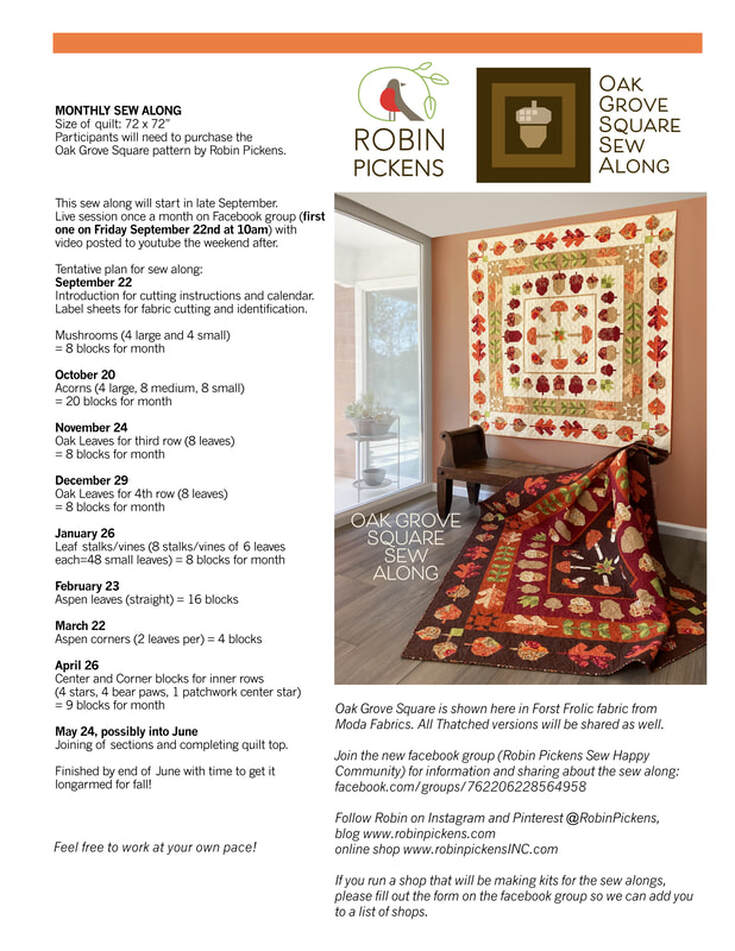 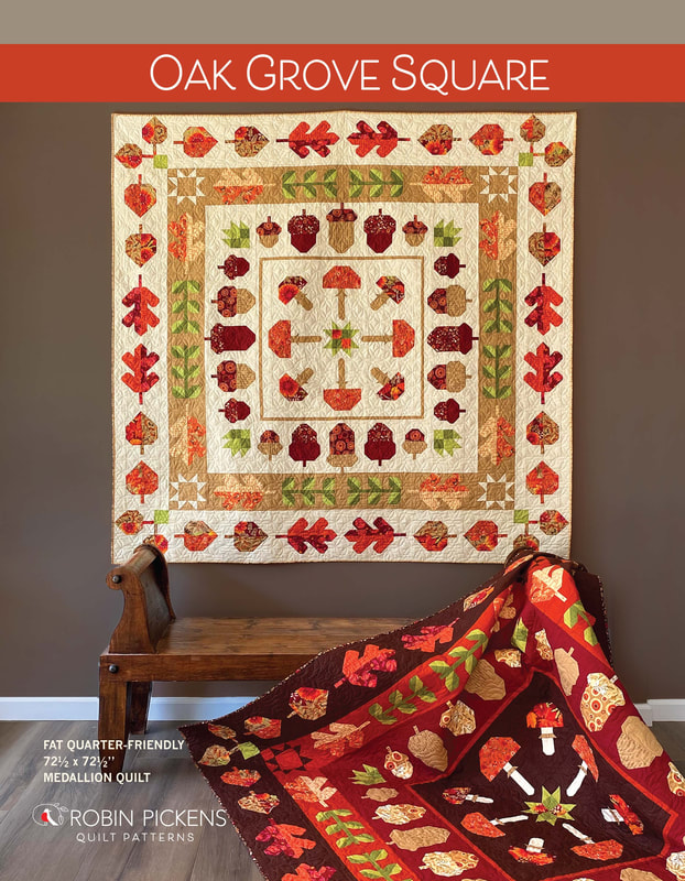 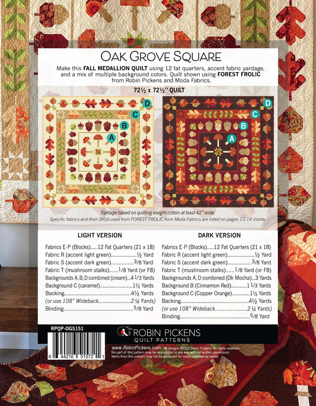 The blocks are not difficult to do and there is minimal matching of points. Since it is grouped monthly and by similar types, the blocks are rather efficient. It is quite fun to see your pile of mushrooms, leaves and acorns growing! I hope you will join us. 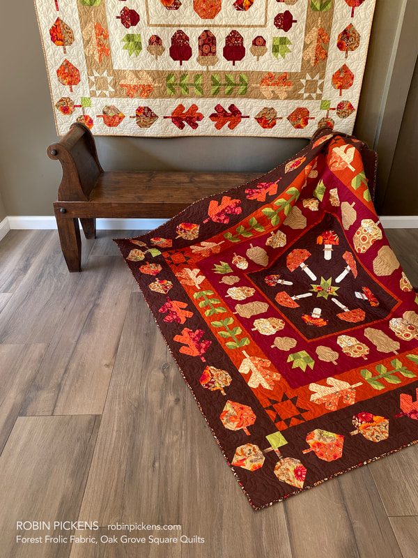 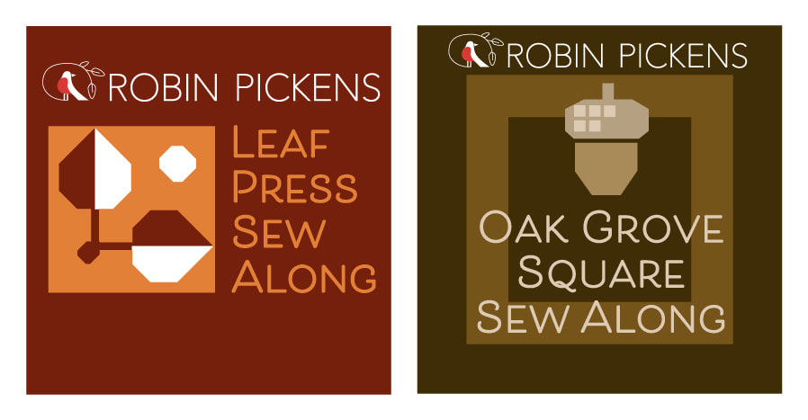 Maybe you are already joining in with the LEAF PRESS sew along? It is not too late to join in! My blog post about Leaf Press shows color combinations for that as well at:
www.robinpickens.com/blog/fall-sew-alongs-leaf-press-with-forest-frolic-or-thatched Patterns for Leaf Press or Oak Grove Square can be found at RobinPickensINC.com. You will need a pattern for the sew alongs. I hope you will join the facebook group and share your progress and quilts. I am so touched by seeing people post their projects with my fabrics or patterns. Thank you so much!
1 Comment
I mentioned the other day that my Mom changed her mind about doing Criss Cross Kisses in Carolina Lilies and now was wondering about either Kyoto Steps or Tokyo Terrace using that fabric collection. I took a little break this week to mock up some versions for her (and for you) to see...what if....? 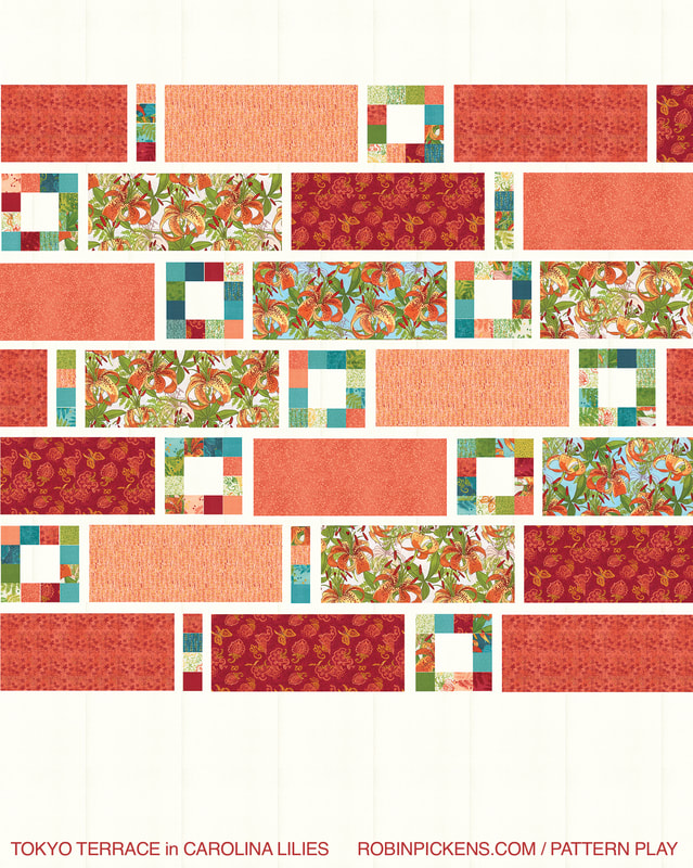 I broke the collection out into red or teal color groupings, just like I had made color families for these quilts before. I like the cohesiveness of telling that big color story. For Tokyo Terrace, I assumed the little squares are accomplished with a Charm Pack of Carolina Lilies with yardage used of the big prints. Even with these warm red tones, I liked the accent of the Carolina Lilies on aqua background for a couple of the big panels to tie in the aqua and teal colors in the little blocks. The big prints here are the Carolina Lilies main print 48700 in cream 11 and aqua 19, Boho Blooms on Ruby 48701-12, Little Drawings 48703-13 Coral, Vines in Coral 48704-13, and Dashed 48705-14 Peach. Background Thatched Cream 48626-36. 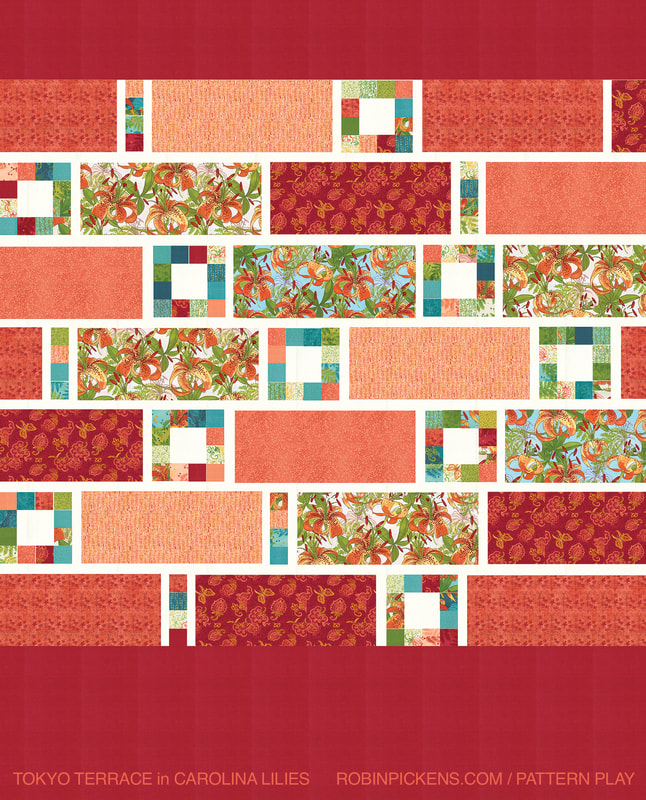 These are the exact same interior fabrics but I added the Thatched Ruby 48626-191 as the background to the top and bottom of the quilt instead of Cream. I kept the Cream for the sashings within the middle body. I love the burst of rich red color on the big background spaces. 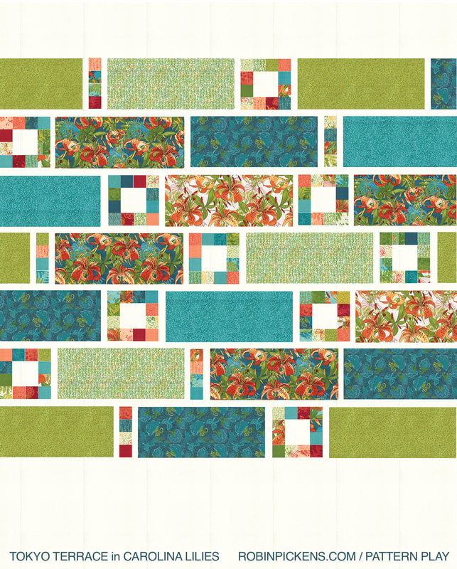 Here is the teal/aqua/green group. I used the Main Carolina Lilies 48700 in Cream 11 again but this time paired with the deeper Teal background, 21. Other panels are Boho Blooms on Teal 48701-21, Vines in Teal 48704-20 and Grass 17, and Dashed 48705-11 Cream. Background Thatched Cream 48626-36. 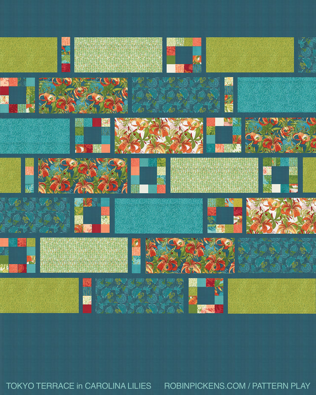 The same prints as above but with a background fully out of Thatched 48626-199 Lagoon. 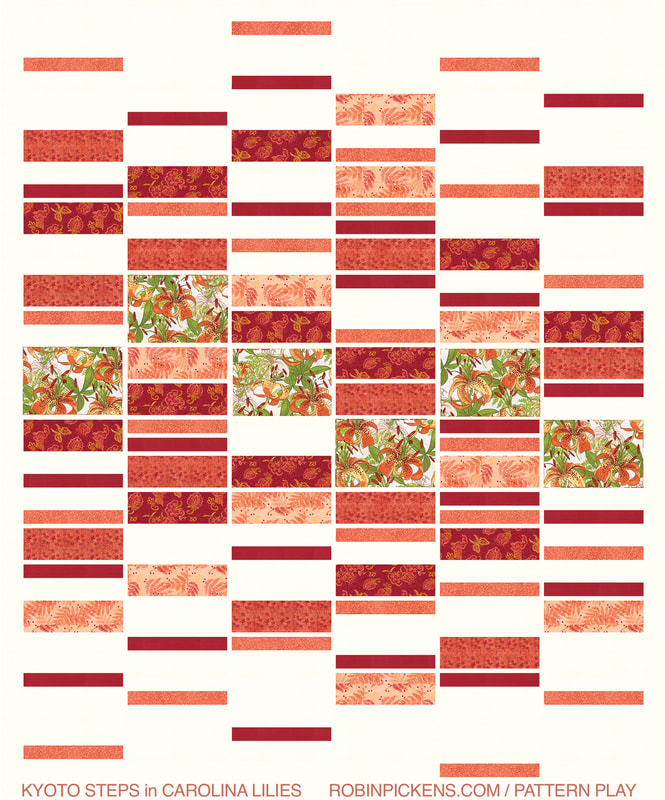 Let's compare with Kyoto Steps. For this quilt pattern I use six 1/2 yard cuts of fabrics (for the twin size). I use the larger floral to the middle, with the coordinates stepping out to top and bottom in thinner and thinner rectangles. This is shown with Carolina Lilies main print 48700 in cream 11, Boho Blooms on Ruby 48701-12, Ferns 48702-14 Peach, Little Drawings 48703-13 Coral, Vines in Coral 48704-13, and Thatched 48705-191 Ruby. Background Thatched Cream 48626-36. 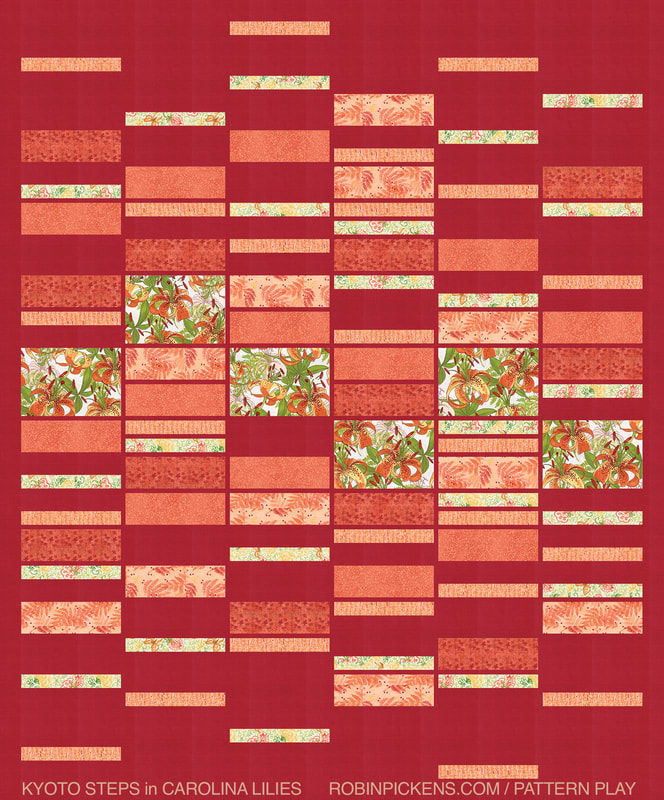 This version on the Ruby Thatched background 48626-191 uses the Carolina Lilies main print 48700-11 cream, Boho Blooms on Cream 48701-11, Ferns 48702-14 Peach, Little Drawings 48703-13 Coral, Vines in Coral 48704-13, and Dashed 48705-14 Peach. 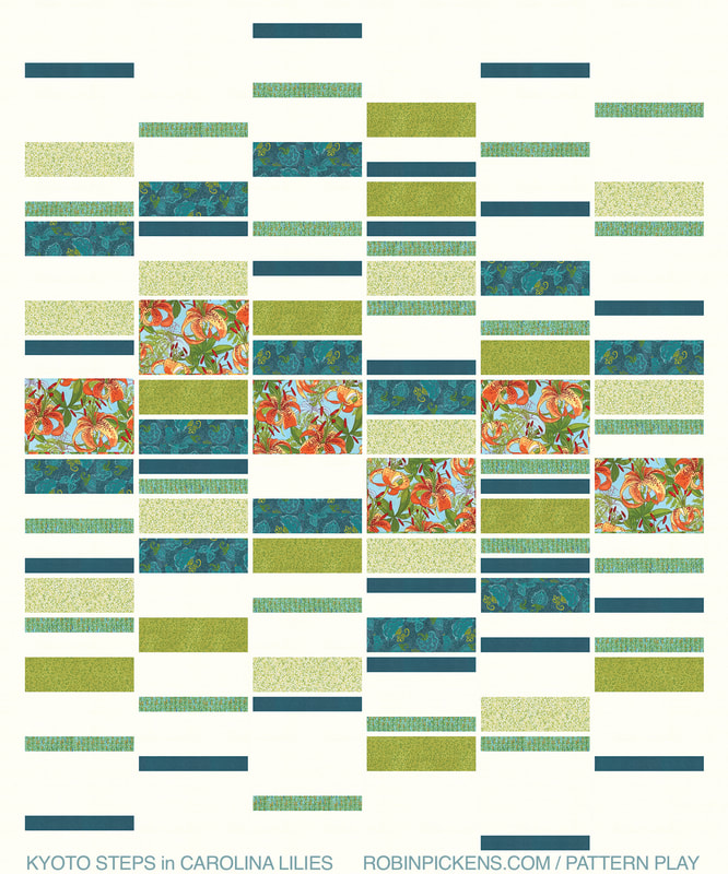 This teal/green combo on Thatched Cream 48626-36 background has Carolina Lilies 4870019 Aqua (love the Aqua!), Boho Blooms on Teal 48701-21, Vines in Grass 48704-17 and Cream/Grass 11, Dashed 48705-19 Aqua, and Thatched 48626-199 Lagoon. For fun, I tried the same mixture on Chartreuse Thatched 75 and I really like how it could look with the thinnest horizontal sashings in Cream and a couple of the vertical sashings in cream, like accent lines that add a little sparkle and added dimension! 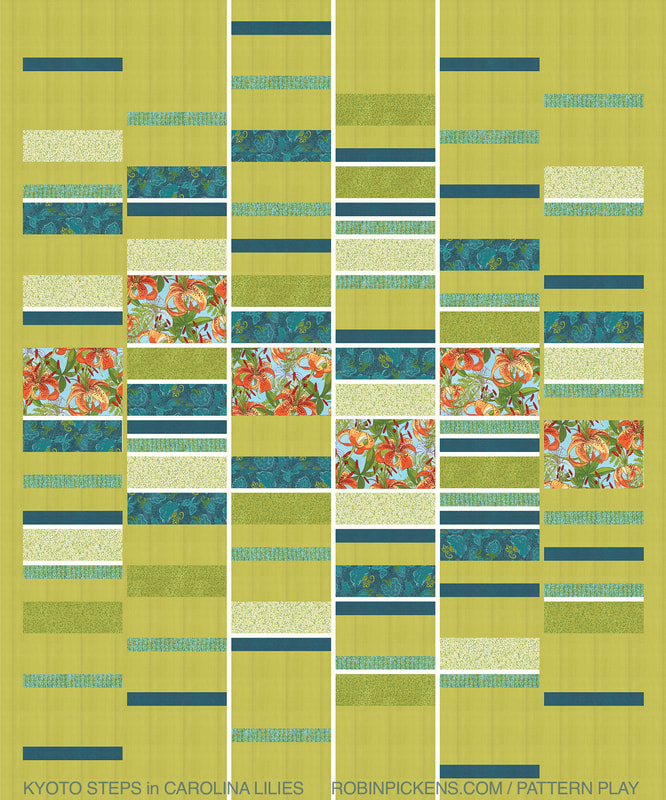 I hope you have enjoyed a little PATTERN PLAY today and are visualizing some fun with Carolina Lilies! 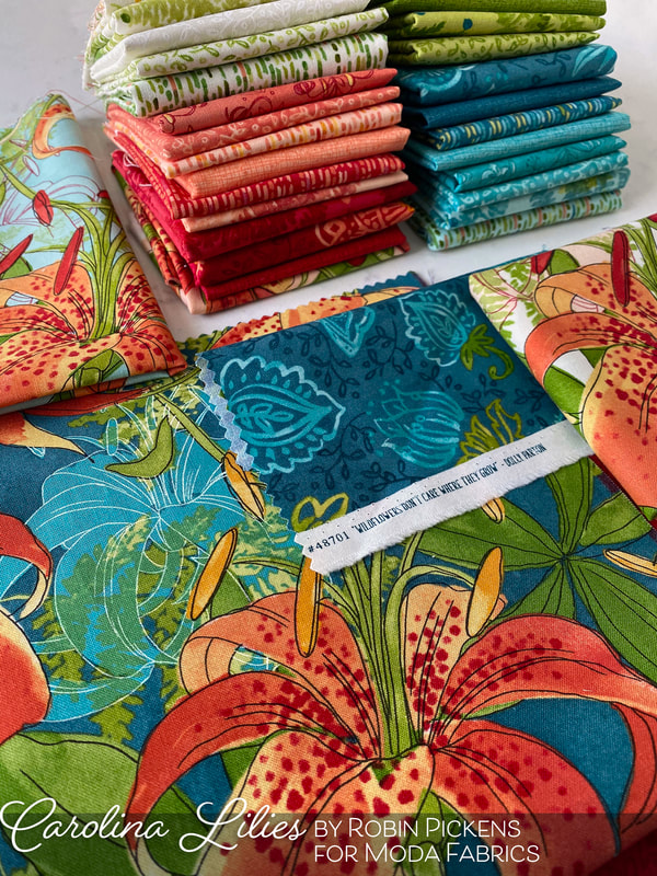 You can find Kyoto Steps and Tokyo Terrace patterns at many quilt shops and they are also availalbe in print and digital formats from robinpickensinc.com 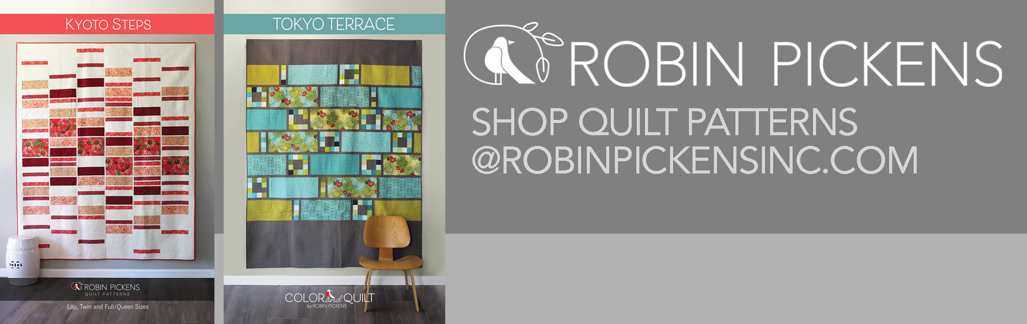 We are three weeks into September and fall has officially begun. I feel like this year has no regular markings of time and this month has been speeding by!! 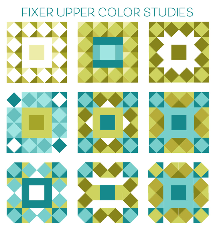 This was such an interesting block to play with. That first image reminds me of the lights around a big celebrity makeup mirror. And the next one emphasizes the center just by nature of the different color. Number three uses negative space to make the center feel like cut ends of a bow in the center. The center shape really gets called to attention in that one.
In the middle row, the turquoise color starts to become more mixed into the outer border and the dark olive tones make diagonal shapes and transparencies. In the bottom row, the outer corners becoming the background color gives the shape a more rounded feel and more of grouped corner units. I'm not sure what I am sewing this week although I am rather drawn to #7. This is a busy week. I just got my calendar tea towel uploaded for the spoonflower challenge that opens up for voting next week. And this week Friday the sewalong "Sewcialites" starts! And I just might be imagining some Halloween project in my mind...I'm thinking about my "Cardinal's Christmas Wreath" pattern but done in more fall colors with a black crow. Can't wait to get that mocked up. Happy sewing!! Happy fall! Who doesn't love adorable house quilt blocks? I love them! And the simplicity of these lovely homes from Stacy makes them a versatile and fun block to do. To get Stacy's block pattern, visit her blog here: 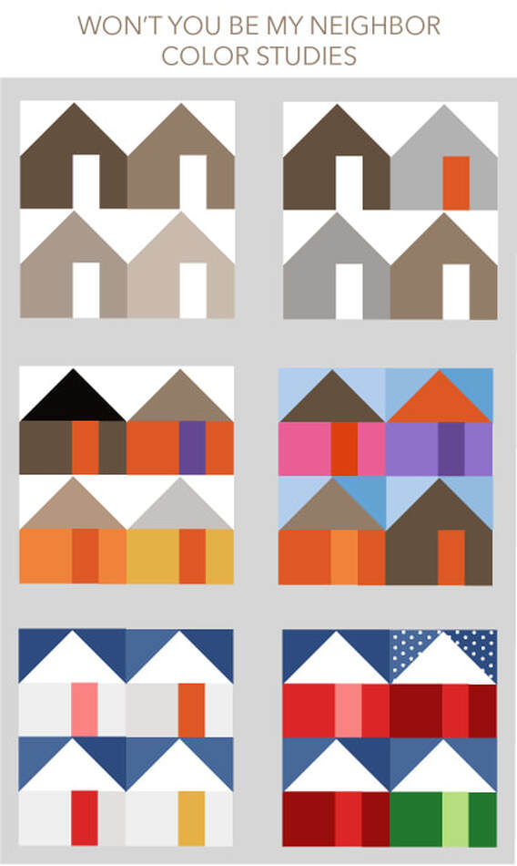 Color studies for this week are pretty straightforward since I think the houses are so cute as houses and I just did some different play with keeping my neighborhood consistent or varied in colors. First off, the houses look modern and minimalist when just done as the shapes in all a single color. Start adding in different colors for doors and roofs and the houses become more dimensional and have more character. I tried Fall colors or a mix of fun pink, purple, orange and brown colors with variety in my sky blues and separate roof browns. What if the houses are all from a snowy village with night blue skies? Or a Christmas street with red and green houses with snow topped roofs and one with the snow falling softly. However you decide to do your houses, I imagine they will reflect some of YOUR neighborhood. 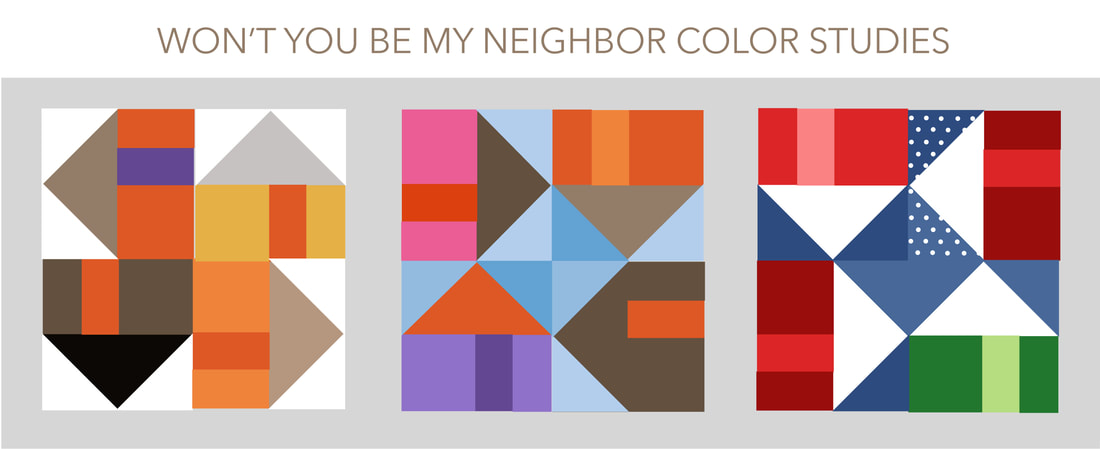 Here is a little fun extra play with the blocks. These are houses rotating around by the roofs or bases. I think of it as traveling around the block. All of a sudden we see arrows and more interesting shapes from the flying geese and those triangles. 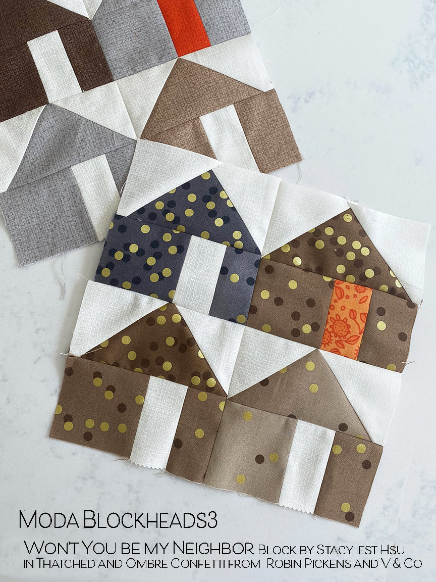 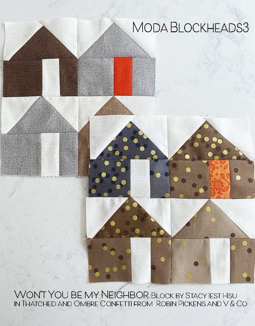 My blocks this week use the brown colorways. Since I don't have many browns in my collections I've used ombre confetti by V & Co for my print blocks with an Abby Rose orange door.
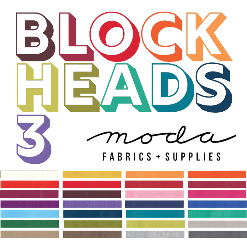
Have fun building your neighborhood this week. And guess what...next week is MY BLOCK again! I'm so excited to share it with you. Be sure to check back next Wednesday! Visit other Blockheads designers: 6.24 – Stacy Iest Hsu<–We are Here 7.1 – Robin Pickens 7.8 – Janet Clare 7.15 – Jen Kingwell 7.22 – Joanna Figueroa 7.29 – Corey Yoder 8.5 – Sherri McConnell 8.12 – Betsy Chutchian 8.19 – Jan Patek 8.26 – Brigitte Heitland 9.2 – Lisa Bongean 9.9 – Lissa Alexander 9.16 – Laurie Simpson 9.23– Vanessa Goertzen Happy Moda Blockheads day! This weeks cheery block is at Vanessa Goertzen's blog: With a name like Lucky Penny, how could I not think of coppery orange colors? Maybe mixed with grays from other change with it? Silver and copper...gray and orange...time for color play! 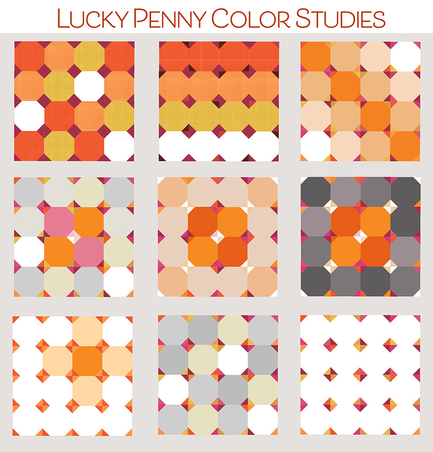 This block is just FUN like gumballs in bright colors! The little stitch and flip corners make friendly curved pieces that can play with random color in spotty placement or lining up the balls in rows or playing with the balls in formation on an angle. I started with all the same color stitch and flip corners and started to introduce other colors to give those corners their own sparkly personality. In the second row I looked at the center stitch and flip unit being light/white while the other corners were darker colors. Combined with the colors of the snowball blocks in the center 4 pieces it really calls attention to that center spot. It is also interesting to carry those light corners out as little bows out to the corners. I kept the middle and right second row images completely symmetrical and tried the outer ring of pieces in light or dark shades. I n the bottom row the image on the left shows using all the same repeating stitch and flip color pairs with mostly white snowball blocks. I've emphasized one block in there with a soft color surrounding it. The other two in the last row could be done in all white or in low volume fabrics with the color coming mostly from the stitch and flip corners. I love how the last one really becomes a composition about the little diamonds and you hardly see the snowballs. 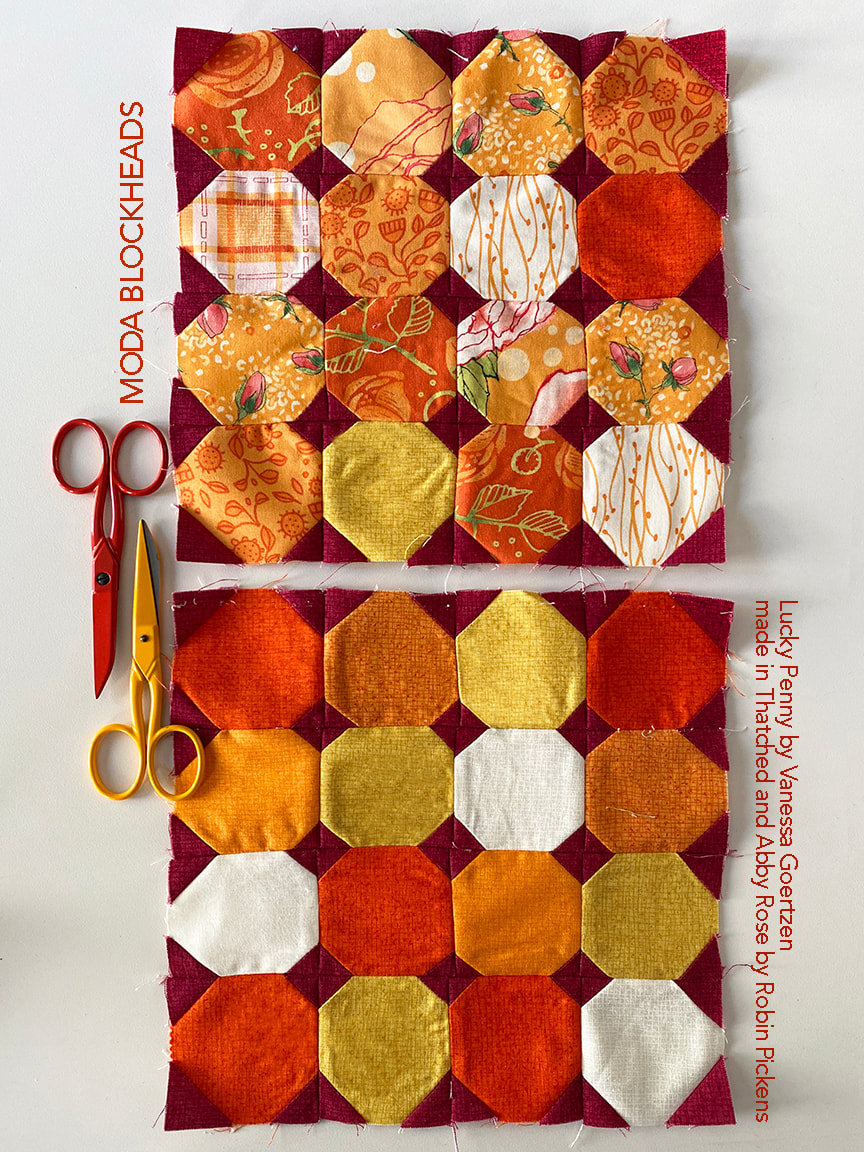 For my own blocks, I liked the colors arranged in a random way and felt that had a playful energy. I used the orange fabrics from Abby Rose to make my scrappy block, using Burgundy from Thatched to make the dark corners that really make the orange prints pop. 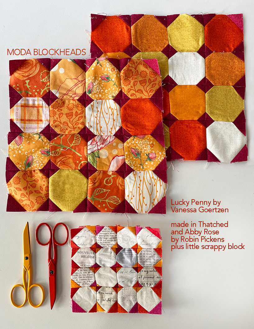 But I was also interested in making the low volume version of the block and decided to make a 4" block with my playful colors in the stitch and flip corners. 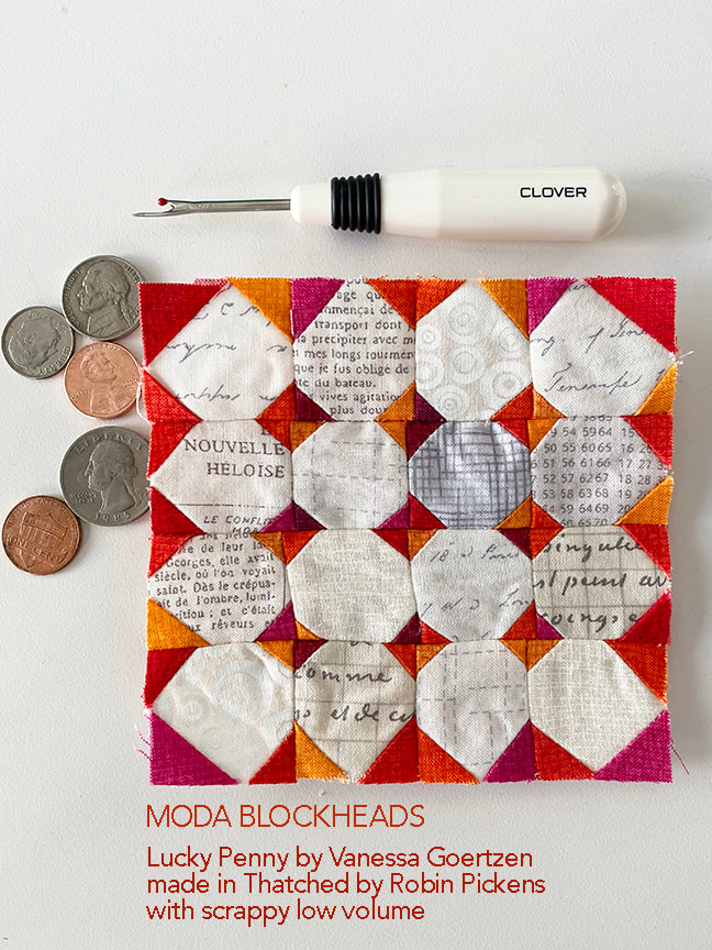 I'm not exactly the most accurate and patient when it comes to making a 4" block with lots of little pieces. I think my block should be renamed "Wonky Penny"! The seam ripper is there because I did rip out my rows and resewed them...believe it or not, this is the improved one! I decided I was just fine with the imperfections on this one and I kind of like the personality it has. Those small blocks sure are cute! 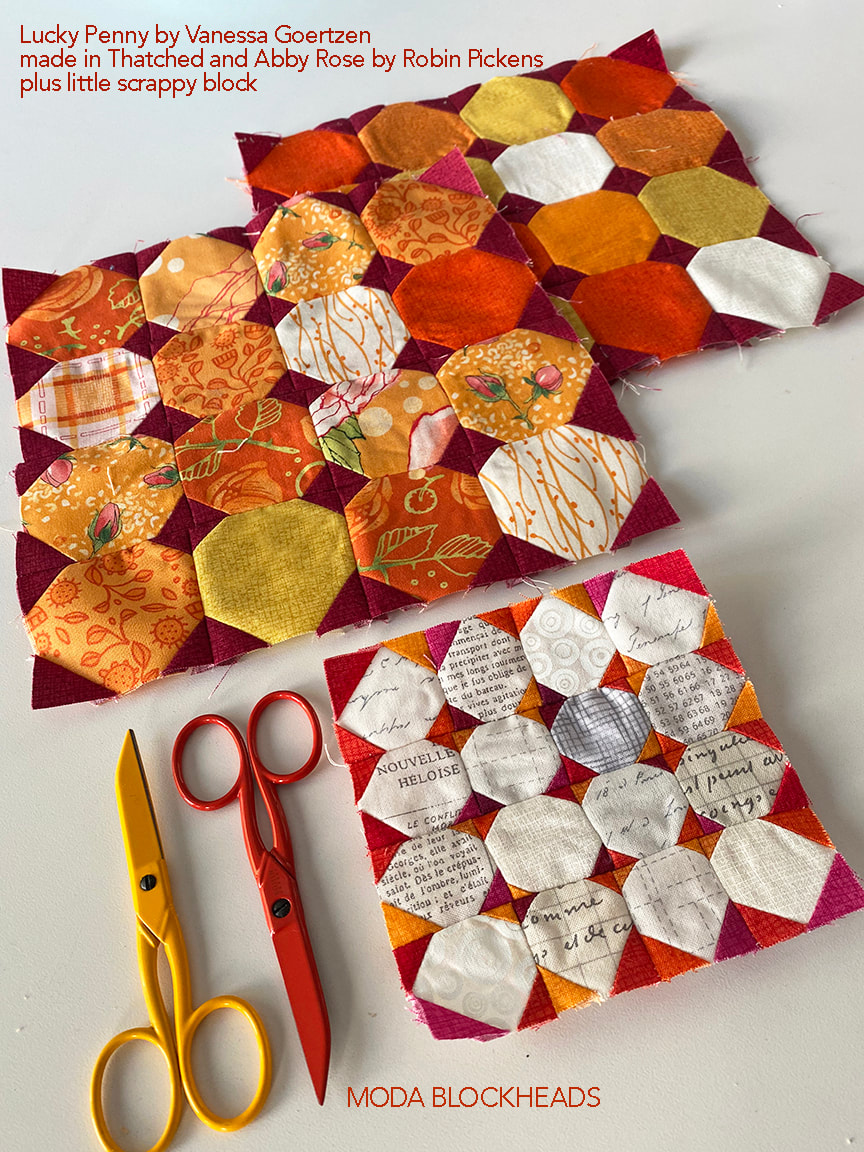 If you want to refer back to other color studies for Moda Blockheads I've made a page that shows an overview of them. The "COLOR STUDIES" is up in the navigation bar at the top. On the page you can click on an image to be taken to that blog post I'll update it and add the new color studies as I do them. 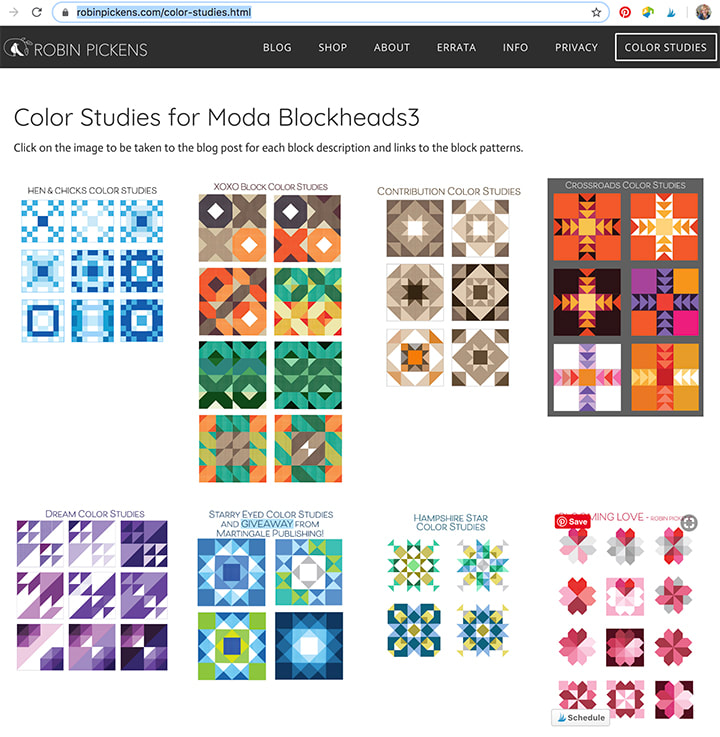 Hope you have lots of fun with your Lucky Penny block! Be sure to check out the other Moda designers!
6.17– Vanessa Goertzen 6.24 – Stacy Iest Hsu 7.1 – Robin Pickens 7.8 – Janet Clare 7.15 – Jen Kingwell 7.22 – Joanna Figueroa 7.29 – Corey Yoder 8.5 – Sherri McConnell 8.12 – Betsy Chutchian 8.19 – Jan Patek 8.26 – Brigitte Heitland 9.2 – Lisa Bongean 9.9 – Lissa Alexander 9.16 – Laurie Simpson I love envisioning past patterns in new fabric lines and since Abby Rose is in shops now, let's play with those cabbage roses!  This light blue in Abby Rose is Thatched Seafoam and I just love the softness and warmer tone of that pretty blue! I wanted to see that as the larger side borders with a cream to highlight the fringe thin sashings. A good choice for the cream is Thatched cream 26 or Bella Solids Porcelain.  Here is the cream as the main background with the Abby Rose/Thatched Greenery 124 as the sashings. We have blenders in the Thatched texture with new collections and they don't all automatically become new basics in Thatched. But if a color is different enough and popular, it's a good chance that it will. Greenery is not as yellowy as charteuse, although it is close. Its pretty and soft, like the other Abby Rose colors. 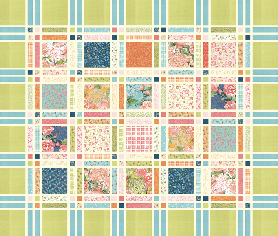 If you were making a king sized quilt, I would assume doubling the twin size. This mockup shows the Greenery as the large border block with the seafoam as the rectangles in the borders. I like the idea of mixing two colors for the borders! You could even go completely scrappy with the borders and have it be an extension of the prints in the body of the quilt. 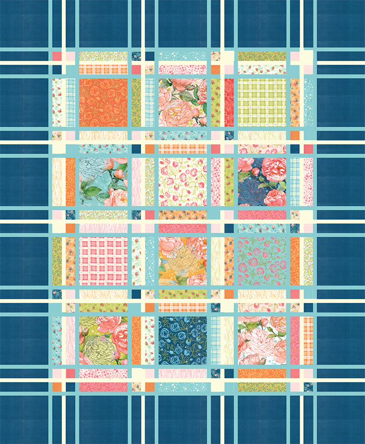 This last image uses the darker, Night 89 Thatched from Abby Rose. It is the same as 89 Marine. I have been so fascinated by Marine, Navy and Burgundy Thatched lately as deep, rich tones. They are so full of depth and personality! Notice on this image that the thin sashings are done in Seafoam Thatched for the two outer pieces, and cream for the inside piece in every group of three. Or you could go from light to dark in three steps to get a more gradated ramp. Lots of possibilities. I just love the drama of the darker border color!
I think Fringe is also a good pattern to play with those large blocks as crazy quilt piecing, string piecing, embroidery panels...lots of options! I hope "seeing" the possibilities with Abby Rose is helpful here! Happy sewing everyone! This week I made my first PURPLE block for my purple row in my Moda Blockheads3 quilt! I love that the name of this block by Sherri McConnell is "Dream" since I think purple can be a dreamy kind of color. 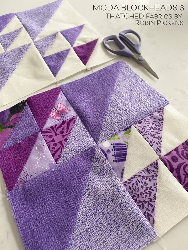 In the purple colors I used here, the darker Thatched purple and more plum-ish red purple color are both basics. The lighter purple was done specifically with my Sweet Pea & Lily line and I like this lighter background with the darker lines a lot. I'm hoping we can add a lighter purple to the basics like this! 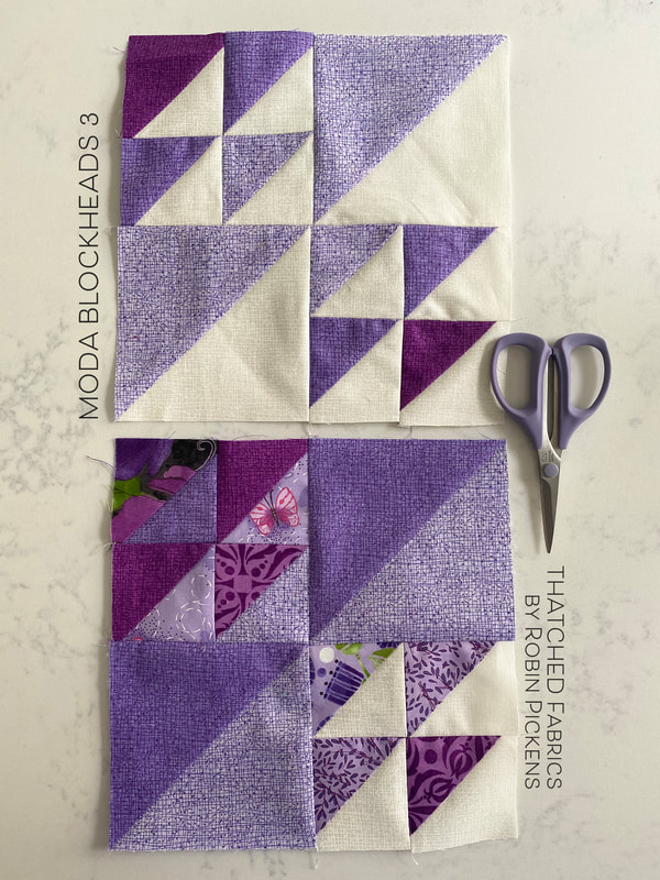 For some reason I was having a hard time getting my points to match up today when I was sewing. Some days are just like that. When that happens, I rip it out, and I re-sew starting right at the middle point where the points are meeting, going out to the side, then flip the block and sew the other half from that middle point (instead of from one side to the other). That usually will allow me to match those points meeting in the center better. 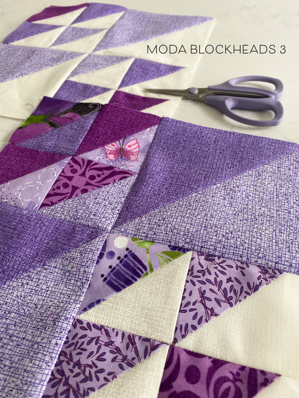 For my Thatched with prints version, I used all purple fabrics from Sweet Pea & Lily and I was reminded how fun it is to do some playing in purples. This block is also fun because I could create some other shapes within the blocks by changing the light and dark placements in the half square triangles. Want to see some color play?? 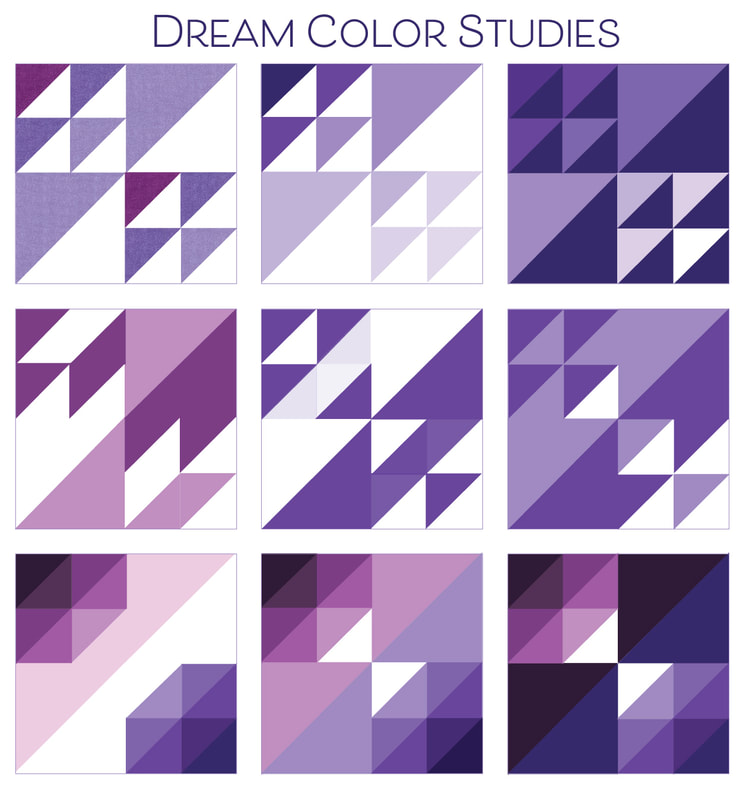 The first one is my initial color mockup and it is the one I decided to go with since it works well with the overall ratio of light to dark within my bigger quilt plan. The next one over is trying the colors all getting lighter as the triangles move from left to right. Then flipping to see how that looks on a dark background. In the second row, the large half square triangles make new shapes if they are the same color as the smaller HSTs. I keep seeing arrows in the one on the left if I squint my eyes. And the two next to it make me think of bowties. The angled movement is strong in these. The bottom row is more dimensional with the additional shades. Are they large angled diamonds...no, they are Amethysts! I am so intrigued by the darkest one and am wondering if perhaps another Dream block is in my future?  But I had one other idea I HAD to try! Wouldn't it be fun to do a little pillow with fun golden fishes, kissing in the sea? I'd need to embroider on some little eyes. I also just liked trying this with bright, bold, summery colors with lots of energy. 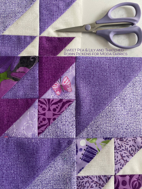 Thanks to Sherri McConnell for this versatile and fun block. You can get the pattern at her blog at A Quilting Life. And just a note about those purple scissors. They are made by Kai Scissors and are serrated edged and are great to use! Love them. And one more piece of news...CONGRATULATIONS JANE KIMBERLING! You are my winner for an ebook of Moda Blockheads 1 from Martingale Publishing! I've emailed you and I hope you love the book!
Check out my fellow designers for their Moda Blockhead posts:
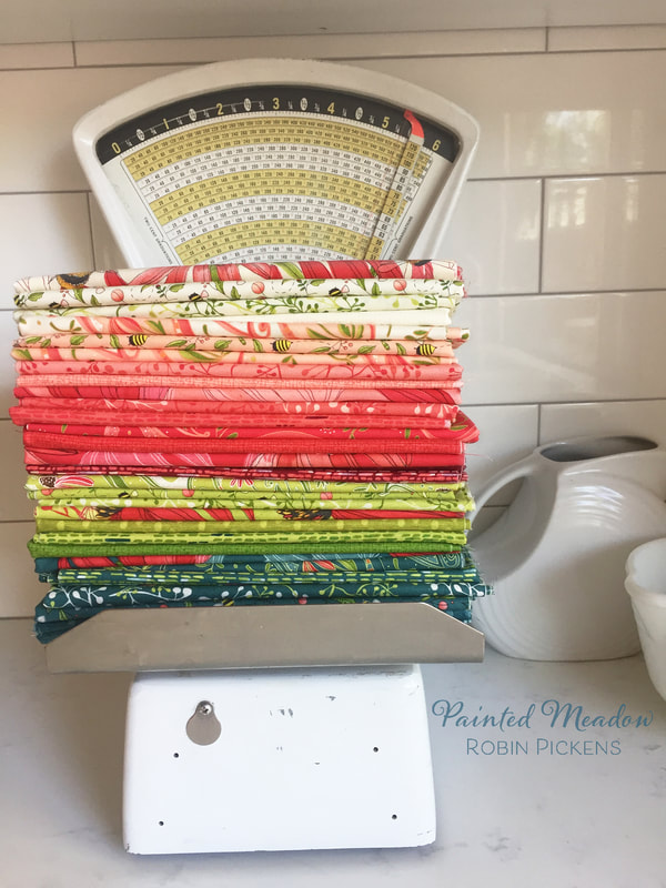
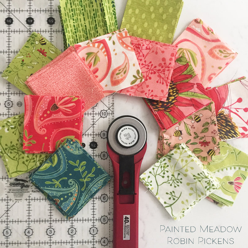
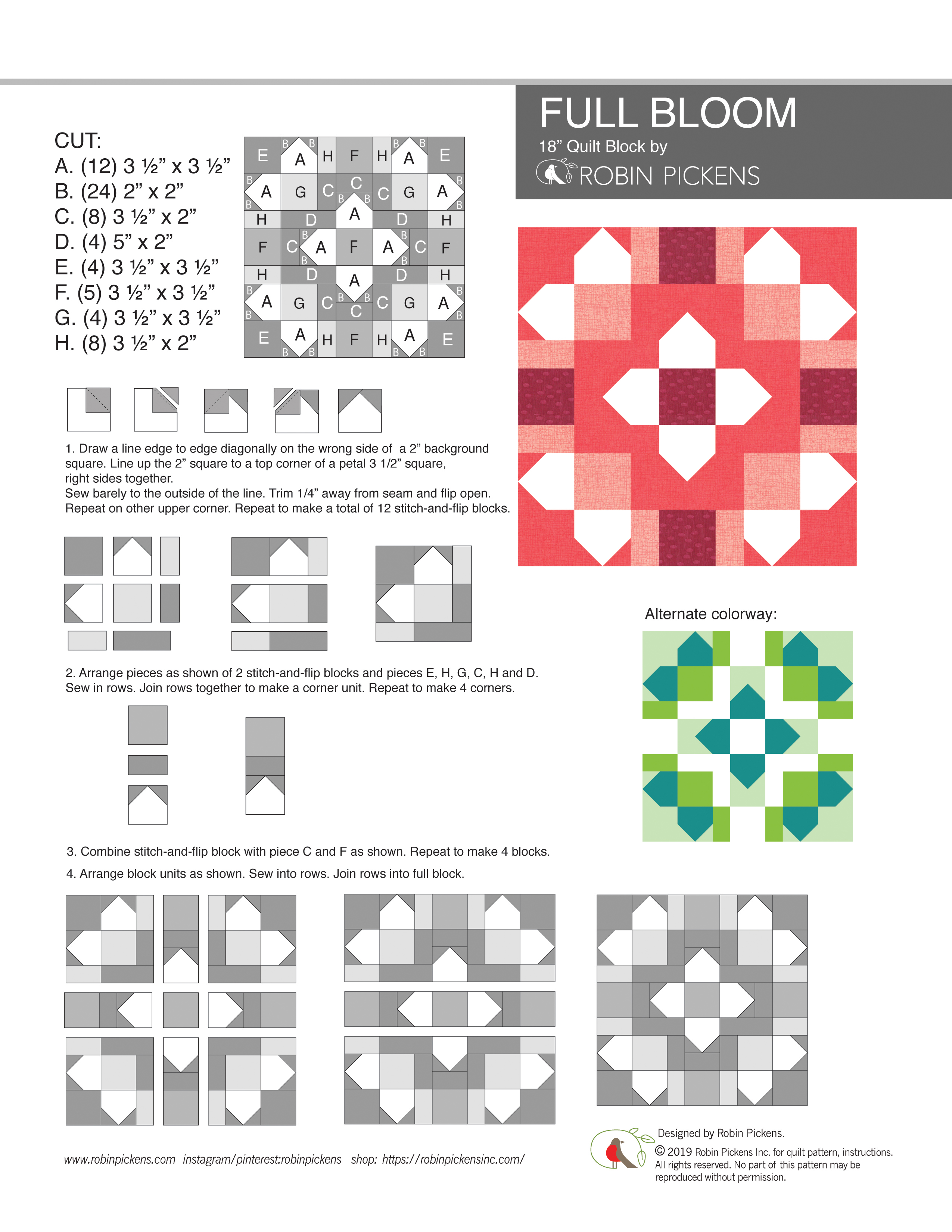
I've had a number of requests for showing Painted Meadow fabric in my Joy and Delight quilt design. I love the ease of the computer to try out a few things so lets have some color and print fun! I designed Joy and Delight with my Christmas collection, Splendid. I showed it with the blocks alternating two prints OR in a version with the large block centers using a Layer Cake for a scrappier look. With this exercise in color play, I'm staying with the scrappy Layer Cake assortment. 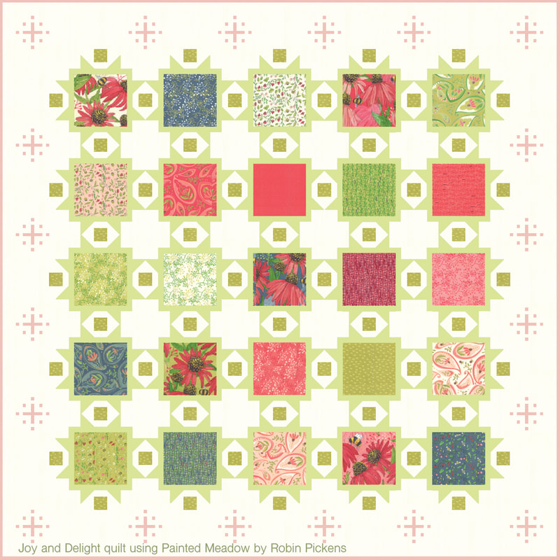 I'm starting with some of my favorites (I think) because I really enjoy how soft and pretty these can look in this more pastel palette. The above quilt shows the snowflakes in the borders in pink. So now I can feel free to call them sparkle bursts instead of snowflakes. They have a sparkly decorative feeling. Of course you can make this quilt without the border sparkles but I think they do add a layer of twinkle (or pixie dust??) to make those borders feel special. Below is a more close up view to see the softness of the sparkle bursts in a light color. Also the framing around the blocks is shown in pink (below) vs light green (above). 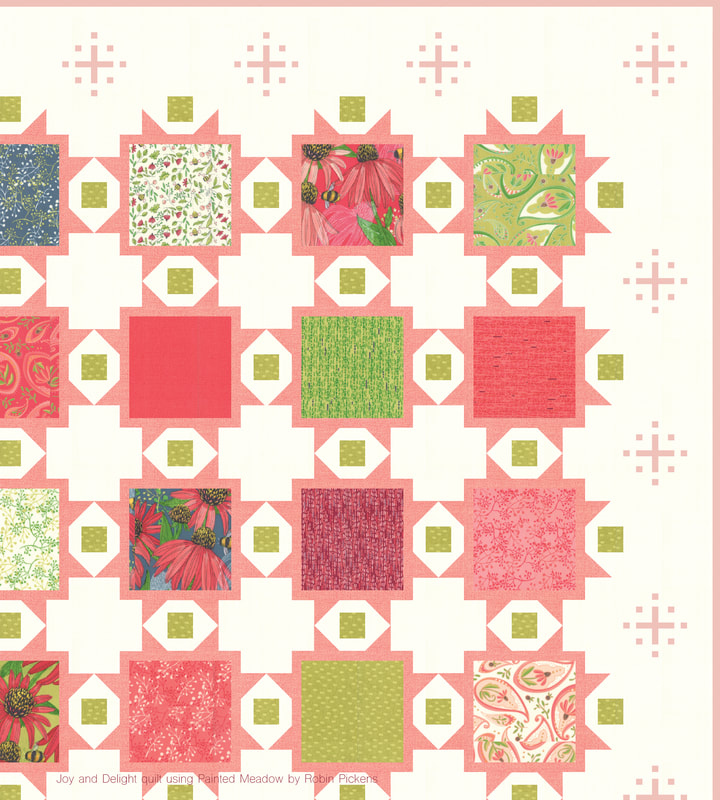 A little more exploration of pinks...lighter to the deeper pink. With the lighter pink background I used dark pink framing and border sparkles. When using a darker frame around the blocks, I like to switch the small squares in between to a light color for more contrast and the color sparkle of the white accents (see, more sparkle!). With the dark pink I went back to the pop of the cream frames but made my border sparkles even darker red.  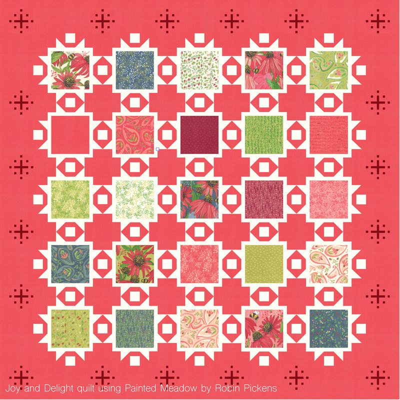 I enjoy the more dramatic tealish blues of Painted Meadow and thought it would be fun to see some blue stories. A deep midnight blue frames the squares in this first one. 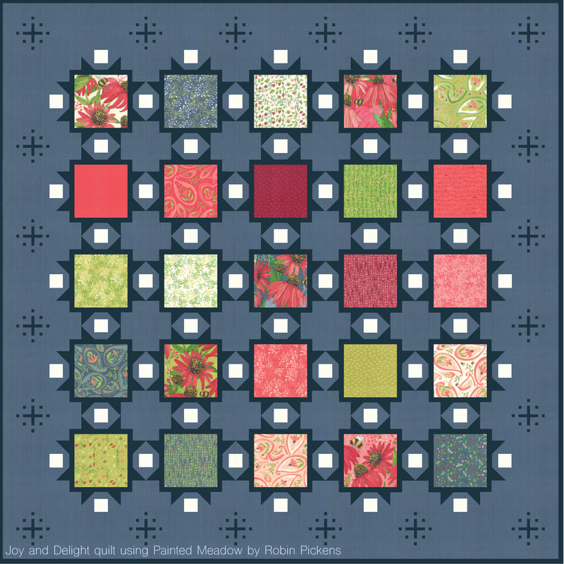 And on this version I wanted to add a soft khaki or light tan for the frames. I think the addition of the neutral natural light tan gives this an entirely different feeling and is a nice compliment to all the color in the blocks. There is something so restful and calm about this color combination. 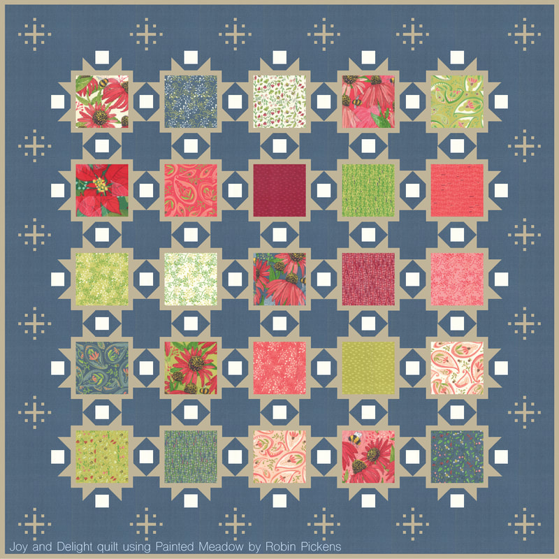 Hope you enjoyed a little color play with Painted Meadow and this helps in visualizing quilt plans! If you are interested in Joy and Delight, it is shown in Splendid in my shop. Happy sewing! 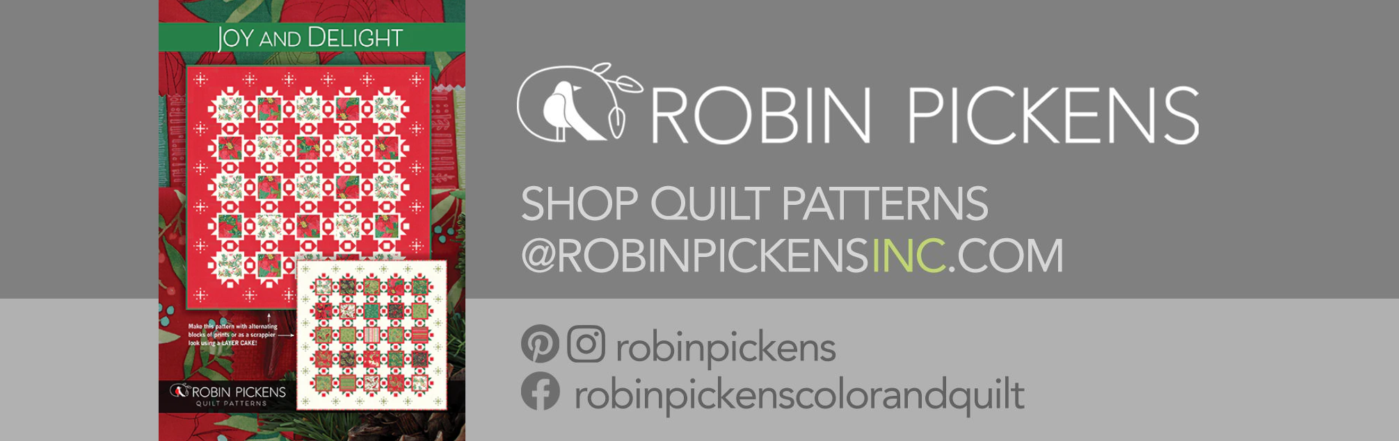 The Moda designers had a fun project for the Spring Quilt Market this year. A group of us designed 18" block patterns to give to local quilt shops to use during this National Sewing Month. 18 inches is a substantial size for a single block and leaves room to play with fabric and combine several shapes and sizes into a layered composition. 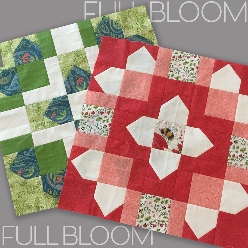 At the time of designing my block I was working on my Picket quilt with it's stitch and flip sides that make up the picket fence border around the quilt perimeter. I liked playing with this shape and how it also suggested flower petals, especially when grouped around a central square. I call my block "Full Bloom" because it reminds me of the petals in a fully open flower in a grand display. The petals are separated by sashings to give more definition and color play in your piecing while dividing the space in an interesting way. 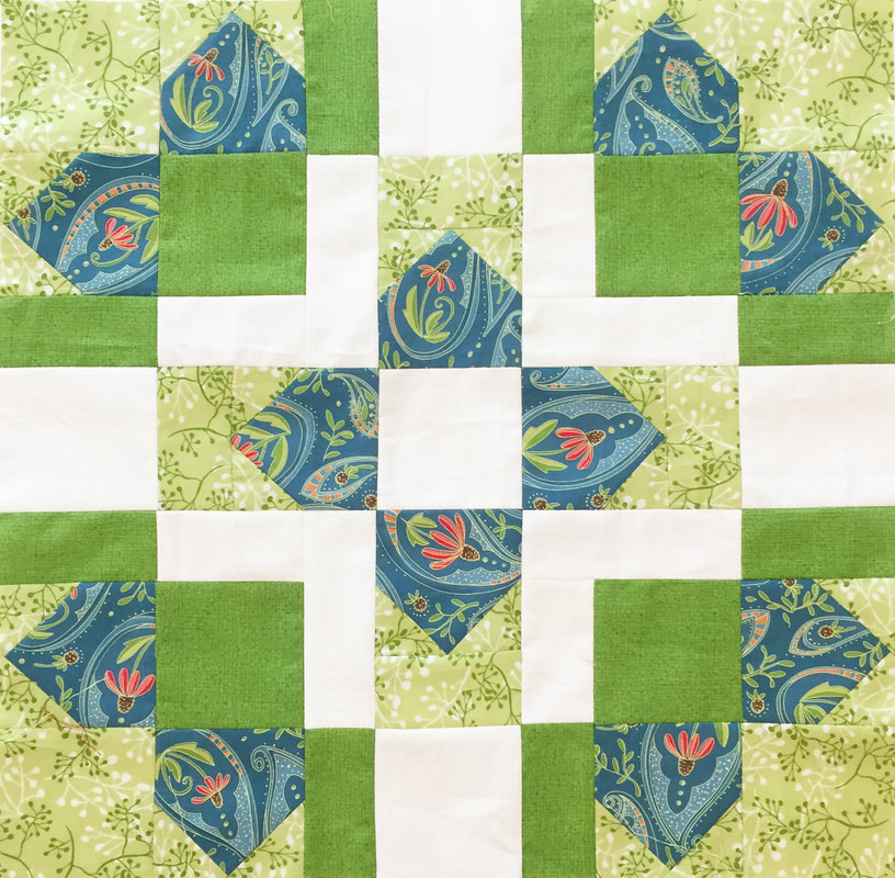 For a schoolhouse session at Market we showed our blocks. I made up two blocks using my new collection (shipping in October 2019) of Painted Meadow. Coneflowers in paisley shapes, textures, little sprigs, all make up the blocks in this composition. And I could not resist doing a little fussy cutting and making one of my fat bumble bees the center of a bloom. Perhaps this bee is looking for pollen in the center? These blocks are not quilted yet and I'm still deciding if I'm going to make pillows or work these into a quilt top. 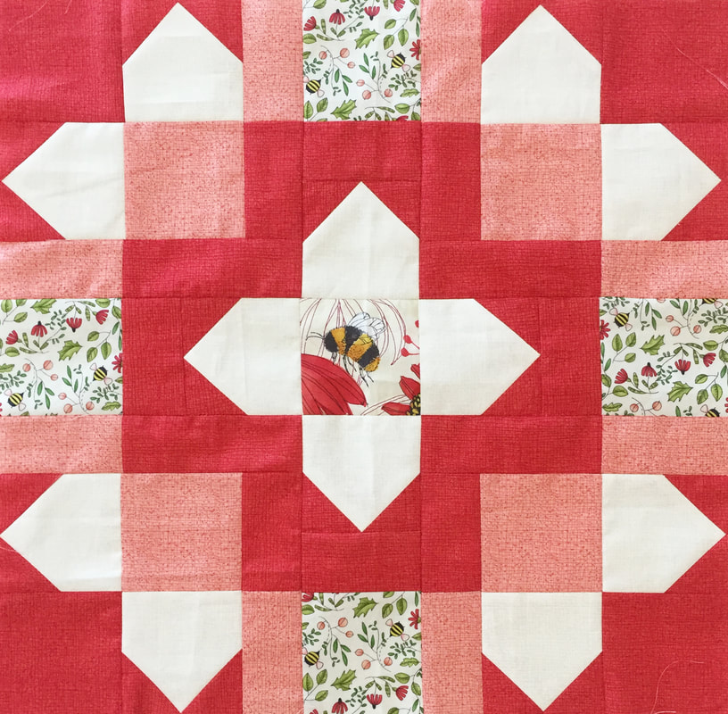 I like to experiment on the computer with the blocks and what it looks like made up different ways. With this block, the corners could be more valentine-like with hearts (like the top left image) and a hashtag center. Or maybe the center is surrounded by darker colors to set it off in contrast. Multi-colored blocks (lower left) have a different feel from monochromatic blocks that play with values of light and dark. 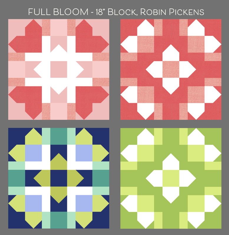 Studying what happens with light and dark values is interesting when you have all these rectangles that continue across the block. You can have mid-range tones that suggest overlap and transparency, or sashing lines that stay solid and strong. Some look like woven plaid. Others are radiating light or dark from the centers. I love the different look and feel you can get from one block with this play of light and dark. Wouldn't it be fun do do a monochromatic quilt just exploring these light and dark relationships? 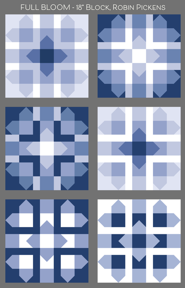 If you want to make a block with a big fuzzy bumble bee, like the one above, look for the Painted Meadow collection in October. Painted Meadow has corals, red, greens, teals and pinks. Or use solids with a range of light and dark values. Or go completely scrappy with enough room in those squares for some good fussy cutting. Whatever you make, I hope it is fully blooming and glorious! Click the blue "download file" for the Full Bloom pattern jpeg.
  Visit the previous designer's blog posts and the future posts to see more 18" block fun! Here is the schedule and links to their blogs: 9.23 - Lella Boutique and Sherri & Chelsi 9.24 - Kansas Troubles and Corey Yoder 9.25 - Crystal Manning and Me & My Sister 9.26 - Jan Patek 9.27 - Robin Pickens (me and here is the pattern!) http://www.unitednotions.com/blog_mi_KC2019_robin-pickens.pdf 9.30 - BasicGrey 10.1 - Betsy Chutchian and Lisa Bongean 10.2 - American Jane 10.3 - Kathy Schmitz 10.4 - Zen Chic and Deb Strain 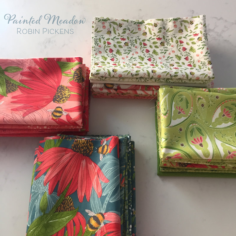 I'd love to see images of things you make with your blocks! Do you make a sampler with all the designer blocks? A table runner with a set of three or four? A pillow or mini wall quilt? Have fun sewing and share with us!
Layers cakes and Half Square Triangles. Fun and lacy borders. Meet "Emilia"! 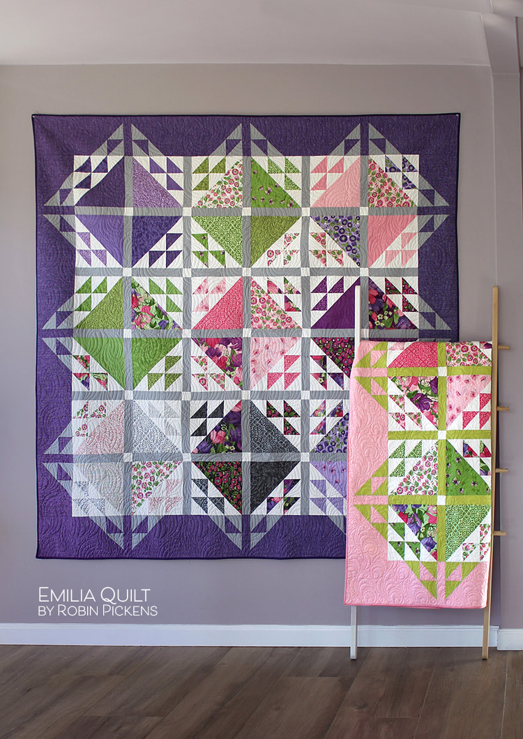 This quilt uses Layer Cake 10" squares to make large triangles and reflected small triangles on the opposite side with the same print. I've grouped them into color blocks. If you don't have a layer cake to use, you may want to make your cutting easier to start by using Creative Grids Perfect10 Ruler (CGRPERF10) to make those nice sized starting blocks! 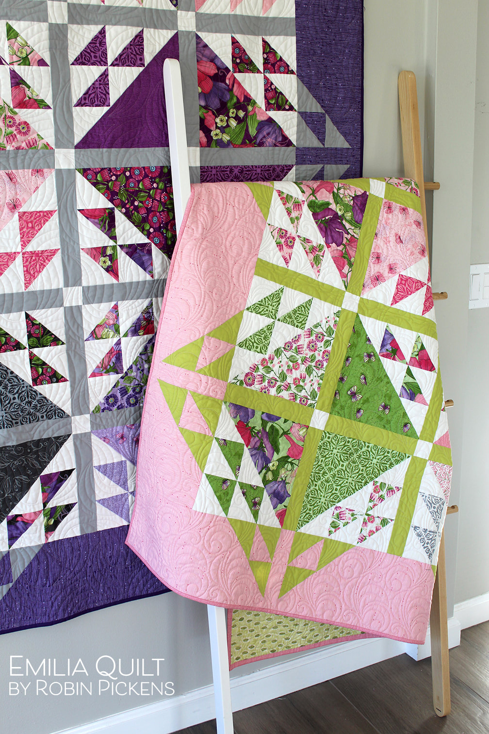 One of the distiguishing characteristics of Emilia is the borders. The half square triangles continue out into the side borders, using the sashing color, to make a lovely triangular lacy edge. It makes the whole quilt almost sparkle! Wouldn't this pink version be pretty in a girl's room? I focused on pink, green and lighter purple shades for this one. I used a chartreuse green for the sashings but a minty green would be pretty too. 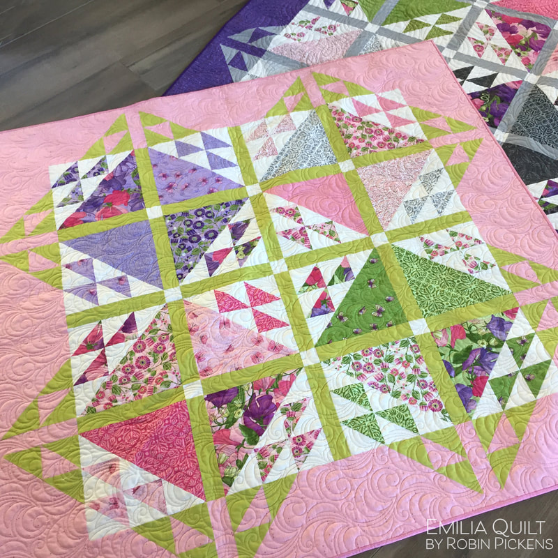 Emilia is written for two sizes, a larger, 76" square or smaller, 55" square lap size. You can easily adapt the pattern to add more rows of blocks if wider sizes are needed. 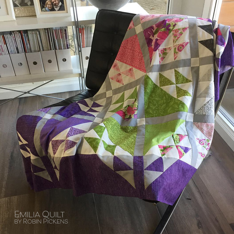 Emilia was designed to show with the Sweet Pea & Lily collection, which is shipping in March 2019 to quilt shops. But since I have Dandi Annie here...and its in stores now, I thought it would be fun to take a look at how Emilia might look in some summer Dandelions! These computer renders are some color play to look at the pieced blocks and how the quilt changes looks with the sashing and border colors. 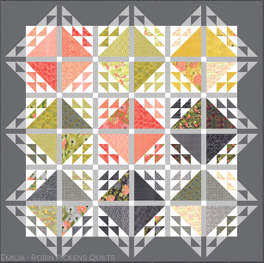 I think I am partial to this darker gray border. I would use Moda Bella Solids Graphite 202 for this. I think the Moda Bella Solids Gray 83 would be nice for the sashings and border triangles. 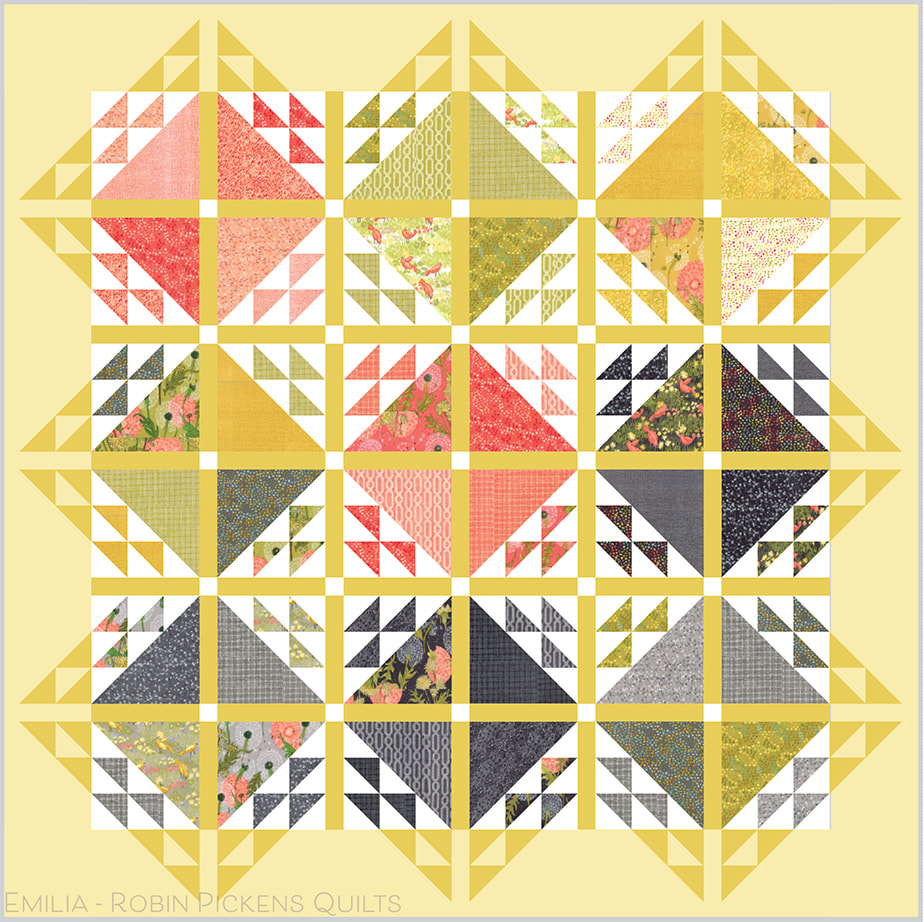 This makes me think of a sunny summer farmhouse day! Moda Bella Solids Baby Yellow 31 and Maize 273 work nicely together with this line. 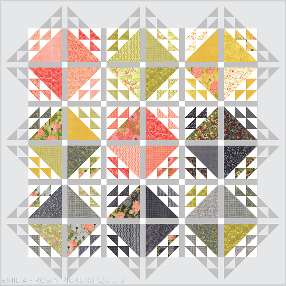 And back to grays with a lighter version of border. I like having a slight difference to white so the inner triangles pop and sparkle more. Moda's Bella Feather is a lovely very very pale gray, close to white. 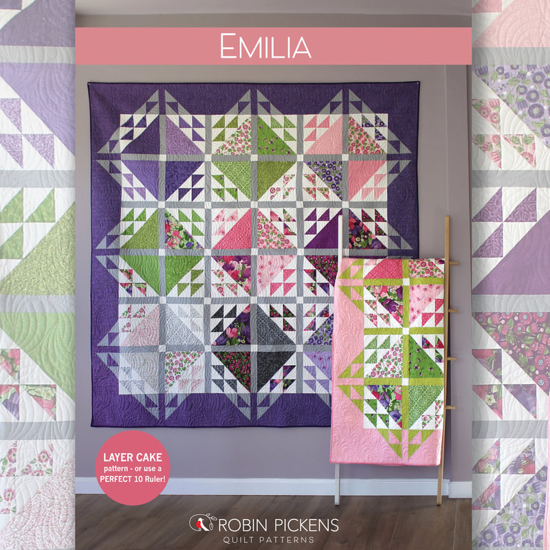 Emilia can be found in local quilt shops or at my shopify shop. I hope you have some fun with half square triangle love and border play with this one! Happy sewing! For more ideas for Sweet Pea & Lily or Dandi Annie, take a look at more patterns...   |
About ROBINDesigner of colorful florals for Moda fabrics. Modern to transitional quilt designer. Illustrator, sewist, crafter. I am proud to be a designer for Moda Fabrics!

Shop Robin's Designs
 I am an affiliate for Fat Quarter Shop and may earn a small commission through my links. Thank you for your support!
Check the March 6, 2017 Episode!
Categories
All
Archives
February 2024
© Robin Pickens Inc. All rights reserved. No images may be reproduced without permission.
|
||||||
 RSS Feed

