|
Back when I did the Splendid Christmas line I created a wall quilt called Cardinal's Christmas Wreath. It was the first bird quilt I did and started my love of making bird blocks! I've now sized the bird to various different sizes and still have fun making my flying friends. I also started thinking about this bird being for different seasons and not just Christmas. The first ideas for Fall started like this, with the idea of a Fall wreath: 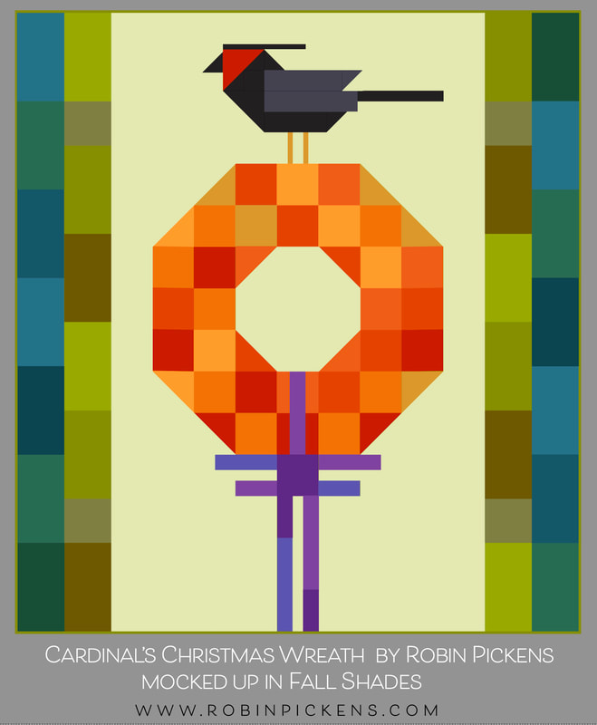 And then I thought about dropping out the bow and also experimented with a black background with a green bird. What if I filled in the wreath so it was more like a pumpkin? 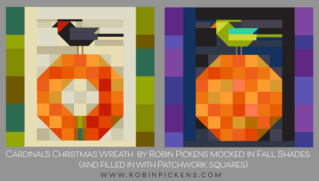 I took this idea (the one on cream) on retreat with me to play with along with some scraps of Thatched fabrics I had. The pattern "Cardinal's Christmas Wreath" has two sizes, a 54 x 60" large and 45 x 47" medium size wall. I have made the larger one for Christmas and decided to do the smaller size for this autumn one. 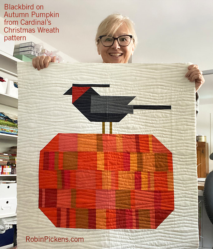 This really was a fun, smaller sized project to do AND I used all scraps. I did make some other changes as I experimented and made rows. First off, I dropped the borders on the sides. My finished quilt is 30" across and I thought that was a good size for a wall space. I also liked how the pumpkin looked more squat and horizontal so I kept the size height of the rows but just used less of them. And my corners for the pumpkin use one half square triangle at the ends, vs on two rows for a more angled corner. What does this look like as a diagram for better understanding? This is the structure and it follows the bird pieces and construction as written in the pattern. 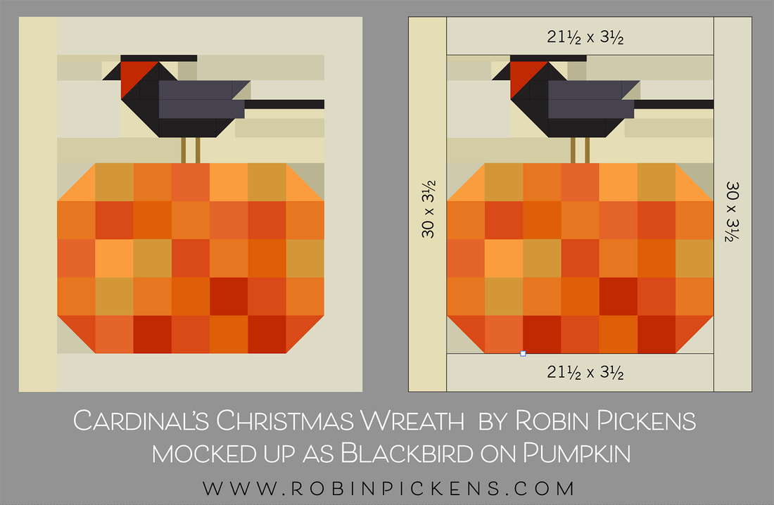 Again, I'm using the smaller size in the pattern (numbers in red in the pattern). The pumpkin would be filled in all the way across with no opening for a wreath. There are 2 LESS rows of blocks for the pumpkin body. only the top and bottom rows have a half square triangle at the very ends for rounding off the shape (vs two rows). I have still constructed my bird with the 21.5" piece on top as is called for in the pattern. But I'm using an extra one on the bottom and using 30" x 3.5" strips on the sides. This means there are a number of background pieces you would NOT need to cut (if you are not doing this as a fall wreath). This would need 3/4 of a yard of background fabric (vs a full yard). Instead of the list on page 3 for Background, you would cut this list: 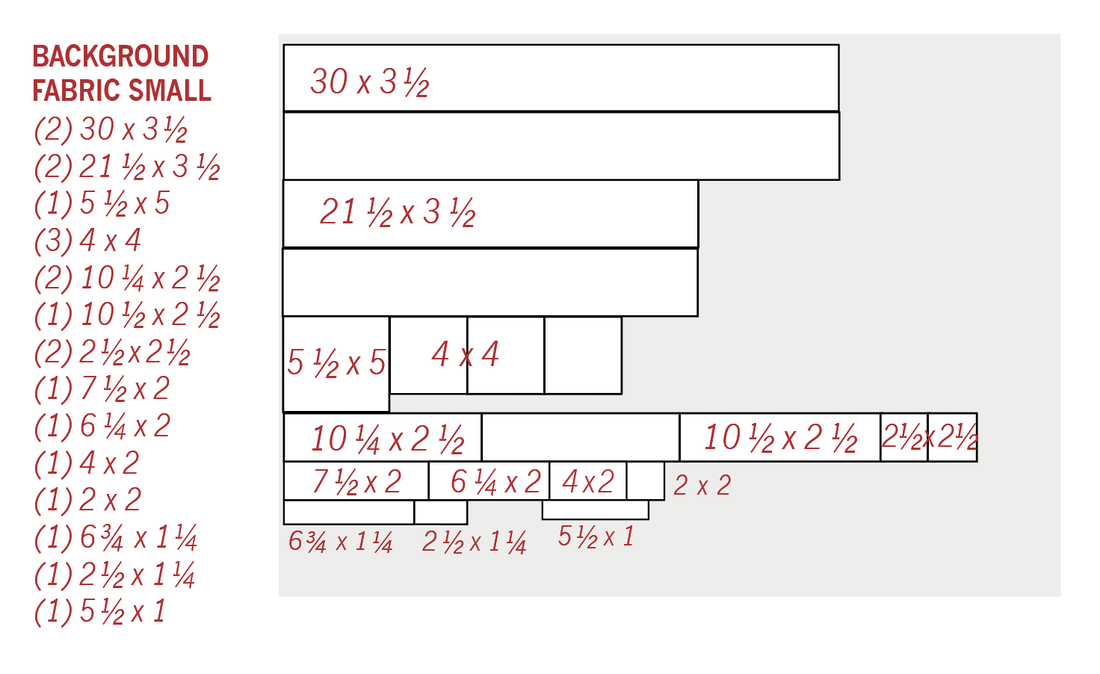 Of the (3) 4 x 4" pieces, (2) of them are for corners and one is for the bird's chest. I have taken out the pieces for the bow and wreath insides, wreath bigger corners and adjusted for the new size of surround with the background. On page 1 the green fabrics shown are for the wreath. If you are making a filled in pumpkin that is more squat but made from all squares, cut: (2) 4" x 4" for corner HST (31) 3.5" x 3.5" squares in a mixture of oranges/fall fabrics. Page 2 shows pieces in red fabric and charcoal fabric for cutting the birds. Flip the colors so you are cutting the BIRD BODY from black and the (1) 4 x 4 from bird's mask color (mine is Smoked Paprika). Do not cut the bow pieces unless you are making as a Fall wreath version. It is up to you if you use the borders. If you do not want the border, skip cutting those from bottom half of page 2. I did not use all squares on my pumpkin. I made my quilt with a more improv approach using my scraps. I cut them all around 1", 1.5", 2", 2.5" and 3.5" in width while keeping them all 3.5" high. I made strips and trimmed to the 21.5" length. The Thatched colors I used were Tangerine, Clementine, Apricot, Citrus, Masala Spice, Rose, Pink Grapefruit, and Smoked Paprika. 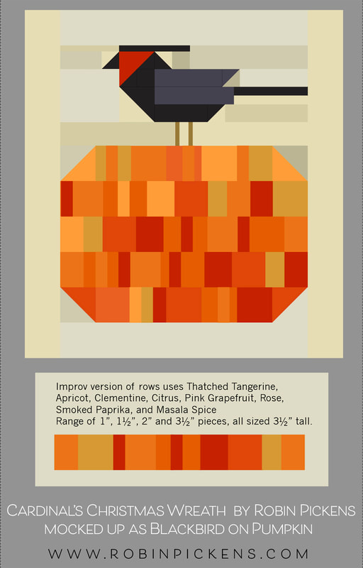 These notes have not been to an editor and I'm trying to have them be as accurate as possible. I did notice the pattern does not say on page 7 that the background piece between the bird's legs is the 2.5" x 1.25" piece (and that is 2.5" as written in the list and not the 2.75" shown on the diagram). I've got Cardinal's Christmas Wreath on sale currently for half price. I hope you like this Fall version! I think it could be cute to add a green wool leaf to the top of the pumpkin! The pantograph I used for longarming is RICH GIRL (extended width) by Longarm League. I used it in the default size I believe. Happy Fall! Check out the pattern at RobinPickensInc.com!
1 Comment
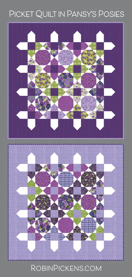 Just a little pattern play with Pansy's Posies today. Picket with the picket fence and colored borders is a good pattern to show off those purple and green colors. I've mocked up the 60 x 60" lap size with a mix of 8 fat quarters. The purple ones use Thatched Pansy 160 for the dark background and the Dotty Thatched Lavender 48715-213 for the light one. 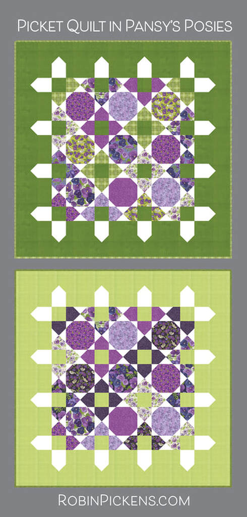 I love greens for a background for the pansies. My top darker green is Thatched 197 Grass and the lower, lighter one is Thatched Meadow 134. Chartreuse is also a good green to pair with this group. In general, when I have a darker background color, I tend to pair prints with it that are lighter and for a light background I look for the darker prints so there is a good amount of contrast in the quilt top.
Picket can also be made with a layer cake of a collection in both the smaller lap or larger 72" square size. If you want to make the larger size with fat quarters, you will need 13 of them. I love that pattern play with Tulip Tango has started with a couple of my favorite patterns, Ring Around the Posies (on the previous post) and MOD FLOWER BOX! I mocked this up awhile ago to figure out a kit for the Shipshewana Quilt Festival to make for a workshop I am teaching there this summer. This first one is the version they picked and I love it! The tulip fabric on cream has such a pretty look and I really love the Love Butterfly print in the collection and used that for the outer border and inner pink border. 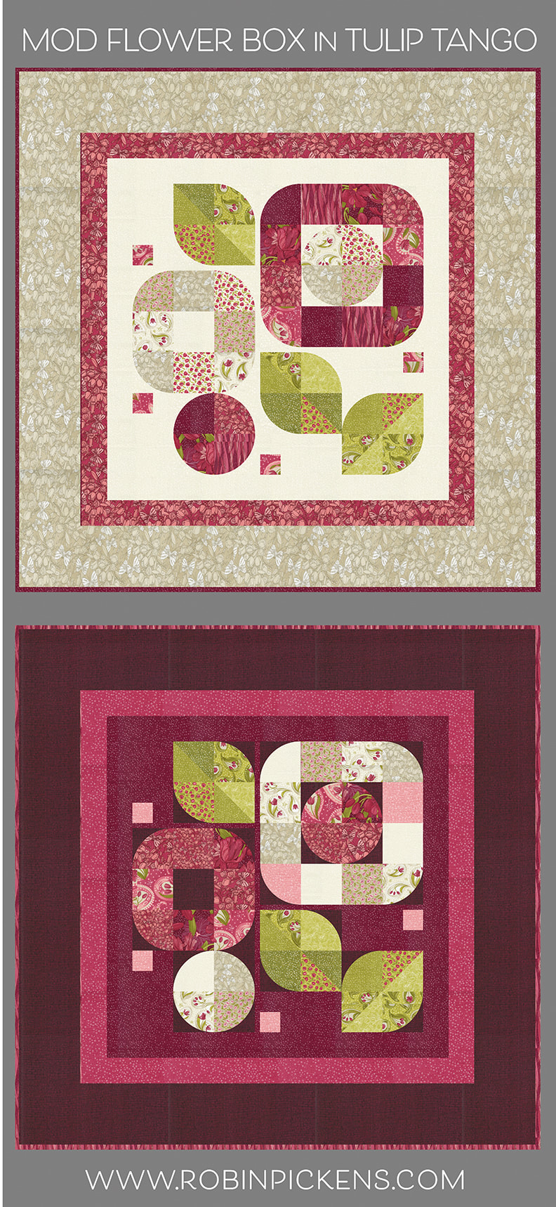 I think this version with Cranberry Dotty Thatched paired with Burgundy regular Thatched (#60) is also striking. The reds are rich and dramatic. This version is showing an option I have on the Mod Flower Box pattern, which is to put a subtle difference in the background fabric on the curves. This gives the curves that "boxed in" look, thus the BOX in the name. But how about those greens and grays? The mood of these deep colors change when paired with the Dotty Thatched in Sprig and Chartreuse. The cream center still keeps the colors crisp and clear while having that springy border or growing greens to compliment the leaves. 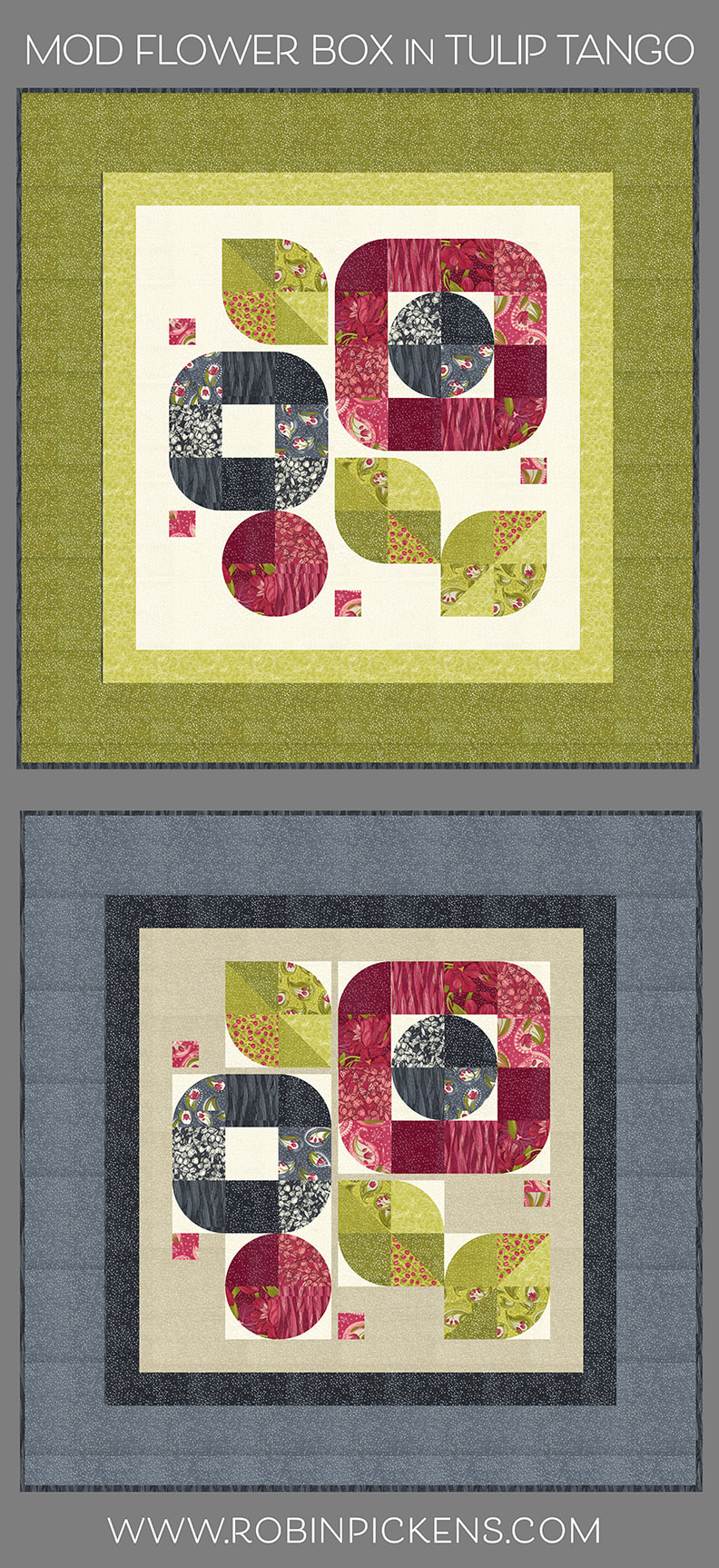 And a Dotty Thatched Shadow border is softened by the larger Gravel colored outer border. Combined with Washed Linen background and highlighted backgrounds for the curves in cream, this version feels serene and meditative. How about more prints? Those big tulips in the big border perhaps? Or the Tiny Tulips? When the outer border has a busier print, I think it is good to separate that with a regular or dotty Thatched smaller border. This gives my eye a place to rest for a moment and clearly defines the spaces without overwhelming with print on print. Another version of the "boxed in" flowers with Burgundy Thatched against the Cranberry Dotty Thatched background. 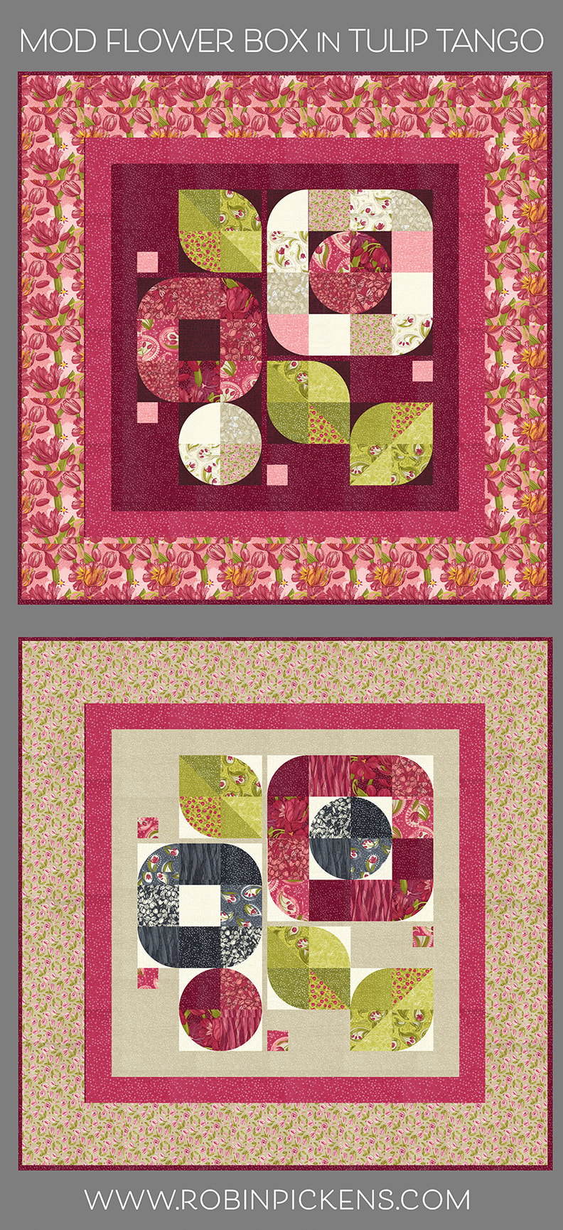 This last one has a warm energy with the earthy linen color mixed with the pinks and shadow grays. I hope you find a version that speaks to you! One of the fun things about this pattern is that it uses curves but not too many, so it is great for those who are feeling a little afraid to try curved piecing. This is an easily manageable amount of curves and only a quarter curve vs a half or full circle. The pattern includes a paper template, but I am also a big fan of the Creative Grids Circle Savvy Ruler for making my curved quilts. I'll be doing a workshop at Shipshewana this summer with the top version of MOD FLOWER BOX or the all-Thatched version. The class is sold out, but I will also be doing some demonstrations in the shop with the Circle Savvy Ruler so if you are there, please stop by to say Hi! I think there are a few spots left in the Tightrope class! 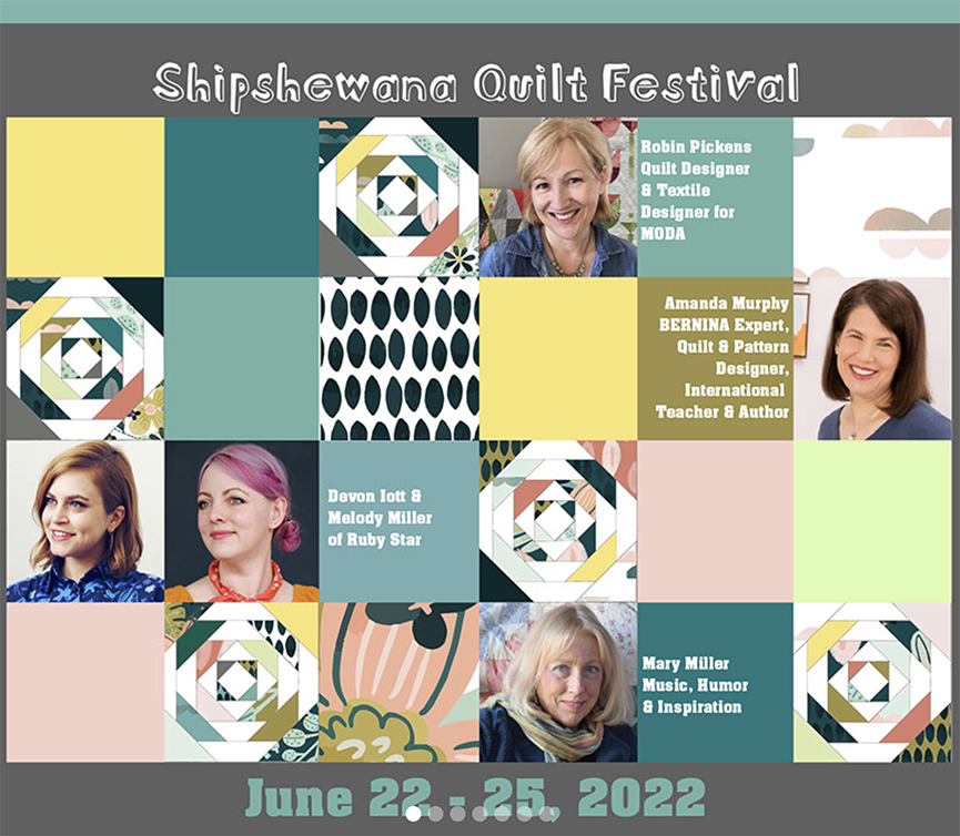 I am honored to be in the company of these other designers and quilters at the festival! I've learned a lot from watching Amanda Murphy with her Bernina longarm (which is the one I have with qmatic) and am very excited to meet her in person. I am so pleased to know Devon and Melody from my shows with Moda Fabrics and look forward to more time at this event!  MOD FLOWER BOX can be made with Fat Eighths, Fat Quarters, Charm Packs or Layer Cakes. Check your local quilt shop for the pattern or visit www.RobinPickensINC.com if they don't have it. This is the all-Thatched version: 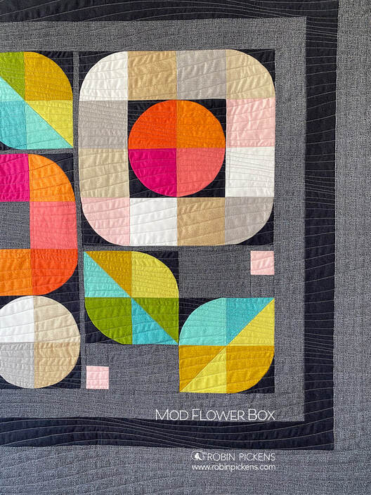 Hope to see you at Shipshewana and I hope you have fun with TULIP TANGO in MOD FLOWER BOX!
In my newsletter I asked what quilt people wanted to see mocked up in Tulip Tango and RING AROUND THE POSIES was a clear winner!! I will be showing more quilt mockups in this fabric line but here is RING AROUND THE POSIES to explore with the Tulip Tango collection. 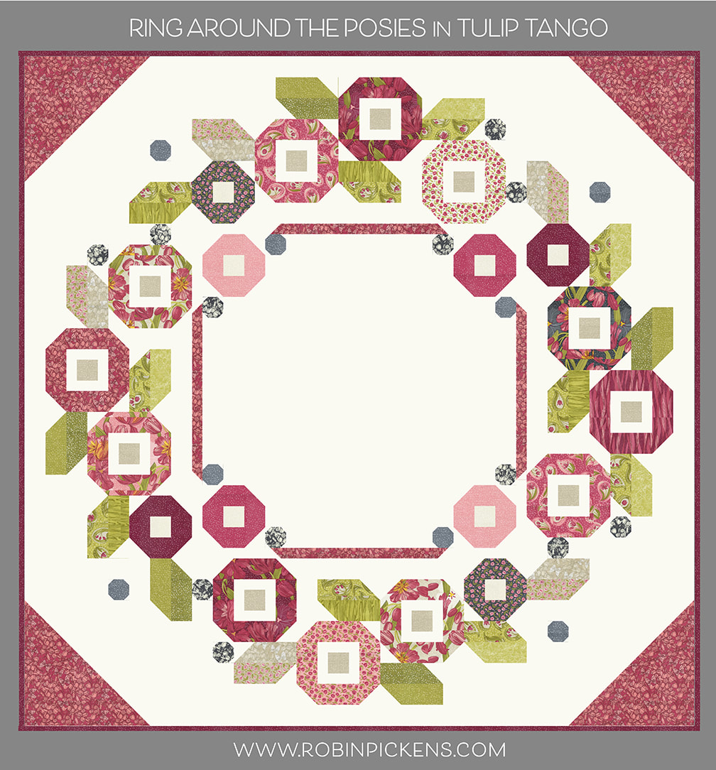 Lets start with the Dotty Thatched Cream background and Love Butterflies in the corners (in Tulip color). Classic reds on cream looks crisp and bright. When I use the Dotty Thatched background in Washed Linen with Cream corners it has a soft and romantic look. I would definitely want to snuggle up under this one! 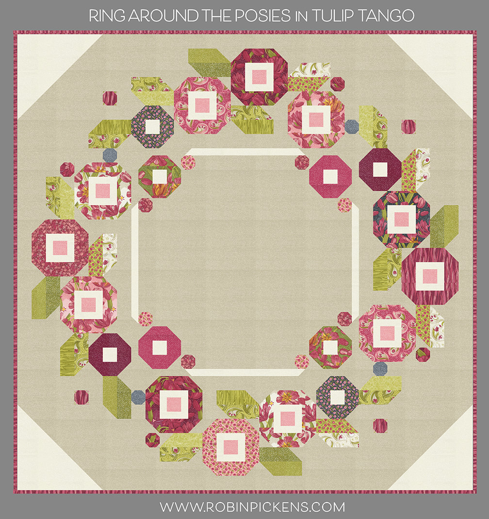 This is the same Dotty Thatched Washed Linen with more of the Grays from the collection. I've used Love Butterfly in Shadow for the corners. I've also used more gray strips for leaves and flowers with the pinks still prominent for the flowers. One thing to point out here is that I've used a different fabric for the interiors of the flowers to give them a little more pop. This is Dotty Thatched in Cream and if you use a different fabric inside the flowers like this, you need a 1/4 yard of fabric for those. 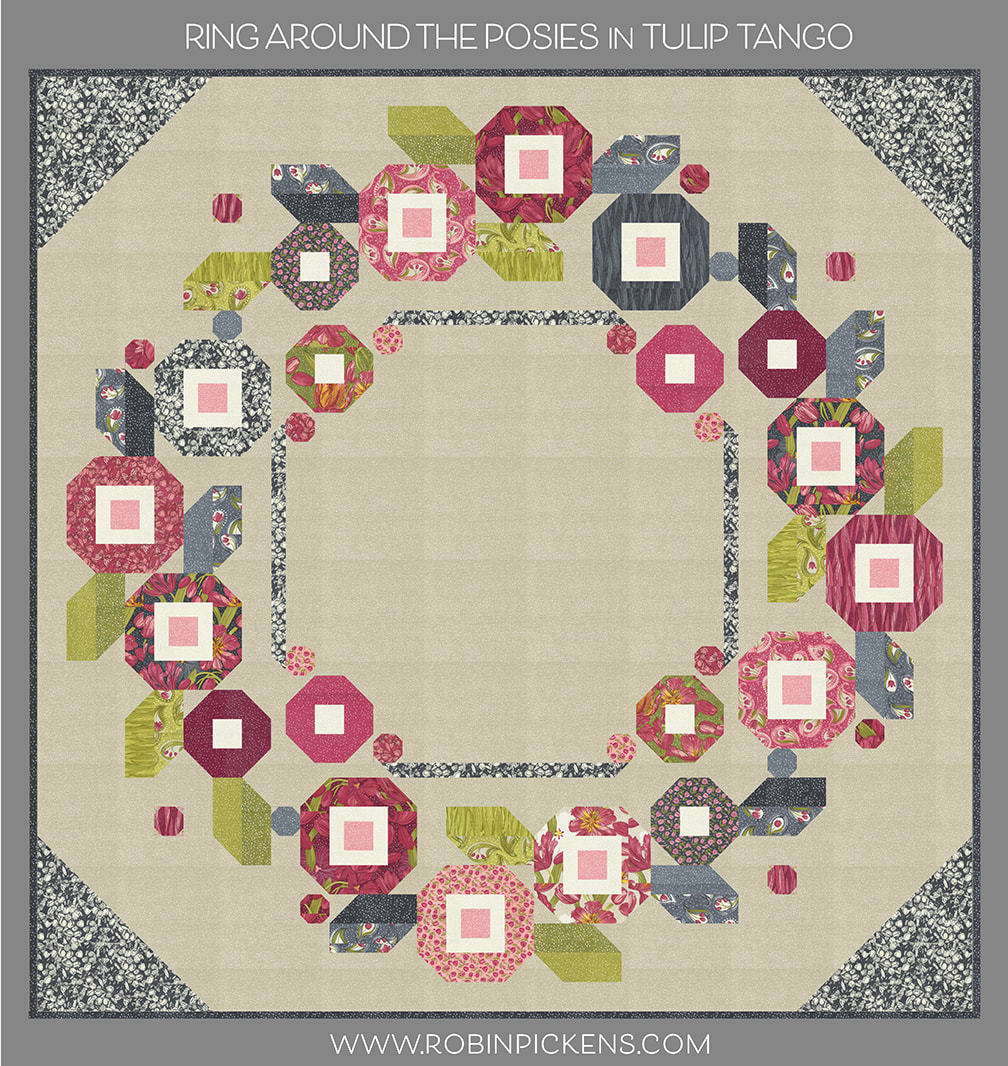 Here I've used the lighter interiors again but sticking to more reds in the collection. The background is Dotty Thatched 118 in Cranberry with corners in Dotty 202 Tulip. 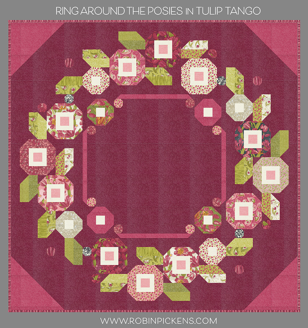 A little darker background is regular Thatched Burgundy 60. I am using the background color inside the flowers too and the main Tulip print 48710-19 in Cranberry for quilt corners. 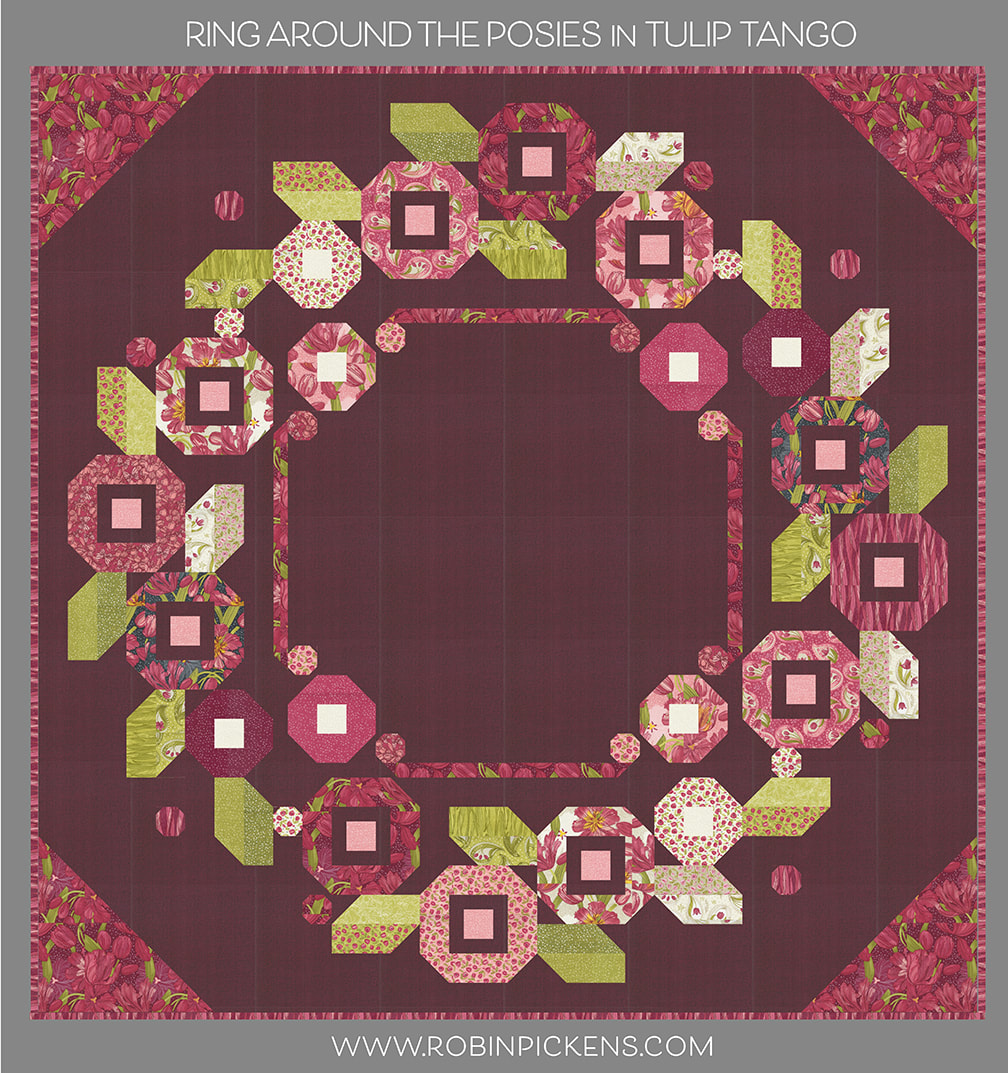 One last one...dramatic night time garden with Thatched Soft Black 152 as the background color and Dotty Thatched 48715-117 in Shadow for quilt corners. Those colors glow against the Soft Black background! I love using the Swirling Leaves print as my bindings because it gives it a free flowing striped look. 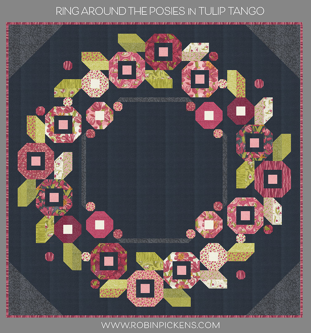 Are you ready to make RING AROUND THE POSIES in Tulip Tango? I am trying to decide between the two washed linen versions. If you are looking for the pattern, please check your local quilt shop to see if they have it. You can also find it at my shop at ROBIN PICKENS INC. More mock ups to come...how about MOD FLOWER BOX next?  I mentioned the other day that my Mom changed her mind about doing Criss Cross Kisses in Carolina Lilies and now was wondering about either Kyoto Steps or Tokyo Terrace using that fabric collection. I took a little break this week to mock up some versions for her (and for you) to see...what if....? 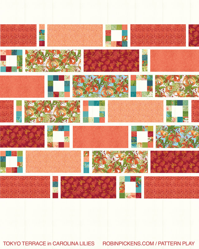 I broke the collection out into red or teal color groupings, just like I had made color families for these quilts before. I like the cohesiveness of telling that big color story. For Tokyo Terrace, I assumed the little squares are accomplished with a Charm Pack of Carolina Lilies with yardage used of the big prints. Even with these warm red tones, I liked the accent of the Carolina Lilies on aqua background for a couple of the big panels to tie in the aqua and teal colors in the little blocks. The big prints here are the Carolina Lilies main print 48700 in cream 11 and aqua 19, Boho Blooms on Ruby 48701-12, Little Drawings 48703-13 Coral, Vines in Coral 48704-13, and Dashed 48705-14 Peach. Background Thatched Cream 48626-36. 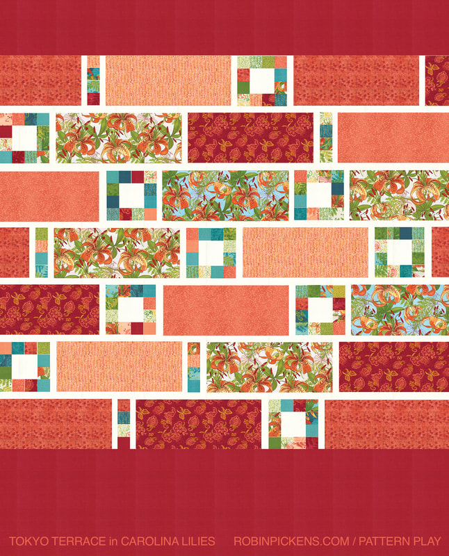 These are the exact same interior fabrics but I added the Thatched Ruby 48626-191 as the background to the top and bottom of the quilt instead of Cream. I kept the Cream for the sashings within the middle body. I love the burst of rich red color on the big background spaces. 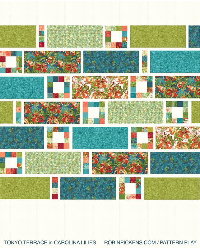 Here is the teal/aqua/green group. I used the Main Carolina Lilies 48700 in Cream 11 again but this time paired with the deeper Teal background, 21. Other panels are Boho Blooms on Teal 48701-21, Vines in Teal 48704-20 and Grass 17, and Dashed 48705-11 Cream. Background Thatched Cream 48626-36. 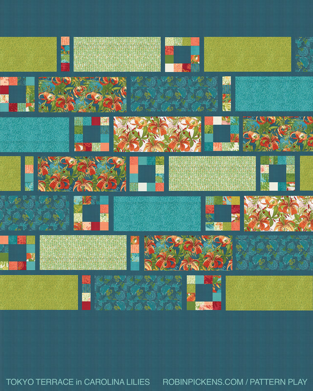 The same prints as above but with a background fully out of Thatched 48626-199 Lagoon. 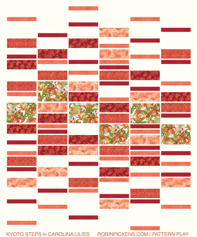 Let's compare with Kyoto Steps. For this quilt pattern I use six 1/2 yard cuts of fabrics (for the twin size). I use the larger floral to the middle, with the coordinates stepping out to top and bottom in thinner and thinner rectangles. This is shown with Carolina Lilies main print 48700 in cream 11, Boho Blooms on Ruby 48701-12, Ferns 48702-14 Peach, Little Drawings 48703-13 Coral, Vines in Coral 48704-13, and Thatched 48705-191 Ruby. Background Thatched Cream 48626-36. 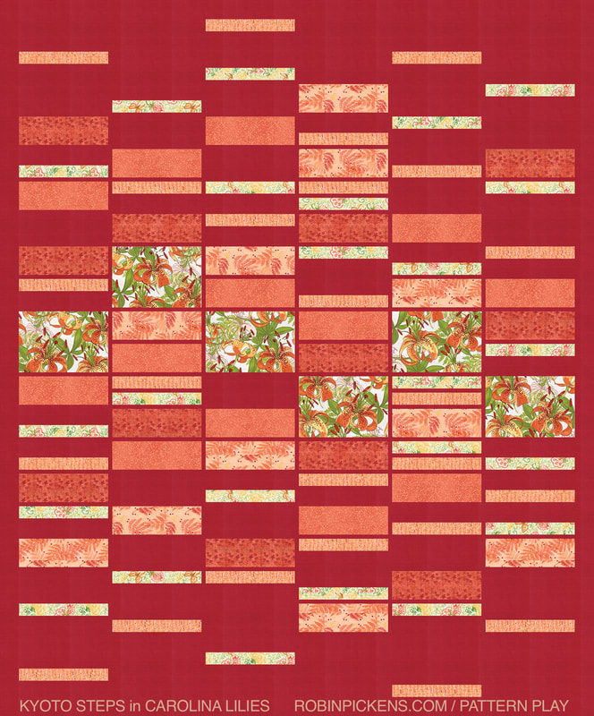 This version on the Ruby Thatched background 48626-191 uses the Carolina Lilies main print 48700-11 cream, Boho Blooms on Cream 48701-11, Ferns 48702-14 Peach, Little Drawings 48703-13 Coral, Vines in Coral 48704-13, and Dashed 48705-14 Peach. 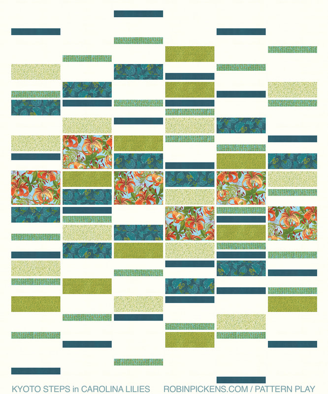 This teal/green combo on Thatched Cream 48626-36 background has Carolina Lilies 4870019 Aqua (love the Aqua!), Boho Blooms on Teal 48701-21, Vines in Grass 48704-17 and Cream/Grass 11, Dashed 48705-19 Aqua, and Thatched 48626-199 Lagoon. For fun, I tried the same mixture on Chartreuse Thatched 75 and I really like how it could look with the thinnest horizontal sashings in Cream and a couple of the vertical sashings in cream, like accent lines that add a little sparkle and added dimension! 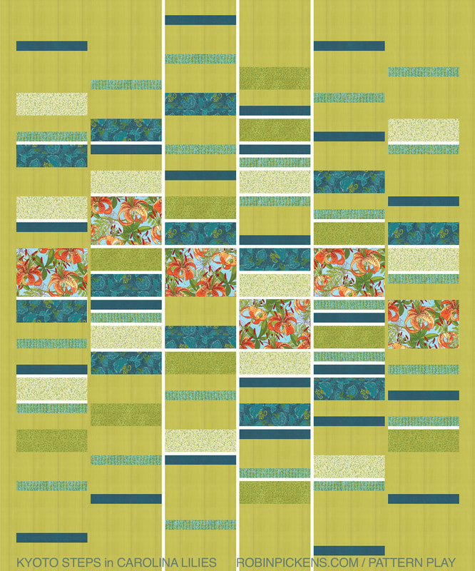 I hope you have enjoyed a little PATTERN PLAY today and are visualizing some fun with Carolina Lilies! 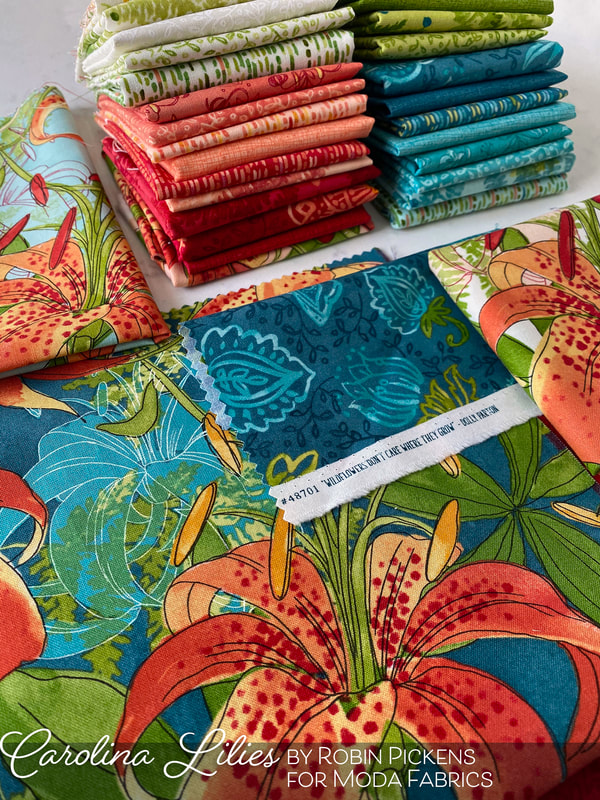 You can find Kyoto Steps and Tokyo Terrace patterns at many quilt shops and they are also availalbe in print and digital formats from robinpickensinc.com 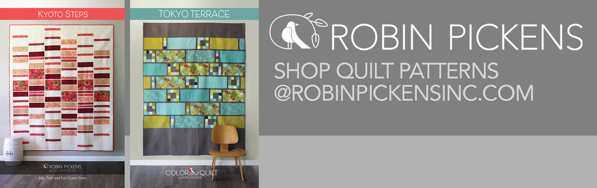 With Project Jelly Roll approaching, I decided to take a look at my Jelly Roll-friendly patterns to figure out what I am going to work on and perhaps share some ideas. One of my Jelly Roll patterns is Definite Plus. 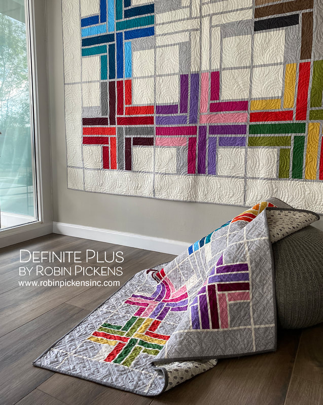 My original Definite Plus quilt is made in Thatched basics. I loved playing with the color families and having a "ghost block" image in the center of just sashings and background. And I made this in both the large size on cream and the small size (using a Honey Bun or 1 1/2" strips) on Heather. 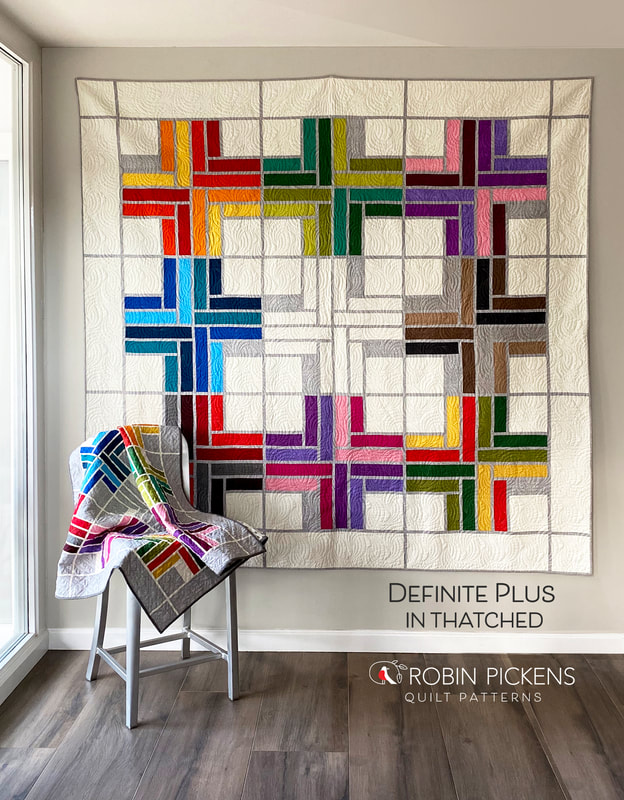 I wanted to see what this would look like made up in a Jelly Roll of print fabrics from a collection. I decided to make one that had no outer borders and no ghost block for the center. Full quarter log cabin blocks without an accent. If you make the large size without the outer border, it goes from being an 82" square quilt to 69 x 69", which makes a lovely large lap or can fit on a twin bed as a nice extra quilt. 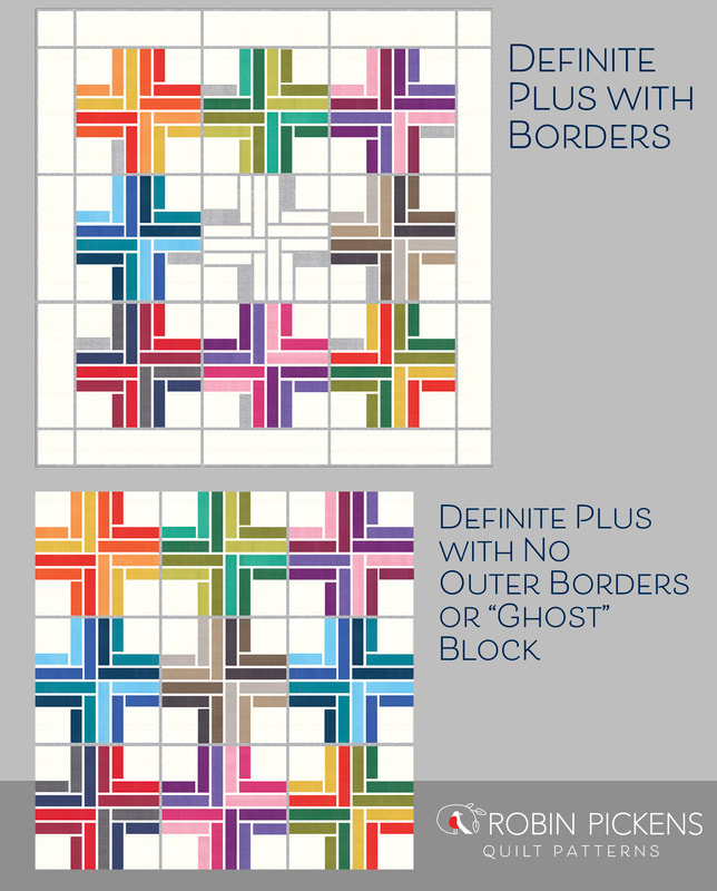 How does this impact yardage and cutting? I have only made it this way in the Large size, so I don't have the specifications for the Small at this point. For Large quilt with no outer border and no ghosted center block or accent rectangles: Sashing: 1 2/3 Yards for sashing instead of 2 1/8 Yards. When you are cutting, you will cut a total of (56) WOF strips. (4) of those will be cut to 34 3/4" and joined end to end to make the long sashings horizontally between the rows. Instead of (44) 6 1/2 x 1" pieces, you will need (36). Background: You need 1 1/4 Yards for background instead of 3 Yards. You will only be cutting the centers of the Quarter Log Cabin blocks and need (36) of them. 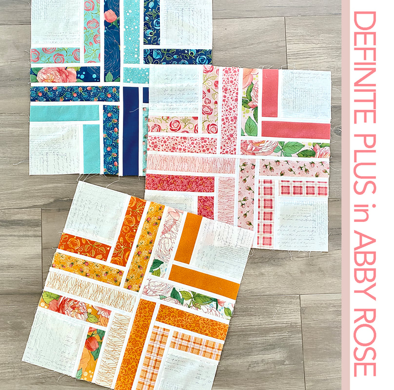 For my print version, I decided to use Abby Rose for my strips. I made all my centers with Zen Chic Modern Paper for a pretty, romantic feel. My sashings are Moda Bella Off White 200. I still kept my groupings of 4 that make a plus sign in color families. 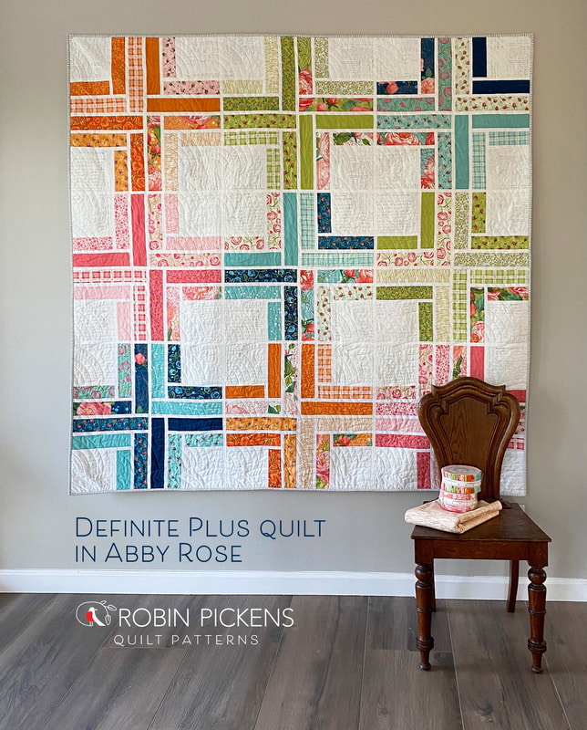 I like seeing the contrast of prints vs a more solid look for this quilt. I am very excited to try it again with upcoming lines and try other versions of background and sashing colors. 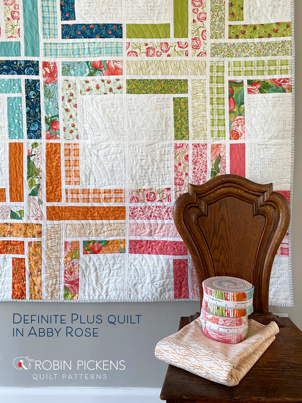 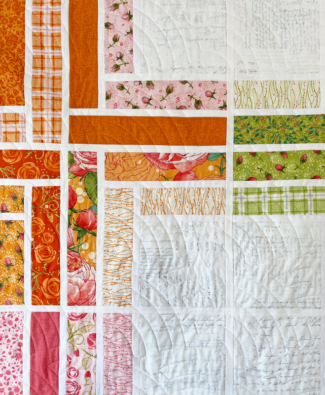 And just one more idea, since I'm playing around with it...what if the placement of colors were more improvisational and the background squares also had some pops of color? I decided to take a look in the suggestion of my Hygge Happy color theme direction (with Washed Linen, Toast, Cocoa, Sugar Rose, etc). What do you think? Playful or too random? 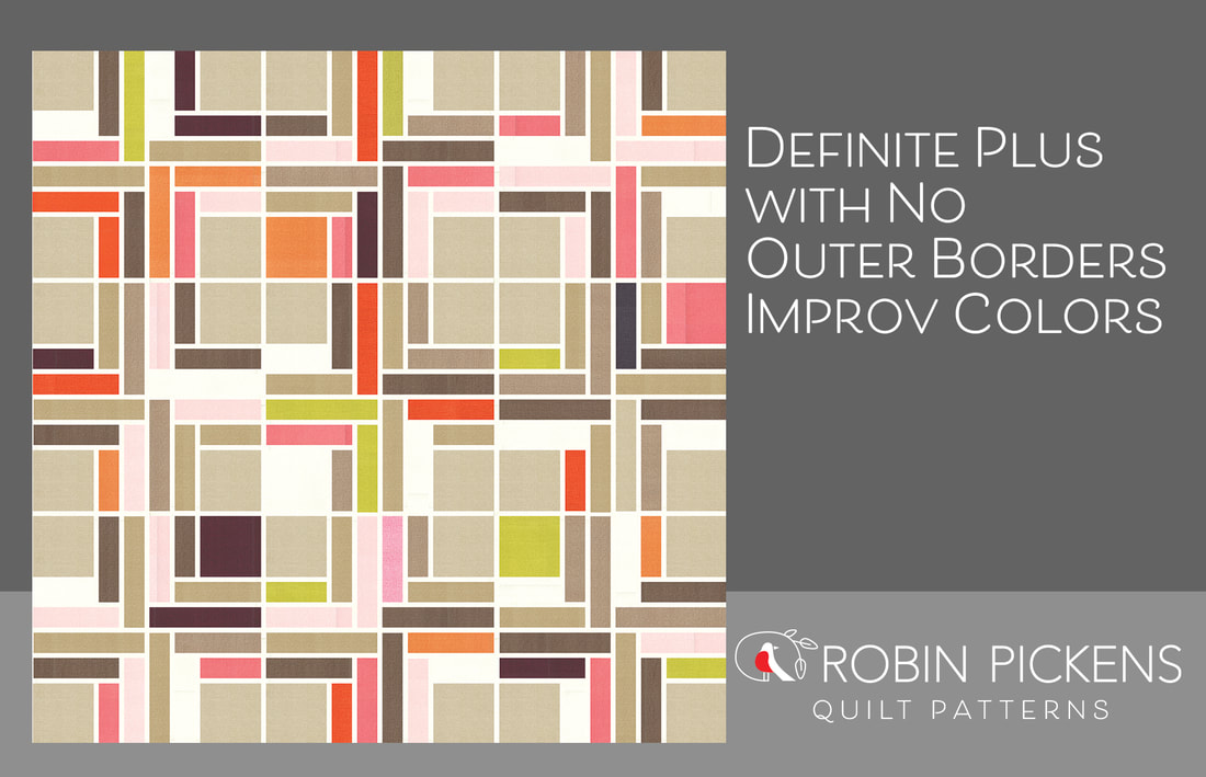 Looking for more Jelly Roll-friendly quilt patterns? Hop on over to my shop and check out Showering Stars, Ring Around the Posies, Equalizer, and Blockstep. And please join in the fun on September 18th 2021 as we sew those Jelly Rolls! 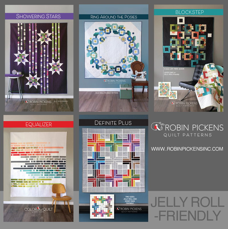 I love envisioning past patterns in new fabric lines and since Abby Rose is in shops now, let's play with those cabbage roses! 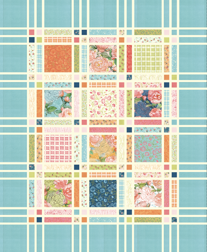 This light blue in Abby Rose is Thatched Seafoam and I just love the softness and warmer tone of that pretty blue! I wanted to see that as the larger side borders with a cream to highlight the fringe thin sashings. A good choice for the cream is Thatched cream 26 or Bella Solids Porcelain.  Here is the cream as the main background with the Abby Rose/Thatched Greenery 124 as the sashings. We have blenders in the Thatched texture with new collections and they don't all automatically become new basics in Thatched. But if a color is different enough and popular, it's a good chance that it will. Greenery is not as yellowy as charteuse, although it is close. Its pretty and soft, like the other Abby Rose colors.  If you were making a king sized quilt, I would assume doubling the twin size. This mockup shows the Greenery as the large border block with the seafoam as the rectangles in the borders. I like the idea of mixing two colors for the borders! You could even go completely scrappy with the borders and have it be an extension of the prints in the body of the quilt.  This last image uses the darker, Night 89 Thatched from Abby Rose. It is the same as 89 Marine. I have been so fascinated by Marine, Navy and Burgundy Thatched lately as deep, rich tones. They are so full of depth and personality! Notice on this image that the thin sashings are done in Seafoam Thatched for the two outer pieces, and cream for the inside piece in every group of three. Or you could go from light to dark in three steps to get a more gradated ramp. Lots of possibilities. I just love the drama of the darker border color!
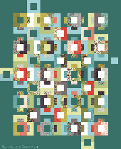
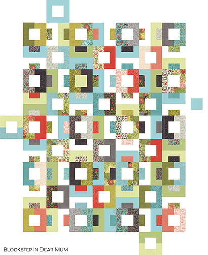
I think Fringe is also a good pattern to play with those large blocks as crazy quilt piecing, string piecing, embroidery panels...lots of options! I hope "seeing" the possibilities with Abby Rose is helpful here! Happy sewing everyone! 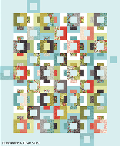 Blues, teals, robin's egg blue. Having fun trying out my Blockstep pattern in Dear Mum fabrics.
I enjoy looking at the difference in light vs dark backgrounds. The feeling changes completely when the fabrics are against a darker teal vs white. Happy color-play! PATTERN UPDATE: You can find the new and improved BLOCKSTEP at my shop at www.robinpickensinc.com.  Color play to visualize new quilts! I wanted to see how Hopscotch Happy might look with some Blushing Peonies fabric (This line will be shipping to stores November 2017). Since I'm still in my summery mode with bright and happy hot colors, I wanted to try the red and gray families of color ways and add a little more of the peonies in the pink/orange colors. For three of the blocks, I liked making the background color a soft apricot to warm it up more. 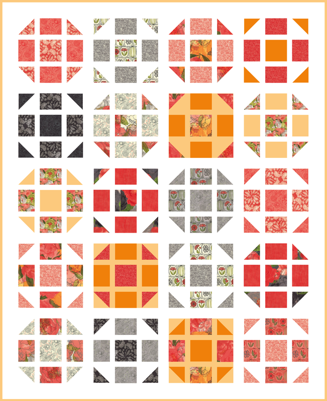 Too much charcoal gray can start to look like Halloween but a touch just adds contrast and sophistication. But what if you DO want a fun quilt that can look fall-like and transition into October and Halloween? A simple switch of background to black and my quilt now looks ready for cozy times in front of the fireplace and candy corn! Have fun playing with Hopscotch Happy! Available at my shop. 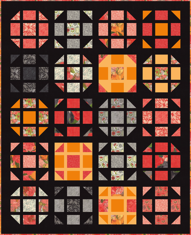  What would Sliding Shoji Screens quilt pattern look like in a new line? I wanted to try it out with my Blushing Peonies prints that will be shipping from Moda Fabrics in November. Here is the original color version of the quilt done in the light version: 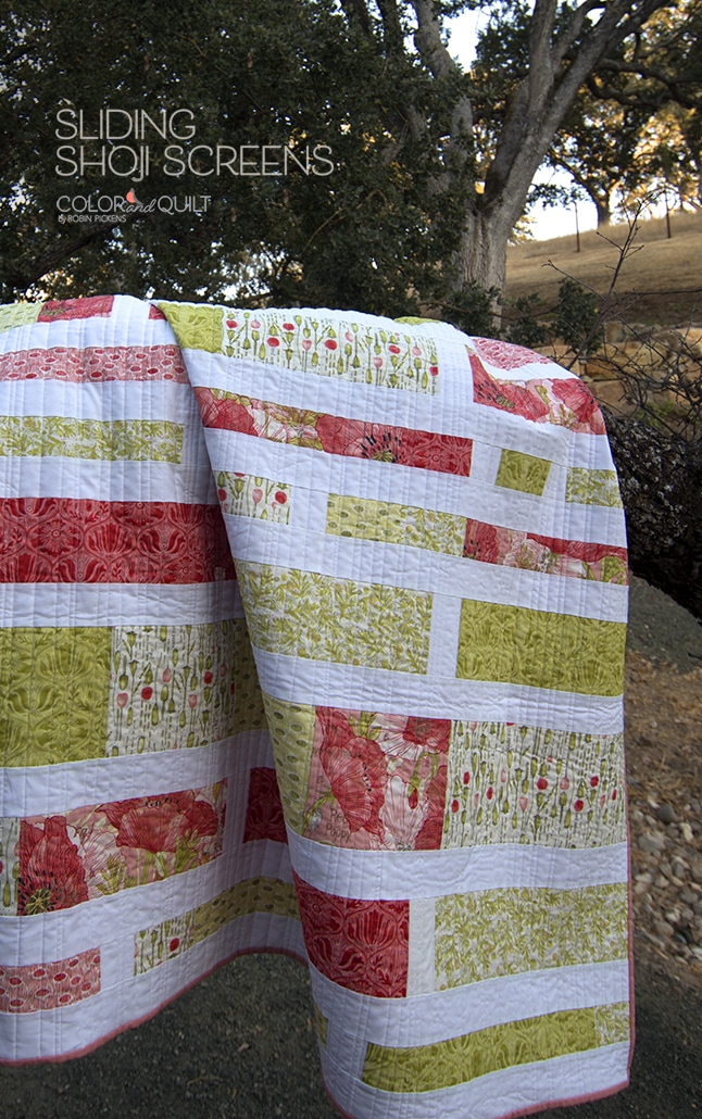 And here are two versions of the quilt in new colors and prints! For the first one I wanted to try a punch of citrus orange (this is Bella Solid 161 Amelia Orange). I made the smaller divider strips in Persimmon 294 to add some deeper contrast. I have ordered my fabric and can't wait to get started on this one! It feels so summery and happy to me! 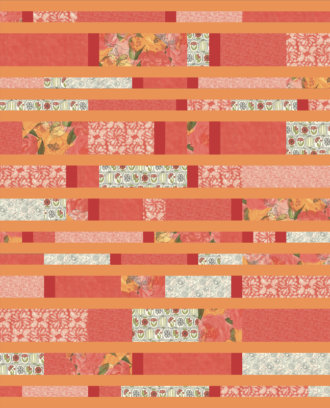 Sliding Shoji Screens in pinks + orange This gray version evokes a calmer, more restful quilt with the pretty color pop of peachy peonies. I wanted to try more light and mid-tone grays and keep my contrast relatively low. I like the added in deep charcoal in the floral pinwheels pattern as my dark color. I don't think it overpowers the other patterns because there is still a lot of light gray in the floral motif. 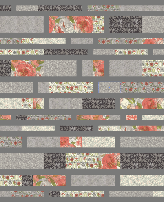 Sliding Shoji Screens grays I'll post more pictures when I'm piecing these! Stay tuned for more color play! If you are interested in my Sliding Shoji Screens pattern you can ask at your local quilt shop or find it on my shop along with other patterns at robinpickensinc.com!  |
About ROBINDesigner of colorful florals for Moda fabrics. Modern to transitional quilt designer. Illustrator, sewist, crafter. I am proud to be a designer for Moda Fabrics!

Shop Robin's Designs
 I am an affiliate for Fat Quarter Shop and may earn a small commission through my links. Thank you for your support!

Check the March 6, 2017 Episode!
Categories
All
Archives
February 2024
© Robin Pickens Inc. All rights reserved. No images may be reproduced without permission.
|
 RSS Feed