|
Last week Joanna Figueroa gave us "Invigorate" for the Sewcialites weekly quilt block. I like seeing a bloom with little leaves blowing around it, a posie with ribbons, plaid zig zags or a rainbow burst. 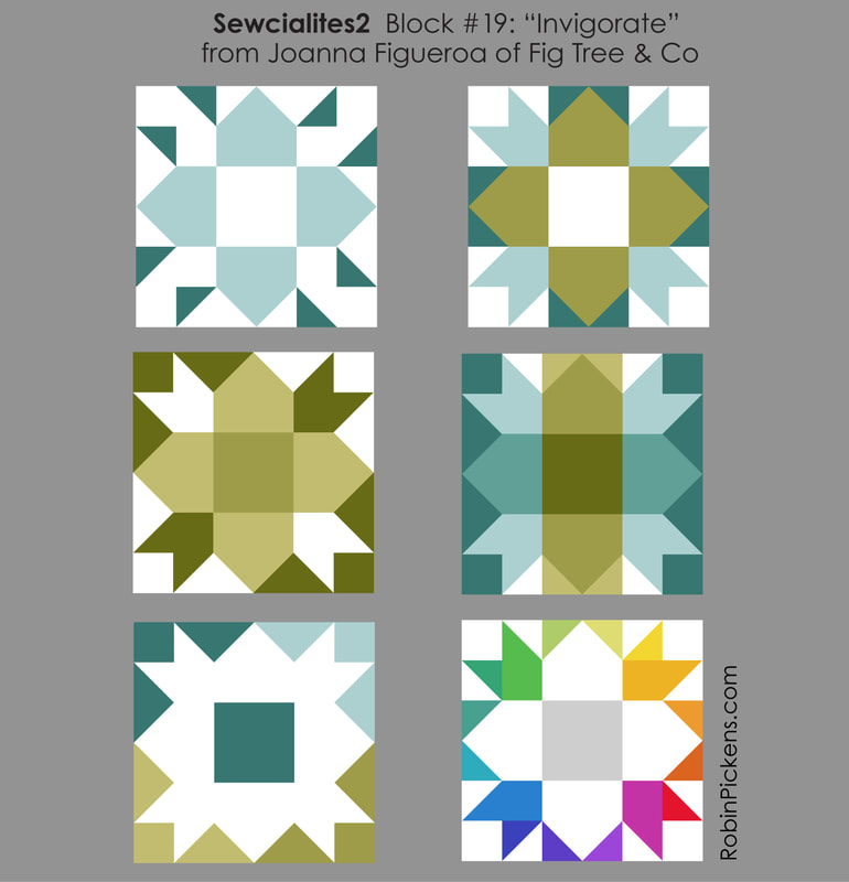 I liked the first one and will have it live in the yellow section of the rainbow print. 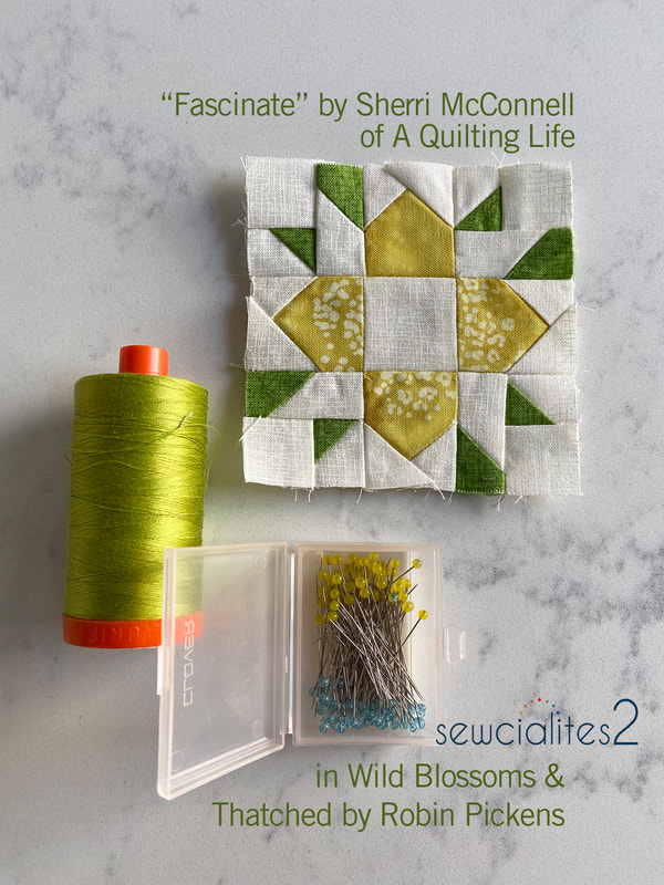 This week Sherri McConnell's "Fascinate" block shows off some green fun for Saint Patrick's Day. Plus sign, arrow heads, variations on a churn dash and stair steps all play in the color studies. 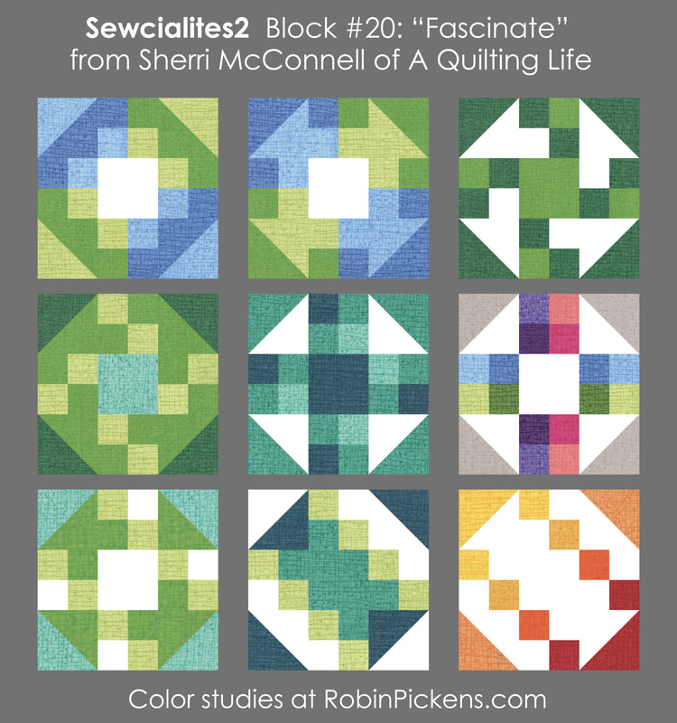 My block has some purple and pink and I like the variations on the corner shapes based on the lights and darks in the little patchwork. So many options! 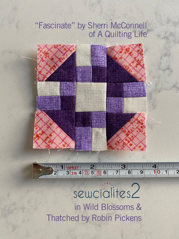 It is so fun to see the little blocks in with their friends and soon the joining into a long row for my runner will begin. Till then, four more weeks of sweet little blocks! 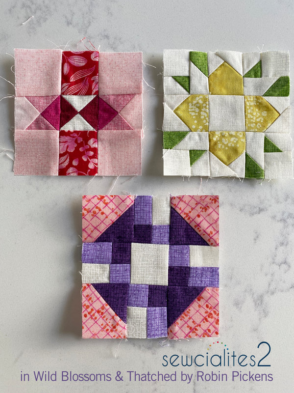
1 Comment
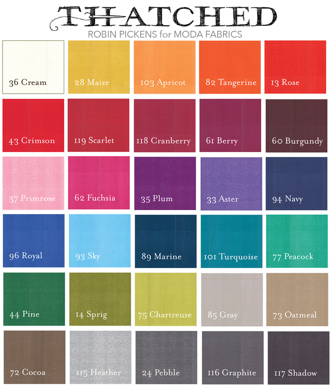
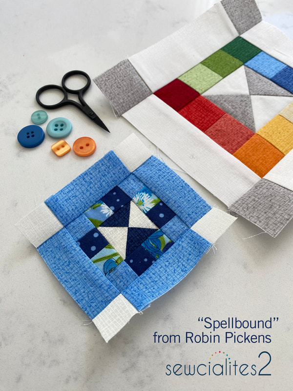 Well yippeeeee yahhooooo it is my week for Sewcialites 2 with Fat Quarter Shop! Meet my "spellbound" block. A quarter triangle block is surrounded by little patchwork squares and then framed by another outer row with squares on the ends. The free pattern is available at the Fat Quarter Shop. All patterns are listed here when released: https://www.fatquartershop.com/sewcialites First I'm sharing my color studies but please also keep reading to see my plans for using my blocks in a colorful table runner. 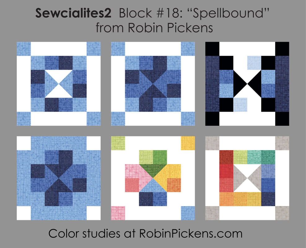 The first one focuses on each row as its own mix of light and dark blues in squares. The next one reminded me of arrows pointing in with shaded 3d arrow bases. The third one makes me think of an hour glass with white sand running from top to bottom ("the sands of time..."). On the bottom row, the outer blues make another chunky plus sign to surround the inner arrows. Then a couple of rainbow spectrum experiments moving around the color wheel, either in the center or in the rows of small squares. 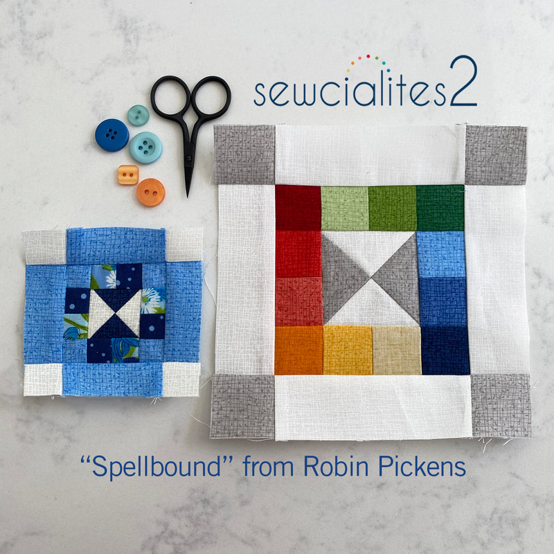 For this sewalong, they asked for blocks that make us crazy. I find that matching up little patchwork square seams can be one of my crazy-making things. Pressing seams in opposite directions, then nesting the seams when joining rows helps. Another thing that helps is when the little squares line up against a sashing or other rectangle, like the little blocks here. As for nesting seams, this is a picture of the back of the blocks. The arrows show some of the places where I have pressed seams to nest. 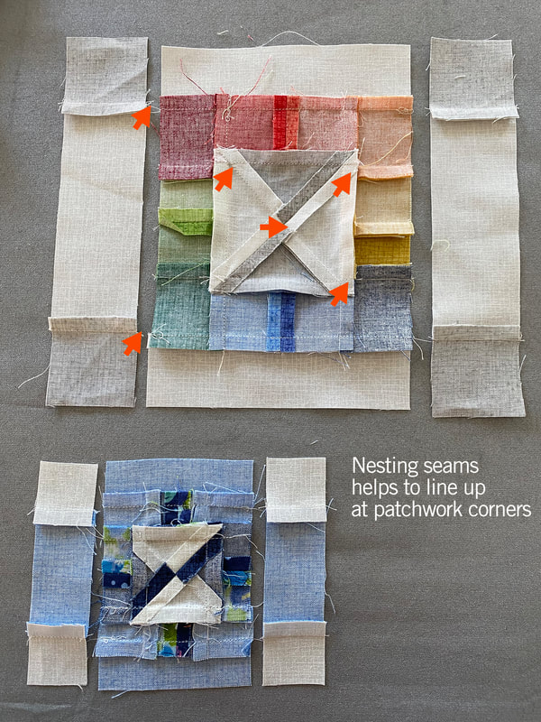 Another thing I will do with little patchwork and small block piecing is starching. I generally don't starch much but with small sized blocks, the starch will help for handling the fabric better and it keeping its shape as you sew and press. If I am doing patchwork squares I will see if I can make some longer pieces and subcut them and I tend to press to one side on my seams instead of pressing open so they don't pull apart easily when I handle them. These things seem to help with small patchwork squares. For my block, I've a little blue 3" block for my project using all my blocks in Wild Blossoms. And then I wanted to make a rainbow square Thatched version. I have some leftover Thatched blocks from Moda Blockheads that I have quilted as little minis for the wall so I might add this to the mix. 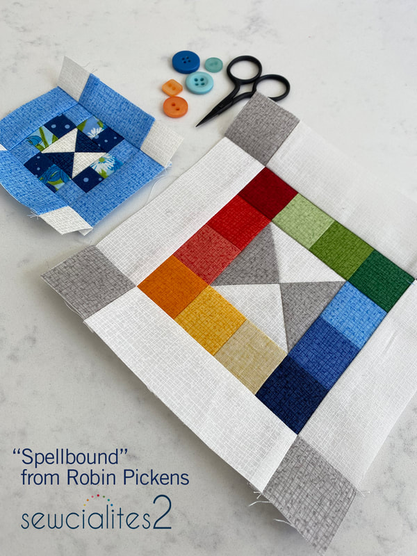 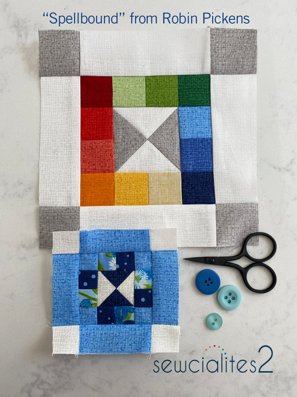 Want to know WHAT I am going to do with those little 3" blocks? The Wild Blossoms fabrics (which are shipping to shops at the end of this month) has a big Width-of-Fabric print that runs selvage to selvage in a big rainbow print of multiple wild flowers. I've been making my blocks in the different colors with the intention of lining them up with the colors in the WOF print. 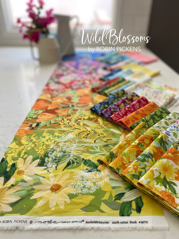 I want to add in a 1" wide sashing strip between the blocks (for a finished sashing size of 1/2") and make a table runner. These are some mock ups of the versions I've been considering, with sold squares left for the blocks that are released in the weeks ahead. The 42" wide runner has two rows of blocks, either in the center, with a center print running through, or placed on the long sides. The top one has cream sashings surrounding the blocks and the second one only has sashings between the blocks and the rainbow print running up to the blocks on top and bottom. For the third one above I tried the Greenery light chartreuse fabric for sashing since it looks really springy. 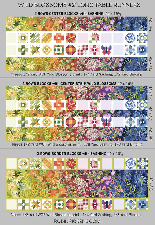 It is a good idea to get a little extra of the rainbow print so you can position the fabric appropriately to show off the little bees. The above ideas would need either 1/3 or 1/2 yard of the WOF print, 1/8 or 1/4 yard for sashing and 1/3 yard for binding (indicated under each image). The CUT sizes of the rainbow print are listed to the right of the images. Another idea is to make a longer runner with a single line of blocks and two pieces of the WOF rainbow print. When wanting to blend the color ramp continuously, I flip the print upside down to continue the flow of color. My table is sized to handle this long version well so I think this is what I will make. I've mocked it up with either the lighter colors/yellows to the center or the darker blues to the center of the runner. 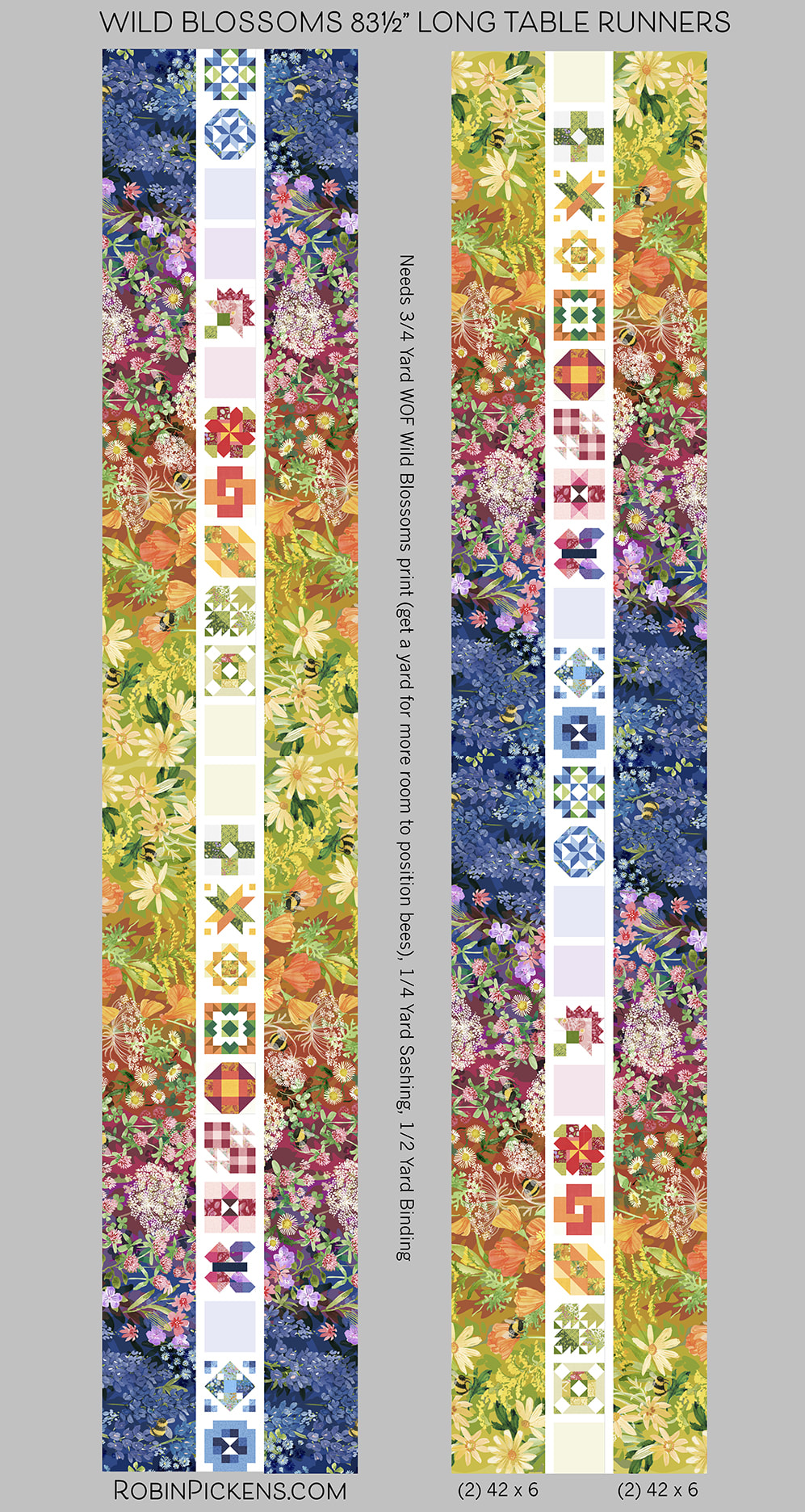 The longer runners need 3/4 yard of WOF print, 1/4 yard sashing, 1/2 yard binding. For binding I'm not sure what I'm using yet but it might be the new Thatched bias binding that Moda makes which is sold by the yard. That makes it SO easy!! 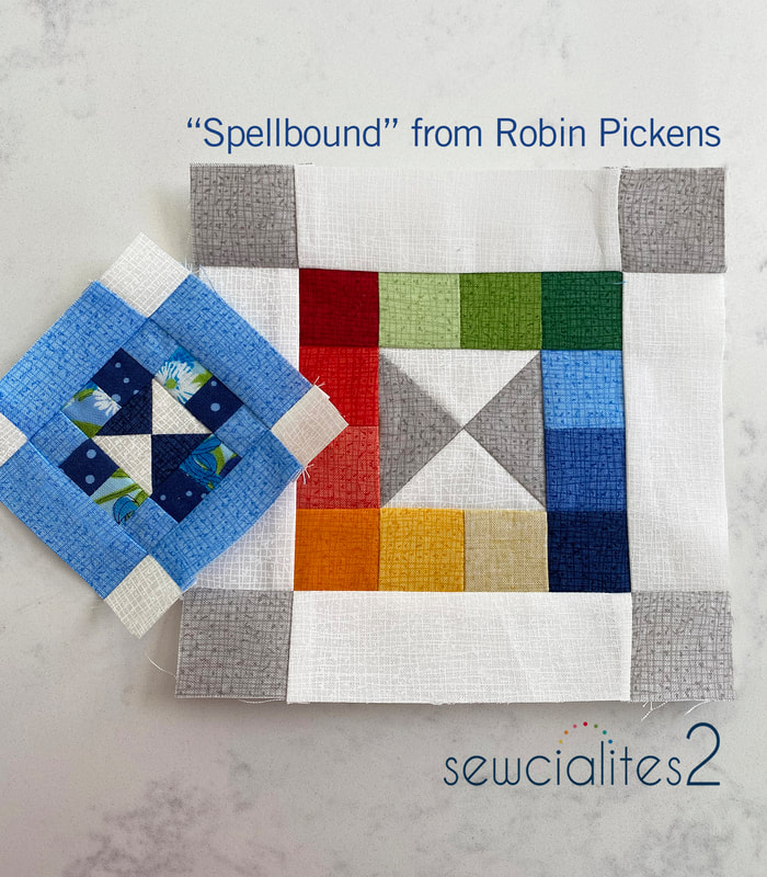 This sewalong has been lots of fun! I've really enjoyed seeing the various blocks people share in the Sewcialites Lounge on facebook. Because I want to keep the sewing joy going, I'm participating in the Bountiful sew along with Fat Quarter Shop with the quilt pattern Corey Yoder designed. I'm using the Wild Blossoms fabric for that one too and you can see the mockup and fabric requirements for the Bountiful quilt on the previous post at https://www.robinpickens.com/blog/2023-bountiful-quilt-along-with-the-fat-quarter-shop-to-benefit-make-a-wish. I hope you will join us. Happy sewing everyone! 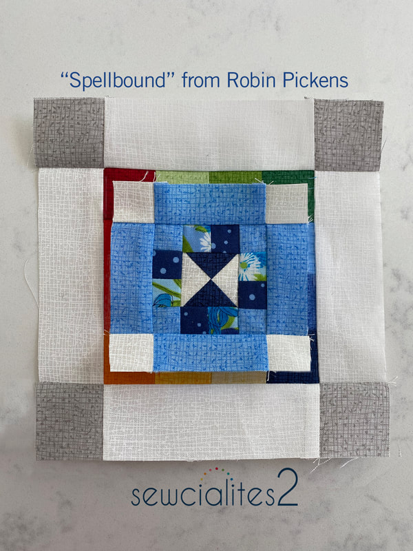 Ah, "Simplicity" for a nice happy week on the Sewcialites sampler. This block is from Vanessa Goertzen of Lella Boutique. Vanessa can make simplicity so very charming and elegant! Lets take a look at some color play! 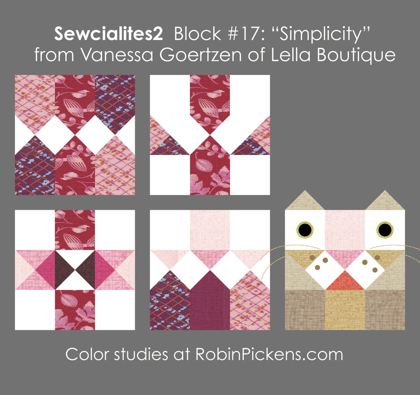 As I was experimenting with the angles and center vertical band, a nose started to appear to me. I could not resist adding a couple more triangles for ears and bringing a little lioness friend for a visit! For my sewn block I stayed with the more geometric play and I liked how the lower left one resembled a plus symbol or cross with interesting faceted bands from the quarter square triangles. Here is my sewn version: 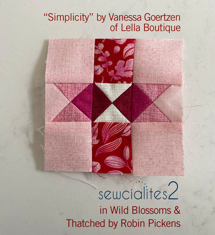 Next week is my block and I'm excited to share! Stop back to see what I'm planning for my little 3" blocks. Till then, happy sewing! 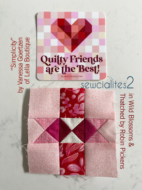 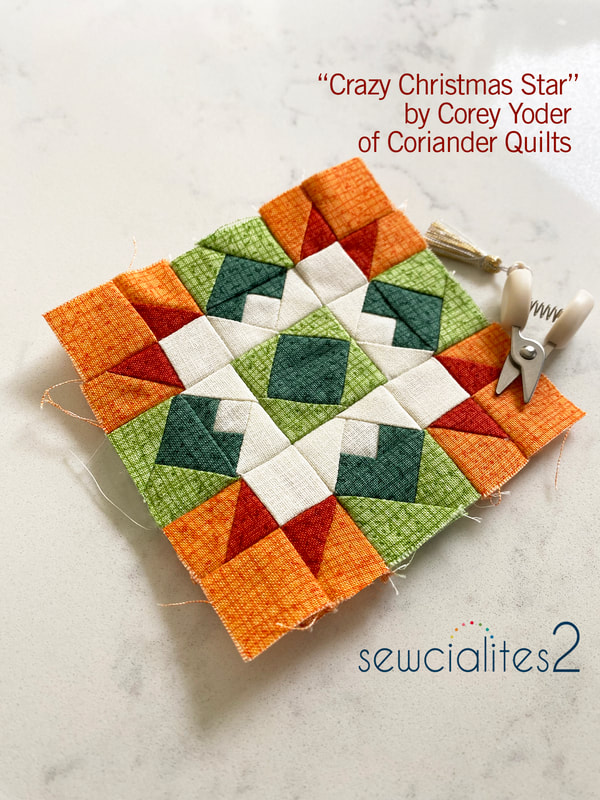 Block 16 from Corey Yoder of Coriander Quilts has lots of pieces to play with. I enjoyed trying the center as a white bloom (like a white Poinsettia) with green leaves or red package ribbons cut with pretty ends. Play up the diamonds by using more background white or emphasize the X angles. This block is similar to Flourish from a couple weeks ago with an added twist on the inner flying geese to make that extra little square. I did my color studies in red and green to go with Corey's Christmas name and it is lively in those combinations. 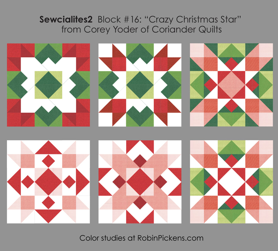 I've used some spicy warmer reds and orange for my block instead of red, based on where I want this to coordinate with my rainbow WOF print of Wild Blossoms. I find that making the 3" blocks can be a challenge for getting my seams to lay flat when pressing. I like to use a tailors clapper of wood to help after pressing. I'll let this sit overnight to reinforce the flat pressed-open seams. 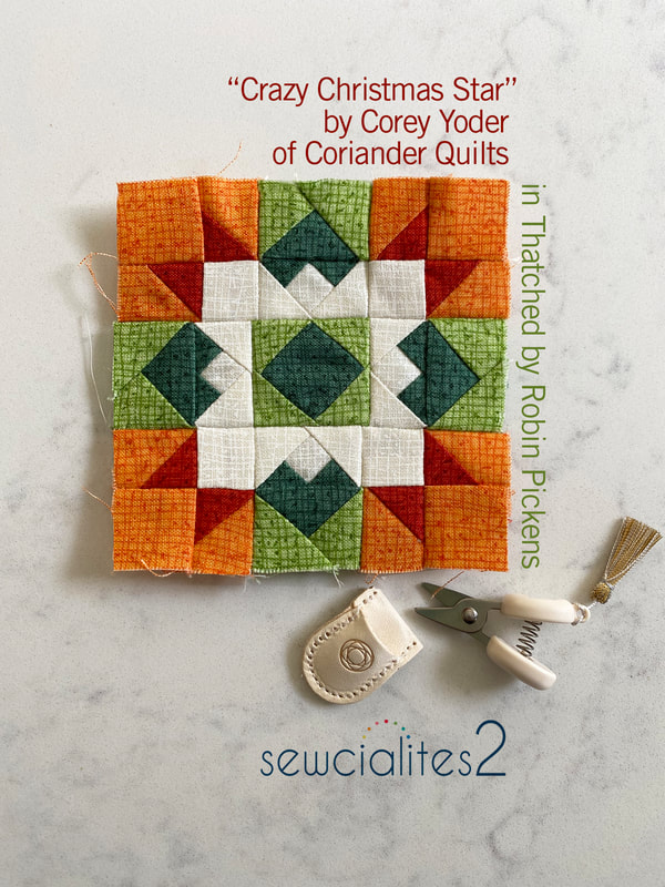 These tiny little scissors are just the most precious! They are made by Cohana and are a pretty little treat for snipping threads. And they are a sweet size to go with these little blocks! Hope you are all having a wonderful time with your Sewcialites blocks through the Fat Quarter Shop! 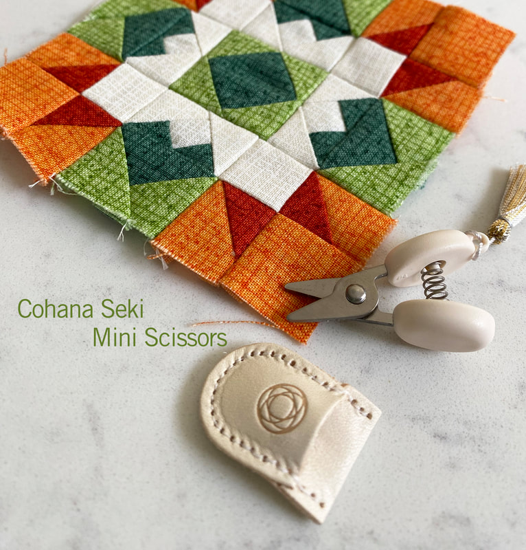 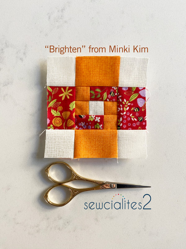 Brighten up your day with a little sewing! Here is "Brighten" from Minki Kim for this week's Sewcialites free block from the Fat Quarter Shop. What an interesting interlocking shape of rectangles. I love it! For color studies, the suggested layout then playing with those squares and rectangles a little to make a geometric layering of transparent squares in the center. Emphasize across the diagonal, have a pixelated "H" or a cut out rectangle that our eye is drawn into with it's dark center. 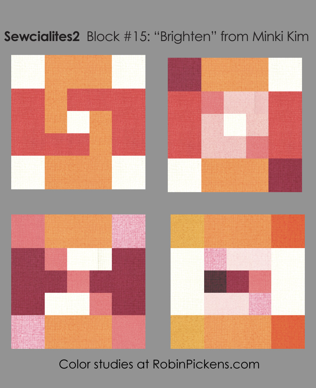 I stayed with the recommended layout since I liked the simplicity and movement of the shapes. I love this little red print in Wild Blossoms. It has all kinds of little blooming things with tiny bees buzzing about. It still shows some of the images in these small 3" blocks. I also had one more block to do to catch up..."Interwoven" from Shereece Nicole of Sew Hooked on Treasures. 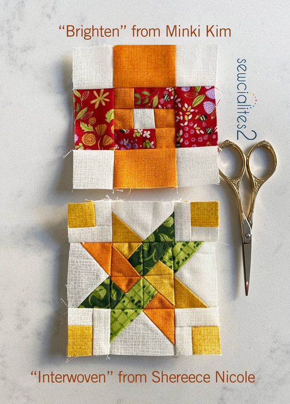 This block took some concentration and careful following of directions. I love the outcome and how the ribbons have a continuous woven interlocking look. 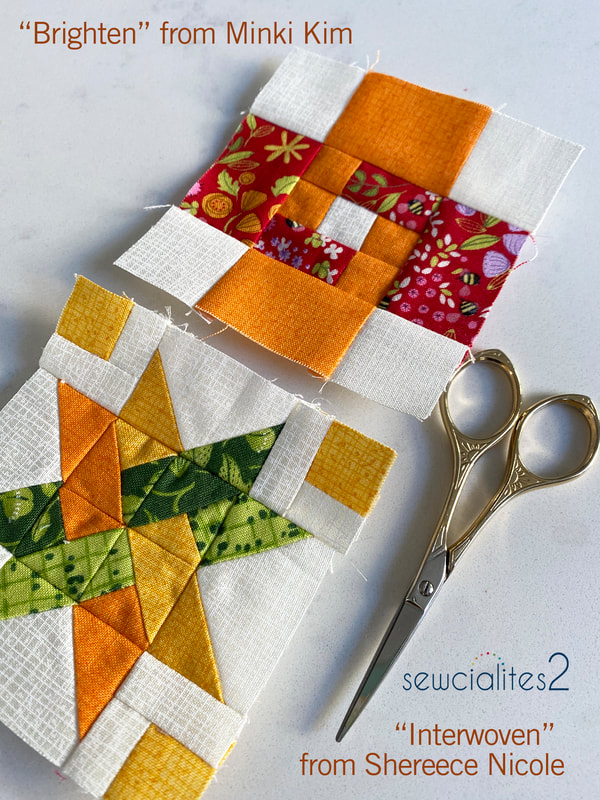 If you are also catching up, here are a couple ideas in the color studies for the Interwoven block. The outer flying geese background can fill in more of a large "plus" shape. Center triangles can pop out as a pinwheel. The star points can be emphasized as their own element and we can also create a large X shape with fun motion. 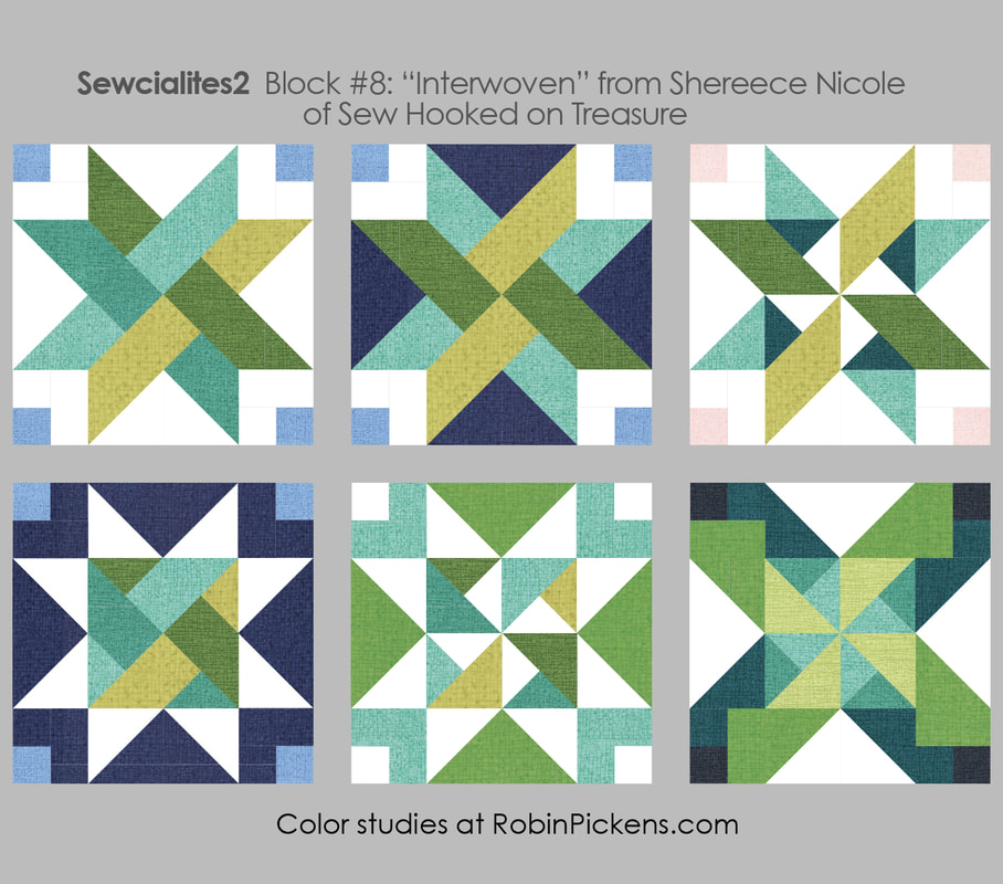 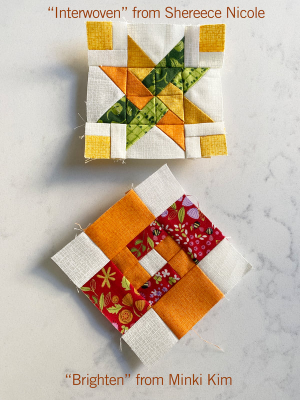 Now I am all caught up and can go back to one block a week! My block will be coming up next month and I'm so excited to share! I hope you all have a fun Valentines (or Galentines) Day next week! Happy sewing! 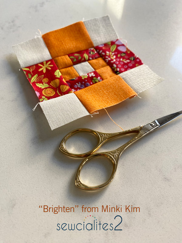 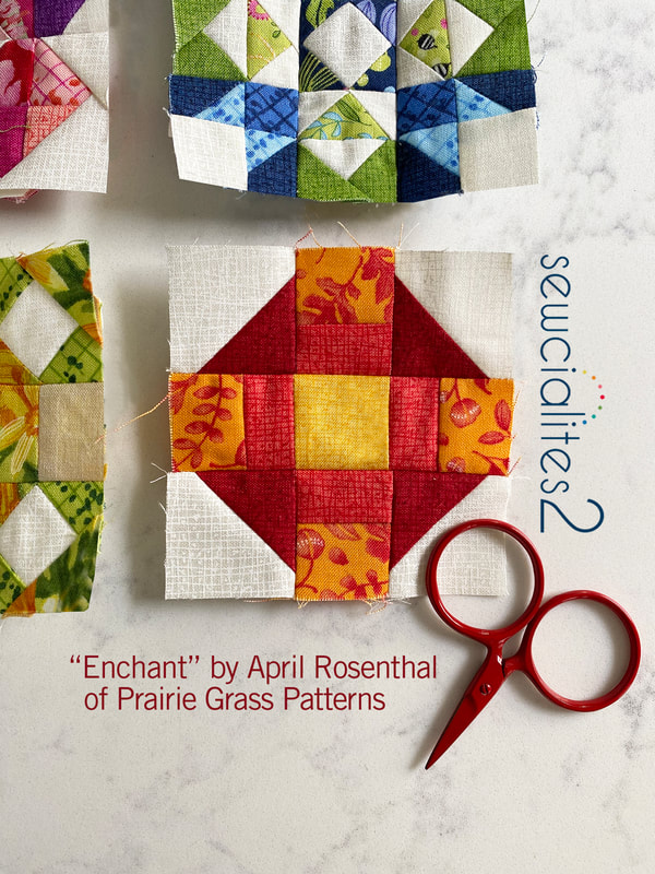 Hello Enchant! I breathed a sigh of relief for a slightly easier block this week since I'm also continuing my catching up on past blocks. I enjoyed this charming block from April Rosenthal of Prairie Grass Patterns on the Sewcialites Sewalong from the Fat Quarter Shop. How about a color study? Yep! 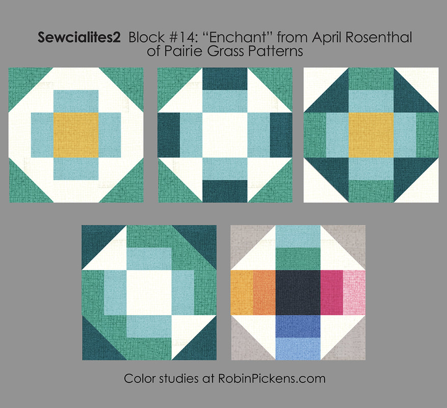 Outside half square triangles in background white or a color? I liked how the third one looks to me like corners folded in, like a galette with a lemon center. The second one plays on the idea of a churn dash block. Fourth uses background white to create a diagonal twisted candy and the last one is a color wheel of sides that draws your eye into the dark center. 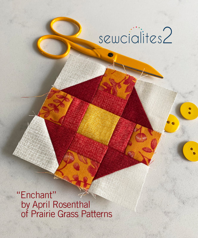 I used number 3 as my inspiration. I think it was the idea of a lemony pastry that got me, and no, I don't have any lemon danishes or pastries here. Sigh. It is not till I look at the photos that I see I have a seam not quite matching but since it is a 3" block, I'm leaving it as is. I did use my seam ripper quite a bit on some of the other blocks I made so this seems minor in comparison to some of the other matching issues I encountered. Speaking of the other blocks, I made Flourish by Lori Holt of Bee in My Bonnet. 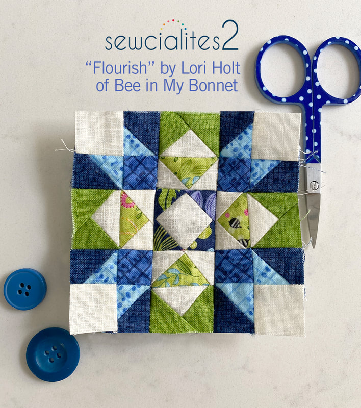 I used my seam ripper on this one a lot. Keep in mind this is a 3" block so each of those sections is only 1/2" finished. I am liking the blue/green combination and look for my smaller prints to use on these tiny-pieces blocks. For color studies, I played with these ideas: 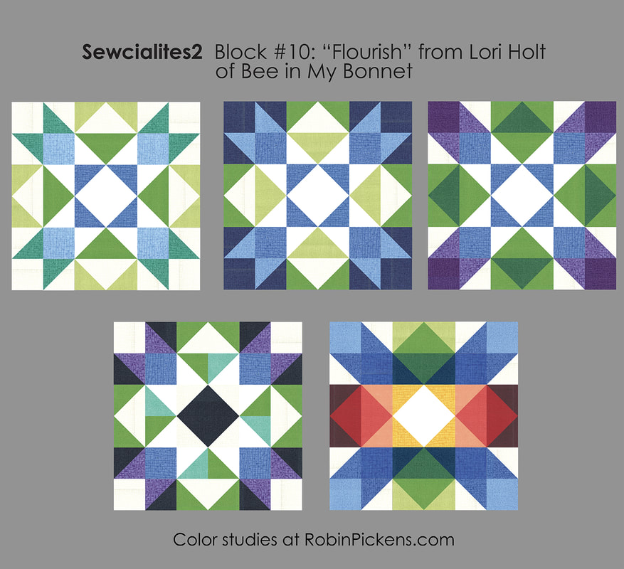 Lots of pieces means lots of options to pull out the X shape (jumping jacks!), think of corner ribbon ends, play up the sides, or treat the rows like different colored bands. I used number two as my inspiration but it was a toss-up with number three. 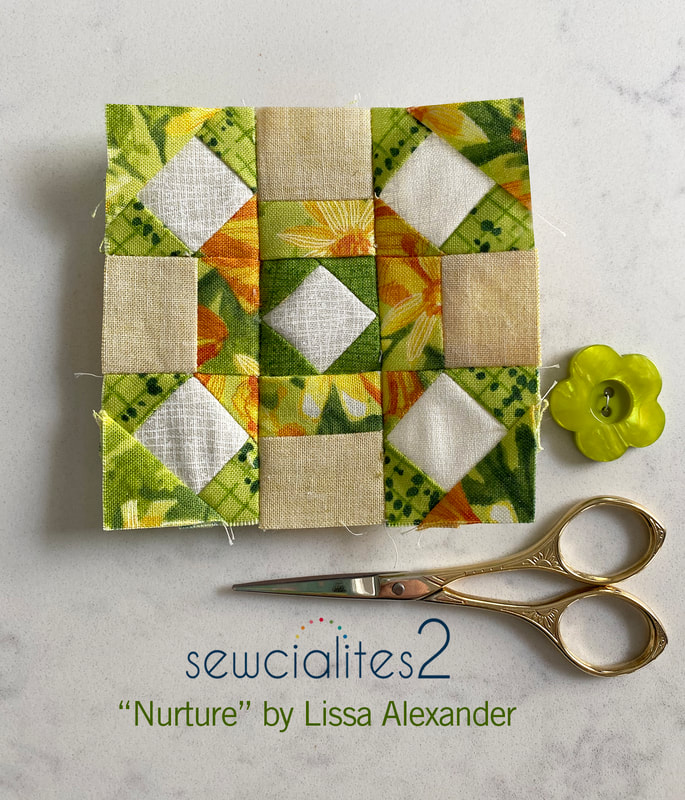 Next was Nuture from Lissa Alexander. Wheels, pointers, plaids and, again, lots of options! This one was really structured for lots of color play. And again, my seam ripper was used a lot on this 3" block. 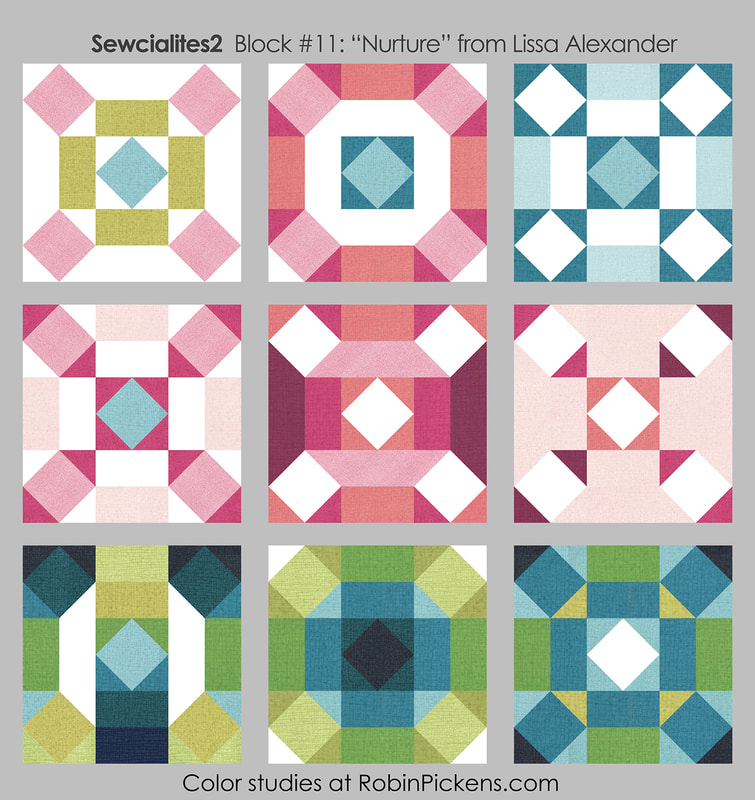 The last of the catch up blocks for the week was Butterfly Garden by Pat Sloan of The Voice of Quilting. I did not do a color study for this one since I had no desire to see it as anything but a butterfly. I thoroughly enjoyed seeing this butterfly come into full formation. 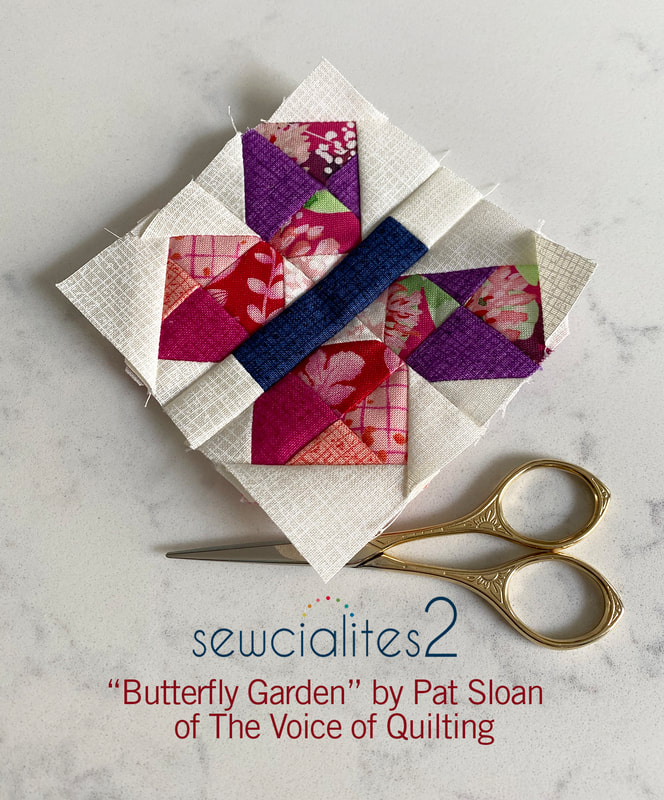 Here is the group of this week's blocks, all done in different colors and fabrics from the Wild Blossoms collection, which should be shipping in March from Moda Fabrics! 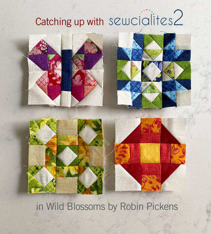 Just a reminder, if you want to see past color studies, go to the COLOR STUDIES page listed in the menu and click on an image to go to that blog post. Next week I'll add in the block Interwoven from Shereece Nicole and I think I will be all caught up with past blocks! 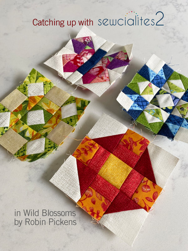 Last week I mentioned I will be doing the Bountiful quilt along (Bountiful quilt from Corey Yoder) with the Fat Quarter Shop, raising money for Make a Wish! Here is a mock up of the quilt in WILD BLOSSOMS. Since Wild Blossoms is shipping in March, it might be a tiny bit behind on the first block but should be available to catch up and sew on the second in time. For more information about the Bountiful sewalong, and to see the fantastic bundles of Corey's fabric line, coordinating threads and a very charming matching CROSS STITCH, visit the Fat Quarter Shop's Bountiful blog post. 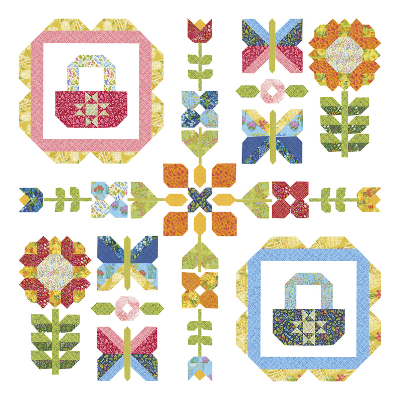 See you next week and until then, happy sewing!! 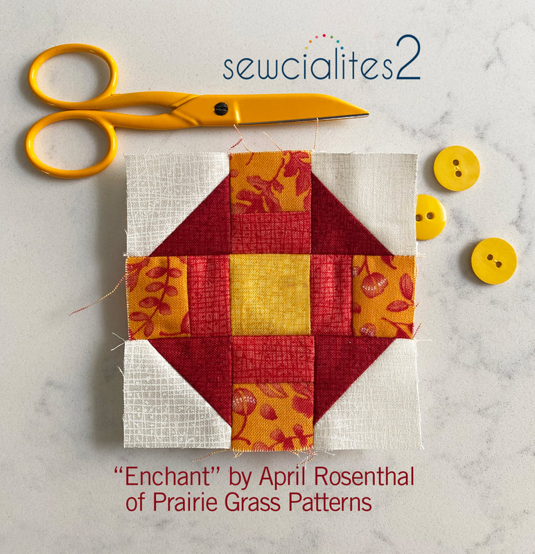 Sewcialites block #9 is from Brigitte Heitland of Zen Chic. Her block, New Plus Old, can use the snowball corners as ends of a ribbon, different color triangles, interlocking ribbon ends, or a twisty candy wrapper. 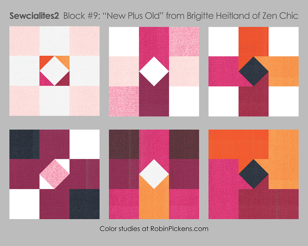 I loved the simplicity of the first block and wanted to try it in my NEW fabric line that will be shipping in July, Forest Frolic. There are 5 new Thatched colors in the collection so I wanted to use the light background of Buttermilk Thatched with the Little Forest Fling print in the square corners. The little triangles in the center block show off the new Caramel, Copper, Cinnamon and Mocha Thatched. 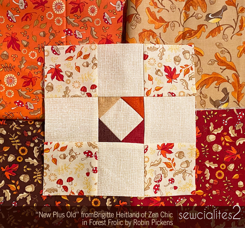 I also made the small 3" version in Wild Blossoms in cream and greens with the interlocking ribbon ends. I think this block would look cute set on point as well as straight. 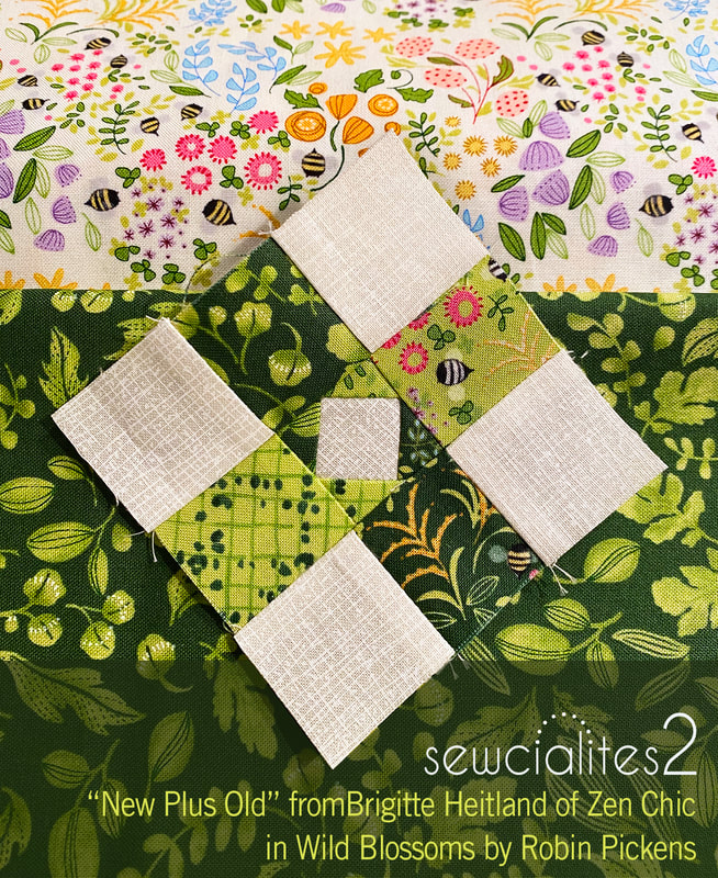 I'm hopeful I can catch up in the New Year with the rest of the blocks so far! Happy sewing!
Chelsi Stratton is our designer this week for Sewcialites and her block is "Flirty." Simple one color with white or pull out more of a Bear's Paw type of block by shading in one corner square. Or treat the block as a study in diagonal movement and shades of sunset colors. Let the white stand out as a bow tie or accent triangles. 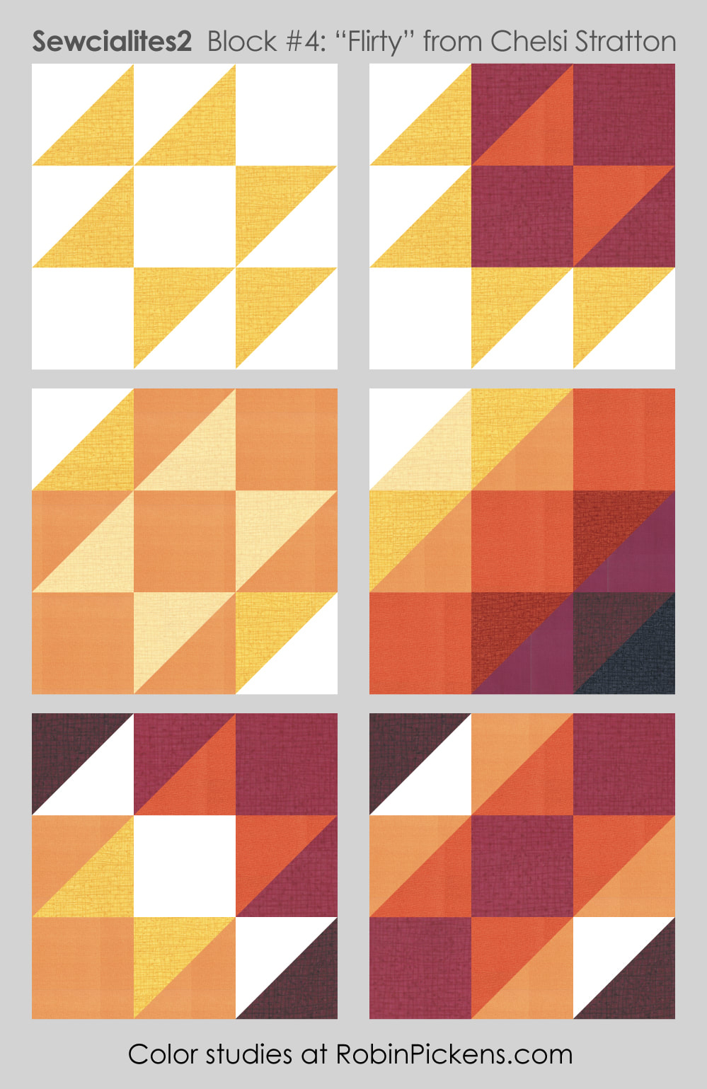 Block sewing will happen next week but I'll enjoy seeing the different blocks popping up in the facebook Sewcialites lounge while I finish up a couple things and then take a sewing break with a sweet 3" block.
Have a great weekend! Hello Patchy Days with little squares and flying geese from Jackie McDonald! I just got to see Jackie in person at Quilt Market in Houston and it was SO nice. We have connected through phone calls and zoom so this was the next step...an actual meeting! I have enjoyed making Jackie's block this month AND I caught up with last week's Tussy Mussy sewing. But first, color studies! 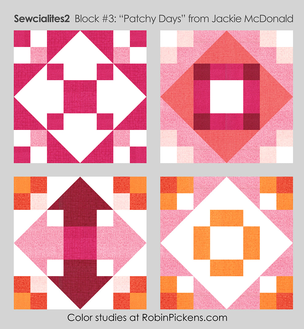 You can emphasize the diamond made from flying geese or the square in the center or make the flying geese and their joining rectangles into arrows pointing out. Those 4-patch corners can be one color plus background or play with gradations and place the lightest parts to the inside or outside. I like the arrow idea and decided to apply that to my sewn block.  I'm using blues from my new Wild Blossoms collection (the one showing at Quilt Market last weekend). The arrows are out of the blue bonnet floral print with corners in the diagonal sketchy plaid. Mist Thatched flipped to the back side for a lighter shade makes the center square. 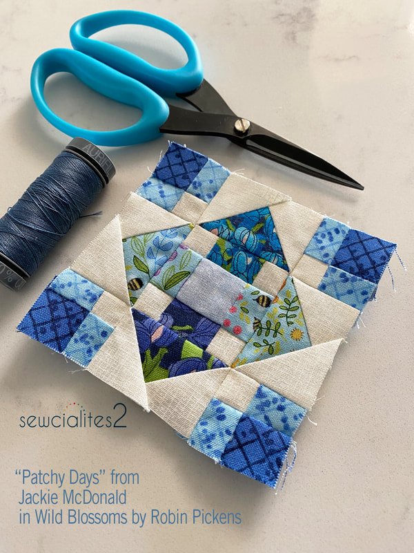 I am thinking about combining these blocks in a variety of colors with the big width-of-fabric rainbow print of all the wildflowers. Perhaps in a tote...I'm working on my plan and will share when it is solid. 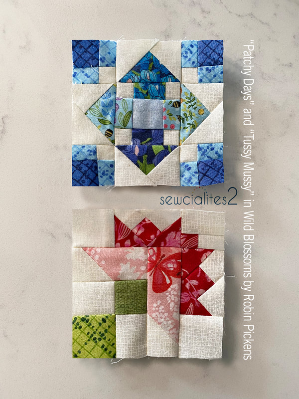 For my Tussy Mussy block, I used the pink Queen Anne's Lace print with a butterfly in the center part of the block, fluttering towards those outer dark petals. These small blocks are so much fun to make. Last year I did all the small 3" ones and fell in love with doing this sweet small size. 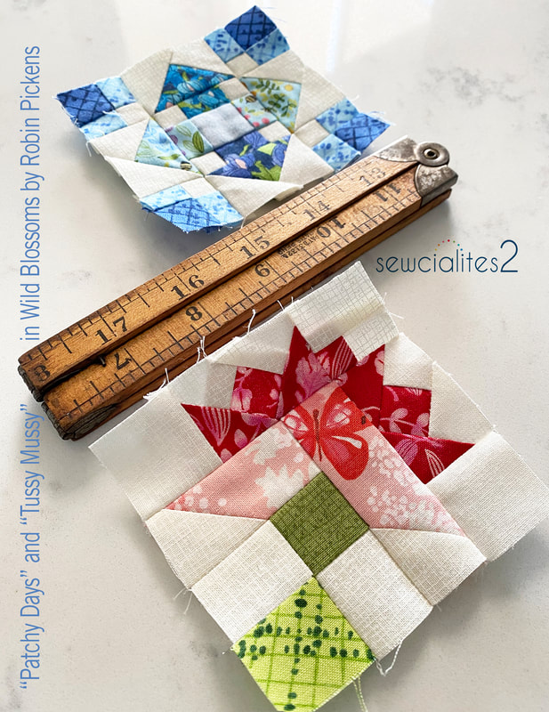 Now I've got a red, pink and blue block and have got to plan out next week's color. Orange, yellow, green? Sewing with the range of colors in Wild Blossoms has so many possibilities. 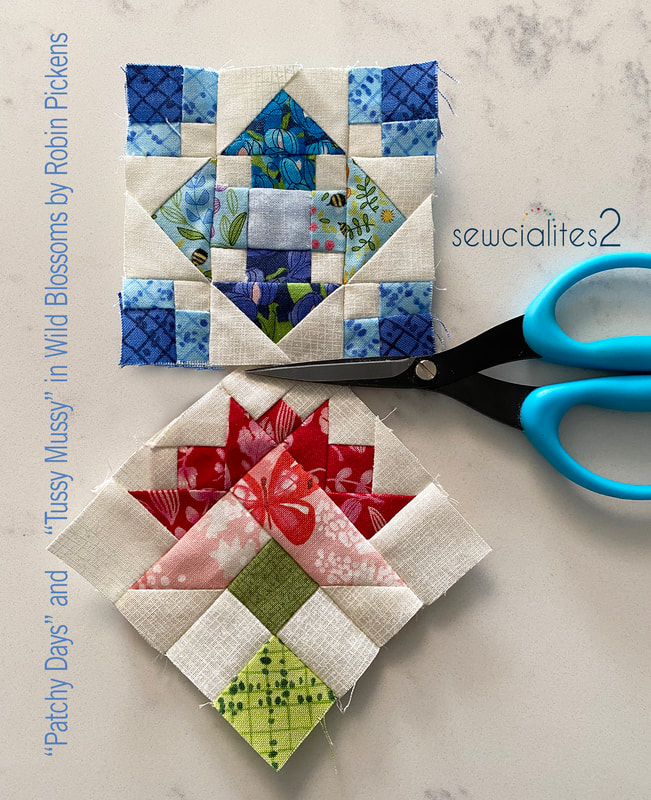 Check out the Fat Quarter Shop blog and shop for the free weekly patterns for this Sewcialites 2 Quilt Along!
Week 2 of Sewcialites with a block from Susan Ache called Tussy Mussy. This traditional nosegay block is adorable as a floral bouquet with pretty colors. Since it is a fairly definite shape and easier to "see" as a bouquet, I thought it would be fun to explore how else it could evolve. 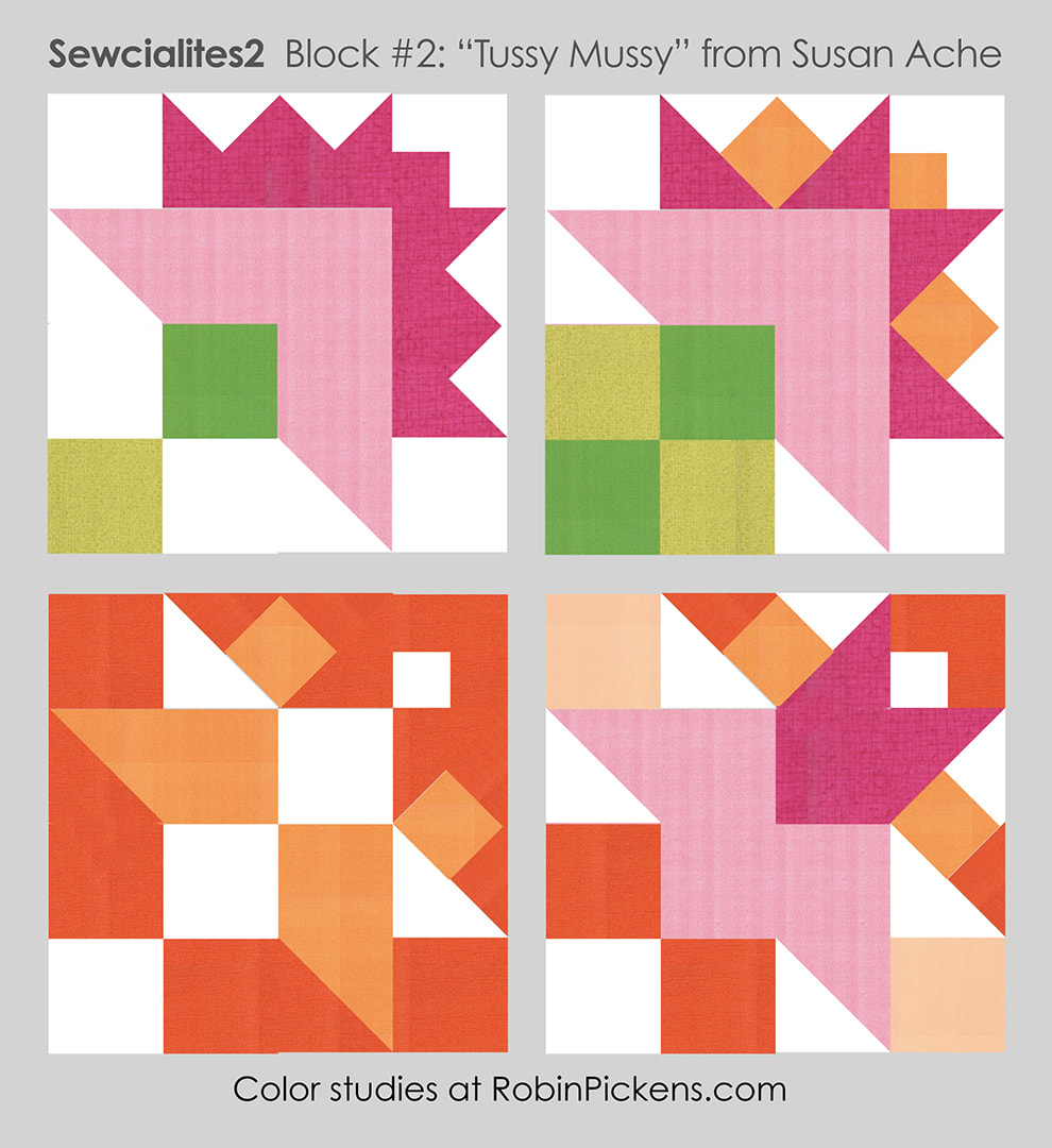 First I have my traditional nosegay of flowers with a little modern feel by keeping the solid colors for the base of the flowers and all the outer fringy ring in the darker pink. Then I went for a blocky stand of greens and mixing apricot into the outer petals to give it a more explosive feel. But what if it is not a nosegay at all? I had to throw a little orange in there in honor of Halloween and that one just plays with shapes and switching up the white into the inner parts of the block and letting some background come in on the outer triangles. That last one was more shape exploration and I keep seeing a little red-haired paper doll girl with a pink skirt. Do you see her? 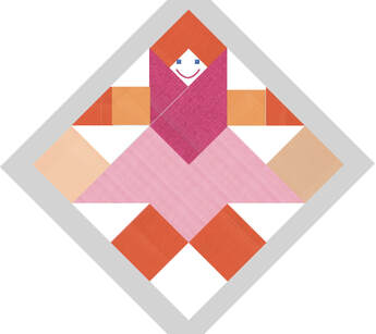 She's wearing a big pink scarf and orange mittens...she might be doing jumping jacks while carrying her grocery bags home. I can't help it! Sometimes the funniest little things jump out! Due to QUILT MARKET happening, my block will have to be sewn when I get back. But I look forward to seeing all your fun Tussy Mussy blocks!
|
About ROBINDesigner of colorful florals for Moda fabrics. Modern to transitional quilt designer. Illustrator, sewist, crafter. I am proud to be a designer for Moda Fabrics!
Shop Robin's Designs
 I am an affiliate for Fat Quarter Shop and may earn a small commission through my links. Thank you for your support!
Check the March 6, 2017 Episode!
Categories
All
Archives
February 2024
© Robin Pickens Inc. All rights reserved. No images may be reproduced without permission.
|
 RSS Feed