|
I am headed off to Nashville Needlework Market and I'm so excited to be going for the first time! I can't wait to see all those materials and flosses and cross stitch goodies! But before I go, I must post these color studies that I did for the MOONBEAMS quilt that the Fat Quarter Shop is doing as their fundraiser for Make-A-Wish! The sew along starts this Friday, March 1st!! 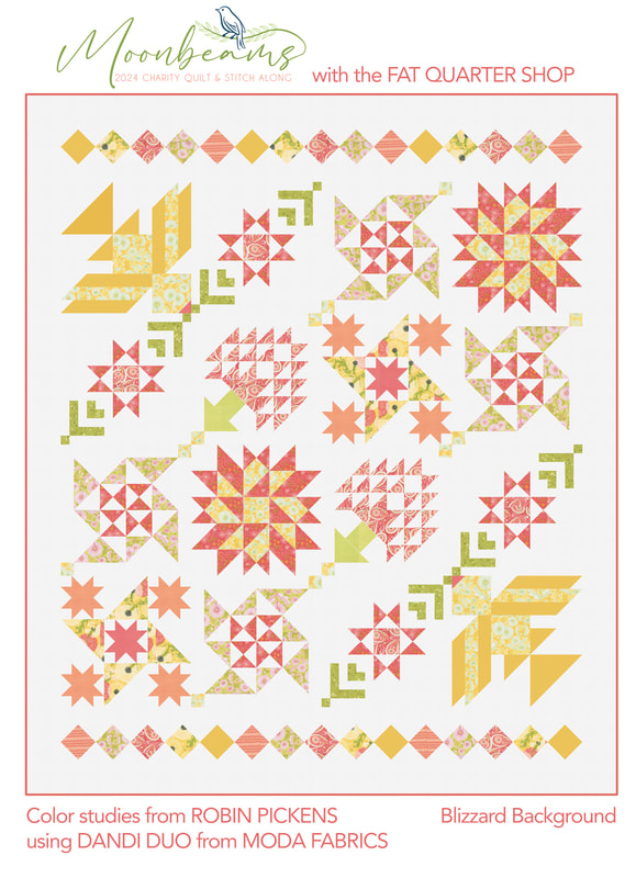 When I saw the design for this year's charity quilt, I thought it was SO pretty and elegant! I love the birds in the corners and the trees especially. This is designed by the Fat Quarter Shop and I will be sewing along, making my version in my Dandi Duo fabric from Moda Fabrics. The first mockup I did was on white and I must admit, I LOVE how light, springy and fresh it looks with the pinks, corals, yellows and greens on a nice white background. Since Dandi Duo also have soft grays I wanted to try that. Although it is also a soft look, I don't think the gray gives the quilt the energy it deserves. 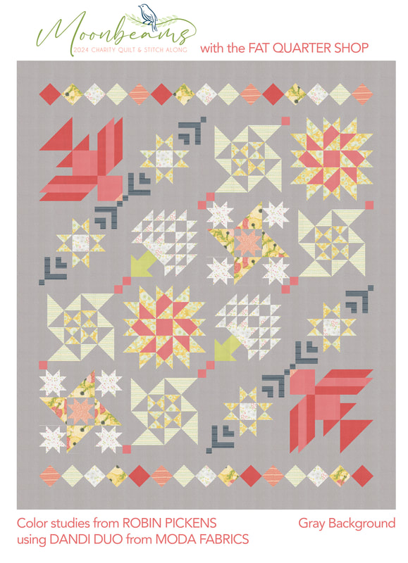 So how about something more vibrant?? This is Thatched Passion 58. It is not a Thatched color that comes in a bundle of Dandi Duo, but it coordinates really well and is a little darker shade to let those lighter pinks and corals pop out. I am definitely liking the Passion color more than the gray. I think it is lively, fresh and very playful. 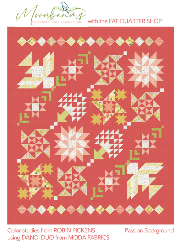 The last version I tried is on Shadow, a nice dark charcoal-ish gray. I was inspired by seeing the Fat Quarter Version with Strawberry and Lemonade from Sherri and Chelsea, which has a dark blue for the background. The dark color really lets all the block elements sparkle and stand out. It is dramatic and sophisticated. 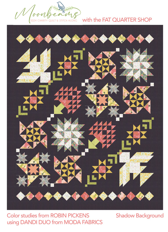 Which one to make?? I really came down to the Passion or white and decided on the white since it felt so happy and cheery to me and I think that works really well with this quilt. My quilt will be auctioned off at the end to help raise money for the charity. Stay tuned for sharing some blocks and get ready to sew. 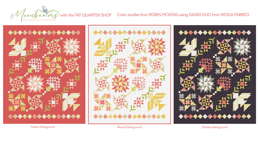 Read more details about the sew along. THere is also a stitch along for a matching cross stitch design that is so lovely! The Jolly Jabber blog from Fat Quarter Shop has all the details on quilt and cross stitch! blog.fatquartershop.com/lets-get-ready-for-moonbeams/  Join in and support a great charity! I'm so excited to make the beautiful quilt! If you post images, use the hashtag #MoonbeamsQAL so we can see your work.
0 Comments
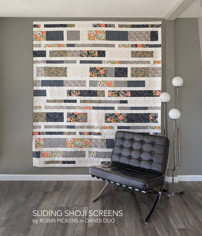 Another quilt to go with the Dandi Duo group is Sliding Shoji Screens. This quilt is revised from an earlier version. It was one of the first patterns I had created and was released with my first collection for Moda, Poppy Mae. Since then I've learned a lot! 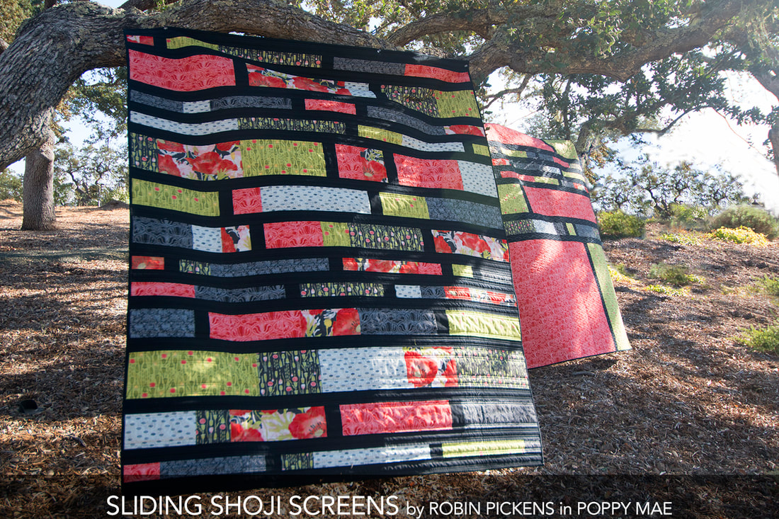 Some revision were in order and I also wanted to give more sizes. I have eliminated the companion piece made with leftover strips and have changed the cutting directions to fit better within 40" width of fabric (vs 42" so allowing for shrinkage of prewashed fabric). There are three sizes. Lap 63 1/2 x 74 1/2", Full/Double 80 1/2 x 90 1/2" and Queen 96 1/2 x 90 1/2". The lap is actually the closest to what the original Sliding Shoji Screens sizing was. 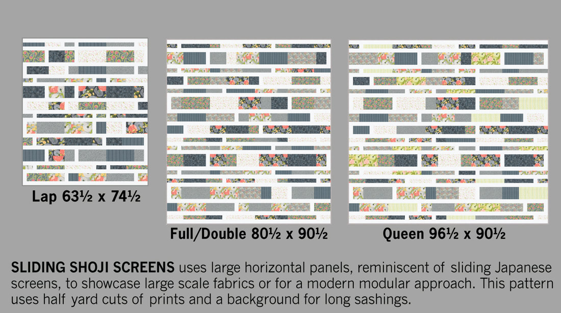 I love the crisp white sashings with the soft grays. For the queen size I've added in the cross stitch stripe and dandelions on green. I enjoyed making this sample in the Full/Double size and for a larger bed, I will place it with the stripes running vertically if I need that wider size. 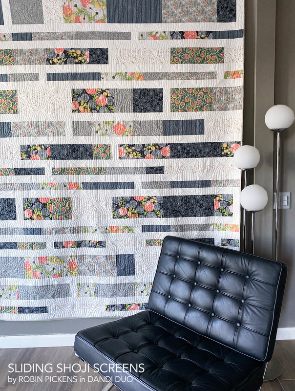 The pantograph I used when quilting this is Rondelle by Jessica Schick. I got it from Urban Elementz online shop. I placed the ovals perpendicular to the horizontal stripes of the quilt. 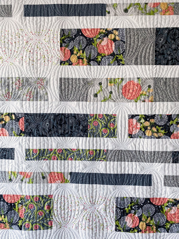 The fabrics used on this Gray/White version is listed below, plus another colorway that is a springy palette. 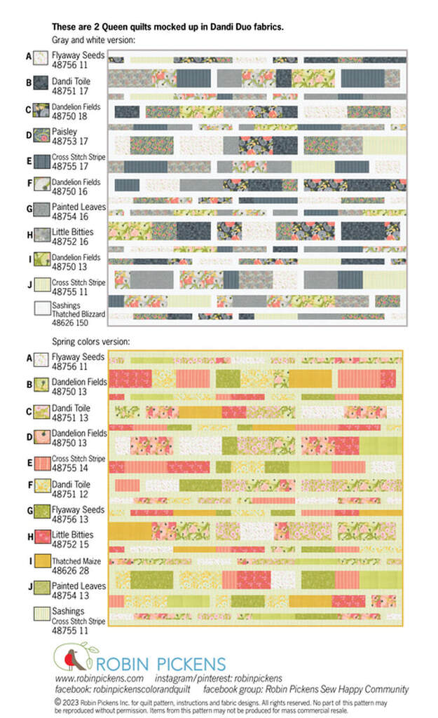 I think the cross stitch stripe would be a very fun sashing to run through the whole quilt. 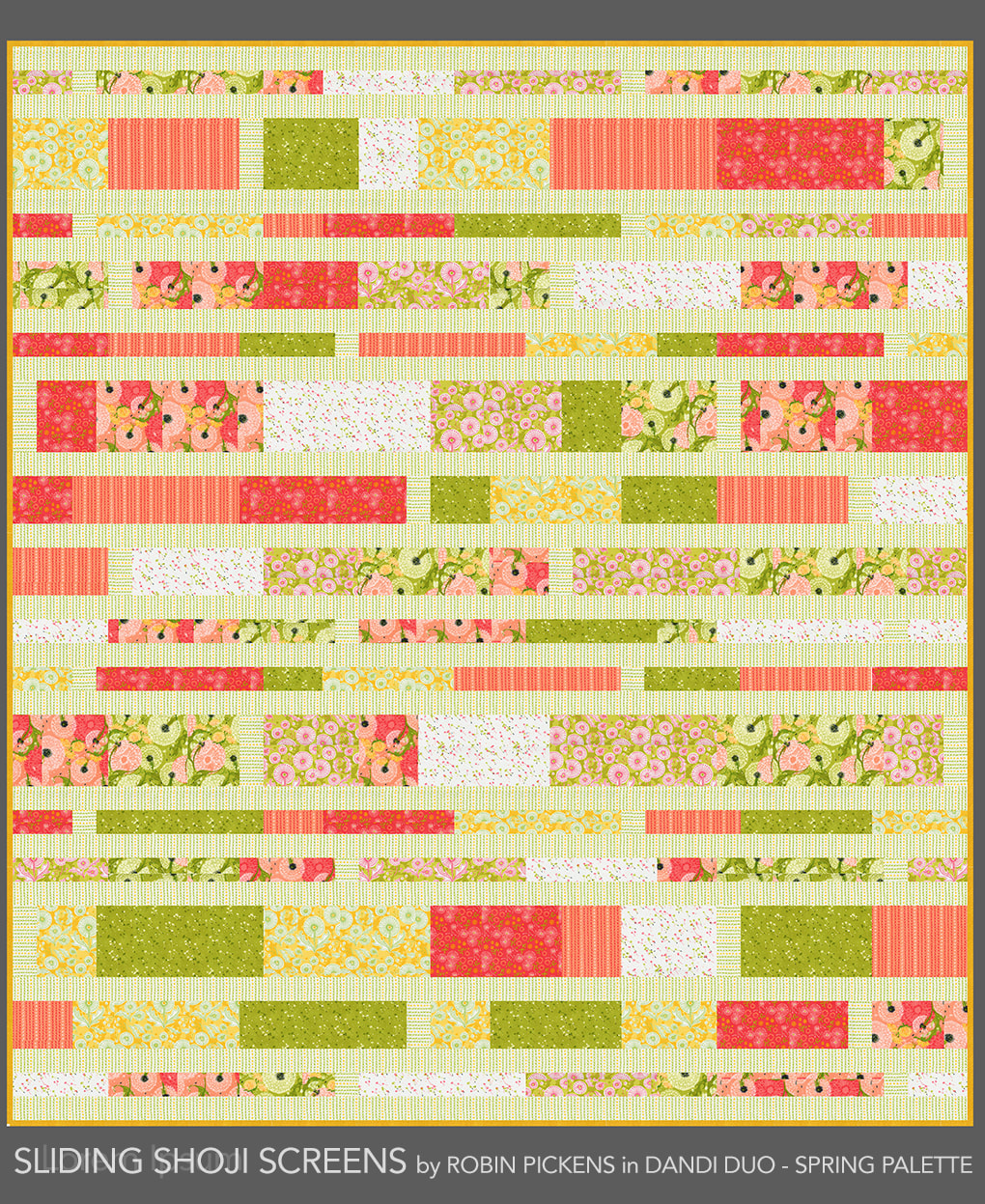 The original inspiration for Sliding Shoji Screens came from the desire to have larger panels to showcase bigger prints/fabric designs. There is a shifting balance between the larger rows and thinner rows and little moments of sashing separating within the bands. 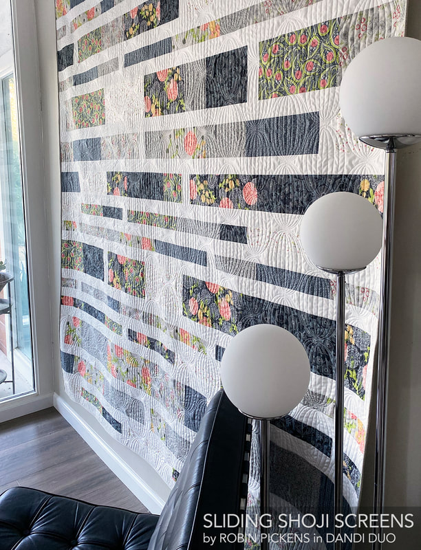 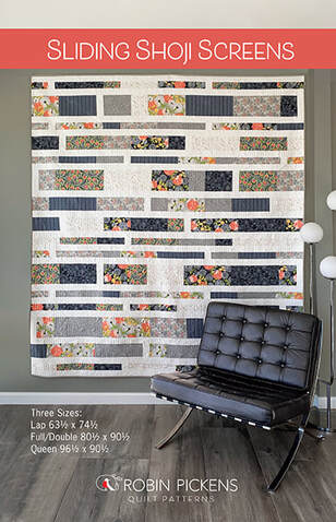 Sliding Shoji Screens uses HALF YARDS of prints. Lap needs (7) fabrics in half yard cuts plus 2 yards of sashing fabric. Full/Double needs (8) fabrics in half yard cuts plus 3 yards of sashing fabric. Queen needs (10) fabrics in half yard cuts plus 3 1/2 yards of sashing fabric. You can find the pattern at RobinPickensINC.com SLIDING SHOJI SCREENS Still two more patterns to share for Dandi Duo...Partial Eclipse and Posies Table Runner and Placemats! 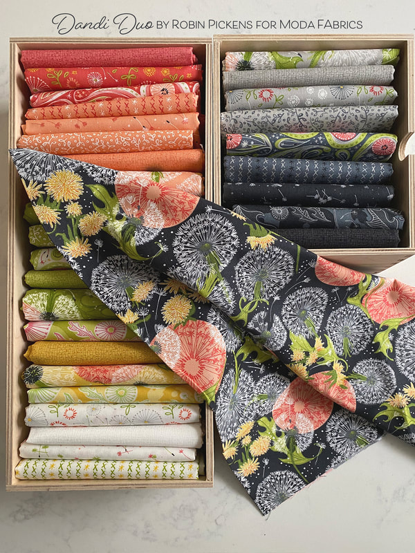 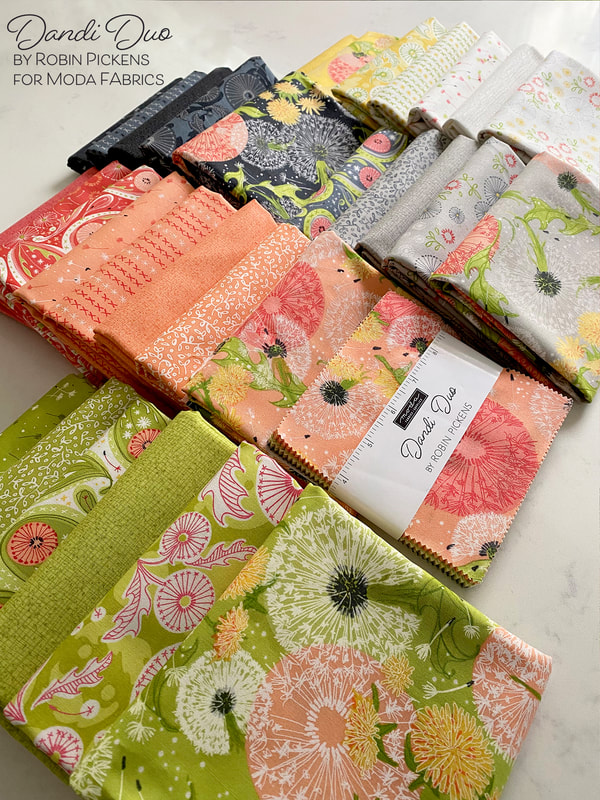 I revisited my pattern "FRINGE" with Dandi Duo. The original Fringe pattern was released with Dandi Annie for it felt fitting to give it an update with my dandelions, Version 2. Fringe uses a Layer Cake of 10" squares and a background fabric and sashing fabric. 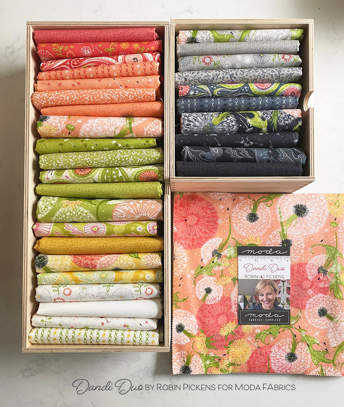 I made minimal changes to the quilt pattern but did eliminate the asymmetrical layout option that was in the first pattern and now included the specs and instructions to make the large square. There is also an option for a smaller 53 1/2" square lap size. 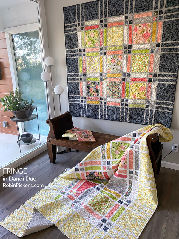 I've made Fringe in two colorways, both using a Layer Cake for the centers and different fabric for thin sashings and borders. The twin size (on wall below) has the Maize Dandi Toile for borders with Thatched Blizzard sashings. The large square size (on wall above) has the Graphite Dandi Toile for borders with Gray Thatched sashing. 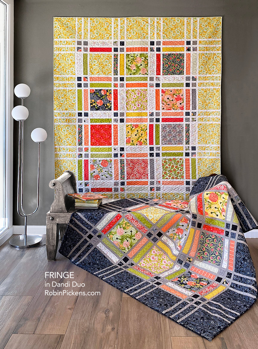 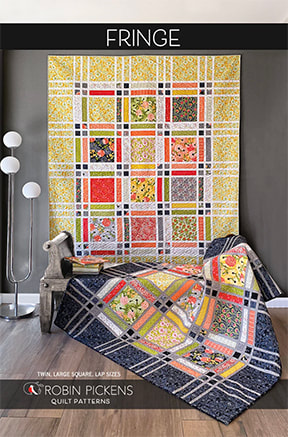 You can find the Fringe pattern in both print and pdf versions at RobinPickensINC.com. My etsy shop only has pdfs, so print versions for US and Canada mailing can be found at my online shop powered by shopify (www.robinpickensINC.com). click here: FRINGE PATTERN Other than the main dandelion print, I think the Dandi Toile, in the borders and especially this dark Graphite version) are my favorite print from this group. I love the 2 shades of background and linear drawings of the simplified dandelions. 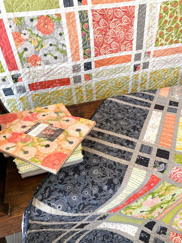 I also like how the "Cross Stitch Stripe" makes a lovely striped binding, as shown on the yellow version. 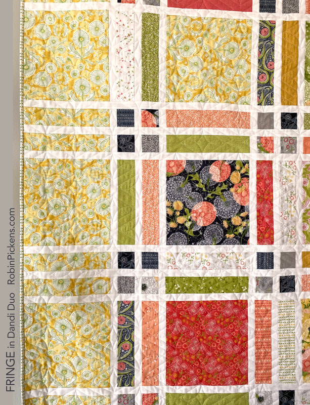 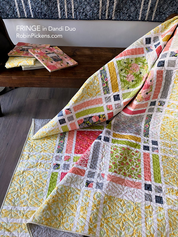 This is from the pattern back, showing the dimensions of the three sizes: 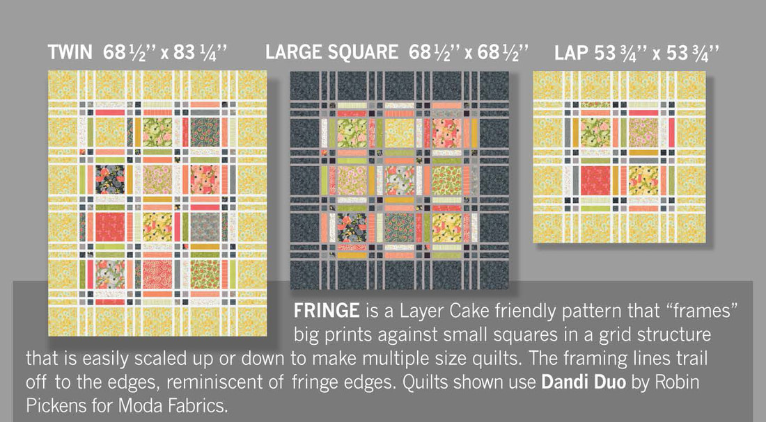 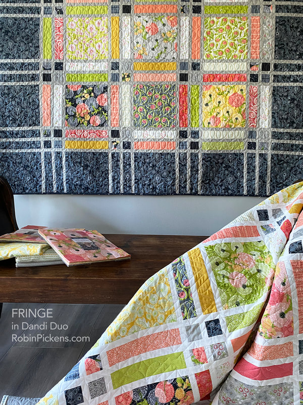 Keep reading on to see another "revamp" with Sliding Shoji Screens for Dandi Duo! 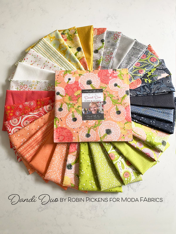 Dandi Duo fabrics arrived in December and with all the rush and excitement of the holidays, I didn't share much about it. Wow, how did THAT happen? So this is a little late, but Dandi Duo is still in shops now. I'm sharing some pictures for you to get a closer look. 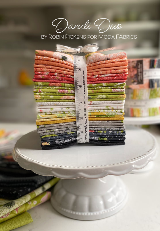 Dandi Duo is the sister collection to Dandi Annie, one of my favorite groups with big white dandelion seed puffs and lots of childhood memories. The beautiful and dreamy weeds are still growing strong and back for another season of blowing wishes to the wind. The main print in Dandi Duo features the big dancing seed puffs along with golden blooms that have yet to turn to seed, backed by big pink circles and flowing leaves. A simpler illustrated “Dandi Toile” and dandelion paisley coordinate with the group, as well as “Little Bitties” of simply sketched blooms and a “Cross Stitch Stripe” for a linear companion. “Flyaway Seeds” is a delicate print of seedlings in flight. 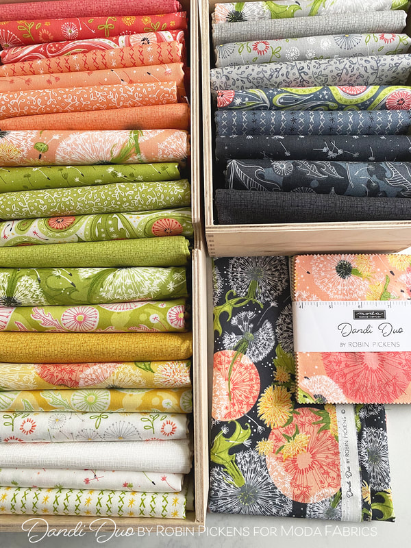 The existing colors of Thatched create the palette of Dandi Duo: Maize, Gray, Shadow, Greenery, Sugar Rose, Peach and Blizzard. These light and happy colors are balanced with the calm, serene nature of the grays and cool white. Don’t forget to add some Thatched 108” wideback fabric in Gray 85 or Blizzard 150 and Thatched premade Bias Binding in Gray or Soft Black to coordinate for easy finishing of your quilts. Here are some images of the color groupings: 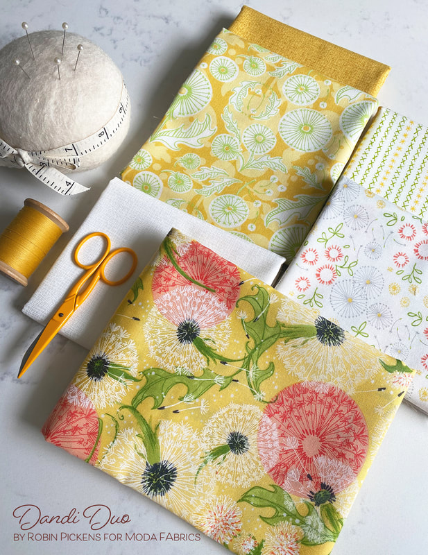 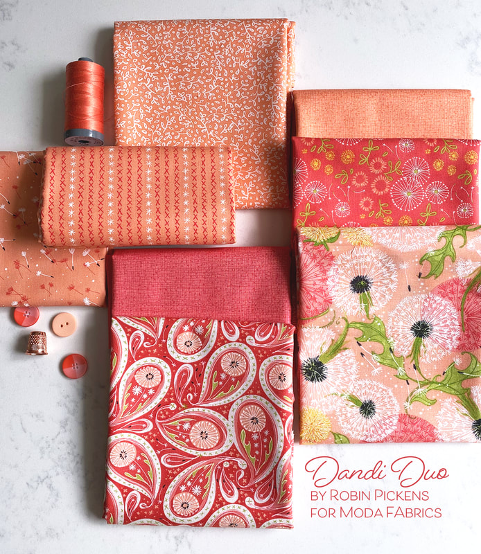 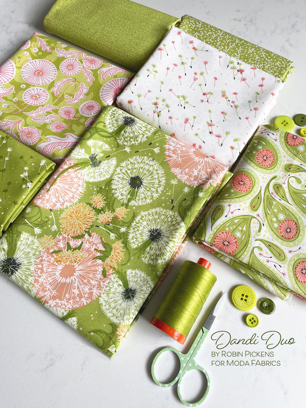 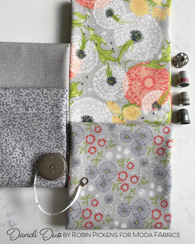 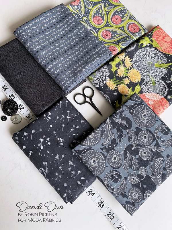 One part of finishing up a collection is finding some fun quote or thoughts you'd like to share on the selvage. For Dandi Duo I just had a simple thought, "Make a wish and blow! Let the seeds of dreams scatter and grow." Isn't that what we all believed as children? I still love the magic of blowing those seeds to the wind! 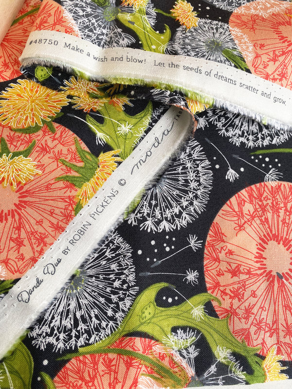 The Dandi Duo collection has 31 SKUs (which includes the 7 Thatched colors of Maize, Gray, Shadow, Greenery, Sugar Rose, Peach and Blizzard) and has precuts of fat quarter bundles, Jelly Roll 2 1/2" strips, 10" Layer Cake squares, 5" Charm Pack squares and 2 1/2" Mini Charm squares. 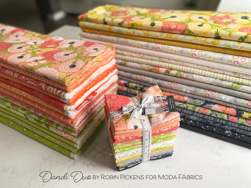 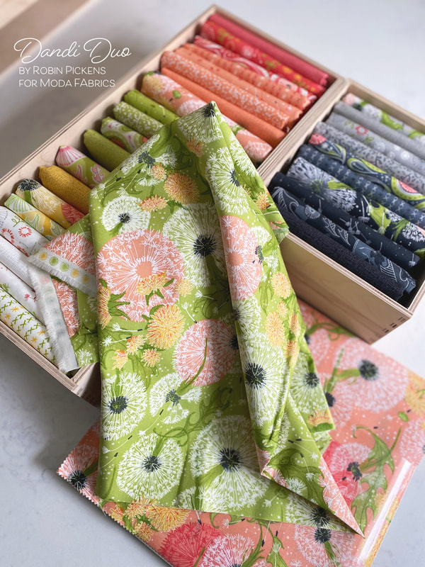 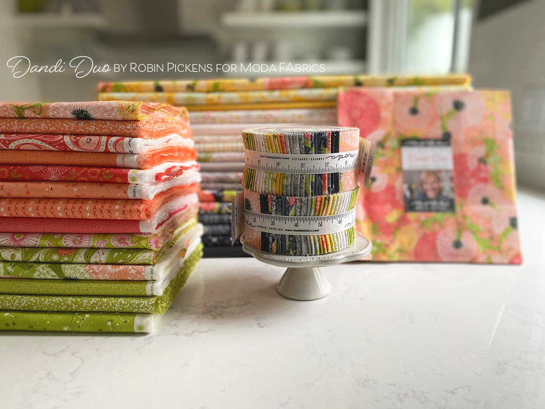 Dandi Duo feels happy and free. I hope it makes you as happy as it makes me! Read on to see more of Dandi Duo made up into some new quilts.
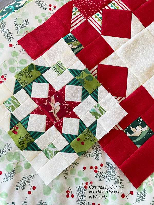
Happy sewing! Moda Blockheads Day! Time to catch up on a few things. 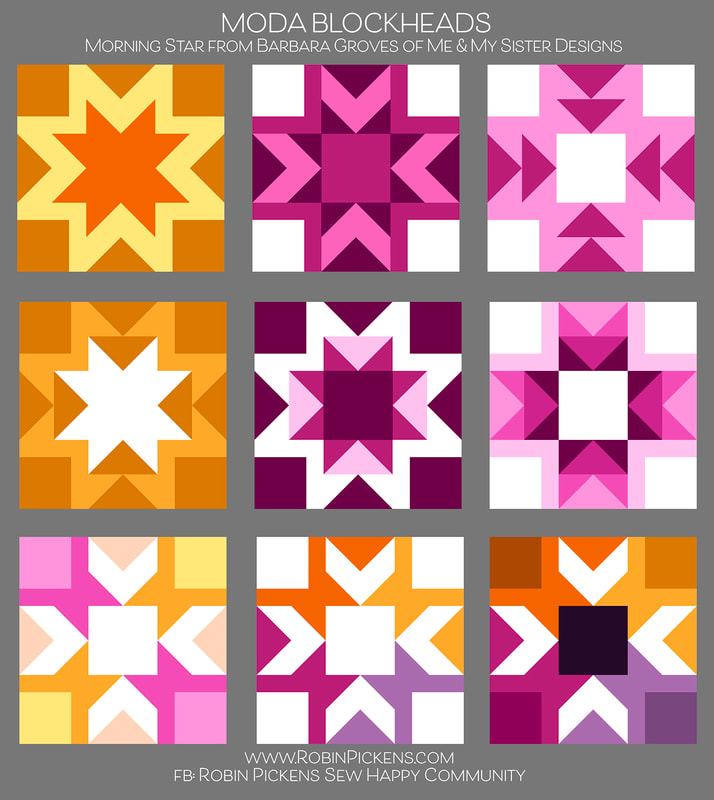 First off, color studies for this week's block, Morning Star from Barbara Groves of Me & My Sister Designs. Are you a supergraphic 70's star outline lover? Or prefer a row of flying geese arrows? Blocky sides? Arrow points towards center with different color corners? Such fun to play with this block and the outline that surrounds the star. This is an awesome block to play with. Thanks so much Barbara. 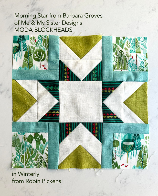 This is my block that I made this week in Winterly fabrics. I decided to make those outlines in the corners the Seafoam color to bring in more of the cool tones in the tree prints in the corners. I liked having a darker green in the center star points in contrast with the Chartreuse sides. 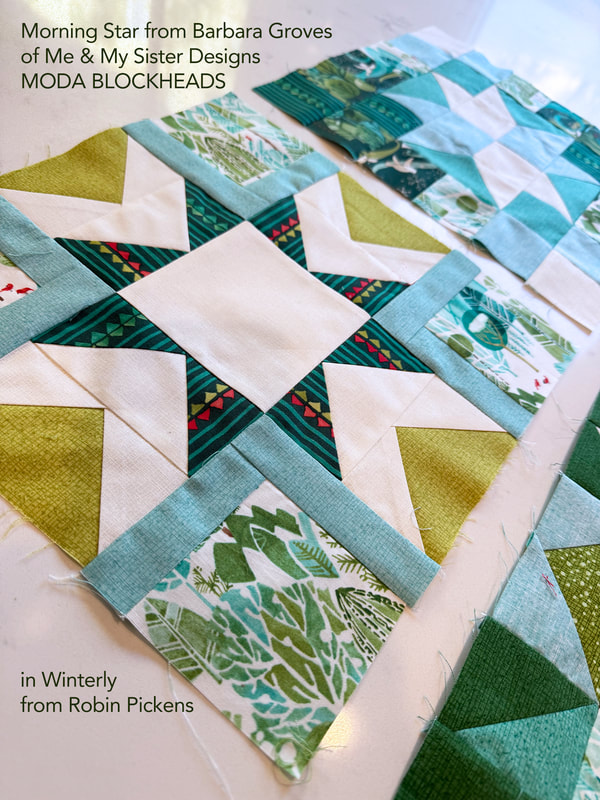 Back in the first group, when I showed my block, I sewed it up in Winterly fabrics and I knew I wanted to make a Christmas quilt, but didn't have a plan. I have numerous Christmas quilts but none done from a sampler or from a sew along. It took awhile to think about it but now I have a plan. 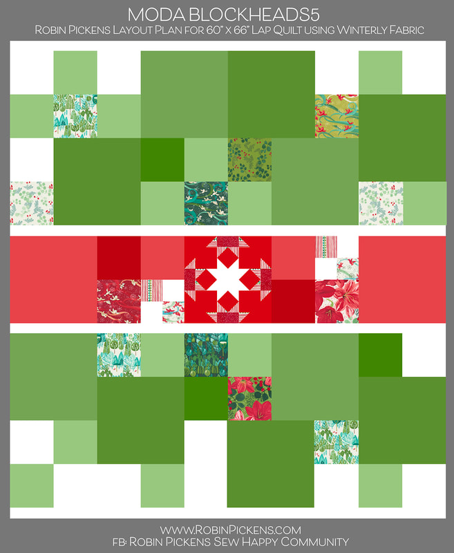 For the past 2 Moda Blockheads quilts, I've made very structured medallion and linear quilts. I wanted a quilt for this one that felt a little more free-flowing but organized. The star blocks seem like the perfect opportunity for a holiday quilt. You can see my first block I made, my "Community Star" block (group 1, block 8) on my previous blog post. Most of my Christmas quilts have a lot of red color so I wanted this to be more green-focused, using more of the tree/landscape/greenery/bird prints from Winterly. The quilt will use a mix of 6" and 12” green blocks, in a flowing arrangement, with a band of red blocks running as a band through the center. I will also intersperse 6" squares of fabrics from Winterly to show off those fabric design, coordinate with the blocks, and fill in any needed spaces. The Thatched colors that I am using along with the Winterly prints are Thatched Cream 36, Crimson 43, Pine 44, Ocean 144 or Dewdrop143, Seafoam 125, Spring 54 and Chartreuse 75. There is a larger group of greens to go with the larger percentage of the quilt and add interest by mixing the warm (Chartreuse) and cool (Seafoam) greens. 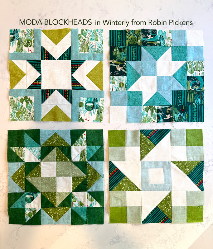 Now that I have decided on my plan, I have some catching up to do! According to this layout, I need about 10 of the 12" blocks and I worked on 4 of those. The blocks above are Morning Star, Super Scrappy Star, Bright Star and Shimmer Star. As I do blocks, I keep track of my progress by filling in my layout image. Since I do color studies, I make up these blocks in Adobe Illustrator and can easily swap in my Winterly fabrics for my layout. This helps me see what I am missing and how to keep the balance of color and light and dark. 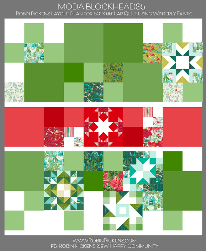 I was a bit late in figuring out my plan and now have LOTS of catching up to do (and I'm sure no one else is in that predicament, right??). I'll share past color studies that I posted in the facebook group along with blocks as I make them here on the blog. This week I made the 4 blocks. The first color study for this week is at the top for Morning Star. The very first block of group 1 was from Betsy Chutchian, called Bright Star. 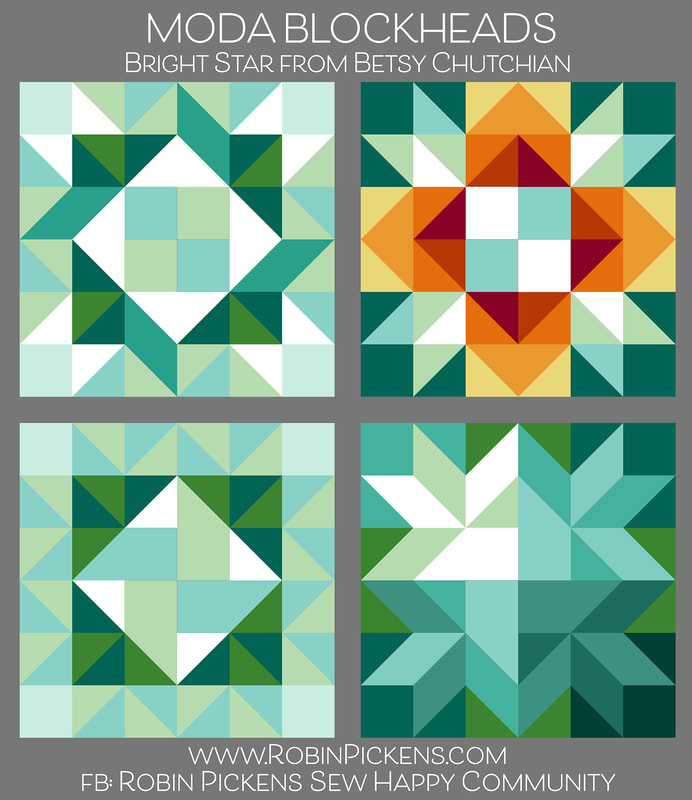 Well, I could have played with this block all day long since there are potentially so many things I could try. I loved the little ribbon like corners and honestly, I think this block is a little busy and I should have limited the number of fabrics and colors I was using. But that is okay since I can balance this out with other, simpler blocks or just the Winterly squares around this. 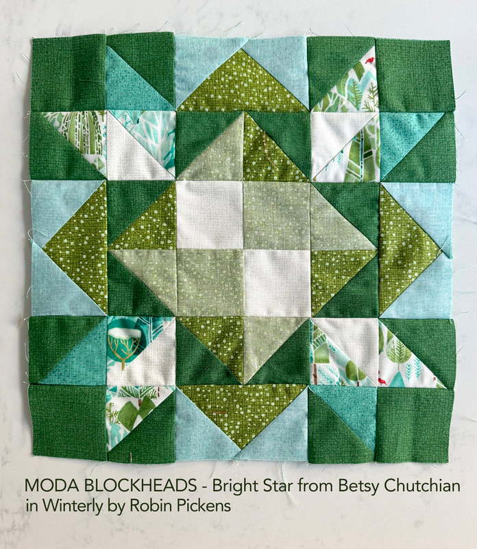 I've also made Super Scrappy Star from Corey Yoder. This was from group 1, block 4. I liked the last of the color studies a lot with the lighter center star and two corners trailing off to darker shades. 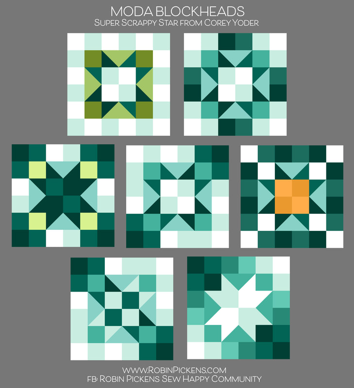 On a block like this, I am using Thatched fabric and also flipping it to the back side to get that lighter shade of the color (the more chambray-looking ones). I just noticed in the photo that my lower left seams are not matching up so well. Hmmmm. To fix or not to fix? I'll probably end up fixing it... 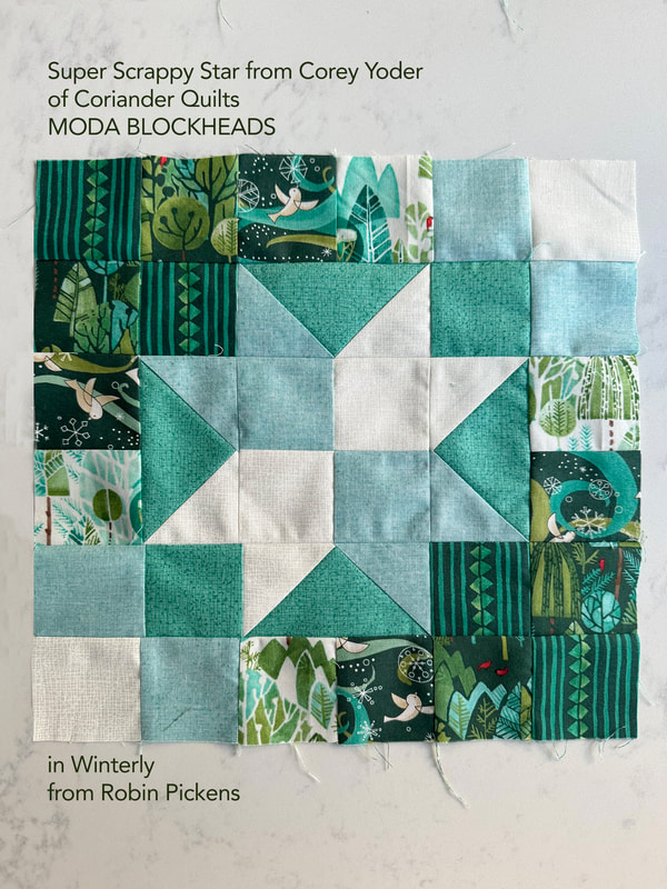 This is last week's color study for Shimmer Star from April Rosenthal. Arrows, checkerboards, ribbons and pinwheels! And yes, stars. 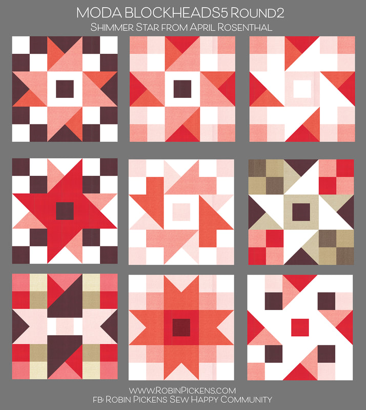 My actual block based on the top row, far right, color study image. I like how Thatched Seafoam (backside) and Spring go with that Pine stripe from Winterly. 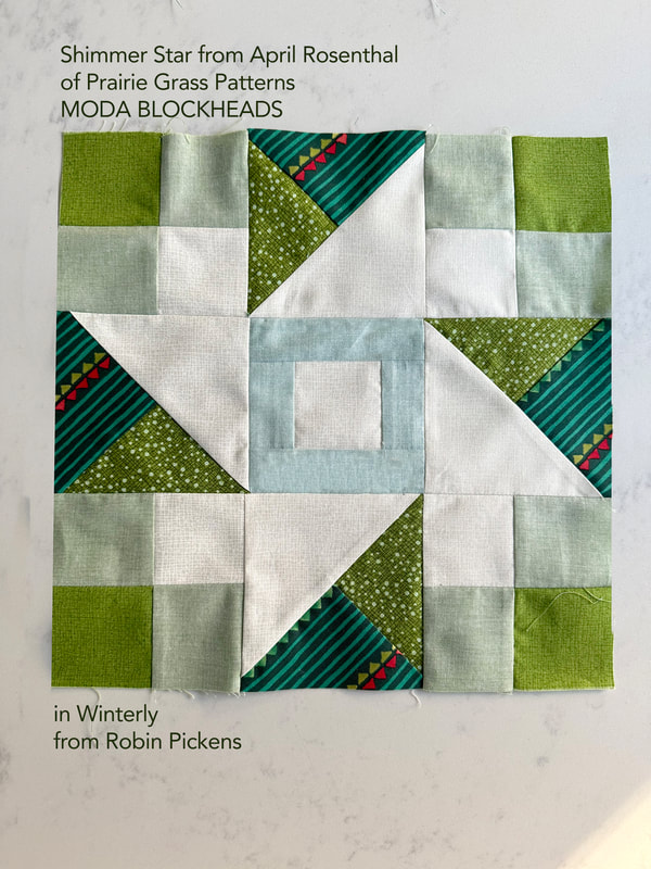 I don't think I'll be getting around the the paper piecing on this block, so I'll post the color study now. This was group 1, block 3 from Brigitte Heitland of Zen Chic, called Stellar Elegance. It sure is elegant! And I love how it can be a split day/night image. 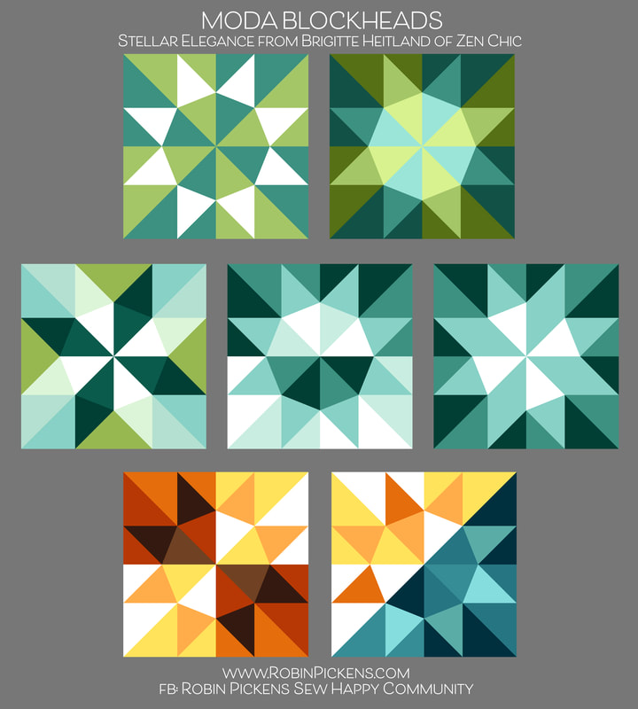 For my next round of blocks, I think I will focus on some of the smaller sizes. This shows the scale change between the 12" and 6" block sizes (and this is one of my Community Star blocks). 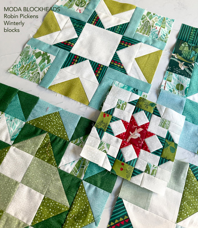 Now that I finally have it all planned out, I get to do the fun part and SEW! Well, the color studies are also a fun part for me as well. I am often surprised by what pops out as I play on the computer. But there is such a satisfaction of seeing those happy fabric blocks evolving when sewing and feeling and working with cloth and thread. 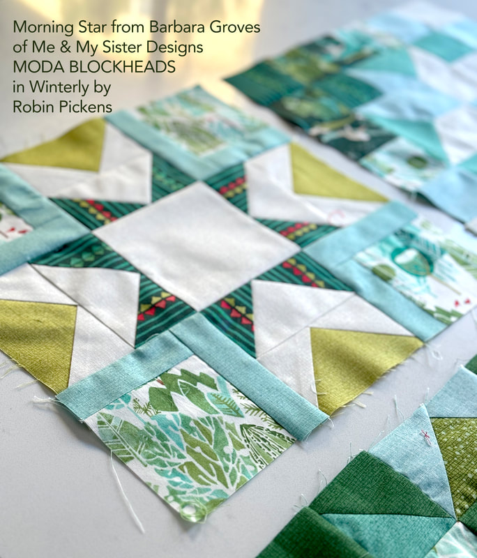 Keep up with my progress and share your own projects through my Facebook group "Robin Pickens Sew Happy Community" where you can also ask questions and be in community with other quilters. Hope to see you there! You can also find me on Instagram and Pinterest @robinpickens as well as on youtube. Happy sewing in the new year! 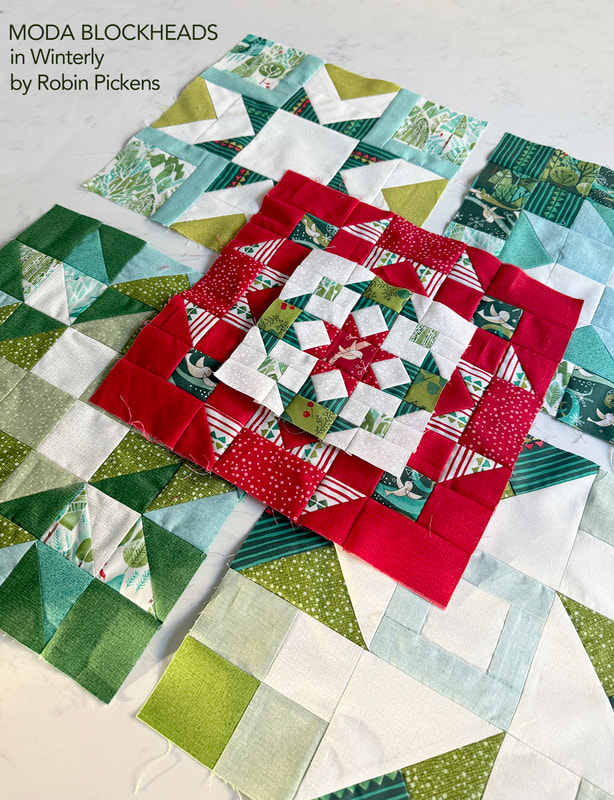 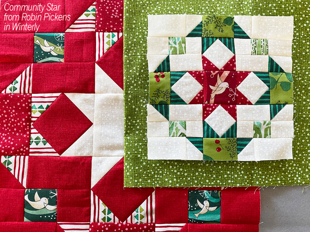 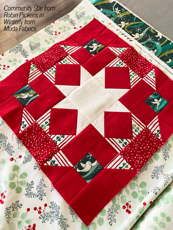 My week for Moda Blockheads! Yay! I am newly back from Quilt Market in Houston (just arrived home late Monday night) and woke up Tuesday morning with the thought of "BLOCKHEADS!!" When I am getting ready for Market, a lot of other things get pushed to the side and making my block became the task of the day. Seriously, I made my block instead of unpacking my quilts and clothes from the trip! 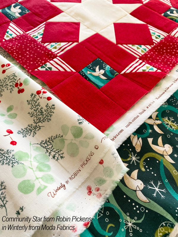 I knew I had to make my star block in my new WINTERLY fabrics that I was just showing at Market! I'm going to be making a holiday quilt to go along with the line and that is why a lot of my color studies have been skewing towards the greens in color...my brain has been piecing Christmas quilts for months. The 12" block I made has a mixture of Crimson Thatched AND Dotty Thatched (which we mix into a line from time to time and reminded me of snowfall for this winter group) and a cheery striped print and some of my whimsical flying birds. I used the Dotty Thatched Cream for the background of the smaller 6" block with greenery and pine stripes for the side stars and a red bird in the center. My concept for "Community Star" is the idea that one star is in the center and the community of others is surrounding, supporting and reaching out to it. There are 4 partial stars that show half their star-bodies and reach out with points to touch the center star. So very often in quilting, we are reaching out and supporting and connecting with each other. It is really an activity that thrives with strong community. And Blockheads is an active and fun community so it seemed fitting. 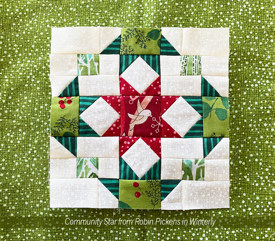 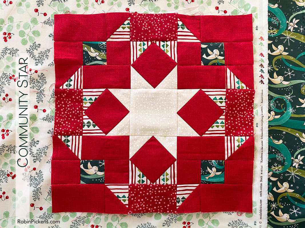 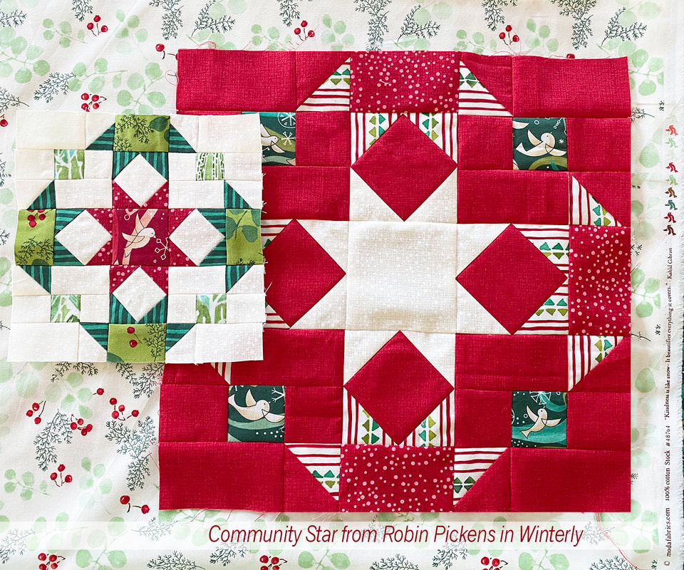 As I read through the directions for my designed block, I realized I needed to share another version of construction for anyone who uses stripes like I am to allow the stripes to be horizontal and vertical. The way the directions are written would split the H and I squares diagonally and sew them to the G square, but the lines would be going diagonally in my final piece. So I did a variation that does take a little more fabric but uses a simple "stitch and flip" with corner squares to achieve the triangles. Using this method allowed me to position my stripes so they always looked like they were coming straight from the sides of the edge stars. If you would like to use this method, these are my changes: 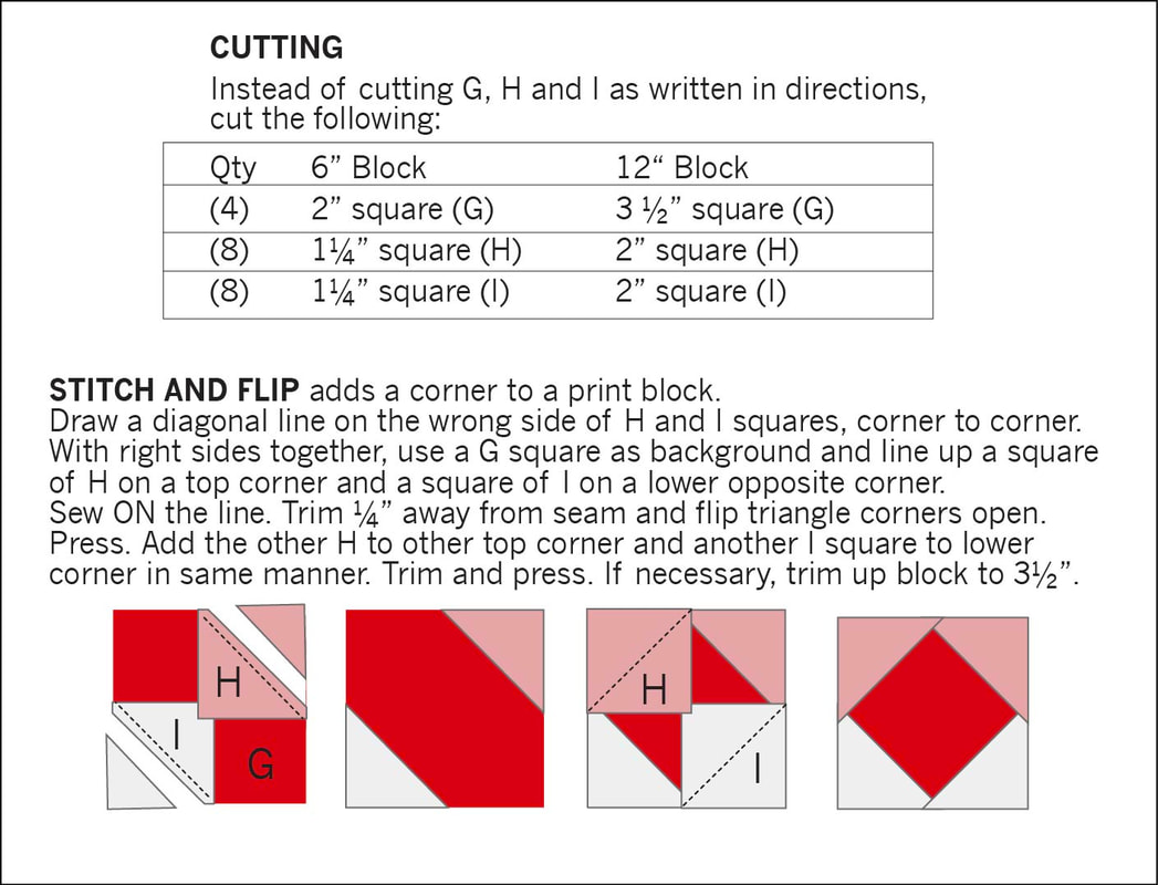 Instead of 4 squares of H and I, you will need 8 of each. Sew them to the corners and flip open and trim, similar to how you make traditional flying geese. After pressing open the opposite corners, add the other 2 corners. Just make sure to press open first (or am I the only one who has forgotten to press open a flying geese side before adding the other square?) Whichever method you choose, I hope you have fun making these star friends! Of course I had to share some color studies with you for this block too... 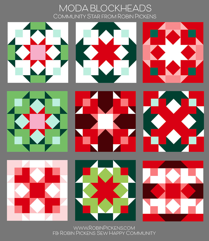 Like I mentioned, I'm thinking Christmas, but you can imagine any colors you like in here. Just substitute and think about those light and dark spaces. Stars can be the same colors in the centers as the points or multiple values of light and dark. The top two probably best illustrate the idea of stars reaching out in community to the center best. It is also fun to look at those outer star shapes as bowties or the center blending into a big X. How about a lighter outer border or a suggested churn dash relative in the white background shapes? Emphasize dots or lines...have fun! You can download the pattern here from the blue DOWNLOAD FILE below. Or visit the facebook page or Moda's blog.
 I'll be making some of the other blocks and sharing them in Winterly fabrics. Winterly will be shipping in May of 2024. It features Amaryllis lilies, birds flying in swirly breezes, hillside landscapes of trees, dotty Thatched, greenery, stripes and a triangle print with holiday motifs. There is also a panel with 4 square bird blocks and two horizontal treescapes. I'll share more pictures and the quilt projects in the next blog post. I've got new Christmas cross stitch to coordinate and it was very fun to share it all at Quilt Market! If you are new to my world, I hope you will consider joining in on the Oak Grove Square sew along. I delayed October due to Quilt Market but just started in September on a monthly sew along. Want to sew some mushrooms? That is the first month! Check out my Facebook group "Robin Pickens Sew Happy Community" where you can share your projects with my fabrics and patterns or ask questions and be in community with other quilters. Hope to see you there! You can also find me on instagram and pinterest @robinpickens Happy sewing! 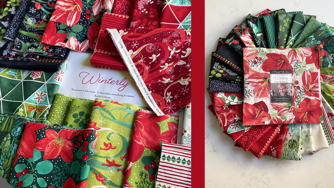  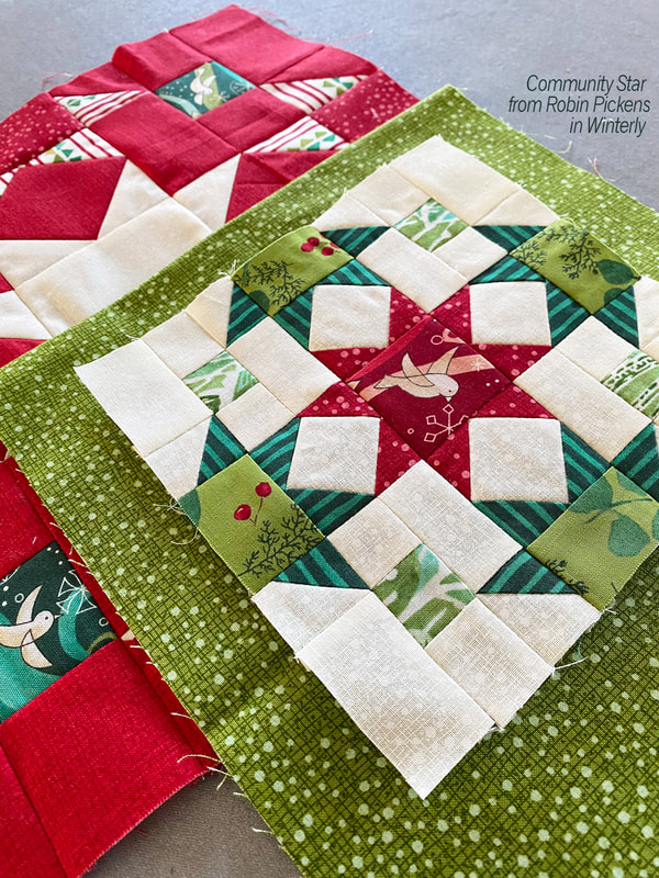 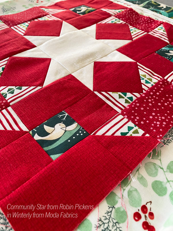 Back when I did the Splendid Christmas line I created a wall quilt called Cardinal's Christmas Wreath. It was the first bird quilt I did and started my love of making bird blocks! I've now sized the bird to various different sizes and still have fun making my flying friends. I also started thinking about this bird being for different seasons and not just Christmas. The first ideas for Fall started like this, with the idea of a Fall wreath: 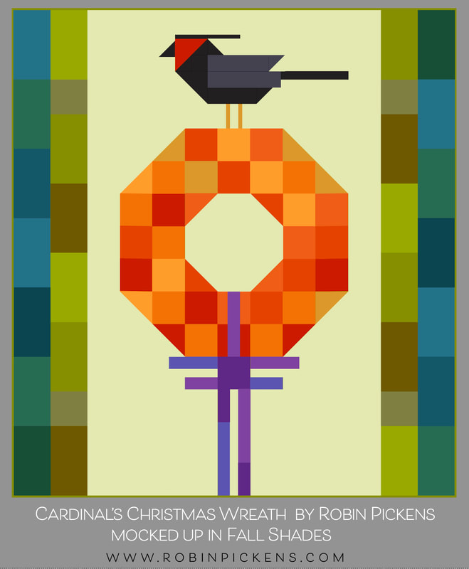 And then I thought about dropping out the bow and also experimented with a black background with a green bird. What if I filled in the wreath so it was more like a pumpkin? 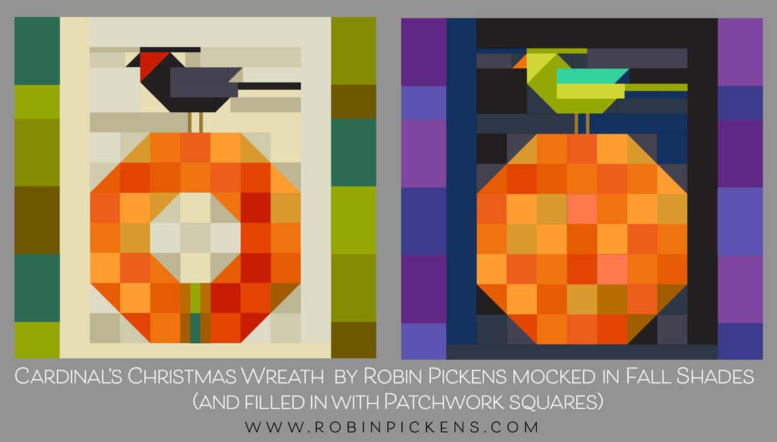 I took this idea (the one on cream) on retreat with me to play with along with some scraps of Thatched fabrics I had. The pattern "Cardinal's Christmas Wreath" has two sizes, a 54 x 60" large and 45 x 47" medium size wall. I have made the larger one for Christmas and decided to do the smaller size for this autumn one. 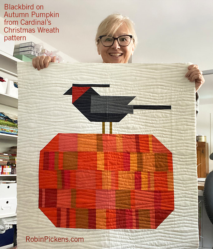 This really was a fun, smaller sized project to do AND I used all scraps. I did make some other changes as I experimented and made rows. First off, I dropped the borders on the sides. My finished quilt is 30" across and I thought that was a good size for a wall space. I also liked how the pumpkin looked more squat and horizontal so I kept the size height of the rows but just used less of them. And my corners for the pumpkin use one half square triangle at the ends, vs on two rows for a more angled corner. What does this look like as a diagram for better understanding? This is the structure and it follows the bird pieces and construction as written in the pattern. 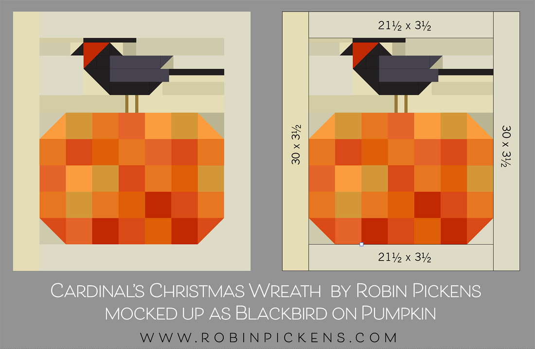 Again, I'm using the smaller size in the pattern (numbers in red in the pattern). The pumpkin would be filled in all the way across with no opening for a wreath. There are 2 LESS rows of blocks for the pumpkin body. only the top and bottom rows have a half square triangle at the very ends for rounding off the shape (vs two rows). I have still constructed my bird with the 21.5" piece on top as is called for in the pattern. But I'm using an extra one on the bottom and using 30" x 3.5" strips on the sides. This means there are a number of background pieces you would NOT need to cut (if you are not doing this as a fall wreath). This would need 3/4 of a yard of background fabric (vs a full yard). Instead of the list on page 3 for Background, you would cut this list: 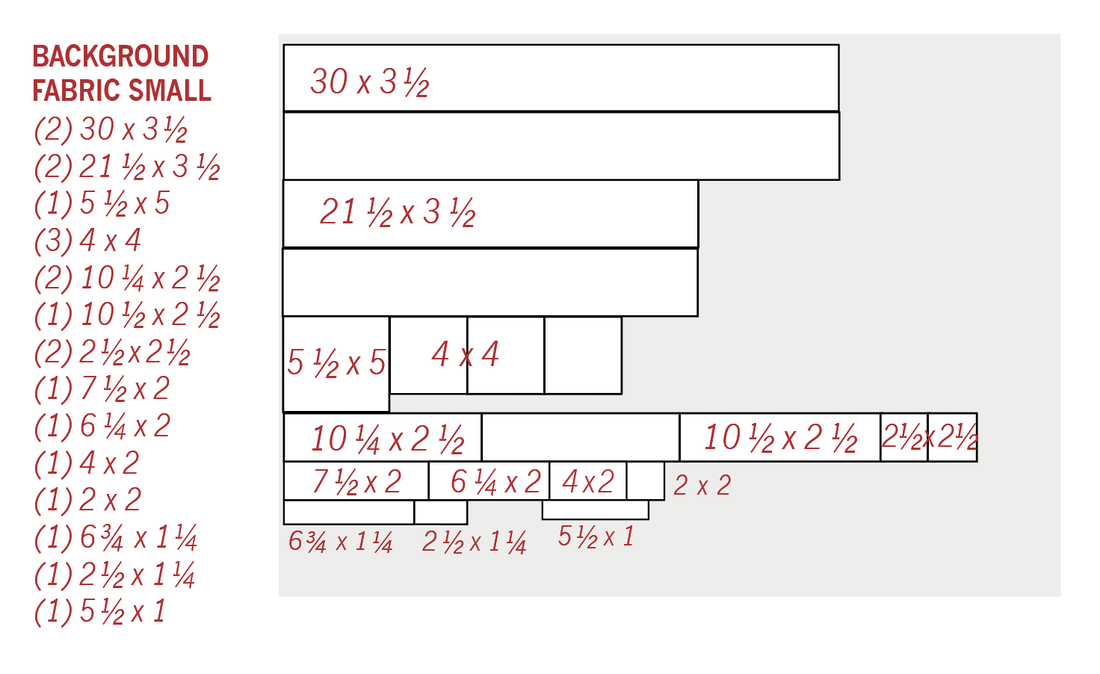 Of the (3) 4 x 4" pieces, (2) of them are for corners and one is for the bird's chest. I have taken out the pieces for the bow and wreath insides, wreath bigger corners and adjusted for the new size of surround with the background. On page 1 the green fabrics shown are for the wreath. If you are making a filled in pumpkin that is more squat but made from all squares, cut: (2) 4" x 4" for corner HST (31) 3.5" x 3.5" squares in a mixture of oranges/fall fabrics. Page 2 shows pieces in red fabric and charcoal fabric for cutting the birds. Flip the colors so you are cutting the BIRD BODY from black and the (1) 4 x 4 from bird's mask color (mine is Smoked Paprika). Do not cut the bow pieces unless you are making as a Fall wreath version. It is up to you if you use the borders. If you do not want the border, skip cutting those from bottom half of page 2. I did not use all squares on my pumpkin. I made my quilt with a more improv approach using my scraps. I cut them all around 1", 1.5", 2", 2.5" and 3.5" in width while keeping them all 3.5" high. I made strips and trimmed to the 21.5" length. The Thatched colors I used were Tangerine, Clementine, Apricot, Citrus, Masala Spice, Rose, Pink Grapefruit, and Smoked Paprika. 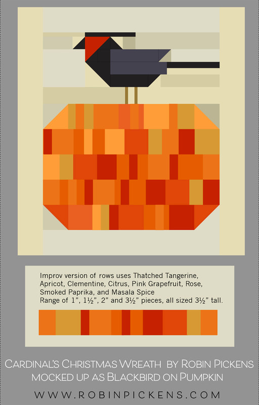 These notes have not been to an editor and I'm trying to have them be as accurate as possible. I did notice the pattern does not say on page 7 that the background piece between the bird's legs is the 2.5" x 1.25" piece (and that is 2.5" as written in the list and not the 2.75" shown on the diagram). I've got Cardinal's Christmas Wreath on sale currently for half price. I hope you like this Fall version! I think it could be cute to add a green wool leaf to the top of the pumpkin! The pantograph I used for longarming is RICH GIRL (extended width) by Longarm League. I used it in the default size I believe. Happy Fall! Check out the pattern at RobinPickensInc.com!
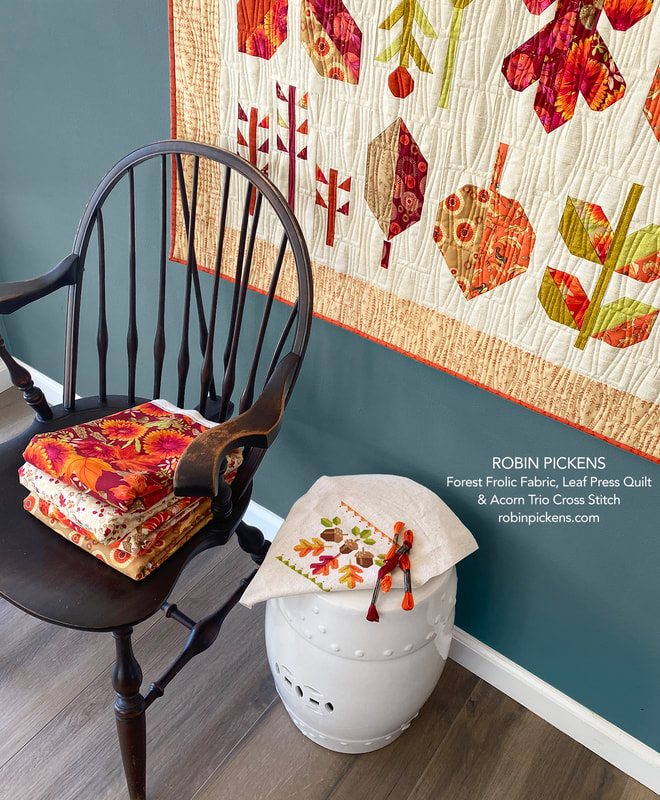
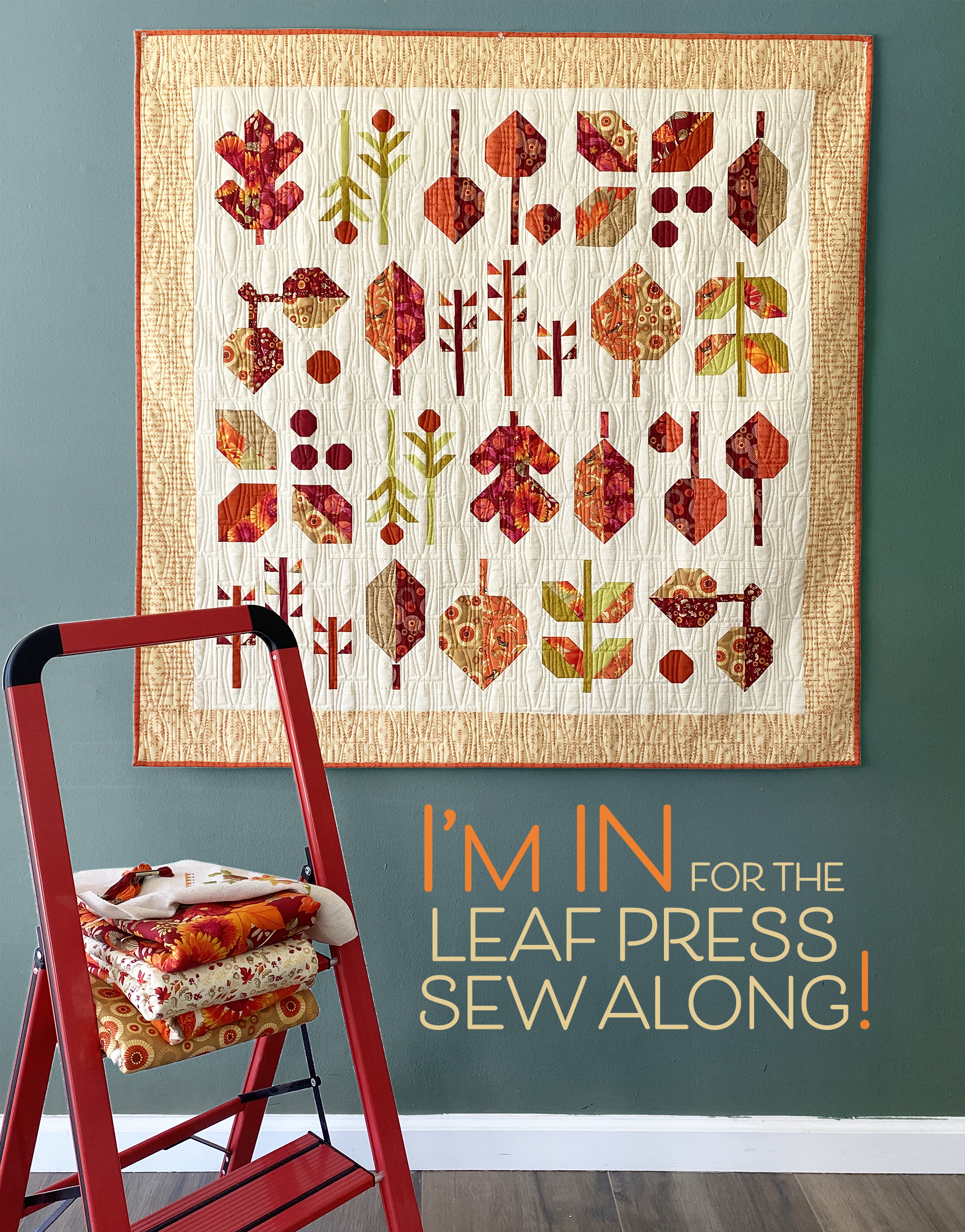
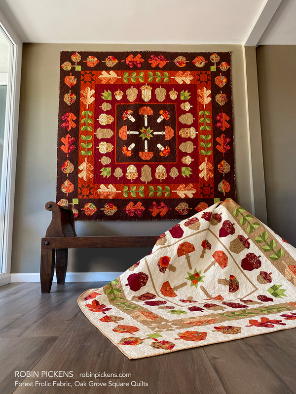 Hello September! It is time for my OAK GROVE SQUARE sew along to start soon! I feel like the weeks have been rushing by so quickly and I'm still trying to catch up. I originally hoped to start Oak Grove in the beginning of September, but due to me being a little delayed getting this info out, I'm starting further into the month. Just like I did for LEAF PRESS, I've played around with some alternative Thatched palettes. My pattern is written to the Forest Frolic fabric and I've made the quilt in Forest Frolic and have both the light and dark version. Because of that, I'll be sewing for the sew along with one of the Thatched versions. 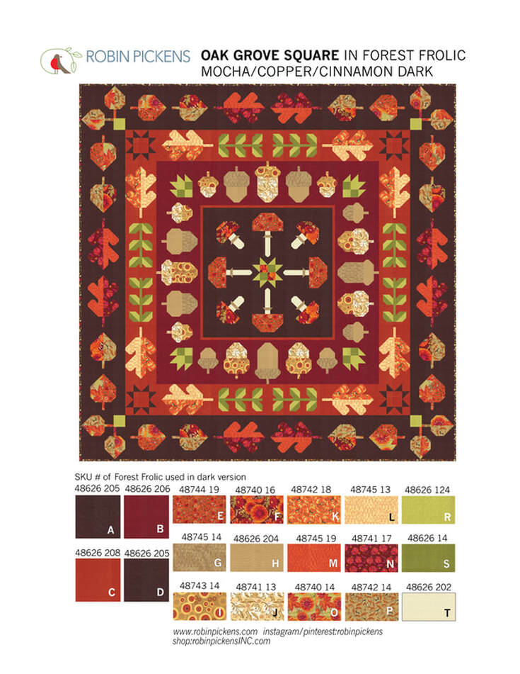 A couple explanations about the quilt first. Finished size is 72 1/2" square. The motifs are of fall leaves and acorns and mushrooms with some leafy stalks and corner stars and patchwork center star. It is a medallion quilt that has a center square and radiating "rings" (or square borders) surrounding it. You can make this quilt with all one background color or make every row/border/ring a different color. On this dark version I've used the new Thatched Mocha for the center and outer row. The Acorns are on a Cinnamon border and the green leaf stalks and some Oak Leaves are on a Copper border. 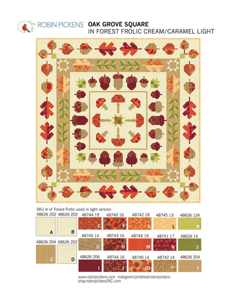 This light version uses Thatched Buttermilk for three of the backgrounds and Caramel for one of the rows. Because of the options to use different background colors, the sections are cut and written in the pattern according to the rows. If you decided to use 4 different backgrounds, you'd need: Background A..... 3/4 yard (you can use 2/3 yard but it is tight so 3/4 gives you more room for play) Background B..... 1 and 1/3 yard Background C..... 1 and 1/2 yard Background D...... 2 and 1/3 yard The prints needed are 12 Fat Quarters of prints (Fabrics E-P) and a couple additional accent fabrics of greens for leaves (1/2 yard for Fabric R and 3/8 yard for Fabric S) and 1/8 yard or Fat Eighth for Fabric T used for mushroom stalks. The blocks all use construction for half square triangles, flying geese and stitch and flip corners. It is regular piecing and not foundation paper piecing. No applique (although feel free to add any embellishments to your own quilt with an applique addition). 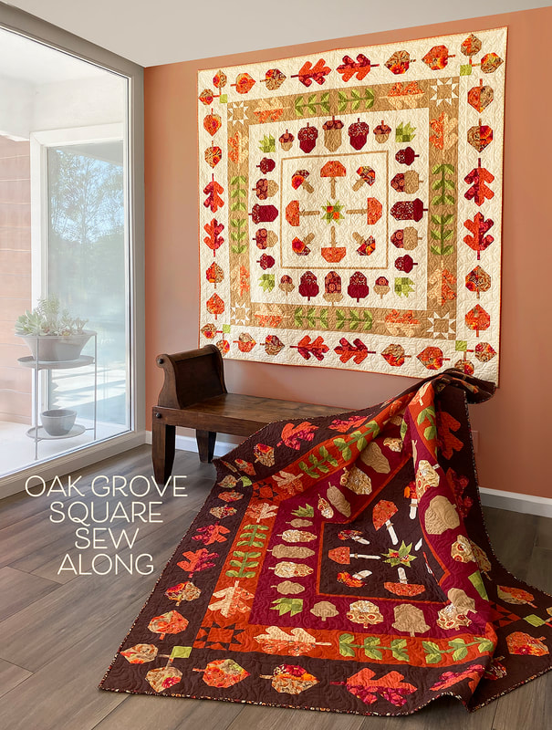 As I worked on the Thatched color studies, I wanted to try versions that felt like they went with the fall season but were not ONLY about fall. I liked this version on Cream Thatched with a Pink Grapefruit border C. This feels light and playful on the crisp cream background, thus the "Lighthearted Fall" name. 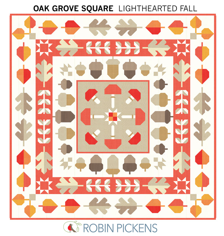 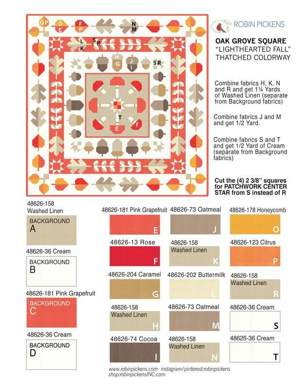 And by simply changing the outer Background D to Smoked Paprika and Background B for acorns to Buttermilk, the feeling evolved to a richer color scheme for "Colorful Fall". 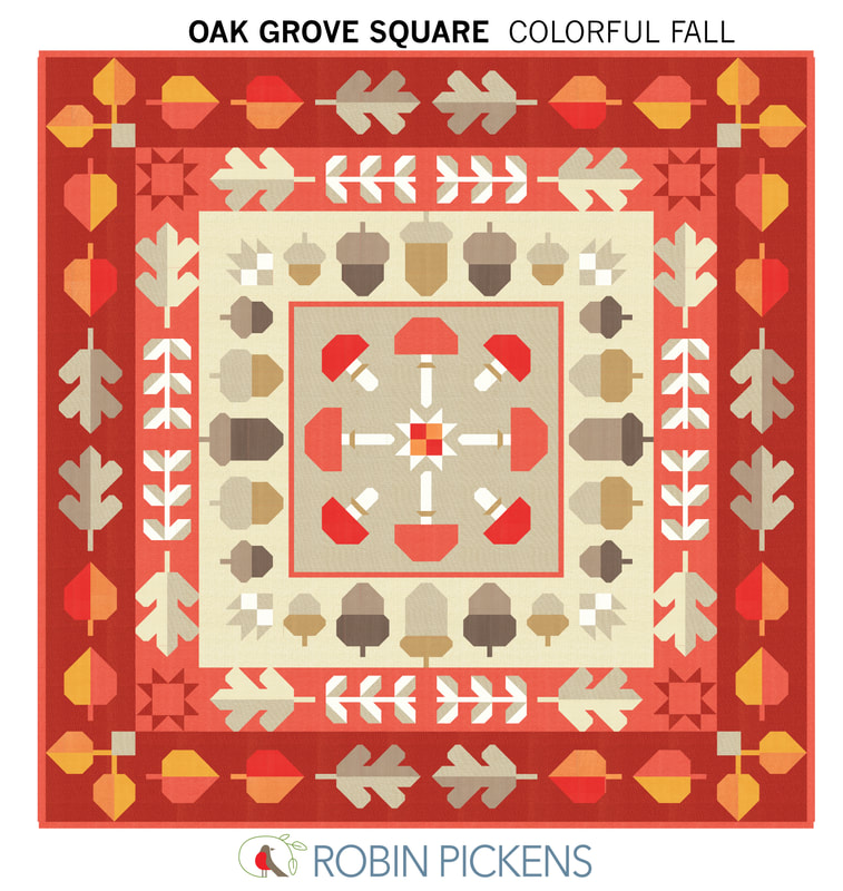 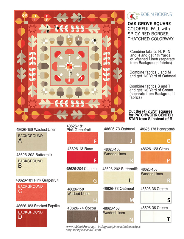 Lets go darker and more dramatic! "Dark Drama" uses Thatched Soft Black with a row of Olive. Lively Passion, Honeycomb, Cranberry and Tangerine give a sparkle of warm bright colors. 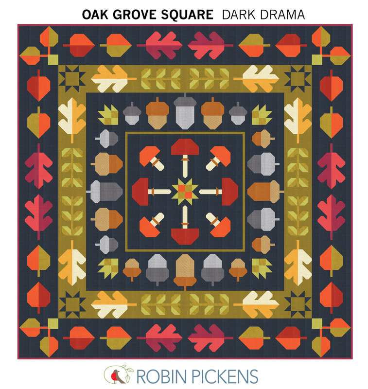 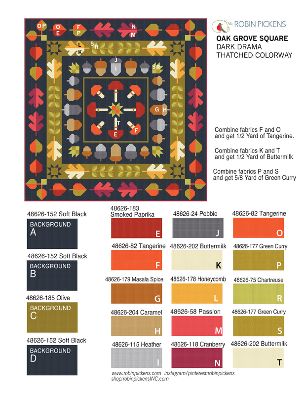 And one more...using colors that stray more from fall and have "Cheery Brights" to make an Oak Grove Square that is fit for year-round fun. 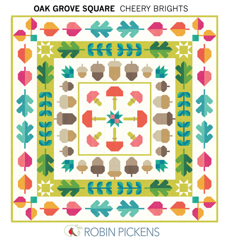 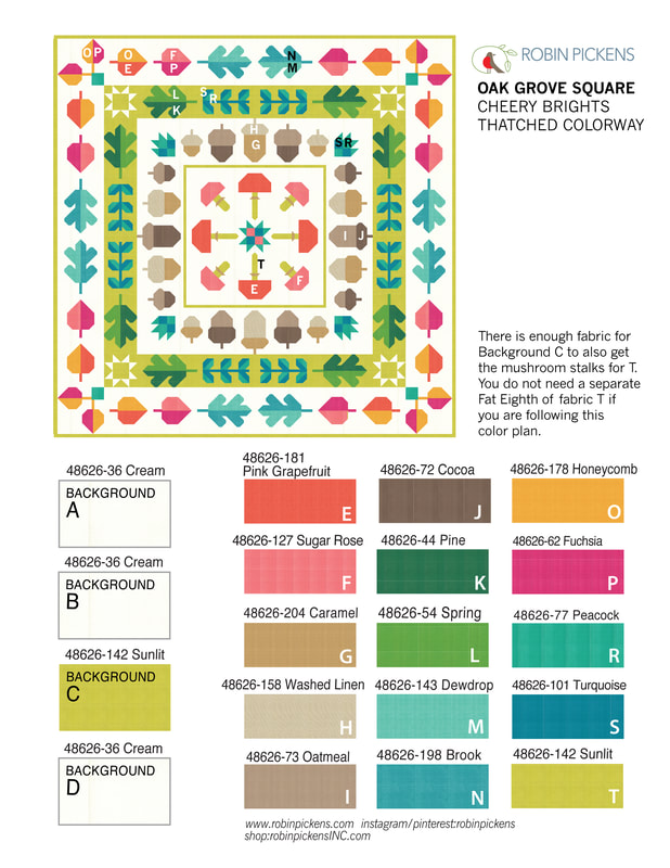 What about the details of sewing along? Where and when? Where: Share your progress and watch videos through Robin's facebook group. Join the facebook group "Robin Pickens Sew Happy Community" at www.facebook.com/groups/762206228564958 For those of you who don't do facebook, I'll be sending the videos to youtube but there is a delay till my video helper (Mr P) can do it on the weekend. Youtube channel is www.youtube.com/channel/UCNFGL95Mw4YSj98_k5RakqQ Oak Grove Square will be a monthly sew along with a group of blocks each month. This is the schedule and I'll be doing my first video on preparing on Friday, September 22nd at 10am on a facebook live in the facebook group. 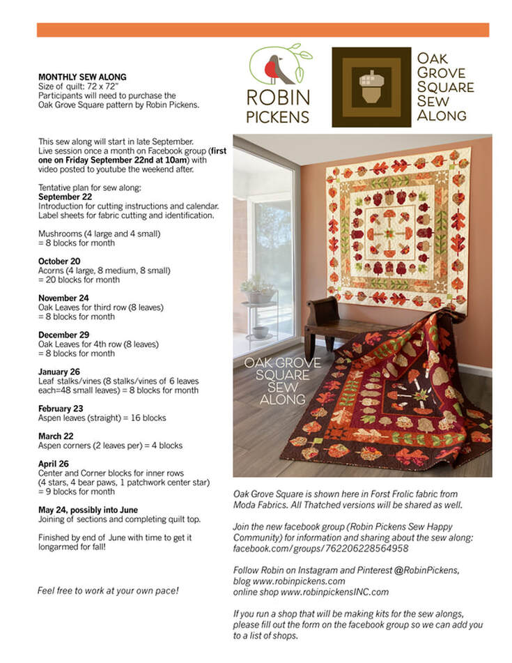 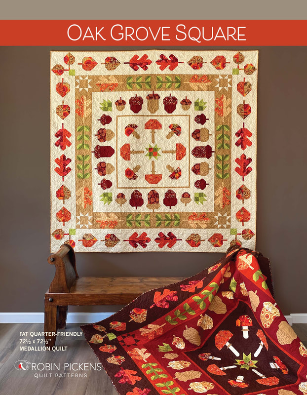 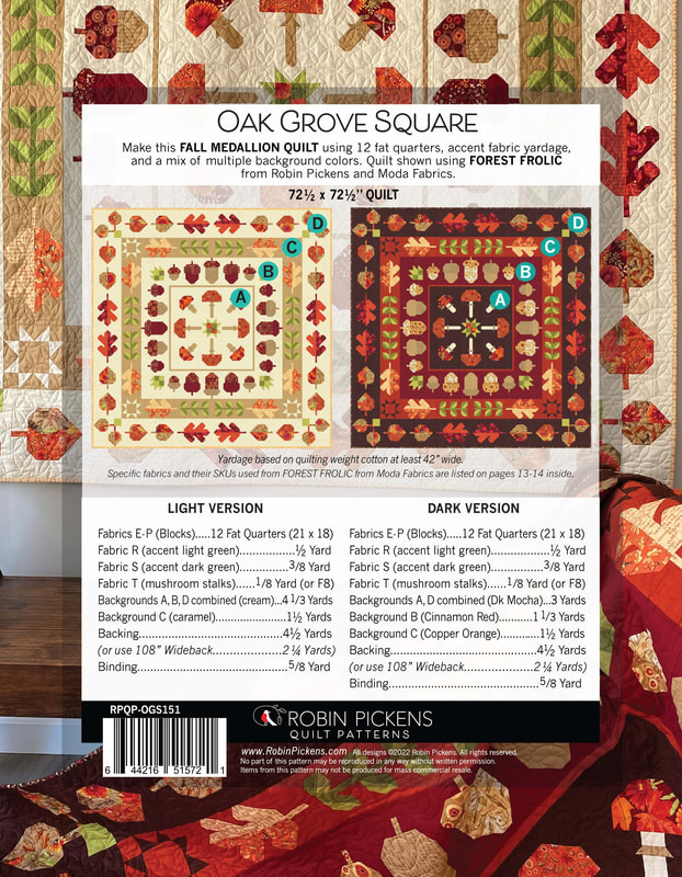 The blocks are not difficult to do and there is minimal matching of points. Since it is grouped monthly and by similar types, the blocks are rather efficient. It is quite fun to see your pile of mushrooms, leaves and acorns growing! I hope you will join us. 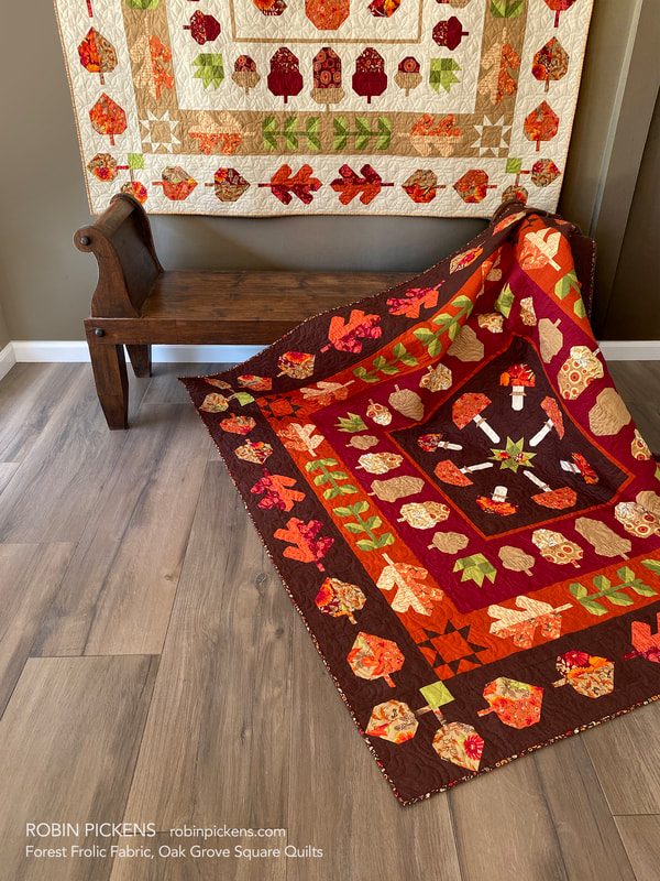  Maybe you are already joining in with the LEAF PRESS sew along? It is not too late to join in! My blog post about Leaf Press shows color combinations for that as well at:
www.robinpickens.com/blog/fall-sew-alongs-leaf-press-with-forest-frolic-or-thatched Patterns for Leaf Press or Oak Grove Square can be found at RobinPickensINC.com. You will need a pattern for the sew alongs. I hope you will join the facebook group and share your progress and quilts. I am so touched by seeing people post their projects with my fabrics or patterns. Thank you so much! 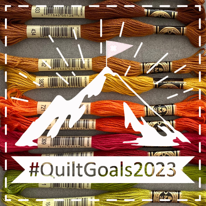
#QuiltGoals2023 / Stitching Goals 2023 with the Fat Quarter Shop with a FREEBIE pattern! If you saw my blog last week, I talked about getting going with CROSS STITCH! I learned from Kimberly's flosstube Cross Stitch University, got MacStitch software, ordered new supplies and started my first cross stitch project/pattern for my Fall collection from Moda Fabrics, Forest Frolic. I love pulling colors for a project and all those lovely colors of DMC make it so fun.
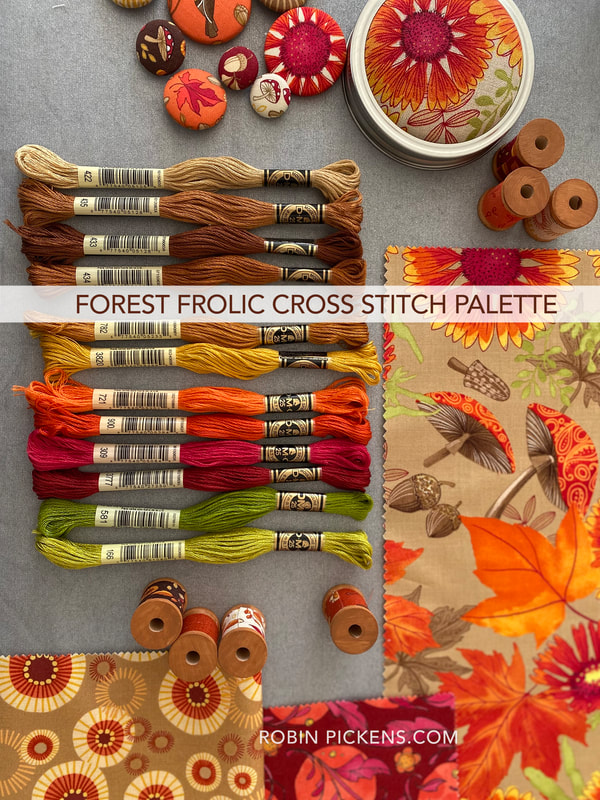
My first goal was to make some designs that would go along with my Forest Frolic fabric line (which is shipping in July from Moda Fabrics). I wanted to use orange, red, brown, tan, greens and a touch of hot pink. My first project was Acorn Trio and I used Forest Frolic "Little Fall Fling" in Chocolate as the background within this frame.
I enjoyed this project so much that it motivated me to make more little acorns. And leaves. Swirly leaves and little vines and colorful Aspen leaves. I loved learning more in MacStitch as I designed new blocks and tried them out as minis before composing them into a Fall sampler.
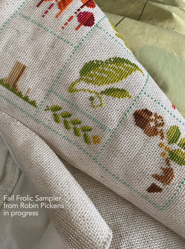
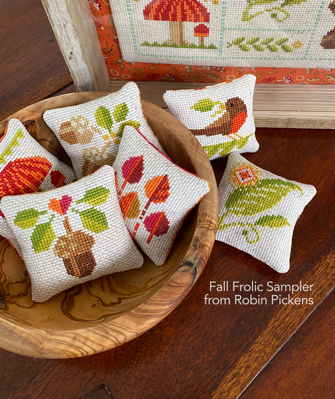
More blocks of mushrooms and a little Robin bird with a leaf in her beak. I thought a light seafoam color was a soft and subtle divider color that also complimented the oranges and warm colors. My sampler of blocks can be made as one big image (of an 8 x 10 approximate size) or as small individual pillows. I think they are so sweet in this little format!
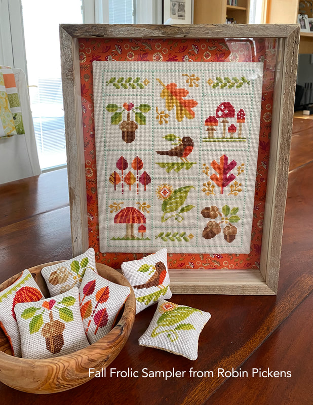
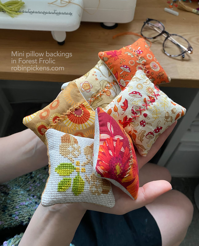
The frame I'm showing this in is a 11 x 14" barn wood shadow box from Hobby Lobby (1982158). For the little pillows, I trimmed each to 3 1/2" square and used Forest Frolic fabrics on the backs. Since the front is about cross stitch, I thought it would be fun to add a decorative stitch of Xs on the back in complimenting colors.
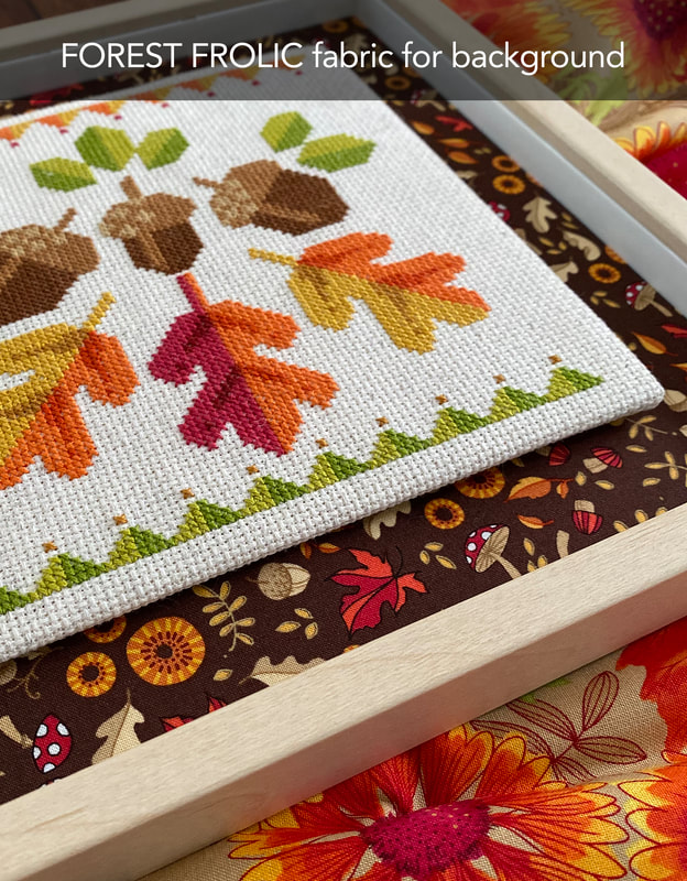
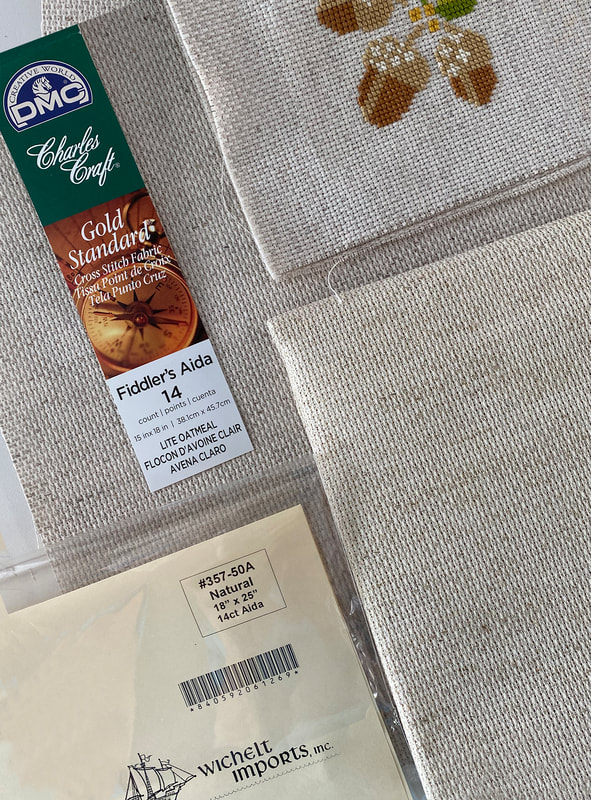
This sampler is made up on Charles Craft 14 count Fiddler's Cloth Light Oatmeal. This is similar to Wichelt 14 count Aida in Natural 357-50A or to Zweigart Artiste 14 count Aida Oatmeal 653220. Since I'm more of a newbie to cross stitch, I think I'll get some more practice before trying a smaller scale fabric like Evenweave or linen. I had started this sampler on the Fiddler's Cloth, otherwise I would have switched to the Natural Wichelt Aida that I got from Fat Quarter Shop since it had just a tiny bit more warmth to it but looked very similar.
Like I did with the mounting of Acorn Trio, I've finished this sampler by mounting on sticky board then floating it on the Little Fall Fling print in Orchard (48744-19). 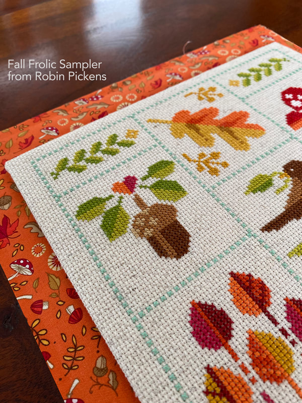
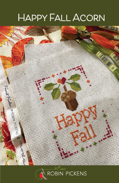
To celebrate the start of my cross stitch journey, I wanted to share a little FREEBIE pattern for you from one of these blocks. I used the acorn with the little heart on top and 4 leaves and added a simple border and a Happy Fall message.
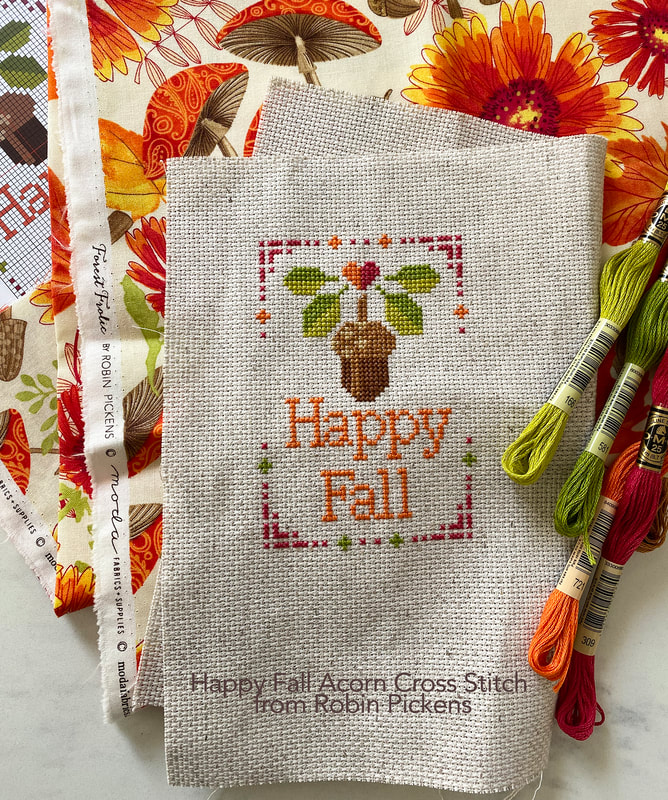
The pattern FREEBIE can be downloaded from the Fat Quarter Shop or here:
Or if you have any problems here, I'll keep up access to HAPPY FALL ACORN on my shopify store. The Fat Quarter Shop has exclusive access to this free pdf and will have the patterns for Acorn Trio and Fall Frolic Sampler for sale.
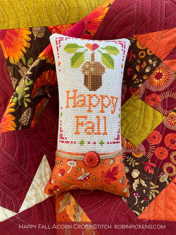
Luckily for me, the lovely Susan Strumpf offered to make my little acorn cross stitch into a sweet pillow with some Forest Frolic fabric. Look at the tiny button she made to go with the twine. It is SO CUTE! What a perfect amount of little added touch...thank you so much Susan!
Paper patterns have arrived! Perfect timing since I'm getting ready to go to the LONG BEACH QUILT FESTIVAL! If you are coming to the show, come by BOOTH 348 to see some of the cross stitch in person (and I just might have another couple designs to show there).
If you didn't see my previous blog post where I talk more about getting started with cross stitch, the fantastic supplies I got from the Fat Quarter Shop, learning from Kimberly's Cross Stitch University, and a sampling of different Aida fabrics, then please check out my previous post: https://www.robinpickens.com/blog/quilt-goals-2023-my-journey-to-cross-stitch 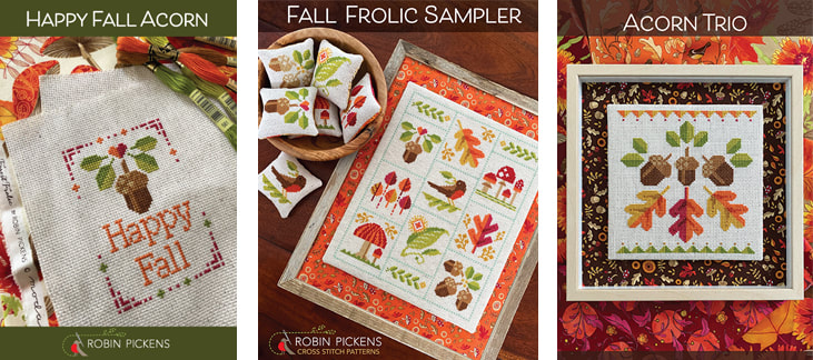

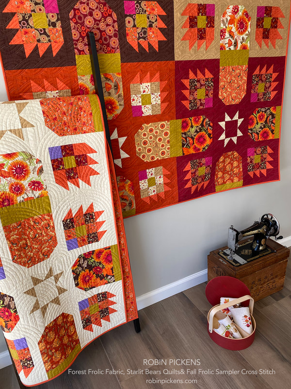
Here are my little sample pieces next to my Starlit Bears quits in the Forest Frolic line. The Fat Quarter Shop will be carrying this line (complete with the Thatched backgrounds, the Acorn Quartet kit AND the Mochi Linen prints!) and I think the two go together nicely. The quilt on the wall uses 4 background colors of Thatched that are new with this collection: Mocha, Copper, Cinnamon and Caramel (48626-205,208, 206 and 204) and the quilt on the ladder has Buttermilk Thatched (202) for the background.
I do show some photos in the previous post of different Aida fabrics I purchased from the Fat Quarter Shop for comparison and future projects. I took a picture to show you how the Fiddler's Cloth is close to the Wichelt Natural 14 count Aida #357-50A. It is just the slightest big warmer and I like that. It would look great with the Fall colors.
Feel free to check out the cross stitch section of my shop for new releases of patterns. I have another fun fall project in the works. Here's a little tiny peek:
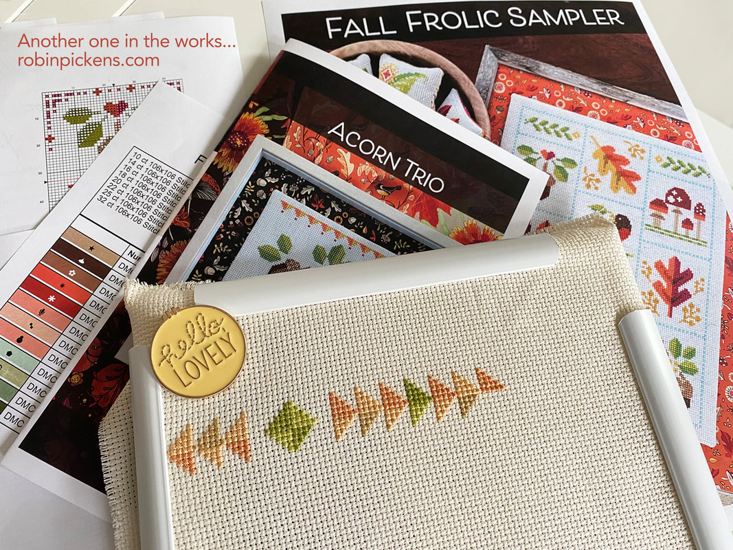
I'm also working on some other cross stitch based on my quilts and artwork/illustrations as well as coordinating with new fabric lines. Stay tuned stitchers! Thanks again Fat Quarter Shop and thanks to all of you for visiting. Happy stitching!
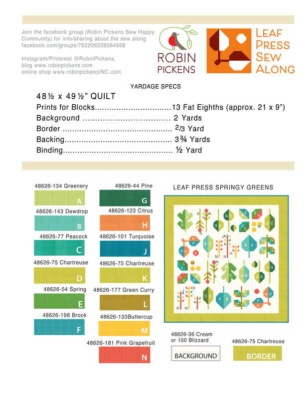
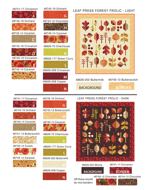
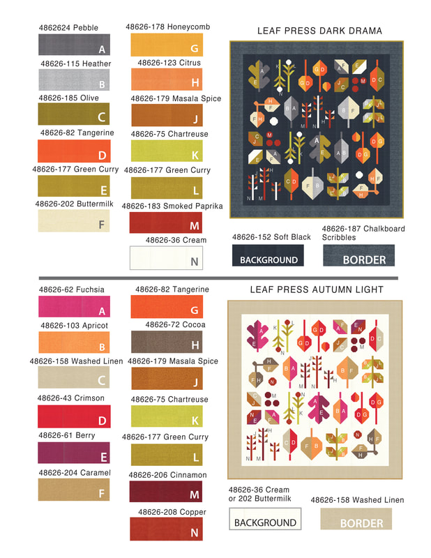
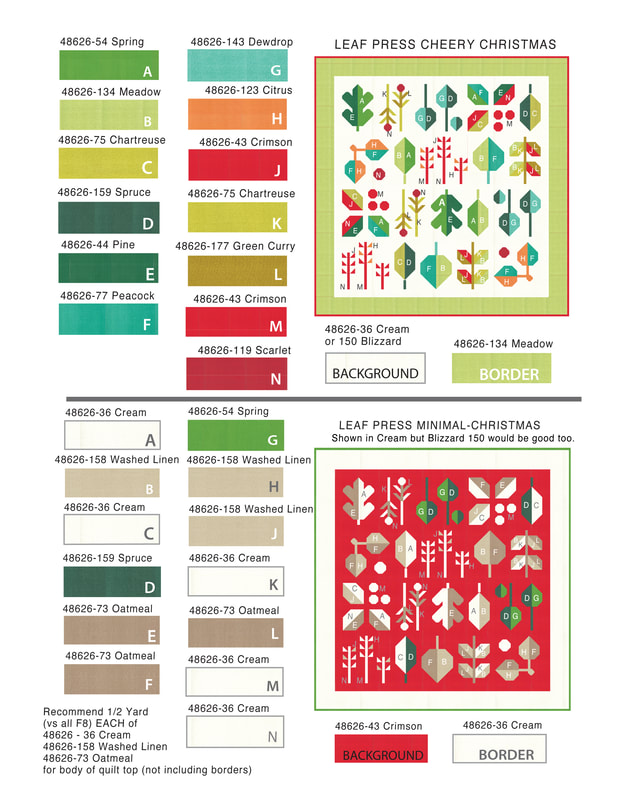
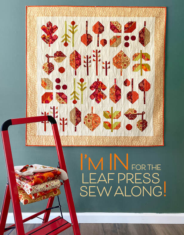
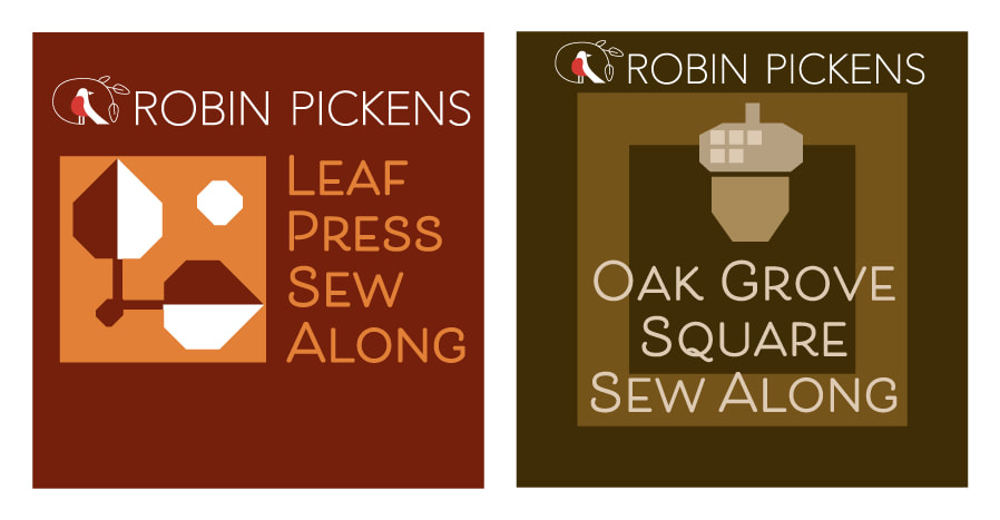 I am eagerly anticipating the start of not one, but TWO sew alongs that I am running this year. This is my first time having my own sew along, so I'm going to go ahead and just apologize for whatever funny glitches and things happen on my learning curve. But it is time to start and get more comfortable with doing more video sharing. I hope you will come along for the journey! 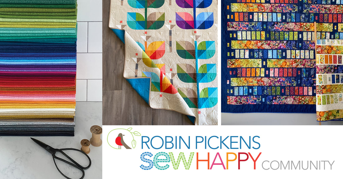 This also means it is time to open a Facebook Group. This group is for those of you who like sewing with my fabrics and patterns. Maybe you have questions. Or hopefully you want to SHARE pictures of the things you are making with my fabrics and/or patterns! This is that space for sharing and supporting one another. I'll also run the sewalongs from the group page and hope to see lots of leaf blocks popping up as the sew along gets going. Want to join the group? Visit Robin Pickens Sew Happy Community and ask to join. https://www.facebook.com/groups/762206228564958 I will do some facebook lives and then post those to youtube as we get going with the sew alongs. I'll also be running a poll to find out when you like to attend a live feed...mornings? During the week or weekends? I'll also be having a few prizes for some random folks who POST their progress while we sew along. No, you don't have to keep to my schedule. But participation and sharing, wherever you are at, is encouraged! 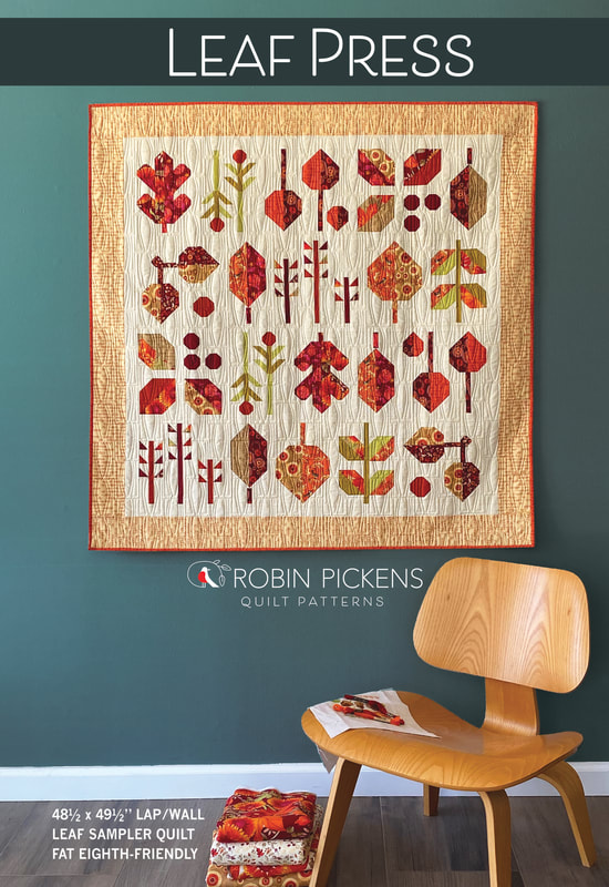 TSo lets talk about LEAF PRESS. It was Lissa Alexander from Moda Fabrics who suggested a leaf sampler. I THOUGHT I was done designing my group of patterns for the Forest Frolic fall collection until she mentioned the idea and then I just couldn't get it out of my head. This might have ended up being my favorite quilt design from the group (although it is still a close toss up with Oak Grove Square). I like the nice lap size and range of leaf types and there is something that feels a little modern as a sampler to me. The number of blocks and variety of leaf types works out nicely to a weekly sewalong where we do couple units a week. We'll be starting at the end of August and finishing up around the middle of October. You will need to buy a pattern. This pattern is in a larger size 8 1/2 x 11" booklet for diagraming all those leaf shapes! Check with your local shops to see if they are carrying it or check my online shop at RobinPickensINC.com. A document with the tentative schedule is in the facebook group FILES. 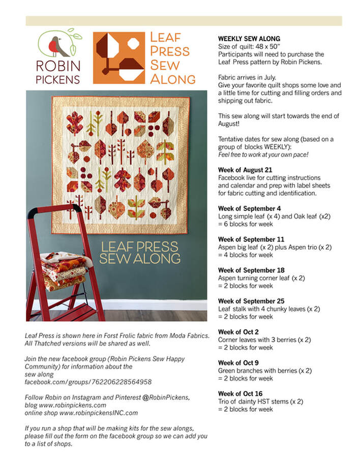 I've only made this particular quilt in the new Thatched Buttermilk background but wanted to mock it up on the computer in the dark brown Mocha color. I like that too! 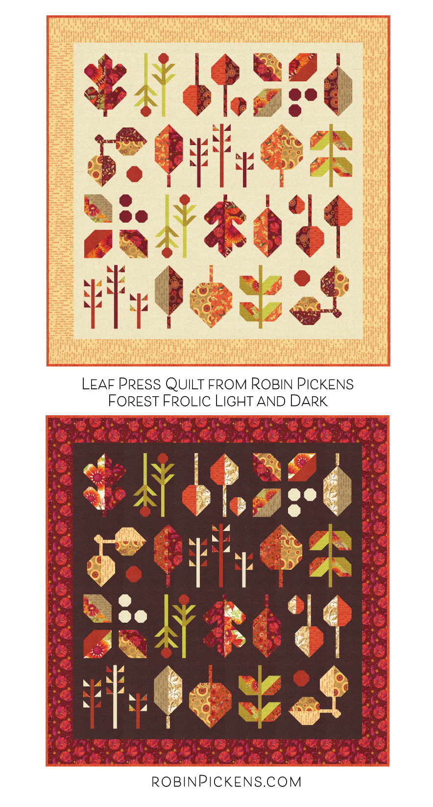 The fabric specifications for Leaf Press include: 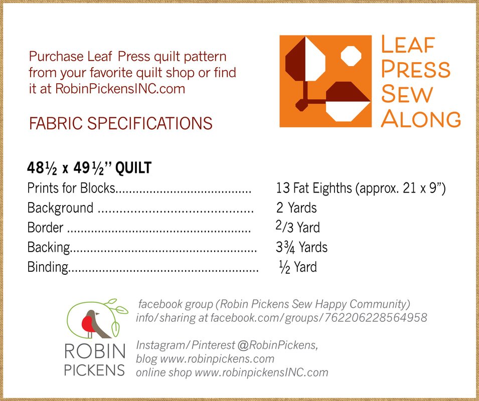 13 Fat Eighths for those leaves. Now I'm sure someone will ask if they can use a Layer Cake of 10" squares. YES you can. One layer cake should be enough. It would also work well as a scrappy quilt. Instead of Fat Eighths you can assemble 7 Fat Quarters for leaves. While playing around with the ideas for this quilt, I wanted to try it in colors as well that were NOT about fall. What about a springy palette? 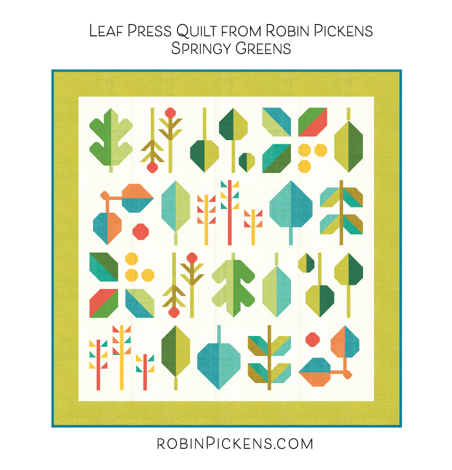 Or fall colors in all Thatched? 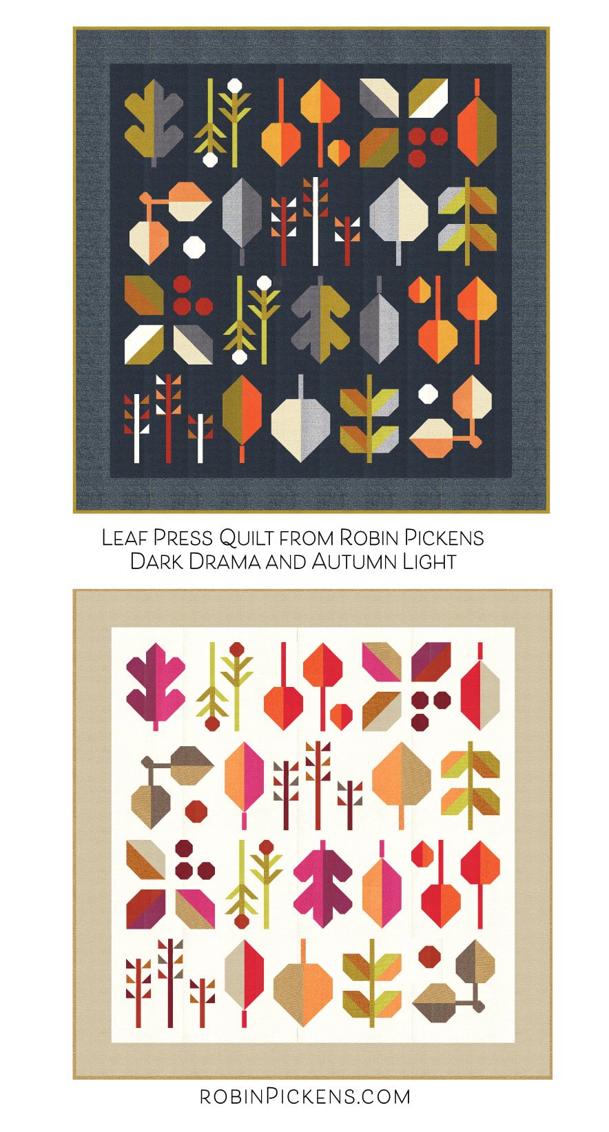 Rachel from Santa Monica Sewing Arts suggested a Christmas palette... 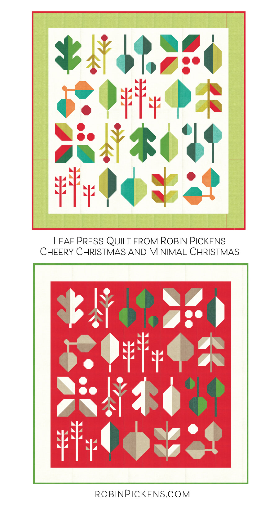 On this last one, I've made it more minimal in terms of the variety of colors. The greens are a little accent and the while, washed linen and oatmeal are all from 1/2 yard of fabric. Makes me think of snowy leaves with a layer of thick frost. What if you want to do one of these...or if you have a quilt shop and want to kit some of these versions? I'm including all the specific fabric colors here and they are also listed in the FILES section of the facebook group. If you do have a shop, please fill out and email us the form so we can compile a data sheet of shops that are carrying the Forest Frolic fabric, Thatched fabrics, Thatched Widebacks, bias binding, etc. to share with folks who are looking for places to order. The blue "download file" is a pdf of the specs I am listing below. I'll have more info next week on my monthly sew along, Oak Grove Square. I will do some color studies for that one as well (but not as many). I hope to see you sewing along with me this fall.
One last note...Forest Frolic is shipping NOW from Moda! Yay!!
|
About ROBINDesigner of colorful florals for Moda fabrics. Modern to transitional quilt designer. Illustrator, sewist, crafter. I am proud to be a designer for Moda Fabrics!
Shop Robin's Designs
 I am an affiliate for Fat Quarter Shop and may earn a small commission through my links. Thank you for your support!
Check the March 6, 2017 Episode!
Categories
All
Archives
February 2024
© Robin Pickens Inc. All rights reserved. No images may be reproduced without permission.
|
||||||||||||
 RSS Feed

