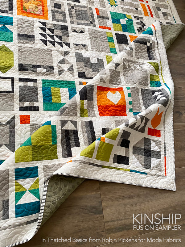
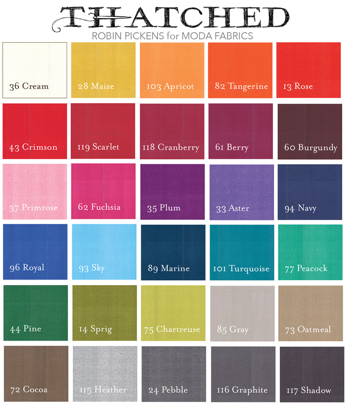
 It's almost here...the 2021 Kinship sew along with Gnome Angel and I thought I'd share a bit of past projects and my plans for this year's quilt! Make sure you scroll down to see the new color combinations!! 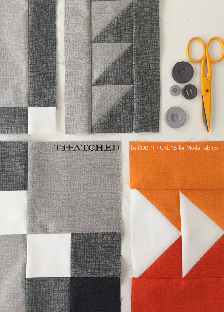 I originally did the #100days100blocks in 2017 when we were using Tula Pink's 100 Modern Blocks book. That was lots of fun. I was really excited to see Ange release her own 100 blocks quilt "Kinship Fusion Sampler" for the 2019 sew along and I knew I had to do it! My Thatched basics fabrics were coming out with Moda and it was a great opportunity to play with them. If you are not familiar with Thatched, it can function like a solid or a blender with subtle drawn, nubby lines. It gives the colors a nice rich feel and a little more depth to the look than a plain solid. 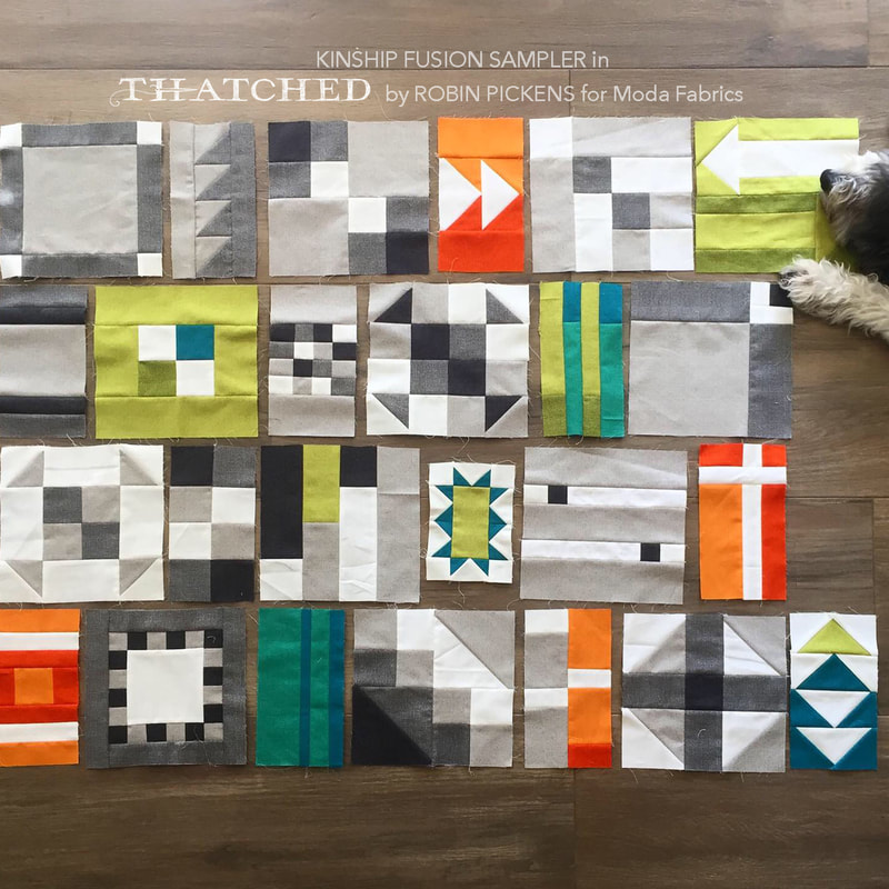 My goal was fairly simple- use a limited color palette of white and 3 grays and add in pops of color with pairs of orange, green and teal/turquoise. I really enjoyed making my blocks because the cutting schemes were so logical and efficient and I knew that if I cut a width of fabric strip in a 4.5" size, I'd be using that whole strip in the variety of blocks we were making. 2.5, 4.5, 6.5, 1.5"...it was consistent with a nice amount of play and experimentation. A block a day. I can do that when they are no too hard yet have the right mix of variation. I bought my pattern directly from gnomeangel.com as a download but shops also have a printed pattern. I just saw them at Cozy Creative in San Diego this last week! Links to Ange's shop are at the end of this post. 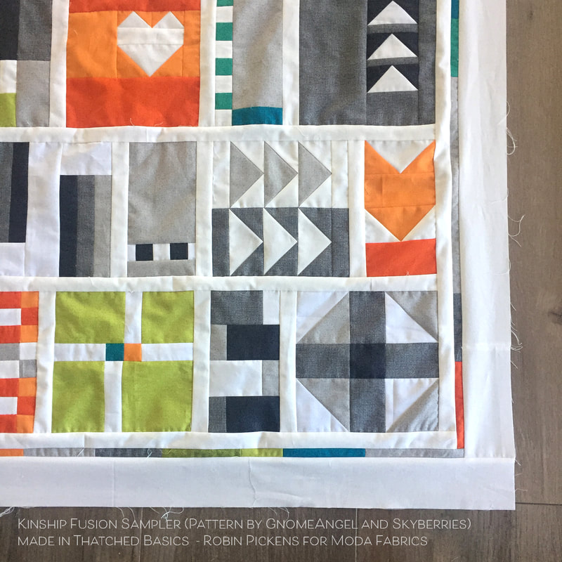 I used Ange's Kitchen Sink version of laying out the blocks with 1" finished sashing in between the blocks (1.5" cut width). I decided to "frame" my quilt top by adding a thin strip of scraps of the colors I had used (1" cut width for 1/2" finished size) and surround that with a 3" cut border. 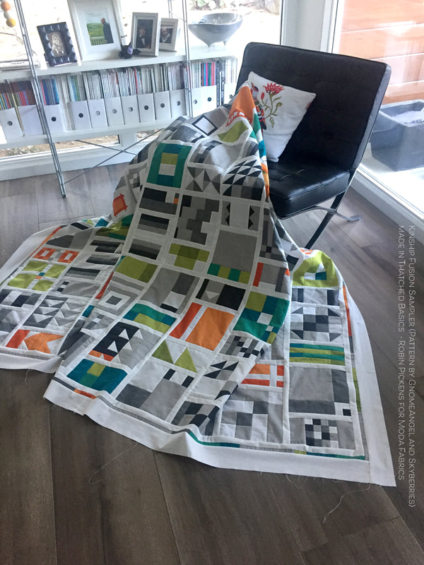 I really like the balance of white and color and clean modern look of this quilt. 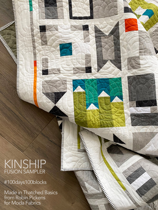 Even though I pieced the top in 2019, I didn't get around to quilting it till mid way through 2020. I purchased a used longarm Bernina Q24 and had some pandemic self-training using YouTube videos to figure out what I was doing. That is a whole other blog post...but it was tremendously gratifying to get this quilted and bound! The pantograph is Swirl Out Jr by Mike Fountain, purchased from IntelligentQuilting.com. 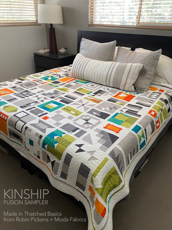 This is sized to be a twin quilt but with the sashing and border, I can put it across the bed and cover my king bed! I started this sew along again last year, doing a scrappy version of blocks, and started making 2 of each block to made a king quilt. Now I'm rethinking that plan since I probably don't need two of all the blocks if I add sashing. I got busy with other projects so might rejoin with some of those scrappy blocks this year as well (or save them for 2022?) 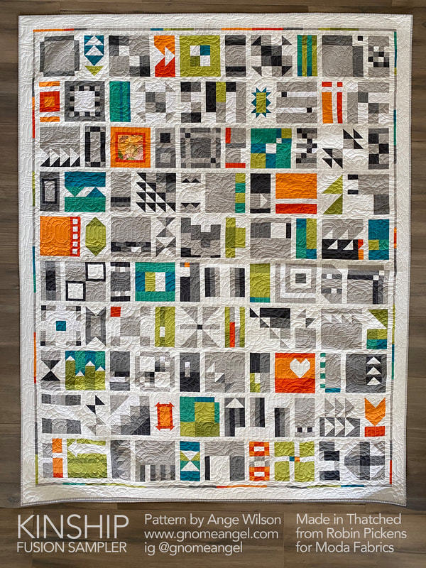 That brings me to THIS YEAR and what my plans are. I like the layout, the idea of a limited palette with some accents, the distribution of accent colors, and the border additions. So I'm calling this Kitchen Sink Renovation (Ange's layout with a little reno). And since some NEW Thatched colors launched at the beginning of this year, I'm keen to try it with some of those. 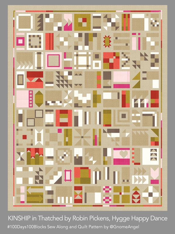 This is Hygge Happy Dance because I think of that Danish soothing comfort vibe with these soft neutral warm colors and a little coral to red to pink warmth. This is the version I am making this year. I am currently very smitten with the new background color, Washed Linen, Thatched 158. Since I'm making this color combination, I'm gathering the fabrics to get ready for July 1st. The other colors in this quilt will be 62 Fuchsia, 122 Early Dawn, 185 Olive, 177 Green Curry, 156 Toast, 72 Cocoa, 183 Smoked Paprika, 181 Pink Grapefruit and 36 Cream. 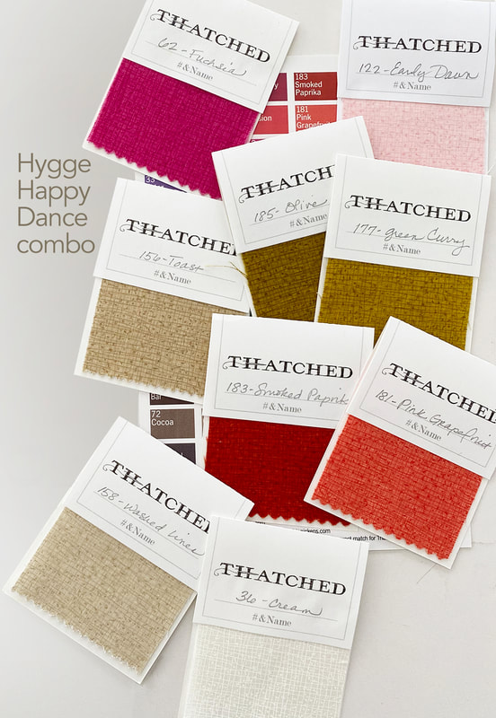 This next mockup is called Midnight Jazz and you could make it with a dark blue Thatched, like Midnight (which is in the new Cottage Bleu line) or Dark Wash Indigo. But Pam at Serendipity Woods, and I decided a Nautical Blue Bella Solid was a great background fabric for this. The Thatched colors are 173 Bluebell, 144 Ocean, 125 Seafoam, 124 Greenery, 103 Apricot, 82 Tangerine, Cream 36, Washed Linen 158 and Toast 156. 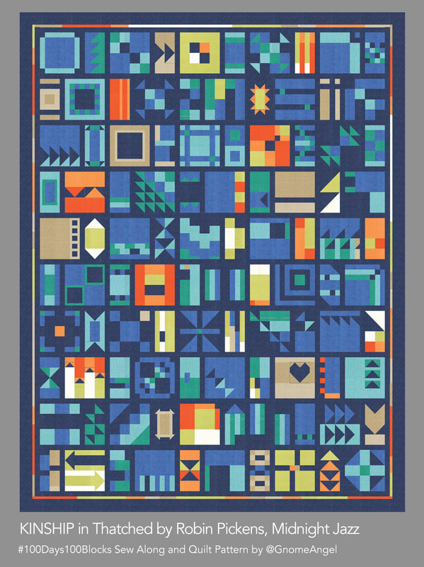 Changing the background to White (Bella 200) brings a light and sparkly look to this same color combination in Morning Blues. 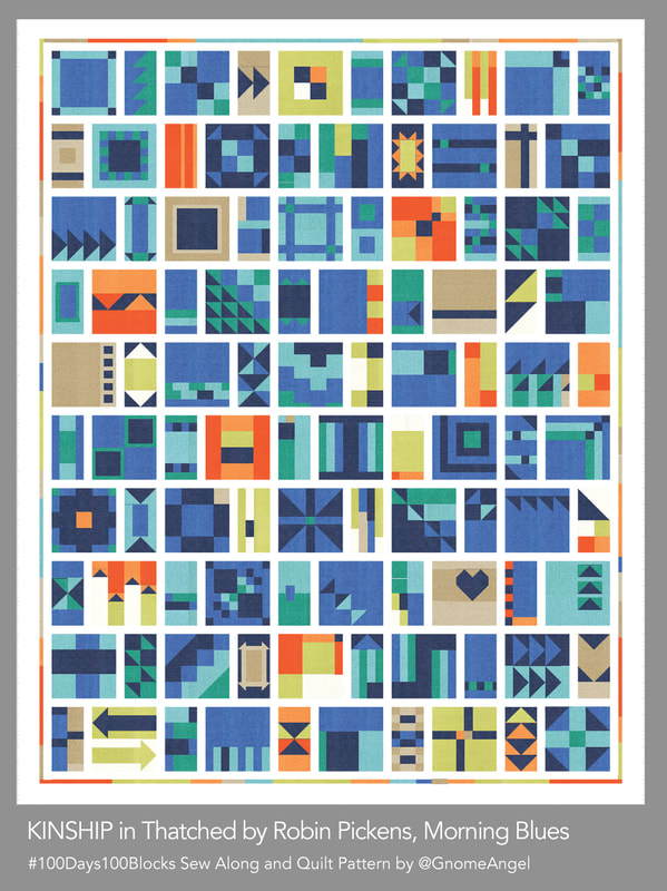 And my original, which I'm calling "Winter Turns to Spring" is Bella 200 Off White pared with Grays of 117 Shadow, 24 Pebble, 85 Gray, oranges 103 Apricot, 82 Tangerine, and greens of Chartreuse 75, Sprig 14, Peacock 77 and Turquoise 101. 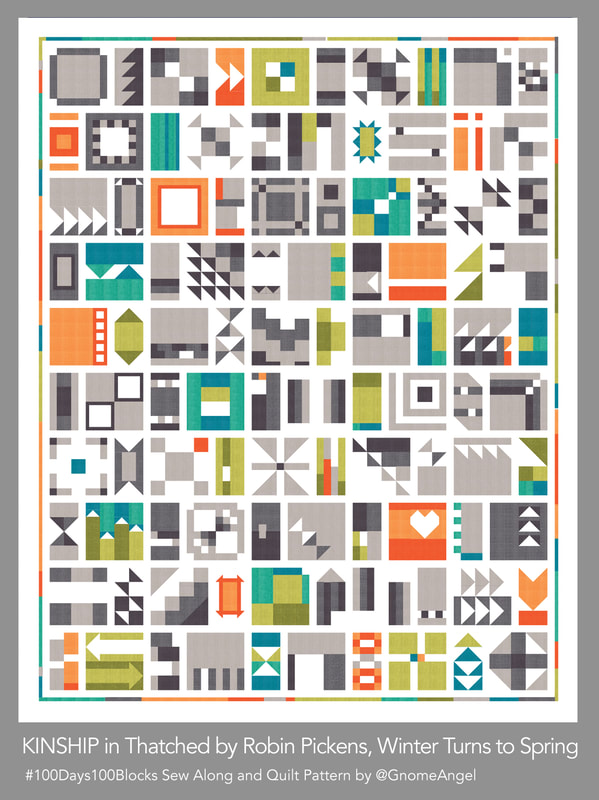 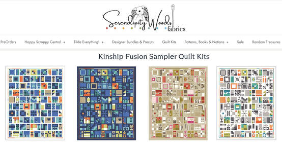 If you are looking for these kitted and ready to go, then check out SerendipityWoods.com for some kits of each of these color ways. I believe Pam will be sewing along with us. I'll also be meeting with Quilt Emporium in Woodland Hills CA to go over the colors and they usually have all the Thatched colors! I'm happy to share any information of shops with Kinship/Thatched kits so let me know. I hope you are joining in the #100days100blocks sew along with GnomeAngel using her Kinship quilt pattern. See you posting in July! 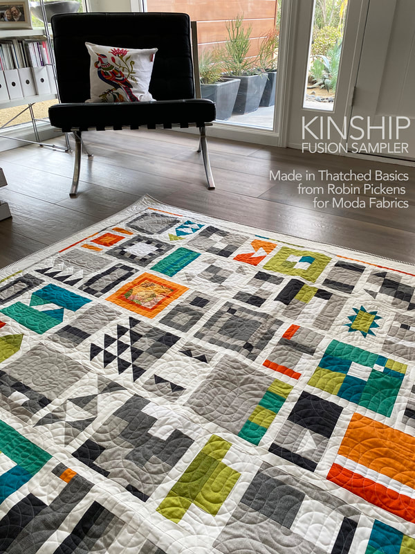 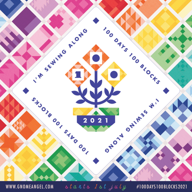 Visit Gnome Angel's website/blog for more info on the sew along and answers to questions you might have at https://www.gnomeangel.com/100days100blocks-event-information/ or purchase a pattern in her shop https://shopau.gnomeangel.com/collections/books-patterns/products/pattern-kinship-100-block-fusion-sampler My dear Roxy has decided she likes this quilt. It's her colors. She must be touching it and making sure it is hers...at all times. 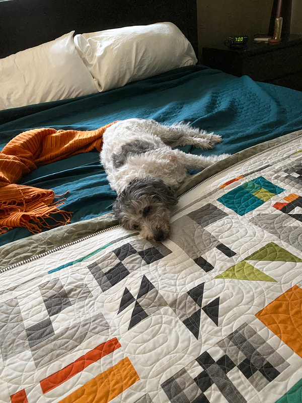
3 Comments
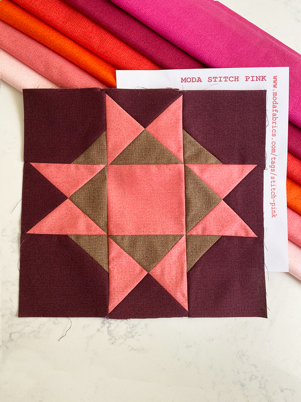
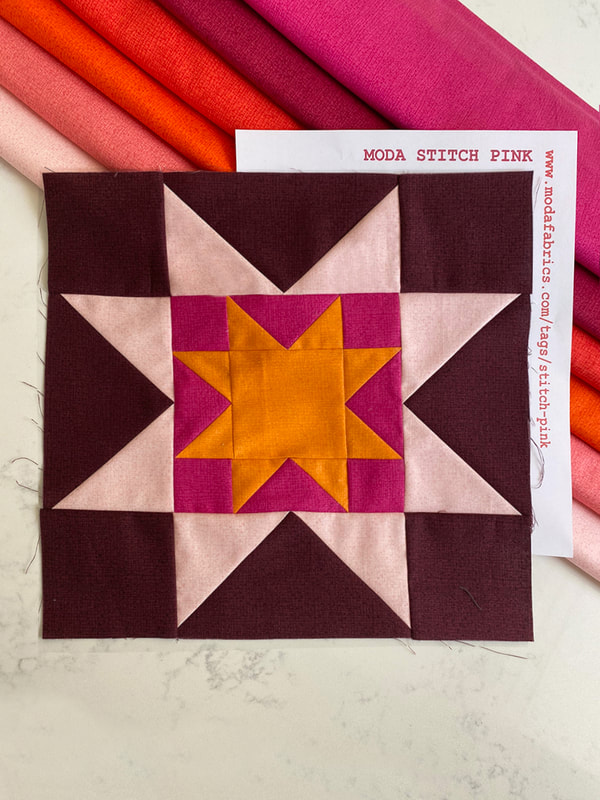
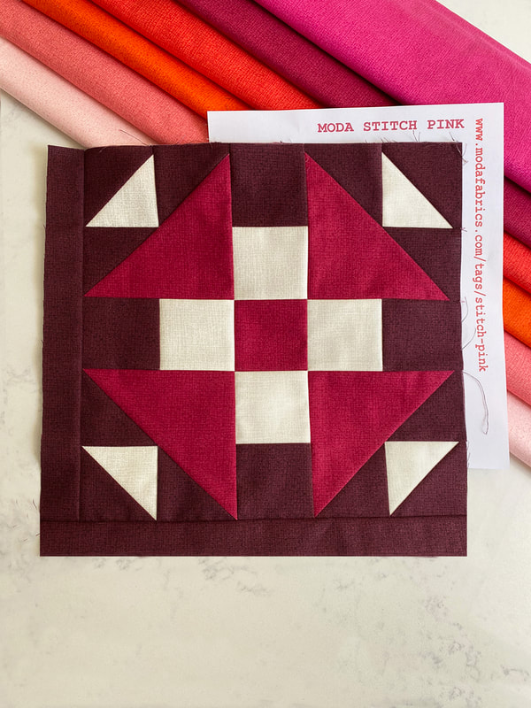
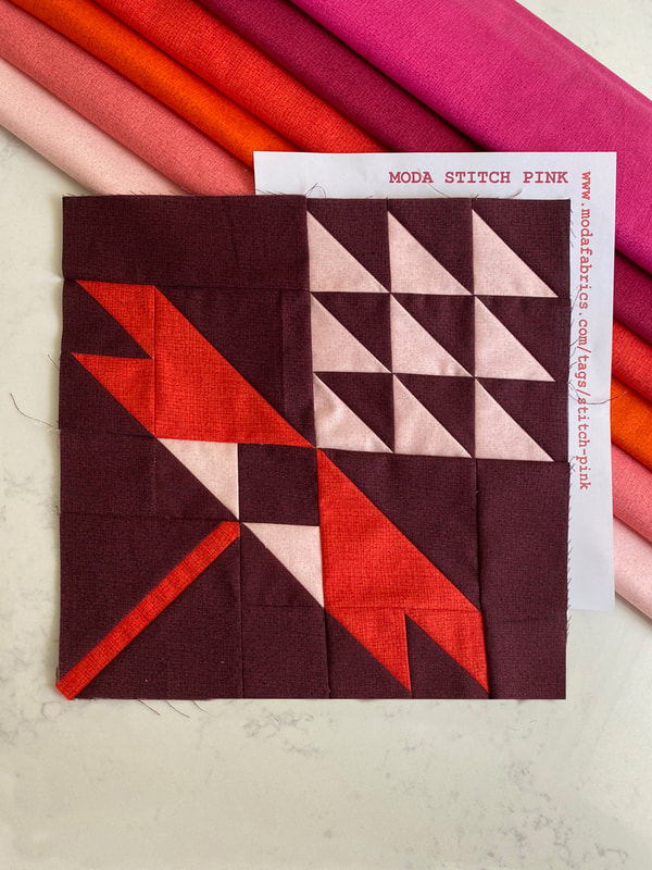
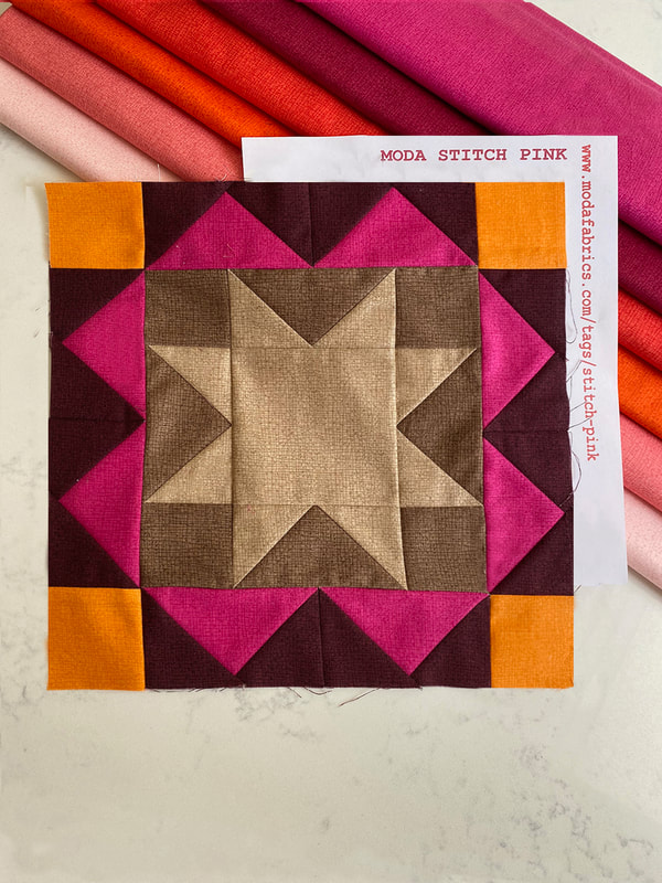
October is Breast Cancer Awareness Month. Moda Fabrics is doing a free block-a-day quilt sampler to commemorate. You can sew along by following Moda Fabrics as they post a pattern each day on their cutting table blog: https://modafabrics.com/tags/stitch-pink Lisa, the owner of the Quilt Emporium (my local shop) asked me what I thought about mocking up this sampler in Thatched fabrics. Oh yes! I did these two versions that she has kitted at the shop, a warm tones one with a deep burgundy background and a blue/green version with a Navy background. 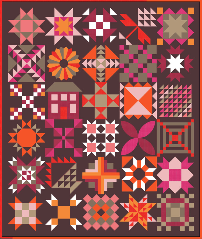 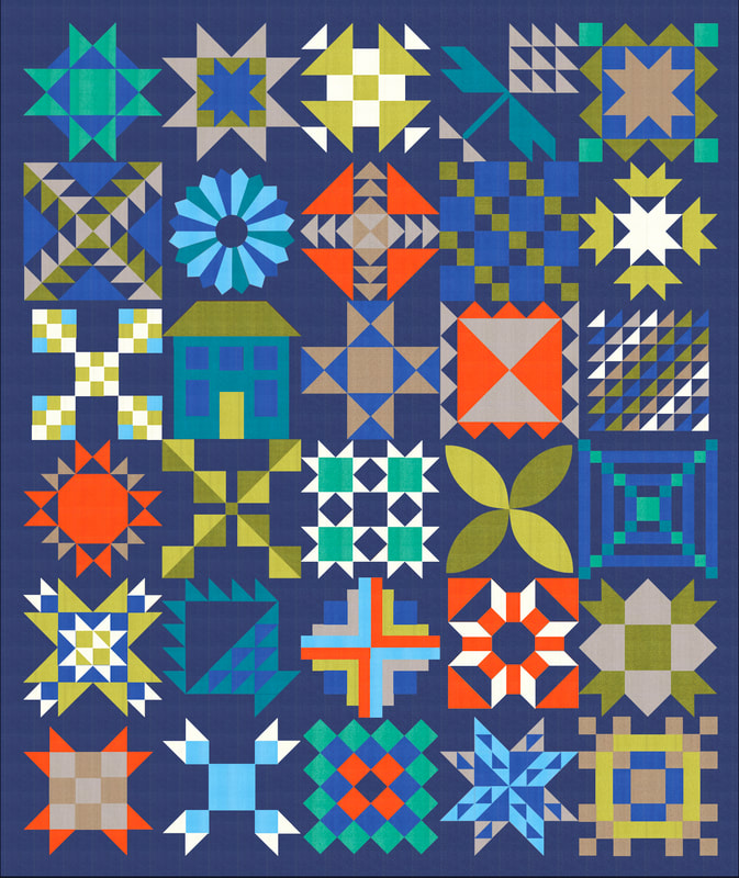 If you are interested in this kitted in Thatched, visit the Quilt Emporium website (burgundy listing or blue listing) or call 1 (818) 704-8238. Lisa is sewing the blue version and Susan V (felted pear) is helping me with burgundy blocks. I am so excited to see this come together and feel like these warm colors are perfect for a lively fall quilt. Here are the blocks so far! If you sew along, share on facebook and instagram using the hashtag #ModaStitchPink
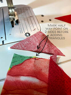
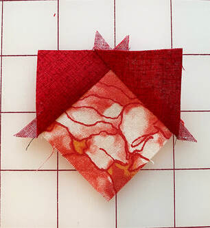
Fair and Square has a special place in my heart because it was in the first group of patterns I designed. I've learned a lot since then and ended up completely rewriting the instructions. This quilt continues to be a learning experience for me! 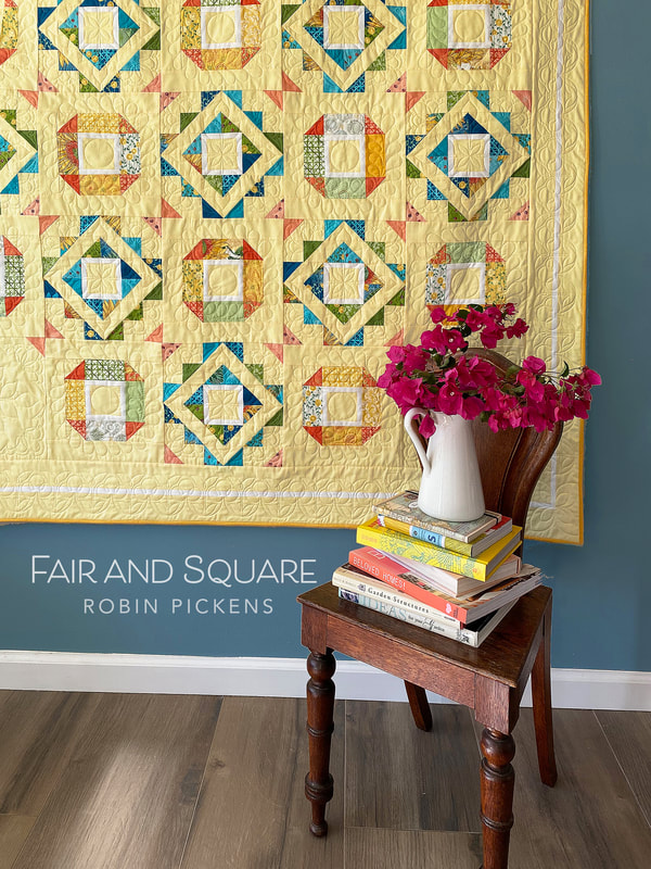 I made a revision to the design from the original quilt. I wanted to show this quilt with a soft, buttery yellow background to go with my big bright sunflowers. Sometimes with a pale color mixed with prints needs a little more defining contrast. I loved how a thin white border gave a little additional crispness to the block centers. I decided to carry that thin white sashing around the border to define the space. 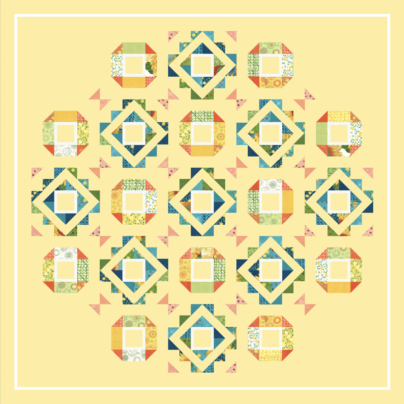 The first time I made this quilt I thought the process of making half square triangles went on FOREVER! Now I just enjoy seeing those big blocks come together from a fun mix of little triangles. This quilt can be a fun way to use up some of your extra half square triangles (I save all my extras for scrappy projects) or pieces at least 3" square. Yup, got a lot of those. This pattern specifies a layer cake but can also be made with scrappy pieces approximately 3 x 5" with background fabric added. 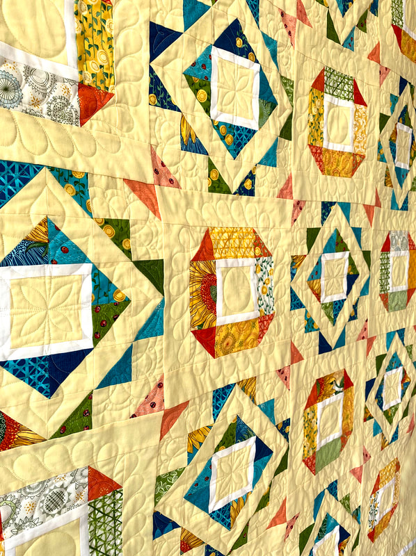 Part of my learning experience this time on the quilt was doing the longarm quilting. My system is computerized and I put the sewing designs into the individual blocks vs going with a continual pantograph that is edge to edge. I did a different border design and two designs rotating between the two types of block styles. Aligning the design, staying centered, working out what looked right with the blocks...I did numerous tests on scraps first. I can say I have SO much respect for the amazing longarm quilters out there that I see doing incredible custom work. It's not easy and requires patience and expertise, even when its guided by the computer. I'm glad I pushed myself to try this. It's not perfect, but I think I gave up the quest for perfection a long time ago! I quite enjoy seeing the areas that have mistakes because it records learning and improving for me. 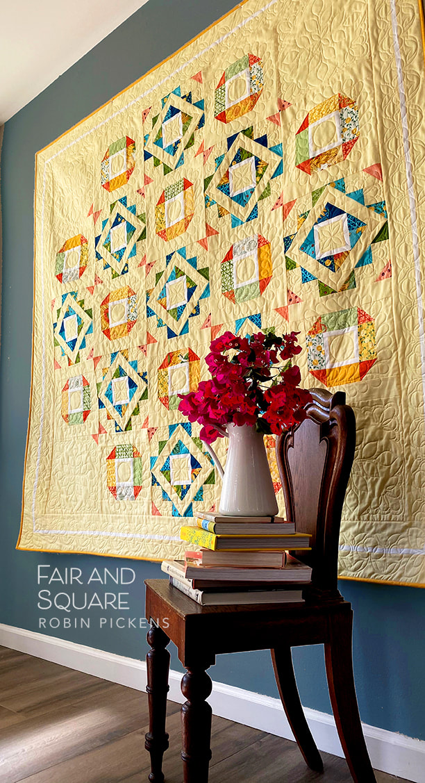 The back of this quilt has the print from Solana of little ladybugs. I just couldn't wait to try this on a backing since it is such a fun little print and I love ladybugs! They seem like good luck and fond wishes coming from busy little bright ladies. This print is great for a backing since the ladybugs have little dashed lines of curvy walking paths in a subtle texture in the background so its very forgiving if you make mistakes while quilting. Yes, I know that from personal experience. 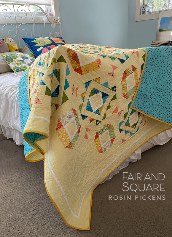 In case you were wondering what yellow this is, its Moda Bella Solids Baby Yellow 31. I paired it with Bella White Bleached 98. This is the original Fair and Square quilt I made with Poppy Mae, my first Moda Fabrics line. It was quilted by Gina Siembieda. 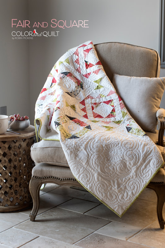 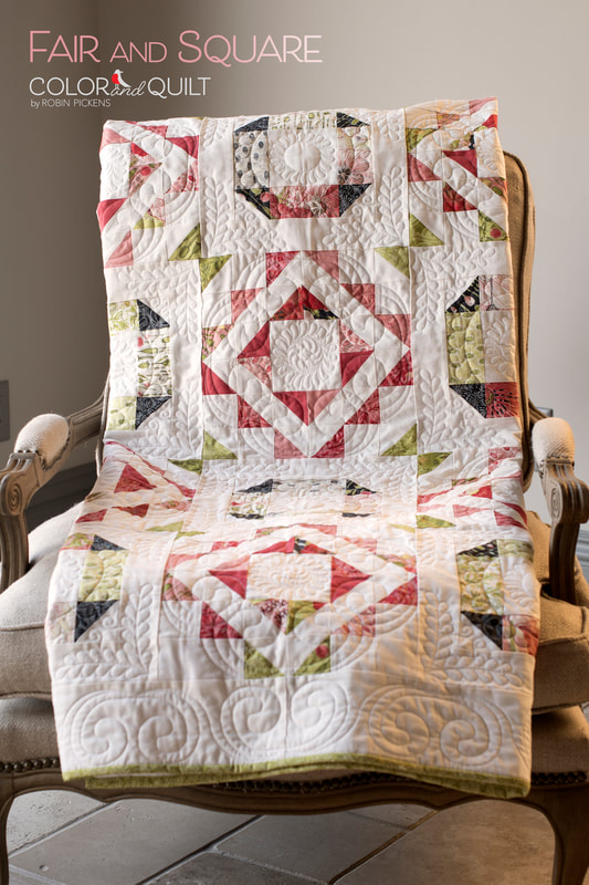 If you want to check out other quilts made with Solana, visit these posts: https://www.robinpickens.com/blog/simple-solstice-on-a-sunny-day https://www.robinpickens.com/blog/solana-patterns-here-comes-backslash or visit my shop! Have a sunny, happy sewing day!  The other new pattern I've released to go with the Solana fabric group is Simple Solstice. This quilt can be done with a Layer Cake or Charm Pack for a small or large quilt! I love the cheery sunshines in sunflower Solana warmth. 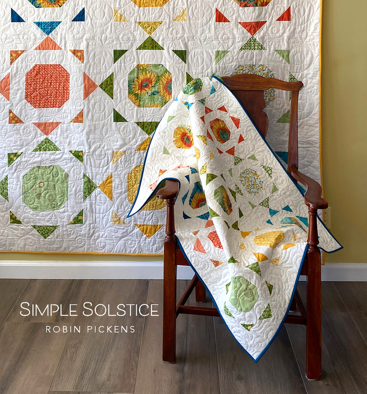 The original plan was just the larger quilt, but when I tried blocks in the smaller, Charm Pack, size, I fell in love with the scale of the sunshines. It makes a lovely wall quilt or baby quilt and can have another row nicely added to make it a square. 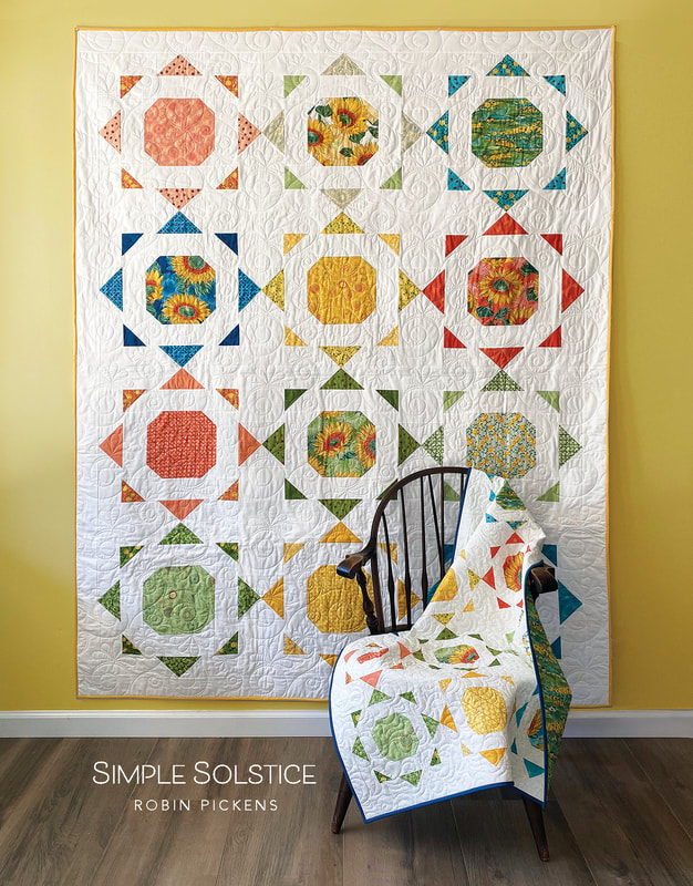 This quilt pattern uses a mix of stitch and flip corners to make snowball blocks, with rays from half square triangles and flying geese. Because the HST and flying geese are spaced apart, there is minimal corner and point matching to do, so this is really a very forgiving quilt if you don't like having to match lots of points and seams exactly. 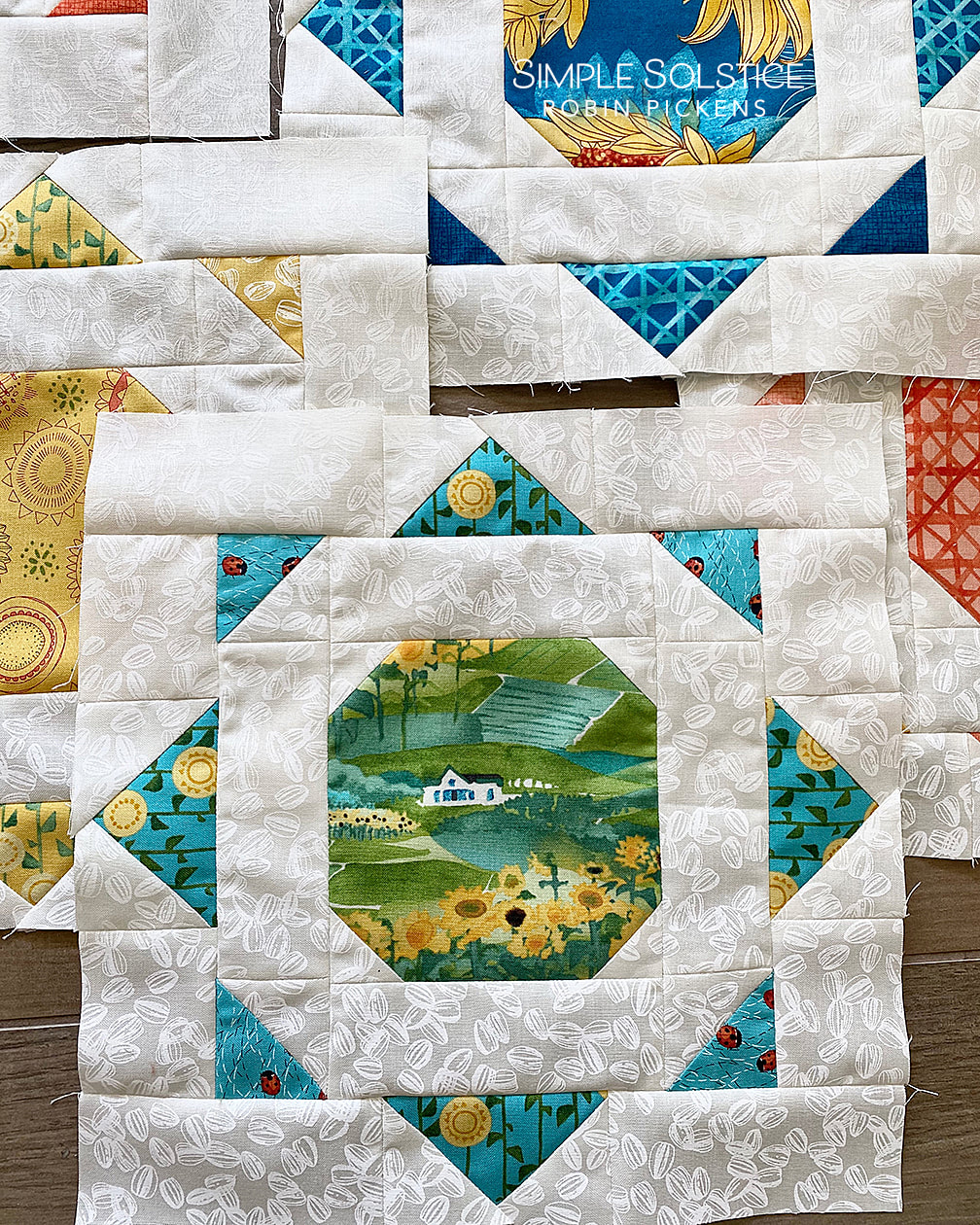 I also like the combination of using the scenic print from Solana for the back of the quilt against the white of the front background fabric. For the small version I used the white on white print of the sunflower seeds and it gives the quilt a slightly lacy feel. 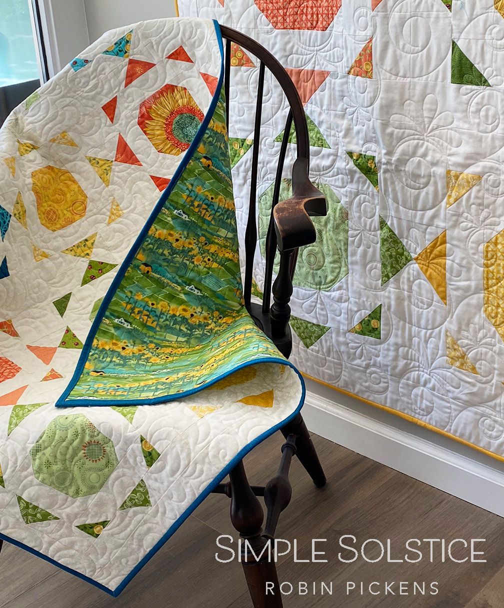 Fun fact: this Windsor chair was my Grandmother's. It has traveled with me from home to home and almost always lives in the corner of my bedroom or a guest bedroom. There is something comforting about having a quilt draped over the arm of this chair and I love the smooth wood of the well worn chair arms. 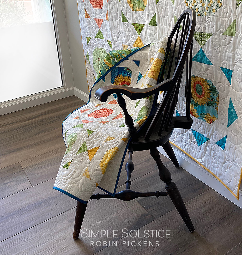 My little visitor friend seems to like these quilt blocks quite a lot. On two separate visits, she claimed them as the place she needed to sit. She knows what she likes! 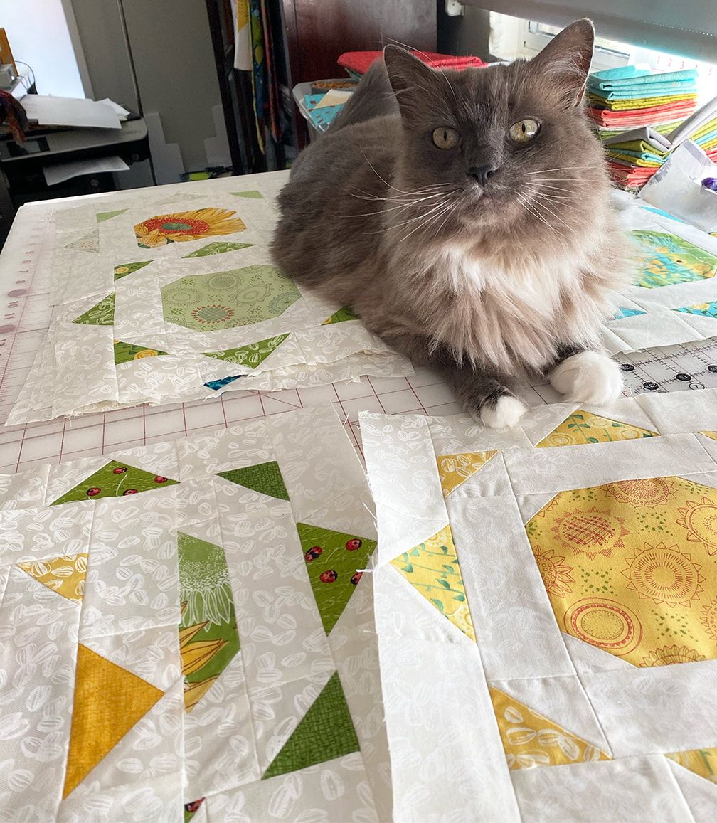 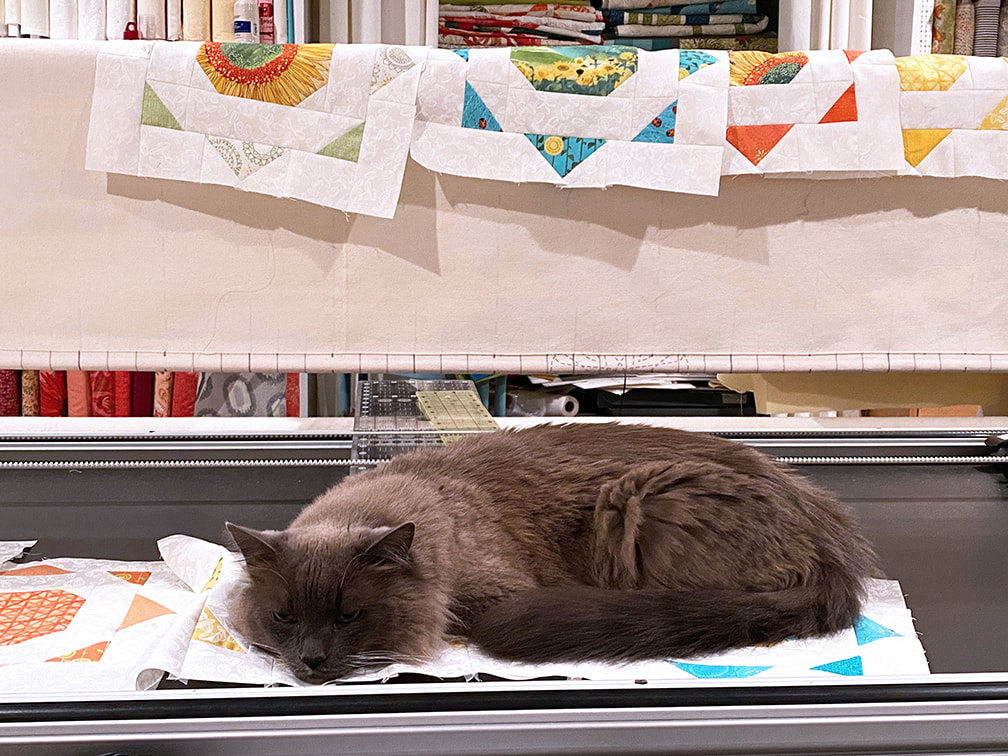 Simple Solstice will be shipping to shops and the Solana fabric will be shipping in October. If you want to check out this and the other patterns shown with Solana, visit my previous post or my shop. Happy sewing and enjoy the sunshine! Today I get to share my newest fabric line for Moda Fabrics, SOLANA. It is based on sunflowers and warm, happy colors. When I designed this fabric, I had no idea how much I would need and enjoy working with this optimistic group of fabrics at this particular time. Solana is a Spanish word for "the sunny side" of a mount or valley. This seemed like a perfect name for a group about sunflowers because they are always looking to the sunny side, always reaching up to that sunshine. This collection feels like it celebrates simple pleasures. Ladybugs crawling on leaves, tall blooms looking pretty yet bold, linear illustrations of fanciful sunflower centers... It does remind me of being on family vacations in the summer, driving across country with the windows down and the warm air rushing at my face. I've included a painting of a rural scene in this collection that reminds me of those car trips and seeing miles of farmland and fields. 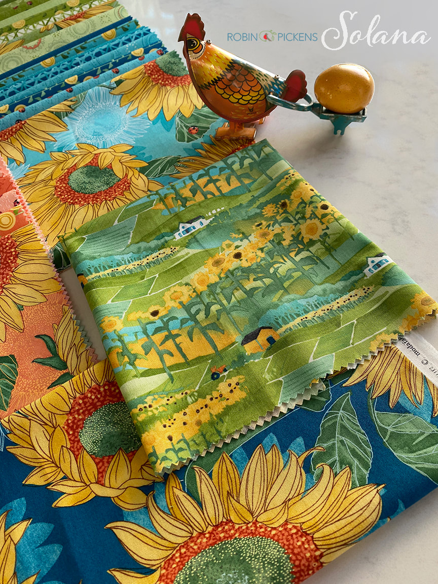 Solana includes 4 main colorways of cream/buttercup, green, peach/clementine, and pond and horizon blues. The large florals are accompanied by a criss cross ratan pattern, tall stalks, ladybugs, varietals illustrations, sunflower seeds, and of course more Thatched blenders. This collection will be shipping to quilt shops in October 2020. 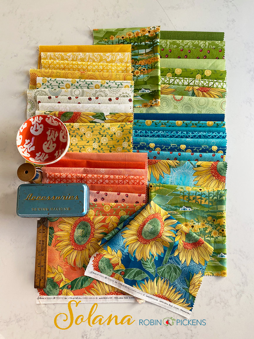 A very exciting addition to the line this time are two PANELS! Each of these panels have a quote in the center and are a yard in width. Want to have some fun with free-motion quilting? Or add blocks for borders and make these the center of a bigger quilt? I can't wait to experiment more with these and share my progress with them! 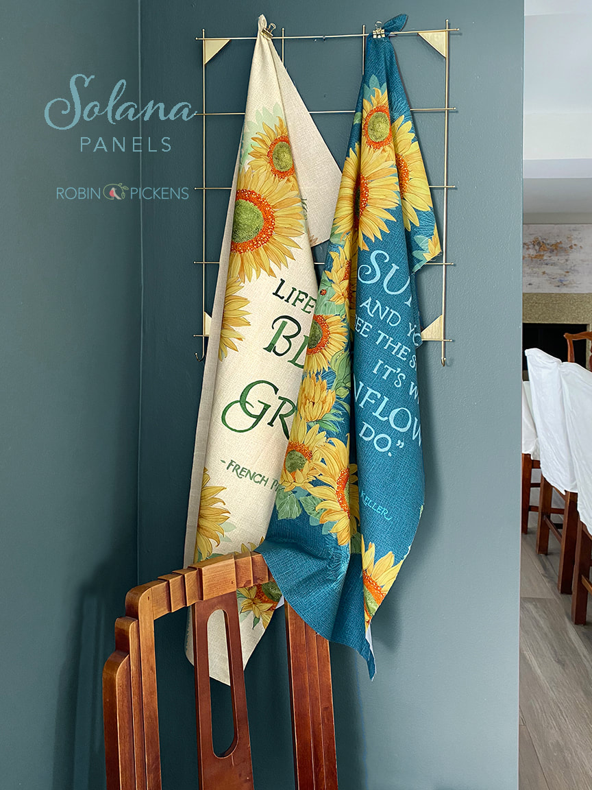 The quotes are "Wherever life plants you, Bloom with Grace" (French Proverb) and "Keep your face to the sunshine and you cannot see the shadows. It's what Sunflowers do." by Helen Keller. 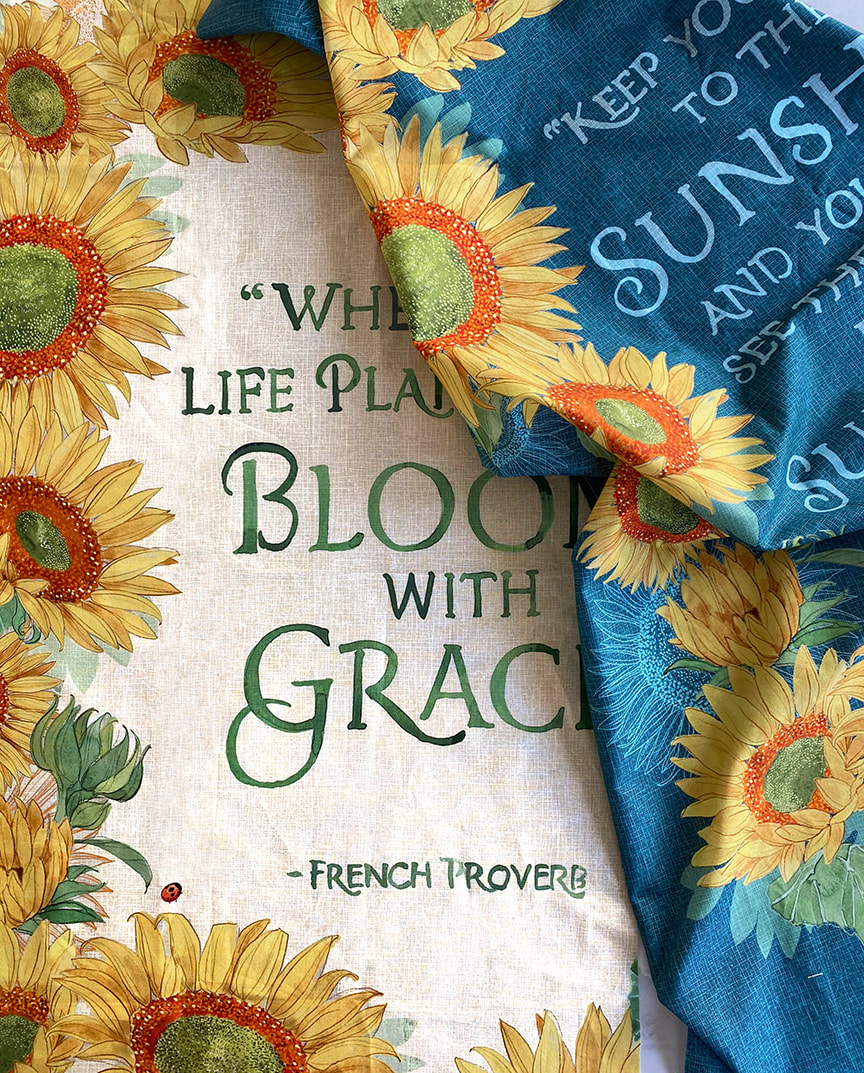 It's been a different experience to prepare for Quilt Market in a virtual way. Today I would have been back home, just arriving from a late night flight after seeing all you wonderful quilty peeps at Market. I miss that experience. It's like reuniting with family. But I am learning new ways of connecting with people over the internet and video. Speaking of video...this is what my dining room ended up looking like to make my market video! I'm still cleaning up... 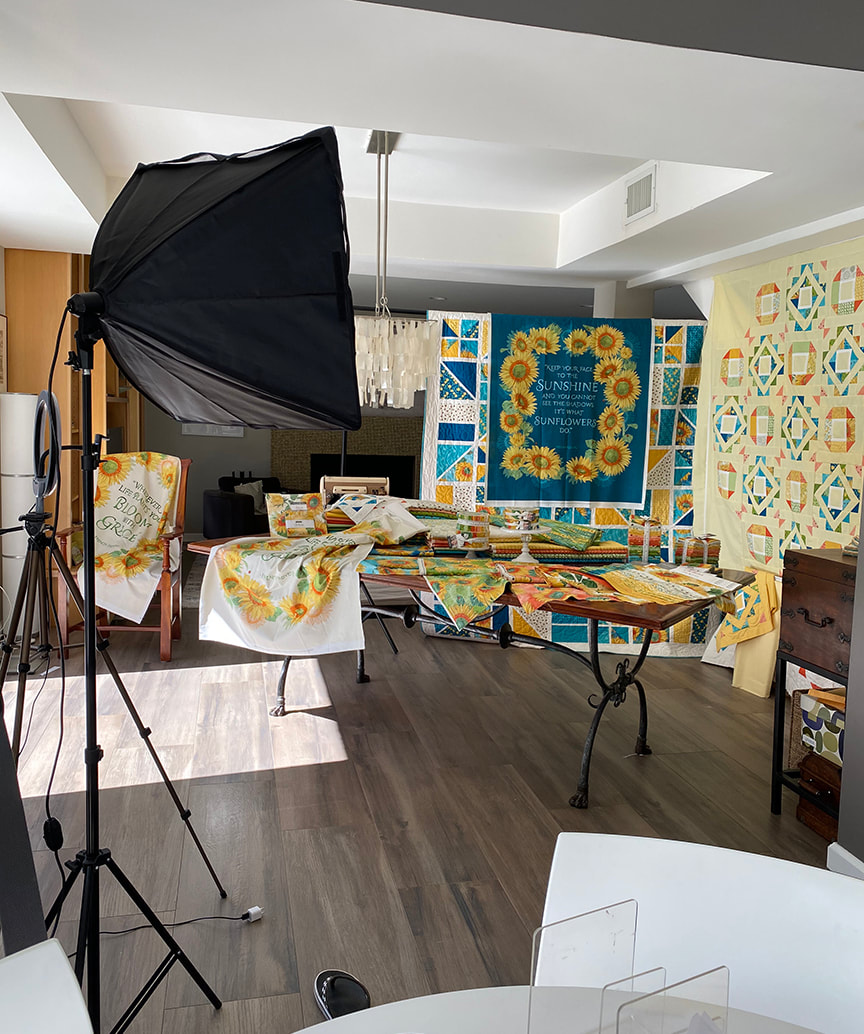 I'll post more about my quilts with this group, as well as my progress with my panels. I hope you are all finding some sunny inspiration in your days and can look to the bright side! -Robin  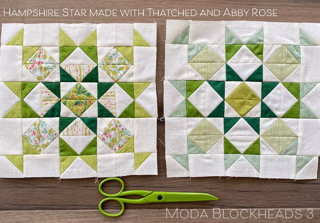 Stop by Janet Clare's blog for this week's Moda Blockheads pattern, Hampshire Star. I still have a few green blocks left to go in my green row so I'm working in that color family, towards the lighter end of my row (I'm going from darker to lighter in my blocks). I made my blocks similar to the layout of lights and darks that Janet showed in her pattern. But what would it look like if we played with those half square triangles with our color and light/dark placement? 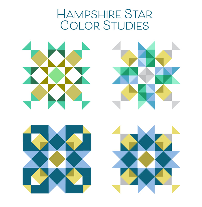 The first image follows the Hampshire Star layout. The second image treats the top, bottom, right and left middles like ribbons or banners with blue and green sides and triangles that play with sparkly light and dark. I emphasized an additional triangle within the inside corners with a darker olive color. The light and dark variations within the colors reminds me of cut crystal. On the bottom row I played with a darker color being in some of the background pieces. This can define the space with more of a suggested diamond center and more shapes created on the outer parts of the block. These blocks might not be considered Hampshire Stars anymore because of how the pieces are colored but I sure think they are interesting. I especially like how the image on the lower left reminds me of petals or interlocking oval rings. Wouldn't that be fun as a really large block? These layouts played with the half square triangles...but when I planned out my block I thought I could make a few less pieces (as well as less seams and points to match) if I used some flying geese pieces for some of the block. I still pieced my block in rows but used more flying geese and rectangles. 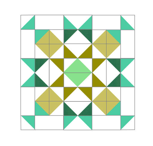 If you want to use flying geese I provided some sizes of pieces. This uses the one-at-a-time method with stitch and flip corners to make each flying geese unit. 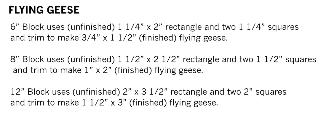 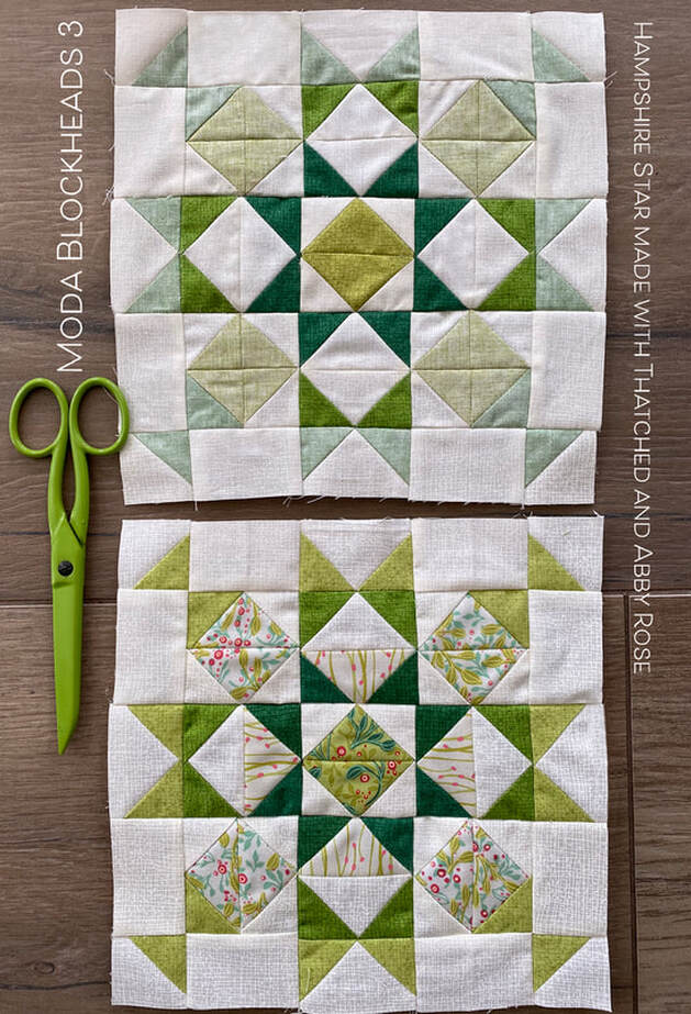 These are my blocks- one of all Thatched. One of Thatched and other prints. I used three coordinates from the Abby Rose collection for the scrappier version. Since I am working on the lighter end of the row of green blocks I thought this would be a good time to try some Thatched fabrics flipped to the back. This shows the lighter range of color. From the back side the colors have a soft, light, chambray look. 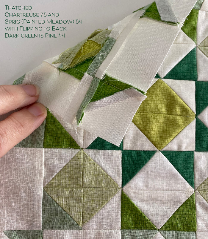 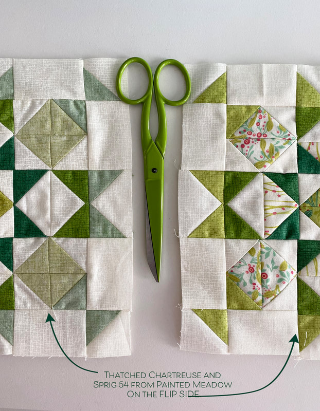 I also enjoyed a subtle change in the background on some of the flying geese in the Abby Rose version so I see a hint of a plus sign surrounding the center (the curvy pollen dance lines on the 4 sides). 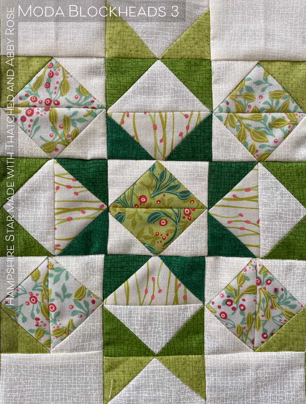 Check out the other Moda Blockhead designers to see their Hampshire Stars! Thanks Janet! Corey Yoder - https://corianderquilts.com/ Sherri McConnell - https://www.aquiltinglife.com/ Betsy Chutchian - http://betsysbestquiltsandmore.blogspot.com/ Jan Patek - http://janpatek.blogspot.com/ Brigitte Heitland - https://www.brigitteheitland.de/blog Lisa Bongean - https://lisabongean.com/ Lissa Alexander - http://modalissa.com/ Laurie Simpson - http://minickandsimpson.blogspot.com/ Vanessa Goertzen - https://lellaboutique.blogspot.com/ Stacy Iest Hsu - https://www.stacyiesthsu.com/blog/ (Me) Robin Pickens - https://www.robinpickens.com/ Janet Clare - http://janetclare.co.uk/blog/ Jen Kingwell - www.jenkingwelldesigns.com/blog Joanna Figueroa - https://blog.figtreeandcompany.com/ 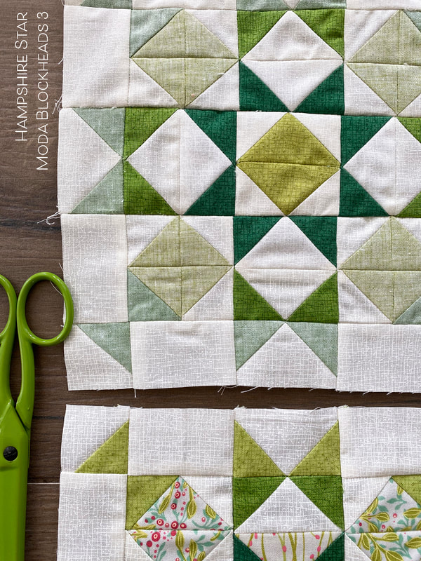 Betsy Chutchian's block this week, Crown and Star, reminds me of arms reaching out with spread hands, bursting with joy. You can get it on her blog at http://betsysbestquiltsandmore.blogspot.com/. I've decided to make my center with a dark pine square, surrounded by white star points on peacock for more contrast. The outer perimeter uses the chartreuse and sprig colors, similar to last week's block HSTs. 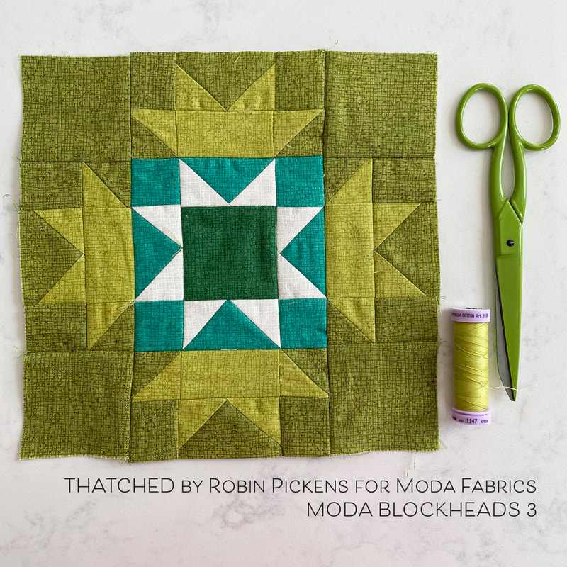 This is another one for the green row in my quilt top layout plan. This block falls on the darker range and uses more color and less white/cream. From the instructions, I deviated a tiny bit and made my flying geese units using a stitch and flip method, trimming off the corner after sewing, instead of cutting the side squares into triangles first. There is more waste with the fabric this way but the pieces are not that large so I don't feel bad throwing those cut pieces away. I'm making the 8" blocks, so my flying geese are made with 1 1/2" x 2 1/2" rectangles for the base and 1 1/2" squares for the geese triangle sides. 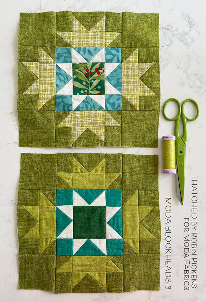 My print/scrappier version of the block keeps the Sprig color as my background fabric but I'm using the Stem Plaid from Dandi Annie in green for the outer crowns. The teal color is from Dear Mum and the center is a mistletoe branch from Splendid. I like a little pop of red to tie in with some of the red blocks. 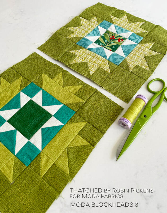 In my overall scheme, I have three blocks made that make up two greens and one red in my rainbow grid. I'm looking forward to getting more filled in and working out the progression to more white or cream as the blocks progress to the right. 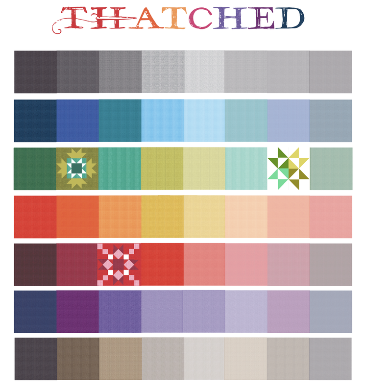 Happy sewing and share your progress on the facebook Moda Blockheads 3 page or tag your blocks on Instagram. Thanks Betsy for a wonderful block! Check out the other designers and their progress too: Corey Yoder - https://corianderquilts.com/ Sherri McConnell - https://www.aquiltinglife.com/ Betsy Chutchian - http://betsysbestquiltsandmore.blogspot.com/ Jan Patek - http://janpatek.blogspot.com/ Brigitte Heitland - https://www.brigitteheitland.de/blog Lisa Bongean - https://lisabongean.com/ Lissa Alexander - http://modalissa.com/ Laurie Simpson - http://minickandsimpson.blogspot.com/ Vanessa Goertzen - https://lellaboutique.blogspot.com/ Stacy Iest Hsu - https://www.stacyiesthsu.com/blog/ Janet Clare - http://janetclare.co.uk/blog/ Jen Kingwell - www.jenkingwelldesigns.com/blog Joanna Figueroa - https://blog.figtreeandcompany.com/ 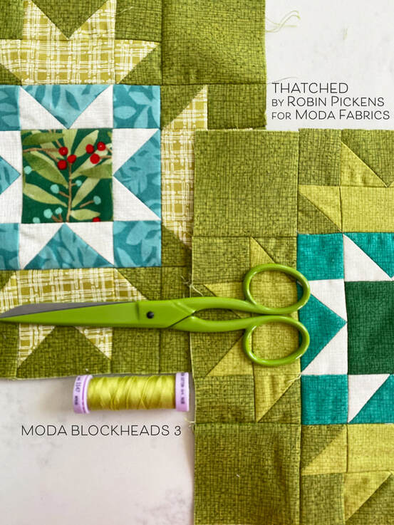 Lets get started with Moda Blockheads 3! Our first block is designed by Corey Yoder and is called "Star Chain." I mentioned in my posts before that I was going to use Thatched basics for making my blocks. This first block is using Crimson 43 for the background red. Outer center triangles are Rose 13. Dark pieces are Cranberry 118 and the light pink is the Thatched print that went with Dandi Annie. 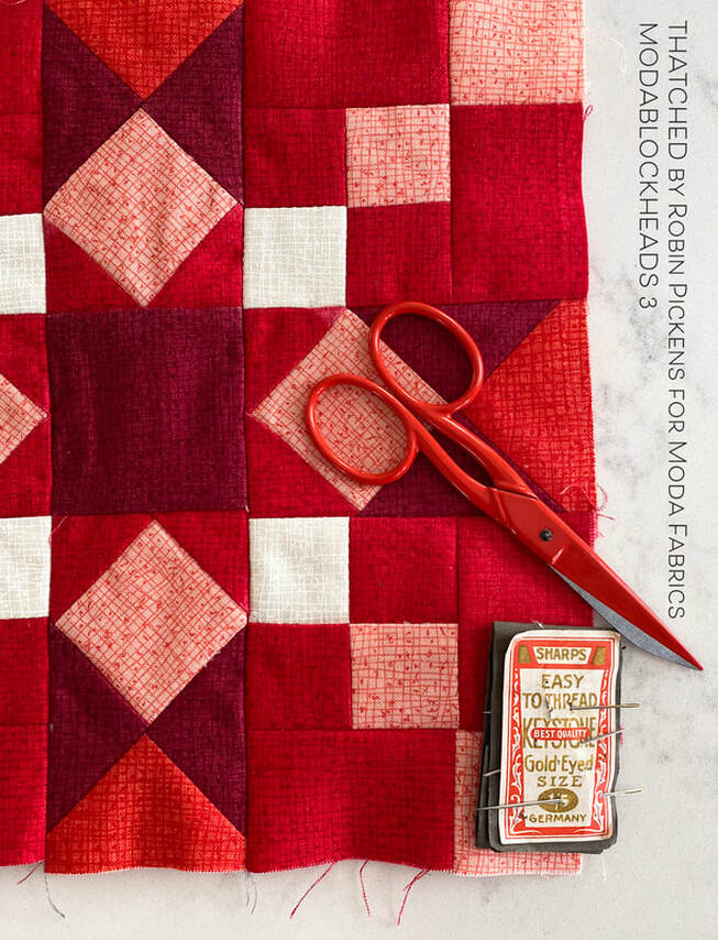 I'm trying to do my blocks in both Thatched-only and in Thatched mixed with prints from some of my collections. The first block I made was the purely Thatched one and I had a few stumbles along the way. For the second block with the prints I READ THE DIRECTIONS and was able to make a more accurate block. 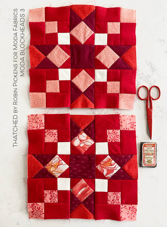 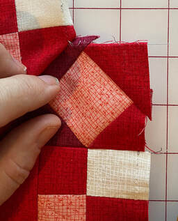 I found it hard to know where to line up my triangles for the center point when adding them onto the diamond square. I have to admit I often like to take the short route and I don't pin much. My "guesses" on mid point when adding the second triangle sometimes left me with uneven pieces and sides for sewing seams. Perhaps I could have found some tips by googling it or something, but I resolved my issue by finger pressing two sides of the square in half, and the long end of the triangle in half, before joining either. That way, once the first triangle was added, I already knew where the triangle and square center point was to line up the next piece accurately. AND since I ended up ironing out the finger presssed crease after attaching the first triangle, I decided making a pencil mark was a better way to mark the square. This gave me a MUCH better result with even edges.
With the second block I also followed Corey's arrows to show which direction to press the block pieces. The entire block lined up well when I finally followed those instructions! However, I still added one whole row to the top upside down and had to rip that out and flip it to the correct side. I figure I'll make all my errors on the first blocks, right? Somehow I have a feeling I will be friends with my seam ripper numerous times as I embark on this journey. But that also means I am learning and stretching my skill set to new levels. I think it a universal understanding of quilters that mistakes, um, I mean "opportunities" help to make us better quilters. 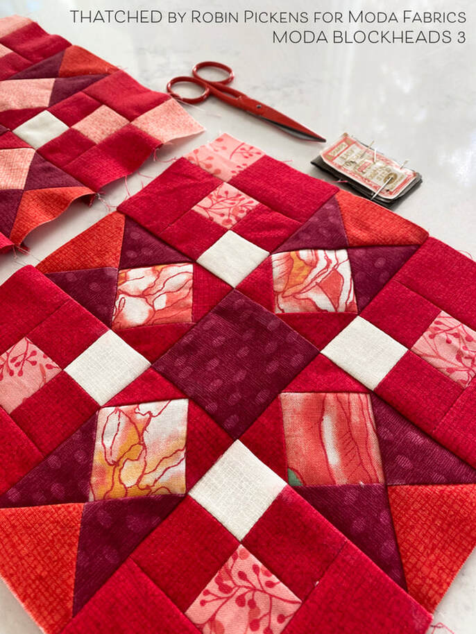 Check back next Wednesday for my Thatched and Thatched/scrappy blocks for week 2. If you want more info on my colors and my overall plan, check out yesterday's post My Plan for Moda Blockheads 3. And visit the other Blockheads 3 designers to see their blocks and progress too! Corey Yoder - https://corianderquilts.com/
Sherri McConnell - https://www.aquiltinglife.com/ Betsy Chutchian - http://betsysbestquiltsandmore.blogspot.com/ Jan Patek - http://janpatek.blogspot.com/ Brigitte Heitland - https://www.brigitteheitland.de/blog Lisa Bongean - https://lisabongean.com/ Lissa Alexander - http://modalissa.com/ Laurie Simpson - http://minickandsimpson.blogspot.com/ Vanessa Goertzen - https://lellaboutique.blogspot.com/ Stacy Iest Hsu - https://www.stacyiesthsu.com/blog/ Janet Clare - http://janetclare.co.uk/blog/ Jen Kingwell - www.jenkingwelldesigns.com/blog Joanna Figueroa - https://blog.figtreeandcompany.com/ I've had a number of requests for showing Painted Meadow fabric in my Joy and Delight quilt design. I love the ease of the computer to try out a few things so lets have some color and print fun! I designed Joy and Delight with my Christmas collection, Splendid. I showed it with the blocks alternating two prints OR in a version with the large block centers using a Layer Cake for a scrappier look. With this exercise in color play, I'm staying with the scrappy Layer Cake assortment. 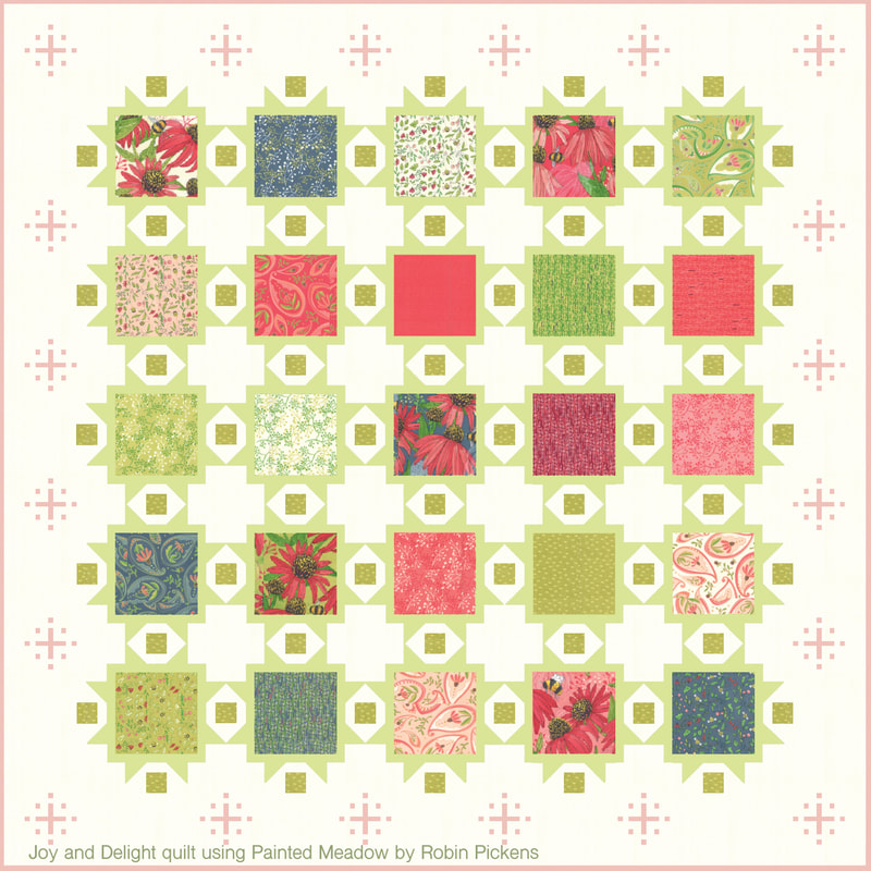 I'm starting with some of my favorites (I think) because I really enjoy how soft and pretty these can look in this more pastel palette. The above quilt shows the snowflakes in the borders in pink. So now I can feel free to call them sparkle bursts instead of snowflakes. They have a sparkly decorative feeling. Of course you can make this quilt without the border sparkles but I think they do add a layer of twinkle (or pixie dust??) to make those borders feel special. Below is a more close up view to see the softness of the sparkle bursts in a light color. Also the framing around the blocks is shown in pink (below) vs light green (above). 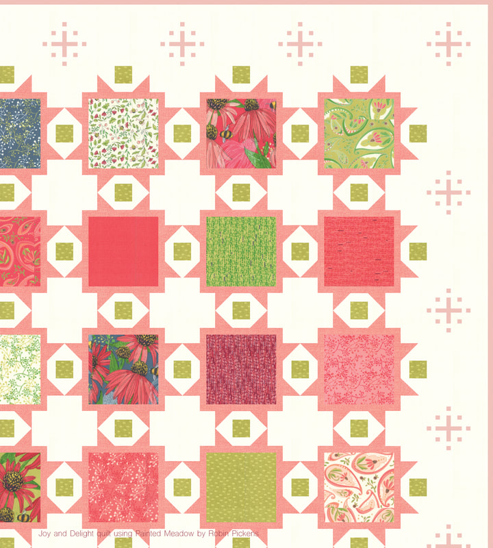 A little more exploration of pinks...lighter to the deeper pink. With the lighter pink background I used dark pink framing and border sparkles. When using a darker frame around the blocks, I like to switch the small squares in between to a light color for more contrast and the color sparkle of the white accents (see, more sparkle!). With the dark pink I went back to the pop of the cream frames but made my border sparkles even darker red. 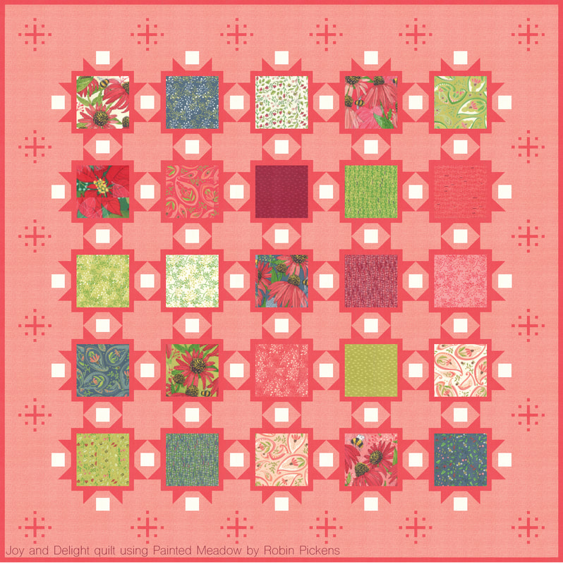 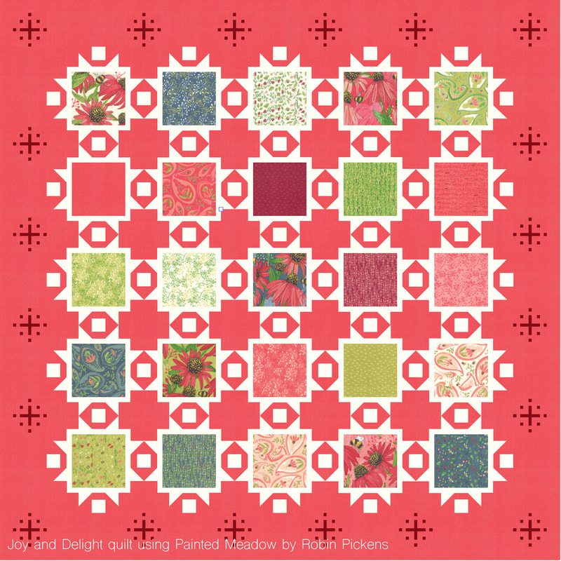 I enjoy the more dramatic tealish blues of Painted Meadow and thought it would be fun to see some blue stories. A deep midnight blue frames the squares in this first one. 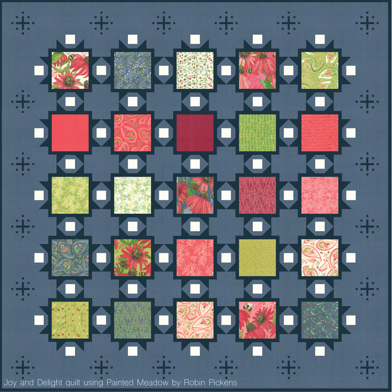 And on this version I wanted to add a soft khaki or light tan for the frames. I think the addition of the neutral natural light tan gives this an entirely different feeling and is a nice compliment to all the color in the blocks. There is something so restful and calm about this color combination. 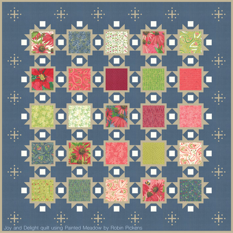 Hope you enjoyed a little color play with Painted Meadow and this helps in visualizing quilt plans! If you are interested in Joy and Delight, it is shown in Splendid in my shop. Happy sewing! 
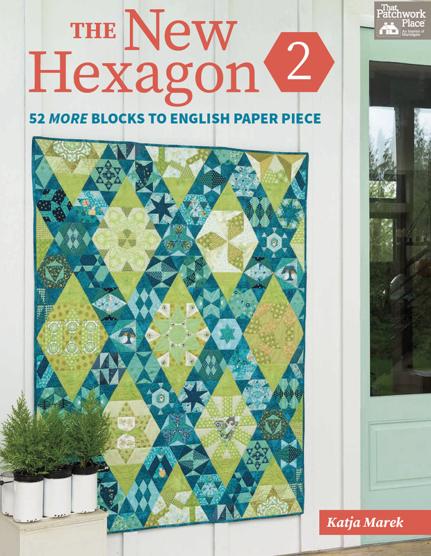
I was so honored that Katja Marek asked me to participate in her instagram book tour for her book, The New Hexagon 2, published by Martingale. This is a second book on hexies, after her popular The New Hexagon. I love the image on the cover here so much! First off, that color palette of greens and teals is stunning and her layout of large and small blocks to make the diamond shaped sashings creates such a wonderful movement within the quilt top.
Katja named the blocks after women she admired and I was so honored that she selected me for one of the blocks! Thank you Katja!! I certainly admire what she has created as well. And I appreciate how thoroughly and well she explains English Paper Piecing in this book with photos and tips that make a difference.
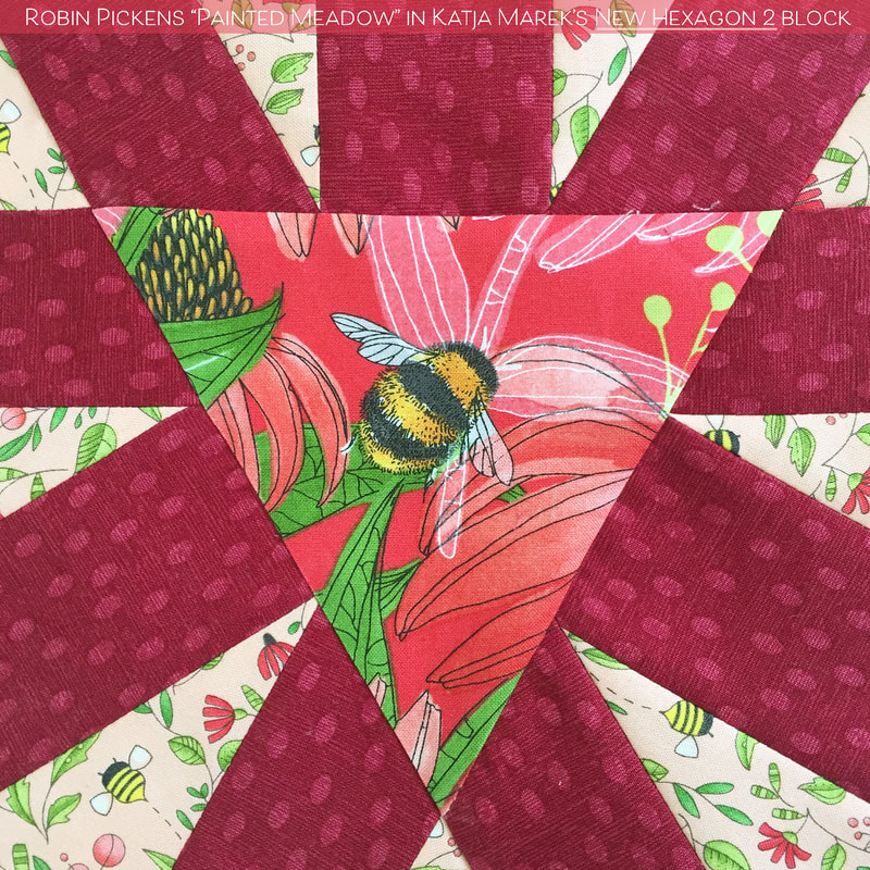
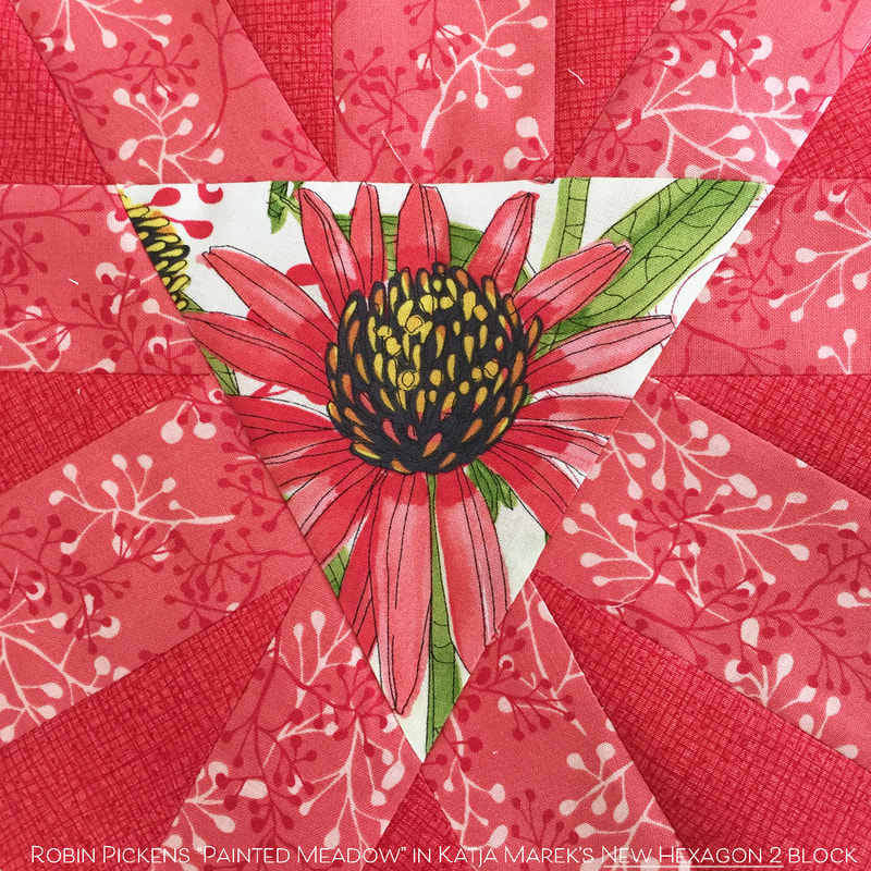
So meet the ROBIN BLOCK! It is block number 7 in the book and is a 12" size, one of the larger blocks. I appreciate having that fun center triangle for putting in something with some fussy cutting. All those rays would look great with fussy cutting too but I decided to make mine with an emphasis on one of my bees and coneflower centers in the middle. 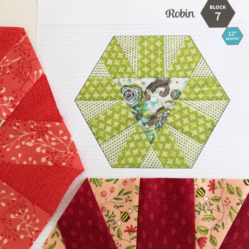
I used my Painted Meadow fabrics to make my blocks since it recently landing in quilt shops. I keep thinking that this block would be great as a lion face (embroidered in the center?) with the rays being a gold lions mane. Or with a graphic sun? I think you could have so much fun with this one.
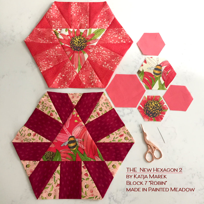
Say his to my bumble bee! She's nice and plump and busy in the garden.
If you want a copy of Katja's book, give some love to your local quilt shop and see if they have it! If they don't, you can follow these links at the bottom of this post to find her new one as well as the original The New Hexagon (also by Katja Marek). If you'd like to visit the other designers and quilters on instagram that joined in on the book tour, check out the list below. There were giveaways, which are closed now, and I hope that everyone who won a book has a happy sewing journey with their hexagons.
On INSTAGRAM: @katja_marek @karenburns1 @martingaletpp @paperpiecesepp @modalissa @kim_brackett @robinpickens @alisonglass @la_casetta_nel_bosco @allie.and.me.design @quilterpatsloan @lynetteandersondesigns @gailpandesigns @sewmorequiltsmom @poppyprint @stitchpublications @stashlabquilts @meghawkey1 |
About ROBINDesigner of colorful florals for Moda fabrics. Modern to transitional quilt designer. Illustrator, sewist, crafter. I am proud to be a designer for Moda Fabrics!

Shop Robin's Designs
 I am an affiliate for Fat Quarter Shop and may earn a small commission through my links. Thank you for your support!
Check the March 6, 2017 Episode!
Categories
All
Archives
February 2024
© Robin Pickens Inc. All rights reserved. No images may be reproduced without permission.
|

 RSS Feed