|
I am headed off to Nashville Needlework Market and I'm so excited to be going for the first time! I can't wait to see all those materials and flosses and cross stitch goodies! But before I go, I must post these color studies that I did for the MOONBEAMS quilt that the Fat Quarter Shop is doing as their fundraiser for Make-A-Wish! The sew along starts this Friday, March 1st!! 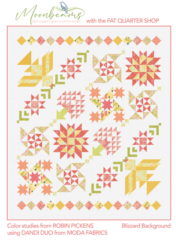 When I saw the design for this year's charity quilt, I thought it was SO pretty and elegant! I love the birds in the corners and the trees especially. This is designed by the Fat Quarter Shop and I will be sewing along, making my version in my Dandi Duo fabric from Moda Fabrics. The first mockup I did was on white and I must admit, I LOVE how light, springy and fresh it looks with the pinks, corals, yellows and greens on a nice white background. Since Dandi Duo also have soft grays I wanted to try that. Although it is also a soft look, I don't think the gray gives the quilt the energy it deserves. 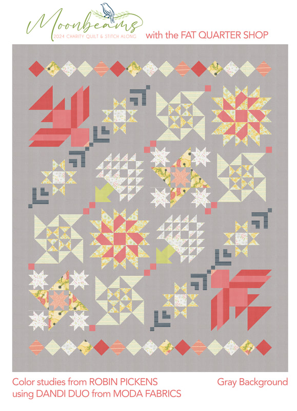 So how about something more vibrant?? This is Thatched Passion 58. It is not a Thatched color that comes in a bundle of Dandi Duo, but it coordinates really well and is a little darker shade to let those lighter pinks and corals pop out. I am definitely liking the Passion color more than the gray. I think it is lively, fresh and very playful. 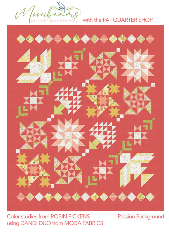 The last version I tried is on Shadow, a nice dark charcoal-ish gray. I was inspired by seeing the Fat Quarter Version with Strawberry and Lemonade from Sherri and Chelsea, which has a dark blue for the background. The dark color really lets all the block elements sparkle and stand out. It is dramatic and sophisticated. 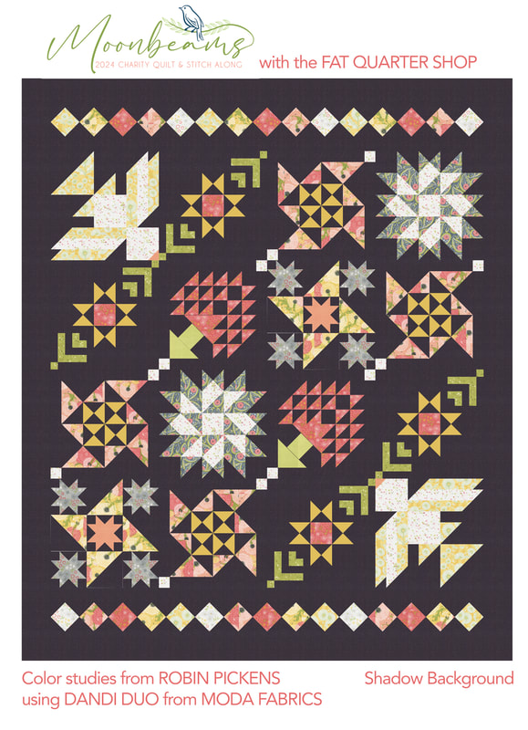 Which one to make?? I really came down to the Passion or white and decided on the white since it felt so happy and cheery to me and I think that works really well with this quilt. My quilt will be auctioned off at the end to help raise money for the charity. Stay tuned for sharing some blocks and get ready to sew. 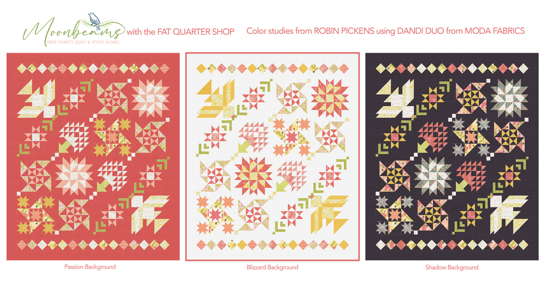 Read more details about the sew along. THere is also a stitch along for a matching cross stitch design that is so lovely! The Jolly Jabber blog from Fat Quarter Shop has all the details on quilt and cross stitch! blog.fatquartershop.com/lets-get-ready-for-moonbeams/  Join in and support a great charity! I'm so excited to make the beautiful quilt! If you post images, use the hashtag #MoonbeamsQAL so we can see your work.
0 Comments
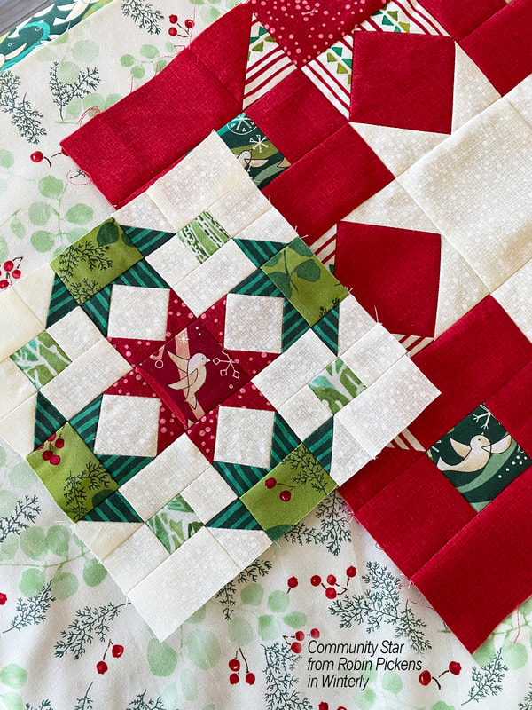
Moda Blockheads Day! Time to catch up on a few things. 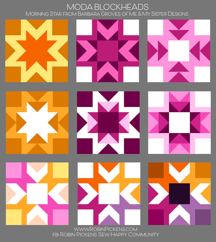 First off, color studies for this week's block, Morning Star from Barbara Groves of Me & My Sister Designs. Are you a supergraphic 70's star outline lover? Or prefer a row of flying geese arrows? Blocky sides? Arrow points towards center with different color corners? Such fun to play with this block and the outline that surrounds the star. This is an awesome block to play with. Thanks so much Barbara. 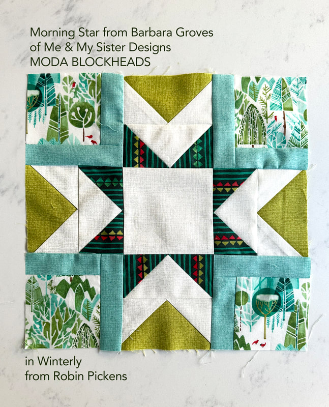 This is my block that I made this week in Winterly fabrics. I decided to make those outlines in the corners the Seafoam color to bring in more of the cool tones in the tree prints in the corners. I liked having a darker green in the center star points in contrast with the Chartreuse sides. 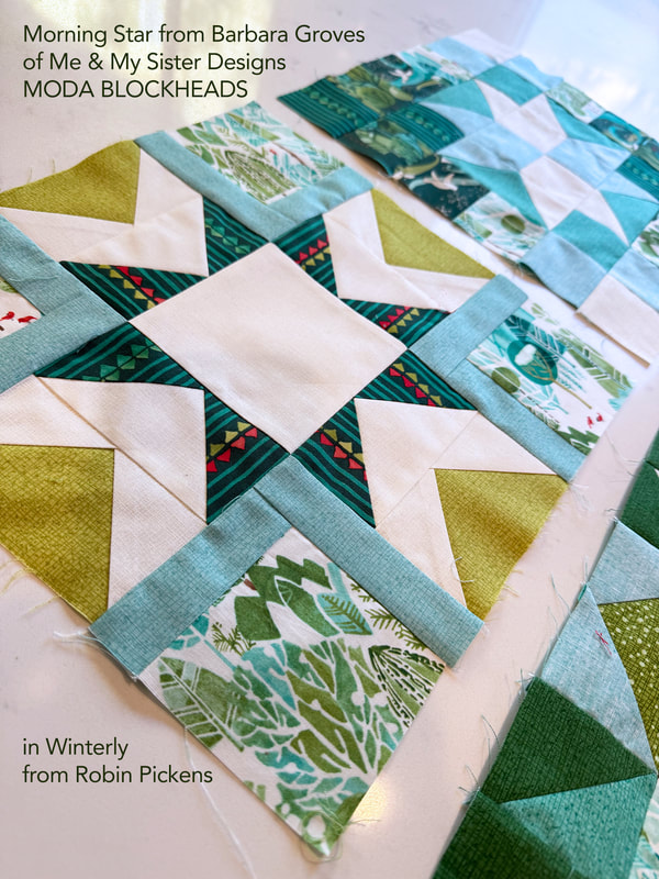 Back in the first group, when I showed my block, I sewed it up in Winterly fabrics and I knew I wanted to make a Christmas quilt, but didn't have a plan. I have numerous Christmas quilts but none done from a sampler or from a sew along. It took awhile to think about it but now I have a plan. 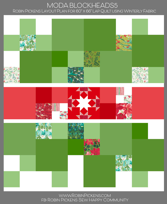 For the past 2 Moda Blockheads quilts, I've made very structured medallion and linear quilts. I wanted a quilt for this one that felt a little more free-flowing but organized. The star blocks seem like the perfect opportunity for a holiday quilt. You can see my first block I made, my "Community Star" block (group 1, block 8) on my previous blog post. Most of my Christmas quilts have a lot of red color so I wanted this to be more green-focused, using more of the tree/landscape/greenery/bird prints from Winterly. The quilt will use a mix of 6" and 12” green blocks, in a flowing arrangement, with a band of red blocks running as a band through the center. I will also intersperse 6" squares of fabrics from Winterly to show off those fabric design, coordinate with the blocks, and fill in any needed spaces. The Thatched colors that I am using along with the Winterly prints are Thatched Cream 36, Crimson 43, Pine 44, Ocean 144 or Dewdrop143, Seafoam 125, Spring 54 and Chartreuse 75. There is a larger group of greens to go with the larger percentage of the quilt and add interest by mixing the warm (Chartreuse) and cool (Seafoam) greens. 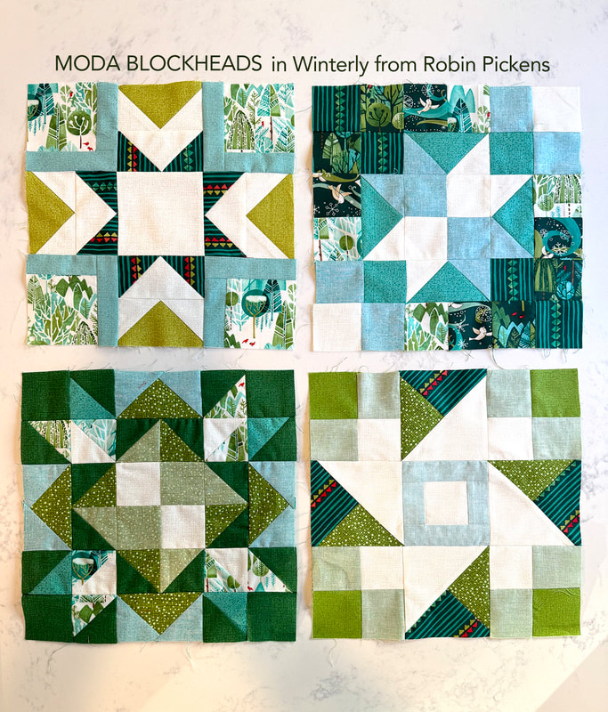 Now that I have decided on my plan, I have some catching up to do! According to this layout, I need about 10 of the 12" blocks and I worked on 4 of those. The blocks above are Morning Star, Super Scrappy Star, Bright Star and Shimmer Star. As I do blocks, I keep track of my progress by filling in my layout image. Since I do color studies, I make up these blocks in Adobe Illustrator and can easily swap in my Winterly fabrics for my layout. This helps me see what I am missing and how to keep the balance of color and light and dark. 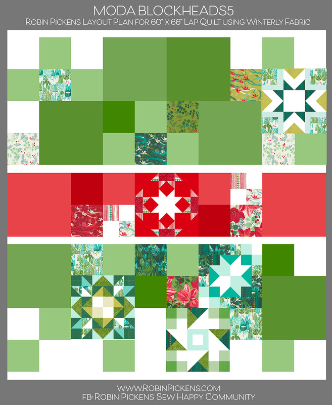 I was a bit late in figuring out my plan and now have LOTS of catching up to do (and I'm sure no one else is in that predicament, right??). I'll share past color studies that I posted in the facebook group along with blocks as I make them here on the blog. This week I made the 4 blocks. The first color study for this week is at the top for Morning Star. The very first block of group 1 was from Betsy Chutchian, called Bright Star. 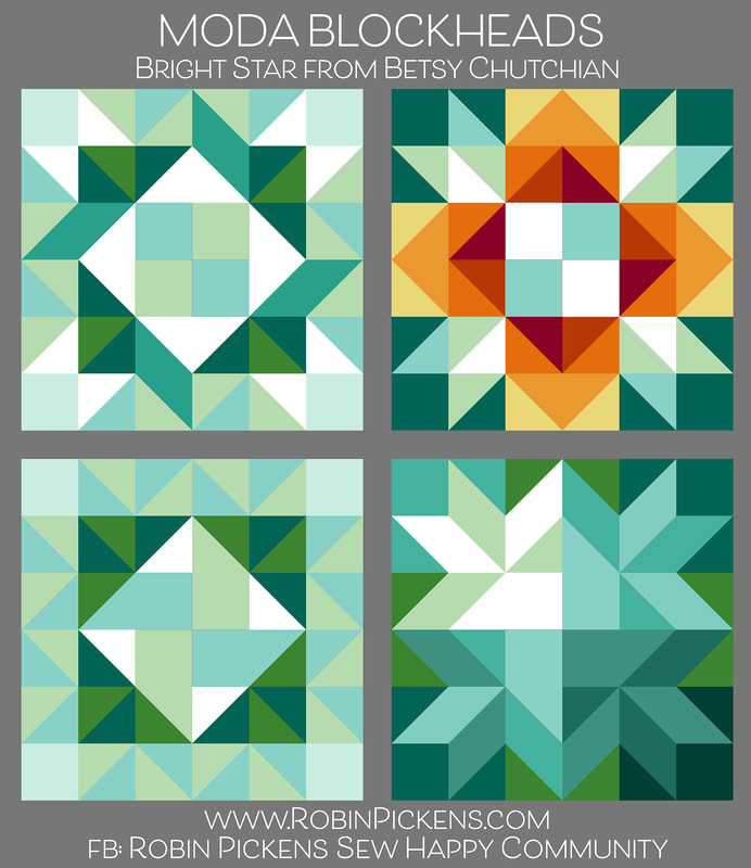 Well, I could have played with this block all day long since there are potentially so many things I could try. I loved the little ribbon like corners and honestly, I think this block is a little busy and I should have limited the number of fabrics and colors I was using. But that is okay since I can balance this out with other, simpler blocks or just the Winterly squares around this. 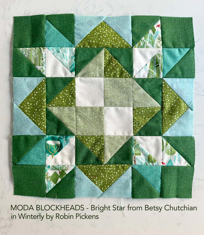 I've also made Super Scrappy Star from Corey Yoder. This was from group 1, block 4. I liked the last of the color studies a lot with the lighter center star and two corners trailing off to darker shades. 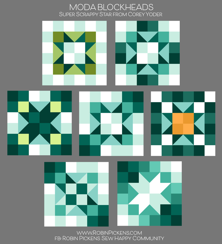 On a block like this, I am using Thatched fabric and also flipping it to the back side to get that lighter shade of the color (the more chambray-looking ones). I just noticed in the photo that my lower left seams are not matching up so well. Hmmmm. To fix or not to fix? I'll probably end up fixing it... 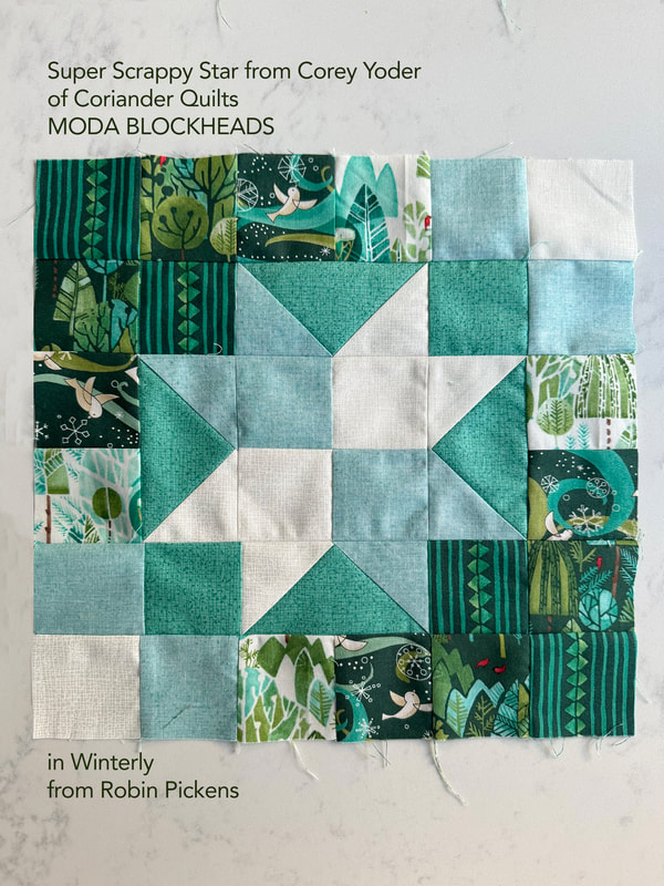 This is last week's color study for Shimmer Star from April Rosenthal. Arrows, checkerboards, ribbons and pinwheels! And yes, stars. 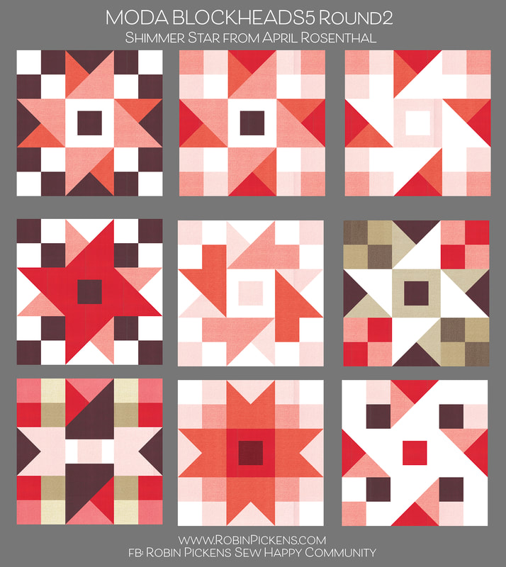 My actual block based on the top row, far right, color study image. I like how Thatched Seafoam (backside) and Spring go with that Pine stripe from Winterly. 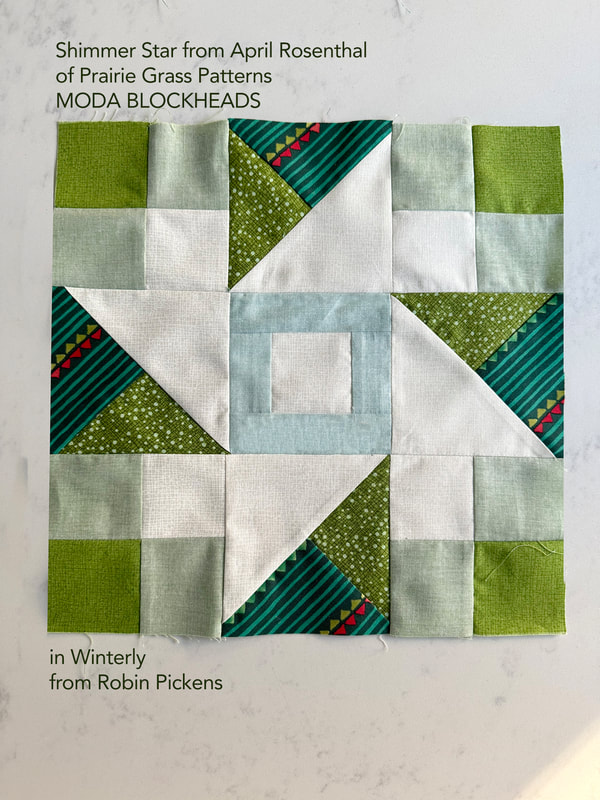 I don't think I'll be getting around the the paper piecing on this block, so I'll post the color study now. This was group 1, block 3 from Brigitte Heitland of Zen Chic, called Stellar Elegance. It sure is elegant! And I love how it can be a split day/night image. 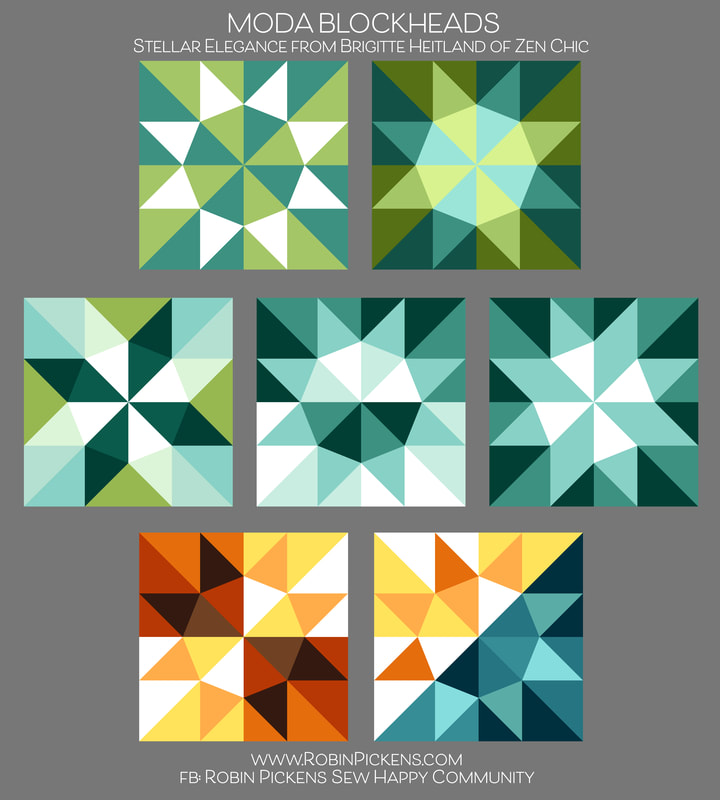 For my next round of blocks, I think I will focus on some of the smaller sizes. This shows the scale change between the 12" and 6" block sizes (and this is one of my Community Star blocks). 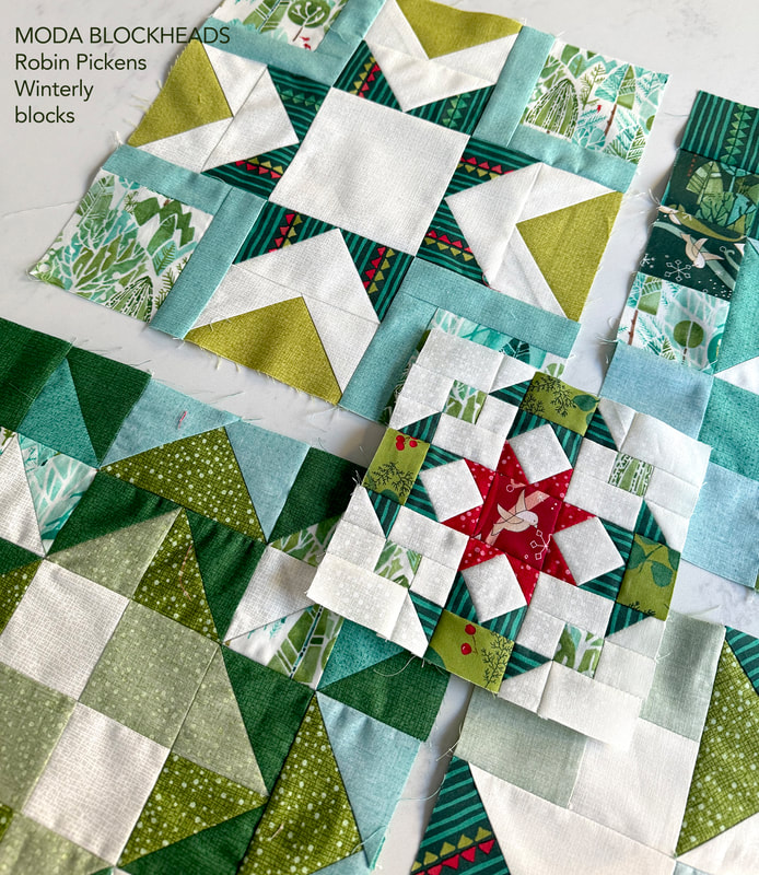 Now that I finally have it all planned out, I get to do the fun part and SEW! Well, the color studies are also a fun part for me as well. I am often surprised by what pops out as I play on the computer. But there is such a satisfaction of seeing those happy fabric blocks evolving when sewing and feeling and working with cloth and thread. 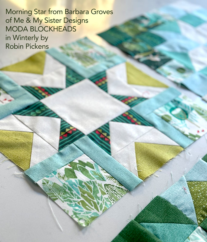 Keep up with my progress and share your own projects through my Facebook group "Robin Pickens Sew Happy Community" where you can also ask questions and be in community with other quilters. Hope to see you there! You can also find me on Instagram and Pinterest @robinpickens as well as on youtube. Happy sewing in the new year! 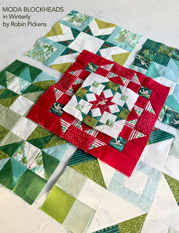 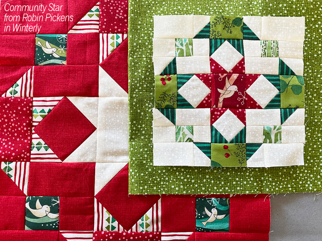 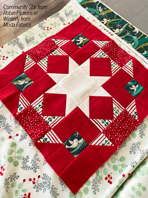 My week for Moda Blockheads! Yay! I am newly back from Quilt Market in Houston (just arrived home late Monday night) and woke up Tuesday morning with the thought of "BLOCKHEADS!!" When I am getting ready for Market, a lot of other things get pushed to the side and making my block became the task of the day. Seriously, I made my block instead of unpacking my quilts and clothes from the trip! 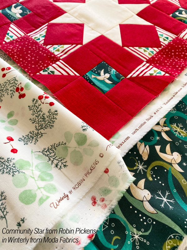 I knew I had to make my star block in my new WINTERLY fabrics that I was just showing at Market! I'm going to be making a holiday quilt to go along with the line and that is why a lot of my color studies have been skewing towards the greens in color...my brain has been piecing Christmas quilts for months. The 12" block I made has a mixture of Crimson Thatched AND Dotty Thatched (which we mix into a line from time to time and reminded me of snowfall for this winter group) and a cheery striped print and some of my whimsical flying birds. I used the Dotty Thatched Cream for the background of the smaller 6" block with greenery and pine stripes for the side stars and a red bird in the center. My concept for "Community Star" is the idea that one star is in the center and the community of others is surrounding, supporting and reaching out to it. There are 4 partial stars that show half their star-bodies and reach out with points to touch the center star. So very often in quilting, we are reaching out and supporting and connecting with each other. It is really an activity that thrives with strong community. And Blockheads is an active and fun community so it seemed fitting. 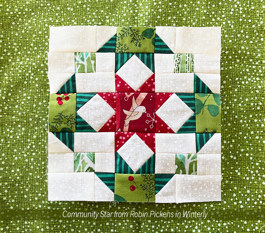 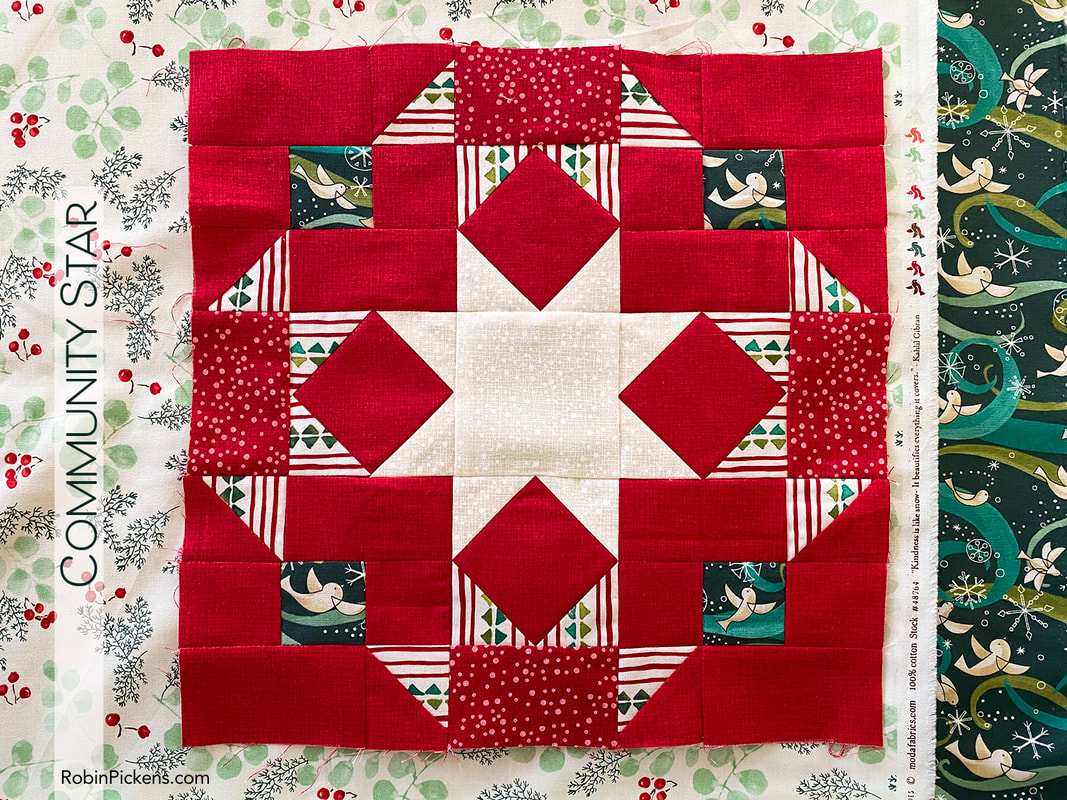 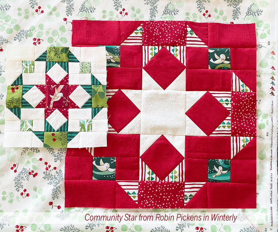 As I read through the directions for my designed block, I realized I needed to share another version of construction for anyone who uses stripes like I am to allow the stripes to be horizontal and vertical. The way the directions are written would split the H and I squares diagonally and sew them to the G square, but the lines would be going diagonally in my final piece. So I did a variation that does take a little more fabric but uses a simple "stitch and flip" with corner squares to achieve the triangles. Using this method allowed me to position my stripes so they always looked like they were coming straight from the sides of the edge stars. If you would like to use this method, these are my changes: 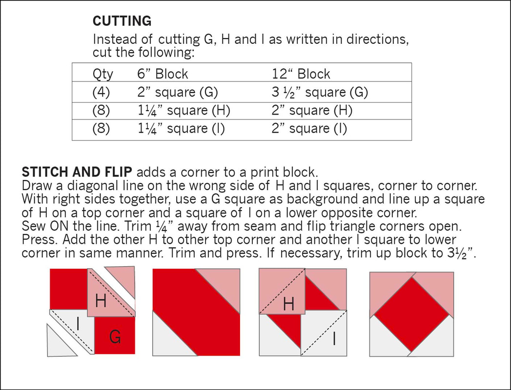 Instead of 4 squares of H and I, you will need 8 of each. Sew them to the corners and flip open and trim, similar to how you make traditional flying geese. After pressing open the opposite corners, add the other 2 corners. Just make sure to press open first (or am I the only one who has forgotten to press open a flying geese side before adding the other square?) Whichever method you choose, I hope you have fun making these star friends! Of course I had to share some color studies with you for this block too... 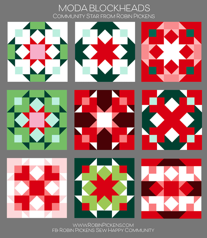 Like I mentioned, I'm thinking Christmas, but you can imagine any colors you like in here. Just substitute and think about those light and dark spaces. Stars can be the same colors in the centers as the points or multiple values of light and dark. The top two probably best illustrate the idea of stars reaching out in community to the center best. It is also fun to look at those outer star shapes as bowties or the center blending into a big X. How about a lighter outer border or a suggested churn dash relative in the white background shapes? Emphasize dots or lines...have fun! You can download the pattern here from the blue DOWNLOAD FILE below. Or visit the facebook page or Moda's blog.
 I'll be making some of the other blocks and sharing them in Winterly fabrics. Winterly will be shipping in May of 2024. It features Amaryllis lilies, birds flying in swirly breezes, hillside landscapes of trees, dotty Thatched, greenery, stripes and a triangle print with holiday motifs. There is also a panel with 4 square bird blocks and two horizontal treescapes. I'll share more pictures and the quilt projects in the next blog post. I've got new Christmas cross stitch to coordinate and it was very fun to share it all at Quilt Market! If you are new to my world, I hope you will consider joining in on the Oak Grove Square sew along. I delayed October due to Quilt Market but just started in September on a monthly sew along. Want to sew some mushrooms? That is the first month! Check out my Facebook group "Robin Pickens Sew Happy Community" where you can share your projects with my fabrics and patterns or ask questions and be in community with other quilters. Hope to see you there! You can also find me on instagram and pinterest @robinpickens Happy sewing! 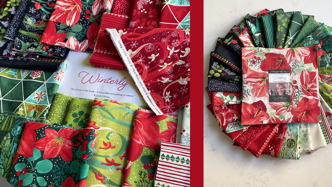  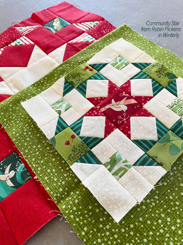 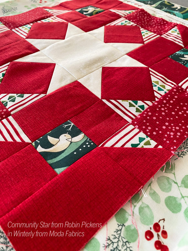 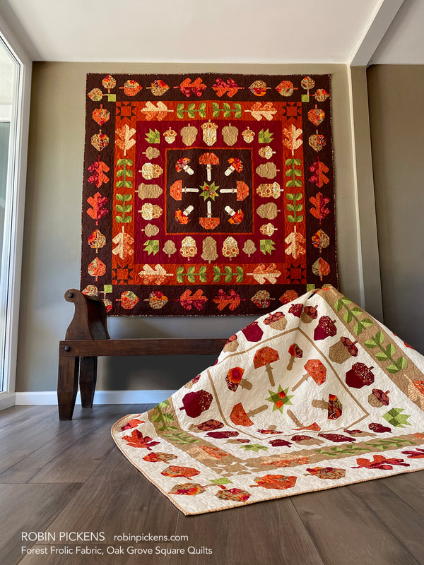 Hello September! It is time for my OAK GROVE SQUARE sew along to start soon! I feel like the weeks have been rushing by so quickly and I'm still trying to catch up. I originally hoped to start Oak Grove in the beginning of September, but due to me being a little delayed getting this info out, I'm starting further into the month. Just like I did for LEAF PRESS, I've played around with some alternative Thatched palettes. My pattern is written to the Forest Frolic fabric and I've made the quilt in Forest Frolic and have both the light and dark version. Because of that, I'll be sewing for the sew along with one of the Thatched versions. 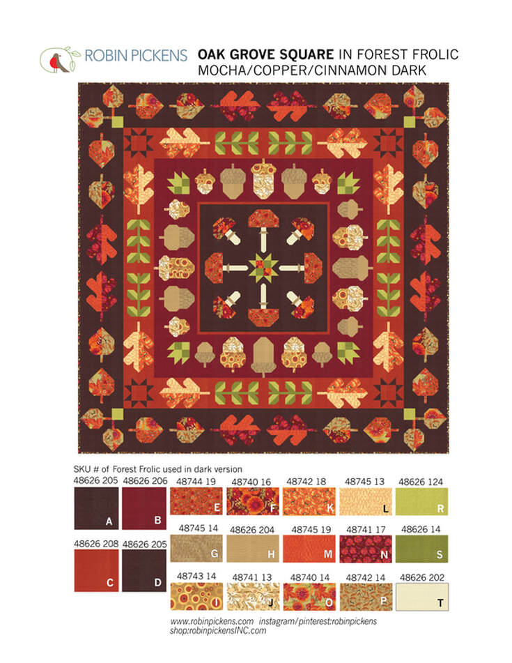 A couple explanations about the quilt first. Finished size is 72 1/2" square. The motifs are of fall leaves and acorns and mushrooms with some leafy stalks and corner stars and patchwork center star. It is a medallion quilt that has a center square and radiating "rings" (or square borders) surrounding it. You can make this quilt with all one background color or make every row/border/ring a different color. On this dark version I've used the new Thatched Mocha for the center and outer row. The Acorns are on a Cinnamon border and the green leaf stalks and some Oak Leaves are on a Copper border. 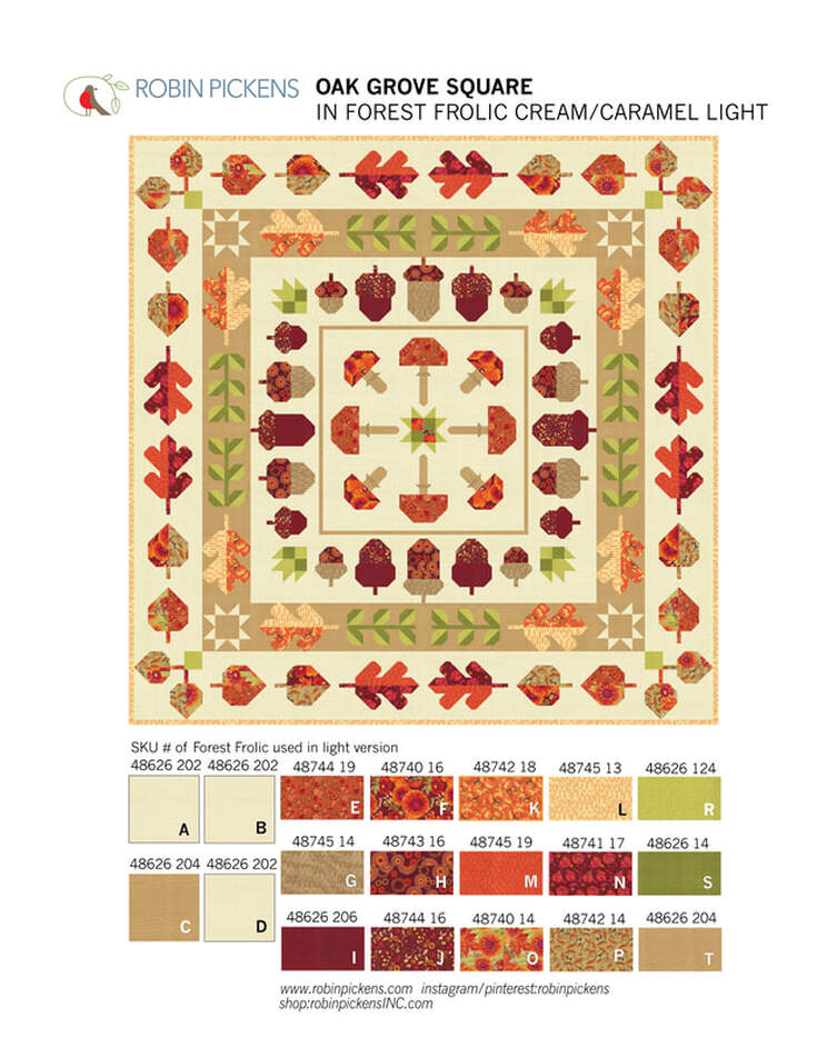 This light version uses Thatched Buttermilk for three of the backgrounds and Caramel for one of the rows. Because of the options to use different background colors, the sections are cut and written in the pattern according to the rows. If you decided to use 4 different backgrounds, you'd need: Background A..... 3/4 yard (you can use 2/3 yard but it is tight so 3/4 gives you more room for play) Background B..... 1 and 1/3 yard Background C..... 1 and 1/2 yard Background D...... 2 and 1/3 yard The prints needed are 12 Fat Quarters of prints (Fabrics E-P) and a couple additional accent fabrics of greens for leaves (1/2 yard for Fabric R and 3/8 yard for Fabric S) and 1/8 yard or Fat Eighth for Fabric T used for mushroom stalks. The blocks all use construction for half square triangles, flying geese and stitch and flip corners. It is regular piecing and not foundation paper piecing. No applique (although feel free to add any embellishments to your own quilt with an applique addition). 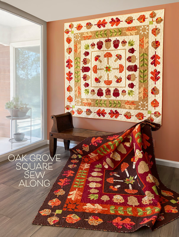 As I worked on the Thatched color studies, I wanted to try versions that felt like they went with the fall season but were not ONLY about fall. I liked this version on Cream Thatched with a Pink Grapefruit border C. This feels light and playful on the crisp cream background, thus the "Lighthearted Fall" name. 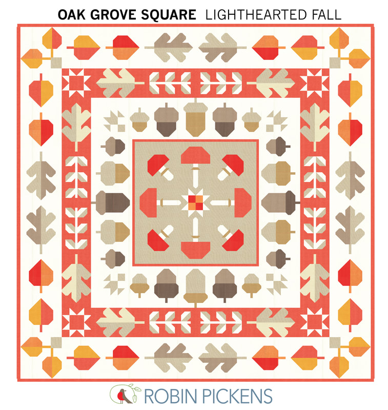 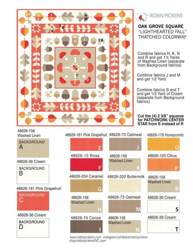 And by simply changing the outer Background D to Smoked Paprika and Background B for acorns to Buttermilk, the feeling evolved to a richer color scheme for "Colorful Fall". 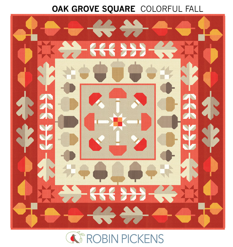 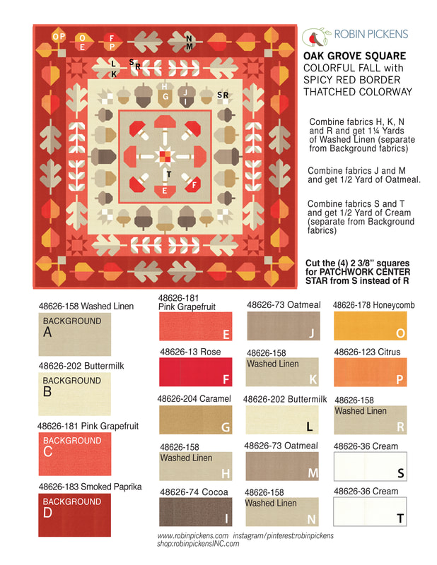 Lets go darker and more dramatic! "Dark Drama" uses Thatched Soft Black with a row of Olive. Lively Passion, Honeycomb, Cranberry and Tangerine give a sparkle of warm bright colors. 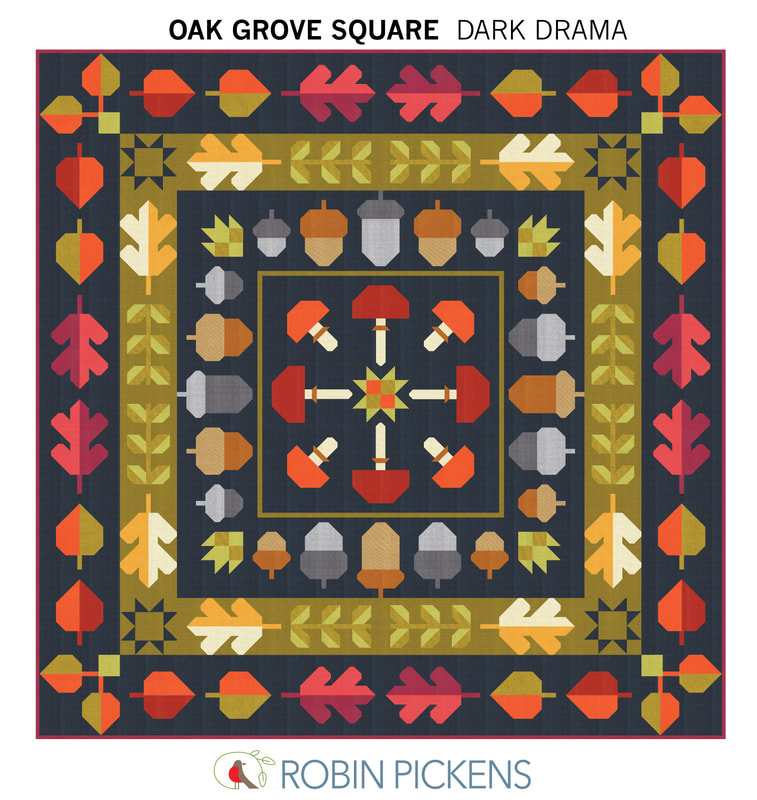 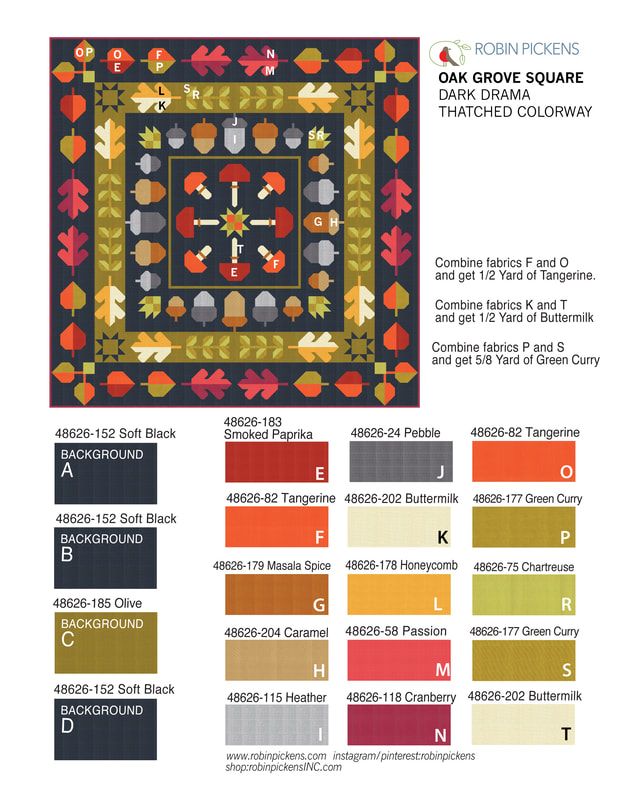 And one more...using colors that stray more from fall and have "Cheery Brights" to make an Oak Grove Square that is fit for year-round fun. 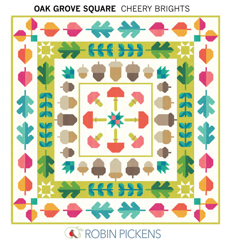 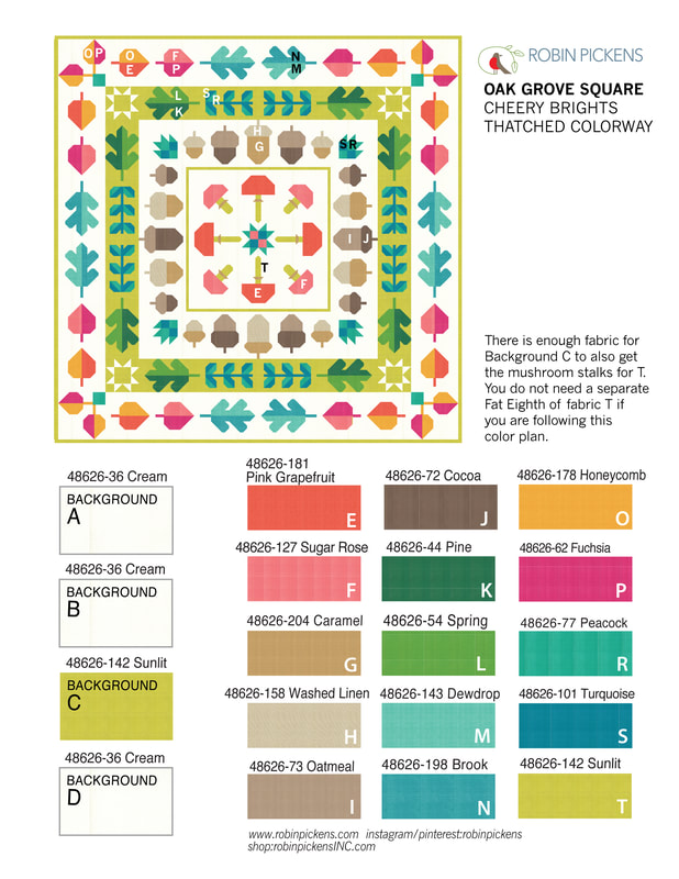 What about the details of sewing along? Where and when? Where: Share your progress and watch videos through Robin's facebook group. Join the facebook group "Robin Pickens Sew Happy Community" at www.facebook.com/groups/762206228564958 For those of you who don't do facebook, I'll be sending the videos to youtube but there is a delay till my video helper (Mr P) can do it on the weekend. Youtube channel is www.youtube.com/channel/UCNFGL95Mw4YSj98_k5RakqQ Oak Grove Square will be a monthly sew along with a group of blocks each month. This is the schedule and I'll be doing my first video on preparing on Friday, September 22nd at 10am on a facebook live in the facebook group. 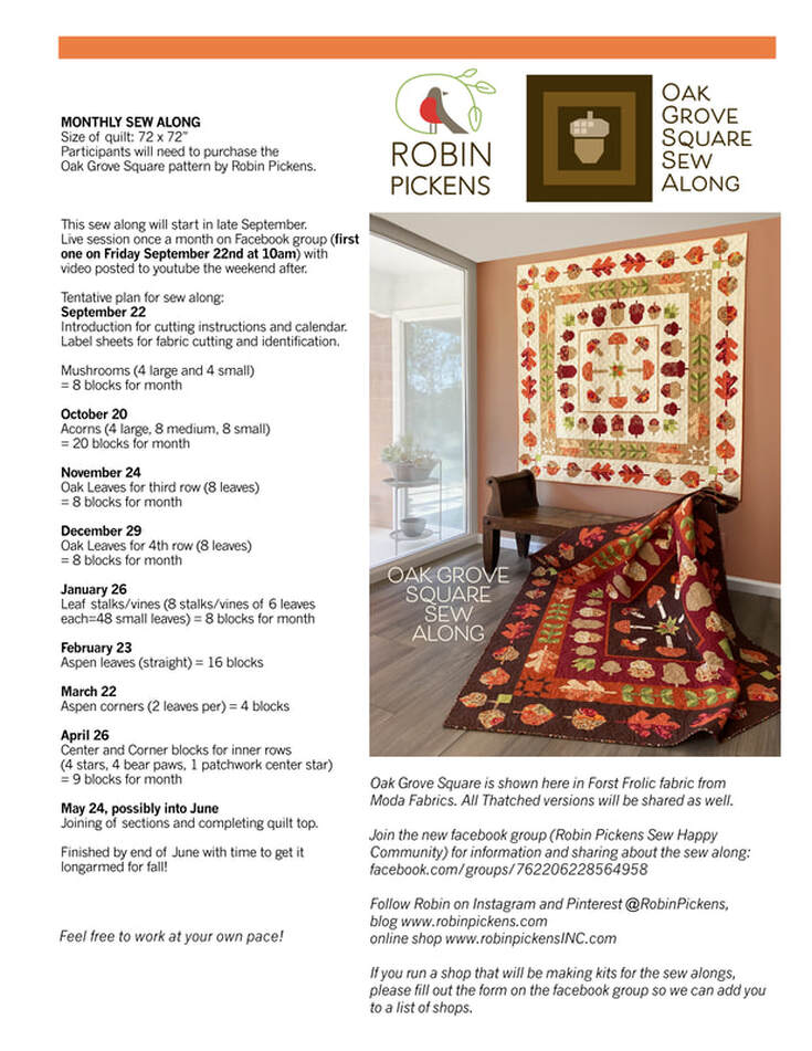 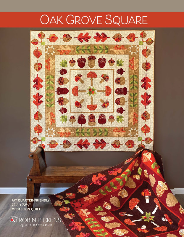 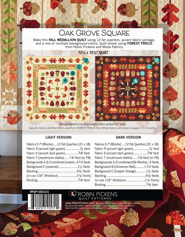 The blocks are not difficult to do and there is minimal matching of points. Since it is grouped monthly and by similar types, the blocks are rather efficient. It is quite fun to see your pile of mushrooms, leaves and acorns growing! I hope you will join us. 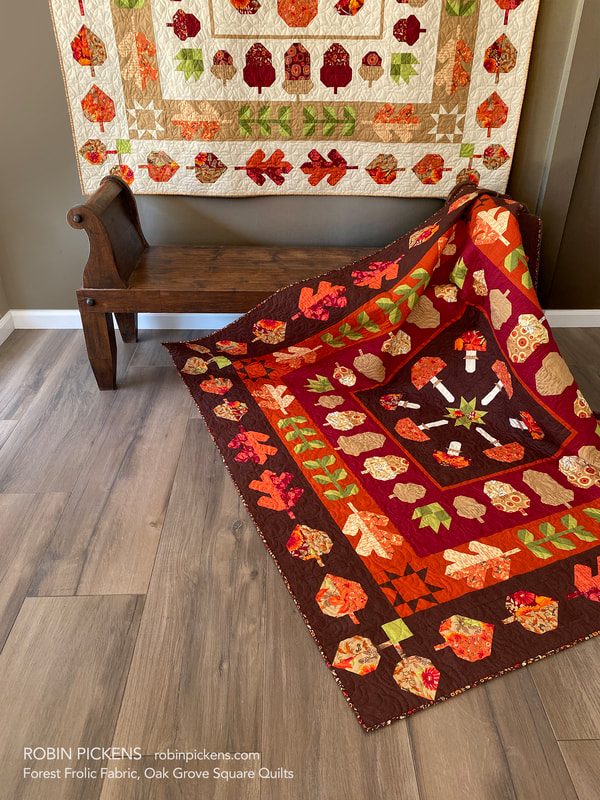  Maybe you are already joining in with the LEAF PRESS sew along? It is not too late to join in! My blog post about Leaf Press shows color combinations for that as well at:
www.robinpickens.com/blog/fall-sew-alongs-leaf-press-with-forest-frolic-or-thatched Patterns for Leaf Press or Oak Grove Square can be found at RobinPickensINC.com. You will need a pattern for the sew alongs. I hope you will join the facebook group and share your progress and quilts. I am so touched by seeing people post their projects with my fabrics or patterns. Thank you so much! Last week Joanna Figueroa gave us "Invigorate" for the Sewcialites weekly quilt block. I like seeing a bloom with little leaves blowing around it, a posie with ribbons, plaid zig zags or a rainbow burst. 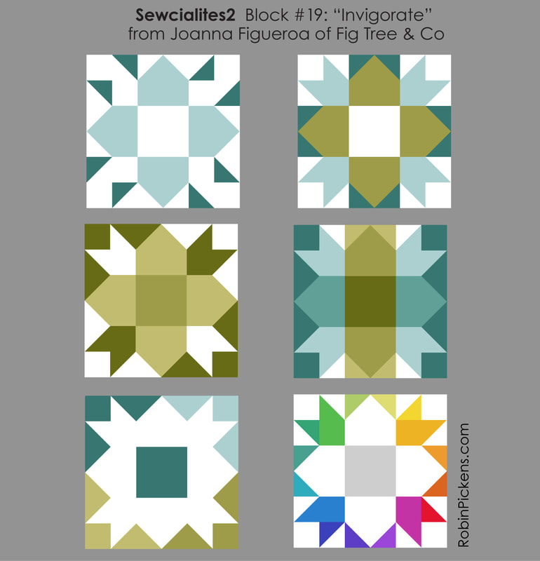 I liked the first one and will have it live in the yellow section of the rainbow print. 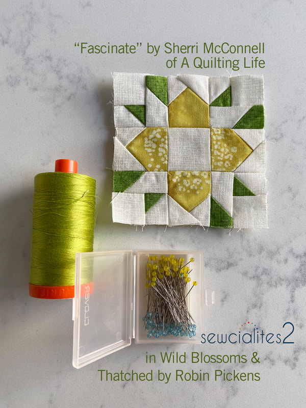 This week Sherri McConnell's "Fascinate" block shows off some green fun for Saint Patrick's Day. Plus sign, arrow heads, variations on a churn dash and stair steps all play in the color studies. 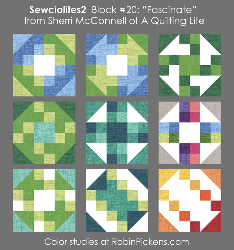 My block has some purple and pink and I like the variations on the corner shapes based on the lights and darks in the little patchwork. So many options! 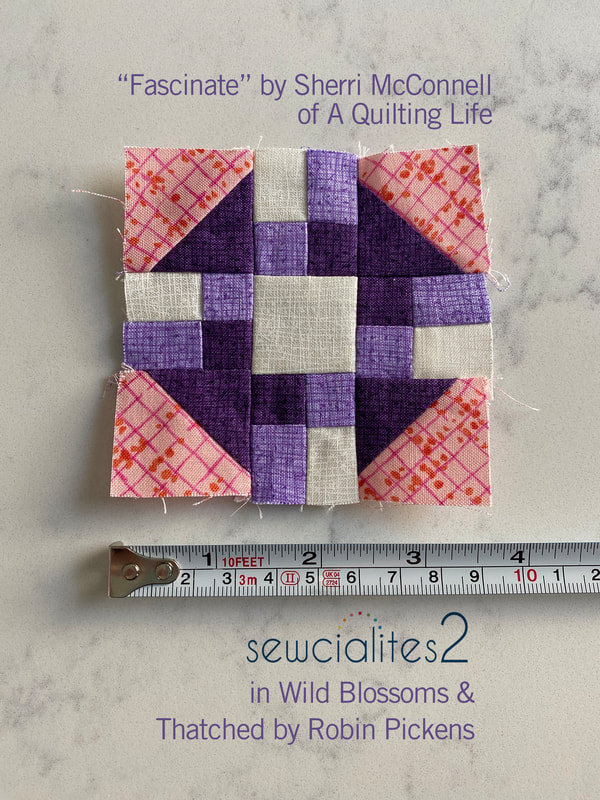 It is so fun to see the little blocks in with their friends and soon the joining into a long row for my runner will begin. Till then, four more weeks of sweet little blocks! 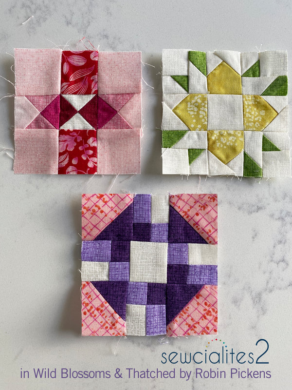 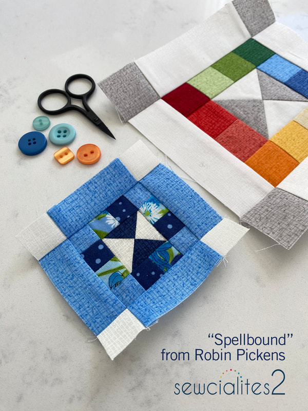 Well yippeeeee yahhooooo it is my week for Sewcialites 2 with Fat Quarter Shop! Meet my "spellbound" block. A quarter triangle block is surrounded by little patchwork squares and then framed by another outer row with squares on the ends. The free pattern is available at the Fat Quarter Shop. All patterns are listed here when released: https://www.fatquartershop.com/sewcialites First I'm sharing my color studies but please also keep reading to see my plans for using my blocks in a colorful table runner. 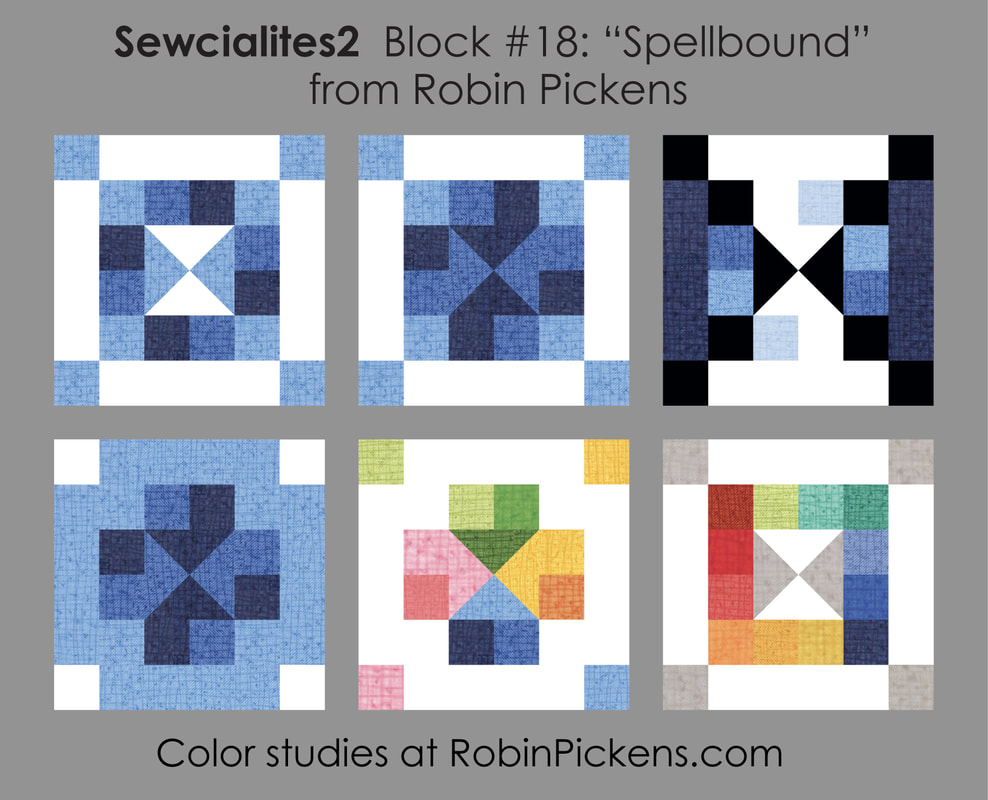 The first one focuses on each row as its own mix of light and dark blues in squares. The next one reminded me of arrows pointing in with shaded 3d arrow bases. The third one makes me think of an hour glass with white sand running from top to bottom ("the sands of time..."). On the bottom row, the outer blues make another chunky plus sign to surround the inner arrows. Then a couple of rainbow spectrum experiments moving around the color wheel, either in the center or in the rows of small squares. 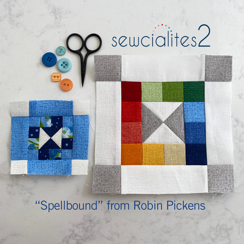 For this sewalong, they asked for blocks that make us crazy. I find that matching up little patchwork square seams can be one of my crazy-making things. Pressing seams in opposite directions, then nesting the seams when joining rows helps. Another thing that helps is when the little squares line up against a sashing or other rectangle, like the little blocks here. As for nesting seams, this is a picture of the back of the blocks. The arrows show some of the places where I have pressed seams to nest. 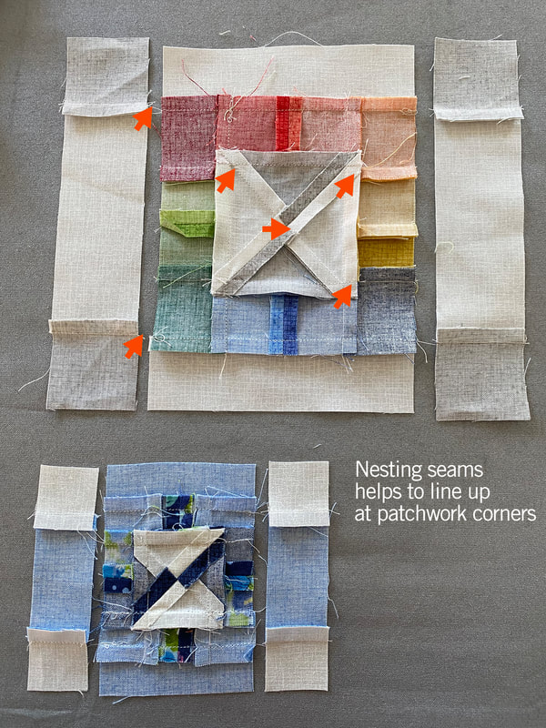 Another thing I will do with little patchwork and small block piecing is starching. I generally don't starch much but with small sized blocks, the starch will help for handling the fabric better and it keeping its shape as you sew and press. If I am doing patchwork squares I will see if I can make some longer pieces and subcut them and I tend to press to one side on my seams instead of pressing open so they don't pull apart easily when I handle them. These things seem to help with small patchwork squares. For my block, I've a little blue 3" block for my project using all my blocks in Wild Blossoms. And then I wanted to make a rainbow square Thatched version. I have some leftover Thatched blocks from Moda Blockheads that I have quilted as little minis for the wall so I might add this to the mix. 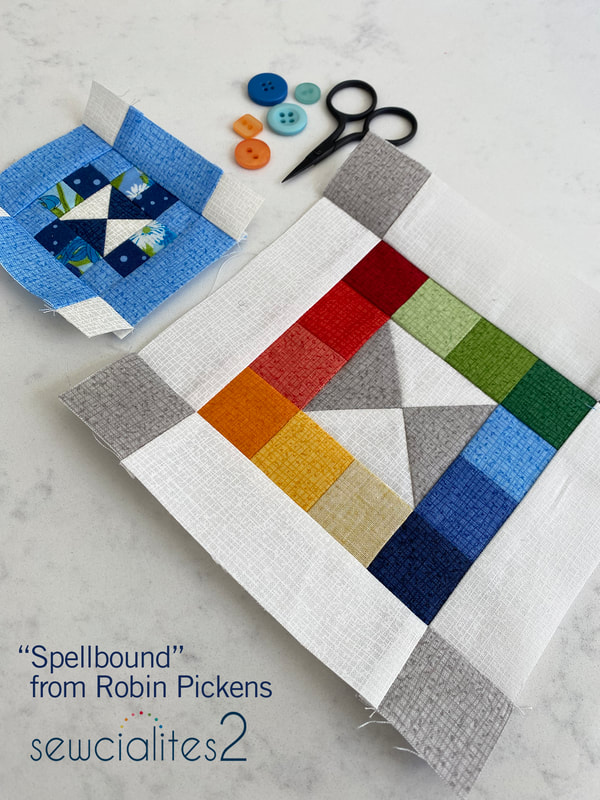 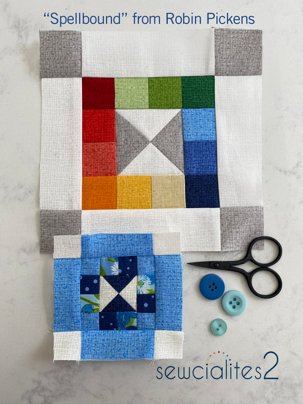 Want to know WHAT I am going to do with those little 3" blocks? The Wild Blossoms fabrics (which are shipping to shops at the end of this month) has a big Width-of-Fabric print that runs selvage to selvage in a big rainbow print of multiple wild flowers. I've been making my blocks in the different colors with the intention of lining them up with the colors in the WOF print. 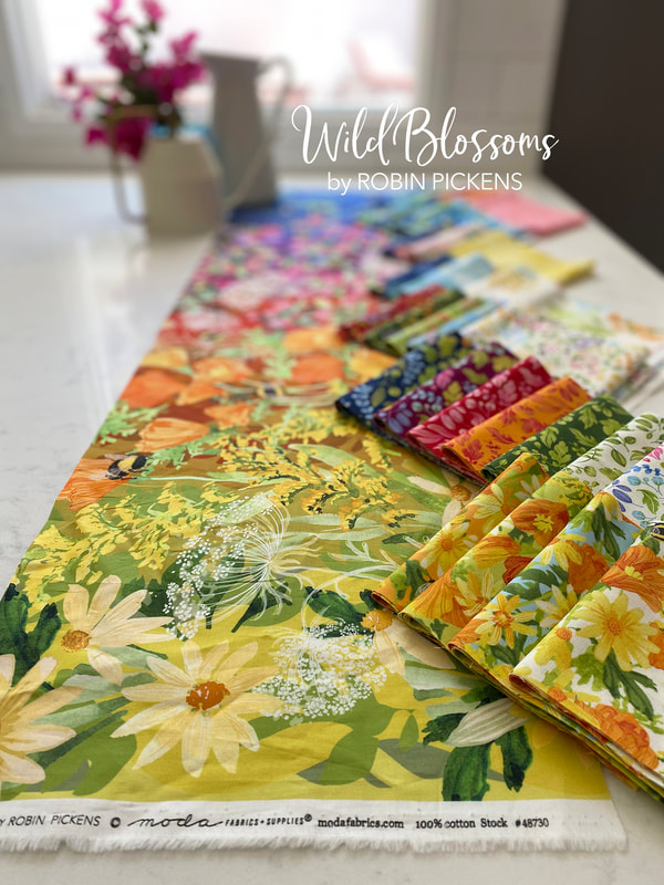 I want to add in a 1" wide sashing strip between the blocks (for a finished sashing size of 1/2") and make a table runner. These are some mock ups of the versions I've been considering, with sold squares left for the blocks that are released in the weeks ahead. The 42" wide runner has two rows of blocks, either in the center, with a center print running through, or placed on the long sides. The top one has cream sashings surrounding the blocks and the second one only has sashings between the blocks and the rainbow print running up to the blocks on top and bottom. For the third one above I tried the Greenery light chartreuse fabric for sashing since it looks really springy. 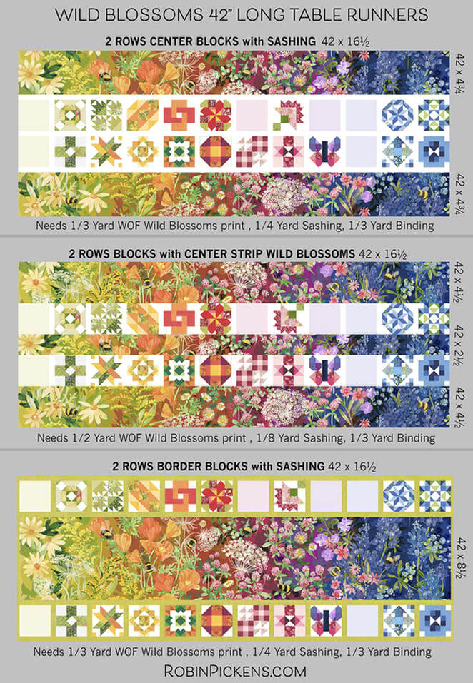 It is a good idea to get a little extra of the rainbow print so you can position the fabric appropriately to show off the little bees. The above ideas would need either 1/3 or 1/2 yard of the WOF print, 1/8 or 1/4 yard for sashing and 1/3 yard for binding (indicated under each image). The CUT sizes of the rainbow print are listed to the right of the images. Another idea is to make a longer runner with a single line of blocks and two pieces of the WOF rainbow print. When wanting to blend the color ramp continuously, I flip the print upside down to continue the flow of color. My table is sized to handle this long version well so I think this is what I will make. I've mocked it up with either the lighter colors/yellows to the center or the darker blues to the center of the runner. 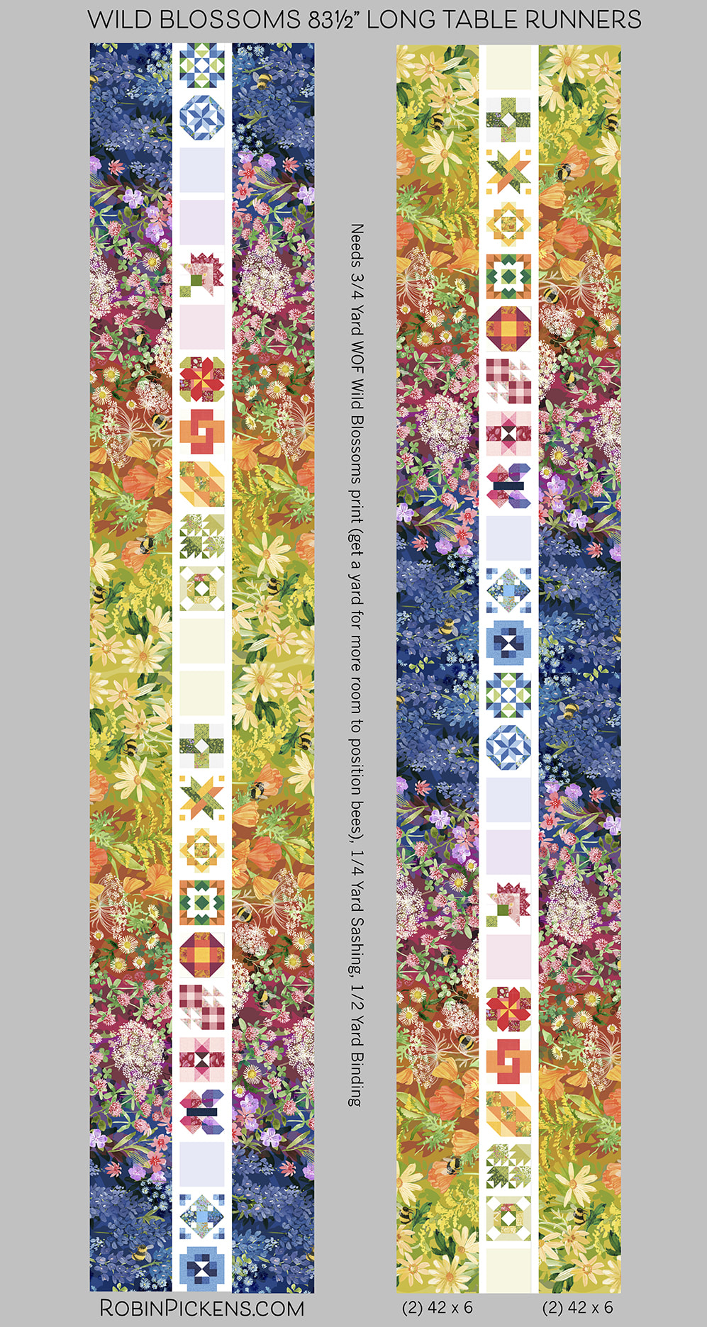 The longer runners need 3/4 yard of WOF print, 1/4 yard sashing, 1/2 yard binding. For binding I'm not sure what I'm using yet but it might be the new Thatched bias binding that Moda makes which is sold by the yard. That makes it SO easy!! 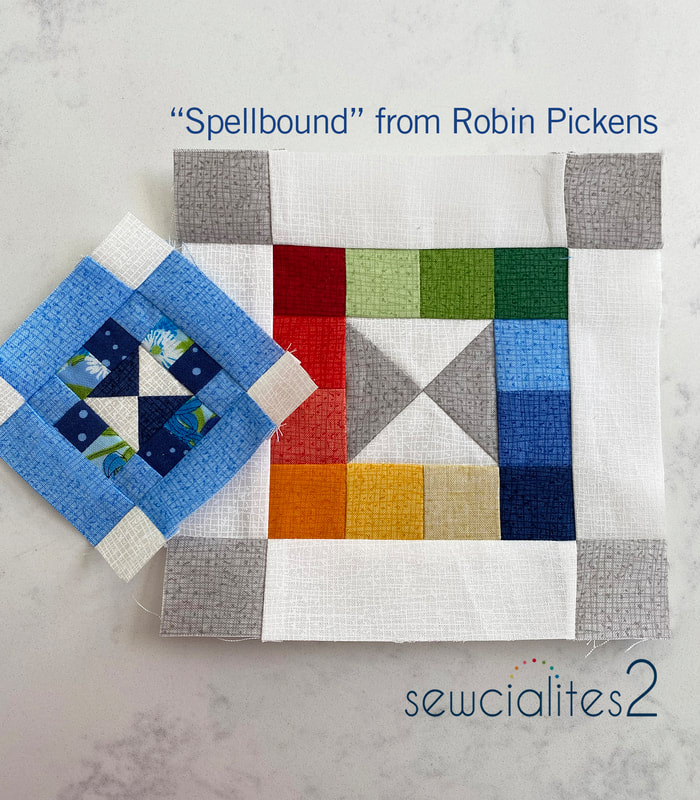 This sewalong has been lots of fun! I've really enjoyed seeing the various blocks people share in the Sewcialites Lounge on facebook. Because I want to keep the sewing joy going, I'm participating in the Bountiful sew along with Fat Quarter Shop with the quilt pattern Corey Yoder designed. I'm using the Wild Blossoms fabric for that one too and you can see the mockup and fabric requirements for the Bountiful quilt on the previous post at https://www.robinpickens.com/blog/2023-bountiful-quilt-along-with-the-fat-quarter-shop-to-benefit-make-a-wish. I hope you will join us. Happy sewing everyone! 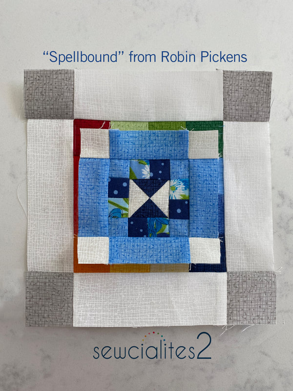 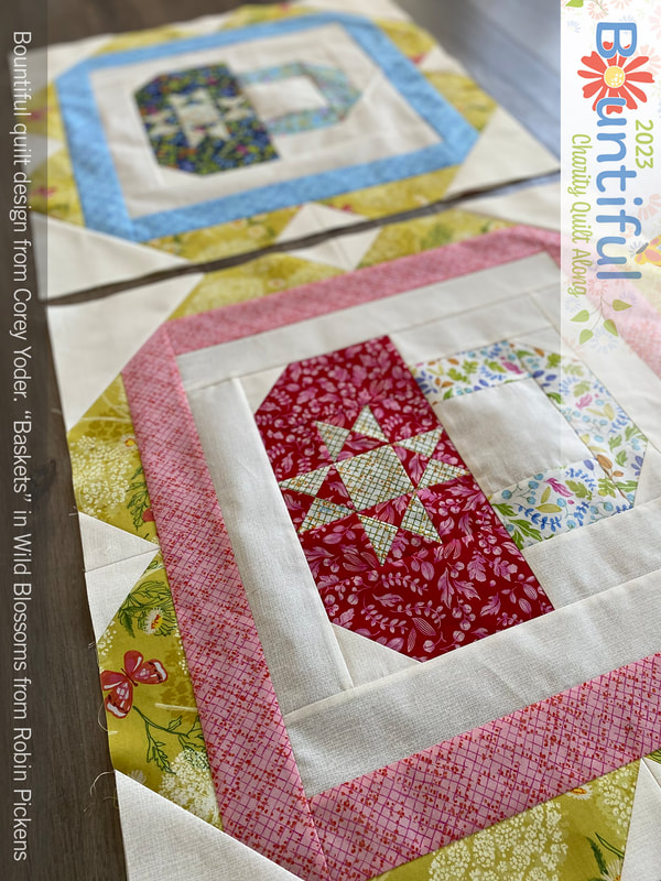 I am thrilled to be sewing along on this absolutely stunning and happy quilt design from Corey Yoder for the Bountiful Quilt Along hosted by the Fat Quarter Shop. This is such a springy, charming quilt! The Fat Quarter Shop also has a matching cross stitch project to go along with it too. This is the mockup of the quilt done in Wild Blossoms fabrics: 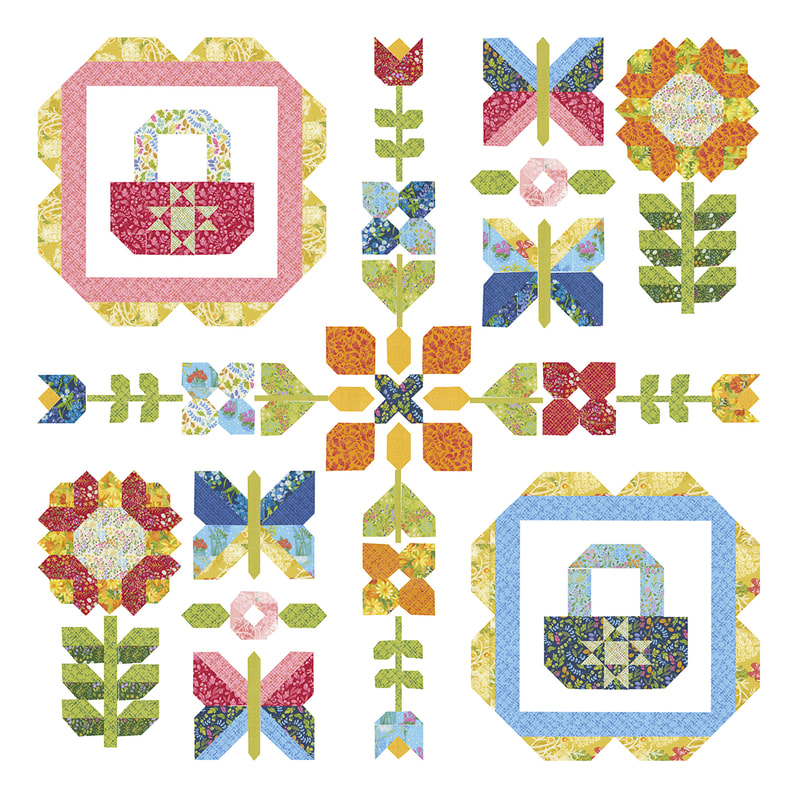 I have completely enjoyed getting to know Corey Yoder more through exhibiting with Moda Fabrics at Quilt Market. She is just delightful. And this past summer I taught at a retreat in her home town of Berlin Ohio and got to enjoy some more time with her there. She drove us to dinner in her Jeep with no doors and the wind whipping through our hair. What a fun way to spend a summer night! To learn more about this sew along that benefits Make-A-Wish, please visit the Fat Quarter Shop's page to get started at https://blog.fatquartershop.com/lets-get-ready-for-bountiful/ Moda Fabrics is partnering with Fat Quarter Shop to match the first $30,000 in donations. Also, I will be giving my finished quilt to Fat Quarter Shop to auction off for the charity towards the end of the sew along. Stay tuned for more info on that! You can go right to the first block info: blog.fatquartershop.com/2023-bountiful-quilt-along-release-1-baskets/ My plan is to make this quilt in my Wild Blossoms fabric collection. This line is shipping to shops later this month from Moda Fabrics (and YES Fat Quarter Shop will be carrying it as well as a bundle of coordinating Thatched colors). If you would like to make one with Wild Blossoms as well, I'm including the fabric specifications based on what the Fat Quarter Shop has done and what I substituted in. I uses a little more of some fabrics and added in a couple more choices to the mix. 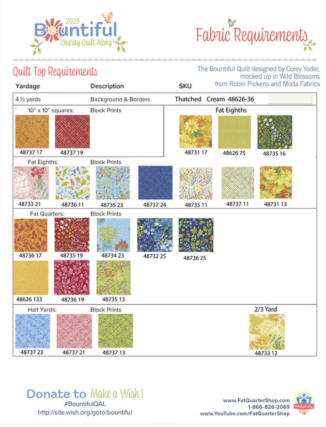 Although I am making mine with the cream Thatched background (48626-36), I thought it would be fun to take a look at it in Thatched Navy (48626-94) or even Deep Sea (48626-145). Both of these versions would be so striking. 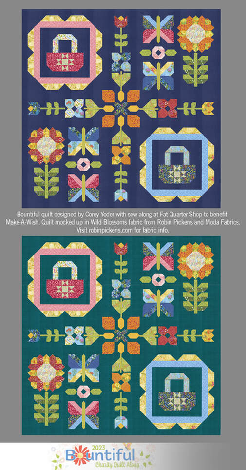 I could not resist the fresh light feel of the cream background so I'm working with that. The first blocks of baskets are so sweet! These are each 24" blocks and are large so I just decided to take my photos on the floor. I made mine with the same outer Queen Anne's Lace yellow fabric with one basket in reds/pinks and the other in blue. 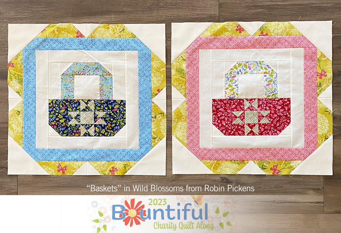 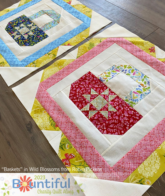 The next blocks for Bountiful will be released on April 7th. Happy sewing! 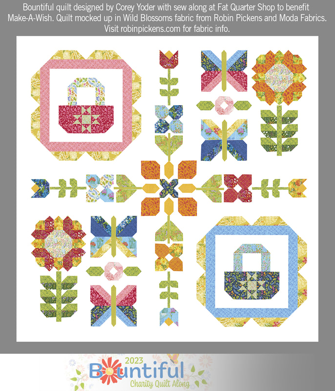 Ah, "Simplicity" for a nice happy week on the Sewcialites sampler. This block is from Vanessa Goertzen of Lella Boutique. Vanessa can make simplicity so very charming and elegant! Lets take a look at some color play! 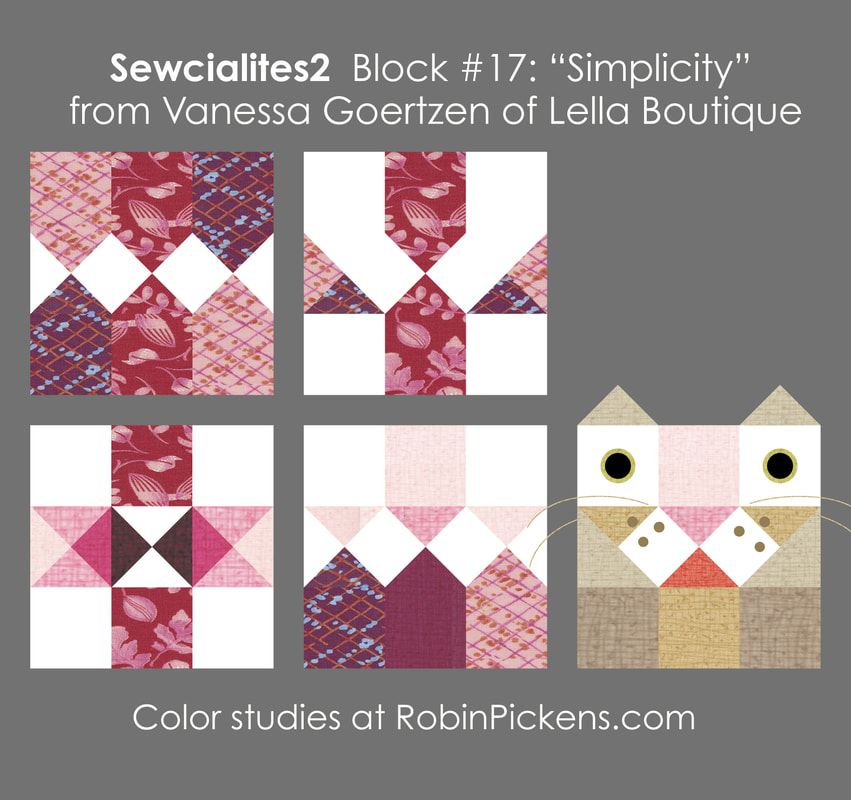 As I was experimenting with the angles and center vertical band, a nose started to appear to me. I could not resist adding a couple more triangles for ears and bringing a little lioness friend for a visit! For my sewn block I stayed with the more geometric play and I liked how the lower left one resembled a plus symbol or cross with interesting faceted bands from the quarter square triangles. Here is my sewn version: 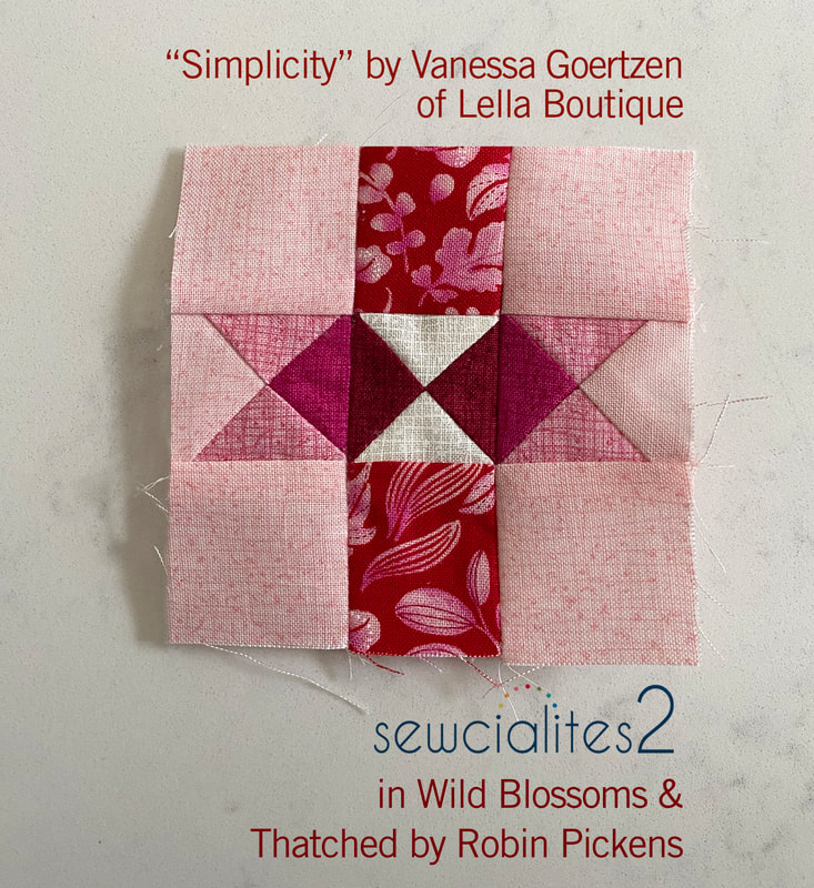 Next week is my block and I'm excited to share! Stop back to see what I'm planning for my little 3" blocks. Till then, happy sewing! 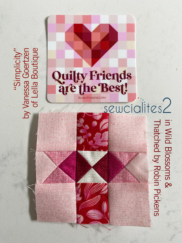 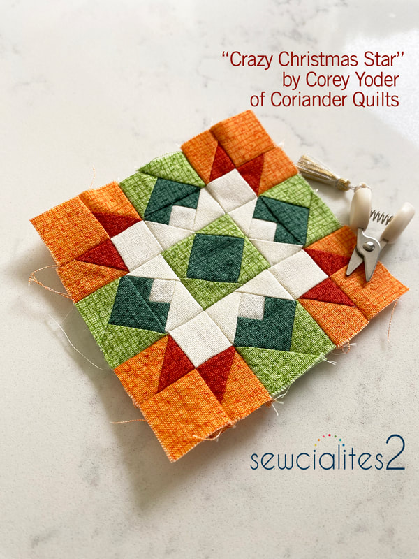 Block 16 from Corey Yoder of Coriander Quilts has lots of pieces to play with. I enjoyed trying the center as a white bloom (like a white Poinsettia) with green leaves or red package ribbons cut with pretty ends. Play up the diamonds by using more background white or emphasize the X angles. This block is similar to Flourish from a couple weeks ago with an added twist on the inner flying geese to make that extra little square. I did my color studies in red and green to go with Corey's Christmas name and it is lively in those combinations. 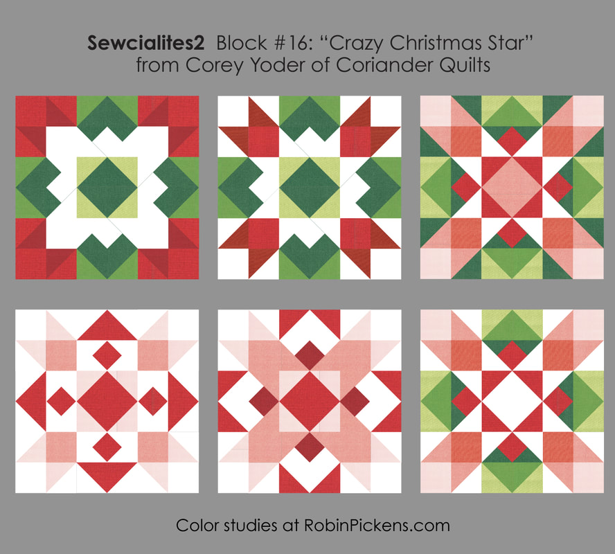 I've used some spicy warmer reds and orange for my block instead of red, based on where I want this to coordinate with my rainbow WOF print of Wild Blossoms. I find that making the 3" blocks can be a challenge for getting my seams to lay flat when pressing. I like to use a tailors clapper of wood to help after pressing. I'll let this sit overnight to reinforce the flat pressed-open seams. 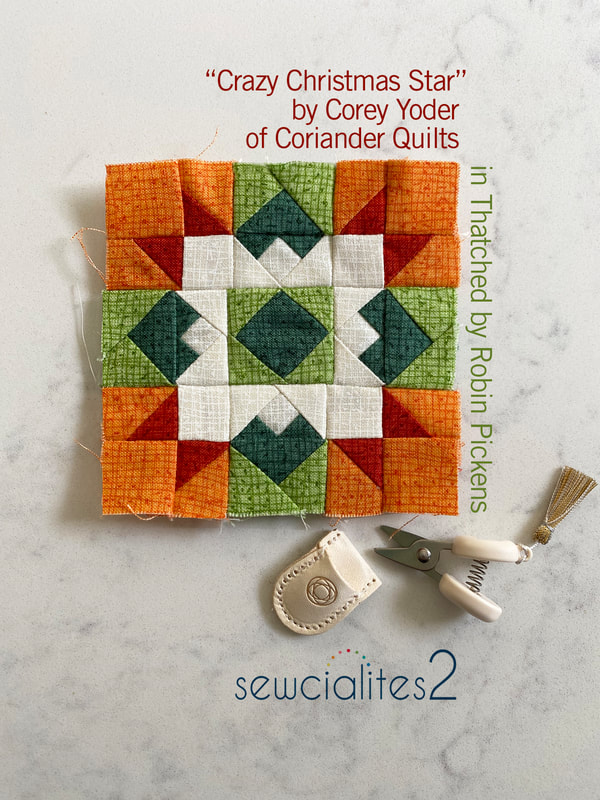 These tiny little scissors are just the most precious! They are made by Cohana and are a pretty little treat for snipping threads. And they are a sweet size to go with these little blocks! Hope you are all having a wonderful time with your Sewcialites blocks through the Fat Quarter Shop! 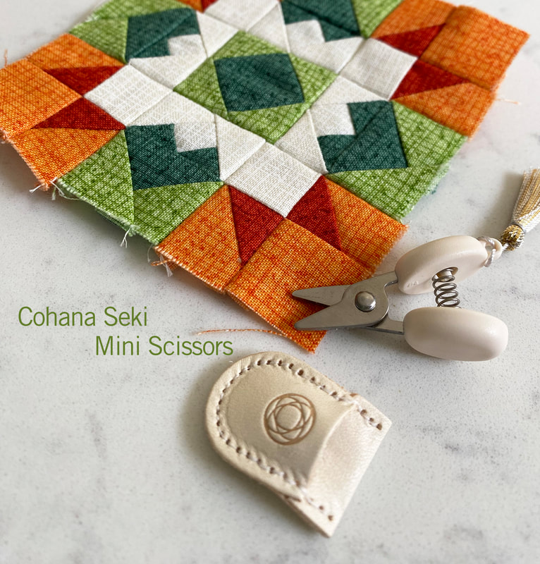 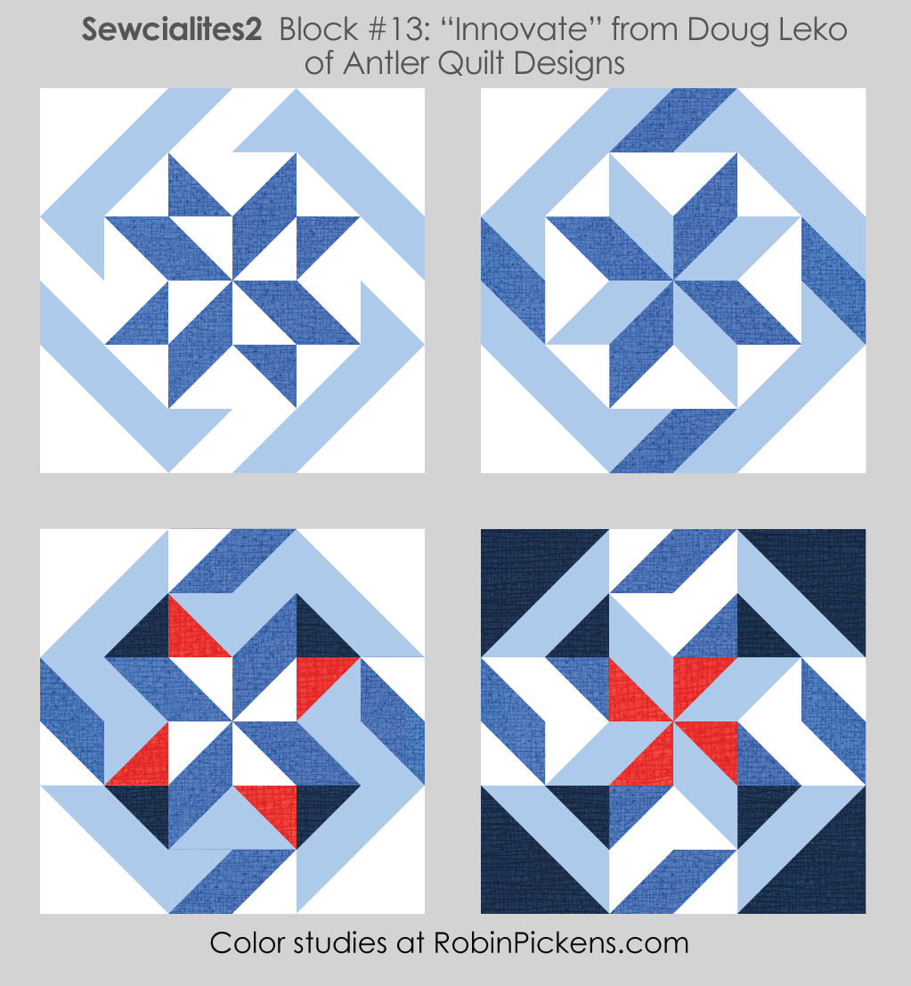 It is week 13 and Doug Leko of Antler Quilt Designs brings us "Innovate." What a lively block with that great pinwheel motion from the outer angled strip. I liked trying the center half square triangles as one color to form more of a band for a star or having the background or alternate color accent to make fan blades or shaded sides. Bringing in dark ends to the "center X" makes them seem a little 3 dimensional. Thanks Doug for such a motion-filled fun block! 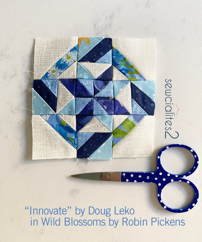 For my little 3" block, I'm using blues from the Wild Blossoms collection. I picked the upper right idea from the color studies and made those tiny little flying geese and half square triangles and angled bar blocks. I must admit that this one is a little bowed in the middle (but I'm sure it will look flat after quilting, right??). I give myself a little more grace with not having everything meet perfectly in this small size. They are fun to make and that's what feels good to me. 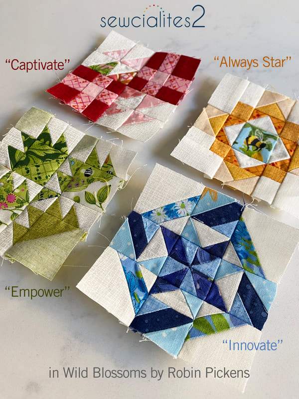 BI worked on a little catch-up this past week. After a busy December and busy start to January, I finally had time to do a little sewing when the internet went out. No tv to stream? No problem with a sewing machine waiting patiently for me to show her some attention. I'm hoping this helps get me back into my sampler groove! These blocks had some color studies too although I had not sewn the blocks yet. Here is last week's "Captivate" from Barbara Groves of Me and My Sister Designs. These can look so different and emphasize a diagonal band within the block or look like transparencies of overlapping shades. The last one is about light to dark gradations within multiple colors. I made my block based off the upper left, first image. 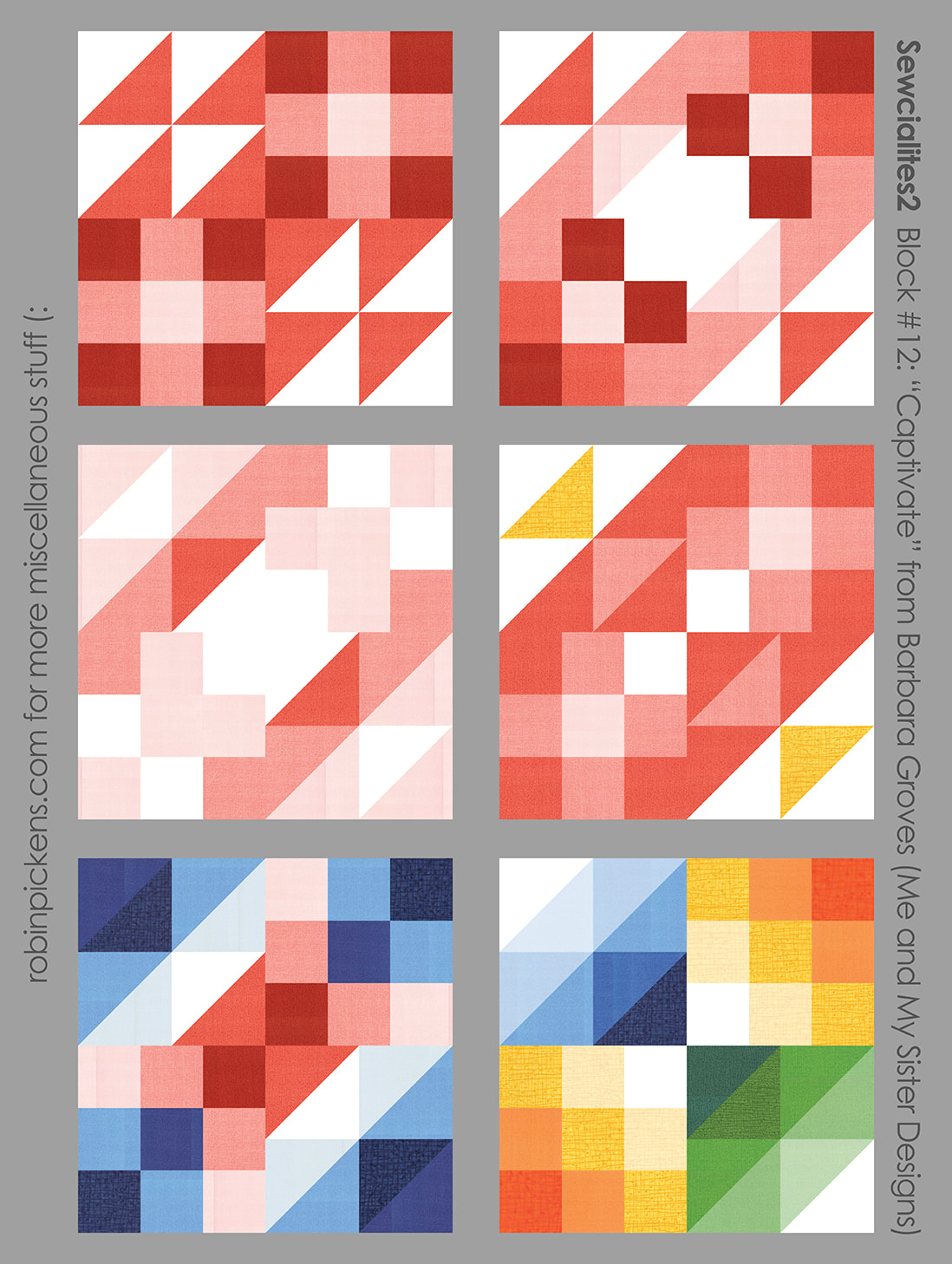 Here is "Always Star" from Camille Roskelley of Thimble Blossoms. Radiating light from a hot sun, the play of just 1 color and white to emphasize squares or an even simpler shape, or a woven plaid of intersecting bands for a plaid-meets-diagonal block. I used the top middle image as my inspiration with a little bumble bee in the very center of my block. 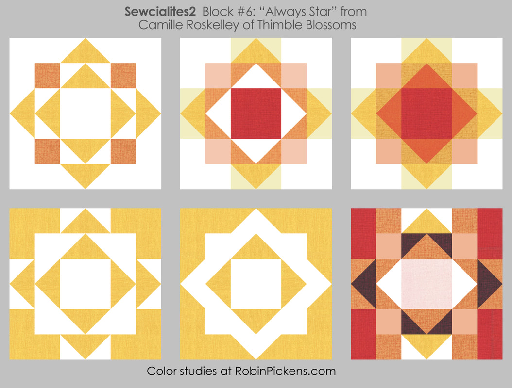 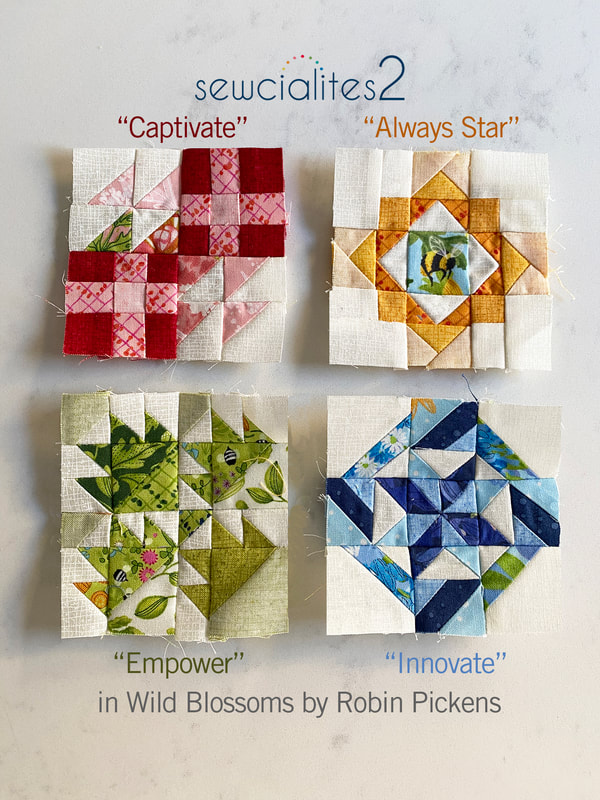 "Empower" by Carrie Nelson uses little Bear Paw blocks with half square triangle angles. This makes a crown on some (middle top) or marching video game fighter jets (middle bottom). The negative/positive can be emphasized or creating strong bands/frames by having the background a dark color in the small half square triangles. Or, that last one with sunshine color paw prints. My actual Empower block is made with greens and played with lighter colors on some of the bigger triangles by flipping my Thatched to the back side. 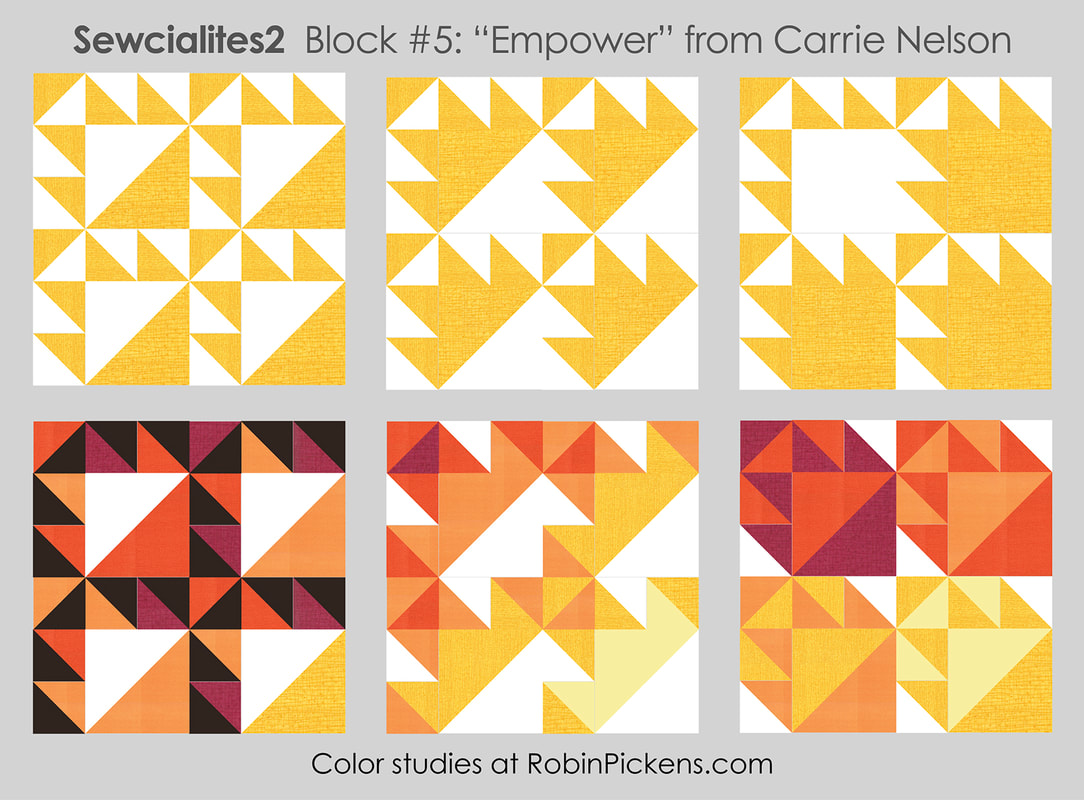 I'm hoping to have another group of four blocks for next week's post. Then I would be all caught up except for one block. But for now, I'm liking how the little blocks are coming along! 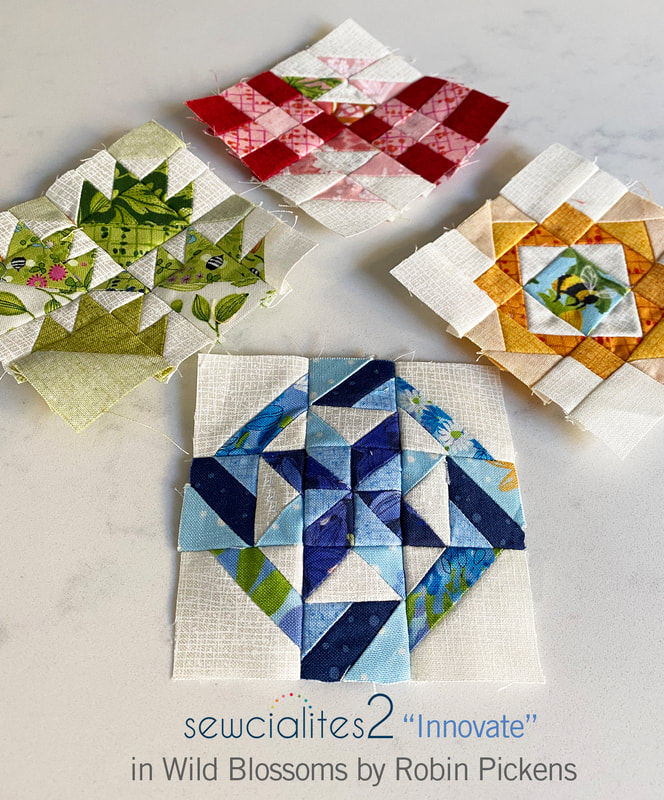 Here are all the little 3" blocks I have so far! I haven't shared my setting yet since I'm still working it out but I'm hoping to incorporate the big width-of-fabric print from this collection along with the color spectrum of individual blocks. 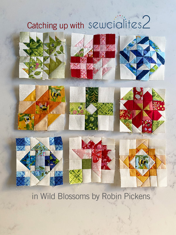 One last thing to mention....I'm going to be sewing along with the Bountiful charity quilt stitch along!! I will be using Wild Blossoms and will share how the blocks look in that as a computer mock up next! I hope you are joining the Fat Quarter Shop on this journey to support Make-A-Wish!
Happy sewing! |
About ROBINDesigner of colorful florals for Moda fabrics. Modern to transitional quilt designer. Illustrator, sewist, crafter. I am proud to be a designer for Moda Fabrics!
Shop Robin's Designs
 I am an affiliate for Fat Quarter Shop and may earn a small commission through my links. Thank you for your support!
Check the March 6, 2017 Episode!
Categories
All
Archives
February 2024
© Robin Pickens Inc. All rights reserved. No images may be reproduced without permission.
|
||||||
 RSS Feed