|
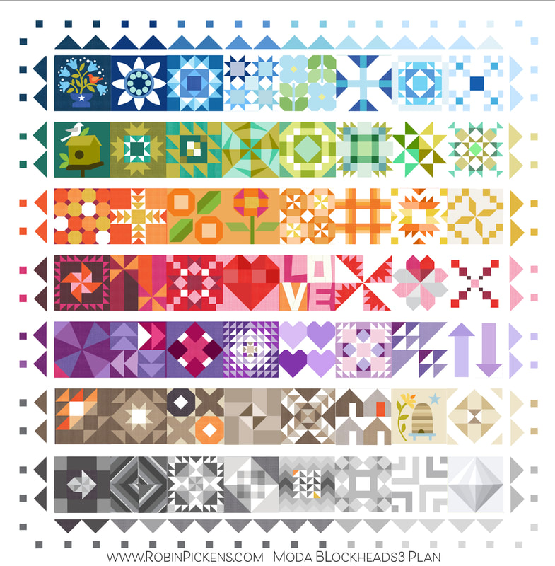
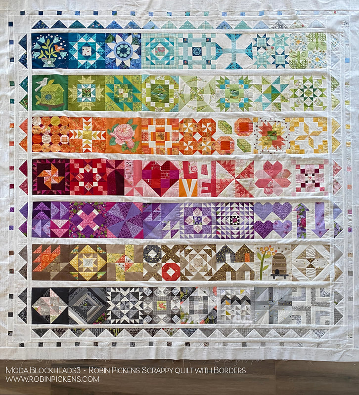
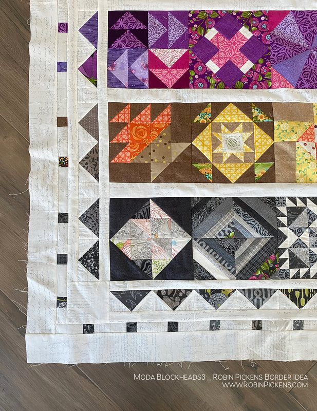
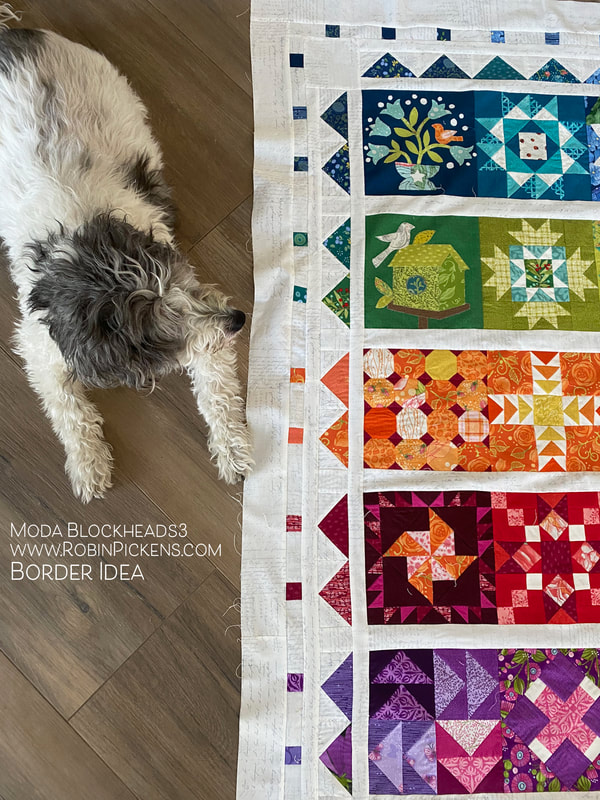
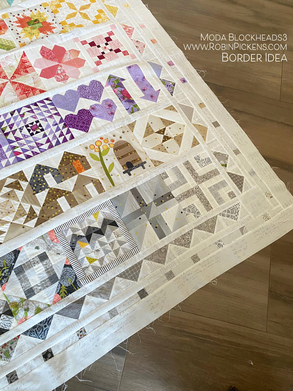
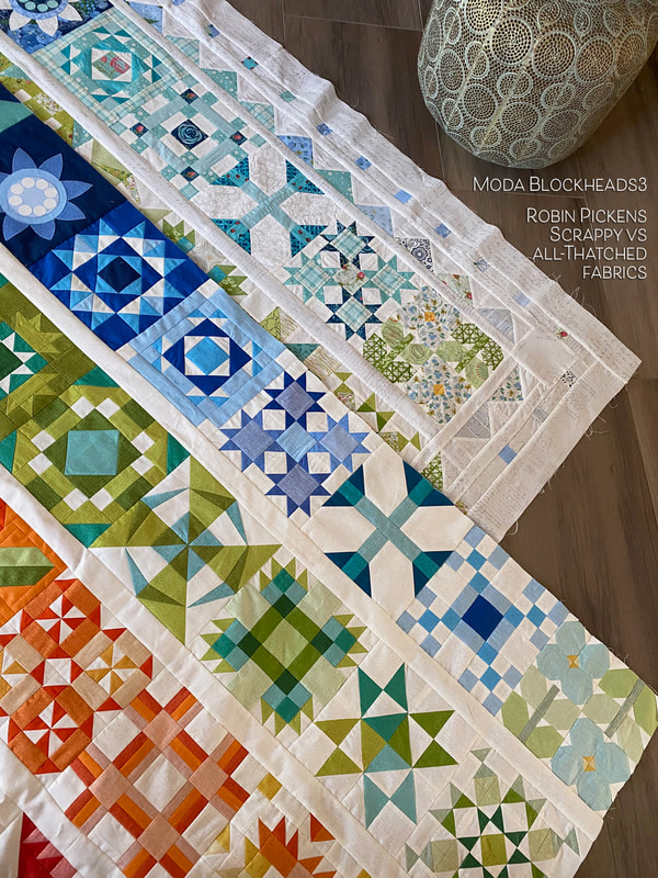
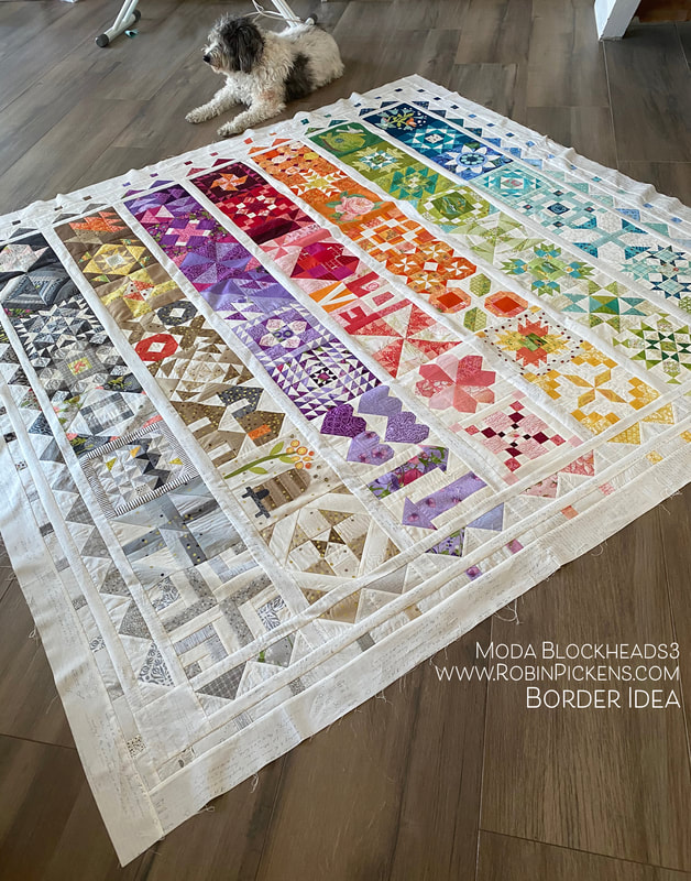
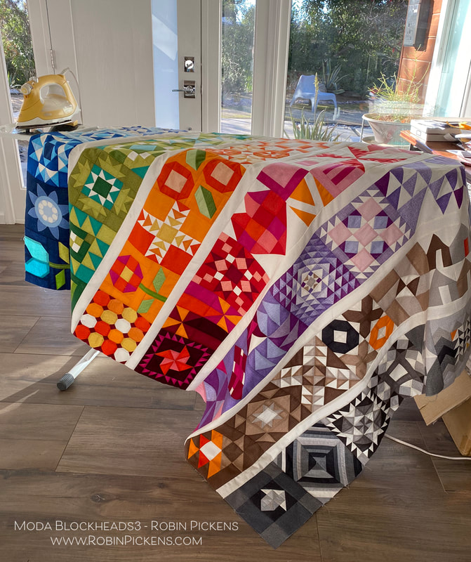
After joining my Moda Blockheads quilt tops, I felt like the scrappy version needed something a little extra and fancy to go with all those prints and prettiness. I thought a border based on flying geese and little squares provided a nice "fringe" to play off the rows and colors.
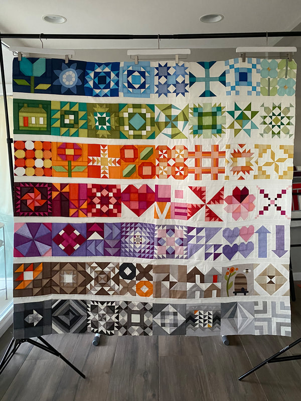
From computer plan to quilt top, I think it went pretty much as planned. I wanted to follow the dark to light scheme and reflect that in the flying geese and squares. I've changed colors as the rows have changed from blue to green to orange and so on.
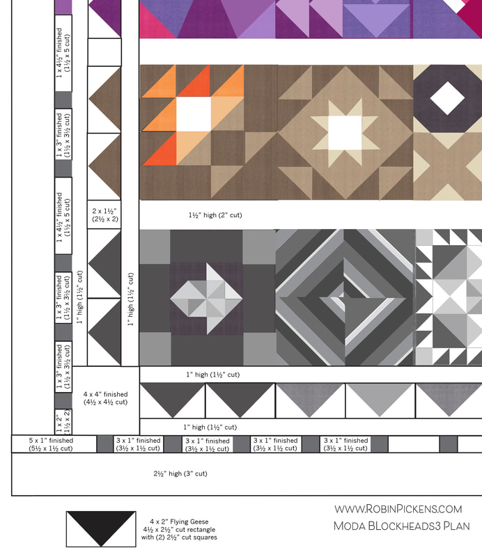
The flying geese on the sides are in pairs with the same sashing width between pairs. Along the bottom, as the blocks are side by side with no sashing separation going across, so are the flying geese.
My blocks were the 8" size. Therefore my flying geese are 2 x 4 finished size. The spaces between the 1" finished squares are 3 x 1" and with the sashing spaces on sides, those are 1 x 41/2". 4 x 4" squares go in the corners and 2 1/2" borders line the outsides (all finished sizes. Cut sizes are marked on diagram as well).
The flying geese with 1" sashings are added to quilt top first. The bottom and tops have the 4 x 4" added when attaching those. Small squares with background rectangles and outer border are added next. The fabric I have use for the sashings and borders background color is Modern Background Paper 1581 11 by Zen Chic. It is such a nice low volume background fabric.
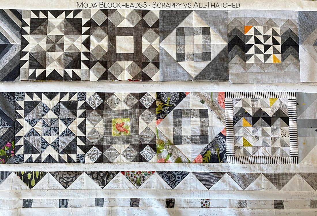
I like to see the difference of how the little squares and flying geese look in the darker values vs the lighter shades.
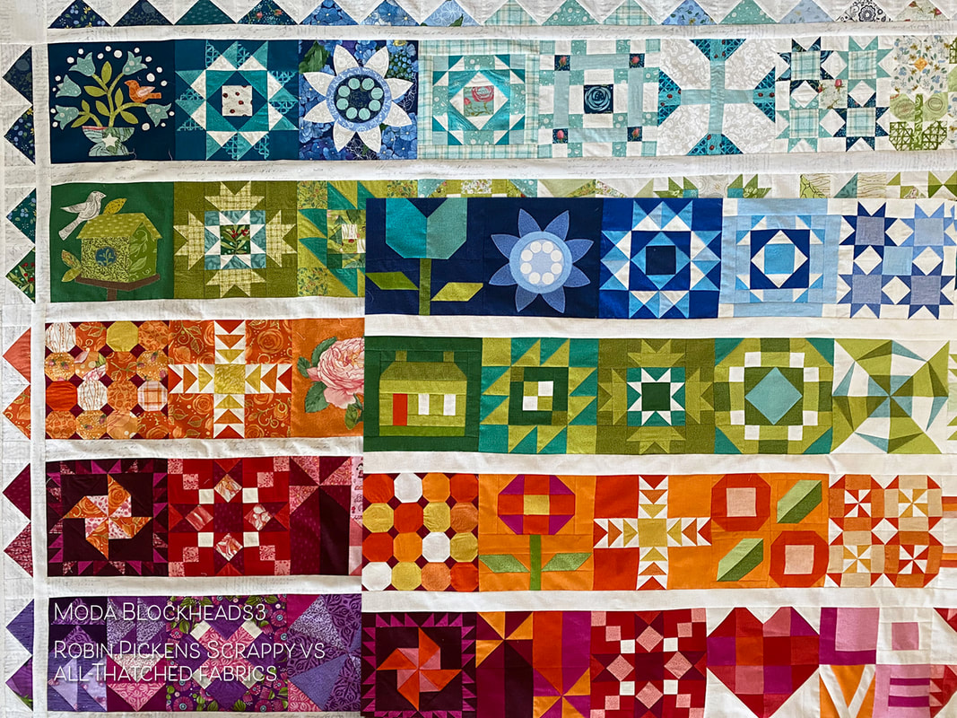
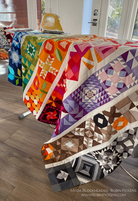
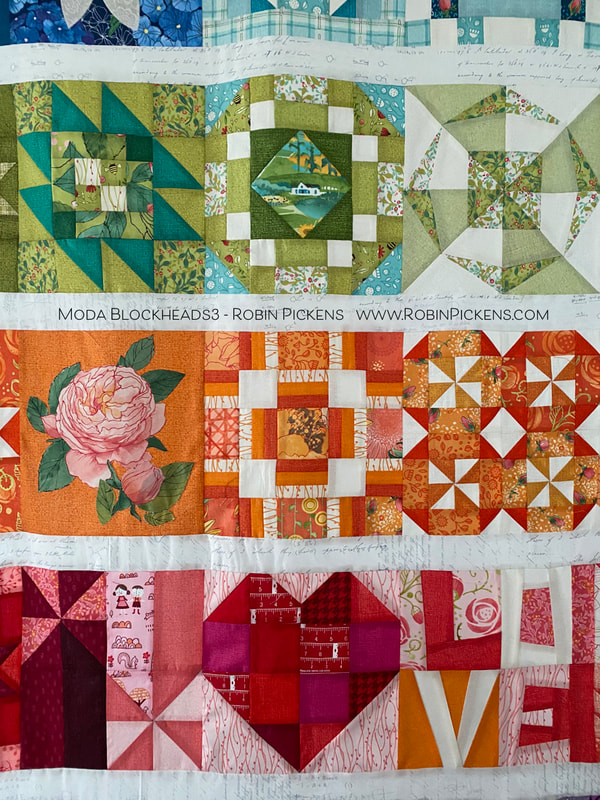
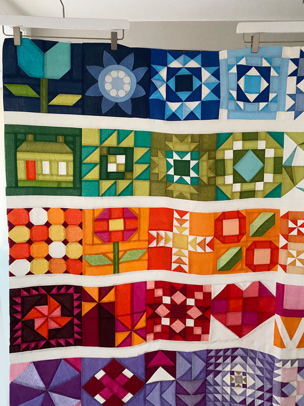
I also like to see the differences in the scrappy fabric quilt top vs the all-Thatched version. I think the border on one and not the other will help to create differences between the two, as well as different quilting. Another change between the quilts is I used piecing for most of the applique blocks on the all-Thatched version. The scrappy quilt used the applique designs. Notice the darkest blue and green blocks have the original designs for flowers and birds and birdhouse. The Thatched quilt has pieced blocks from Joanna Figueroa of the tulip, house and posie (which replaces the applique rose that I used Abby Rose fabric for).
Sometimes the fabric choices for scrappy provided a different mix of light and dark so I rearranged some blocks within rows between the two types of quilt tops. The blue row especially flipped positions of some blocks.
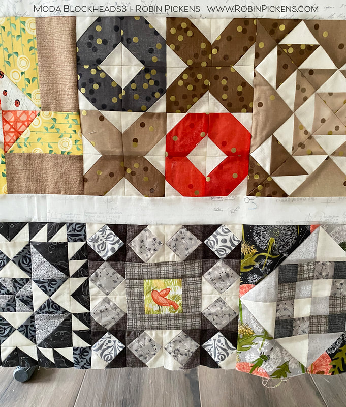
I liked adding the little bird in the center of the Fixer Upper block from Vanessa Goertzen. Small peeks of color help to tie the gray blocks in with other rows.
Time for quilting on these tops. The finish line is in sight! Hope you are having fun with wherever you are in the process!
18 Comments
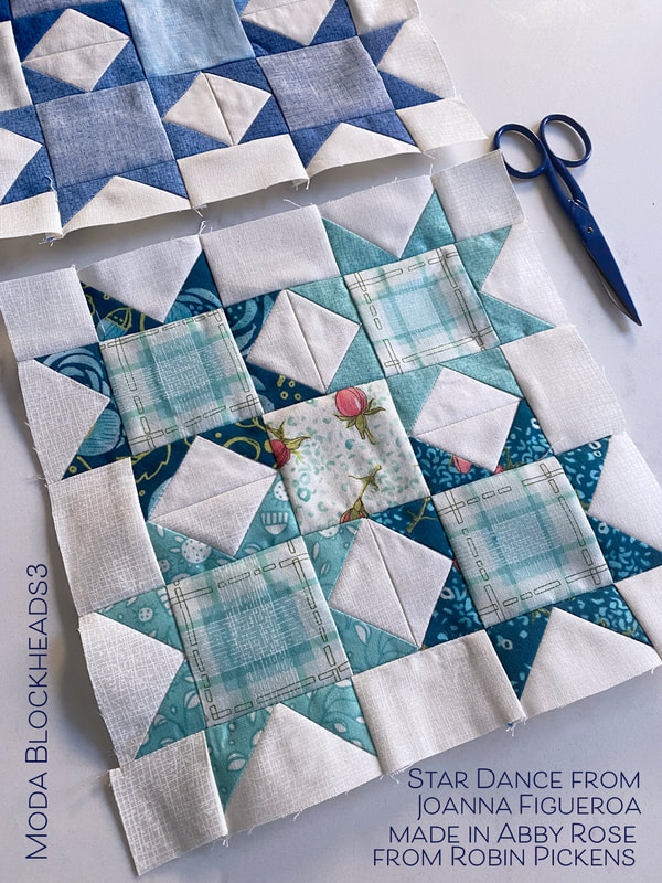
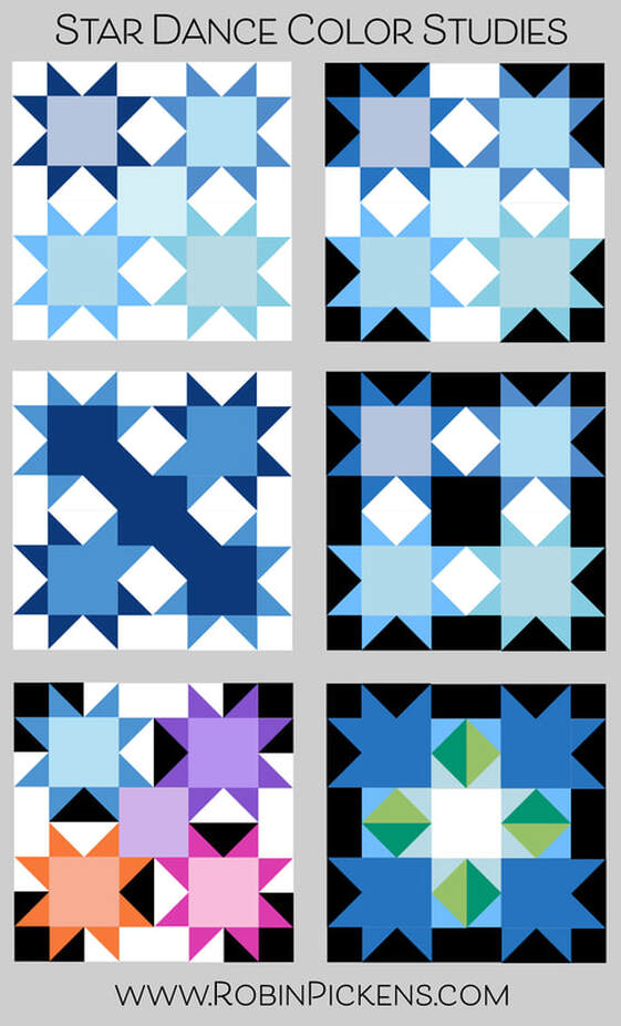
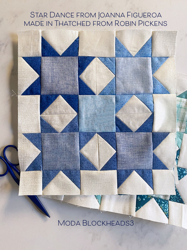
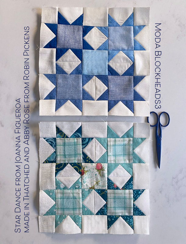
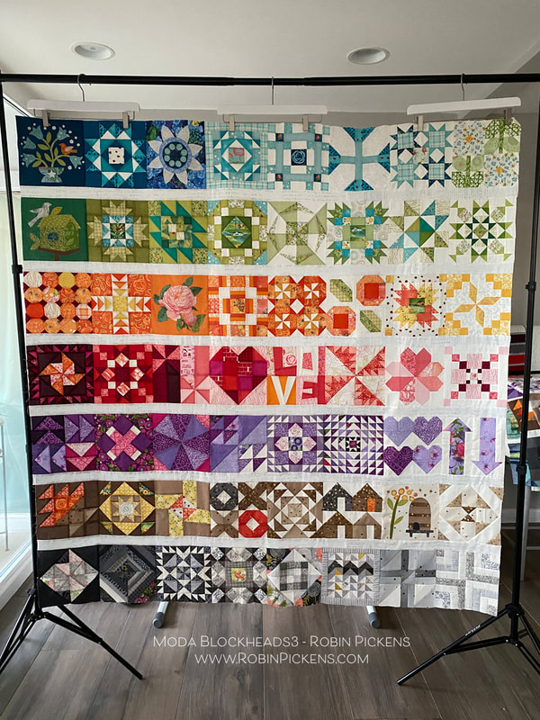
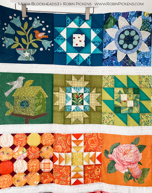
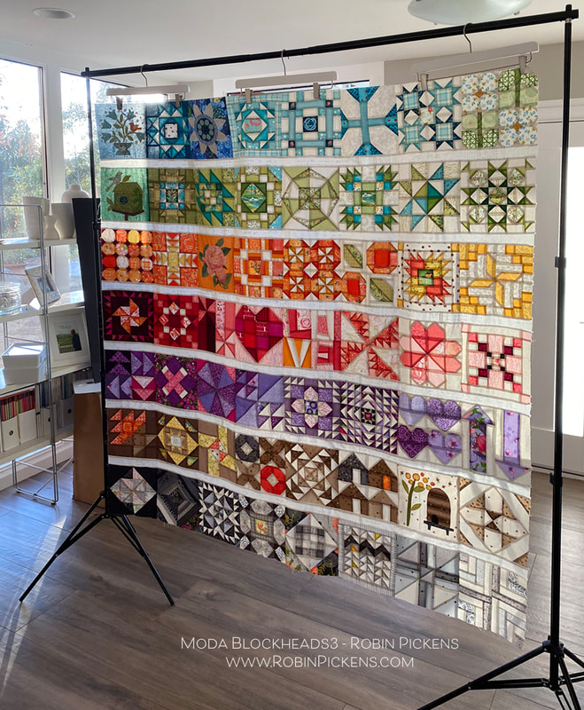
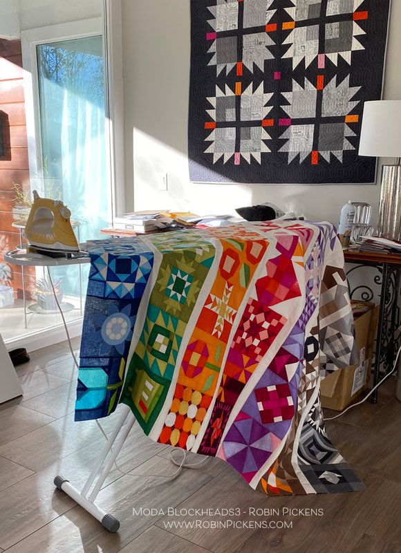
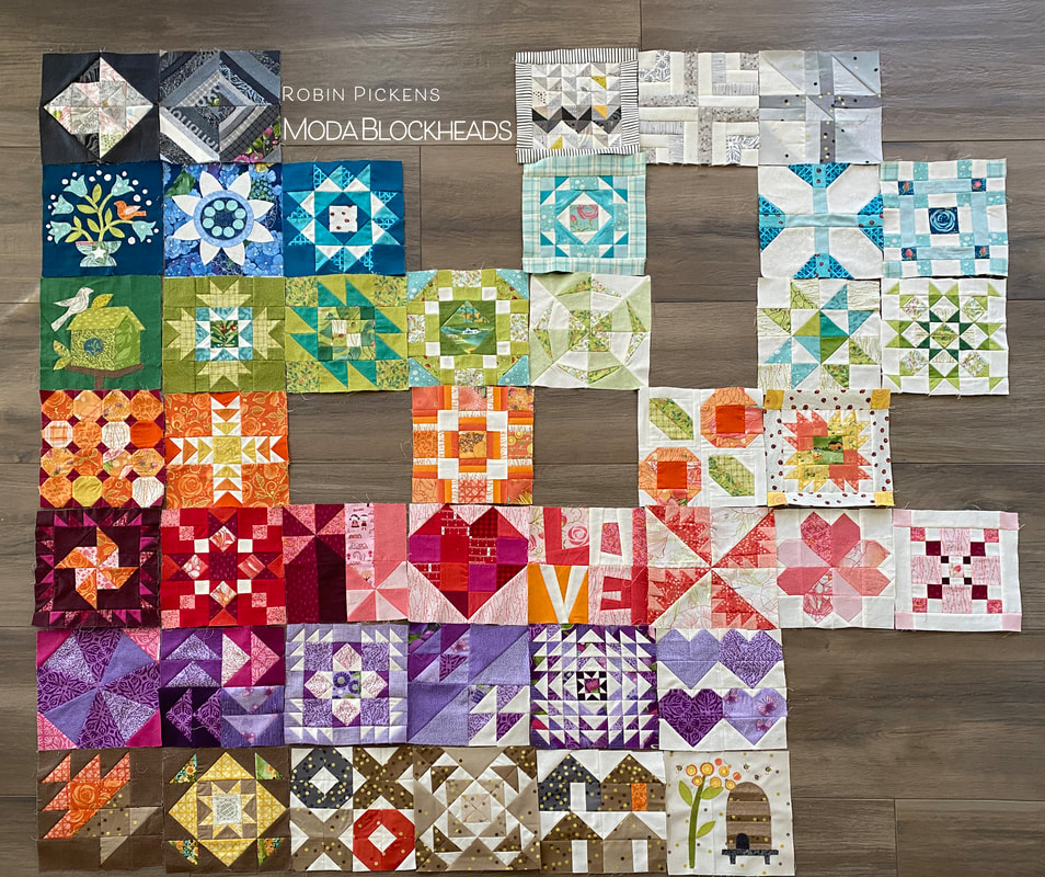
56 Weeks of sewing fun. I've been busy adding blocks together to make my rainbow colored rows. But one block was missing...that final block. Joanna Figueroa from Fig Tree & Co. is our final blockheads designer to wrap it all up. Thank you Joanna for your lovely "Star Dance" block! To get to Joanna's blog with the free pattern, click on the gray bar below. But keep reading if you want to see my color study and how my TWO quilts have come together! Flying geese and squares to make sparkly stars. A number of my patterns such as Showering Stars, Little Star Shower, and Constance, use stars like this. I liked how Joanna's version also played with the very center square in the overall composition in a color or print too. Let's take a look at a couple of color studies. My last block belonged in my blue row so that was my starting place. Light, medium and dark blues with subtle variations between the stars. It could be fun to play with black for the background (or starting rectangle of the flying geese) and I love how the white really pops in contrast. The white and black backgrounds make new shapes within the block. The left middle image uses a mix of medium and dark blues on some of the geese corners, positioned so it looks like the colors run diagonally through the block. And the last image creates arrows pointing to a glowing center. After designing Cottage Bleu (shipping in April) and adding new Thatched colors, I have more blues in my Thatched range now. I have used a few from Cottage Bleu and used back sides as well for lighter shades. When making my print blocks, I used blue prints from Abby Rose. The plaid fit nicely into the centers of the four stars and I decided to use a different print for the center with my light background and roses. If I were to make another one of these blocks, I would try the blue hydrangeas from Cottage Bleu. For this particular print quilt, I felt the warmer blues from Abby Rose were a cohesive color group with the other surrounding blue blocks. Here is an image of the rows joined together on my mixed prints/scrappy version. For the sashings on this print/scrappy version, I've used Modern Background Paper from Zen Chic. It is one of my favorite low volume fabrics to use. On my print version quilt, I chose to do applique on the weeks that Jan Patek and Jen Kingwell had their sweet designs. Last year I did all pieced blocks so this was a change for me. I still seem to resist doing turned edge applique and find my happy place is with the fusible raw edge applique. I think my favorite of the appliques is the bird on the upper left, dark blue. I added and extra flower or two and more white dots. They make me think of little white baby's breath in a bouquet. And for the "rose" applique week, I chose to cut out one of my Abby Rose blooms instead of the template shapes. How perfect is it, that the block that says LOVE was actually pieced by my mother? She was visiting a year ago January when it was the week for that block and she helped me out. Then the pandemic and quarantines started and I have not been able to see her in person since then. So I am especially happy to have a little bit of her in this quilt! The little bird in the middle gray block is one I had not shown yet. It was a block I did late, catching up one weekend. It is the Fixer Upper block from Vanessa Goertzen and I liked it as a framework around my birdie friend. I love to see how the light comes through when a quilt top is hanging on the frame, before it is quilted. It looks like stained glass and the colors almost glow! I started this project with a few design parameters I set: 1. Horizontal rows of color (rainbow-like rows), separated by a simple white line. 2. Each of the rows would use gradations of the color to go from darker shades on the left to lighter shades on the right. 3. I would make TWO quilts, one with all Thatched basics and one with a mix of Thatched and colored prints from my collections (with some other designer's goodies added in there too) for a scrappier look. This was to see how different or how similar the quilts ended up looking by the change in prints. So how about that all-Thatched one? I must admit the vibrancy and saturation of all that color was surprising to me when I got it all joined together. I was glad I graduated color to the lighter right side so it was not too overpowering. I used the Thatched Cream 36 for my sashings. Instead of the applique blocks, I used pieced alternatives from Joanna Figueroa. The upper left has the tulip block, house block and another flower posie. I did keep two applique blocks- the Bachelor Buttons from Jen Kingwell since it felt so graphic, and the Bee Skep from Jan Patek. My sister likes bees and having this block reminds me of her. So now I have a mom remembrance and a sister remembrance in my quilt. Its hard for me to say if I like one version of the quilt better than the other. I will keep some things different as I finish these, using different pantographs for quilting them, and I'm also thinking about adding an additional little decorative border around the scrappy/print one. I like the Thatched one being simpler with no outer border. I am happy to come to this finishing phase of Moda Blockheads, but I'm also sad that it is ending. I know the connection and sewing along is so important during these strange and unpredictable times. So I made the decision to join in on sewing along with "My Favorite Color is Moda" because of course I need another project! I think the quilt design and colors they have suggested are beautiful! I hope to see you while sewing along with that! The resource link to all the free block patterns from this Moda Blockheads sew along- archived at the Moda website: Thank you for the lovely comments that you have shared each week on the block posts and color studies. You are the best! And thank you Moda for this wonderful sew along and all the organizing, writing, planning, giveaways and support. It is a BIG project and you do it with expertise, grace and style.
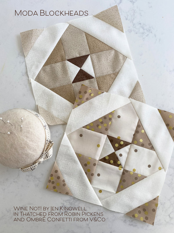
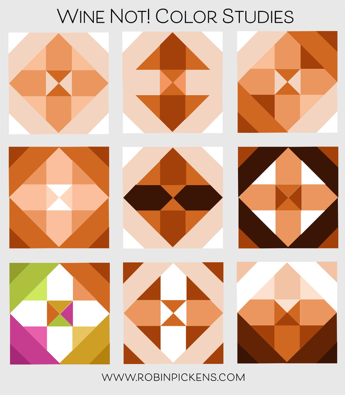
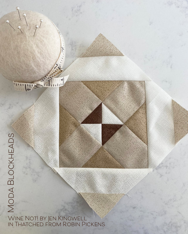
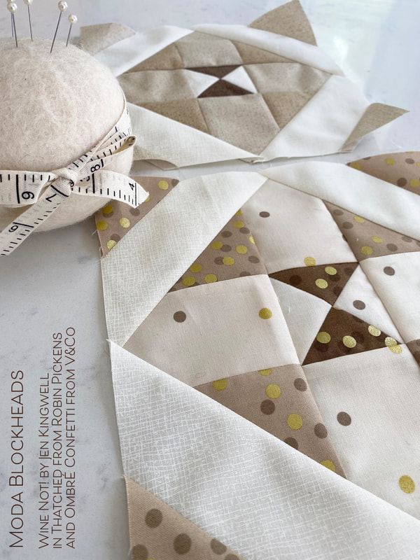
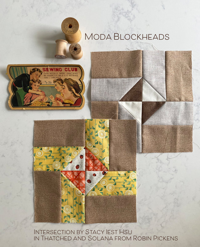
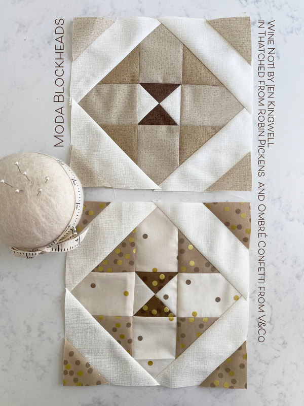
Let's finish up some quilts, right? Hugs to you all, Robin Wine Not! from Jen Kingwell is an easy block this week with a lovely diamond shape. This block looks great square or set on point. This is the very light end of my brown row and the soft warm colors look calm and comfortable. In playing with the color studies, I liked how the shapes can have a strong arrow form or emphasize the outer diagonals or the inner quarter square triangle center. The last one feels a little dimensional with the center having light and shadow as if it were a pointed pyramid triangle. For my pieced all-Thatched version block, I used a couple of my new shades that are shipping at the beginning of February. The center dark brown is 164 Chocolate Bar and the light tans are 156 Toast with the lighter 158 Washed Linen. My print version uses a fabric that has been quite prevalent in my brown row, Ombre Confetti from V&Co. The ombre gradations make it easy to find the light and dark levels you want within a block while keeping the colors harmonious. I love those little pops of confetti! Pop on over to Jen's blog for her Wine Not! pattern. And since I'm sharing brown blocks this week, here is one I did last weekend to catch up on a missed week. It is Intersection from Stacy Iest Hsu in Thatched and Solana. Next week is the last block and then it is time for joining and finishing. I love seeing what you all are piecing together on the facebook page. Keep sewing!
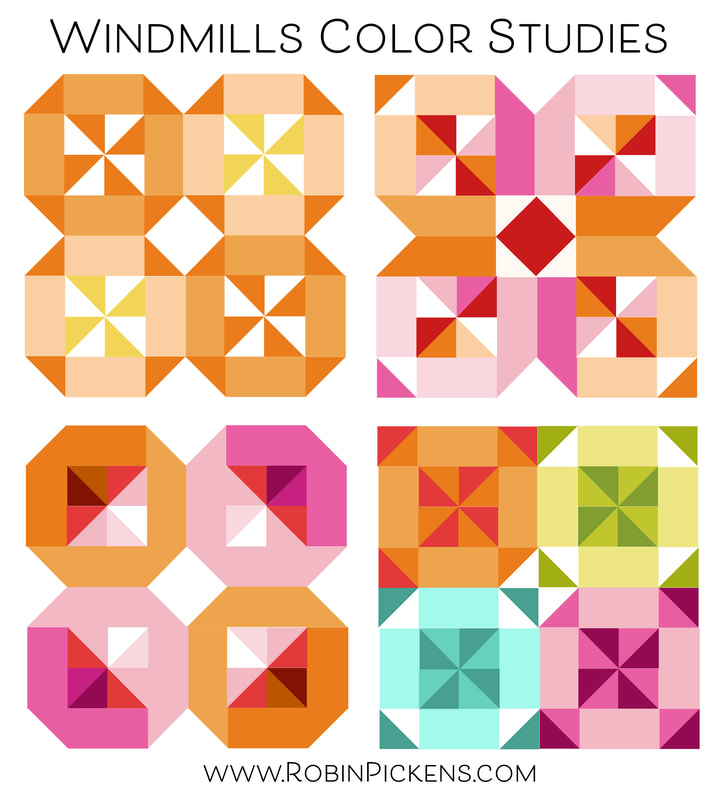
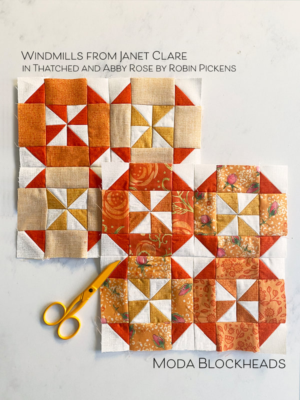
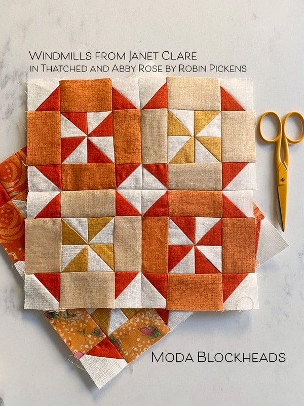
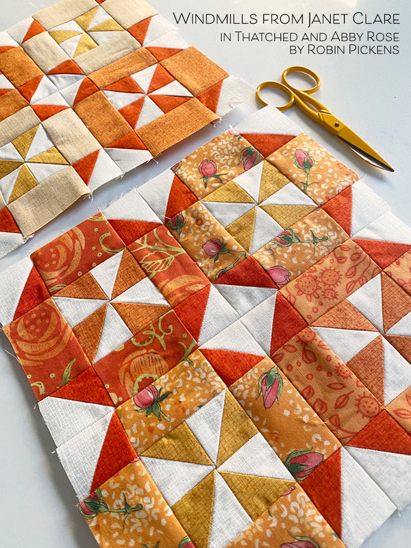
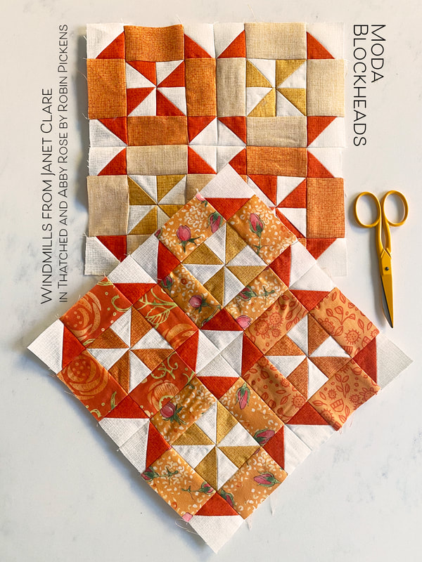
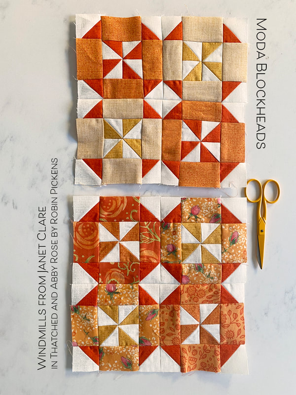
Happy Moda Blockheads Wednesday! Janet Clare brings us this week's block "Windmills" with a fun pinwheels in a group of 4 blocks. I like how the block can be rounded off forms around the pinwheels or emphasize those corner points to change that outer shape. The second one reminds me of ribbons running through the center of the block with sparkly quadrants. The third one has depth in the corners within the 4 centers from the dark and light focused to the outer corners. The last one is a colorful party of windmills! My blocks were cut out before I did color studies so I stayed pretty close to the original layout. This is the last one for my orange row and I wanted to mix in some yellow for the lighter range, and dark Tangerine for the darker range. My Thatched fabrics show off the flip side for the pale orange rectangle sides. I used triangle paper for making my HST. With 32 HST per block, and 2 blocks, it seemed best to simplify my colors for those elements and use the papers so I didn't have to do extra trimming. Fabrics from Abby Rose bring in the orange prints on my scrappy block. I stayed with consistent orange/yellow HST from my first block to be most efficient with the HST making. The rectangle sides were the place to swap out prints to play with my Thatched fabrics. Hop on over to Janet's blog for the pattern this week and have fun with windmill motion and HST fun!
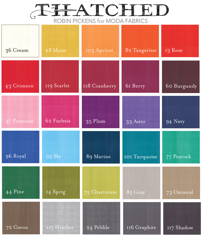
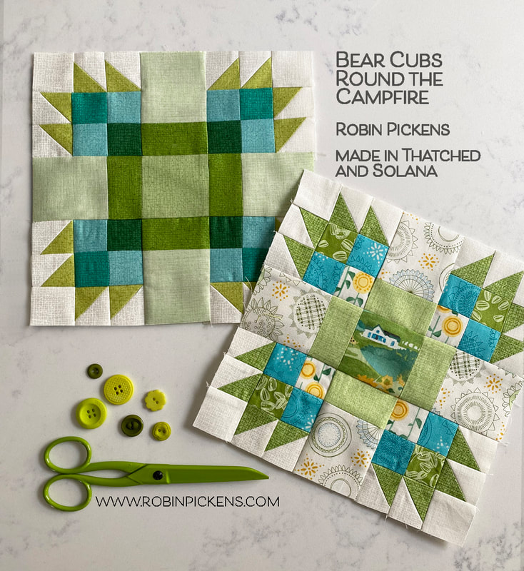
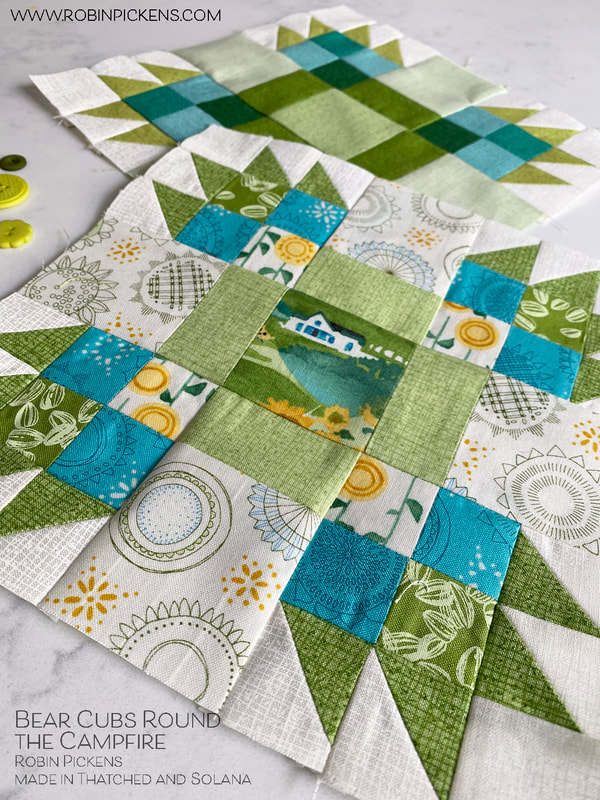
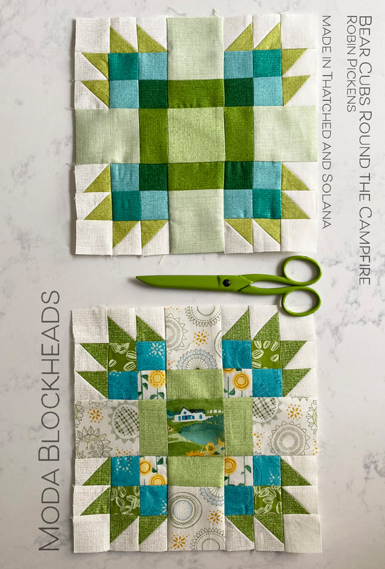
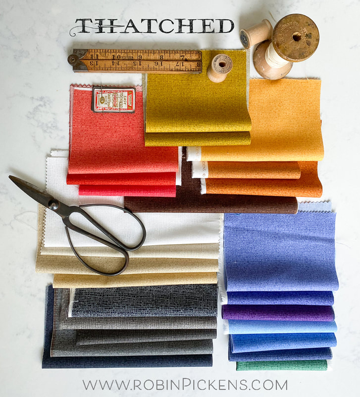
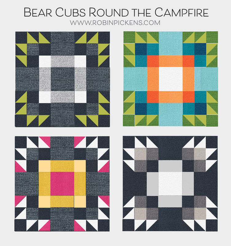
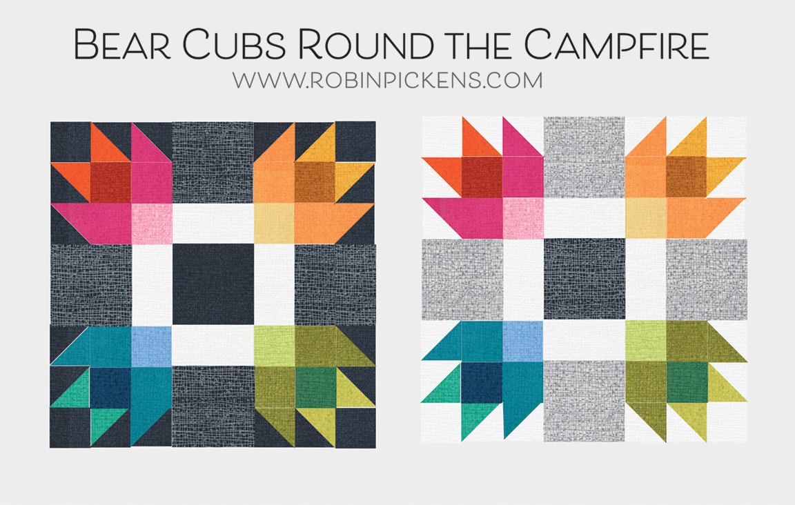
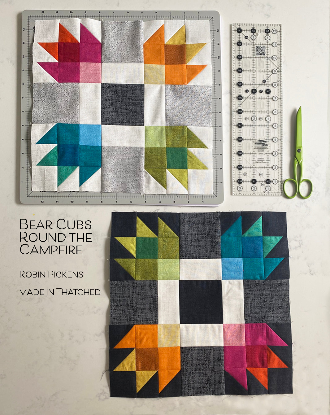
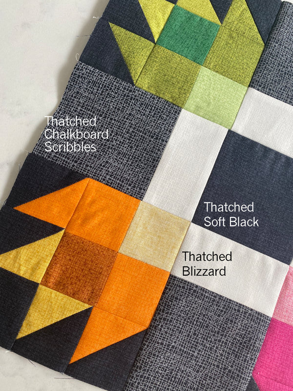
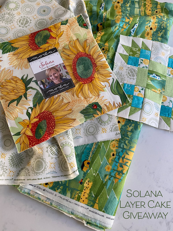
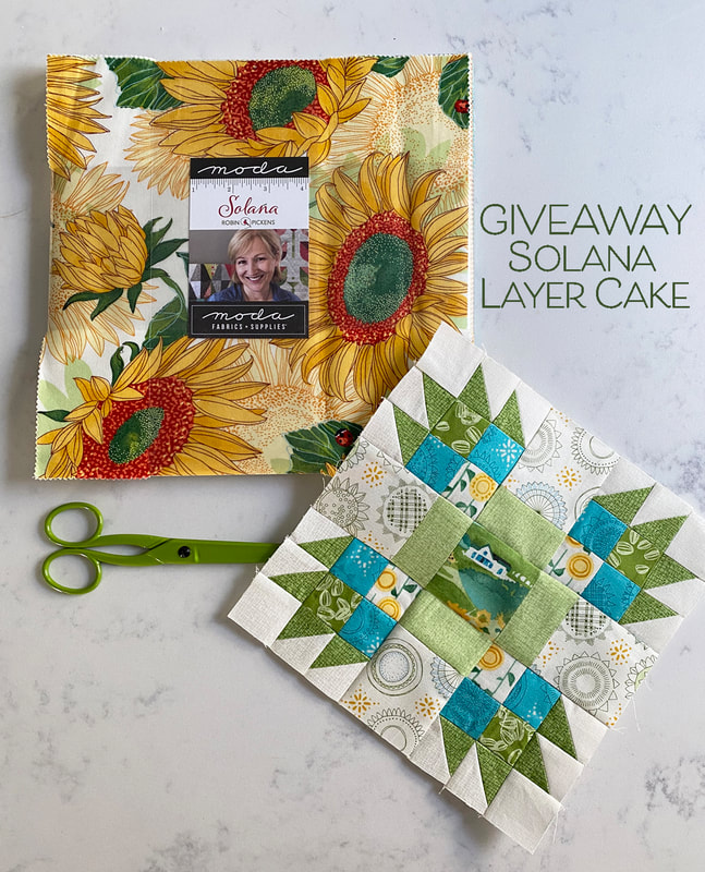
It is my week for the Moda Blockheads quilt block and I am feeling a little sentimental that this is all wrapping up soon. I have had such a good time! Last year I sewed the sampler but was not one of the block designers. This year, the excitement of sharing blocks I've envisioned has been a highlight to my months. The connection through online communities and sewing has been more important than ever with the changes we have all been going thorough with quarantines and working from home. In weeks that have blurred into other weeks, one thing has been steady...the fun and creativity of Wednesday block releases for Moda Blockheads. Thank you all for being a part of this quilt journey and community! I hope you are excited with your evolving quilts. And for this week's addition, block 53 is "Bear Cubs Round the Campfire." I've been enjoying some projects with Bear Paw blocks and liked the idea of a simpler corner with a small paw. With all four corners surrounding a center block, it felt like smaller bears, or little bear cubs, sitting around the fire pit or campfire. I have actually been camping when a big, tall bear came into our campsite. He/she smelled the food cooking and we banged the pots and pans to scare the bear away. For this quilt block, I envision these bears to be smaller and so much more friendly! I took the opportunity to put my little farmhouse from Solana into the center square on my print version. Greens with a little pop of blue is my theme and the farmhouse is warmed up with some happy sunflowers. For my all-Thatched version, I've got greens from Painted Meadow, Solana and Abby Rose, along with the original basics Pine and Chartreuse. I used the flip side of the Solana light green to get the lightest outer shades. Speaking of Thatched...I recently announced that Moda is releasing another 25 colors into the basics line! It will be shipping either this month or February. I am thrilled to have more colors to play with and can't wait to experiment with more color combinations. Check back to my blog in the next few days because I will be releasing a NEW FREE mini quilt pattern that uses a Mini Charm. I'll have it as a download on my blog. I've got it shown in the new Thatched colors and I am loving the spicy warm colors and new periwinkle/cornflower blues. But lets get on to the COLOR STUDIES! And of course the pattern and then, please enter to win a layer cake of SOLANA (enter on the Facebook Moda Blockheads page on my announcement post with the picture of my sewn blocks). The pattern is here - just click the gray bar right below this paragraph. But to see mockups and learn more about the GIVEAWAY, keep reading... When first planning this block, I had a red center square for the "fire" but as I played with it and realized it was going to live in my green row of the quilt, I switched out center colors and added more subtle bands of color in the middle of the sides. I also liked looking at this with warm colors on a dark background, and again tried those bands in a different value of the lighter brown. 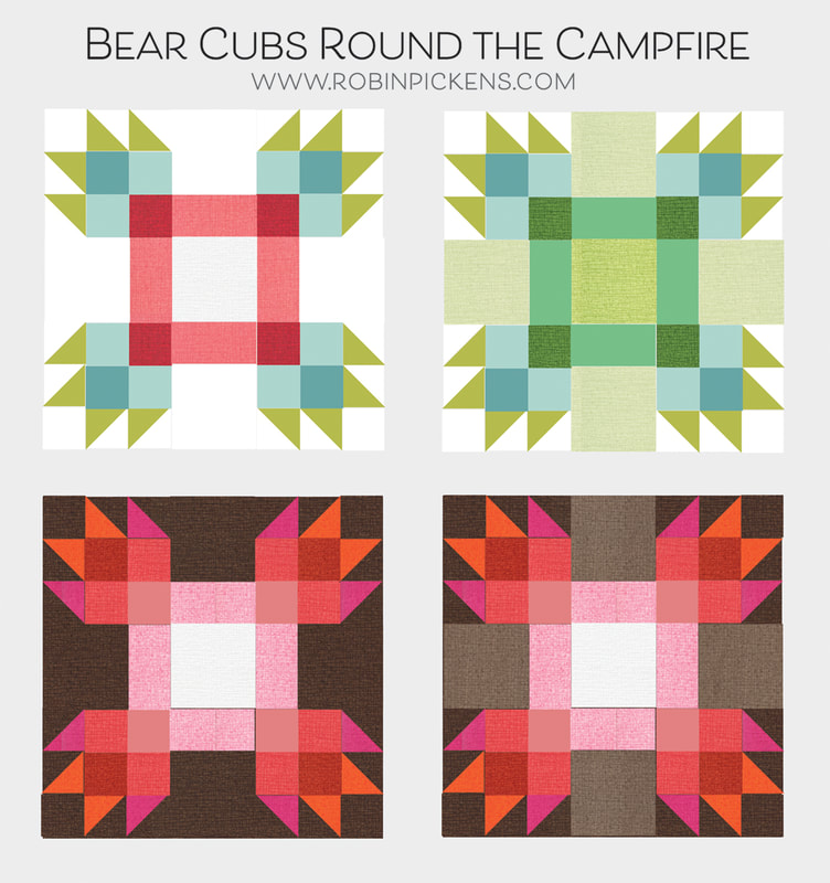 Next I tried emphasizing the squares in the middle, either through light and dark or a highlighted color. On the last one I dropped out the corners on the inner box so it reads like a big chunky plus sign. The facets of cut glass? 70's supergraphics? More continuation of color from piece to piece and the illusions of lines turning corners. It is exciting that this doesn't resemble a bear paw any more. 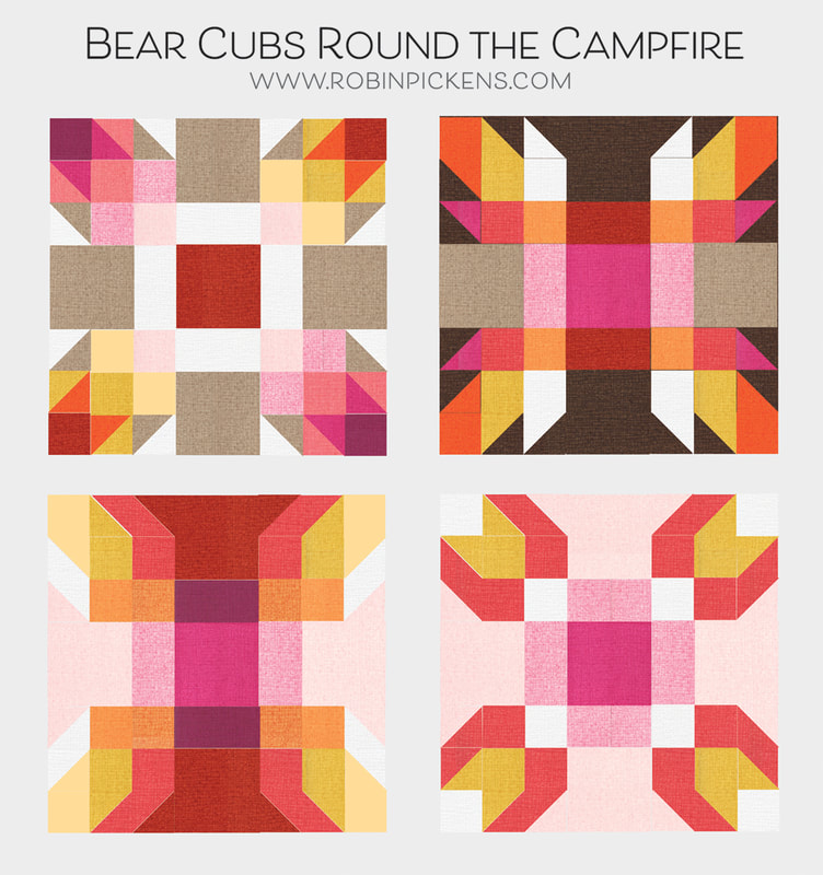 And finally, a little rainbow love with a color wheel of color showing up in those corners. I like these as a pair with the light and the dark background. So of course I had to stay up late and make these! I didn't have good enough light to photograph last night so I added these to the post later. I did these as 12" blocks (my green ones are 8") and I think that adding some extra borders would increase the size to nice pillow covers. I've used some of the new Thatched colors in these. The background below is so fun to try out! It is called Chalkboard Scribbles and is basically the reverse of Heather from the first group (grey lines on white). There is a crisper white on white called Blizzard and deep and dramatic tonal Soft Black. Thank you for all your lovely comments about the color studies over the weeks! I have greatly enjoyed doing them and sharing the mockups. GIVEAWAY INFO: I'll be drawing a person to win a Layer Cake of SOLANA fabric. Please enter by commenting on my post in the Moda Blockheads FACEBOOK group (my post with the photo of these green blocks, not the color study one) and tell me what flowers you would like to see me do on a future fabric collection. I'll be picking a winner next Tuesday the 19th. Thank you all for sewing along and may 2021 bring health and happiness to everyone!
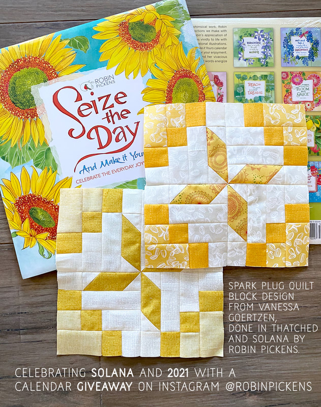
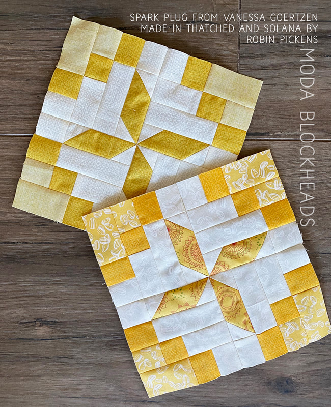
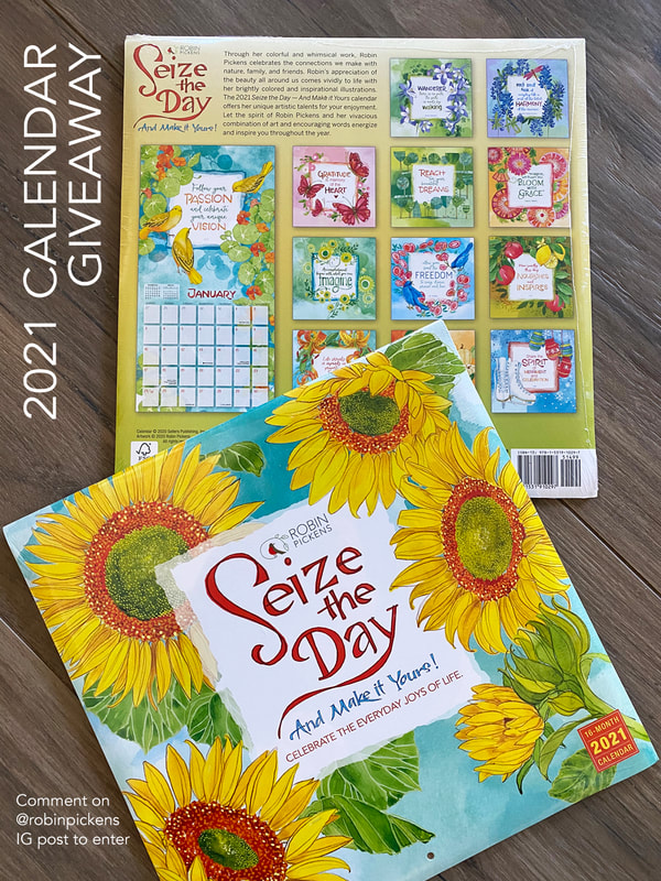
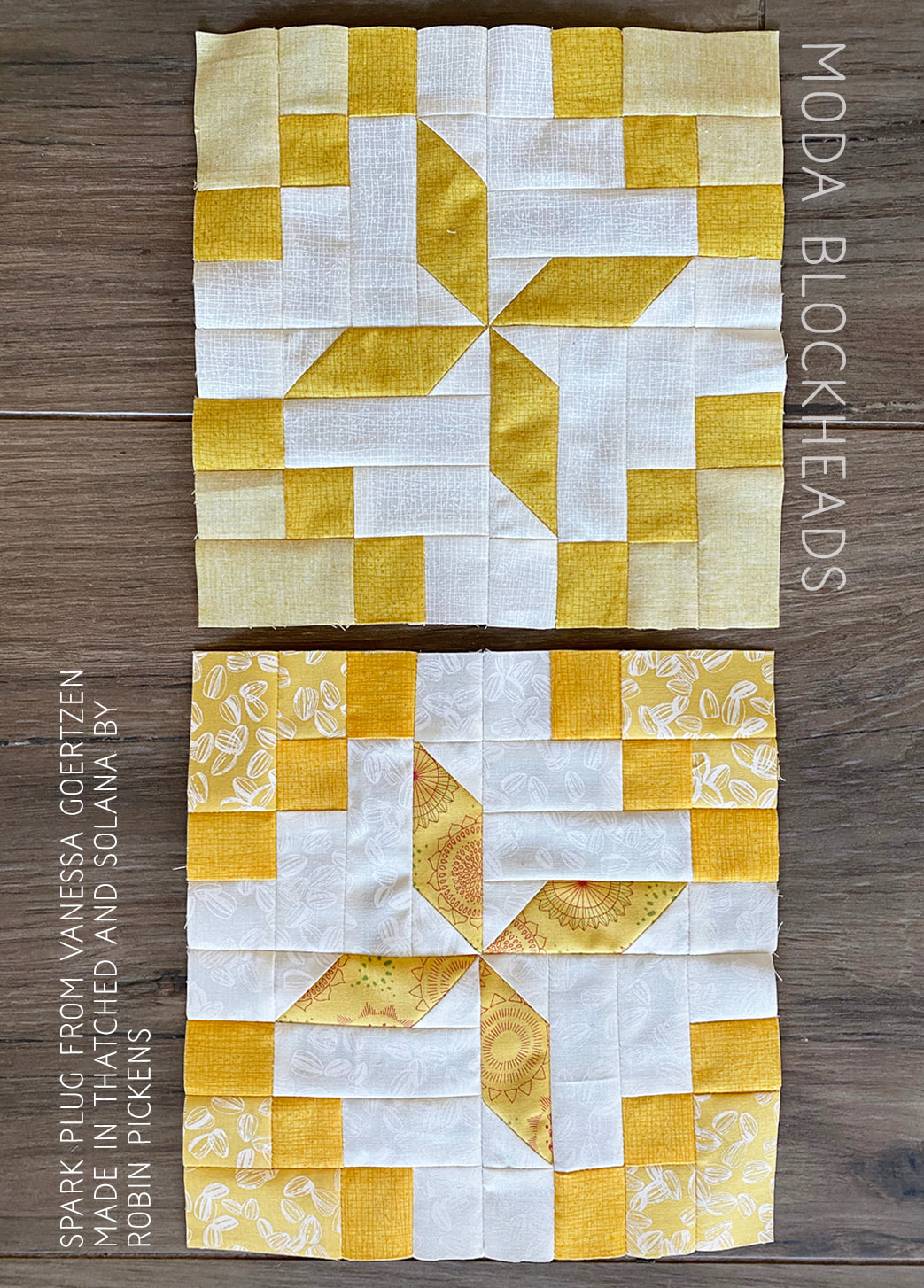
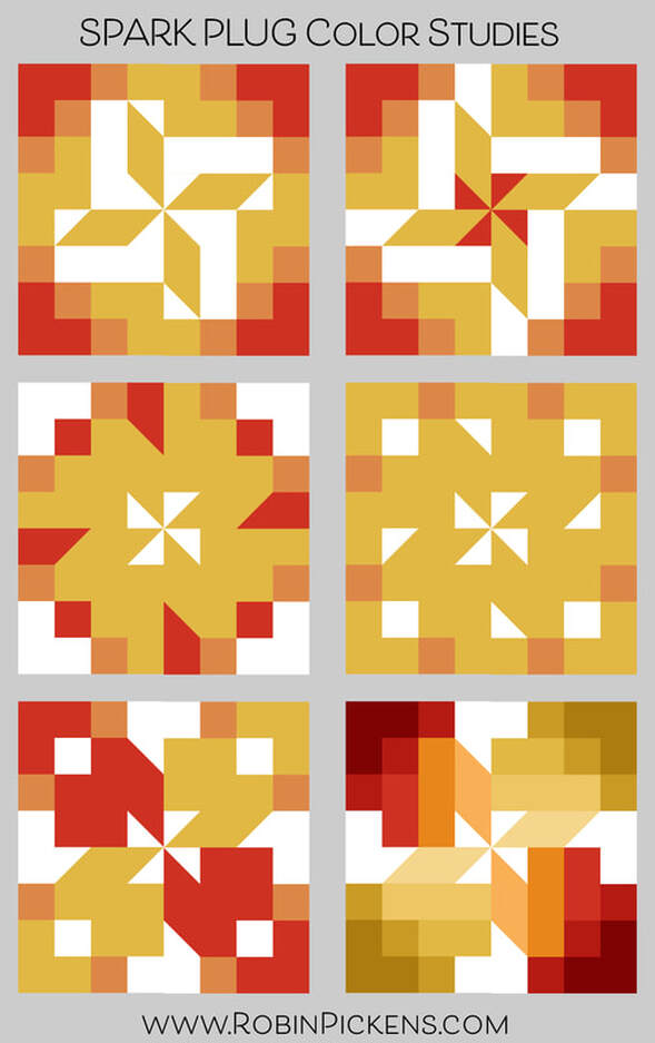
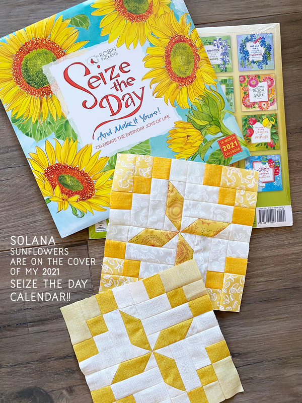
I usually start the Moda Blockheads posts with my color studies. But today I want to share a time-sensitive thing first...a giveaway! Yes, in honor of 2021 starting in a couple of days, I am doing a calendar giveaway on instagram @robinpickens. Just comment in the giveaway post and I'll be selecting 2 winners on January 2nd (just in case some of you are already celebrating and haven't seen the post yet!) Vanessa's SPARK PLUG block this week is a fun one and I wanted cheery energy with some yellows. They are yellow fabrics from my SOLANA collection that is in shops now. I used the white on white tonal sunflower seeds as my background fabric in the print block and I love the subtleness of the hinted texture. I really enjoy the "varietals" coordinate in this collection and used that for the center rectangles. It was perfect timing to have the cover of this next year's Seize the Day wall calendar be the same cheery sunflowers that I used in the SOLANA main prints! I really hope this year brings more sunshine and happy days in a spirit of optimism and progress. And, just in case you are wondering, the Seize the Day calendars come in wall, daily and checkbook sized formats. I just saw some recently at my neighborhood Barnes and Noble. But back to quilt blocks...for the Thatched version I used the Maize color and got that lovely soft light yellow in the corners by flipping and using the back side. Stay tuned for some news very very soon about Thatched (hint, hint, I hope 2021 will be more colorful) And now...COLOR STUDIES! I stayed pretty true to Vanessa's layout when making my blocks. But when playing on the computer, I had a little fun playing with a variety of shades of color. I find it especially interesting how the shape looks almost flower like on that middle left one. Or I notice the surrounding box shape on the one to the right of it. And I like all the color gradations on the last one and having some different color families in the corners. Hop on over to Vanessa's blog for the SPARK PLUG pattern and enter her layer cake giveaway on facebook in the Moda Blockheads group. And a Happy New Year to you all and may 2021 be filled with fun sewing projects!
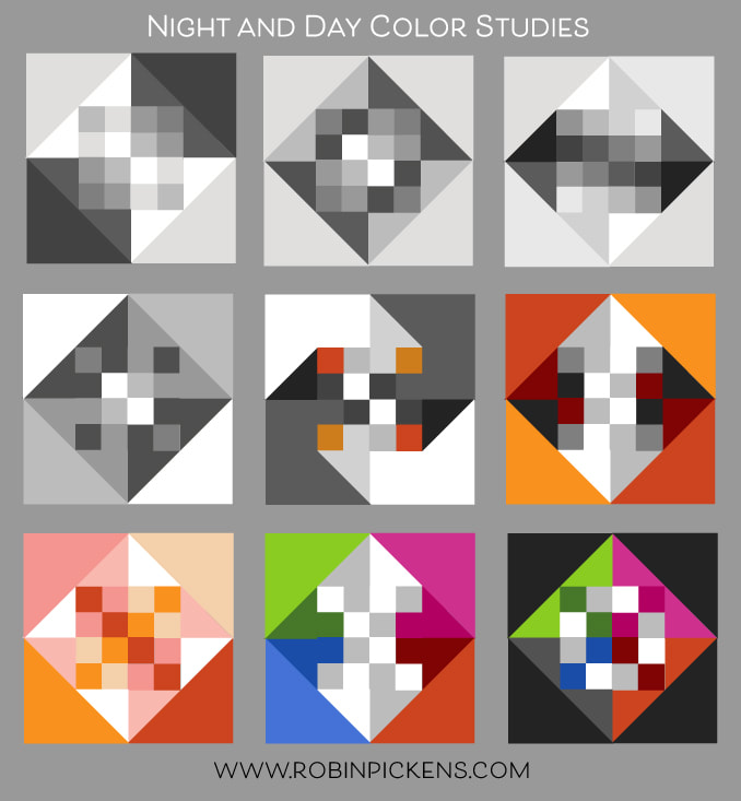
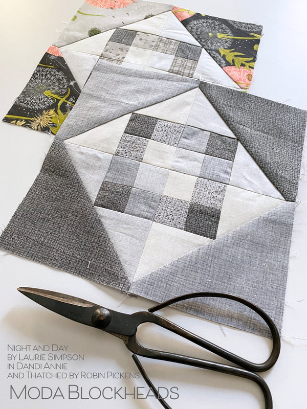
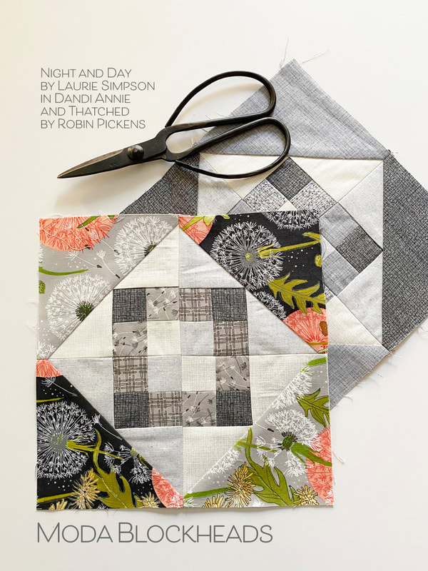
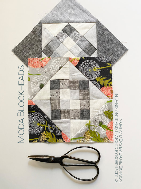
Within the structure of "Night and Day" the inside grid can be a simple checkerboard or gradation of colors. I like how the little squares can form a new perimeter around the center or can work with the middle triangles to make arrows. The outer triangles can frame the diamond or play with colors dancing around the shape. For my blocks I used Thatched in grays, using the backsides as well to get those lighter shades and subtle gradations. I wanted the effect of the checkerboard squares in the center to be very whispery and to highlight the structure of the box surrounding it more. Dandi Annie became my fabric choice for prints. I forgot how much I love working with these big puff balls of dandelion seeds! I kept the structure of the center box outline and the darker corners on two opposite sides. I'm still debating if I need to rip out and line up those medium gray squares better, but honestly, it is the week of Christmas and I think I'd rather be baking cookies over ripping out seams. So it is staying I think. Sometimes we need to say "it is good enough" and allow ourselves to love the imperfections. Hop on over to Laurie Simpson's blog for the pattern! And she is doing a layer cake giveaway on instagram! Happy sewing and happy Moda Blockheads day!
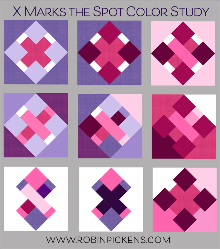
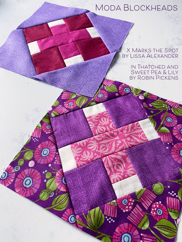
X Marks the spot by Lissa Alexander! I wondered what it would look like with a different color on the bar ends? Like little white cat's paws? How fun to play with switching corner colors and making the background "disappear" by using the same color for some corners as the big background. I think the one on the lower left looks like it is twisting. And the very last one makes the corner squares almost float. Can you see the white arrow in that one? Looking for the pattern? Hop over to Lissa's blog and see what she has as a giveaway too!
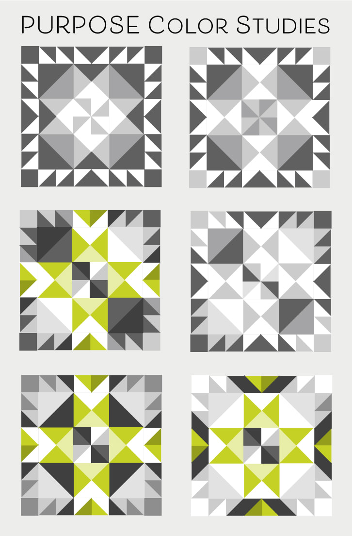
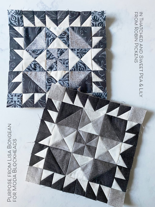
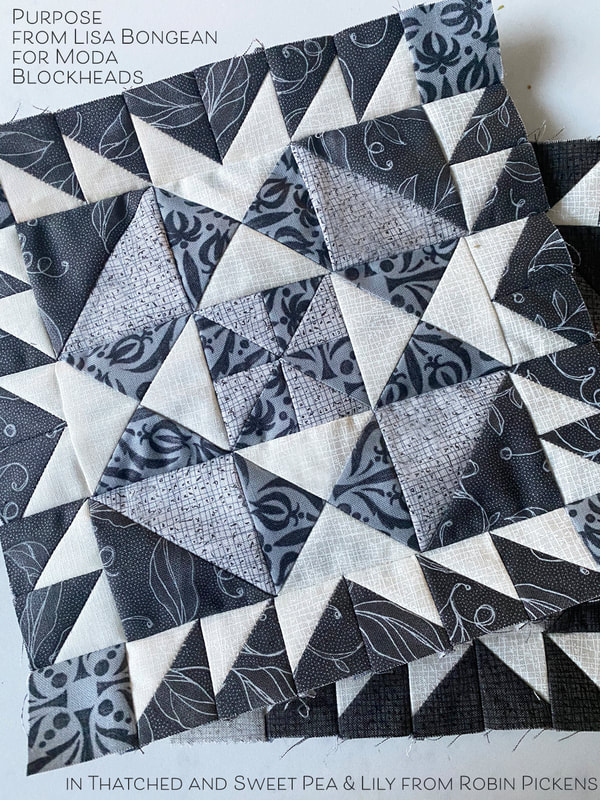
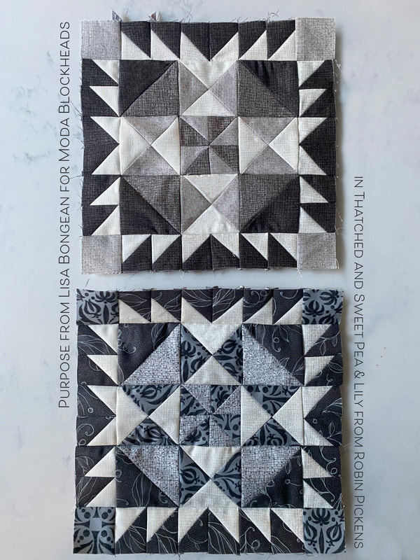
Lisa Bongean blocks usually have lots of options for what to do with those half square triangles. This week did not disappoint! I love to see how the larger half square triangles on the inner corners make an octagon shape or a chunky plus sign on point. You can treat the outer HST as a fringe or a bears paw entire unit. Play with the corners in different contrast of light and dark? And what a fun V shape in the centers of the perimeter on the last one! Visit Lisa's blog for this week's pattern: Each week I take stock of where I have spaces left in my overall layout and look at balancing the more intricate blocks with the simpler blocks. This block will end close to middle/ middle dark on my gray row. My print pattern block is using Sweet Pea & Lily grays. The Heather in Thatched is a cooler gray is works nicely with the stronger prints here. On the all-Thatched block, I am using slightly warmer grays. In both my blocks I have used triangle paper to make the half square triangles more efficient and reduce trimming time. Enjoy this lovely block and happy sewing this week!
In Moda Blockheads I am doing two versions, one scrappy and one all-Thatched. This is the progress on my scrappy version! I've used mostly fabrics from my collections with some additional fabrics from V&Co Ombre Confetti and a Little Red Riding Hood from Stacy Iest Hsu. I've mixed Thatched into these blocks to be a blender and make a link to the other version. For the rainbow bands I am debating adding some strips of color in between the blocks and I plan on having white sashing between the horizontal rows of color.
I'll be posting my blocks for this week on Friday so stay tuned! |
About ROBINDesigner of colorful florals for Moda fabrics. Modern to transitional quilt designer. Illustrator, sewist, crafter. I am proud to be a designer for Moda Fabrics!
Shop Robin's DesignsI am an affiliate for Fat Quarter Shop and may earn a small commission through my links. Thank you for your support!
Categories
All
Archives
February 2024
© Robin Pickens Inc. All rights reserved. No images may be reproduced without permission.
|
Proudly powered by Weebly

 RSS Feed
