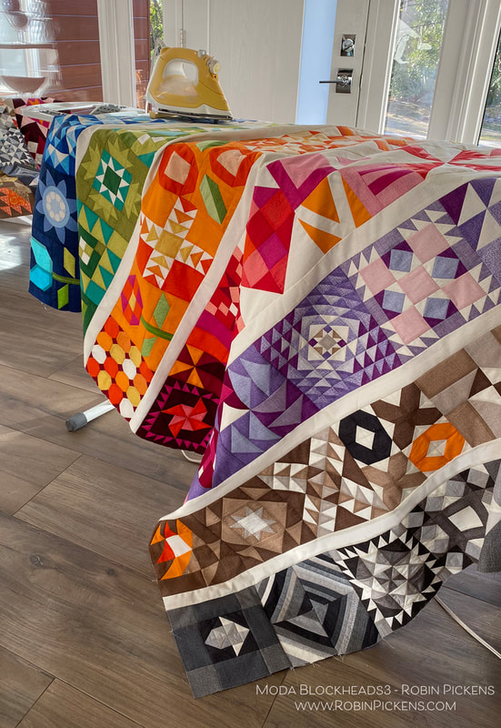
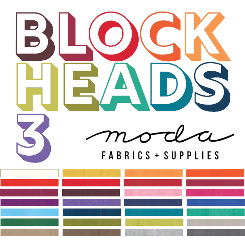
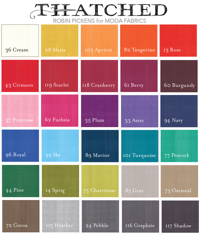
 56 Weeks of sewing fun. I've been busy adding blocks together to make my rainbow colored rows. But one block was missing...that final block. Joanna Figueroa from Fig Tree & Co. is our final blockheads designer to wrap it all up. Thank you Joanna for your lovely "Star Dance" block! To get to Joanna's blog with the free pattern, click on the gray bar below. But keep reading if you want to see my color study and how my TWO quilts have come together! 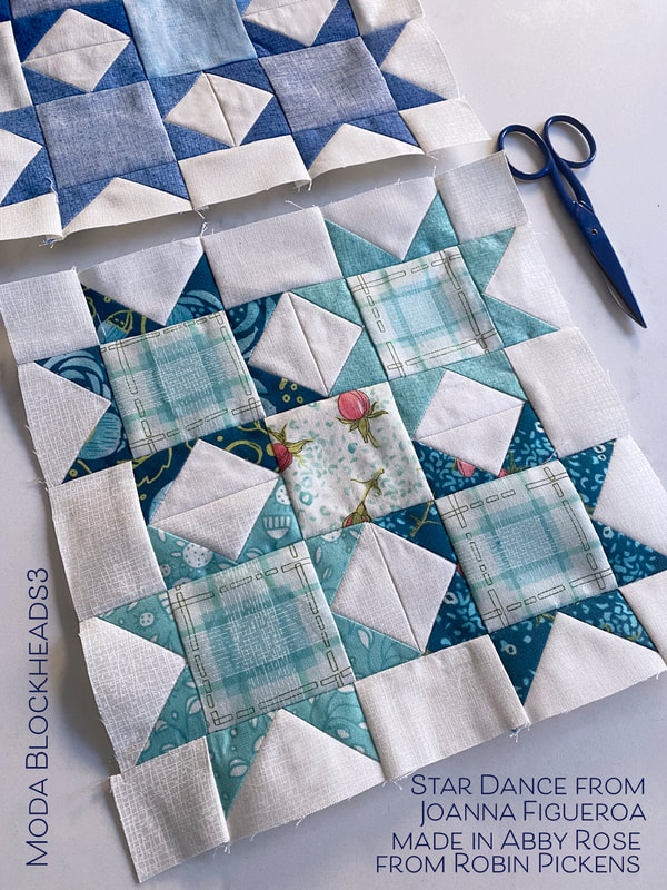 Flying geese and squares to make sparkly stars. A number of my patterns such as Showering Stars, Little Star Shower, and Constance, use stars like this. I liked how Joanna's version also played with the very center square in the overall composition in a color or print too. Let's take a look at a couple of color studies. 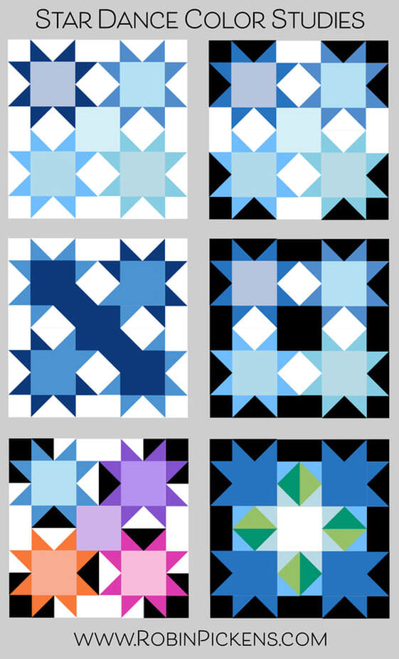 My last block belonged in my blue row so that was my starting place. Light, medium and dark blues with subtle variations between the stars. It could be fun to play with black for the background (or starting rectangle of the flying geese) and I love how the white really pops in contrast. The white and black backgrounds make new shapes within the block. The left middle image uses a mix of medium and dark blues on some of the geese corners, positioned so it looks like the colors run diagonally through the block. And the last image creates arrows pointing to a glowing center. 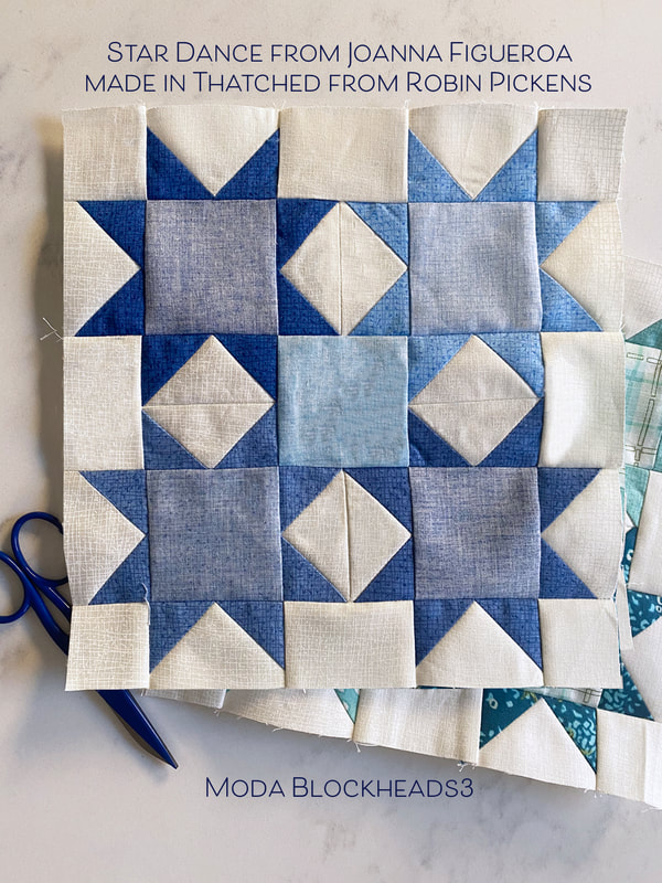 After designing Cottage Bleu (shipping in April) and adding new Thatched colors, I have more blues in my Thatched range now. I have used a few from Cottage Bleu and used back sides as well for lighter shades. When making my print blocks, I used blue prints from Abby Rose. The plaid fit nicely into the centers of the four stars and I decided to use a different print for the center with my light background and roses. 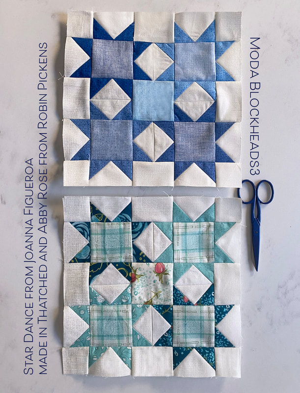 If I were to make another one of these blocks, I would try the blue hydrangeas from Cottage Bleu. For this particular print quilt, I felt the warmer blues from Abby Rose were a cohesive color group with the other surrounding blue blocks. Here is an image of the rows joined together on my mixed prints/scrappy version. For the sashings on this print/scrappy version, I've used Modern Background Paper from Zen Chic. It is one of my favorite low volume fabrics to use. 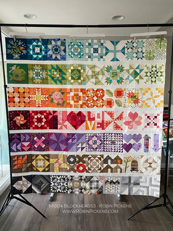 On my print version quilt, I chose to do applique on the weeks that Jan Patek and Jen Kingwell had their sweet designs. Last year I did all pieced blocks so this was a change for me. I still seem to resist doing turned edge applique and find my happy place is with the fusible raw edge applique. 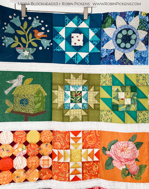 I think my favorite of the appliques is the bird on the upper left, dark blue. I added and extra flower or two and more white dots. They make me think of little white baby's breath in a bouquet. And for the "rose" applique week, I chose to cut out one of my Abby Rose blooms instead of the template shapes. 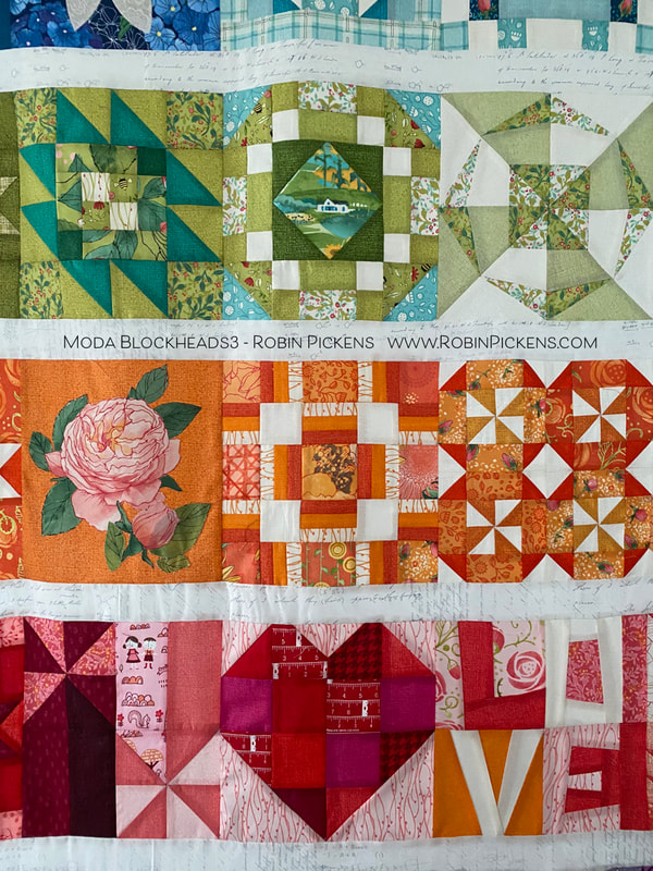 How perfect is it, that the block that says LOVE was actually pieced by my mother? She was visiting a year ago January when it was the week for that block and she helped me out. Then the pandemic and quarantines started and I have not been able to see her in person since then. So I am especially happy to have a little bit of her in this quilt! 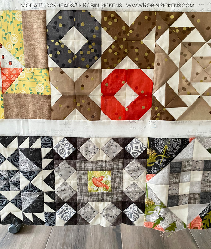 The little bird in the middle gray block is one I had not shown yet. It was a block I did late, catching up one weekend. It is the Fixer Upper block from Vanessa Goertzen and I liked it as a framework around my birdie friend. 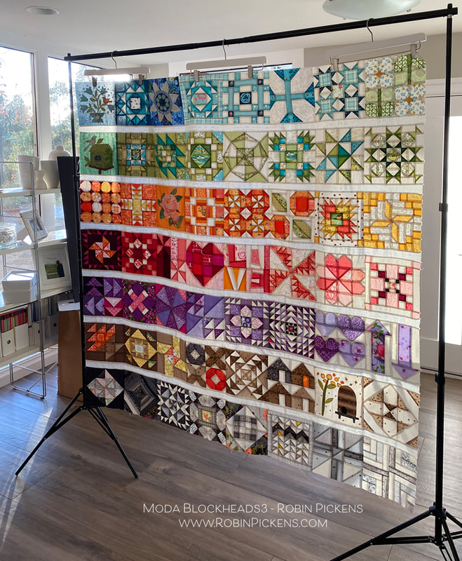 I love to see how the light comes through when a quilt top is hanging on the frame, before it is quilted. It looks like stained glass and the colors almost glow! I started this project with a few design parameters I set: 1. Horizontal rows of color (rainbow-like rows), separated by a simple white line. 2. Each of the rows would use gradations of the color to go from darker shades on the left to lighter shades on the right. 3. I would make TWO quilts, one with all Thatched basics and one with a mix of Thatched and colored prints from my collections (with some other designer's goodies added in there too) for a scrappier look. This was to see how different or how similar the quilts ended up looking by the change in prints. So how about that all-Thatched one? 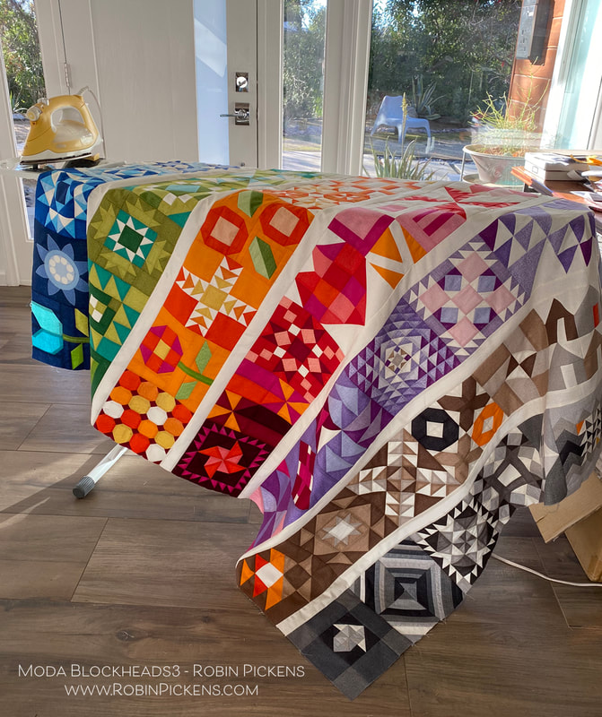 I must admit the vibrancy and saturation of all that color was surprising to me when I got it all joined together. I was glad I graduated color to the lighter right side so it was not too overpowering. I used the Thatched Cream 36 for my sashings. 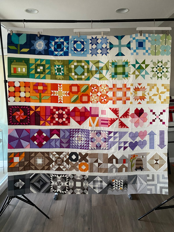 Instead of the applique blocks, I used pieced alternatives from Joanna Figueroa. The upper left has the tulip block, house block and another flower posie. I did keep two applique blocks- the Bachelor Buttons from Jen Kingwell since it felt so graphic, and the Bee Skep from Jan Patek. My sister likes bees and having this block reminds me of her. So now I have a mom remembrance and a sister remembrance in my quilt.  Its hard for me to say if I like one version of the quilt better than the other. I will keep some things different as I finish these, using different pantographs for quilting them, and I'm also thinking about adding an additional little decorative border around the scrappy/print one. I like the Thatched one being simpler with no outer border. 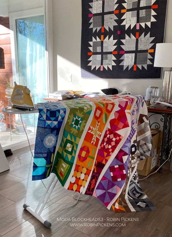 I am happy to come to this finishing phase of Moda Blockheads, but I'm also sad that it is ending. I know the connection and sewing along is so important during these strange and unpredictable times. So I made the decision to join in on sewing along with "My Favorite Color is Moda" because of course I need another project! I think the quilt design and colors they have suggested are beautiful! I hope to see you while sewing along with that! The resource link to all the free block patterns from this Moda Blockheads sew along- archived at the Moda website: Thank you for the lovely comments that you have shared each week on the block posts and color studies. You are the best! And thank you Moda for this wonderful sew along and all the organizing, writing, planning, giveaways and support. It is a BIG project and you do it with expertise, grace and style.
Let's finish up some quilts, right? Hugs to you all, Robin
14 Comments
Alycia
2/3/2021 05:47:48 am
I love your fussy cut plaid in your print verdion of this week's block. Thank you for your color studies each week. It really has helped me to think outside the pattern! Your 2 quilts turned out so pretty! Thank you for sharing your talents with us for the past 56 weeks. The information you have shared has helped me grow as a quilter. I hope you have enjoyed being part of BH. I am not doing My Favorite Color is Moda, but I hope our paths cross in another project in the future. I will keep up on your blog! Have a great day!
Robin Pickens
2/3/2021 08:37:28 pm
Alycia,
Nancy Ronaldson
2/3/2021 05:58:20 am
Love, love, love them both! The colours make me happy.
Robin Pickens
2/3/2021 08:38:25 pm
Hi Nancy!
Kathie L
2/3/2021 06:14:10 am
Thanks for sharing your design ideas. I've loved both your projects.
Robin Pickens
2/3/2021 08:40:01 pm
Hi Kathie,
Lillian R
2/3/2021 03:48:46 pm
WOW!
Robin Pickens
2/3/2021 08:41:49 pm
Thanks so much Lillian! This has been a great learning experience for me and fun to share. Sew alongs are great for seeing things in all the versions that people try. So fun! Thanks so much for following along in the color explorations.
bobbie rumler
2/4/2021 08:29:37 am
That quilt is wonderful and happy thanks for the inspiration...never thought it would have turned out so great if I'd had done it...again thanks bobbie
Mary
2/5/2021 05:22:42 am
How in the world did you #1: Pick out all the fabrics #2 then think about the graduation of colors throughout?!? I love the way the sun comes through the quilt top.this is truly inspirational.
Glenna C. Denman
2/5/2021 09:28:24 am
I have so enjoyed your color studies for the blocks, it really got my brain working to see the variations. I also love both your quilts. I will keep your setting in mind for future quilts. It is so original and so effective.
Melanie
2/5/2021 05:21:07 pm
Simple, but complicated. Beautifully executed. I've been so busy with my own projects i hadn't been following yours. I like your ideas and it plays into something I've been thinking about lately. I'm going to have to go back and see some of your block constructions, as i might want dinne of them in my final product. Gorgeous!!!
Karen S
2/16/2021 06:03:45 am
Those are both gorgeous, Robin! So fun to see them put together. Lots of work, but very lovely with the color gradations. Thanks for all your quilty inspiration. 2/20/2021 07:30:18 am
Absolutely gorgeous... love both versions! Your comment will be posted after it is approved.
Leave a Reply. |
About ROBINDesigner of colorful florals for Moda fabrics. Modern to transitional quilt designer. Illustrator, sewist, crafter. I am proud to be a designer for Moda Fabrics!

Shop Robin's Designs
 I am an affiliate for Fat Quarter Shop and may earn a small commission through my links. Thank you for your support!
Check the March 6, 2017 Episode!
Categories
All
Archives
February 2024
© Robin Pickens Inc. All rights reserved. No images may be reproduced without permission.
|
 RSS Feed