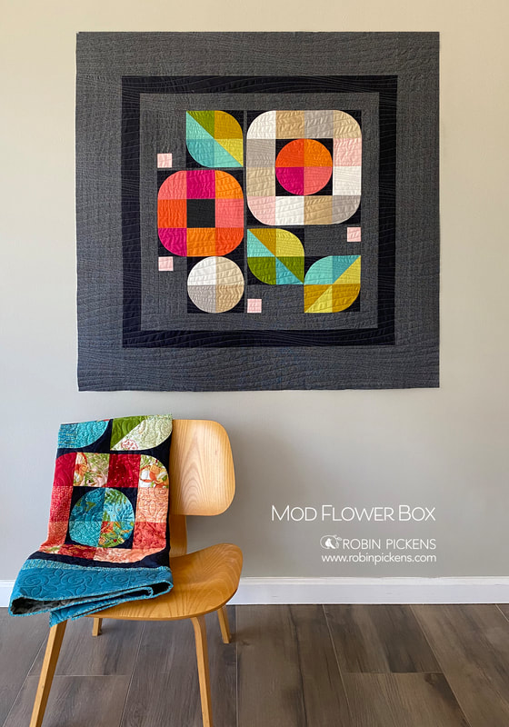
 I am often a "transitional" quilter (or you could call it modern traditionalism)- relating to sewing between traditional quilters and modern quilters. I love to make more traditional quilts, but I also enjoy how modern quilts can allow you to express your creativity in a different way! For some people, modern design can be a bit intimidating. They may only know of more improvisational modern quilting and not have comfort with improv. However, modern quilting doesn't have to be difficult or intimidating. You also don't have to use a complicated pattern to get that modern look. To help you embrace the modern quilter that is within you, I am sharing one of my easy modern quilt patterns which creates a stunning quilt with tools that you have on hand and no matter what fabric you choose to use! 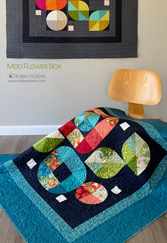 I enjoy a modern quilt design that is not overly complicated. In fact, I often feel a simpler, pared down design will have a more modern feel. I wanted to come up with a modern quilt that would allow you to easily create with fabrics you may have on hand, utilizing scraps, yardage, or even precuts (and precuts as small as a 5" square Charm Pack). I combined curves and squares into striking modern blooms in this geometric garden. This is Mod Flower Box, ready to bloom upon your wall! I'm showing two versions of this modern quilt in these photos. You can see how it still has a striking composition whether done in all solid fabrics or a combination of prints. This version on the chair is made with Carolina Lilies. This collection is scheduled to ship to shops in November 2021 and features spotted lilies, paisley prints, vines and ferns. Rich teal and green colors mix with spicy reds and peach tones reminiscent of my Painted Meadow collection. I chose to keep the background a dark soft black so there is high contrast with the colors and they really pop! I like to see the different ways that light and dark colors change up a quilt (keep reading for a lighter version below). 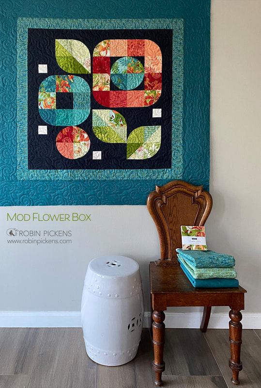 The wall/lap quilt in Carolina Lilies uses Thatched Soft Black 152 for the background and borders in Thatched Lagoon 199 (the teal color) and Dashed lines 48705-21 in Teal. The flowers and leaves are made from one Charm Pack of 5" squares. You can also use a Layer Cake of 10" precut squares and cut them in half both, horizontally and vertically. 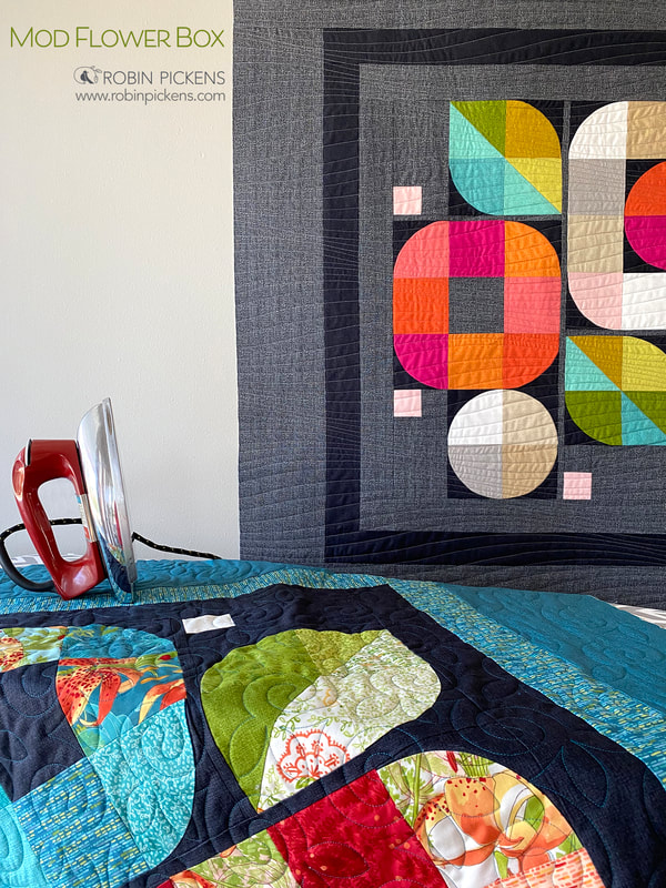 Another option for making this quilt is using Fat Eighths. My favorite version of this modern quilt is the one that looks like solid fabrics. It is actually using Thatched basics for the fabric. I've paired a use of bold colors with this subtle textured fabric to make the hues really stand out in a dramatic way. With the floral groupings all in the center, the outer borders create balance with a more expansive negative space that can be good for specific border quilting or just a breathing space and strong framing device. To get the look of these graphic areas of solid color, I've used a mix of 14 Fat Eighths, with 9 for flowers and 5 for leaves. For this version, I wanted to emphasize the corners and really play with the spaces left from the curved blocks by "boxing in" the flowers. That is where the name Mod Flower BOX comes in (plus the extra outer border). 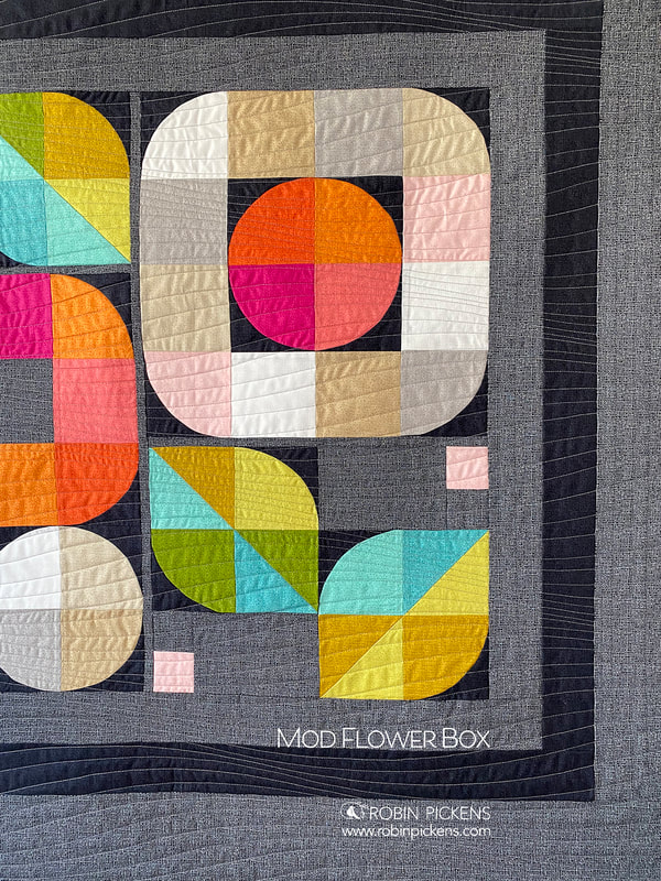 The background is made with Thatched Chalkboard Scribbles 187 with curves and inner border using Soft Black 152. The flower and leaf blocks use a mixture of Blizzard 150, Washed Linen 158, Toast 156, Gray 85, Early Dawn 122, Sugar Rose 127, Citrus 123, Clementine 138, Fuchsia 62, Green Curry 177, Sunlit 142, Grass 197, Dewdrop 143 and Brook 198. 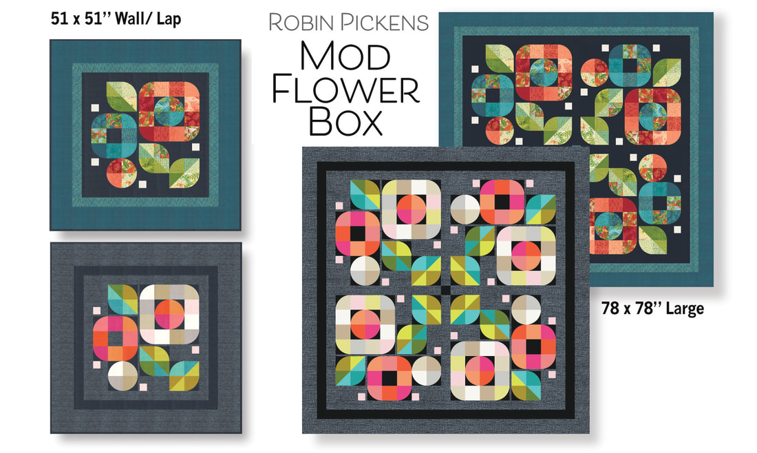 There are two different sizes of Mod Flower Box. The wall/lap size is 51" square with borders. If you choose to not have borders for a smaller wall quilt, the inner part is 34 x 34". The large quilt sized 78" square, uses 4 units of the rotated Mod Flower Boxes. Depending on which quilt size you choose, the Mod Flower Box pattern can be made with a Charm Pack or Fat Eighths for the wall/lap size or with a Layer Cake (or 4 Charm Packs) or Fat Quarters for the large size. 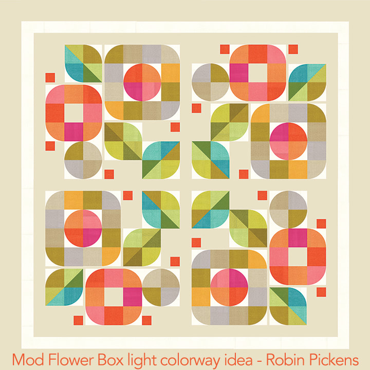 I am planning on starting this lighter color version of Mod Flower Box, probably with a Washed Linen background or maybe Sandcastle 157 flipped to the backside and accent corners for curves in Blizzard 150. Speaking of colorways, this is actually one of my favorite things about this quilt design! You could create your own quilt top in almost any color scheme! For instance, you could use solid colors, different styles of fabric within a particular color palette, ombre fabrics, or simply your favorite colors. Color always gives me a new way to look at modern quilt designs. Needless to say, the color choices you have are absolutely endless! 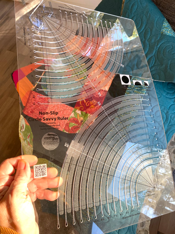 I've made lots of quilts with curved corners and I DO include a paper template you can work from in the pattern (or pattern downloads if you buy the pdf file version). I do prefer to use a specialty ruler for doing curves and know of a number of them. I usually go to my trusty Creative Grids Circle Savvy Ruler since it has every size I want and I know I will get a really good result cutting with these! I note which slots in the pattern if you have this ruler too. 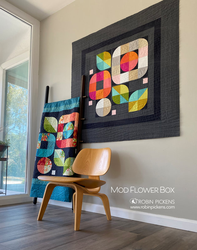 Since we are talking about curved corners, many beginner quilters stay away from modern quilts due to ''sewing curves''. I took this fact into consideration, so if you are new to curves, this is a great pattern to try since it only uses quarter circles vs half or full circles! Quarter circle curves are not very hard and I'd suggest making a practice quilt block or two first and then go for it! I love the look of curved blocks- so soft and curvy and gentle. They are a fun thing to experiment, plus, it will make you more confident in your quilting skills! 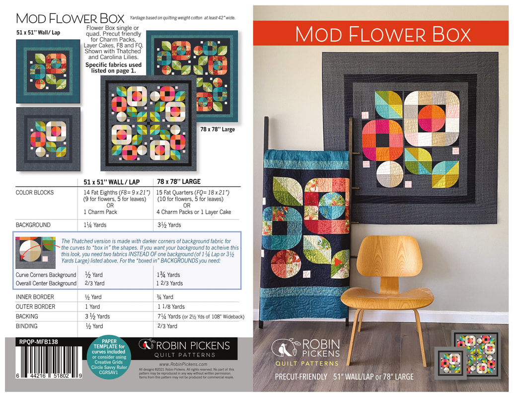 So, if you are ready to take a break from traditional quilts and want to create your very first modern style quilt, then the Mod Flower Box is a great place to start! Above I have included additional information on quilting materials and specifications. However, since this is only a blog post, I highly recommend that you check out my shop to learn more about this fun quilt pattern! If you are interested in the pattern, it is up in my shop at RobinPickensInc.com! 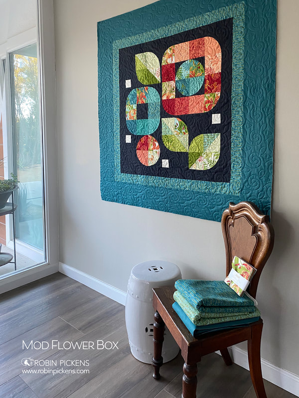 
11 Comments
With Project Jelly Roll approaching, I decided to take a look at my Jelly Roll-friendly patterns to figure out what I am going to work on and perhaps share some ideas. One of my Jelly Roll patterns is Definite Plus. 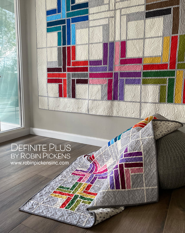 My original Definite Plus quilt is made in Thatched basics. I loved playing with the color families and having a "ghost block" image in the center of just sashings and background. And I made this in both the large size on cream and the small size (using a Honey Bun or 1 1/2" strips) on Heather. 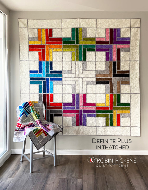 I wanted to see what this would look like made up in a Jelly Roll of print fabrics from a collection. I decided to make one that had no outer borders and no ghost block for the center. Full quarter log cabin blocks without an accent. If you make the large size without the outer border, it goes from being an 82" square quilt to 69 x 69", which makes a lovely large lap or can fit on a twin bed as a nice extra quilt. 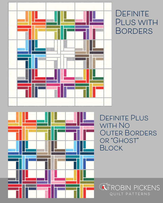 How does this impact yardage and cutting? I have only made it this way in the Large size, so I don't have the specifications for the Small at this point. For Large quilt with no outer border and no ghosted center block or accent rectangles: Sashing: 1 2/3 Yards for sashing instead of 2 1/8 Yards. When you are cutting, you will cut a total of (56) WOF strips. (4) of those will be cut to 34 3/4" and joined end to end to make the long sashings horizontally between the rows. Instead of (44) 6 1/2 x 1" pieces, you will need (36). Background: You need 1 1/4 Yards for background instead of 3 Yards. You will only be cutting the centers of the Quarter Log Cabin blocks and need (36) of them. 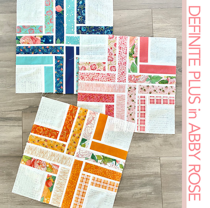 For my print version, I decided to use Abby Rose for my strips. I made all my centers with Zen Chic Modern Paper for a pretty, romantic feel. My sashings are Moda Bella Off White 200. I still kept my groupings of 4 that make a plus sign in color families. 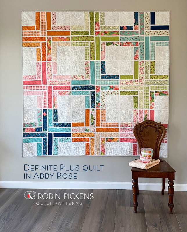 I like seeing the contrast of prints vs a more solid look for this quilt. I am very excited to try it again with upcoming lines and try other versions of background and sashing colors. 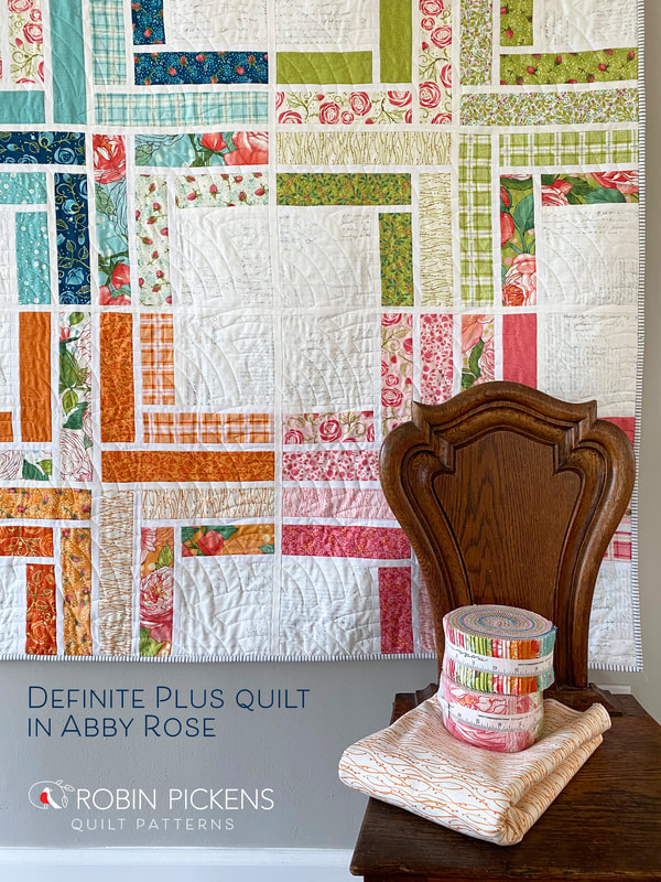 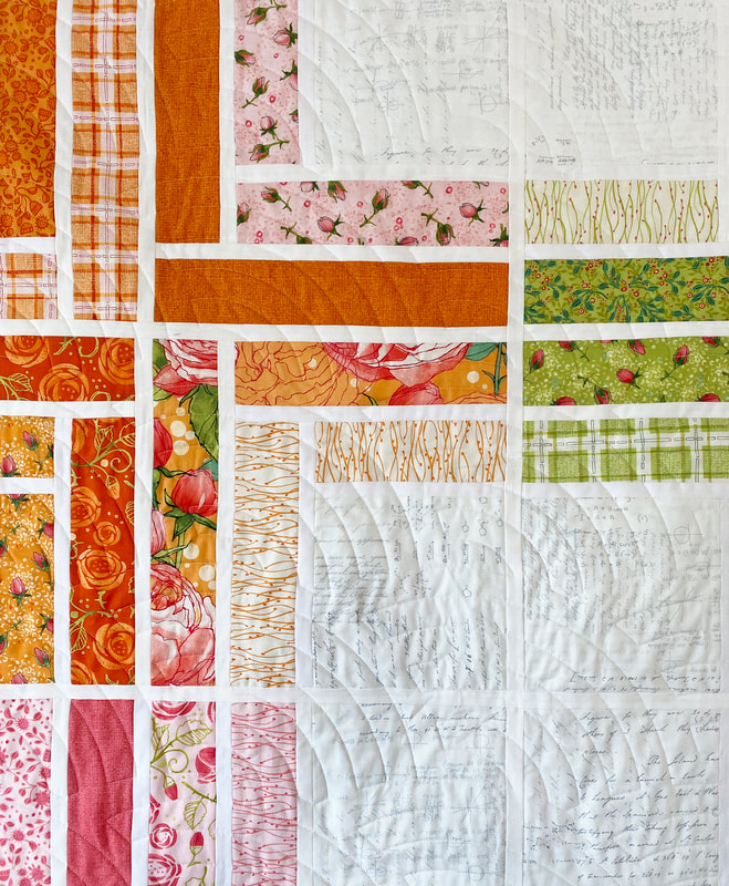 And just one more idea, since I'm playing around with it...what if the placement of colors were more improvisational and the background squares also had some pops of color? I decided to take a look in the suggestion of my Hygge Happy color theme direction (with Washed Linen, Toast, Cocoa, Sugar Rose, etc). What do you think? Playful or too random? 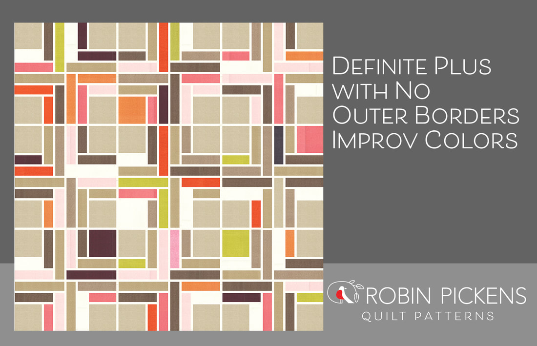 Looking for more Jelly Roll-friendly quilt patterns? Hop on over to my shop and check out Showering Stars, Ring Around the Posies, Equalizer, and Blockstep. And please join in the fun on September 18th 2021 as we sew those Jelly Rolls! 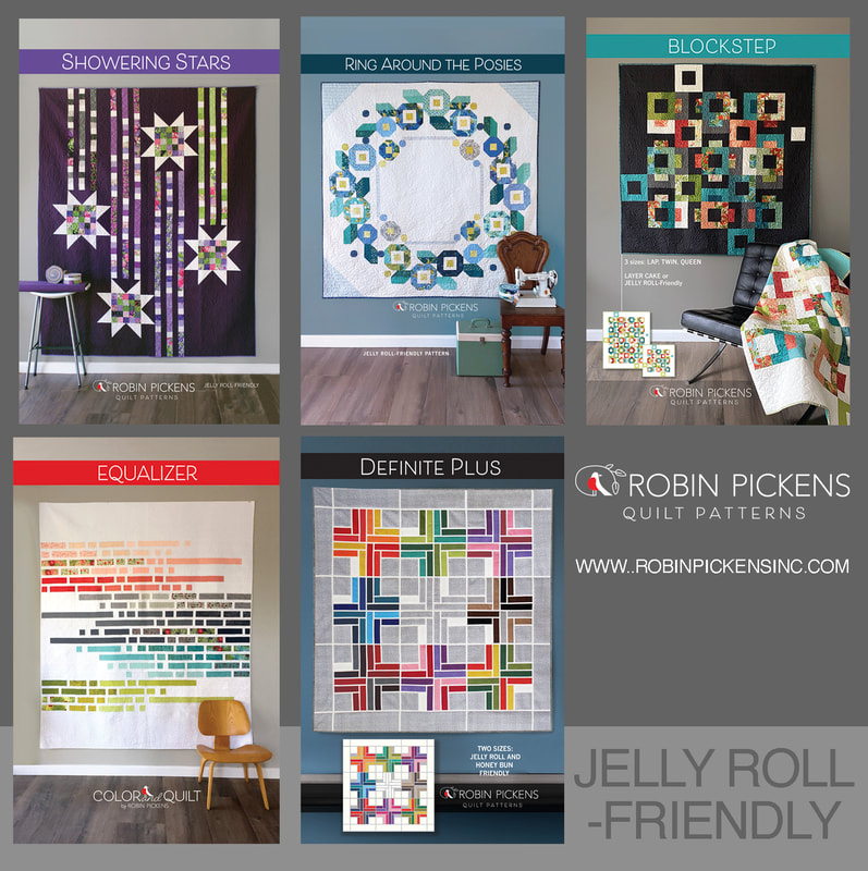 I've compiled blocks into groups to share the updates of blocks 11-30 for the Kinship Fusion Sampler on the 100 Days 100 Blocks sewalong with GnomeAngel. My palette is the Hygge Happy Dance colorway of Thatched fabrics. Missed the post? Check it out here: Kinship in Thatched palettes. 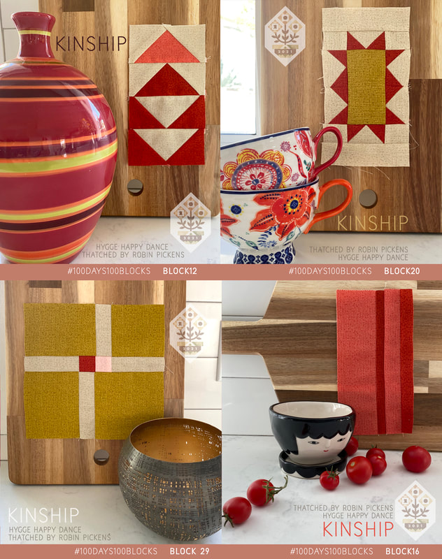 I've had so much fun finding the little photo props to go with my blocks for this project! They remind me of so many special people in my life. My husband gave me those lovely mugs and I think he hit that surprise gift out of the park! And the lovely girl ceramic planter face...I also got one for my mom. She just makes me smile! I'm showing Smoked Paprika, Pink Grapefruit, Green Curry as the warm and spicy color here. 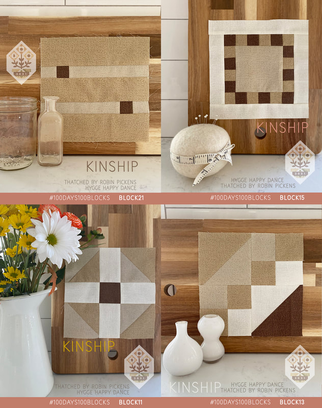 The calmness of the creams and tans has been lovely to sew with. Washed Linen, Toast, Cream and Cocoa. Little squares of cocoa make wonderful pops of contrast. 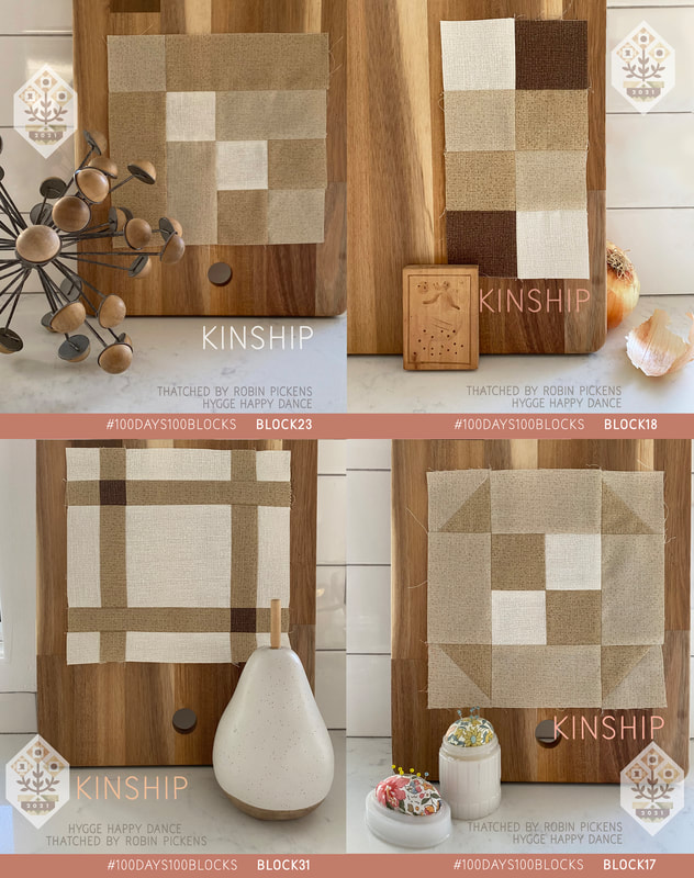 And pink, pretty pink in soft light shades (Early Dawn) or vibrant energy (Fucshia). These are the moments of girl power and contrast of both bold and soft. 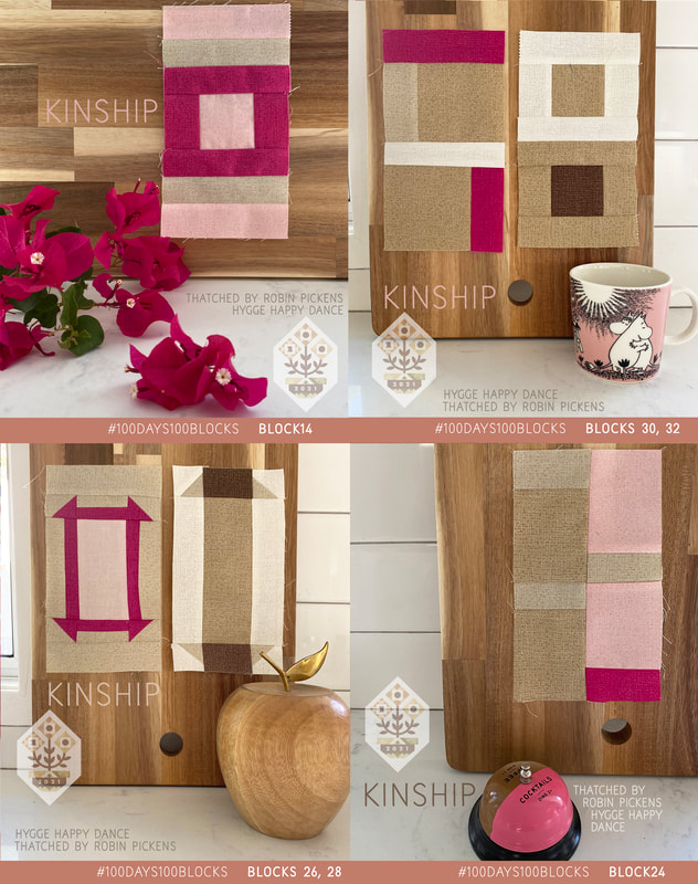 We are a third of the way...keep sewing and enjoy the kinship!
July has been a busy sewing month! The other sew along I am participating in is the #100days100blocks with Gnome Angel using the Kinship Fusion Sampler pattern. My hygge happy dance color palette is enjoyable to sew with. I'm usually not a brown color kind of quilt person but I love the light Washed Linen color and find the colors feel calming to sew with. These blocks celebrate a modern, natural and simple style and I have had so much fun finding things around my space to photograph with the blocks. 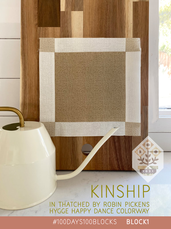 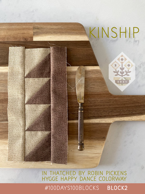 I have to smile at how many times my little items were a gift from someone special or remind me of a specific time or friend. This little person with the plant hair was a treat from my daughter. She is always coming up with sweet ideas and is so thoughtful. 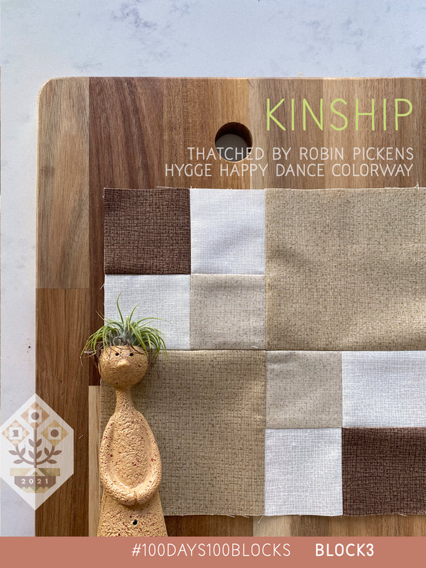 Pinks add some lively pops of color in Early Dawn light pink and Fuchsia vibrant pink. More warm colors of Smoked Paprika, Pink Grapefruit, Green Curry and Olive add spicy color flavor. 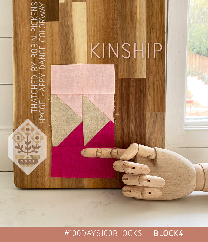 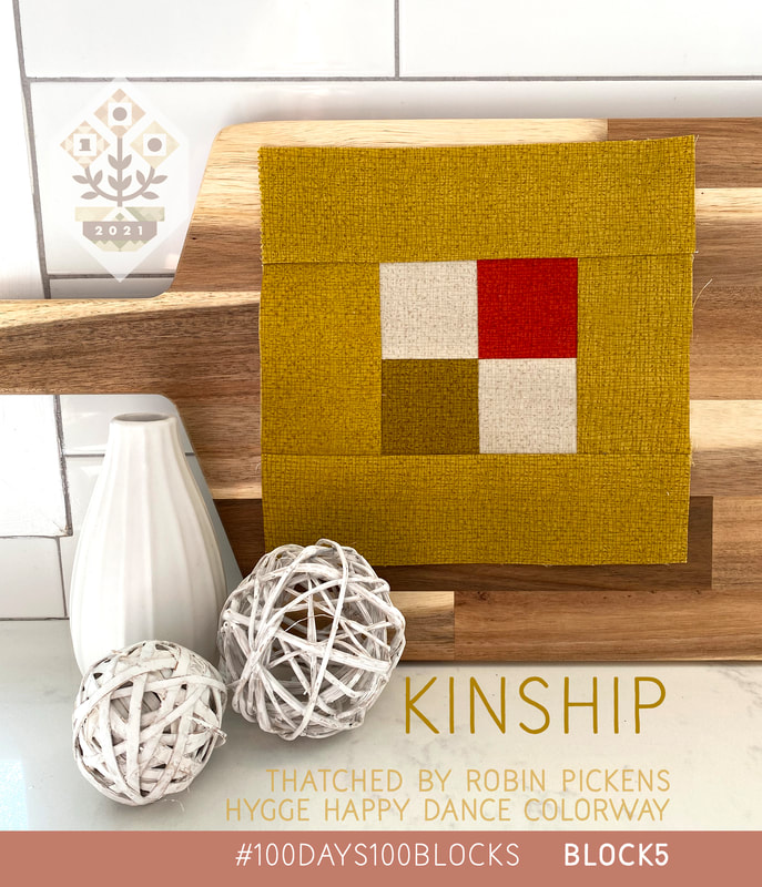 Ellie the elephant is another treat from my daughter and the rounded wood cutting board is from my son. They know me well. 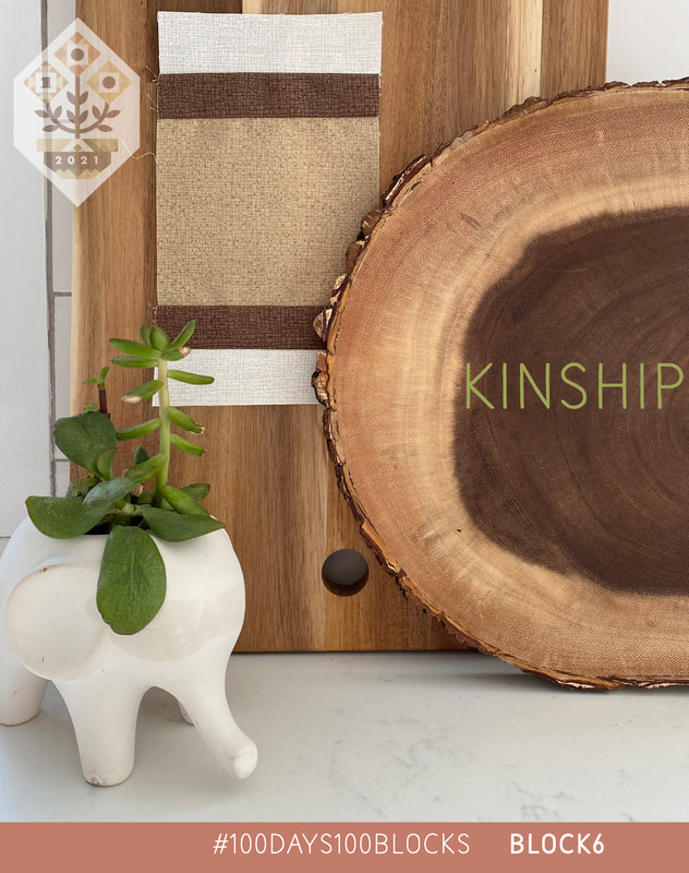 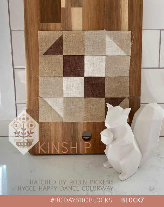 Here is the Pink Grapefruit mixed in. Yummy! 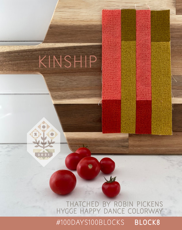 These little friends remind me of my dear Roxy and our visitor friend Stevie the cat. She does like to sleep a lot so the expression is fitting. 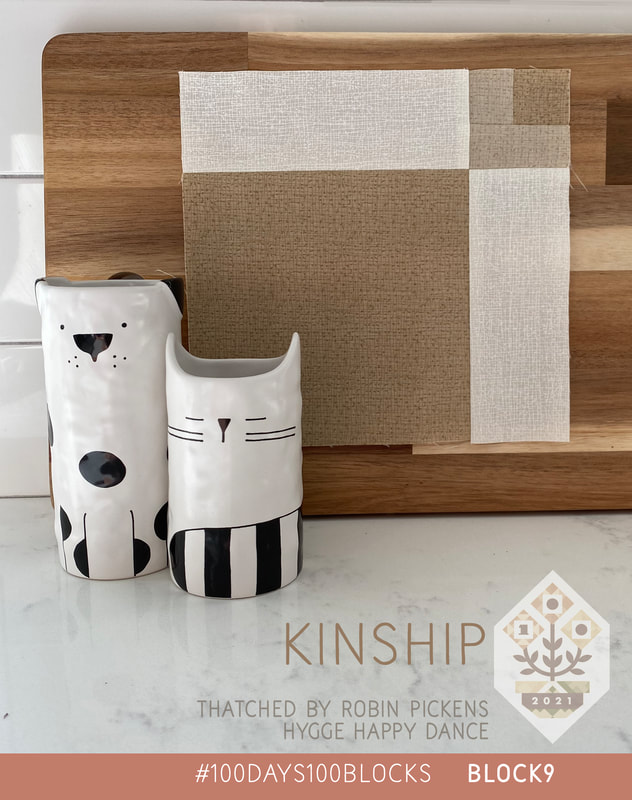 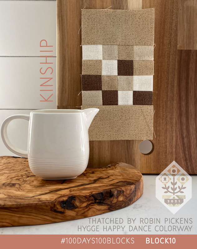 First 10. Even if it is 100 degrees outside, these make me feel like a cup of cocoa and a snuggle with my dog. Next week I'll share the group of the next 10 or you can watch every day on instagram. Check out the hashtag #100days100blocks to see the great fussy cutting and fun fabric choices others are making.
Cheers! 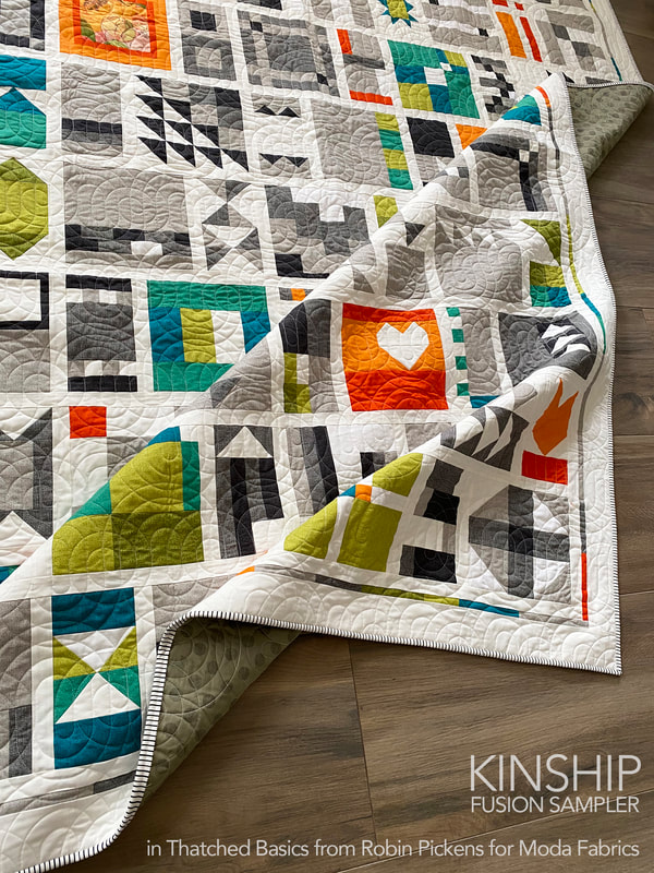 It's almost here...the 2021 Kinship sew along with Gnome Angel and I thought I'd share a bit of past projects and my plans for this year's quilt! Make sure you scroll down to see the new color combinations!! 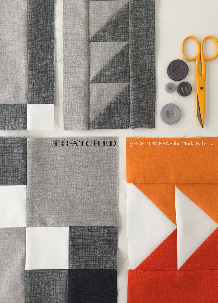 I originally did the #100days100blocks in 2017 when we were using Tula Pink's 100 Modern Blocks book. That was lots of fun. I was really excited to see Ange release her own 100 blocks quilt "Kinship Fusion Sampler" for the 2019 sew along and I knew I had to do it! My Thatched basics fabrics were coming out with Moda and it was a great opportunity to play with them. If you are not familiar with Thatched, it can function like a solid or a blender with subtle drawn, nubby lines. It gives the colors a nice rich feel and a little more depth to the look than a plain solid. 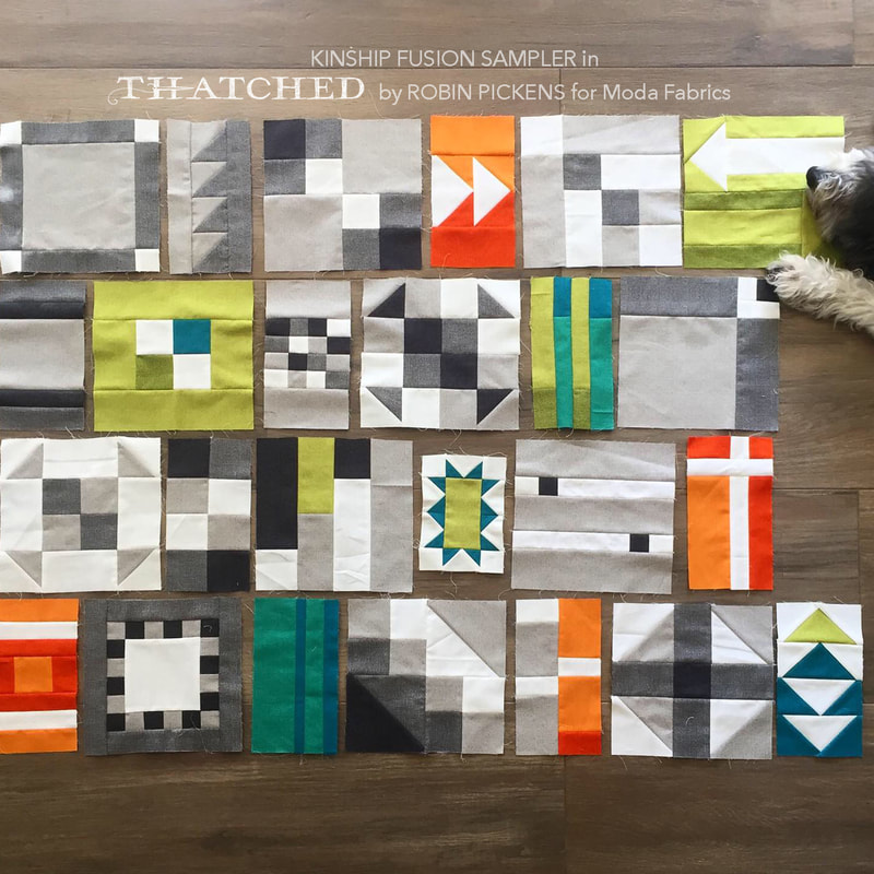 My goal was fairly simple- use a limited color palette of white and 3 grays and add in pops of color with pairs of orange, green and teal/turquoise. I really enjoyed making my blocks because the cutting schemes were so logical and efficient and I knew that if I cut a width of fabric strip in a 4.5" size, I'd be using that whole strip in the variety of blocks we were making. 2.5, 4.5, 6.5, 1.5"...it was consistent with a nice amount of play and experimentation. A block a day. I can do that when they are no too hard yet have the right mix of variation. I bought my pattern directly from gnomeangel.com as a download but shops also have a printed pattern. I just saw them at Cozy Creative in San Diego this last week! Links to Ange's shop are at the end of this post. 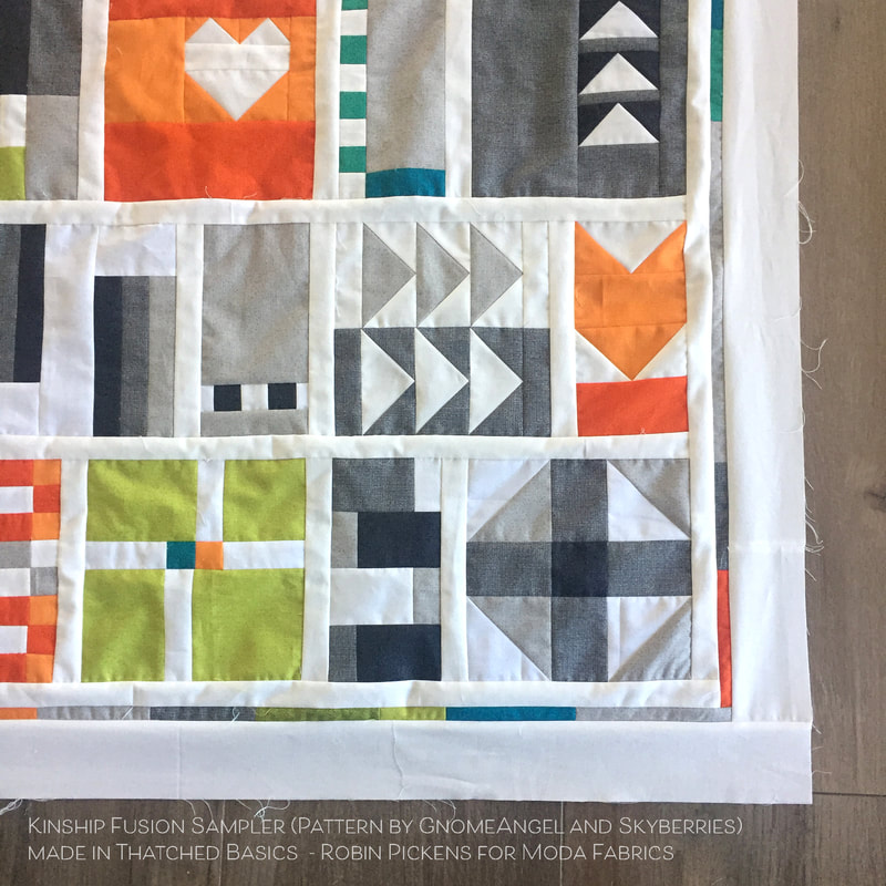 I used Ange's Kitchen Sink version of laying out the blocks with 1" finished sashing in between the blocks (1.5" cut width). I decided to "frame" my quilt top by adding a thin strip of scraps of the colors I had used (1" cut width for 1/2" finished size) and surround that with a 3" cut border. 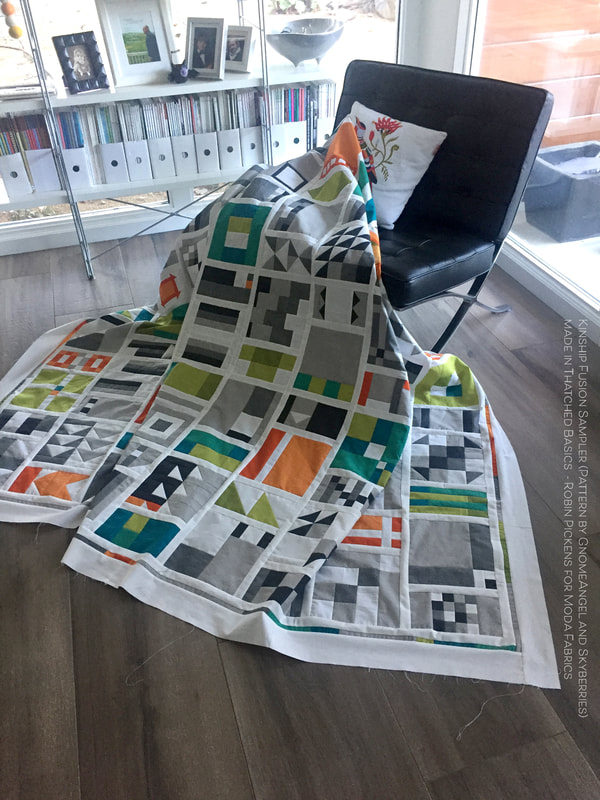 I really like the balance of white and color and clean modern look of this quilt. 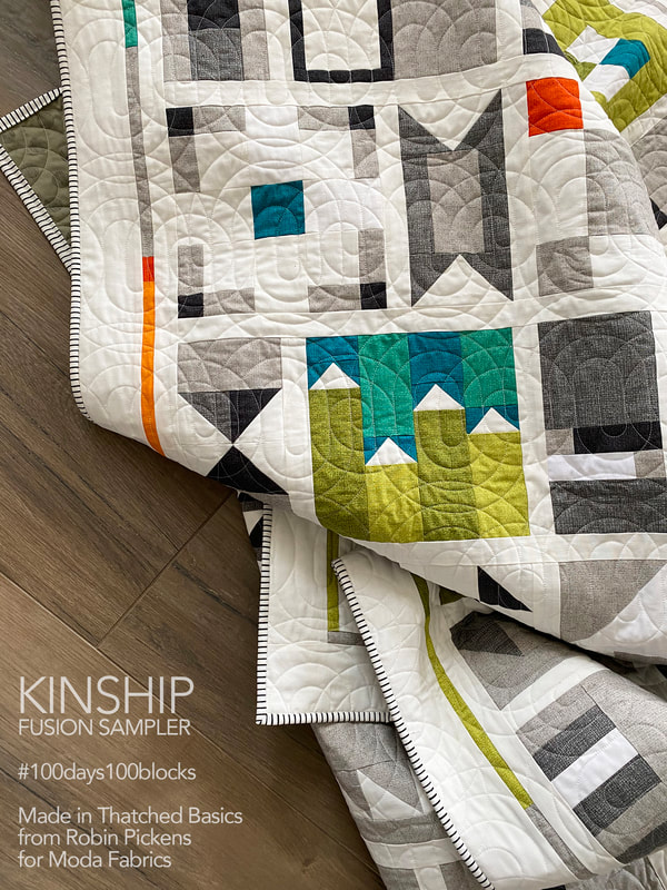 Even though I pieced the top in 2019, I didn't get around to quilting it till mid way through 2020. I purchased a used longarm Bernina Q24 and had some pandemic self-training using YouTube videos to figure out what I was doing. That is a whole other blog post...but it was tremendously gratifying to get this quilted and bound! The pantograph is Swirl Out Jr by Mike Fountain, purchased from IntelligentQuilting.com. 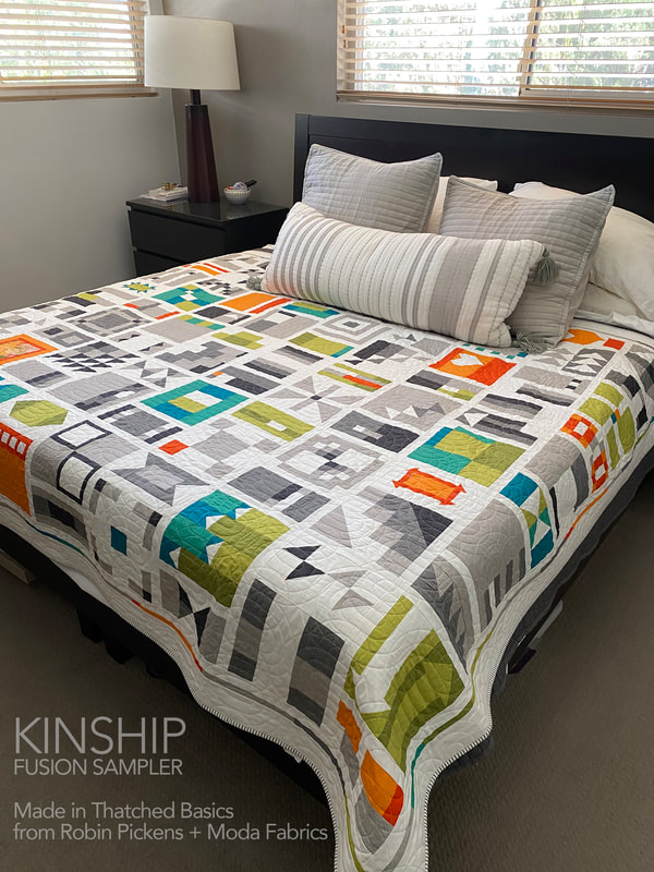 This is sized to be a twin quilt but with the sashing and border, I can put it across the bed and cover my king bed! I started this sew along again last year, doing a scrappy version of blocks, and started making 2 of each block to made a king quilt. Now I'm rethinking that plan since I probably don't need two of all the blocks if I add sashing. I got busy with other projects so might rejoin with some of those scrappy blocks this year as well (or save them for 2022?) 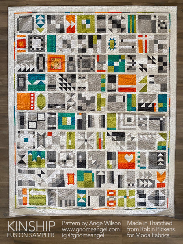 That brings me to THIS YEAR and what my plans are. I like the layout, the idea of a limited palette with some accents, the distribution of accent colors, and the border additions. So I'm calling this Kitchen Sink Renovation (Ange's layout with a little reno). And since some NEW Thatched colors launched at the beginning of this year, I'm keen to try it with some of those. 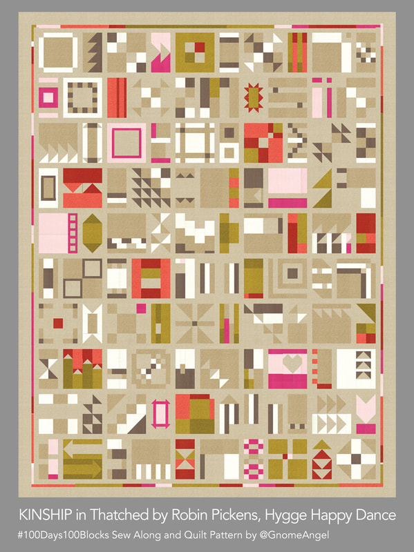 This is Hygge Happy Dance because I think of that Danish soothing comfort vibe with these soft neutral warm colors and a little coral to red to pink warmth. This is the version I am making this year. I am currently very smitten with the new background color, Washed Linen, Thatched 158. Since I'm making this color combination, I'm gathering the fabrics to get ready for July 1st. The other colors in this quilt will be 62 Fuchsia, 122 Early Dawn, 185 Olive, 177 Green Curry, 156 Toast, 72 Cocoa, 183 Smoked Paprika, 181 Pink Grapefruit and 36 Cream. 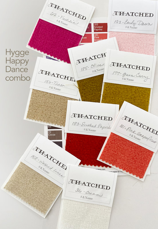 This next mockup is called Midnight Jazz and you could make it with a dark blue Thatched, like Midnight (which is in the new Cottage Bleu line) or Dark Wash Indigo. But Pam at Serendipity Woods, and I decided a Nautical Blue Bella Solid was a great background fabric for this. The Thatched colors are 173 Bluebell, 144 Ocean, 125 Seafoam, 124 Greenery, 103 Apricot, 82 Tangerine, Cream 36, Washed Linen 158 and Toast 156. 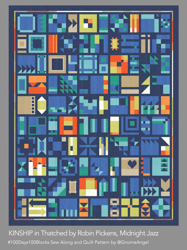 Changing the background to White (Bella 200) brings a light and sparkly look to this same color combination in Morning Blues. 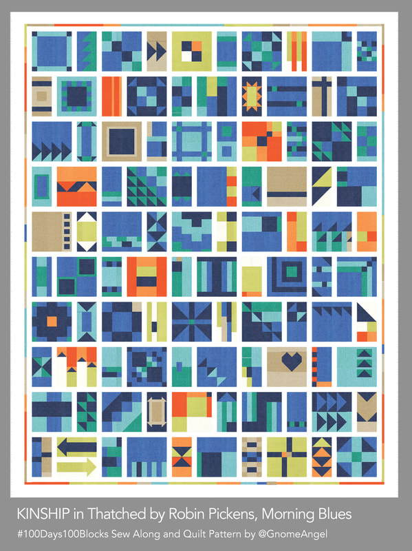 And my original, which I'm calling "Winter Turns to Spring" is Bella 200 Off White pared with Grays of 117 Shadow, 24 Pebble, 85 Gray, oranges 103 Apricot, 82 Tangerine, and greens of Chartreuse 75, Sprig 14, Peacock 77 and Turquoise 101. 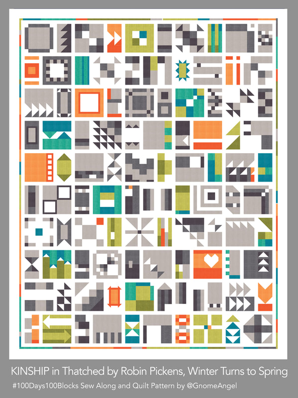 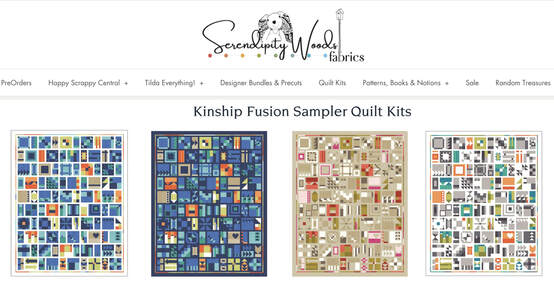 If you are looking for these kitted and ready to go, then check out SerendipityWoods.com for some kits of each of these color ways. I believe Pam will be sewing along with us. I'll also be meeting with Quilt Emporium in Woodland Hills CA to go over the colors and they usually have all the Thatched colors! I'm happy to share any information of shops with Kinship/Thatched kits so let me know. I hope you are joining in the #100days100blocks sew along with GnomeAngel using her Kinship quilt pattern. See you posting in July! 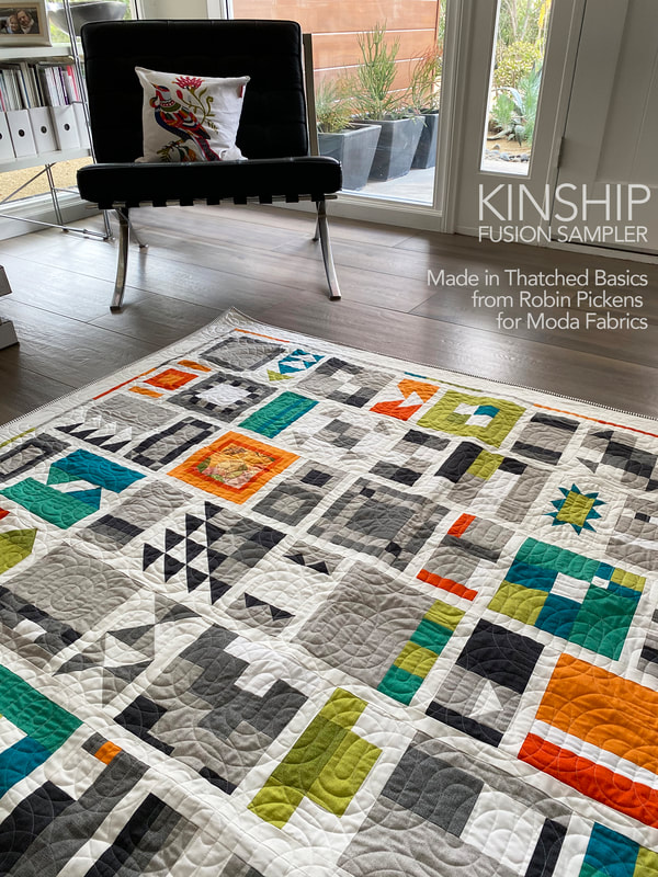 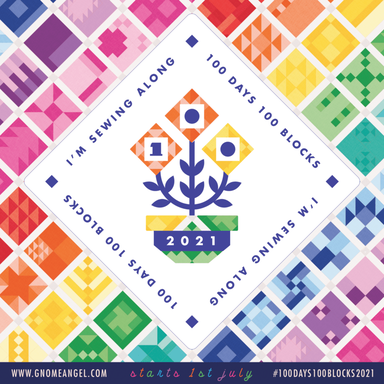 Visit Gnome Angel's website/blog for more info on the sew along and answers to questions you might have at https://www.gnomeangel.com/100days100blocks-event-information/ or purchase a pattern in her shop https://shopau.gnomeangel.com/collections/books-patterns/products/pattern-kinship-100-block-fusion-sampler My dear Roxy has decided she likes this quilt. It's her colors. She must be touching it and making sure it is hers...at all times. 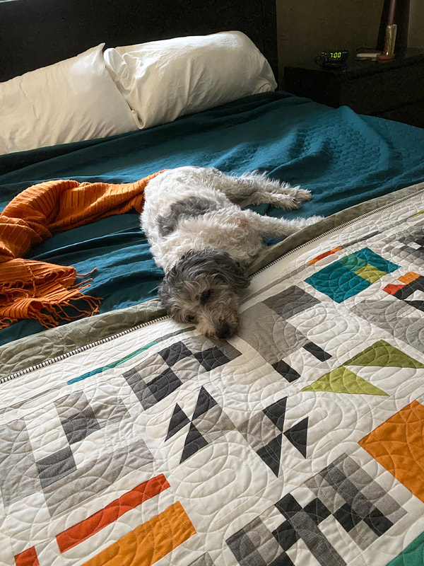 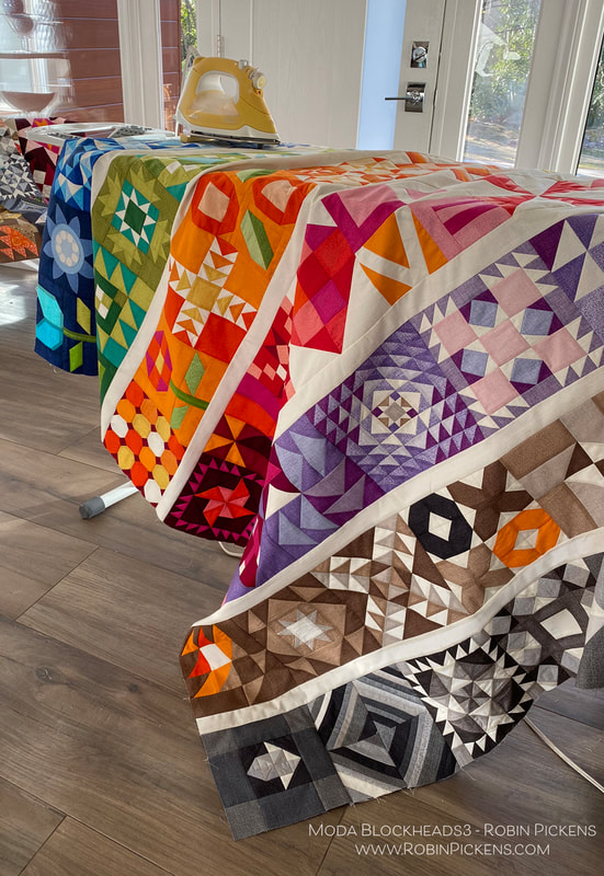 56 Weeks of sewing fun. I've been busy adding blocks together to make my rainbow colored rows. But one block was missing...that final block. Joanna Figueroa from Fig Tree & Co. is our final blockheads designer to wrap it all up. Thank you Joanna for your lovely "Star Dance" block! To get to Joanna's blog with the free pattern, click on the gray bar below. But keep reading if you want to see my color study and how my TWO quilts have come together! 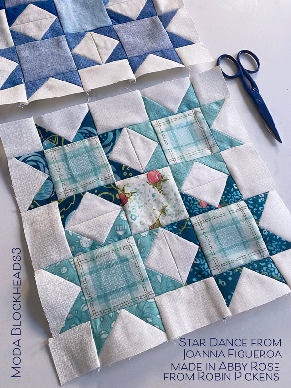 Flying geese and squares to make sparkly stars. A number of my patterns such as Showering Stars, Little Star Shower, and Constance, use stars like this. I liked how Joanna's version also played with the very center square in the overall composition in a color or print too. Let's take a look at a couple of color studies. 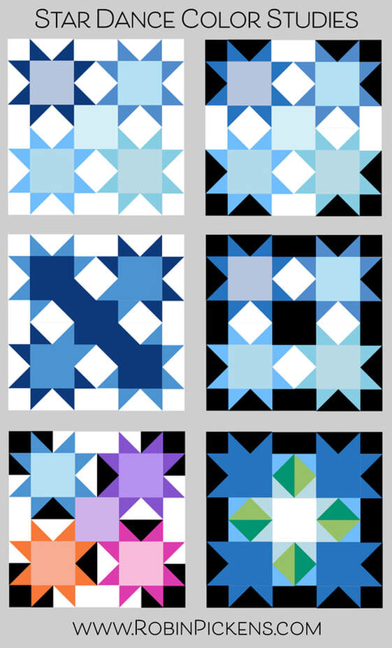 My last block belonged in my blue row so that was my starting place. Light, medium and dark blues with subtle variations between the stars. It could be fun to play with black for the background (or starting rectangle of the flying geese) and I love how the white really pops in contrast. The white and black backgrounds make new shapes within the block. The left middle image uses a mix of medium and dark blues on some of the geese corners, positioned so it looks like the colors run diagonally through the block. And the last image creates arrows pointing to a glowing center. 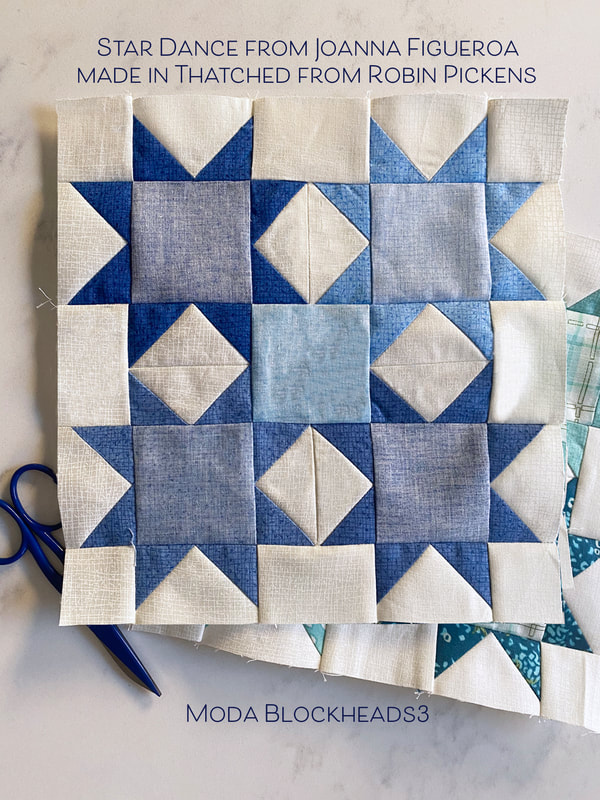 After designing Cottage Bleu (shipping in April) and adding new Thatched colors, I have more blues in my Thatched range now. I have used a few from Cottage Bleu and used back sides as well for lighter shades. When making my print blocks, I used blue prints from Abby Rose. The plaid fit nicely into the centers of the four stars and I decided to use a different print for the center with my light background and roses. 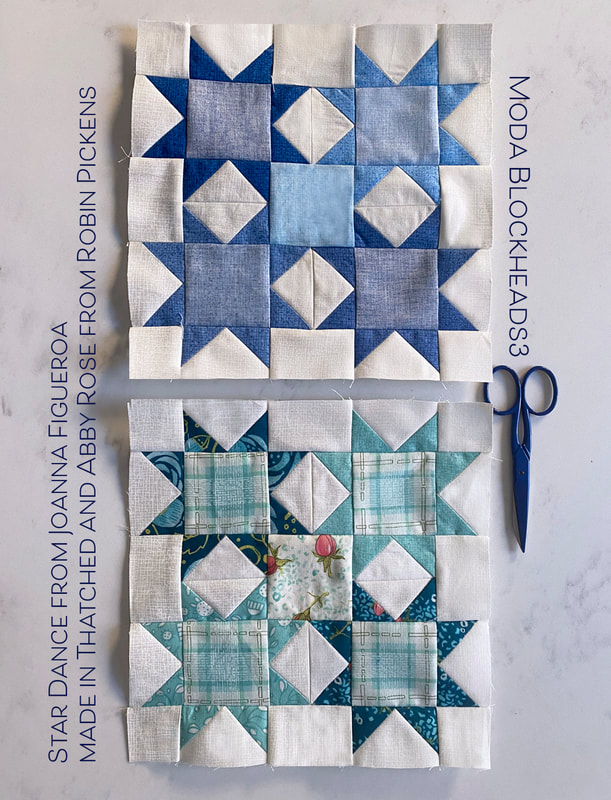 If I were to make another one of these blocks, I would try the blue hydrangeas from Cottage Bleu. For this particular print quilt, I felt the warmer blues from Abby Rose were a cohesive color group with the other surrounding blue blocks. Here is an image of the rows joined together on my mixed prints/scrappy version. For the sashings on this print/scrappy version, I've used Modern Background Paper from Zen Chic. It is one of my favorite low volume fabrics to use. 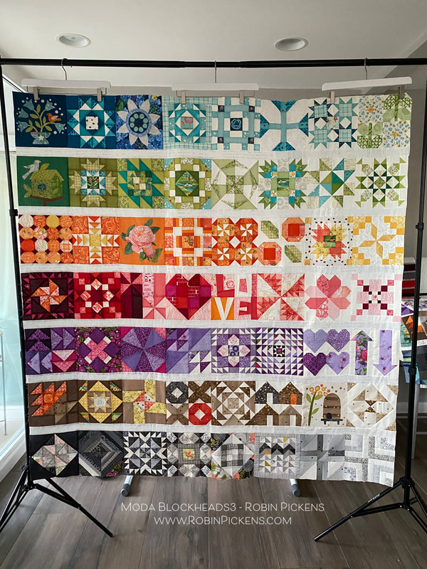 On my print version quilt, I chose to do applique on the weeks that Jan Patek and Jen Kingwell had their sweet designs. Last year I did all pieced blocks so this was a change for me. I still seem to resist doing turned edge applique and find my happy place is with the fusible raw edge applique. 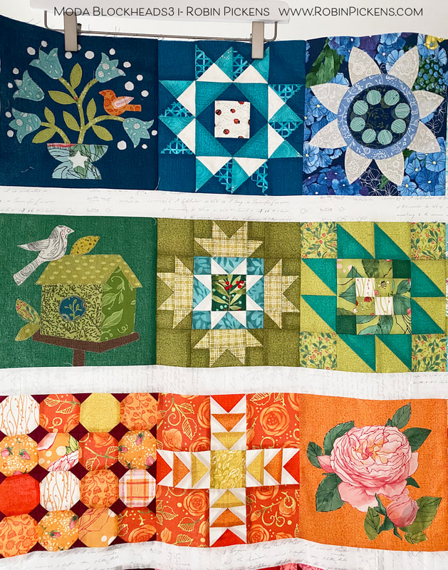 I think my favorite of the appliques is the bird on the upper left, dark blue. I added and extra flower or two and more white dots. They make me think of little white baby's breath in a bouquet. And for the "rose" applique week, I chose to cut out one of my Abby Rose blooms instead of the template shapes. 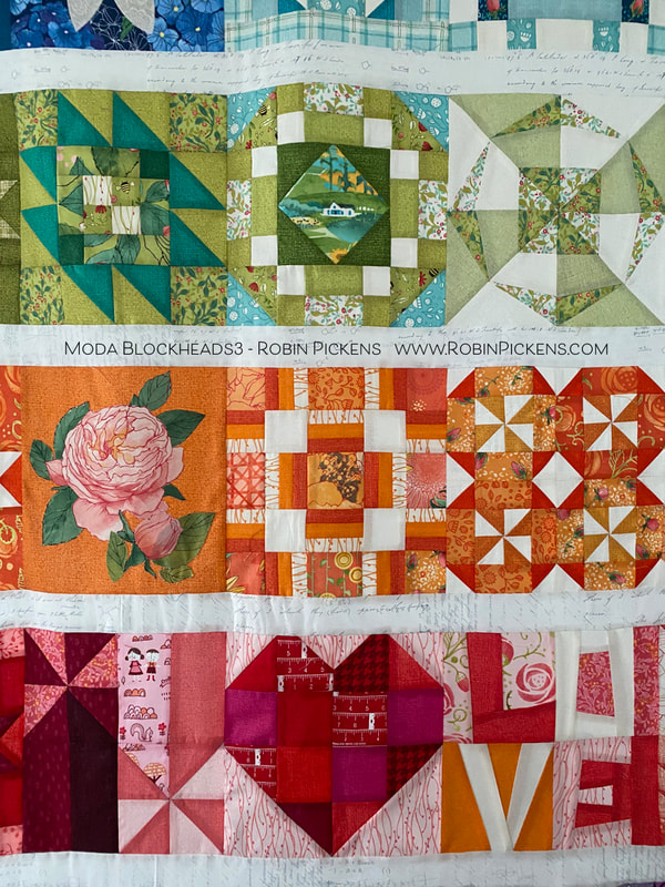 How perfect is it, that the block that says LOVE was actually pieced by my mother? She was visiting a year ago January when it was the week for that block and she helped me out. Then the pandemic and quarantines started and I have not been able to see her in person since then. So I am especially happy to have a little bit of her in this quilt! 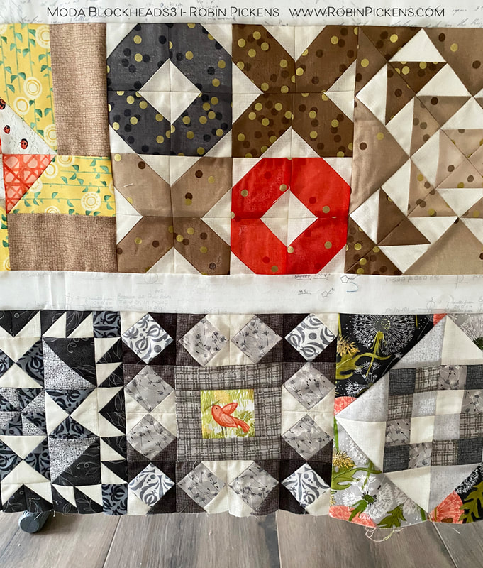 The little bird in the middle gray block is one I had not shown yet. It was a block I did late, catching up one weekend. It is the Fixer Upper block from Vanessa Goertzen and I liked it as a framework around my birdie friend. 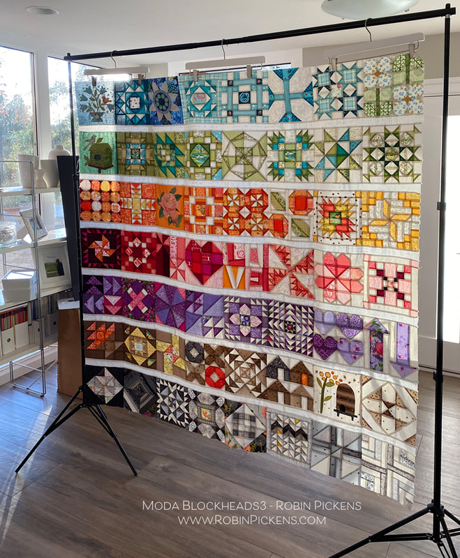 I love to see how the light comes through when a quilt top is hanging on the frame, before it is quilted. It looks like stained glass and the colors almost glow! I started this project with a few design parameters I set: 1. Horizontal rows of color (rainbow-like rows), separated by a simple white line. 2. Each of the rows would use gradations of the color to go from darker shades on the left to lighter shades on the right. 3. I would make TWO quilts, one with all Thatched basics and one with a mix of Thatched and colored prints from my collections (with some other designer's goodies added in there too) for a scrappier look. This was to see how different or how similar the quilts ended up looking by the change in prints. So how about that all-Thatched one? 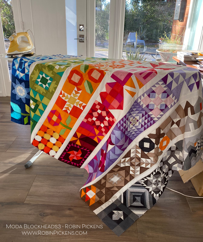 I must admit the vibrancy and saturation of all that color was surprising to me when I got it all joined together. I was glad I graduated color to the lighter right side so it was not too overpowering. I used the Thatched Cream 36 for my sashings. 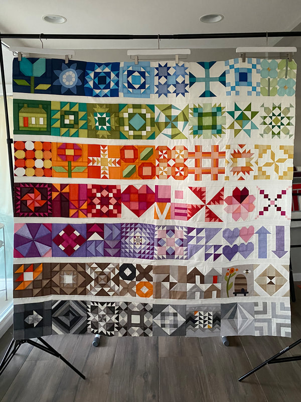 Instead of the applique blocks, I used pieced alternatives from Joanna Figueroa. The upper left has the tulip block, house block and another flower posie. I did keep two applique blocks- the Bachelor Buttons from Jen Kingwell since it felt so graphic, and the Bee Skep from Jan Patek. My sister likes bees and having this block reminds me of her. So now I have a mom remembrance and a sister remembrance in my quilt.  Its hard for me to say if I like one version of the quilt better than the other. I will keep some things different as I finish these, using different pantographs for quilting them, and I'm also thinking about adding an additional little decorative border around the scrappy/print one. I like the Thatched one being simpler with no outer border. 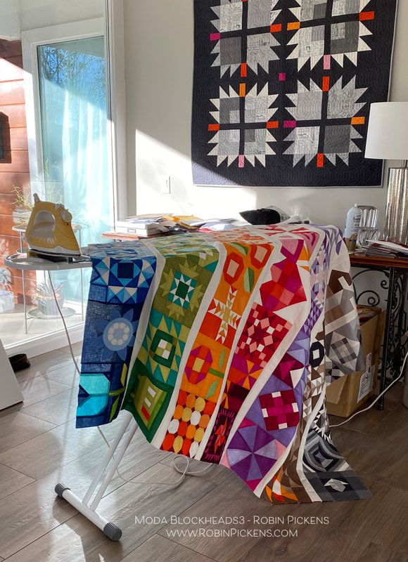 I am happy to come to this finishing phase of Moda Blockheads, but I'm also sad that it is ending. I know the connection and sewing along is so important during these strange and unpredictable times. So I made the decision to join in on sewing along with "My Favorite Color is Moda" because of course I need another project! I think the quilt design and colors they have suggested are beautiful! I hope to see you while sewing along with that! The resource link to all the free block patterns from this Moda Blockheads sew along- archived at the Moda website: Thank you for the lovely comments that you have shared each week on the block posts and color studies. You are the best! And thank you Moda for this wonderful sew along and all the organizing, writing, planning, giveaways and support. It is a BIG project and you do it with expertise, grace and style.
Let's finish up some quilts, right? Hugs to you all, Robin Wine Not! from Jen Kingwell is an easy block this week with a lovely diamond shape. This block looks great square or set on point. This is the very light end of my brown row and the soft warm colors look calm and comfortable. 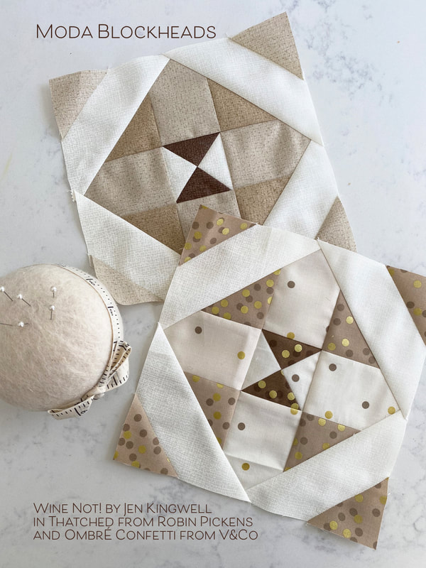 In playing with the color studies, I liked how the shapes can have a strong arrow form or emphasize the outer diagonals or the inner quarter square triangle center. The last one feels a little dimensional with the center having light and shadow as if it were a pointed pyramid triangle. 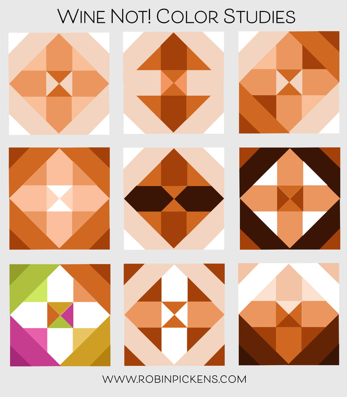 For my pieced all-Thatched version block, I used a couple of my new shades that are shipping at the beginning of February. The center dark brown is 164 Chocolate Bar and the light tans are 156 Toast with the lighter 158 Washed Linen. 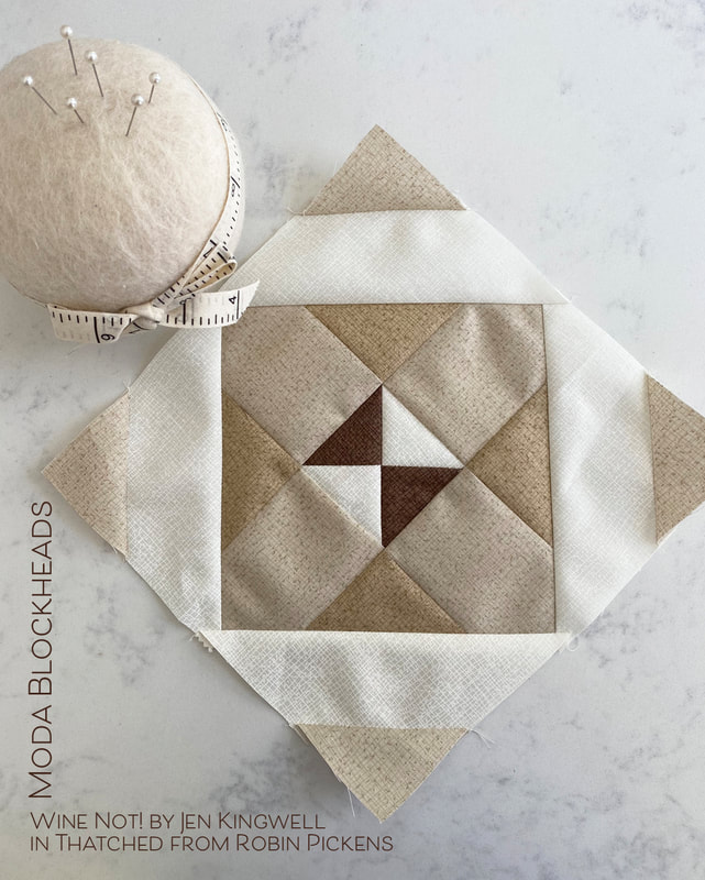 My print version uses a fabric that has been quite prevalent in my brown row, Ombre Confetti from V&Co. The ombre gradations make it easy to find the light and dark levels you want within a block while keeping the colors harmonious. I love those little pops of confetti! 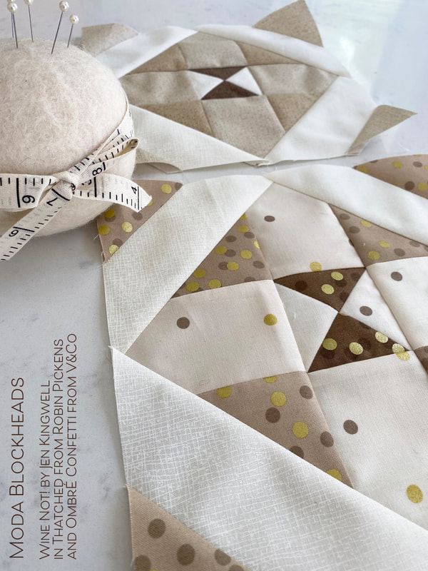 Pop on over to Jen's blog for her Wine Not! pattern. And since I'm sharing brown blocks this week, here is one I did last weekend to catch up on a missed week. It is Intersection from Stacy Iest Hsu in Thatched and Solana. 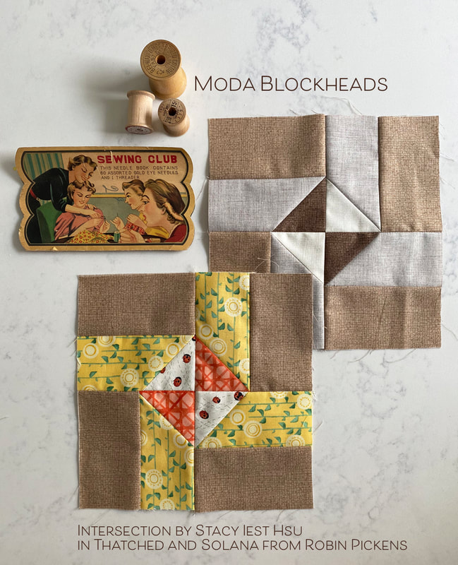 Next week is the last block and then it is time for joining and finishing. I love seeing what you all are piecing together on the facebook page. Keep sewing! 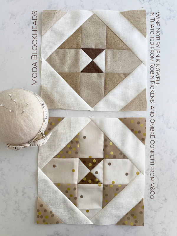 To celebrate the new colors of Thatched basics that are joining the group, I've got a FREE mini quilt pattern to share! Here is "Radiance Bloom"! The pattern PDF to download is further down on this blog post, so keep reading. 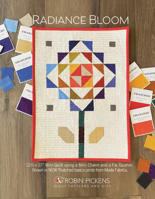 This mini quilt finished at 12 1/2" x 17" and is made from a MINI CHARM PACK and background of one FAT QUARTER. Add another fat quarter for the binding and one for backing and you have a fun flower ready to bloom on your wall. I called it Radiance Bloom since the petals seem to radiate out from the center. 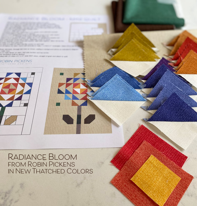 I love to collect Mini Charms with their sweet size of 2 1/2" squares. When paring them to make half square triangles, you end up with 1 1/2" finished blocks. I wanted to show off the new pretty colors that Moda Fabrics just added to Thatched, which created a warm and spicy colored mix of petals. Since I didn't have an actual Mini Charm yet, just some sample swatches, I cut my pieces to the 2 1/2" size to start. But I love that this part would be so fast with a precut pack of those squares. 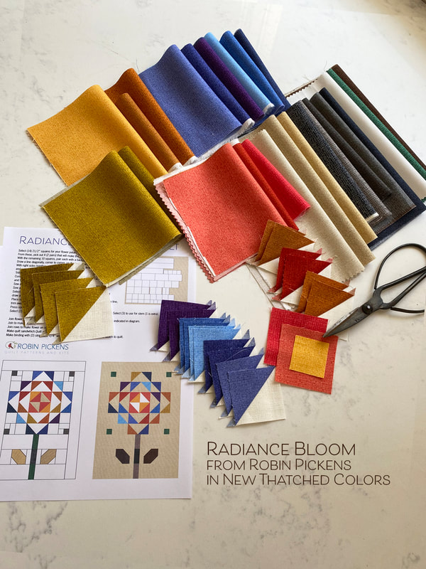 I think of these as almost fall-like colors and think it would be fun to do a mix for a spring flower, summer flower or winter flower. I love the new color called "Chalkboard Scribbles" and mocked one up on the computer using that as my background and my petals in Blizzard White, Washed Linen and Toast. This is the Radiance Bloom I will make next! I also think this would look fun with the background in Washed Linen as shown on my initial printouts. I can't wait to incorporate this more into some of my future blocks as a nice light neutral color. 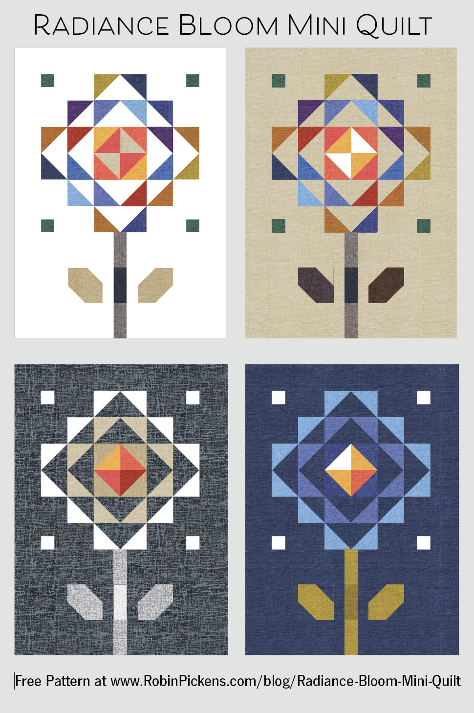 And since I'm playing with it...how about a night time blue (this one on the lower right has a background of Dark Washed Indigo) with blue petals glowing in the moonlight? The stem is Green Curry and Olive and the petals are Forget Me Not, Periwinkle and Dutch Iris. 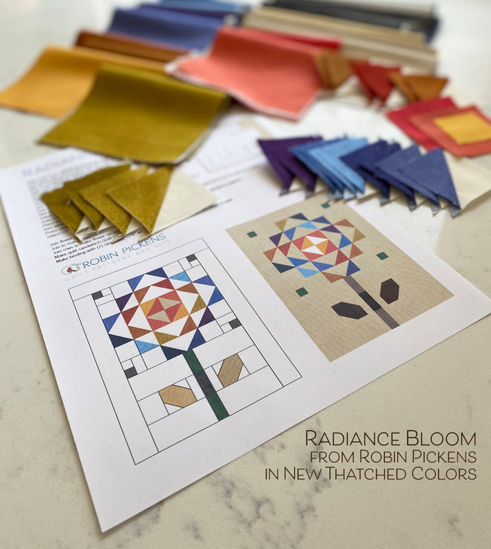 I hope you have fun playing with this fun little free pattern. Maybe even make a row of flowers in the garden with multiple blooms! My friend Pam (from Serendipity Woods) will be sharing an adorable scrappy bloom she made too from this pattern, so check her feed on instagram in the coming days (@serendipitywoods) and I'll post my winter one as soon as that is done (@robinpickens). Plant some color, enjoy some new Thatched shades, click on the PDF link right below to get your pattern and HAPPY SEWING! -Robin
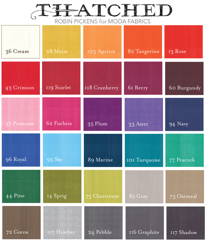
I've been bursting at the seams, ready to celebrate MORE Thatched colors and I can finally share! What a beautiful way to start the new year with more colors and possibilities. 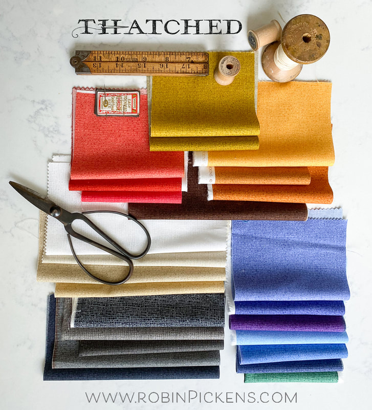 Because New Years is a time of making plans and goals and looking ahead, I can't help but include these new colorful friends in my future planning. I like the warm and earthy shades that will be so welcoming in a fall quilt. The names evoke a warm and spicy meal with Masala Spice, Smoked Paprika, Green Curry, Olive and a little sweet with Honeycomb. The crisp blues that have purple mixed in to make a lovely garden with Dutch Iris, Periwinkle, Bluebell and Forget Me Not. These might be great in a spring quilt. 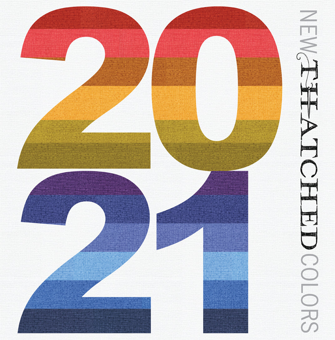 Want more drama? Soft black is a nice dark black to balance Blizzard, the white on white tonal print. There are more neutrals with this group including Toast, Sand Castle, and Washed Linen. I really like how the light neutrals make a calming palette and look so pretty with all the colors. We have brought back some of the warmer grays of Charcoal and Stone. 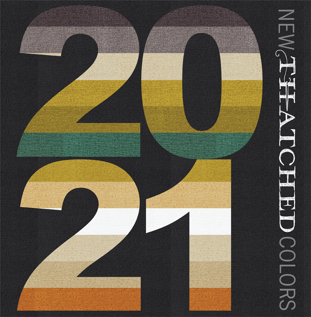 This new group adds 25 new colors to the Thatched family, 22 of which are brand new colors and three that are brought back from earlier collections. Swatch color cards are in the works for shops and I'm thinking some postcards with a color chart might be helpful. I made up my own little swatches to help with identifying and designing with the colors. 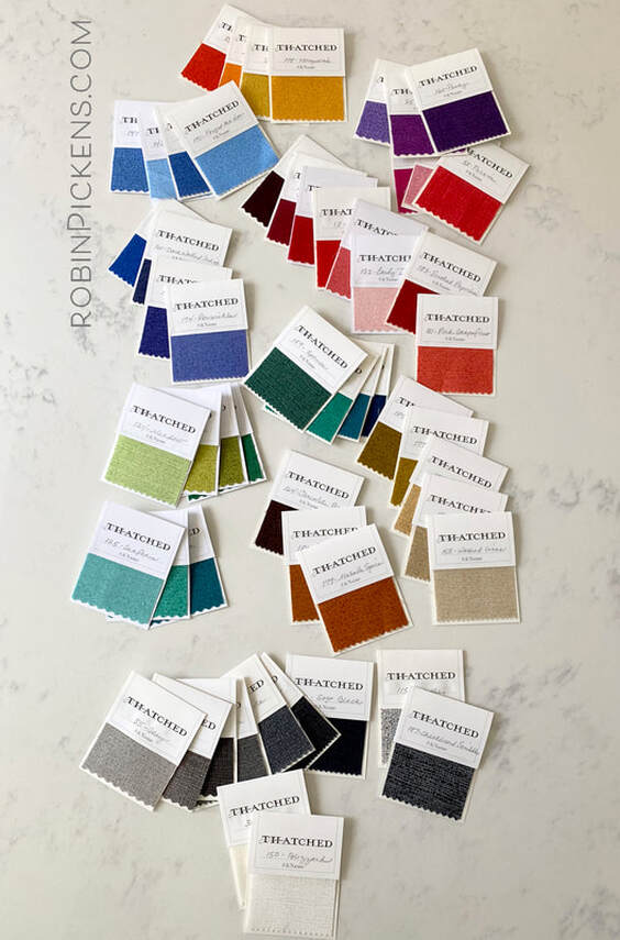 If you would like to make your own swatch sample cards to use as you have little scraps left from projects, please download the file below and print on an 8 1/2 x 11 sheet of paper or heavier cover weight paper. You can then fill in the number and name of the fabric you used to help keep track for future projects. The jpeg file has 6 rectangles you cut and fold over and attach fabric in the middle with glue or a stapler.
This is what the jpeg file looks like:  Or if you want a digital representation to refer to, use this chart for the new colors. I'll be adding a new and improved chart to the side bar of the blog with all the Thatched colors together once I have my color card to make sure I've got them all covered. 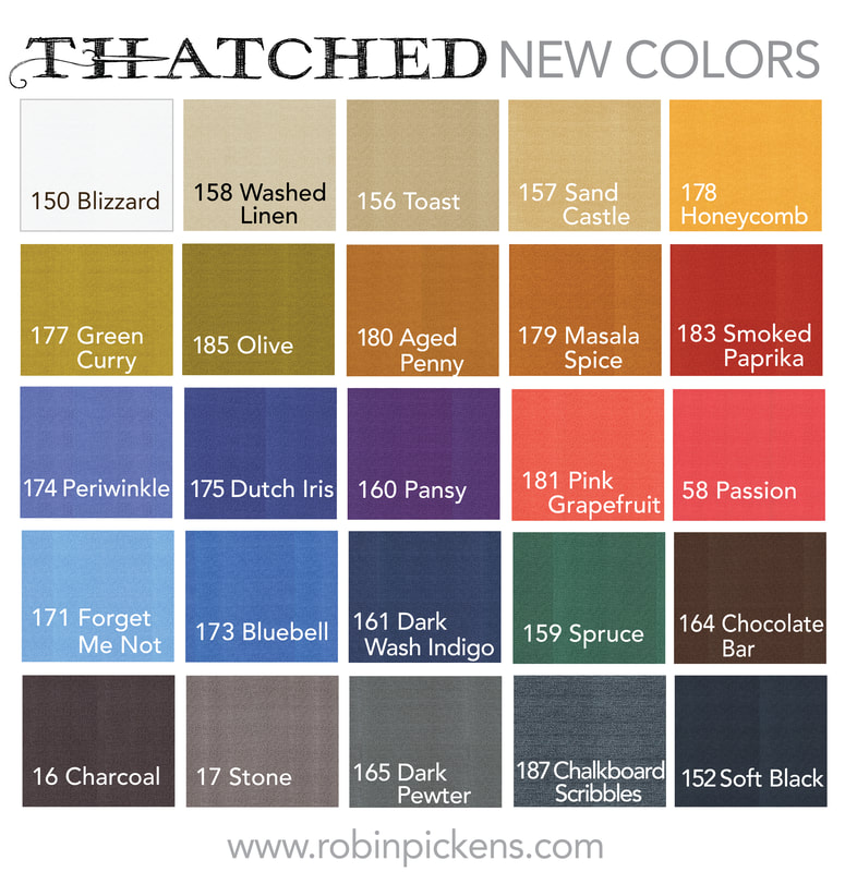 Stay tuned for more Thatched sharing. I've got a fun mini quilt project that is a FREE pattern and uses a mini charm of Thatched and a fat quarter of background fabric, a fat quarter of backing and fat quarter of binding fabric. AND there is a new pattern I am releasing with some pillow covers that are shown with the new Thatched colors. Till then, enjoy this start of the new year and happy sewing! 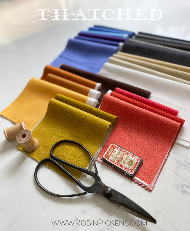  Half square triangles in rows can be straight lines of direction or create more square formats within the space. Here are a few experiments in playing with different lights and darks on the half square triangle colors. When I squint my eyes, I can see things more as overall shape and not be influenced by the smaller pieces. Xs, bowties, circles...do you see them? 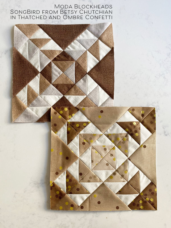 My blocks are for my brown row. I have Thatched browns but not many prints so Ombre Confetti is my go-to for brown blocks. I just love those metallic gold polka dots! 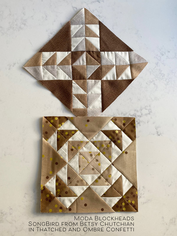 Visit Betsy Chutchian's blog for the pattern at athttp://betsysbestquiltsandmore.blogspot.com/ 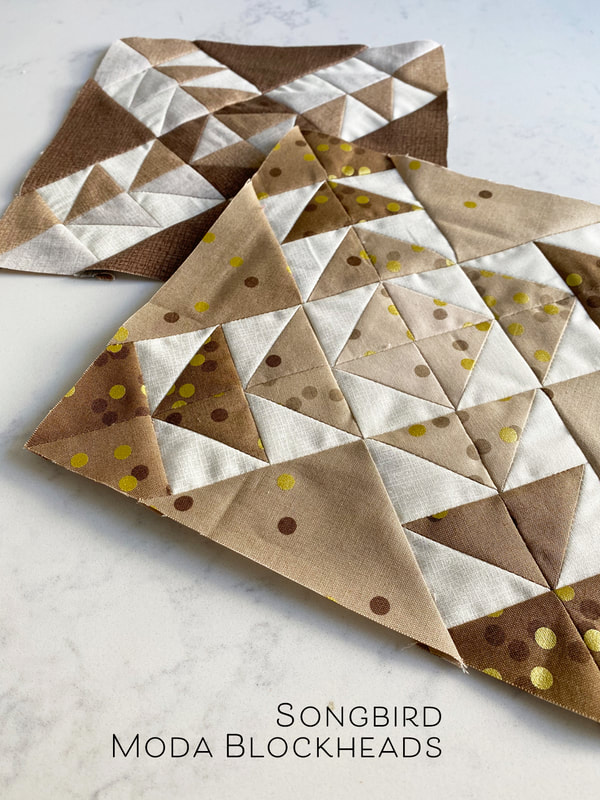 Did you know there are giveaways going this last round of patterns?? Yes! See Betsy for more details on this week's giveaway! Happy sewing!
|
About ROBINDesigner of colorful florals for Moda fabrics. Modern to transitional quilt designer. Illustrator, sewist, crafter. I am proud to be a designer for Moda Fabrics!
Shop Robin's Designs
 I am an affiliate for Fat Quarter Shop and may earn a small commission through my links. Thank you for your support!
Check the March 6, 2017 Episode!
Categories
All
Archives
February 2024
© Robin Pickens Inc. All rights reserved. No images may be reproduced without permission.
|
||||||||
 RSS Feed

