|
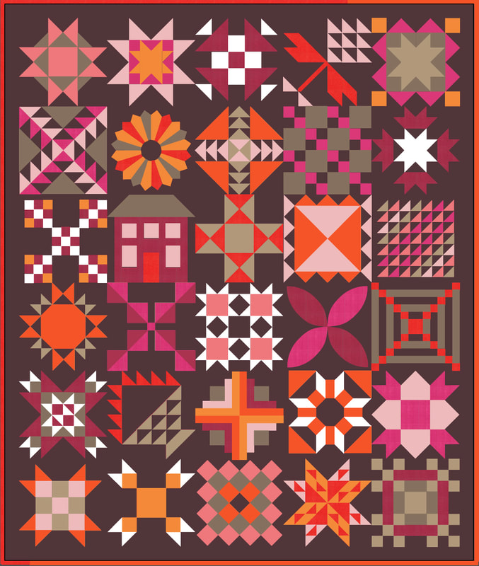
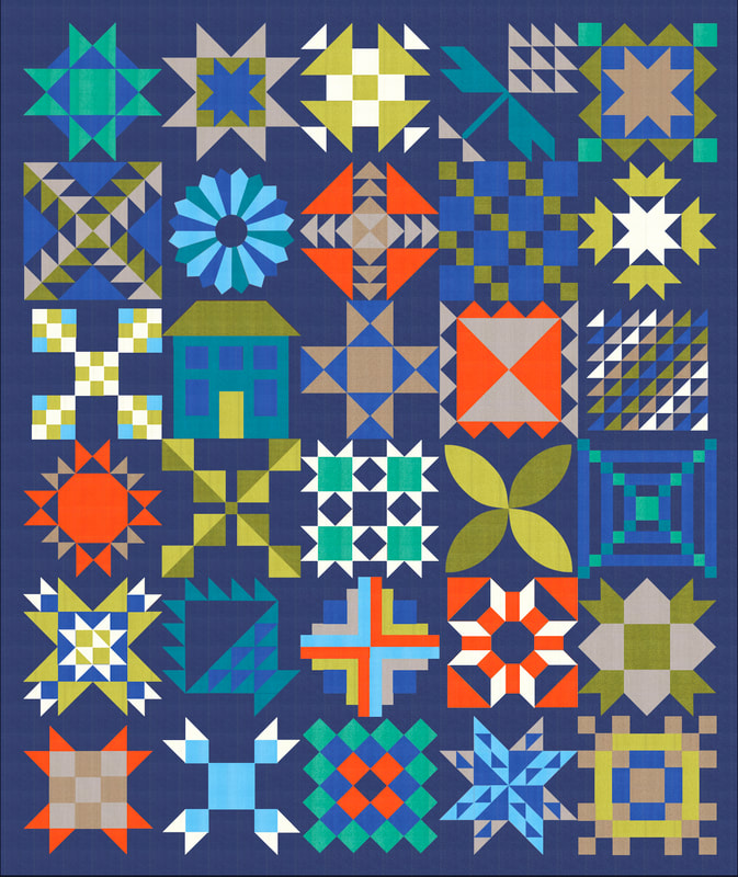
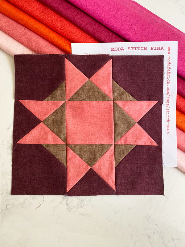
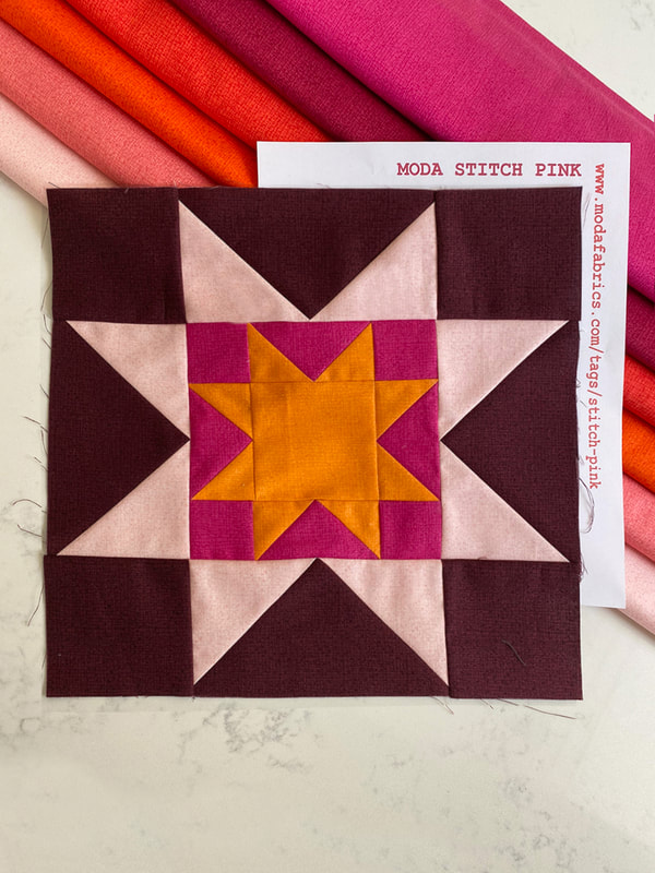
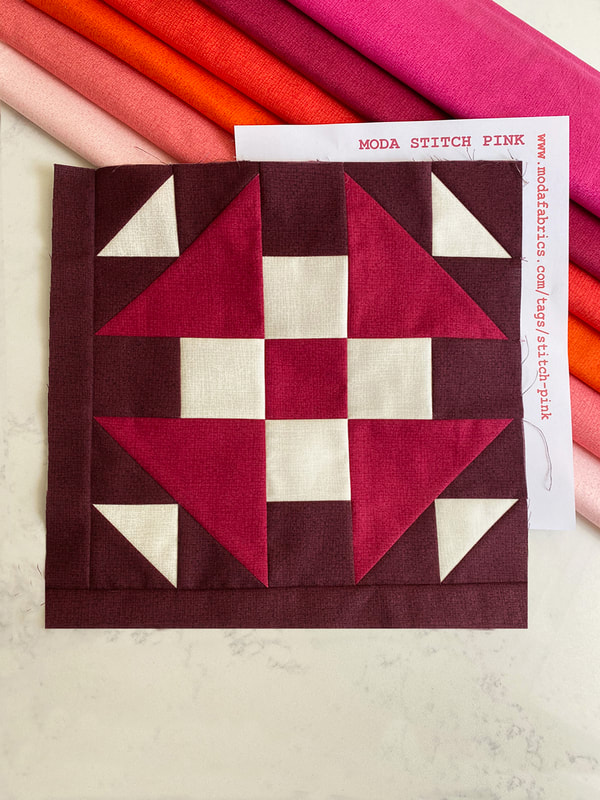
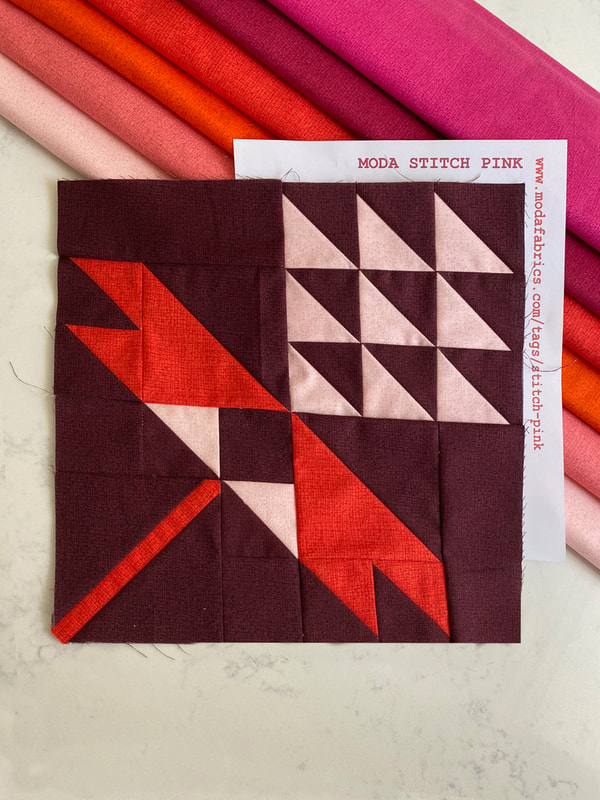
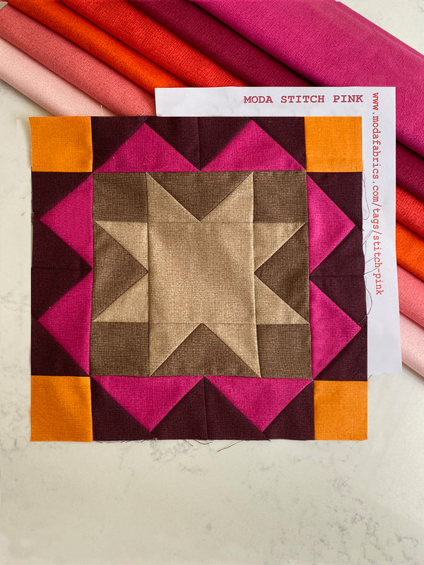
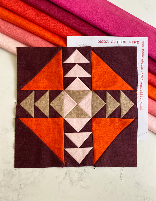
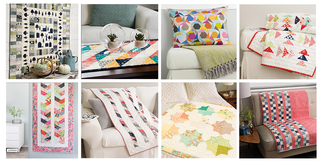
October is Breast Cancer Awareness Month. Moda Fabrics is doing a free block-a-day quilt sampler to commemorate. You can sew along by following Moda Fabrics as they post a pattern each day on their cutting table blog: https://modafabrics.com/tags/stitch-pink Lisa, the owner of the Quilt Emporium (my local shop) asked me what I thought about mocking up this sampler in Thatched fabrics. Oh yes! I did these two versions that she has kitted at the shop, a warm tones one with a deep burgundy background and a blue/green version with a Navy background. If you are interested in this kitted in Thatched, visit the Quilt Emporium website (burgundy listing or blue listing) or call 1 (818) 704-8238. Lisa is sewing the blue version and Susan V (felted pear) is helping me with burgundy blocks. I am so excited to see this come together and feel like these warm colors are perfect for a lively fall quilt. Here are the blocks so far! If you sew along, share on facebook and instagram using the hashtag #ModaStitchPink
3 Comments
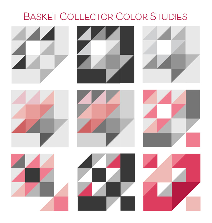
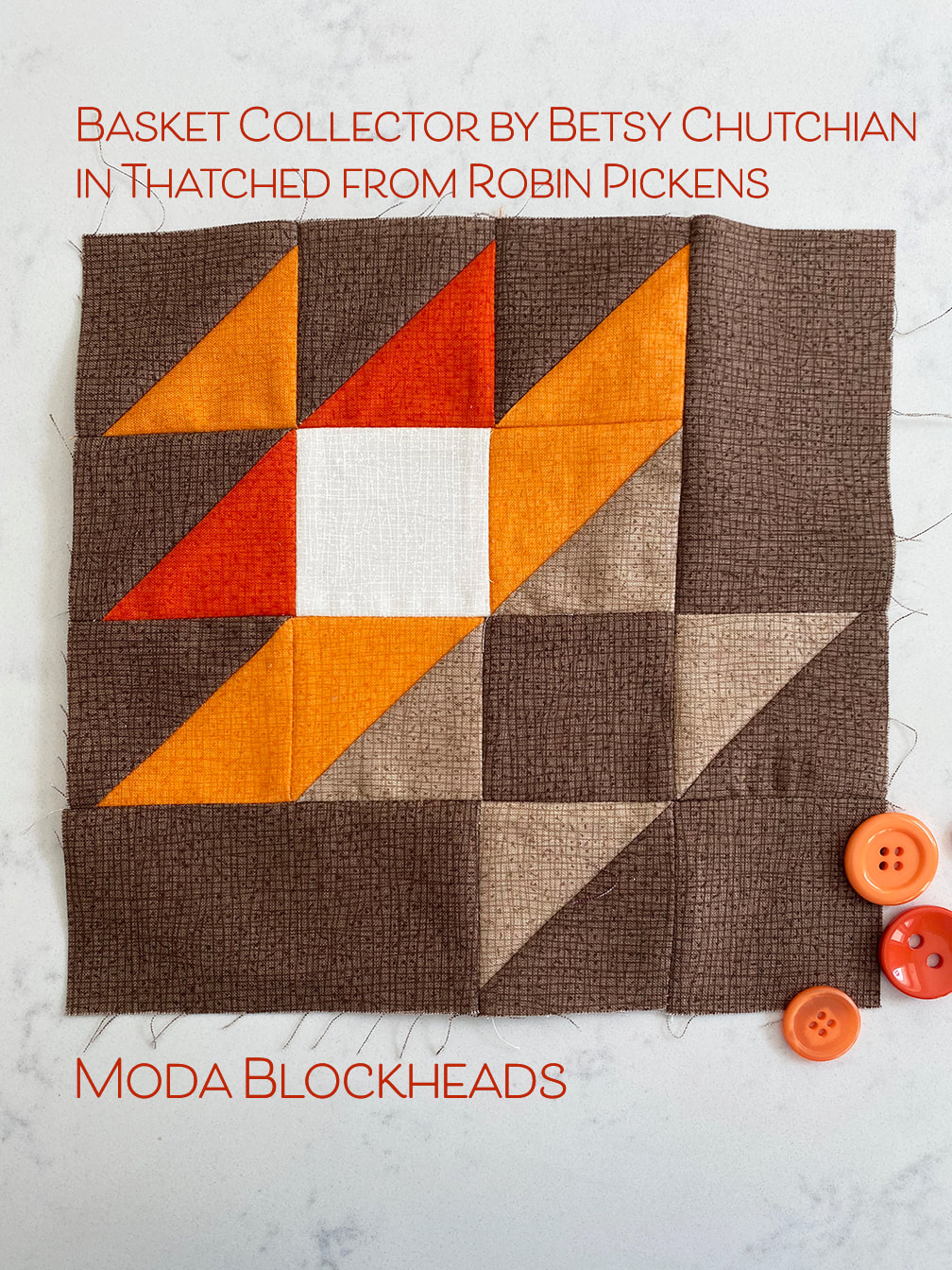
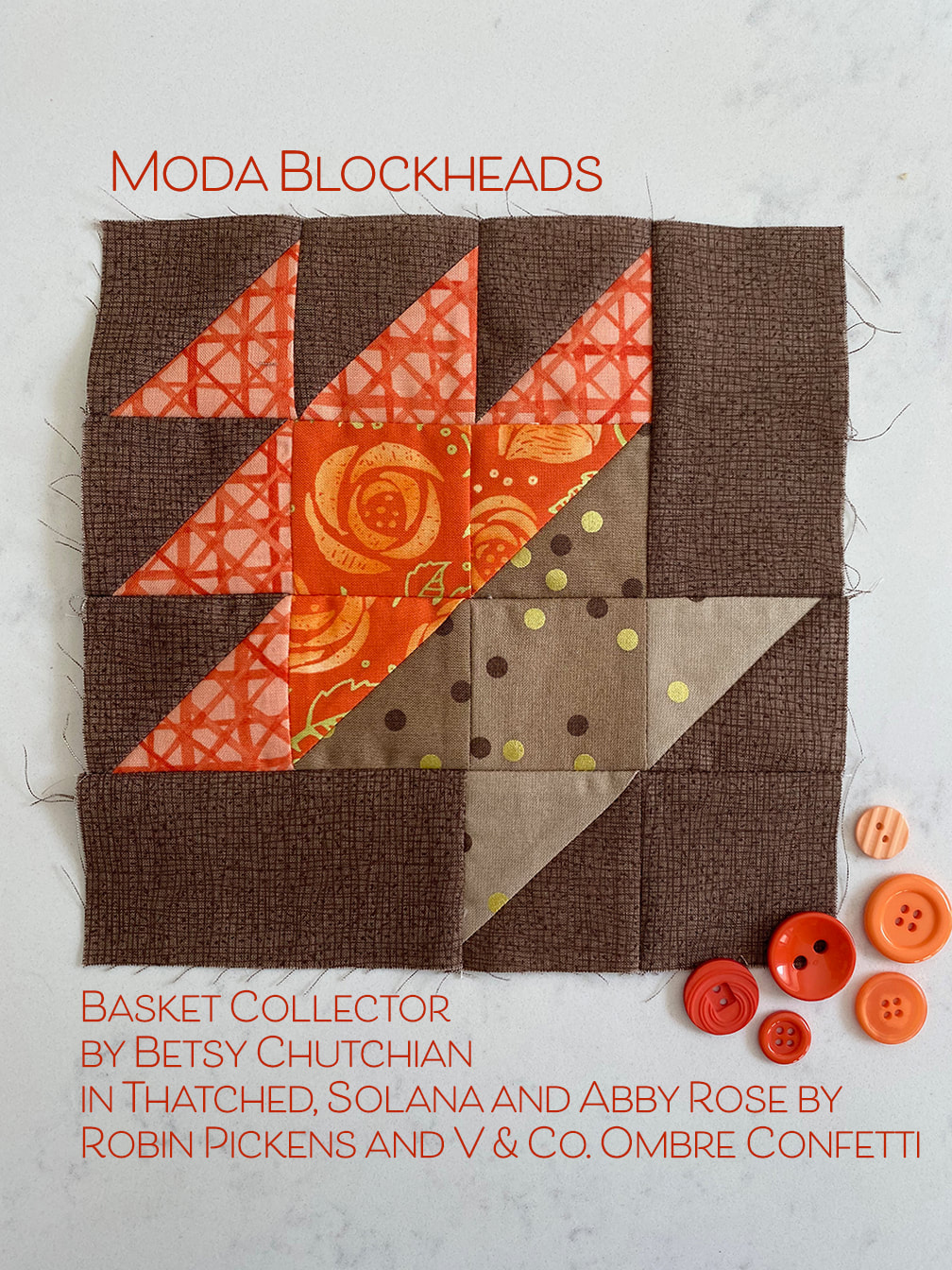
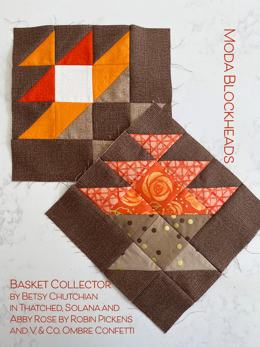
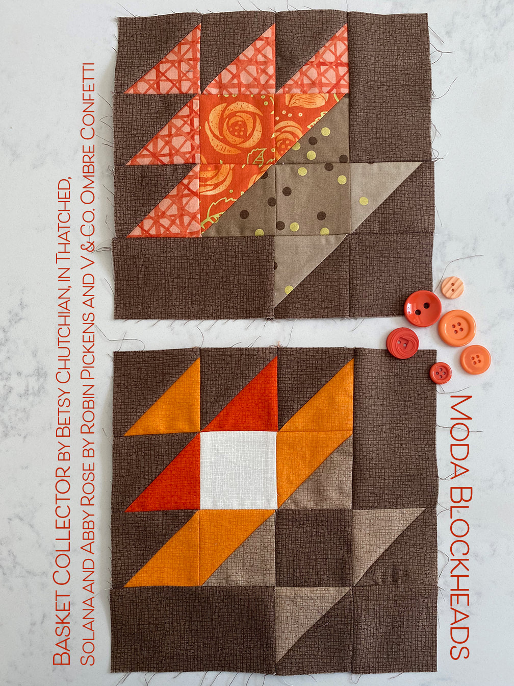
It is such fun to see the differences you can come up with for Basket blocks. Last year's Blockheads sampler had one that ended up being one of my favorite blocks in the group (although I couldn't pick just one favorite). I like to see the variations on them. Visit Betsy Chutchian's blog for this weeks lovely basket block that she has provided! For color studies I looked at the outer triangles going from light to dark on the outsides, light basket on dark background and more variations of scrappy grays to make a sparkly mix of light and dark. When I introduced another color I did a light to dark gradation and one where background ramps darker going in the opposite direction of the basket getting darker. Then I just played with the triangles to see what forms I could get that broke out of the basket theme. They feel very graphic to me. The very last one reminds me of corners of paper folded over and touching in the middle, almost like folding origami paper. My baskets will live in the brown row so I'm staying with the more traditional basket theme and making the top part of the basket in lively oranges while the base is a lovely oatmeal color. For my scrappy version I've got some Solana, Abby Rose and some Ombre Confetti to add some pattern play and some roses in the center of the basket. I thought the ratan/caning look of the Solana print had that basket feel in the print. For those people placing their blocks on point, the basket is especially nice. I can't wait to see the versions of ones that people make on the facebook group! Be sure to visit other Blockheads designers for more inspiration and happy basket collecting! 8.12 – Betsy Chutchian- we are here!
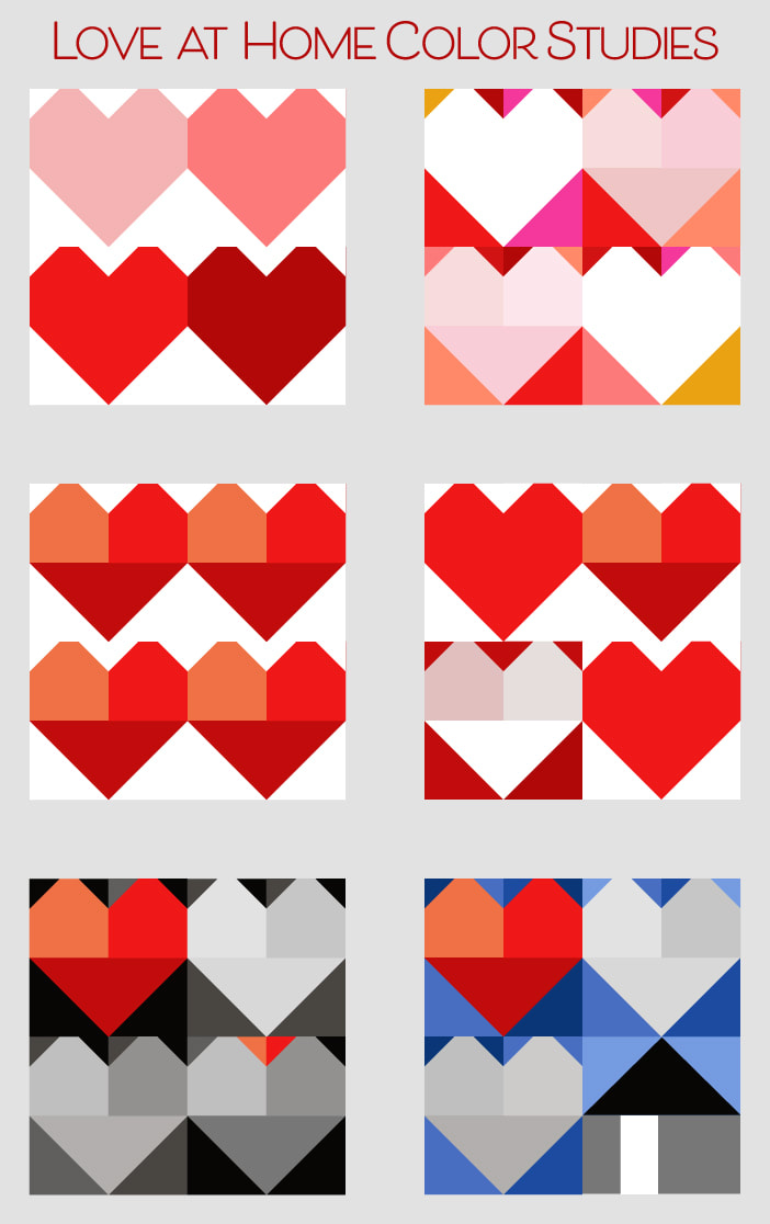
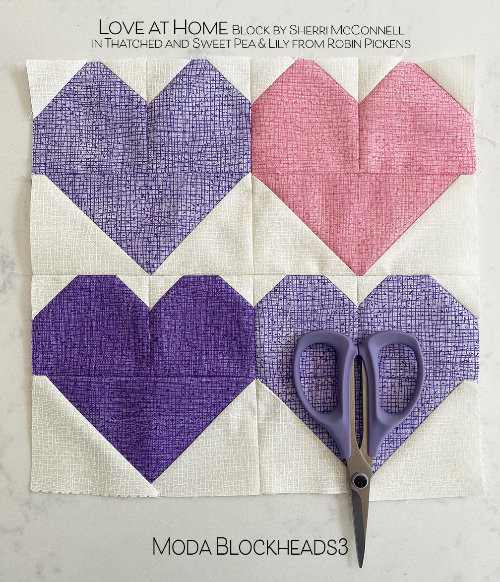
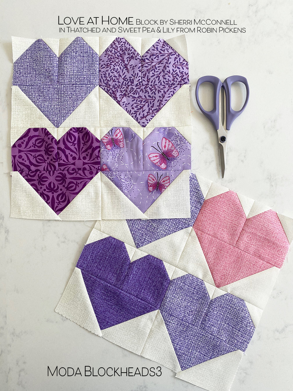
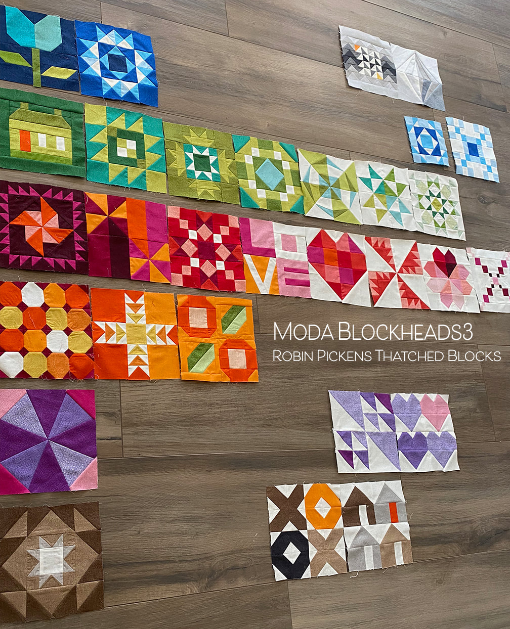
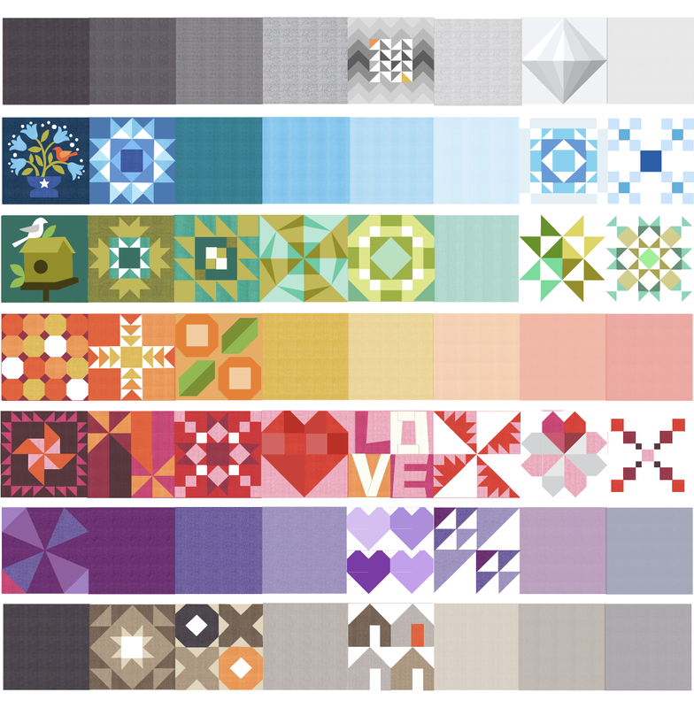
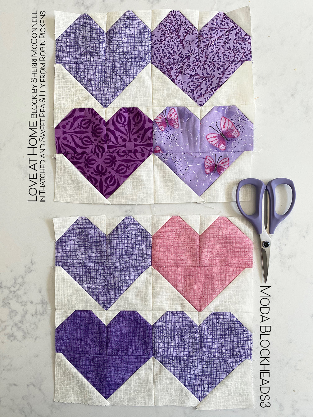
8.19 – Jan Patek 8.26 – Brigitte Heitland 9.2 – Lisa Bongean 9.9 – Lissa Alexander 9.16 – Laurie Simpson 9.23– Vanessa Goertzen 9.30 – Stacy Iest Hsu 10.7 – Robin Pickens 10.14 – Janet Clare 10.21 – Jen Kingwell 10.28 – Joanna Figueroa 11.4 – Corey Yoder 11.11 – Sherri McConnell Doesn't it just make you happy when the block is about love? It does for me! Visit Sherri's blog for her sweet Love at Home block instructions: The hearts are adorable and I think it is absolutely perfect that there are 4 of them and we have four in our family! I think the color studies are fairly straightforward. What I've tried here is alternating colors of hearts, playing with color in the background with lighter hearts, making the hearts multiple shades of red (reminiscent of shading) and trying a single switched out heart to light on dark within the composition, or with neutrals and one pop of reds! How about tucking a little accent in there to reflect the reds? And the last one was an idea...remember Stacy Iest Hsu's Won't You Be My Neighbor block? What if ONE of those houses took up a quadrant of this block to signify the "Love at Home"! I just love it when blocks can play together! My hearts this week will live in my purple row. Purple Heart Honor? Royal heart? Or just the majestic feeling of purple theatrical drama. Paired with pink it is romantic and pretty. For my scrappy quilt I used fabrics from my Sweet Pea & Lily line. Did you know the two purples in Thatched Basics are from that particular line? AND in August there is a Basics Bundle that Moda is showing on instagram and that Aster purple is in the basics bundle. It makes such a nice lively color combined with the greens and blues of the group (and oranges too) So would you like a peek of how my quilt layout is progressing so far? When I jump around each week from color family to color family it is hard to tell so here is a preview: For reference, below is a computer image with blocks I've filled in as I've done them. I am working on making a darker/more color saturated left side gradating to a lighter, less saturated right side, while keeping rows of rainbow color. Can I say rainbow color when I have brown and gray in there? A spectrum of color, I guess, is a better description. It is very interesting to see how it is progressing as I work along. I do have some things in advance but not everything so I keep working with a large part of this being a mystery to me too! Have fun with your hearts and lots of love this week! Visit the other Moda Blockheads designers:
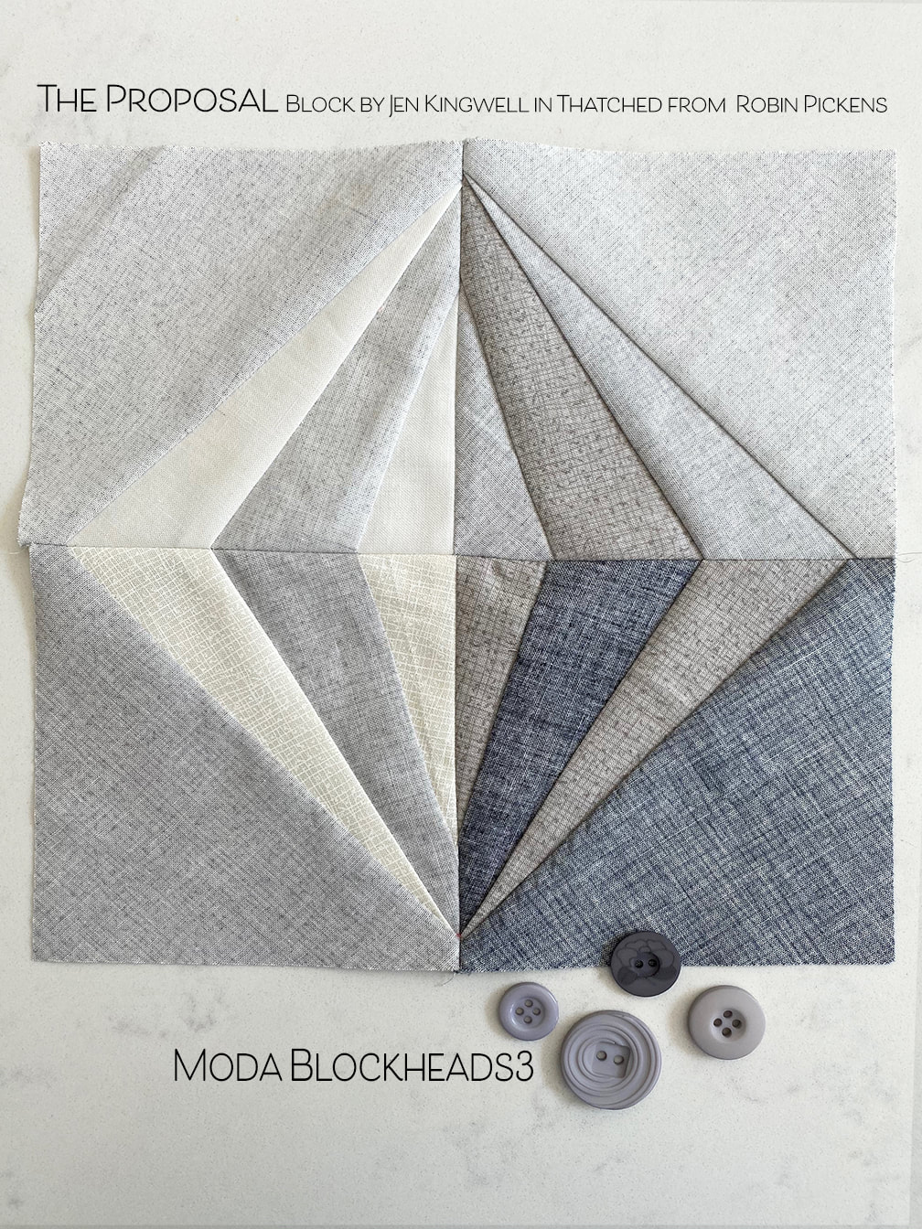
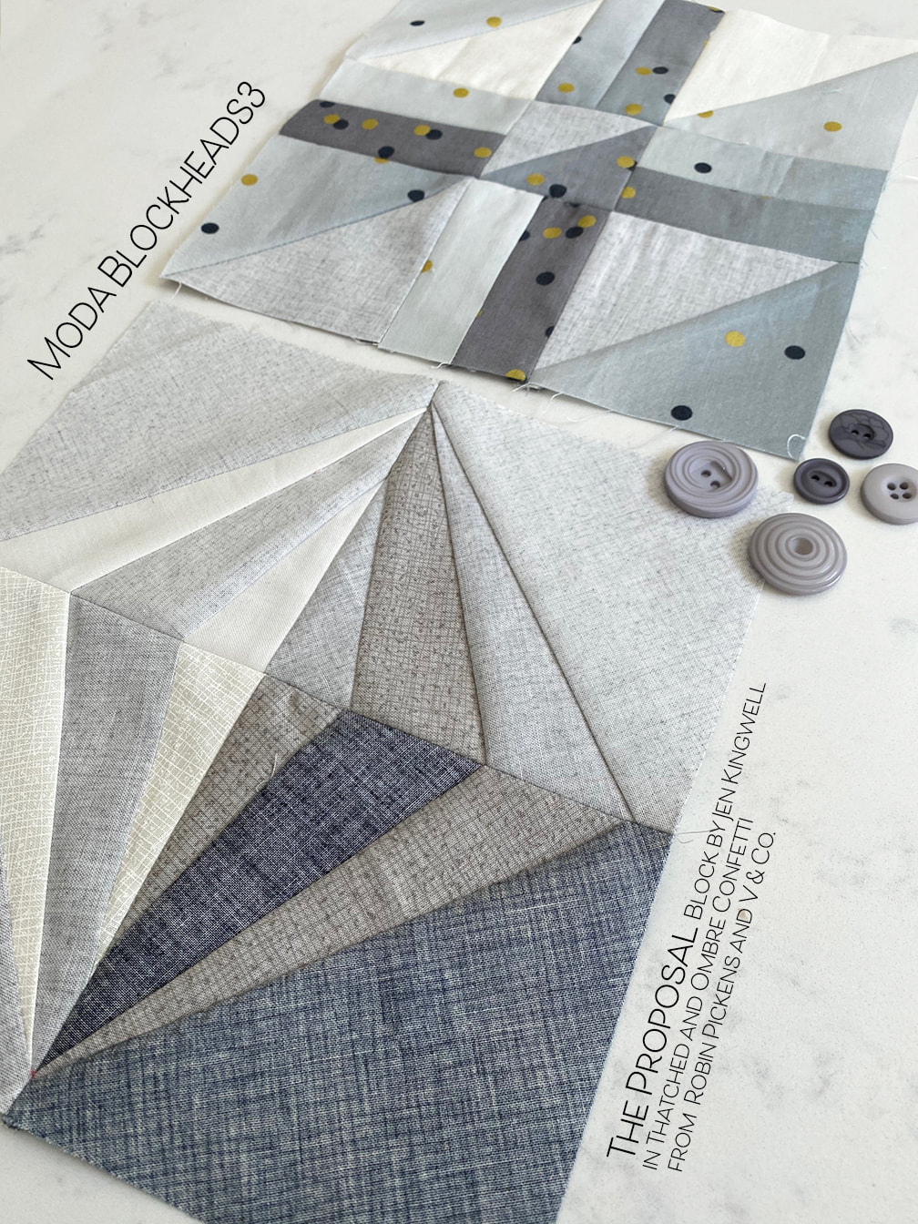
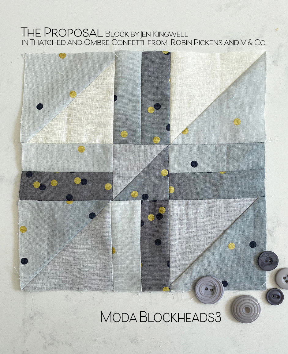
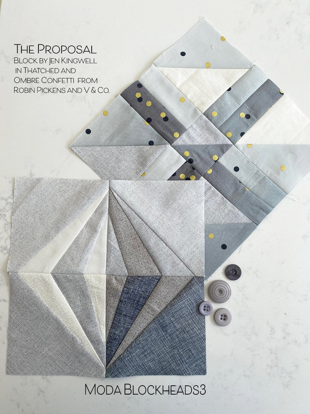
8.5 – Sherri McConnell- we are here! 8.12 – Betsy Chutchian 8.19 – Jan Patek 8.26 – Brigitte Heitland 9.2 – Lisa Bongean 9.9 – Lissa Alexander 9.16 – Laurie Simpson 9.23– Vanessa Goertzen 9.30 – Stacy Iest Hsu 10.7 – Robin Pickens 10.14 – Janet Clare 10.21 – Jen Kingwell 10.28 – Joanna Figueroa 11.4 – Corey Yoder Yes, my proposal was years ago and I am still happily married to Mr. P, my sweetie! But the "other" proposal, "The Proposal" quilt block designed by Jen Kingwell for Moda Blockheads, well that finally happened. Sometimes on the facebook Moda Blockheads group I see someone post their block that is, let's say, less than perfect and they express how they were frustrated making it. I just wanted to share that you are not alone. We all have those days. This block really kicked my butt! I just don't seem to "think" the way that paper piecing comes together. I have to concentrate really hard and mark the paper with what piece is going there and double and triple check. Yet still I ended up completely throwing away one section and starting it over. And boy that seam ripper was out. A LOT. One seam was ripped out four times. I found myself muttering "don't cry, its only a quilt block." The block wasn't THAT hard. But sometimes we should just put the sewing down and come back to it the next day. But that was not the mood I was in. I was in the mood to conquer and overcome and tough it out. After the fourth time ripping out the one seam I finally got the piece big enough (I swear I thought my piece was big enough and positioned right). And I finished it. I am quite happy with the result. I wanted to try for the look of light on one side of my diamond and shaddow on the other. I like the softness of the grays. I like the subtlety of the Thatched used on front and back sides for lighter shades. But could I really do a second one for my other, scrappy quilt? When I have trouble with a block I wonder WHY I decided to do TWO quilts. I could give that up now, even though we are more than half way to the end. But now, I will make another block. Yes, the desire to tough it out and overcome is deeply entrenched. But this is where the advice I sometimes give other people kicked in...you don't HAVE to do every block. You can pick and choose if you don't like something in Moda Blockheads. There is no quilt police that will throw you out if you skip a block. So I decided to make a block and JUST MAKE IT UP! That's right. I just used scraps of fabric I had from Thatched and Ombre Confetti from V & Co and did some half square triangles to mimic the feeling of angles and stayed true to my palette and I quite like how they look as a pair! So maybe some day with more practice the paper piecing will "click" and be easier. But for now I am happy with my "improv make-do" additional block! If you would like to make an alternate block similar to mine, I don't have a pattern made up but I can share the sizes. The corner half square triangles are 3 1/2" unfinished. I made them from two 4" squares that I make two HST from and trim to 3 1/2" (for a finished size of 3"). You will need (4) of them. The center HST is 2 1/2" finished, made from 3" squares. You need (1). The rectangles between the HST are each 1 1/2" x 3 1/2" inches (for 1 x 3" finished sizes). This block uses (8) of those rectangles. I joined in rows, then join rows together. Now I can breathe a sigh of relief that I am caught up (for now!) Just in time for a new block tomorrow....
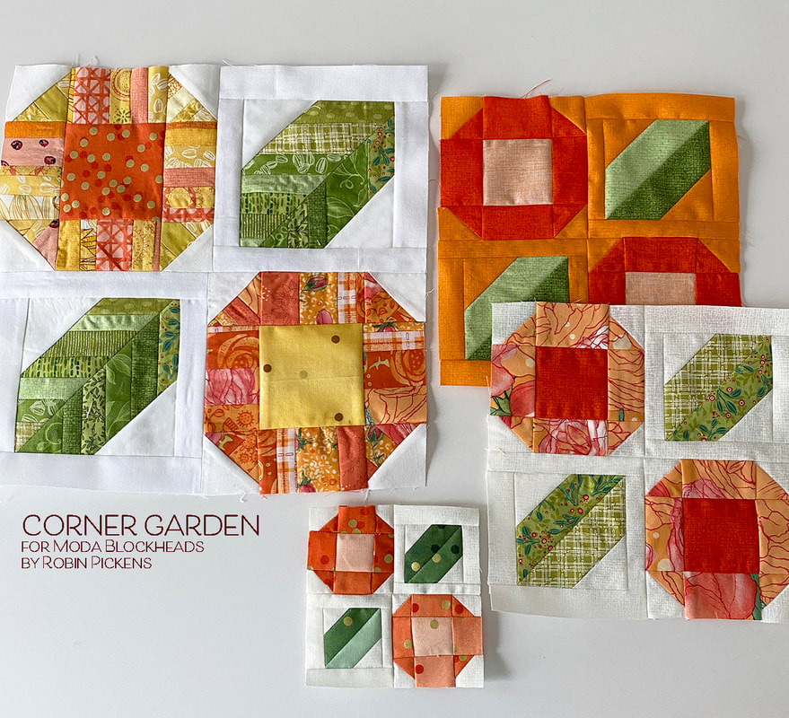
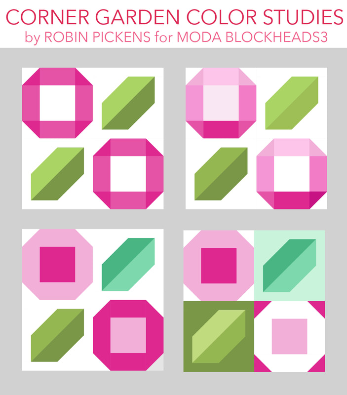
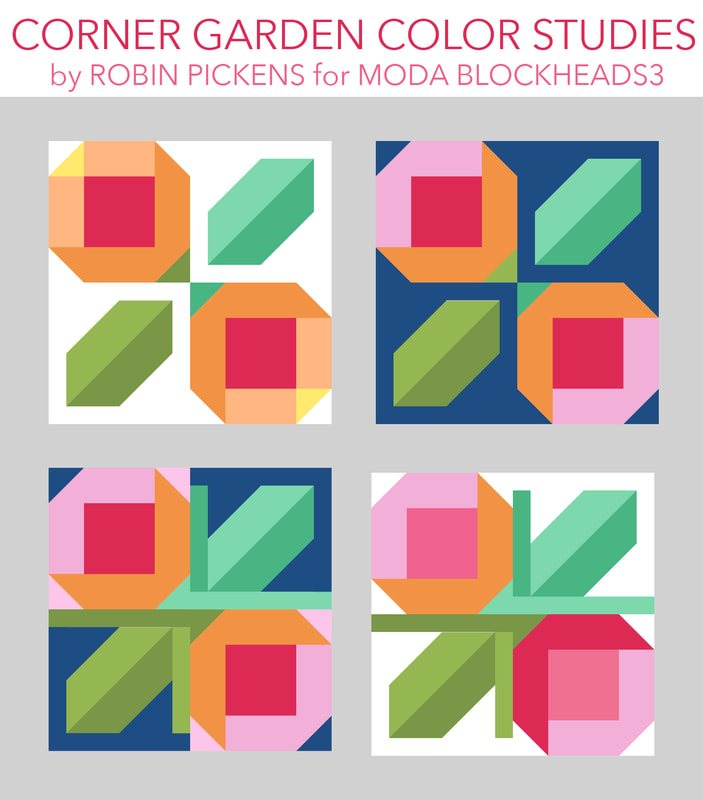
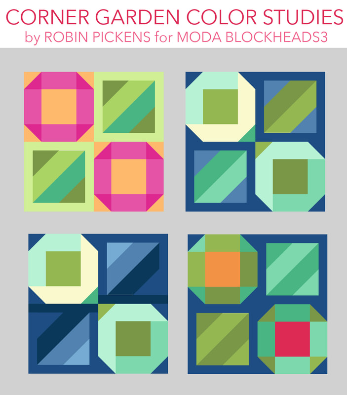
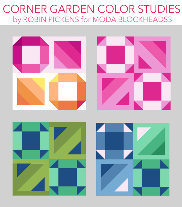
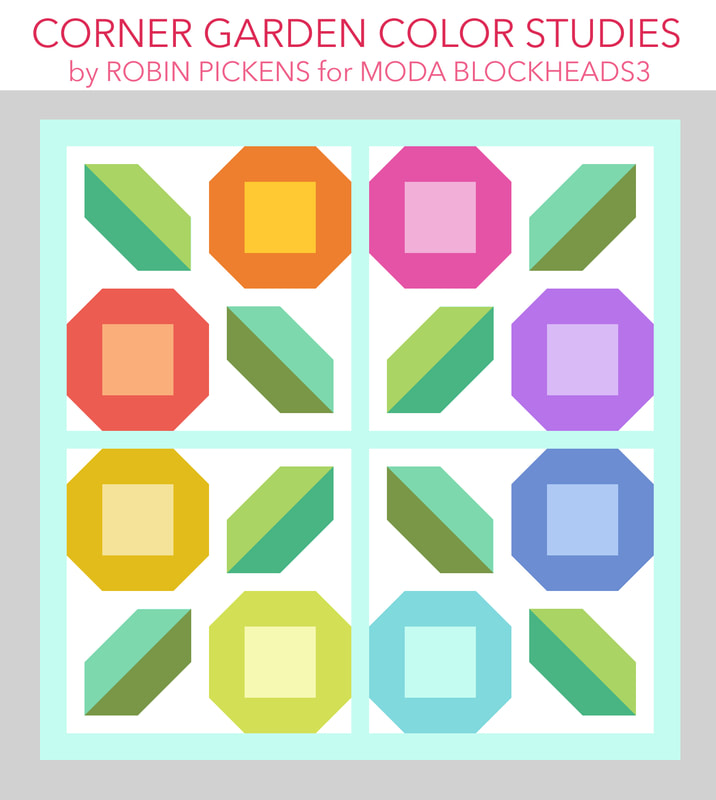
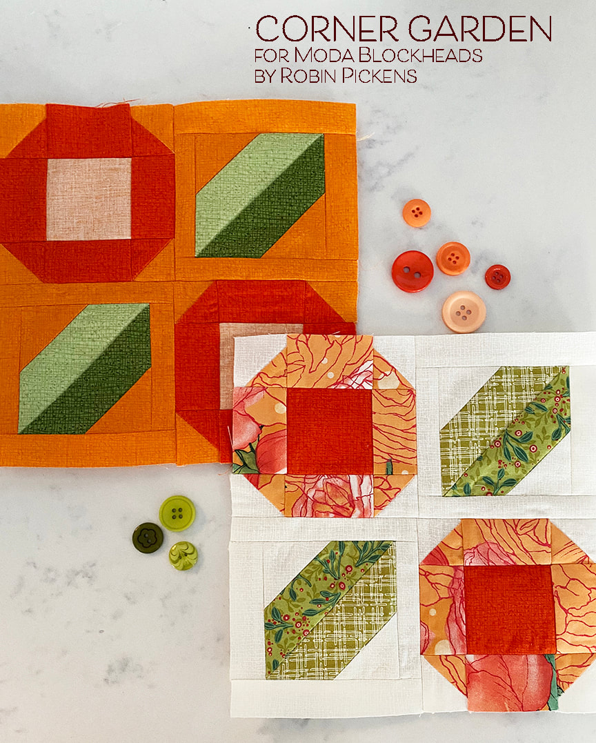
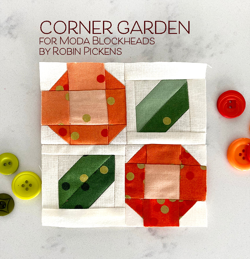
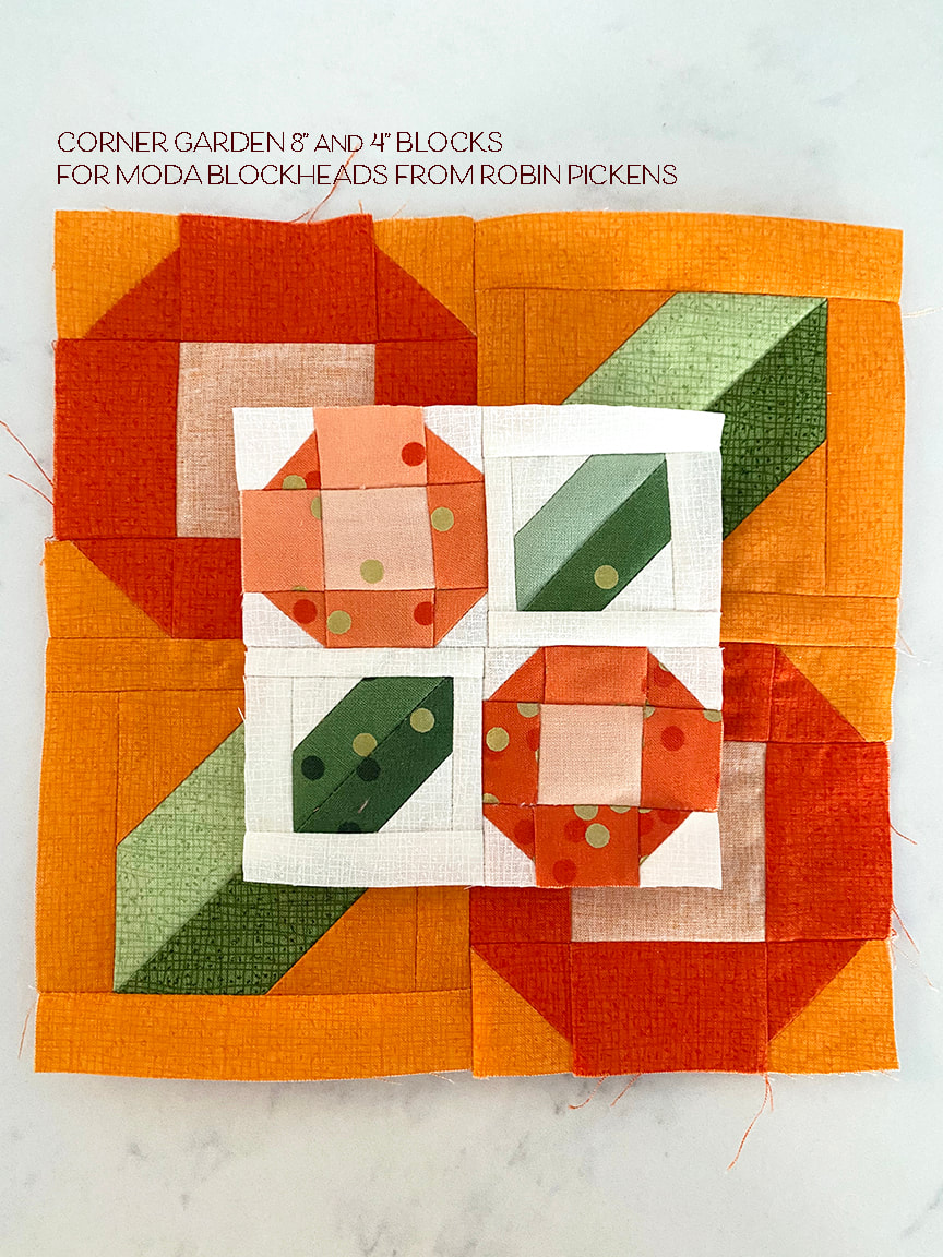
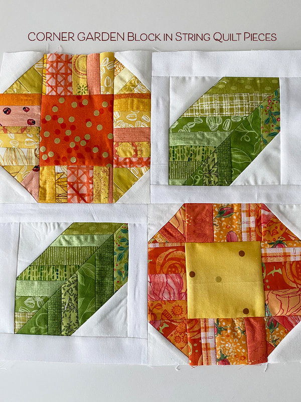
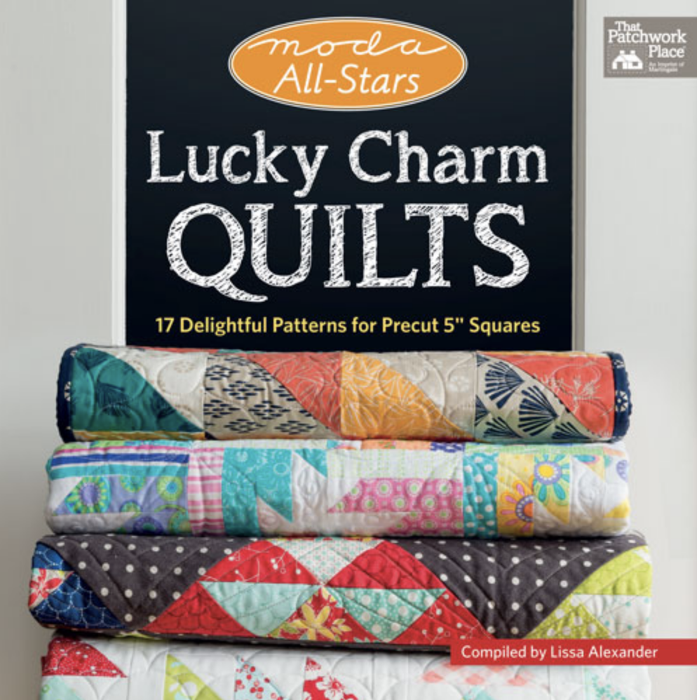
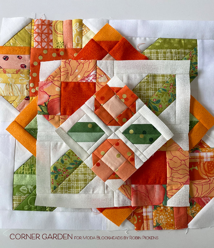
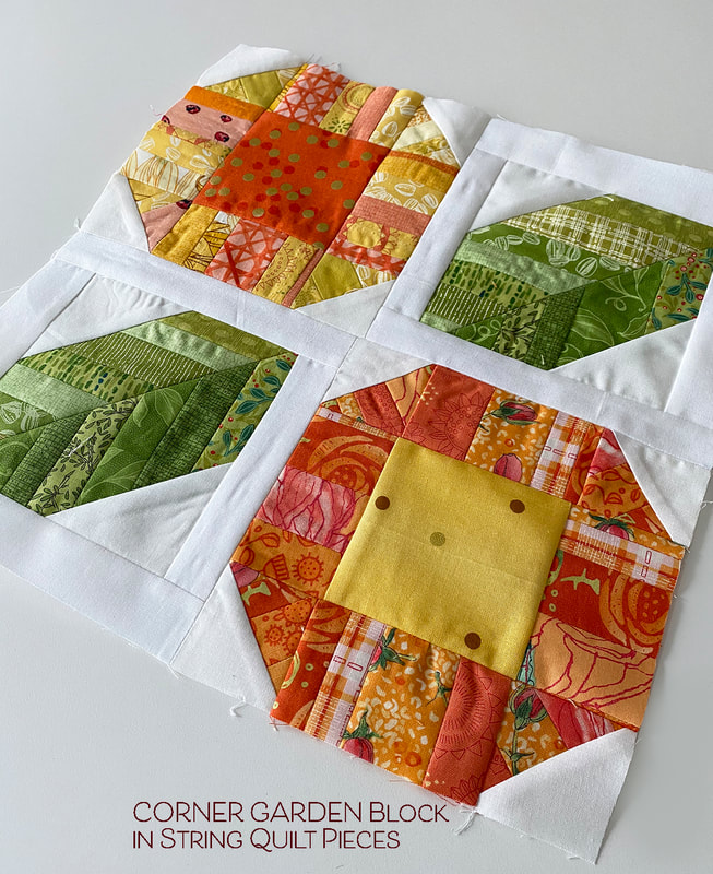
I've got a lot to cover today so keep reading! There is a book giveaway included from Martingale at the end! New block pattern, color studies and book giveaways...sounds like a good Wednesday to me! I'm very excited to share my block this week "CORNER GARDEN"! This block came out of the leaves in my Bird Talk quilt with a desire to do a simplified floral bloom. I think this block would be adorable in the corners of a pieced border of a quilt, plus it plays off the 4 corners of the block, thus the CORNER part of the garden name. The pattern is here in the gray link box right under this paragraph, but keep reading for color play and a BOOK GIVEAWAY from Martingale Publishers! Big square flower blooms and leaves....simple in flat colors or you can try them with a color ramp from light to dark. Change up the colors and contrast from one bloom to the next and switch up the leaf colors. I also played with the negative and positive shapes in the last one, with a change in leaf backgrounds too. Since the corners of the pattern are made up with stitch and flip squares, why not try greens to the center to make a base for the flower bud with two of the corners? And you can play with varying shades of color to give the illusion of angle and perspective on the flower sides. The bottom images also play with the rectangles that border the leaves. If you make part of those the leaf colors it creates an image of stems weaving together in a flower twist. Then I started to break down the shapes to be less literal as flowers, and to emphasize the triangles to the sides of the leaves. They start to look like supergraphic stripes and boxed in angled stripes vs leaves. I also explored a blue/cream/green palette. The last image starts to play off the faceted corners of the octagonal shapes. And this last one breaks down the shapes even more to the churn dash idea and graduated stripes. These feel graphic and can work well if you are more focused on shapes and don't want blocks that suggest flowers and literal objects. I think this block has lovely possibilities to explore pairs and reflected units, playing off rainbow colors or just simple groupings. These are my all-Thatched and scrappy versions of Corner Garden. The scrappy one uses Abby Rose and Dandi Annie plaid with Cream and Tangerine Thatched. These are 8" blocks. I tend to make my corner pieces a little larger and trim them down to size. And if all the HST corners are the same, I make my HST with an 8-at-a-time method vs individually. The 4" block I made in V& Co Ombre Confetti. I just love doing these little blocks! And I thought it would be fun to try making a block from strip/string quilt pieces. The block below is a 12" block using strips from Solana, Dandi Annie, Painted Meadow, Sweet Pea & Lily, Blushing Peonies and Abby Rose. I used the Ombre Confetti for centers since I thought the dots reminded me of big pollen filled flowers. There are lots of ways to have fun with this block! The other exciting piece of news today is the Martingale giveaway of some of the Moda All-Stars books! You can enter to win a digital download version of one of the quilt books. I am taking names here on my blog to be entered into a random sweepstakes for a digital copy of Lucky Charm Quilts. Sales of this Moda All-Stars book benefit Alex's Lemonade Stand, a Foundation for kids with childhood cancer and has funded over 1,ooo research projects. TO ENTER TO WIN A DIGITAL COPY OF THIS BOOK, enter a comment below telling me your favorite color to sew with! I'll be drawing a winner on Friday and will contact the person through their information on the blog comment. Thank you for supporting the All-Stars books that benefit wonderful charities! But I'm not the only one doing a giveaway! All the Moda Blockheads designers are giving away one of the All-Stars books this week. Please visit the other designer blogs and enter for more chances to win one of the digital books! Links to their blogs are below:
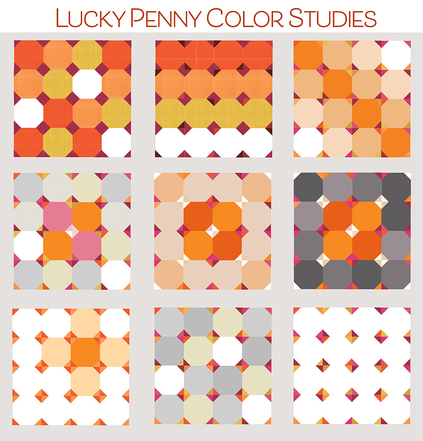
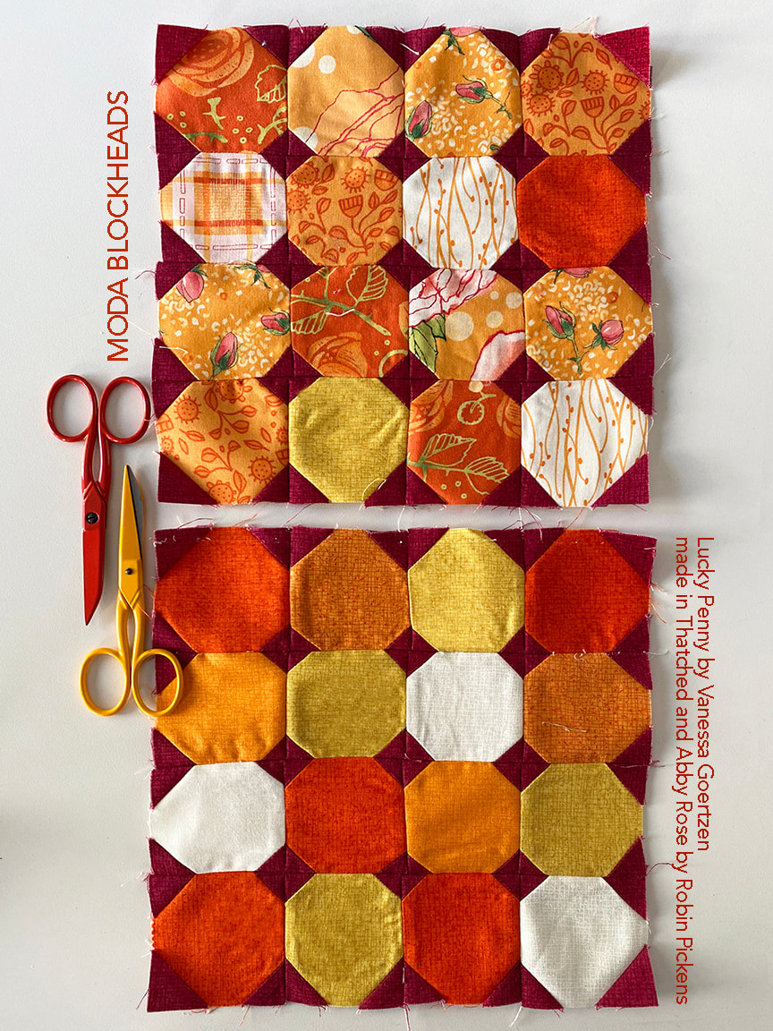
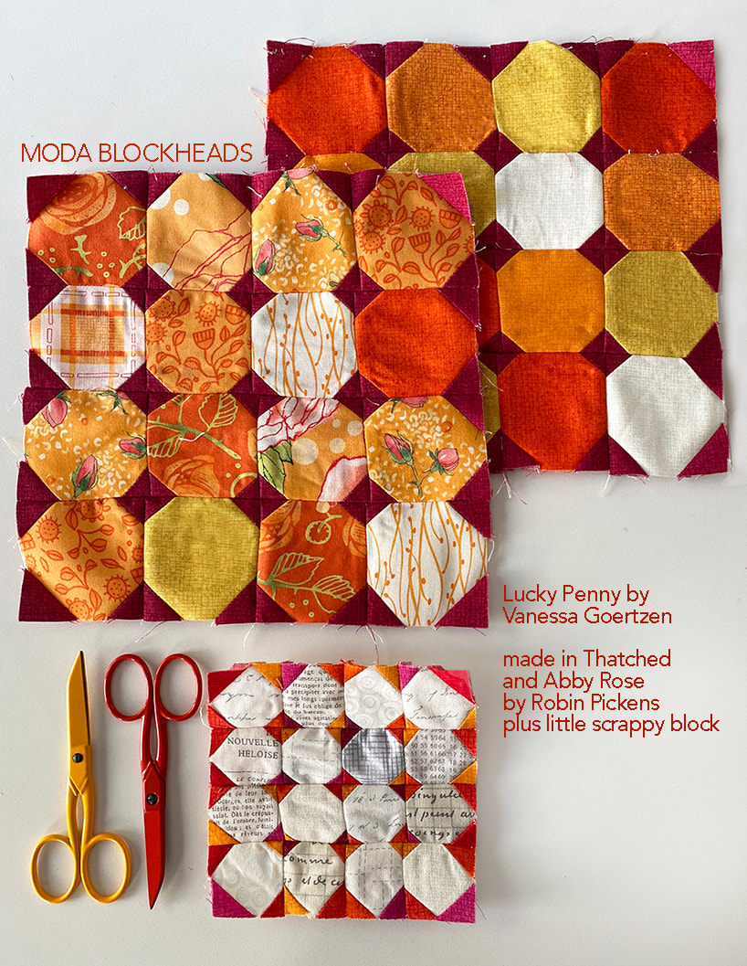
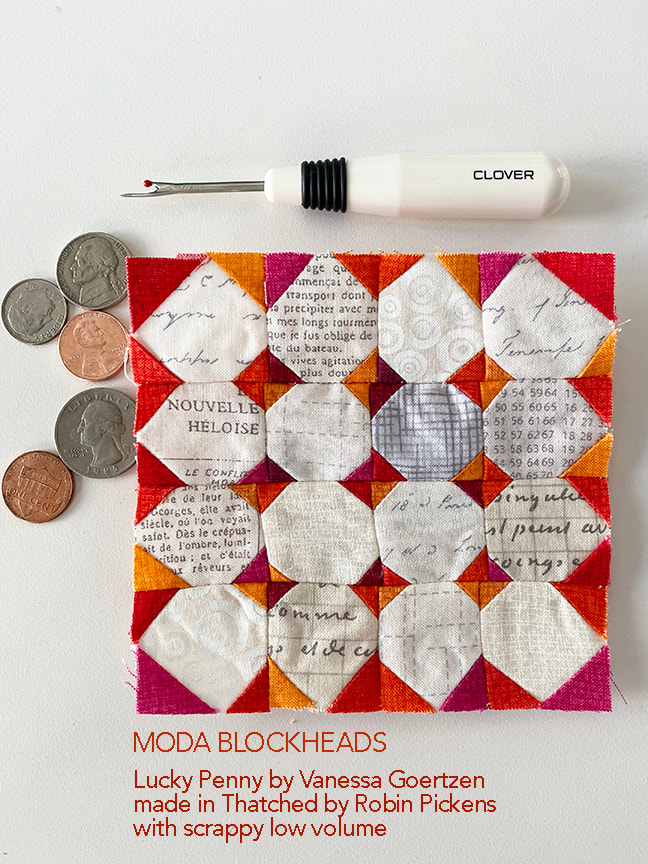
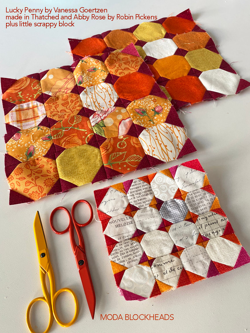
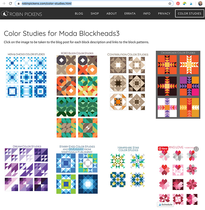
7.1 – Robin Pickens - we are here! 7.8 – Janet Clare 7.15 – Jen Kingwell 7.22 – Joanna Figueroa 7.29 – Corey Yoder 8.5 – Sherri McConnell 8.12 – Betsy Chutchian 8.19 – Jan Patek 8.26 – Brigitte Heitland 9.2 – Lisa Bongean 9.9 – Lissa Alexander 9.16 – Laurie Simpson 9.23– Vanessa Goertzen 9.30 – Stacy Iest Hsu Happy Moda Blockheads day! This weeks cheery block is at Vanessa Goertzen's blog: With a name like Lucky Penny, how could I not think of coppery orange colors? Maybe mixed with grays from other change with it? Silver and copper...gray and orange...time for color play! This block is just FUN like gumballs in bright colors! The little stitch and flip corners make friendly curved pieces that can play with random color in spotty placement or lining up the balls in rows or playing with the balls in formation on an angle. I started with all the same color stitch and flip corners and started to introduce other colors to give those corners their own sparkly personality. In the second row I looked at the center stitch and flip unit being light/white while the other corners were darker colors. Combined with the colors of the snowball blocks in the center 4 pieces it really calls attention to that center spot. It is also interesting to carry those light corners out as little bows out to the corners. I kept the middle and right second row images completely symmetrical and tried the outer ring of pieces in light or dark shades. I n the bottom row the image on the left shows using all the same repeating stitch and flip color pairs with mostly white snowball blocks. I've emphasized one block in there with a soft color surrounding it. The other two in the last row could be done in all white or in low volume fabrics with the color coming mostly from the stitch and flip corners. I love how the last one really becomes a composition about the little diamonds and you hardly see the snowballs. For my own blocks, I liked the colors arranged in a random way and felt that had a playful energy. I used the orange fabrics from Abby Rose to make my scrappy block, using Burgundy from Thatched to make the dark corners that really make the orange prints pop. But I was also interested in making the low volume version of the block and decided to make a 4" block with my playful colors in the stitch and flip corners. I'm not exactly the most accurate and patient when it comes to making a 4" block with lots of little pieces. I think my block should be renamed "Wonky Penny"! The seam ripper is there because I did rip out my rows and resewed them...believe it or not, this is the improved one! I decided I was just fine with the imperfections on this one and I kind of like the personality it has. Those small blocks sure are cute! If you want to refer back to other color studies for Moda Blockheads I've made a page that shows an overview of them. The "COLOR STUDIES" is up in the navigation bar at the top. On the page you can click on an image to be taken to that blog post I'll update it and add the new color studies as I do them. Hope you have lots of fun with your Lucky Penny block! Be sure to check out the other Moda designers!
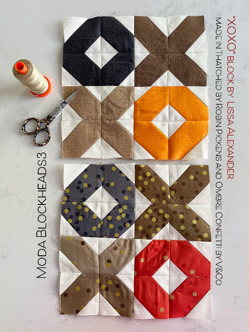
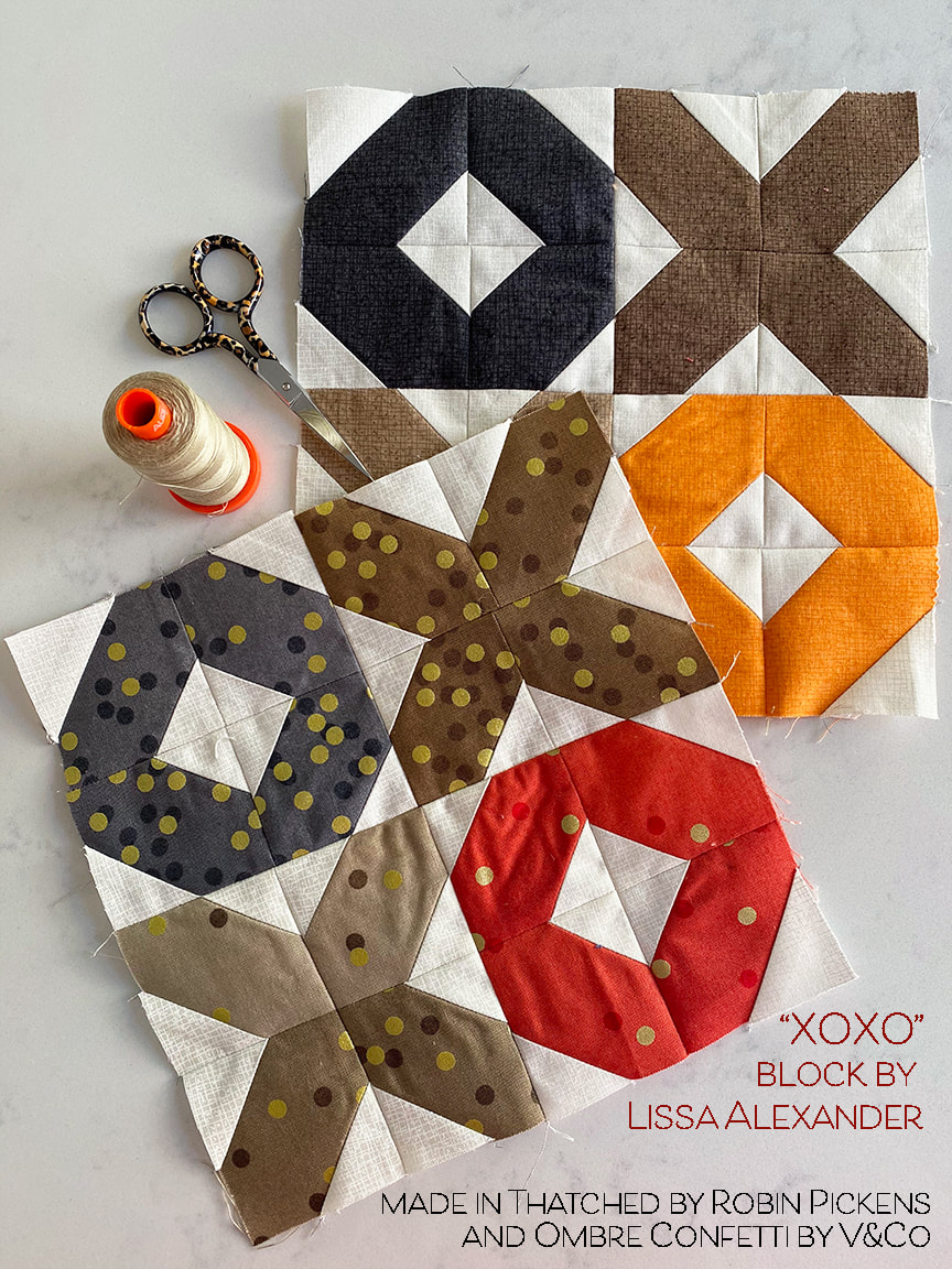
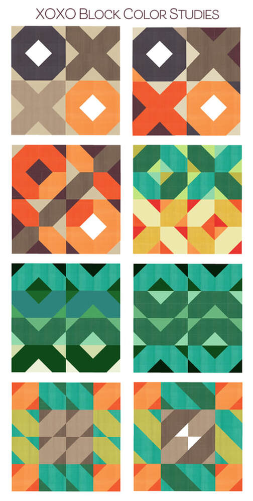
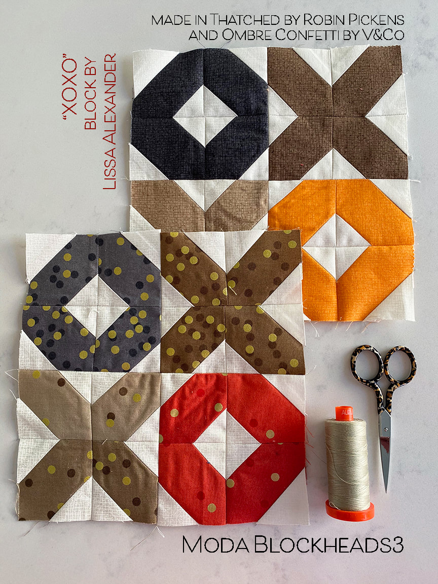
6.17– Vanessa Goertzen 6.24 – Stacy Iest Hsu 7.1 – Robin Pickens 7.8 – Janet Clare 7.15 – Jen Kingwell 7.22 – Joanna Figueroa 7.29 – Corey Yoder 8.5 – Sherri McConnell 8.12 – Betsy Chutchian 8.19 – Jan Patek 8.26 – Brigitte Heitland 9.2 – Lisa Bongean 9.9 – Lissa Alexander 9.16 – Laurie Simpson This week's block, XOXO from Lissa Alexander can be found at the Moda blog archive of Blockheads blocks. This is a great resource place to get your blocks and catch up on any you missed. I'm still doing some browns this week so I've added a pop of orange to liven it up, and a little gray for a cooler balance. I intended to do this block with tan background corners and just white centers in the O's but I forgot and my blocks were done before I remembered. I'm sticking with these! For my mixed print this week I 'm using V&Co Ombre Confetti. I just love this fabric! The density change with the dots to go with the lighter or darker value of the color is just perfect. I love that little pop of celebration and movement. And those little leopard print handle Gingher scissors...they are the first scissors I got with fun handles. I got them about 18 years ago and they were a special birthday treat I gave myself. Soooooo...want to see some color studies?? First I have my basic browns and orange. I made this in the first version since it went in with my rainbow row theme. I like looking at the richness when you add dark colors along with the light colors into those stitch-and-flip corners. And more orange, and how about playing with the orange and switching it up within the Xs and Os? If I were making the block for a fun pillow I would probably do something more mixed, like the right one on the second row. This stays with color stories- greens on top, yellow and oranges on the bottom. But each one is a mix of values within those colors and it feels like a lively mix of movement. The all-green blocks have a different feel. The one on the left has the OXXO go from light on top to dark on bottom while the background does the reverse, dark to light going down each row. And next to it, the lights and darks stay the same in the top and bottom and the 2 middle rows. This emphasizes the feeling of mountains and valleys vs letters. On the last row, I've played with the browns making a center square by using one corner of each X, O block. Then consistent color above and below that, to the sides and in the corners. It creates a feeling of banded color or a transparent film of color layed over the Xs and Os. And lastly, by alternating the insides and outsides (so a chartreuse center has turquoise corners and the next one has a turquoise center with chartreuse corners) we get a continuation of the angled shape from block to block, creating a composition on angled lines that form new diamonds. The little white triangles in the center are a focal point and a bow on the package! This one really has a strong directional movement to the way the blocks read as a continual sections. This is the other one I think I'd make as an experiment. Check back on Saturday when I post some of the blocks I've been catching up on. I am really excited to share my applique bird and urn from a couple weeks ago and I did Joanna Figueroa's alternate flower too.
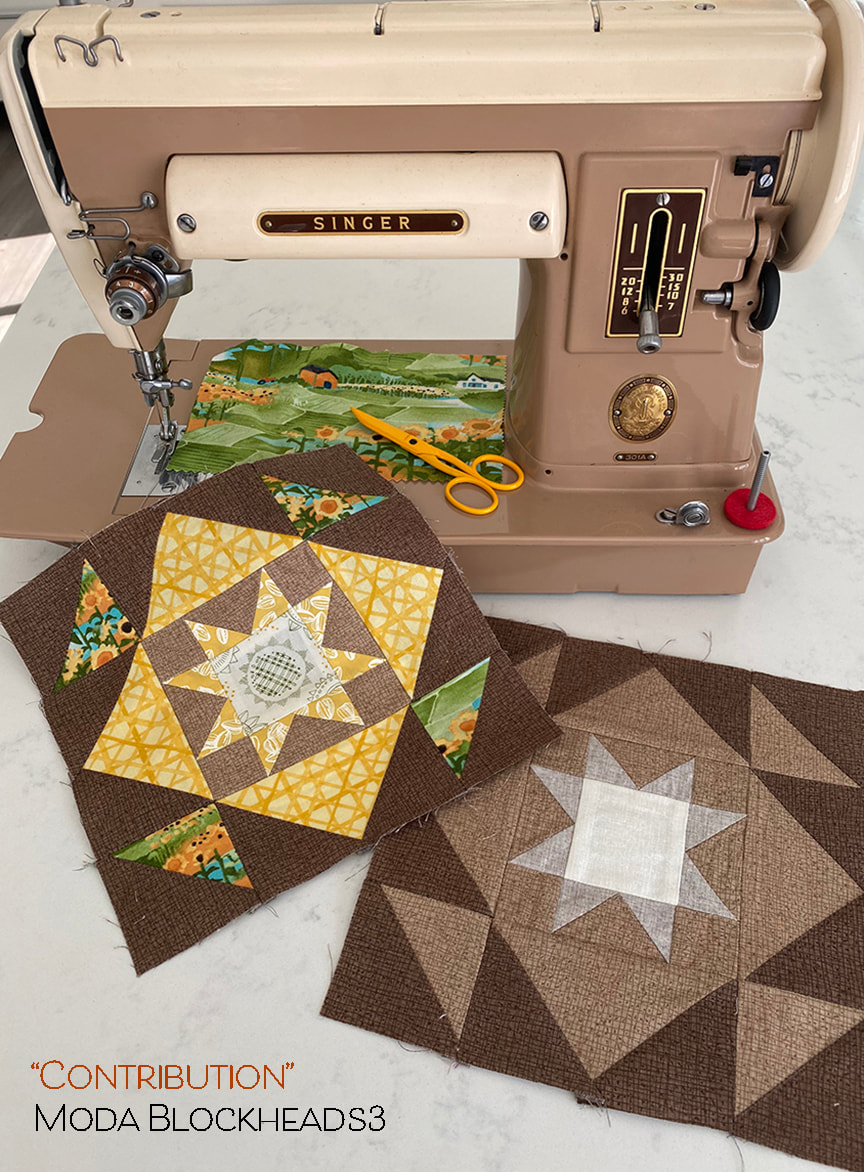
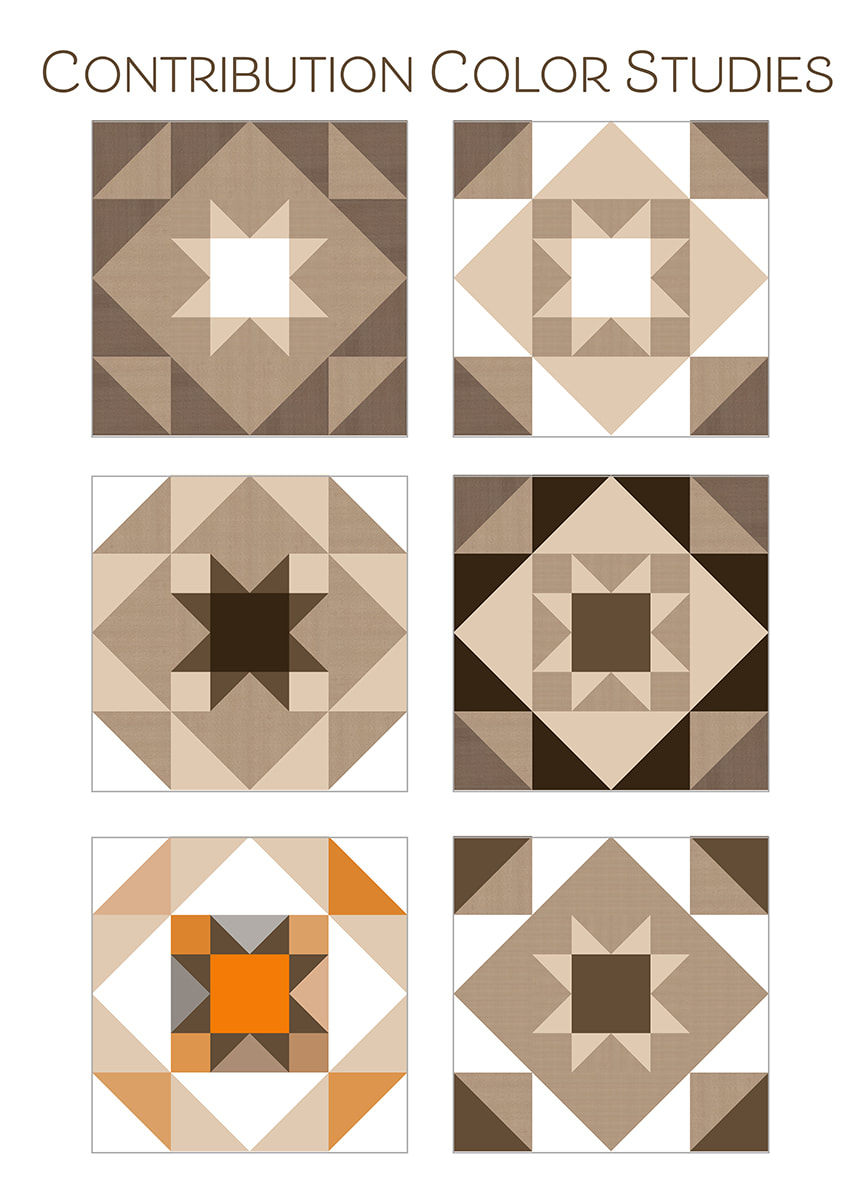
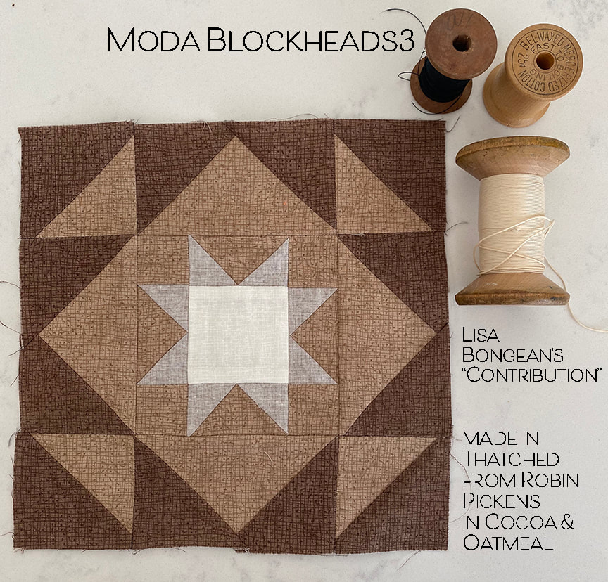
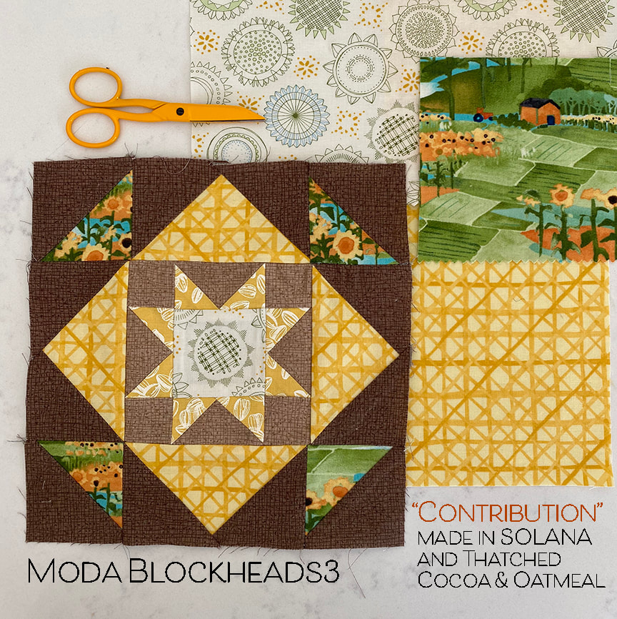
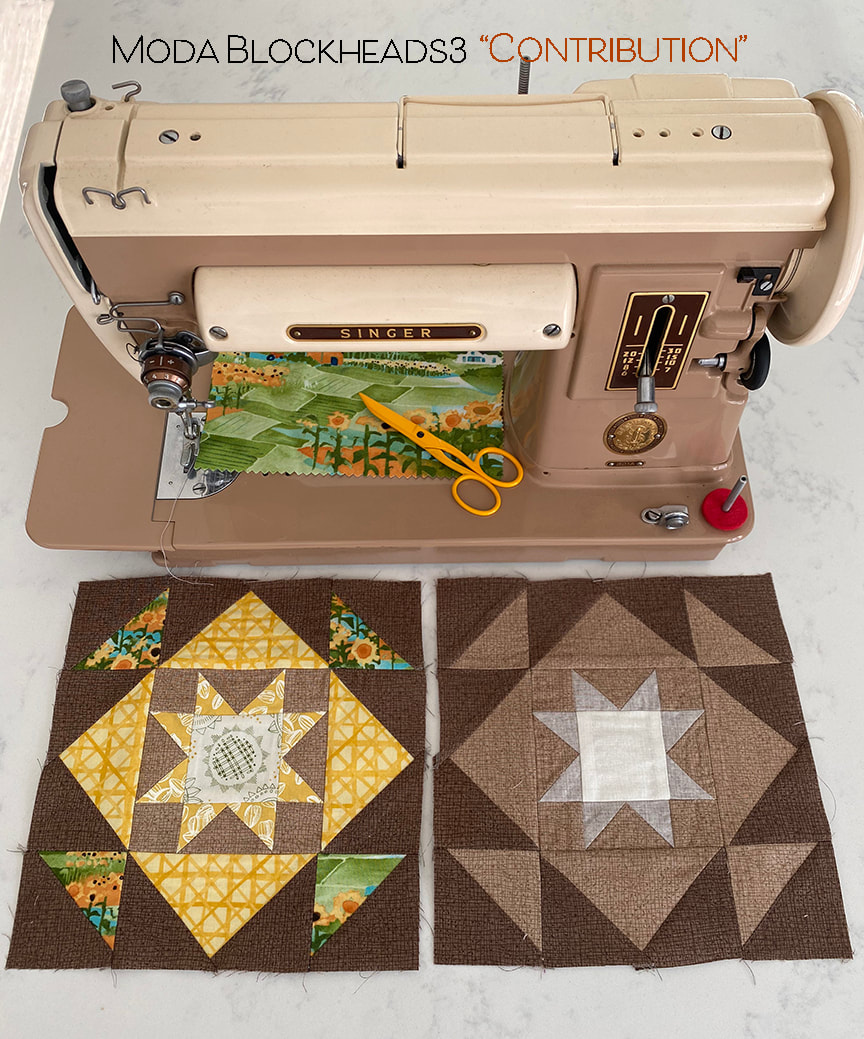
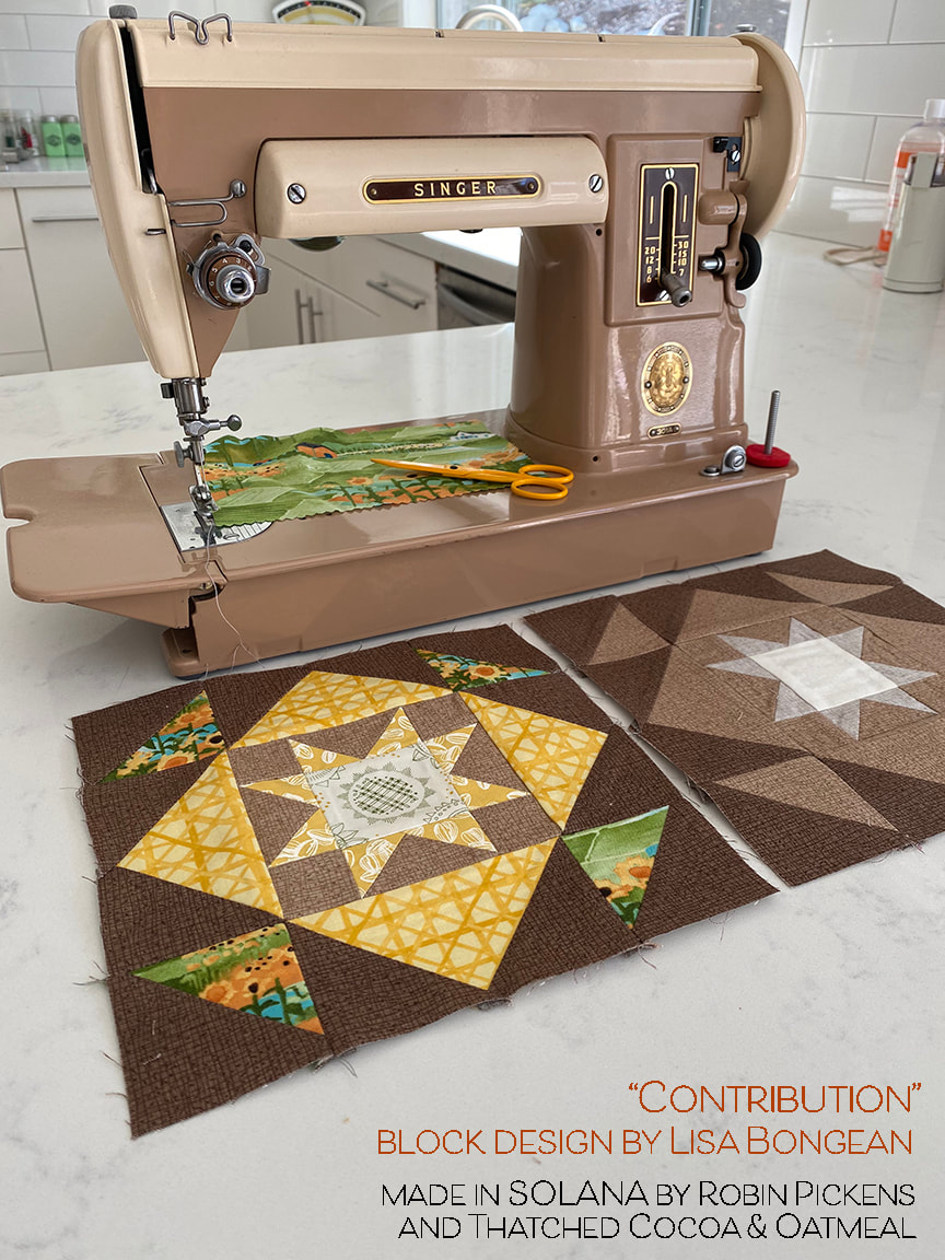
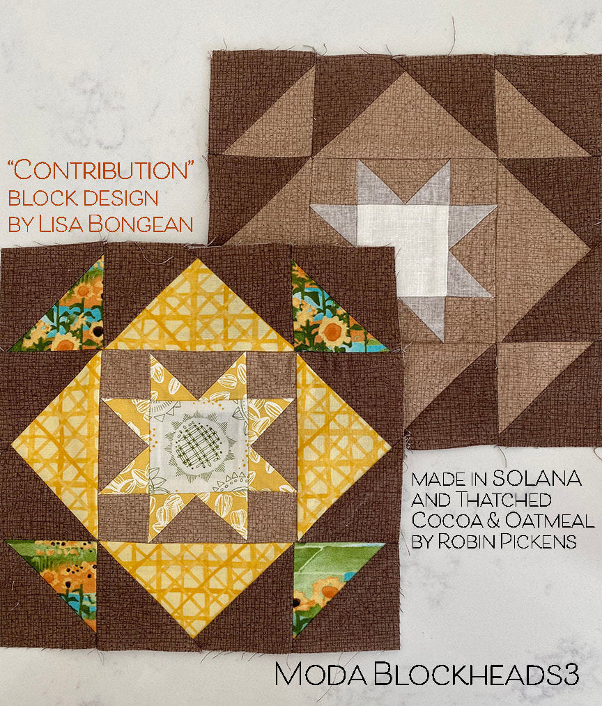
See you soon! If it's easier to see my posts on a feed, I am also on Bloglovin at https://www.bloglovin.com/blogs/robin-pickens-blog-20472215 Thank you to Lisa Bongean for a wonderful block for this week's Moda Blockheads. You can access the block pattern on her blog at this link: This week I was making the first of my blocks for my BROWN row in my rainbow row quilt. I don't work with brown a whole lot so this is a good exercise for stretching myself beyond my go-to colors. AND I decided to work in some of my new SOLANA fabric to the mixed prints block so it made it even more fun. But first...a little color/contrast study with the block... I love the illusion of a square on point made from those flying geese when you keep the same color on all the flying geese and the small corner squares in the center. I also liked keeping a little shading difference between the center square and the star points surrounding it. But its interesting to see how playing with the outside half square triangles and making them a different color from the flying geese can give the block an overall octagonal feeling. And if you play with different colors for the flying geese on the larger and smaller blocks, it separates the inner square vs the illusion of the square on point. The example with the darkest corners on the large flying geese emphasizes a giant plus sign behind the on-point square. And in the bottom row I started playing with adding some orange, thinking a scrappier mix of colors and I like how the white corners and flying geese centers work together as a band of on-point border. The one with orange one might be my favorite of the color studies. But I think that is partly because I really like orange as a color. My all-Thatched version is using the Cocoa and Oatmeal brown Thatched with a center square of Cream. The star points around the center are the Oatmeal from the back side for subtle difference. For my version with prints, I am using the scenic print from the group in the corners with the criss cross ratan plaid, sunflower seeds on yellow and varietals on cream in the center. Solana doesn't have brown as a colorway but I think these browns from Thatched go with it quite well since the whole group has a warm, earthy feel. Makes me want to get out in the garden and start planting. I love how perfectly these blocks go with my latest vintage Singer acquisition- this two tone 301. When I saw the two-tone colors I fell in love with this one. I just got it at Road to California in January from Aspire Sewing from Anaheim. She is lovely. I haven't named her yet (keep thinking "Mabel"). Please stop by the other Moda Blockheads designers' blogs and check out what they are all up to. I'm happy to be back to posting on time this week! Still catching up with a few so stay tuned for more to come this week! Want to follow me on Bloglovin'? If so, click this link! https://www.bloglovin.com/blogs/robin-pickens-blog-20472215
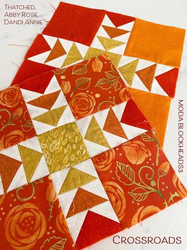
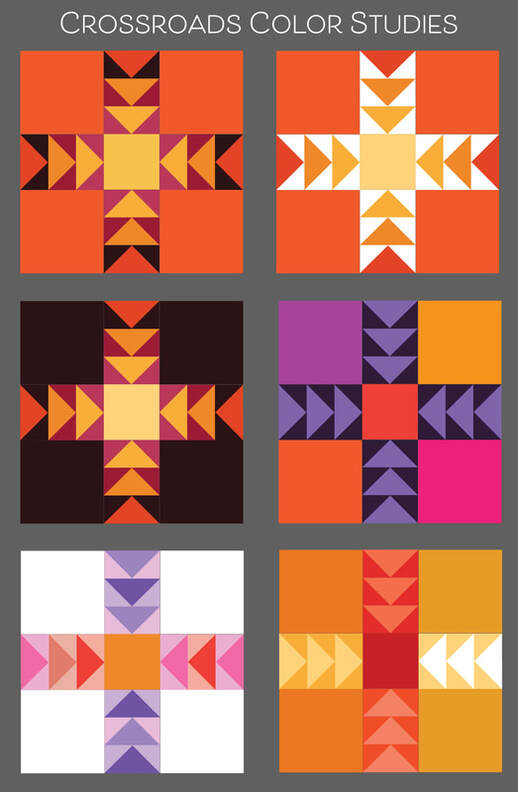
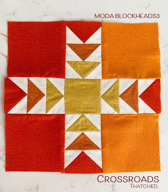
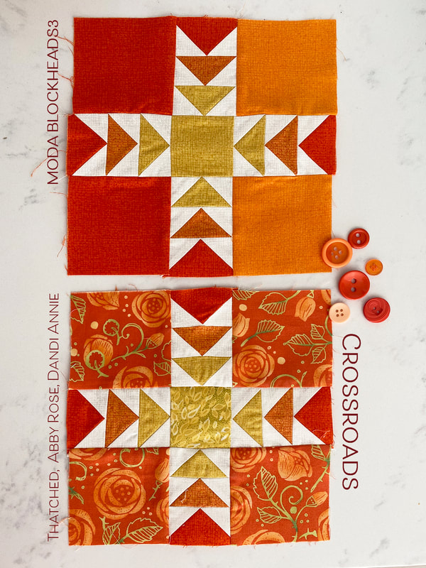
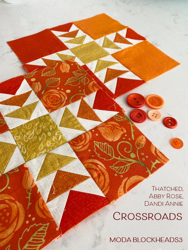
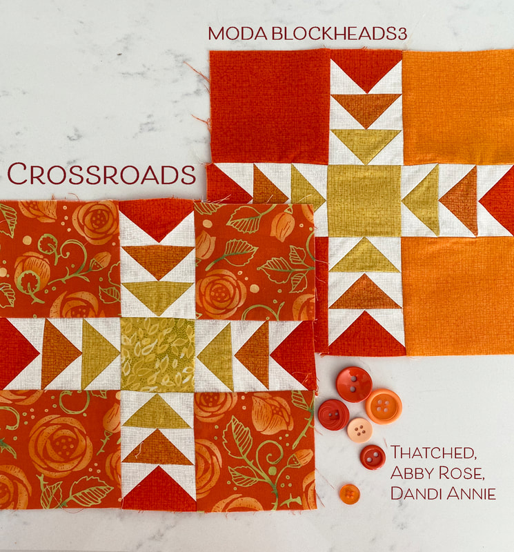
Happy Blockheads Wednesday! I squeezed a few flying geese in here or there while I was doing other sewing this week. I love the balance and movement in this Crossroads block from Betsy Chutchian. You can get the pattern by visiting her blog here: This week I am playing with ORANGES and it is such a lively color. Orange and purple, orange and green, orange and yellow, orange and pink...these are all ways I love to see orange pair up with other colors. I've used a mix of Abby Rose and Dandi Annie and Thatched on my mixed print block. Before I show more pictures of those, would you like to see some COLOR PLAY with this block design? I liked the idea of the flying geese changing color as they moved closer to the square in the center. The top two image have darker geese on the outer perimeter with colors getting lighter as they march towards the center. The one on the left also mimics the dark to light movement with the triangles in the corners of the geese units as well, with a very dark background moving to a dark to medium pinks for the geese backgrounds. On the row right under that, its fun to see how the large corner blocks all becoming that same dark background makes the outer geese look like horns blowing out in all four directions. My next one was just color play to see the blocks in all different colors. Then on the bottom row I tried mixed colors within the geese, keeping my rows in a more pinky horizontal row and more purple vertical row, with a pop of orange for the center. The white large squares keeps all the focus on those flying geese rows. The very last image feels like 3 vertical columns with orange, red and gold reading in a stronger vertically banded composition. Since my overall quilt plan is to go from darker blocks on the left to lighter blocks on the right, I thought I would borrrow from this last color study idea. My Thatched-only block has the Tangerine color to the left large squares and I'm envisioning the light movement by making my right squares the lighter Apricot color. I think I'm going to have to fix that seam on the left or replace that upper left block to give myself a better seam allowance when I join these together. But that is for another day... I also used the idea of the dark perimeter geese moving into the lighter/more yellow colors as we get to the center. I feel like it is pointing to the sunshine! Visit the other Blockheads designers to see their blocks this week! Corey Yoder - https://corianderquilts.com/ Sherri McConnell - https://www.aquiltinglife.com/ Betsy Chutchian - http://betsysbestquiltsandmore.blogspot.com/ Jan Patek - http://janpatek.blogspot.com/ Brigitte Heitland - https://www.brigitteheitland.de/blog Lisa Bongean - https://lisabongean.com/ Lissa Alexander - http://modalissa.com/ Laurie Simpson - http://minickandsimpson.blogspot.com/ Vanessa Goertzen - https://lellaboutique.blogspot.com/ Stacy Iest Hsu - https://www.stacyiesthsu.com/blog/ Robin Pickens - https://www.robinpickens.com/ Janet Clare - http://janetclare.co.uk/blog/ Jen Kingwell - www.jenkingwelldesigns.com/blog Joanna Figueroa - https://blog.figtreeandcompany.com/ On another note, I'll be sharing a new fabric line coming in a few weeks! I'm busy sewing and so excited to share so I hope you check back in. Till next week, happy sewing everyone!
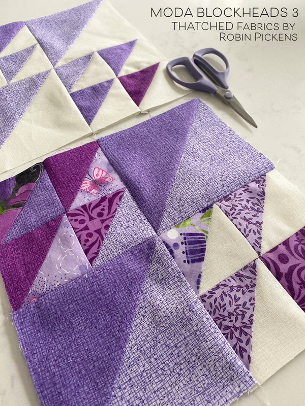
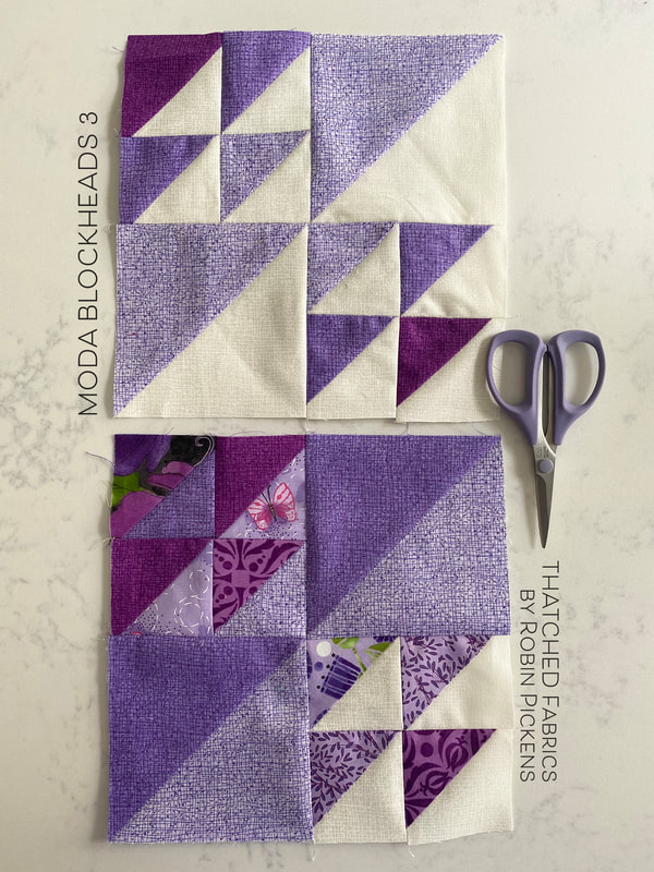
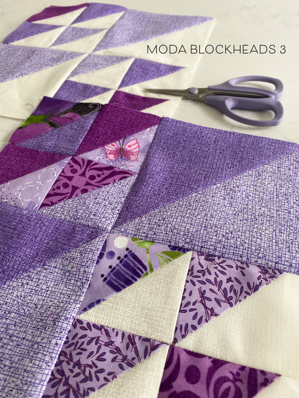
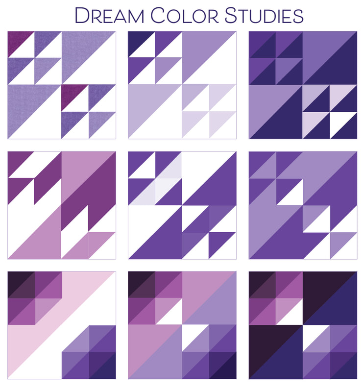
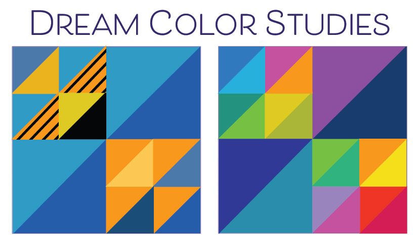
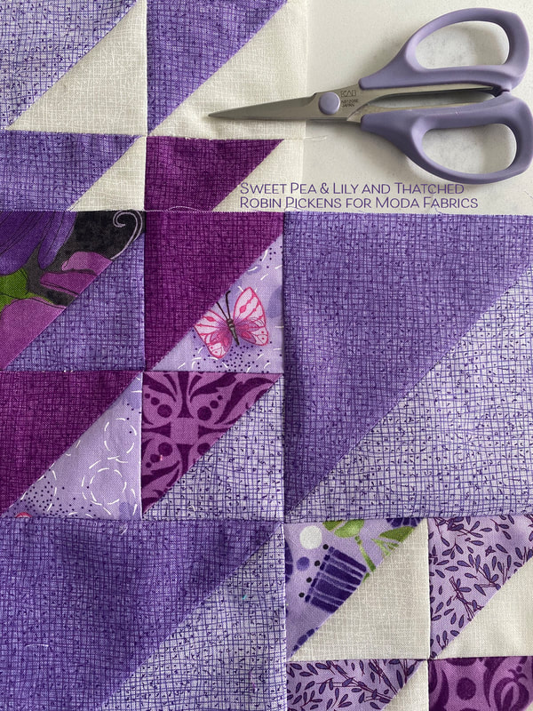
Robin This week I made my first PURPLE block for my purple row in my Moda Blockheads3 quilt! I love that the name of this block by Sherri McConnell is "Dream" since I think purple can be a dreamy kind of color. In the purple colors I used here, the darker Thatched purple and more plum-ish red purple color are both basics. The lighter purple was done specifically with my Sweet Pea & Lily line and I like this lighter background with the darker lines a lot. I'm hoping we can add a lighter purple to the basics like this! For some reason I was having a hard time getting my points to match up today when I was sewing. Some days are just like that. When that happens, I rip it out, and I re-sew starting right at the middle point where the points are meeting, going out to the side, then flip the block and sew the other half from that middle point (instead of from one side to the other). That usually will allow me to match those points meeting in the center better. For my Thatched with prints version, I used all purple fabrics from Sweet Pea & Lily and I was reminded how fun it is to do some playing in purples. This block is also fun because I could create some other shapes within the blocks by changing the light and dark placements in the half square triangles. Want to see some color play?? The first one is my initial color mockup and it is the one I decided to go with since it works well with the overall ratio of light to dark within my bigger quilt plan. The next one over is trying the colors all getting lighter as the triangles move from left to right. Then flipping to see how that looks on a dark background. In the second row, the large half square triangles make new shapes if they are the same color as the smaller HSTs. I keep seeing arrows in the one on the left if I squint my eyes. And the two next to it make me think of bowties. The angled movement is strong in these. The bottom row is more dimensional with the additional shades. Are they large angled diamonds...no, they are Amethysts! I am so intrigued by the darkest one and am wondering if perhaps another Dream block is in my future? But I had one other idea I HAD to try! Wouldn't it be fun to do a little pillow with fun golden fishes, kissing in the sea? I'd need to embroider on some little eyes. I also just liked trying this with bright, bold, summery colors with lots of energy. Thanks to Sherri McConnell for this versatile and fun block. You can get the pattern at her blog at A Quilting Life. And just a note about those purple scissors. They are made by Kai Scissors and are serrated edged and are great to use! Love them. And one more piece of news...CONGRATULATIONS JANE KIMBERLING! You are my winner for an ebook of Moda Blockheads 1 from Martingale Publishing! I've emailed you and I hope you love the book!
Check out my fellow designers for their Moda Blockhead posts:
|
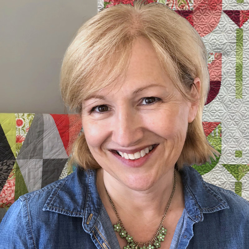
About ROBINDesigner of colorful florals for Moda fabrics. Modern to transitional quilt designer. Illustrator, sewist, crafter. I am proud to be a designer for Moda Fabrics!
Shop Robin's DesignsI am an affiliate for Fat Quarter Shop and may earn a small commission through my links. Thank you for your support!
Categories
All
Archives
February 2024
© Robin Pickens Inc. All rights reserved. No images may be reproduced without permission.
|
Proudly powered by Weebly

 RSS Feed
