|
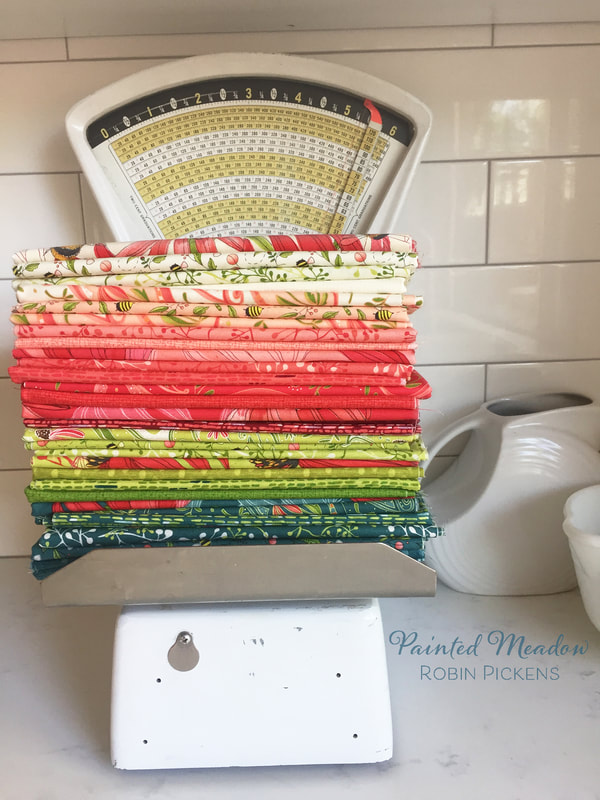
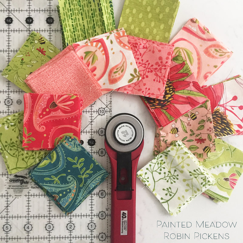
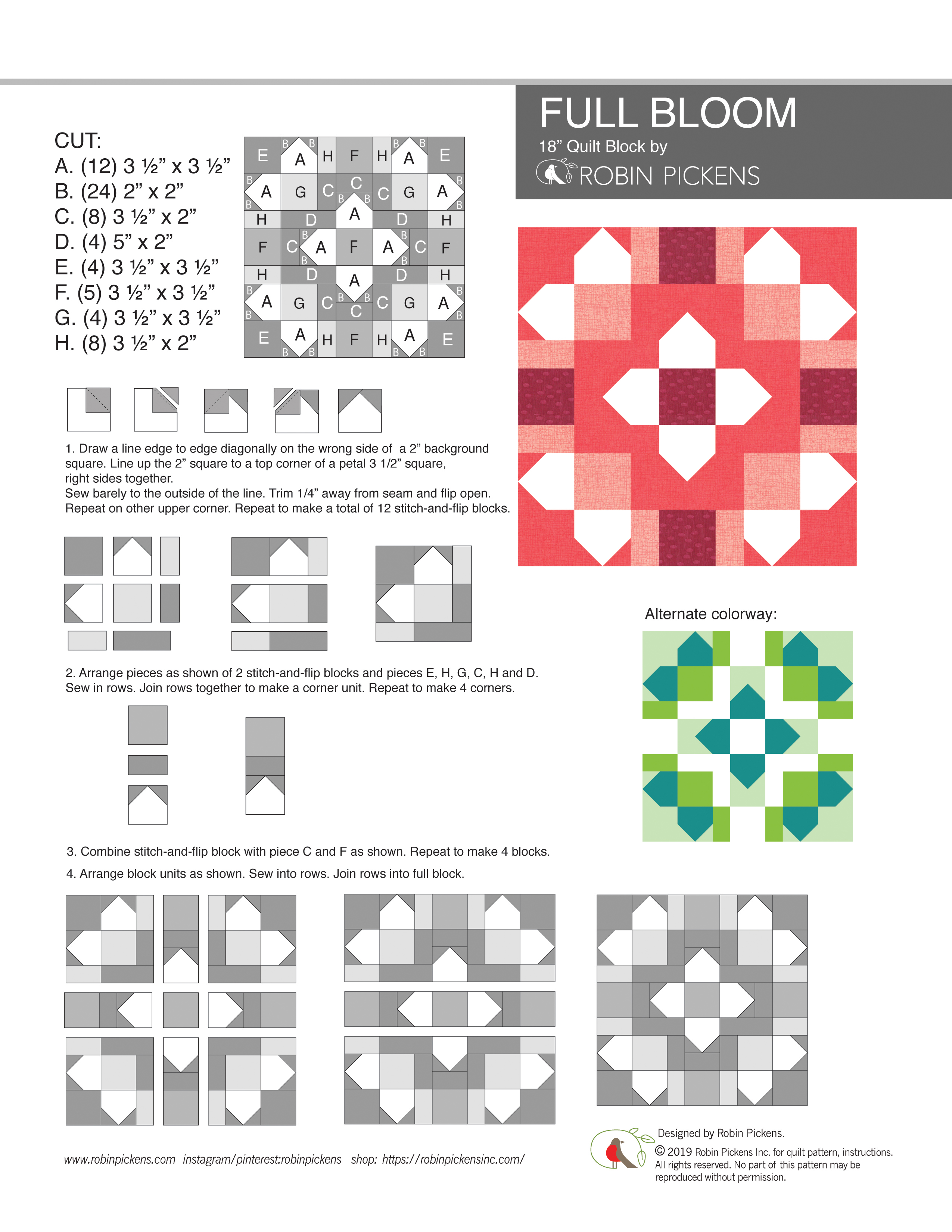
The Moda designers had a fun project for the Spring Quilt Market this year. A group of us designed 18" block patterns to give to local quilt shops to use during this National Sewing Month. 18 inches is a substantial size for a single block and leaves room to play with fabric and combine several shapes and sizes into a layered composition. 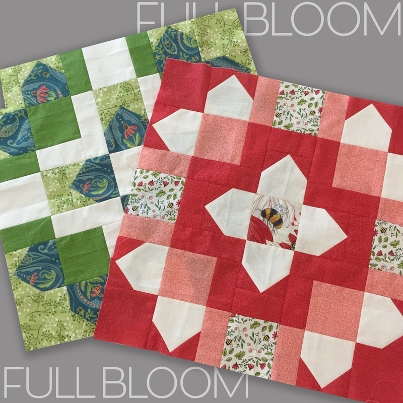 At the time of designing my block I was working on my Picket quilt with it's stitch and flip sides that make up the picket fence border around the quilt perimeter. I liked playing with this shape and how it also suggested flower petals, especially when grouped around a central square. I call my block "Full Bloom" because it reminds me of the petals in a fully open flower in a grand display. The petals are separated by sashings to give more definition and color play in your piecing while dividing the space in an interesting way. 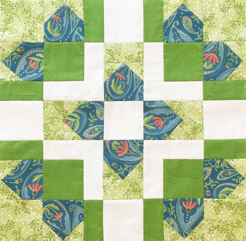 For a schoolhouse session at Market we showed our blocks. I made up two blocks using my new collection (shipping in October 2019) of Painted Meadow. Coneflowers in paisley shapes, textures, little sprigs, all make up the blocks in this composition. And I could not resist doing a little fussy cutting and making one of my fat bumble bees the center of a bloom. Perhaps this bee is looking for pollen in the center? These blocks are not quilted yet and I'm still deciding if I'm going to make pillows or work these into a quilt top. 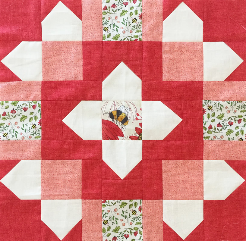 I like to experiment on the computer with the blocks and what it looks like made up different ways. With this block, the corners could be more valentine-like with hearts (like the top left image) and a hashtag center. Or maybe the center is surrounded by darker colors to set it off in contrast. Multi-colored blocks (lower left) have a different feel from monochromatic blocks that play with values of light and dark. 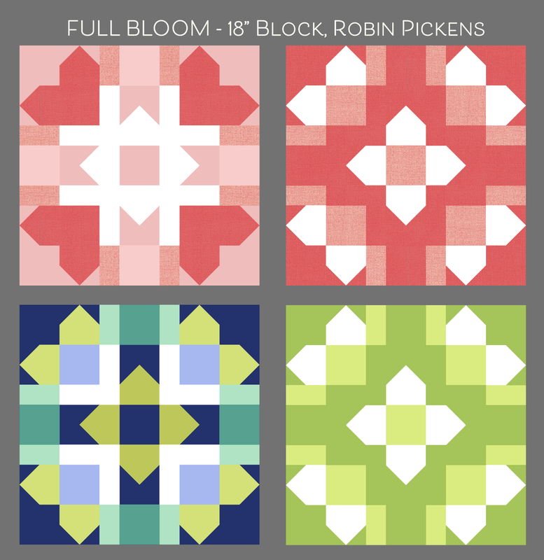 Studying what happens with light and dark values is interesting when you have all these rectangles that continue across the block. You can have mid-range tones that suggest overlap and transparency, or sashing lines that stay solid and strong. Some look like woven plaid. Others are radiating light or dark from the centers. I love the different look and feel you can get from one block with this play of light and dark. Wouldn't it be fun do do a monochromatic quilt just exploring these light and dark relationships? 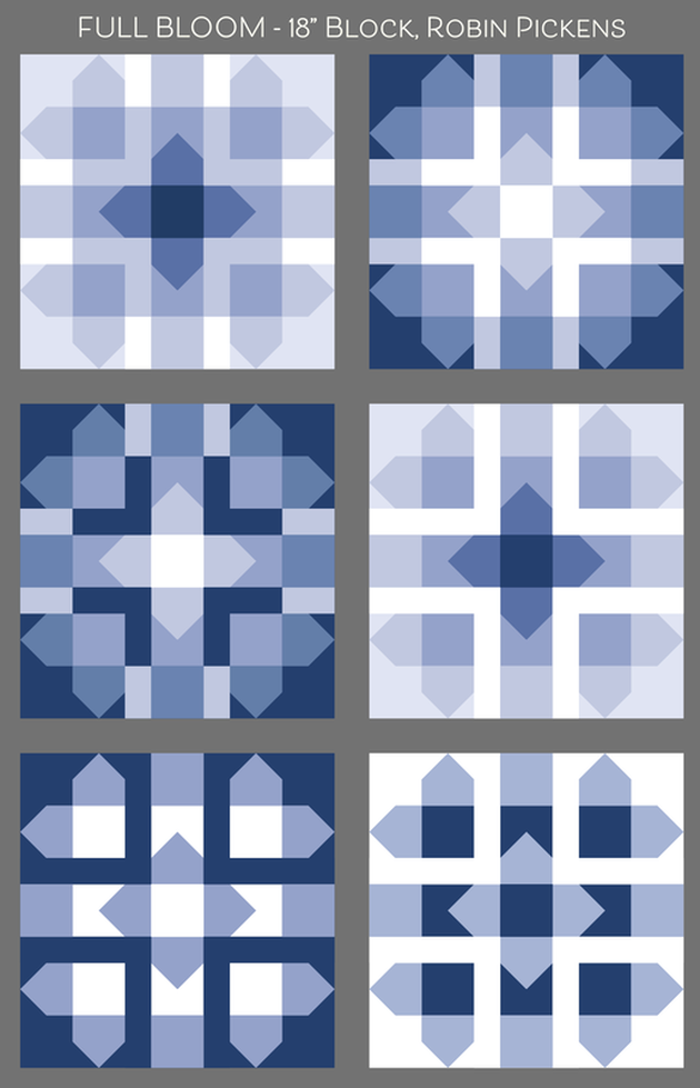 If you want to make a block with a big fuzzy bumble bee, like the one above, look for the Painted Meadow collection in October. Painted Meadow has corals, red, greens, teals and pinks. Or use solids with a range of light and dark values. Or go completely scrappy with enough room in those squares for some good fussy cutting. Whatever you make, I hope it is fully blooming and glorious! Click the blue "download file" for the Full Bloom pattern jpeg.
  Visit the previous designer's blog posts and the future posts to see more 18" block fun! Here is the schedule and links to their blogs: 9.23 - Lella Boutique and Sherri & Chelsi 9.24 - Kansas Troubles and Corey Yoder 9.25 - Crystal Manning and Me & My Sister 9.26 - Jan Patek 9.27 - Robin Pickens (me and here is the pattern!) http://www.unitednotions.com/blog_mi_KC2019_robin-pickens.pdf 9.30 - BasicGrey 10.1 - Betsy Chutchian and Lisa Bongean 10.2 - American Jane 10.3 - Kathy Schmitz 10.4 - Zen Chic and Deb Strain 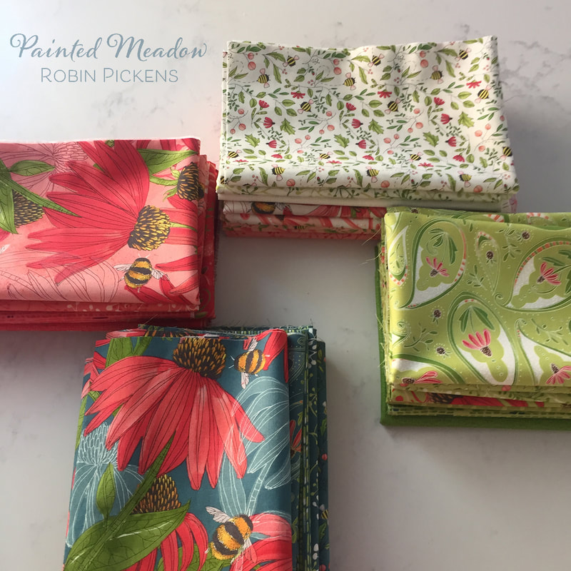 I'd love to see images of things you make with your blocks! Do you make a sampler with all the designer blocks? A table runner with a set of three or four? A pillow or mini wall quilt? Have fun sewing and share with us!
15 Comments
Sometimes I just like to sew. You know, the hum of the machine. The forward motion and progress. Adding piece after piece in a rythmic order and just getting into my zen place of calm at seeing rows of color and pattern coming together. KYOTO STEPS takes me to this zen place. 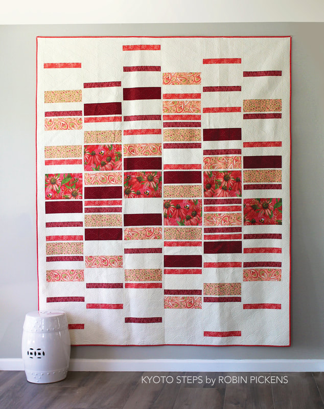 This quilt is easy to make- a logical cutting scheme and straight sewing- but still has a richness of activity and proportions. It is designed to allow some large prints to have a bigger block (yes, my common theme to show off my large florals) that are more centrally located. Then think of the other blocks as steps that skip and hop away from the center in light and dark. 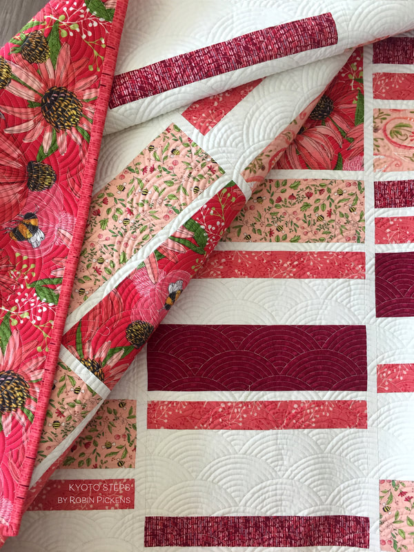 I just love the quilting on this one. I want to rub my hands over it and feel the texture of those fans! Marion Bott (@bottmarion on IG) did a fantastic job with adding the perfect layer of textural dimension to this quilt. The fabric here is from my Painted Meadow collection (shipping October 2019) and I made sure some of my fat bumble bees made it into the large blocks. I also put the large pink print with big Coneflowers on the back of the quilt so there would be lots of drama and excitement when you turned it over. 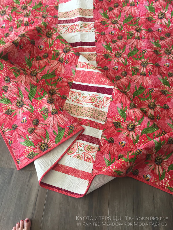 I must admit I really don't like making quilt backs. And I REALLY don't like trying to match a print on a seam when making a back. I'd much rather add a panel down the middle so I don't have to see an unmatched print and use some extra pieces of fabric I have. In this case I made another row of rectangles from leftovers from the quilt top and ran it down the center. I think its stays in the style and spirit of the quilt front and gives a fun interest to the back. 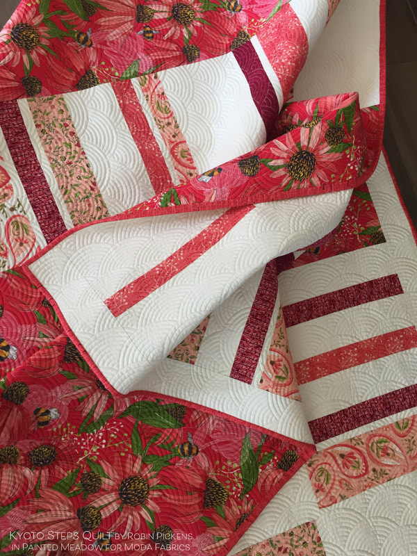 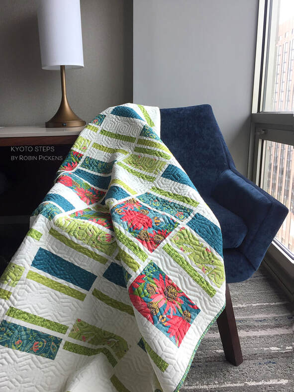 Kyoto Steps looks serene in these teal and green colors. This is a scaled down version of the quilt with slightly smaller rectangles. This lap version still gives plenty of room for a big print to shine while playing with those rhythmic rectangles. Sally Corona (@coronaquiltworks on IG) quilted this one in fabulous hexies. Quite a perfect shape with this chair! 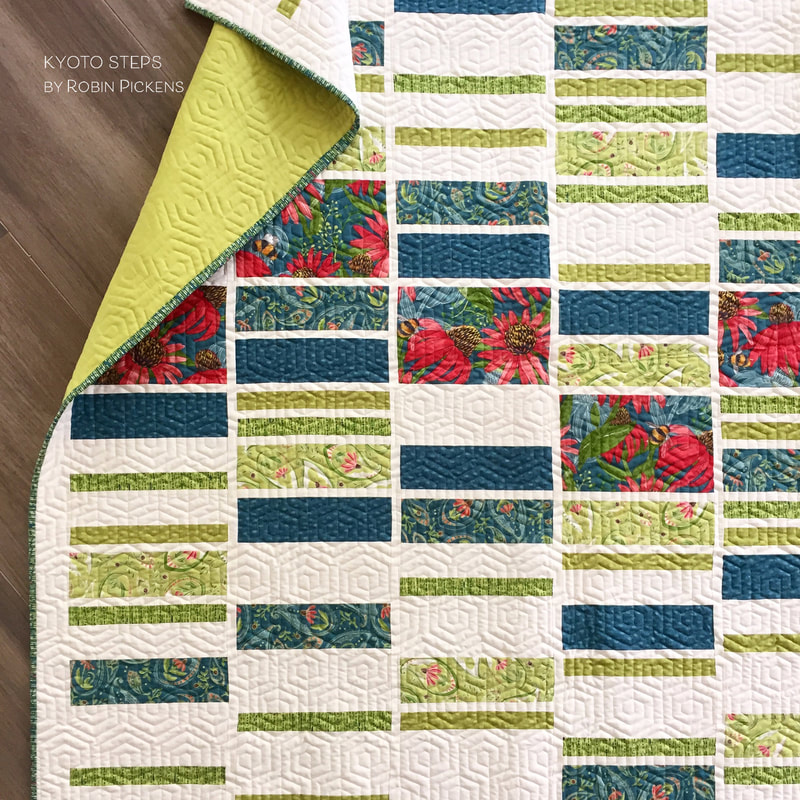 For this quilt I chose a Moda Bella Solid for the backing- I believe it is Pistachio. I wanted to keep it serene and calm but with a pop of color! I like the way the painted lines coordinate print in the Painted Meadow collection make a good binding with subtle stripes of teal, green, deep red or saturated pink color families. 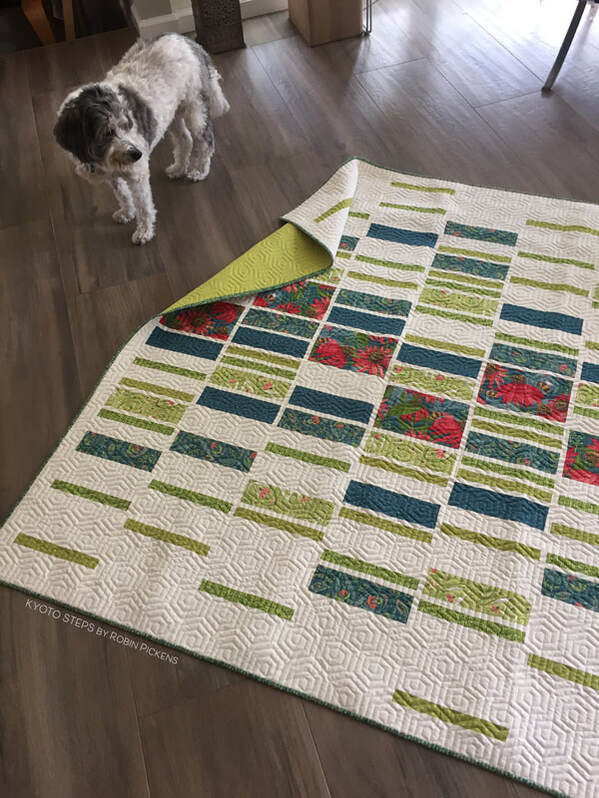 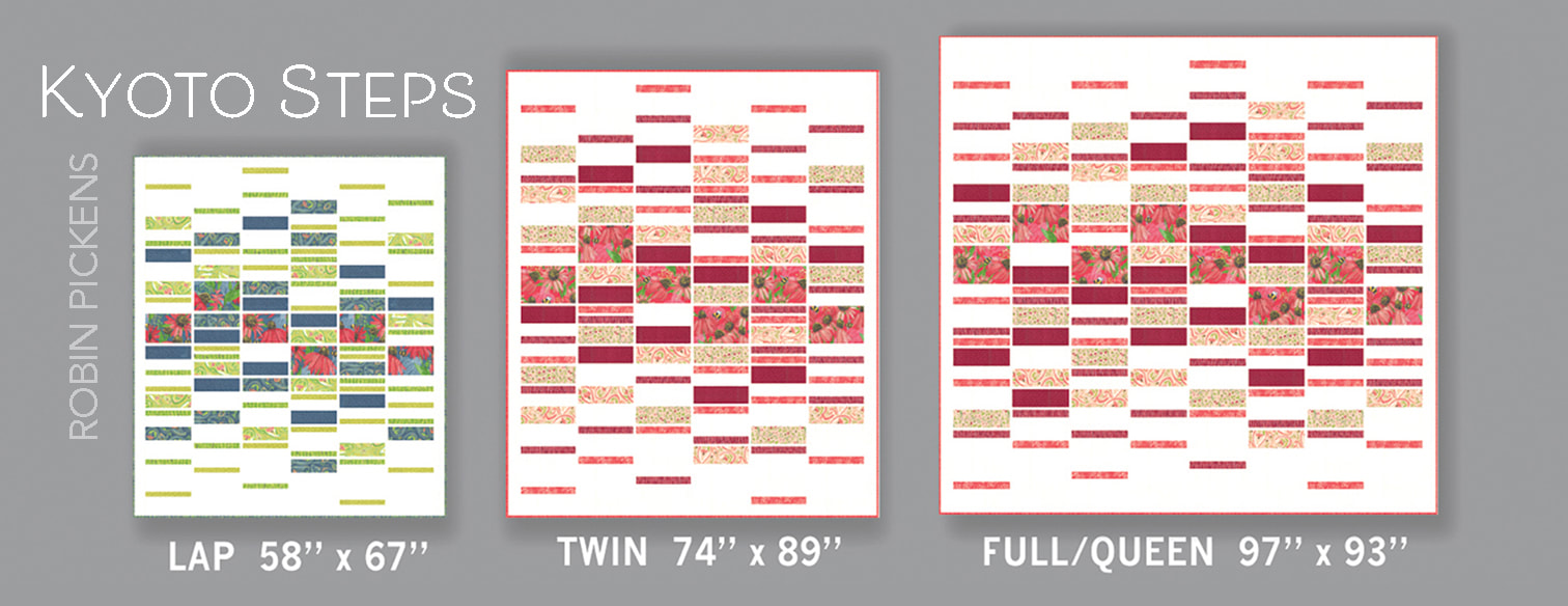 KYOTO STEPS is written for three sizes- Lap 58" x 67", Twin 74" x 89", and Full/Queen 97" x 93". The placement of the rectangles is diagrammed out to make it easy to replicate this spacing of blocks. The quilt is made with 6 half-yard cuts plus background if you are making the Twin, mostly 1/3 yard cuts for the Lap (but get 1/2 yard if your main print is directional like mine is) and a mix of 2/3 and 3/4 cuts for the Full/Queen (also adding background yardage to the Lap and Full/Queen). If you want to make this in a scrappier way, you can use mixes of Fat Quarters for your pieces. If you are using a Layer Cake, the scaled down size of the Lap will work for those 10" pieces. This quilt is suitable for more beginning quilters.  You can find KYOTO STEPS along with other patterns from the Painted Meadow release at my shop and the patterns are shipping to local quilt shops with the fabric collections!
The original inspiration for this quilt was a caned back to a chair I saw at a yard sale. I thought it would be fun to replicate that woven look with center octagons in fabric. As I was laying it out, the design was becoming a bit too busy and challenging. It needed simplification so the lines did not compete with the prints on the fabrics and so I wouldn't tear my hair out! My happy ending place was this center part of Picket, with white triangle corners meeting each other, suggesting the continuation of line and an almost mosaic-like feel. 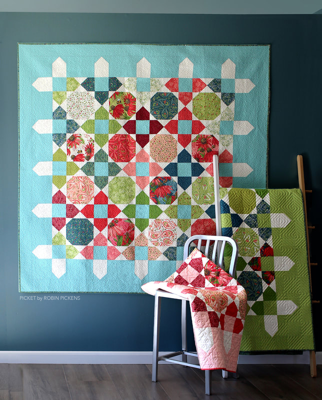 As I was playing with the shapes, I loved how the triangles played together and with some of my diagrams, the flying geese ends started to make their own statement. By lengthening the strips, they suggested picket fence posts (but not too long to be overly literal). The pop of white against a colorful border gave that additional chance to set the mood with color. 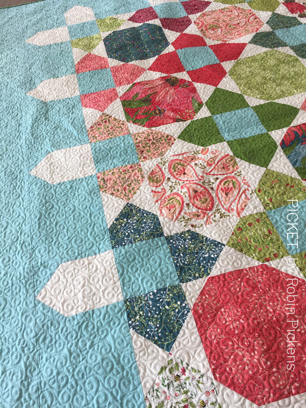 Picket is designed to be made with either a layer cake (or any mix of fun scrappy 10" blocks of fabric) OR with fat quarters. I like using the fat quarters to get a good mix of fabrics but still have repeating prints and to select my fabrics to tell a color story. The two lap quilts here have color themes of pink/coral/red and blue/green/teal. They have such a different feeling based on the warmth or coolness of the fabric colors. 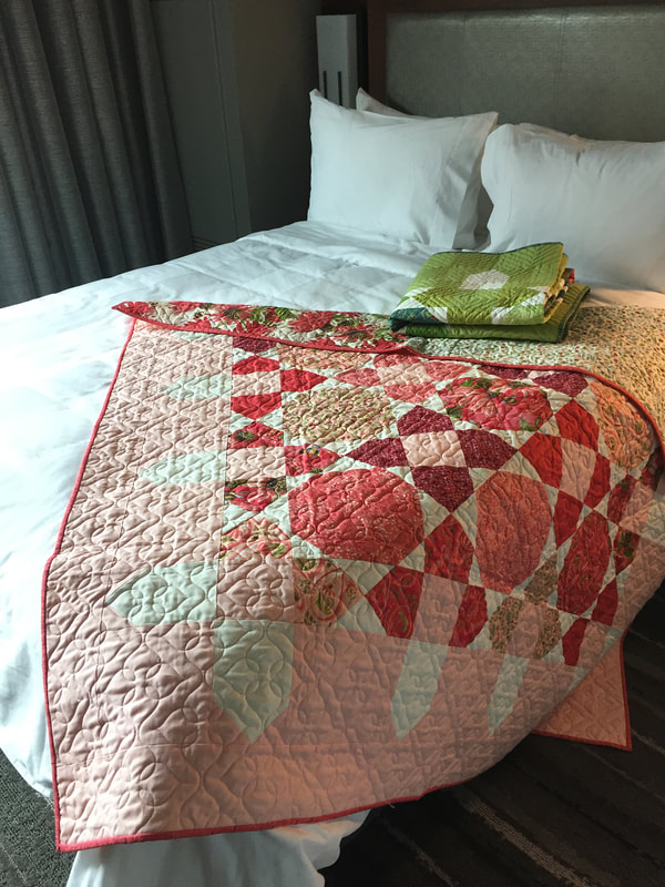 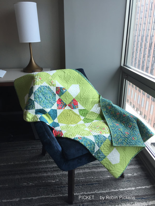 For the layer cake version of Picket, I auditioned quite a few colors for the border and centers of the X blocks but I kept coming back to this Moda Bella Solids Spray color. There is something so fresh about it and I loved how it popped with the teals and greens and reds. 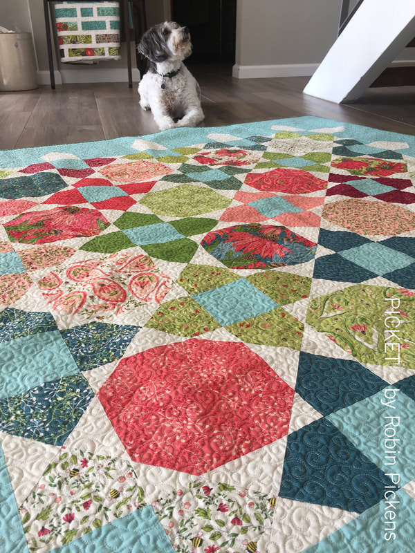 The quilt is made up of Snowball and X blocks, set on point. It's really pretty fast to make once you get in the groove of the blocks. I make up all the Xs, all the snowballs, then play with arranging them. Then at the end, I get to enjoy my colorful garden all surrounded by my picket fence. 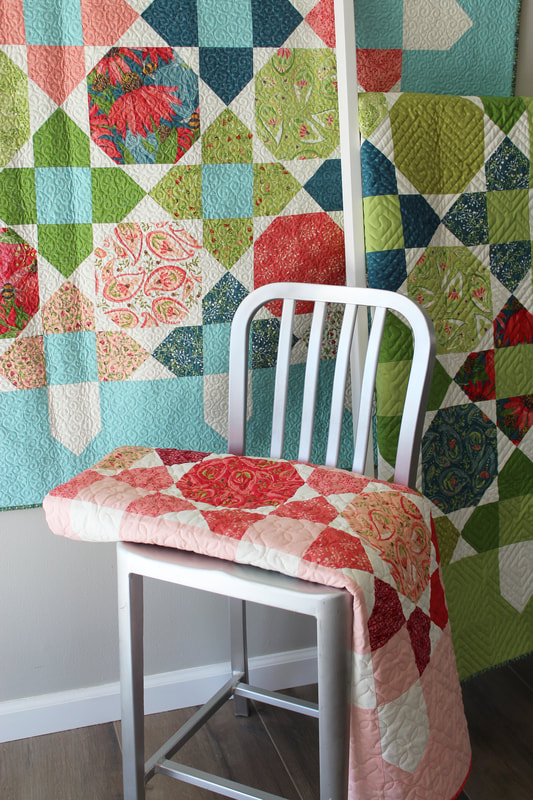 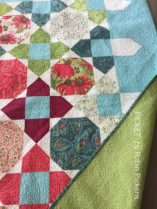 I'm so happy to have had a lot of helpers on these! The large quilt was pieced by Susan Vaughan @thefeltedpear and was longarmed by Marion Bott @bottmarion. The lap quilts were pieced by Danica Willig @danicawilligdesigns and longarmed by Sally Corona @coronaquiltworks. Check out more patterns made with Painted Meadow (and yes, Painted Meadow is shipping to shops in October 2019 from MODA FABRICS!) at my shop! 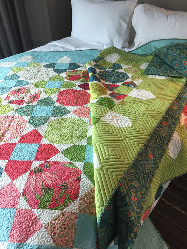  Chunky leaves in curved friendly shapes with graphic triangular blooms. Say hi to Beanstalk! This is a leaf/vine quilt made with Painted Meadow fabrics. The selection of fabrics and instructions use fat quarters for the leaf and bloom prints. The green stems and background are indicated as yardage. 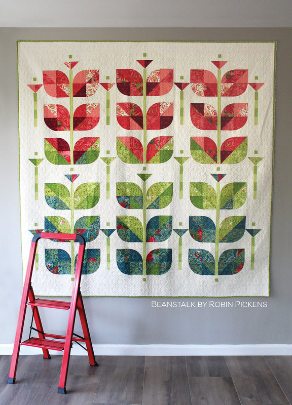 I wanted some growing, garden themed quilts. Beanstalk and my Picket quilts were a direct reflection of the desire to marry plants and quilts. 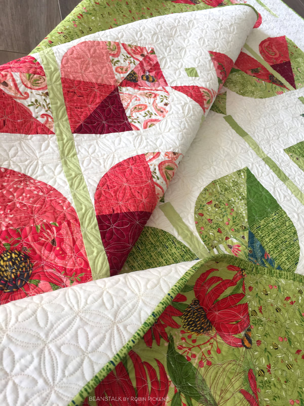 Beanstalk has chunky, curved leaves made with 4" radius quarter circles (8" full circle size) that make the gentle sides of the leaf shapes, meeting half square triangles to finish off the leaves. You can play with the leaves by putting all dark colors to the bottom for a more shaded look or doing scrappy piecing with color and light/dark values. 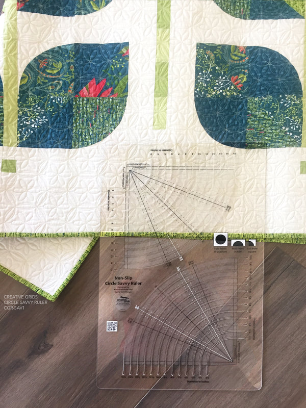 The Beanstalk pattern comes with a paper template to make the curved blocks. However, I made the blocks for this sample using the Creative Grids Circle Savvy Ruler and I recommend it! Cutting circles with a ruler like this makes them so accurate and easy to sew together. I also have a number of Drunkards Path and quarter circle rulers in different sizes and one of the reasons I like this Creative Grids one is that it has ALL the sizes I use in one ruler! I can design with it, try different sizes with it, and translate a pattern for applique vs piecing with it too (different sizes minus the seam allowance). 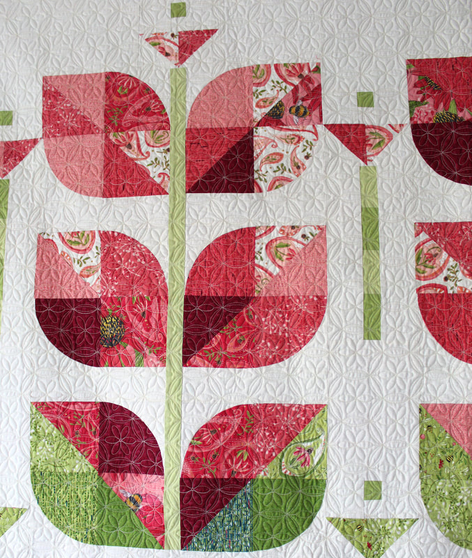 When I started the plans for this quilt, I thought I would make it in only green shades for the leaves. But then I mocked it up with the teal and red shades and loved the graduation amongst the color families. It reminds me of fall and changing leaf colors. I think the reds add a lively touch! 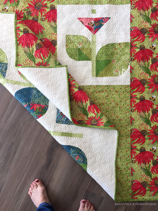 Because I try different blocks to figure out my sizing, I usually make a variety of sample blocks. It seems like such a shame to waste these so I try to incorporate them into the backs of my quilts when I can. For this Beanstalk quilt, I used leaves that were too big and too small and a larger bloom as a pieced block in the center of my backing. 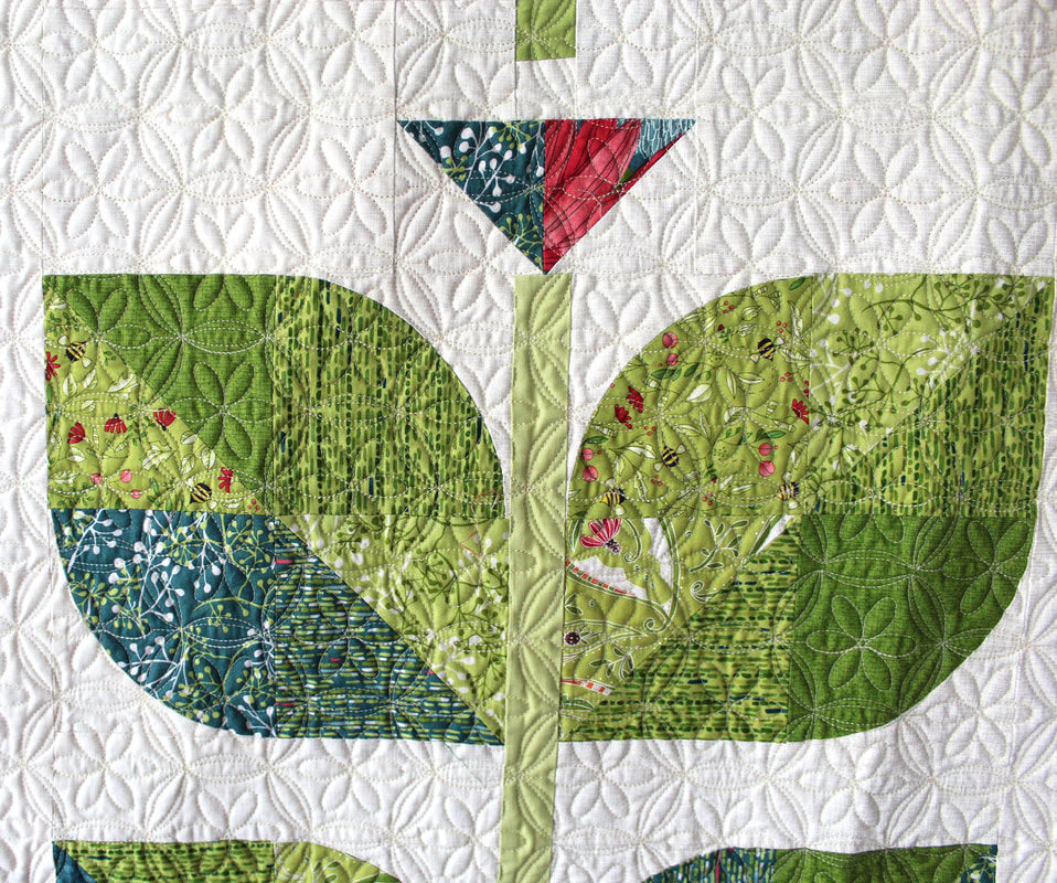 This quilt was longarm quilted by Marion Bott and the pantograph is a Sand dollar design. I love the pretty flower shape and the orange peel structure of this design. It makes such a lovely texture on the quilt!  I'm trying to decide what Beanstalk quilt will be next- one from Thatched basics? One with grays and muted colors? I'm not sure but I'm looking forward to planting a new Beanstalk! Visit my shop for this pattern and more that are made with the Painted Meadow collection from Moda Fabrics (shipping October 2019 to quilt shops). Happy sewing!
When I saw the Kinship Fusion Sampler created by Gnome Angel and Skyberries I knew I wanted to try it in Thatched fabric, my new basics line coming out with Moda Fabrics (shipping in November 2019). I was wanting a color-play exercise that used a limited palette and a select group of the fabrics. I like this line for fillers and backgrounds, but they deserve to hold their own in a quilt sew-along! 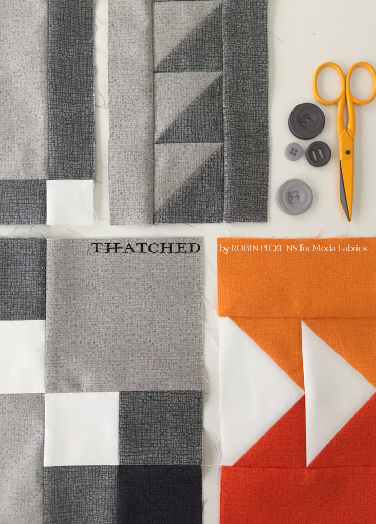 I love the modern feel of many of the blocks, playing with geometry in often asymmetrical layouts. I thought the woven illustration of Thatched would work well to add just a little depth to the blocks. 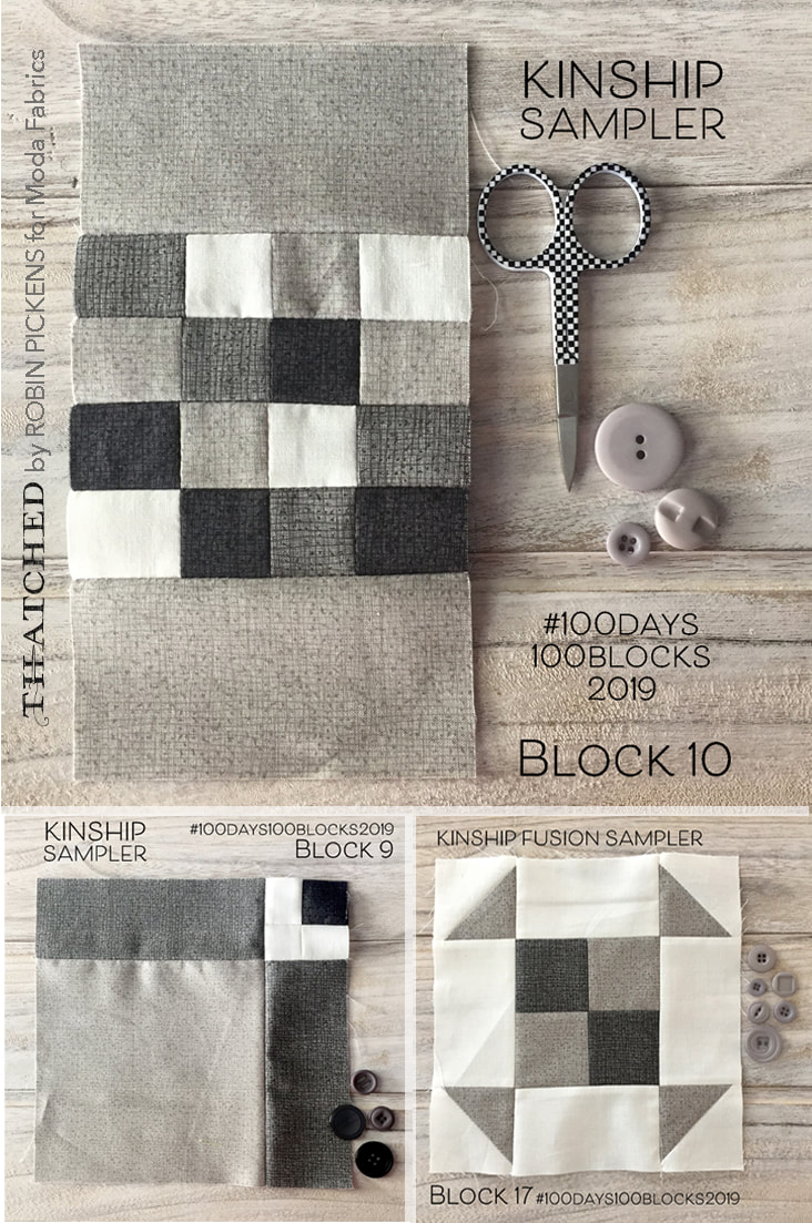 I actually jumped in about a week into the sew-along, which is typical for me. I WANTED to do the sew-along but I get distracted and think I don't have time to add ANOTHER project. But then I see people posting on instagram and I can't stand it anymore and jump in late. 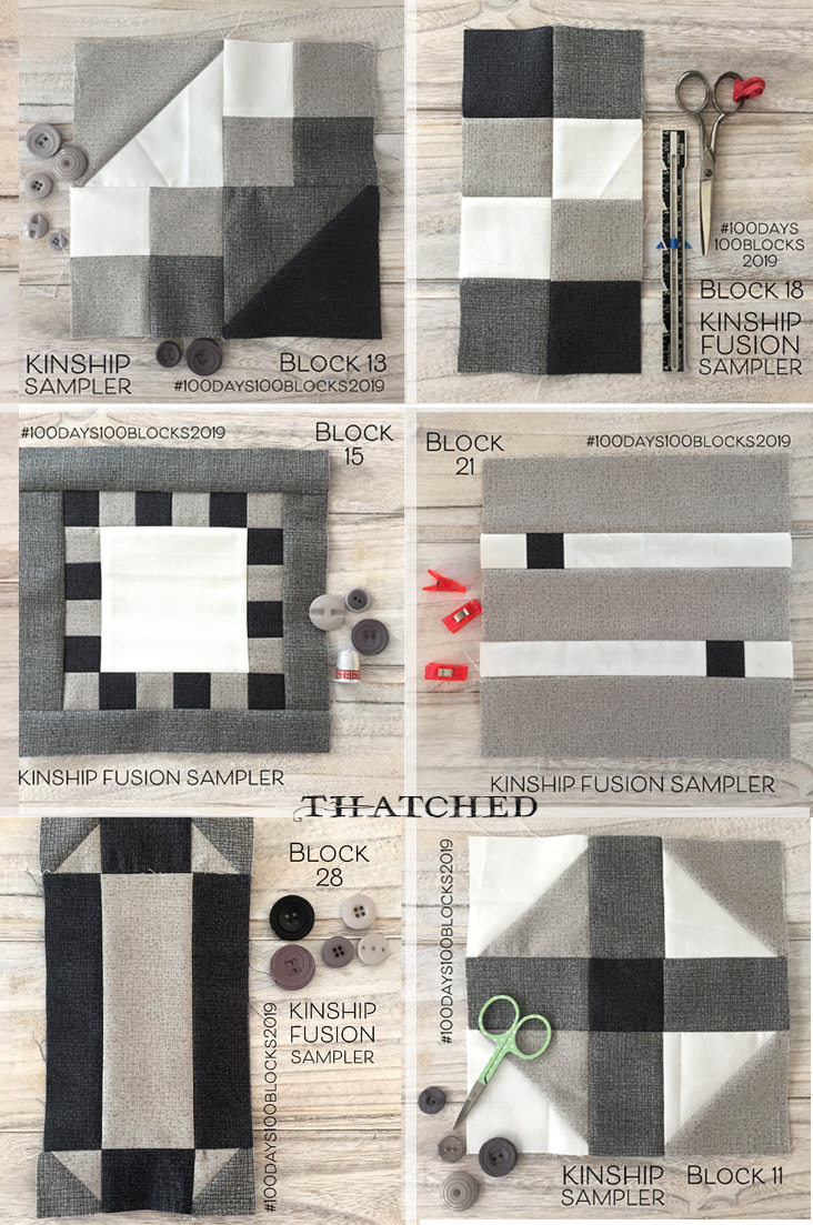 My original plan was to make the quilt in mostly grays and white with a tiny pop of color. Maybe just the heart block in orange? I selected three grays from Thatched to use- the Gray 85, Pebble 24 and Shadow 117, giving me a light to dark range of grays. There are actually 5 grays in this first release of Thatched but I wanted to keep it simple. I've never made a black and white quilt before or a black, white and gray one, so this was a new exercise in restraint. 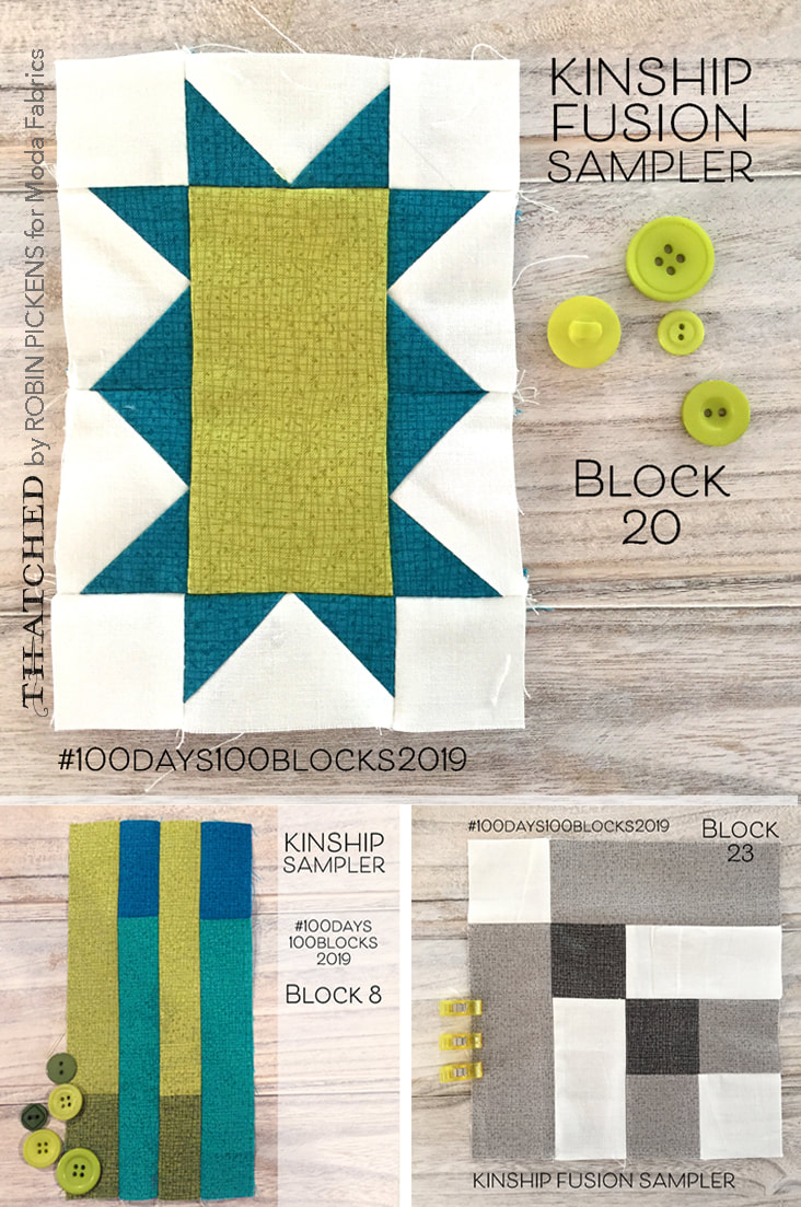 fBut I guess at heart I am really a COLOR GIRL and I needed more than just one pop of color! I loved the idea of just orange with the quilt, but the addition of greens to the mix felt so much more appealing and fun. I really like how the combination of Chartreuse 75, Sprig 14, Peacock 77 and Turquoise 101 play together. It was a tough call to decide if I should add the dark green Pine 44 to the mix but I left it at the original four greens. 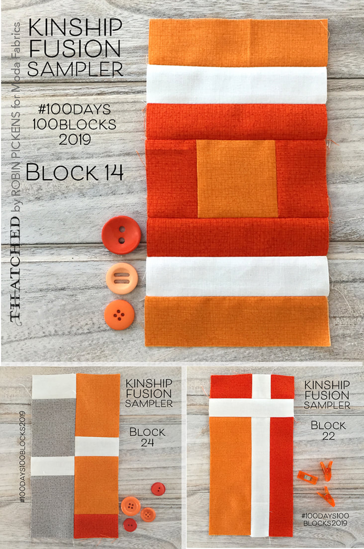 For the oranges I used Tangerine 82 and Apricot 103. Again, tempted to add more with Maize gold but I pared it back. Every time I use the oranges it feels like a jolt of orange juice waking me up! 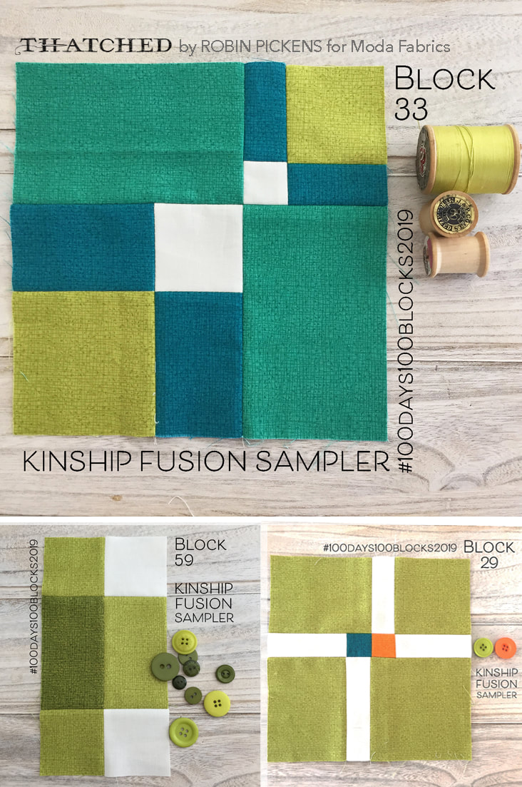 Usually I keep the color story of greens or oranges within a block but once in awhile, one escapes and jumps in another color block! Quilt block 29 is an example of that with it's little orange square. And block 82 with one orange corner to liven up the group! (And yes, sometimes I go out of order and make some of the later squares in advance if I have the right pieces cut) 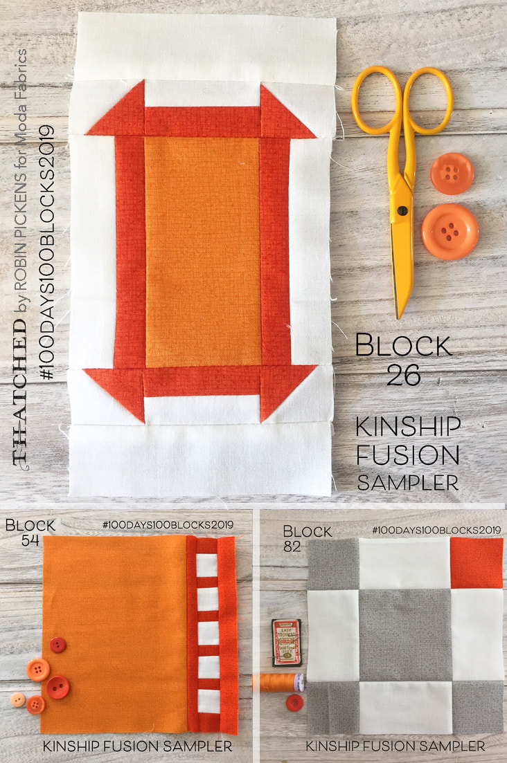 When I got to day 25, I layed out what I had on the floor to get a feeling for them all together. For the planning of this sampler, I used the coloring sheet that Gnome Angel has on her blog at https://www.gnomeangel.com/?s=colouring+sheet. It was tremendously helpful in planning and playing around with the colors. You need to purchase the pattern to get the coloring sheets and I am not posting my colored in one since that would be a violation of the pattern copyright. 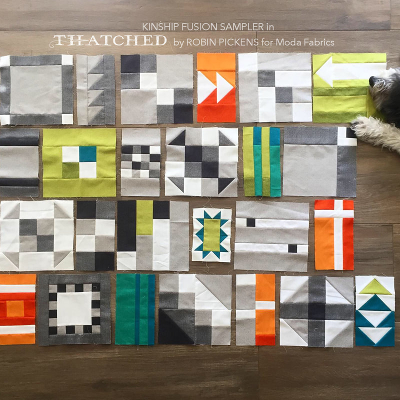 Yes, my helper was involved and let me know she was bored of this whole thing. 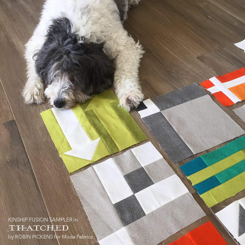 There is one thing I wanted to mention about this particular pattern for a sampler. I really appreciate that the sizes of the blocks you cut are very consistent so it is efficient with fabric and makes it easy to precut pieces. For example, a lot of pieces might be 2 1/2" wide so you knew that by cutting that size strip, it would be utilized for a lot of smaller pieces. I could go through and count out how many pieces I would need at certain sizes or how many flying geese were needed at the same size and then make them in bulk. This really cuts down on time and makes it enjoyable to move through the blocks faster and with more efficiency and economy. I thought it was a very smartly planned out sampler that way! 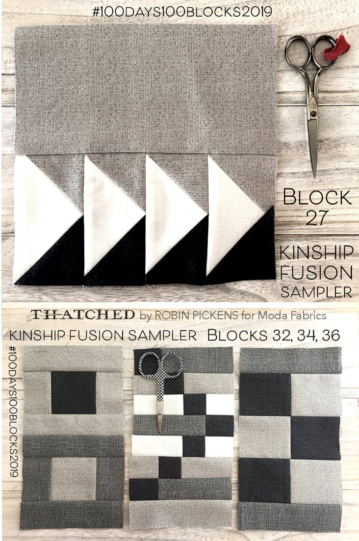 I have been loving the blocks I've been seeing on instagram from other people sewing along. I particularly love seeing some of the fussy cutting and cute fabrics. It is a different feeling to do a sampler with a limited palette and limited fabrics and I like the new muscle that is flexing in my mind to explore the contrast and color relationships. I like how clean and modern this feels to me. But I can't lie, a part of me wants to just throw one of my big flowers into one of these blocks! 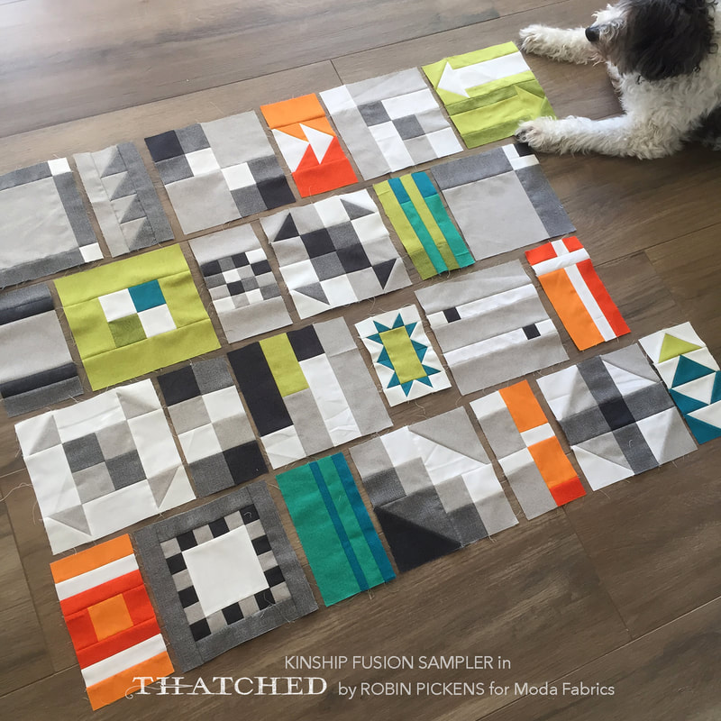 I'm guessing the next time I share these blocks on the blog I'll be done or at least close to done. Follow me on instagram to see more progress with the Thatched blocks at @robinpickens. Follow along to see all the great blocks on instagram with the hashtag #kinshipfusionsampler or #100blocks100days2019 and thank you Angie @gnomeangel and Bec @skyberries for a great sewalong! (Also, I am dying over Bec's blocks made with Heather Ross fabrics- fantastic!!)
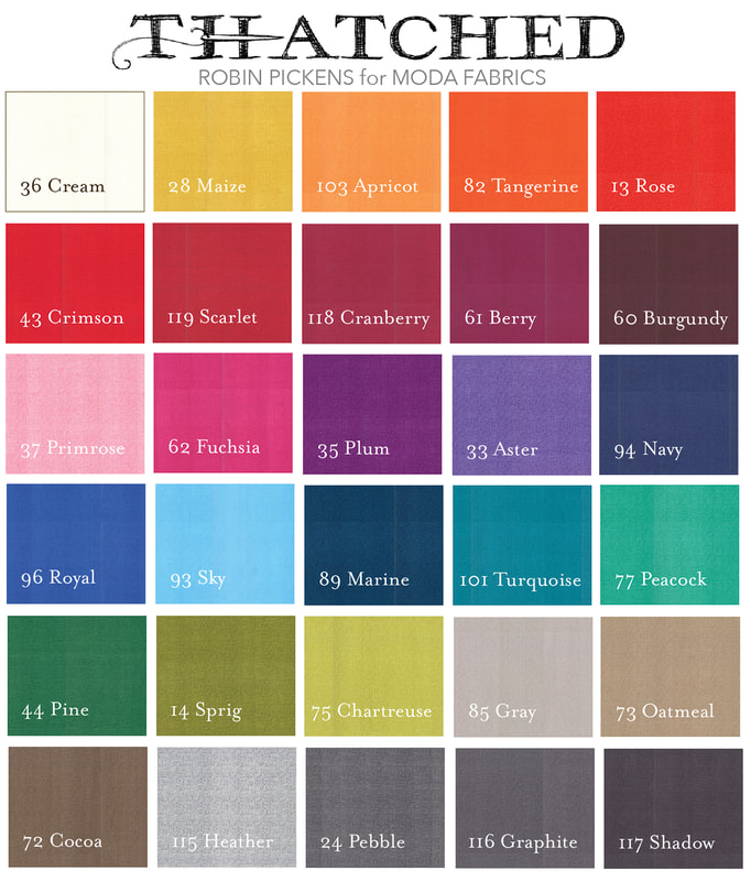
I like to pair bigger prints with some solids for balance. But does that mean all solids are flat? Calm and rest for the eye can still have subtleties of design and texture. There is something so enjoyable in a little tonal and linear variation that brings interest and depth, like the character of a hand drawn line. It is in this drawn texture that I think of threads coming together to create "Thatched." 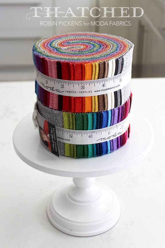 Thatched was hatched (ha, ha!) a number of collections ago, as a coordinate for Dear Mum. The little woven drawn lines became a texture print in gray, warm red, green and the Robin's egg blue. It blended so well it wove its way into the next collection, and the next. 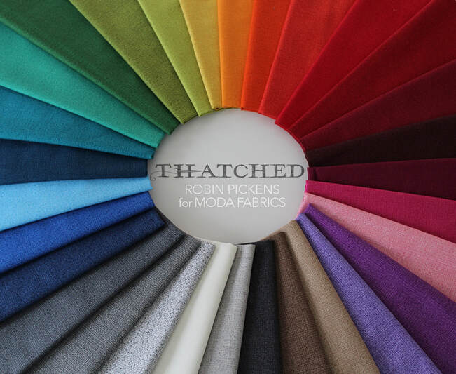 Now Thatched is ready to claim its place as a basics line and make its OWN color statement. Colors have been added to round out the palette to include browns, blues, oranges, burgundy and Berry. 30 prints of luscious colors.  Perhaps you keep Thatched as a subtle texture print to balance out your larger prints and be a background fabric or blender. Or you may decide to play with the combinations and relationships of color families and groupings in color studies with saturated splendor. 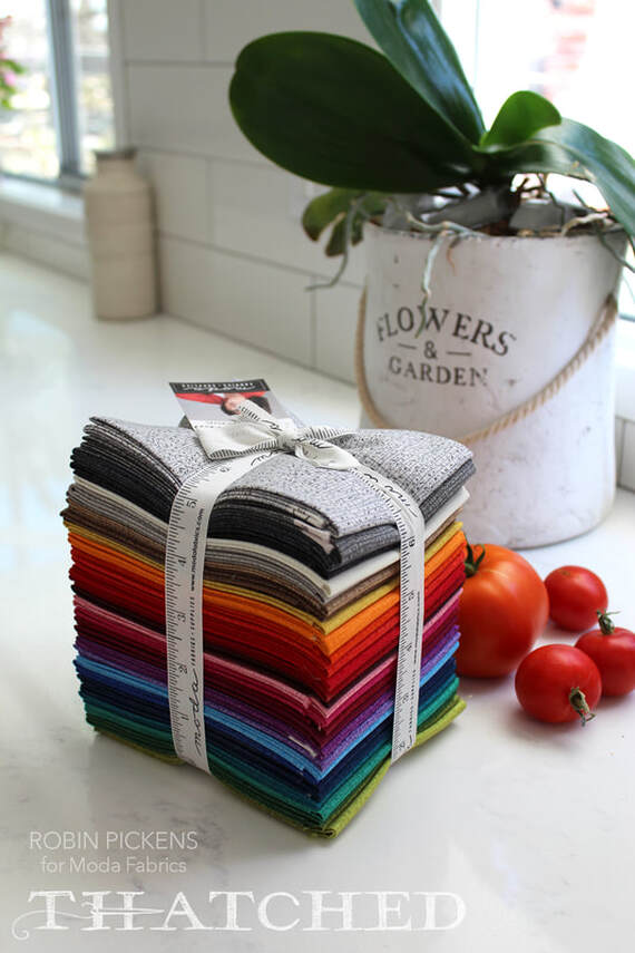 Let your world of color mix with the texture of drawn line, the feeling of linear weaving. We are, after all, makers. We have interwoven lives and notice the small textures and details that make life richer. 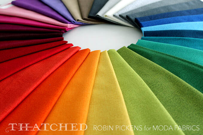 Lean in and notice the detail. Rejoice in the imperfections. Drink in the saturated colors. 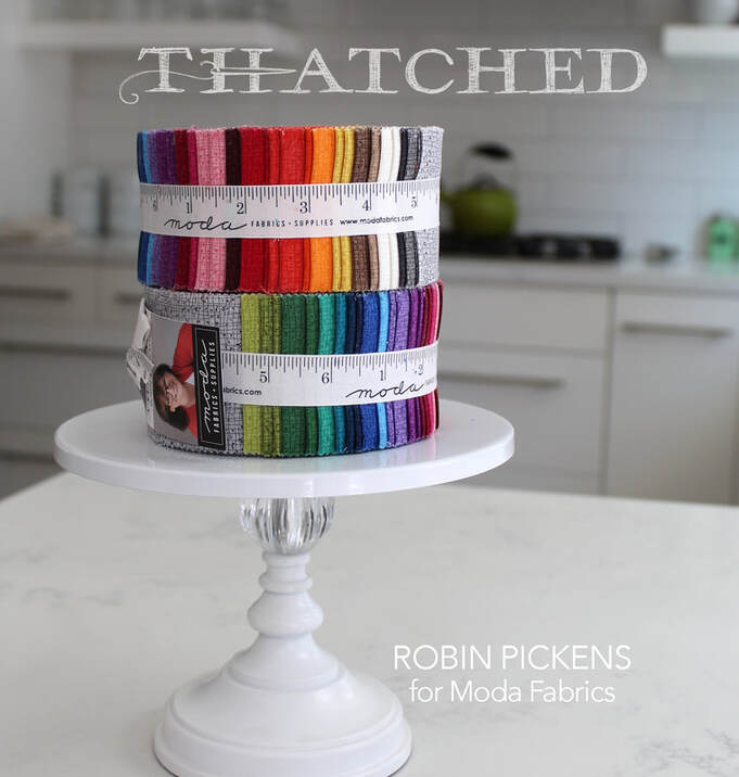 At my conference table (the kitchen table!) the ring of color commands presence in the space, singing out a rainbow of song. 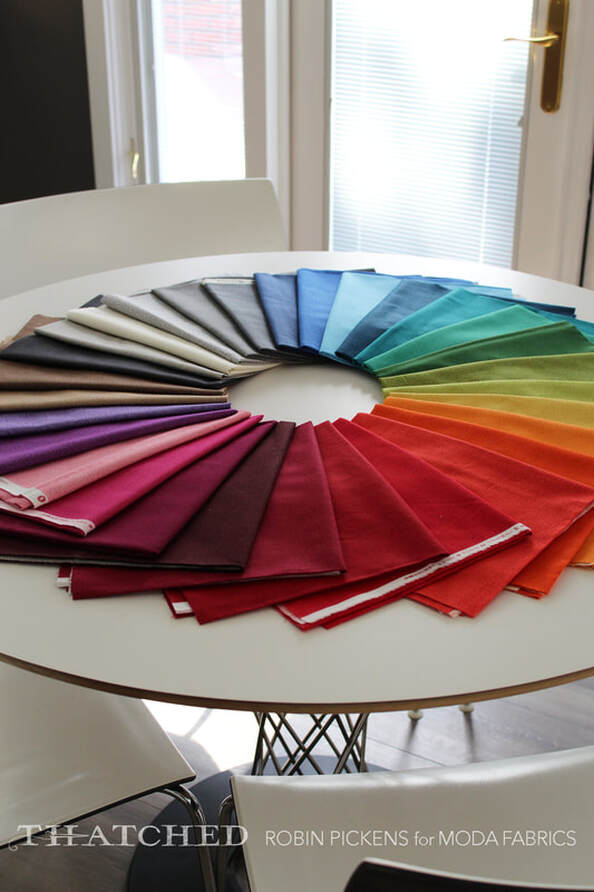 Enjoy the blues of Navy, Marine, Sky and Royal. Dark to go with denim. Light to brighten like the sky. Blues blend into greens and teal shades. Moody, pretty blues. Grays that are warm and cool, speckled and subtle. Reds that are deep and dramatic or bright and cheery (and yes, the Crimson and Pine of Splendid are in the basics). 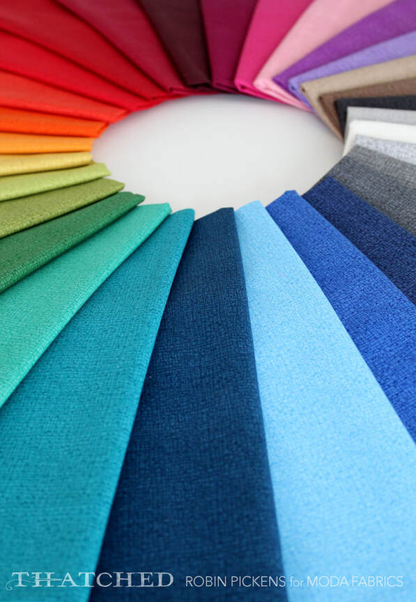 Drawn line in color tones with the character and heart of handmade texture. 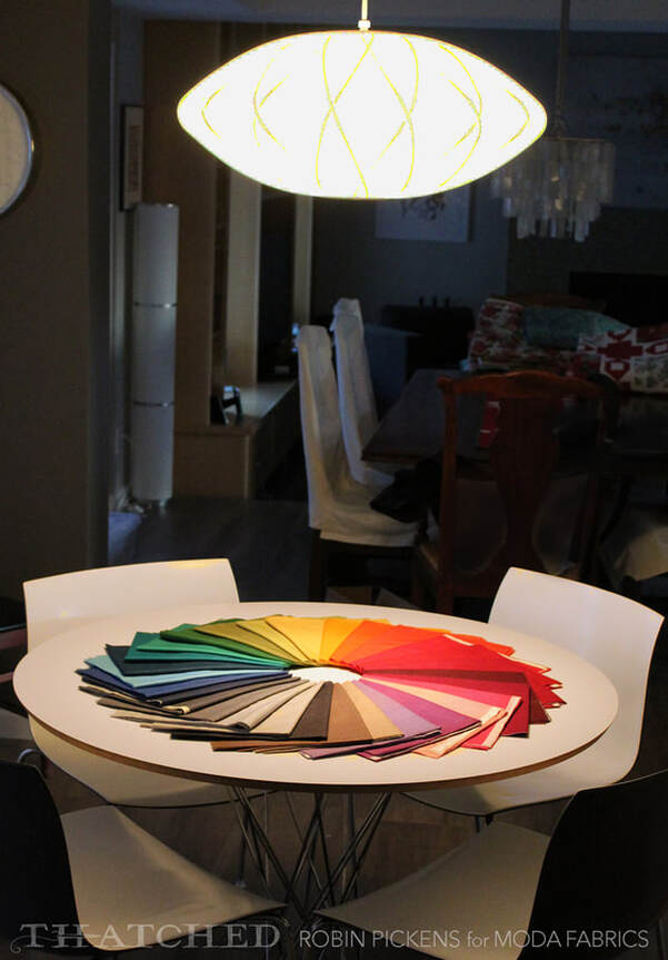 The ring of color is almost luminous under the light as night time falls. I will clear it tomorrow. For tonight I will sleep with rainbow dreams...
Hop on over to youtube to see Jennifer from Shabby Fabrics do a tutorial of a festive Christmas Tree Farm Table Runner!  She used a pattern that Moda Fabrics had and allowed her to share. The trees are red and green on one side and white on the other- a fun reverse effect of background vs foreground. Of course I'm really thrilled with this particular table runner since she's showing it in Splendid fabric!! 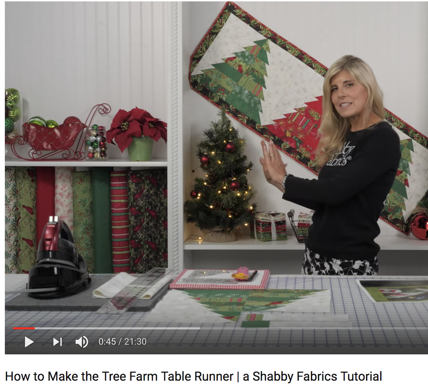 Along with the Splendid collection there are pops of red and gold star bursts in Grunge fabric as well as with white and star bursts on the background white. I loved seeing how these trees came together in two sides with the strips! 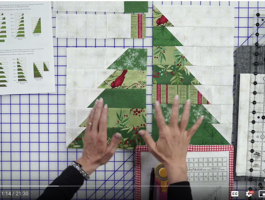 If you are interested in Tree Farm Table Runner kits, Shabby Fabrics has a few available at their store! The download link for the free Gina Martin pattern (17.5 x 51.5") offered through Shabby Fabrics website is https://www.shabbyfabrics.com/Assets/Downloads/TreeFarmTableRunner_forDownload.pdf Happy holiday sewing! 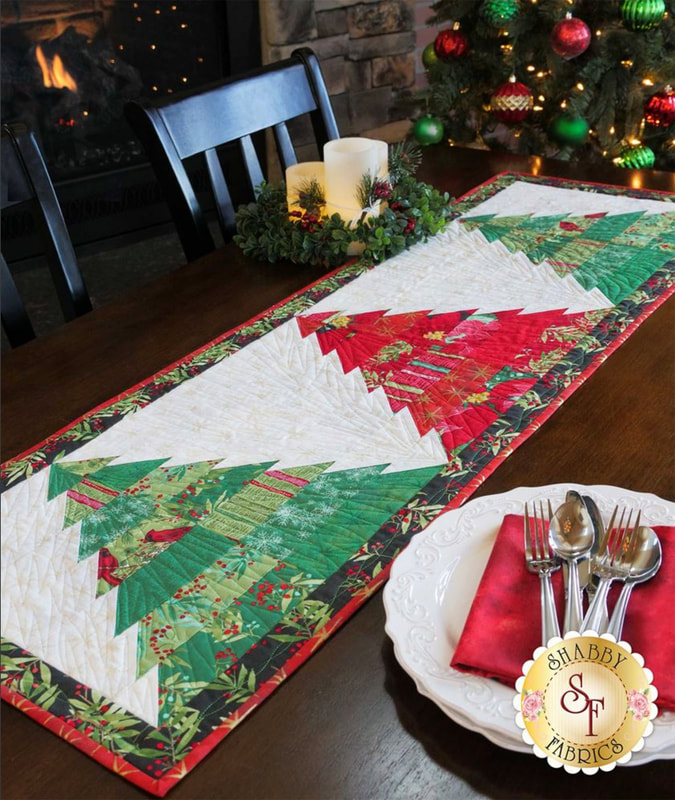 A quick catch-up on some Moda Blockheads2 blocks. I have learned so much while doing these blocks! I tried triangle paper for the first time (and liked it!) and I stretched myself with smaller piecing on some of these than I normally do. With every sewalong I do I feel my skills become better. I start to think more efficiently when I look at instructions and question if I can make more of the blocks in a different way (like making Half Square Triangles in the 8-at-a-time method). This first one is Sherri McConnell's block "Vintage" and I used a bunch of scraps I had from earlier blocks from my Dear Mum collection. I am pretty pleased with how this one came out. I don't have that much experience doing Quarter Square Triangles so this was good practice!  This was the alternative block designed by Corey Yoder called Rainbow Vine. Mine is not a rainbow but does have a variety of green leaves. I liked how quickly this fun block came together. Now I think I need to make sure the block above in my arrangement has a design that suggests a flower bloom! 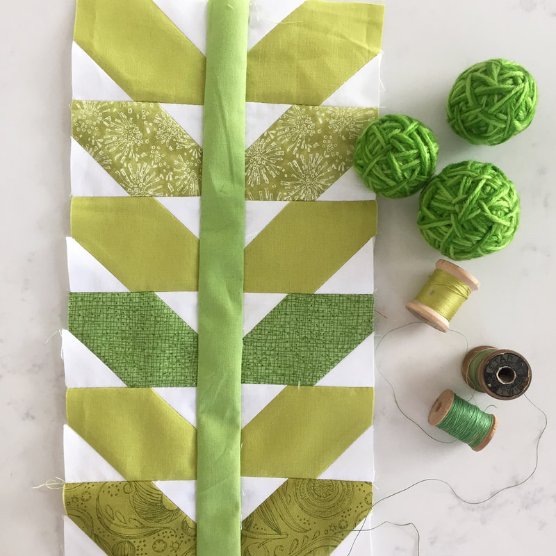 The next block is a larger 18" one and is designed by Betsy Chutchian. Feels good to get this one completed and I really like this pattern! I used #poppymaefabric and #blushingpeonies . After making a big 18” block like this I needed to do a small one next! 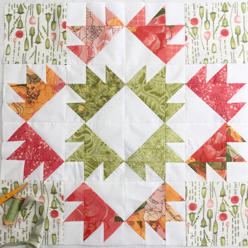 And last one to share today is this block designed by Corey Yoder. Its called Dainty Blossom and is an alternate for the Block 48 which was originally designed in applique. This is so cheery! 12 inch block with a big blooming presence! 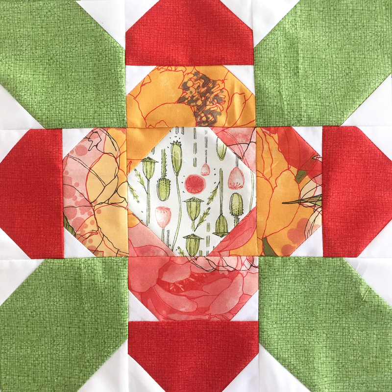 I just may be seeing my blockheads blocks wrapping up here! Time for arranging and joining!
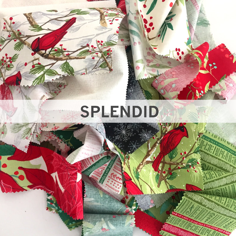
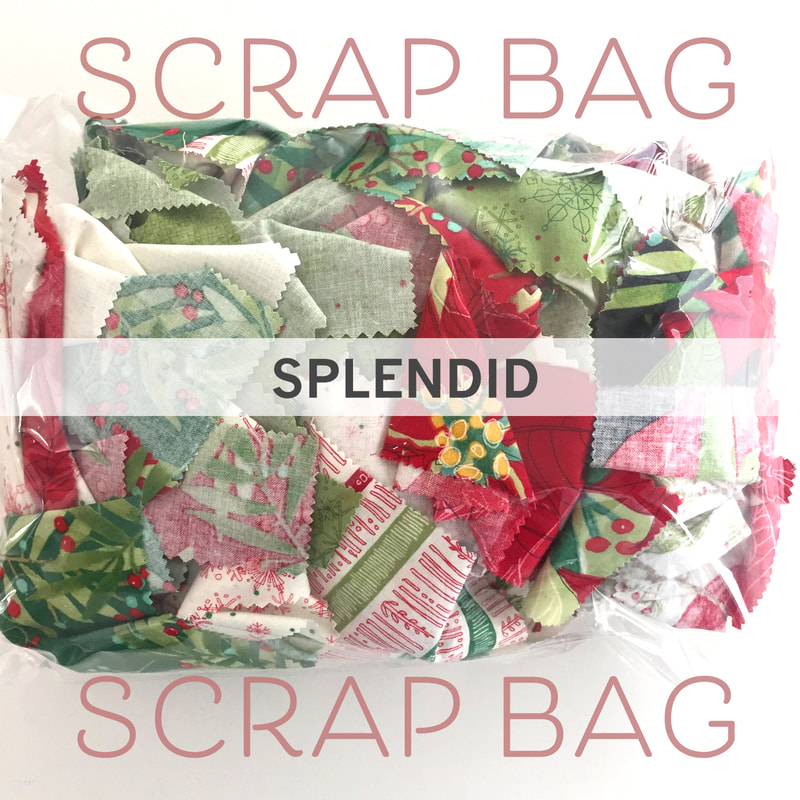
I know its a journey and not a race. But I feel like I can see the finish line. But I'm not there yet. One step at a time...that's how progress happens. These are the things I tell myself when I'm nearing the end and need that extra push! 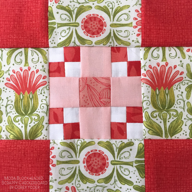 So a few more blocks here. Above its the Scrappy Checkerboard designed by Cory Yoder. Below its Ribbon Star by Lynne Hagmeier. I'm trying to take stock of what I have and what I need from a perspective of color and size. I saw a great layout on instagram that Susan @quiltingcousin did and I liked the organization of blocks in the overall quilt. I've decided to model my quilt after this layout too. 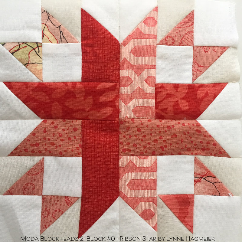 But first, finishing the blocks. I'm not done yet. But I'm keeping up the effort and I WILL FINISH! As I roll closer to the finish line I've done Fidget Spinner by Lynne Hagmeier and Bella Spinners by Me & My Sister Designs. Also Around the Corner by Carrie Nelson and On Point Star by Stacy Iest Hsu. Sew on!!! 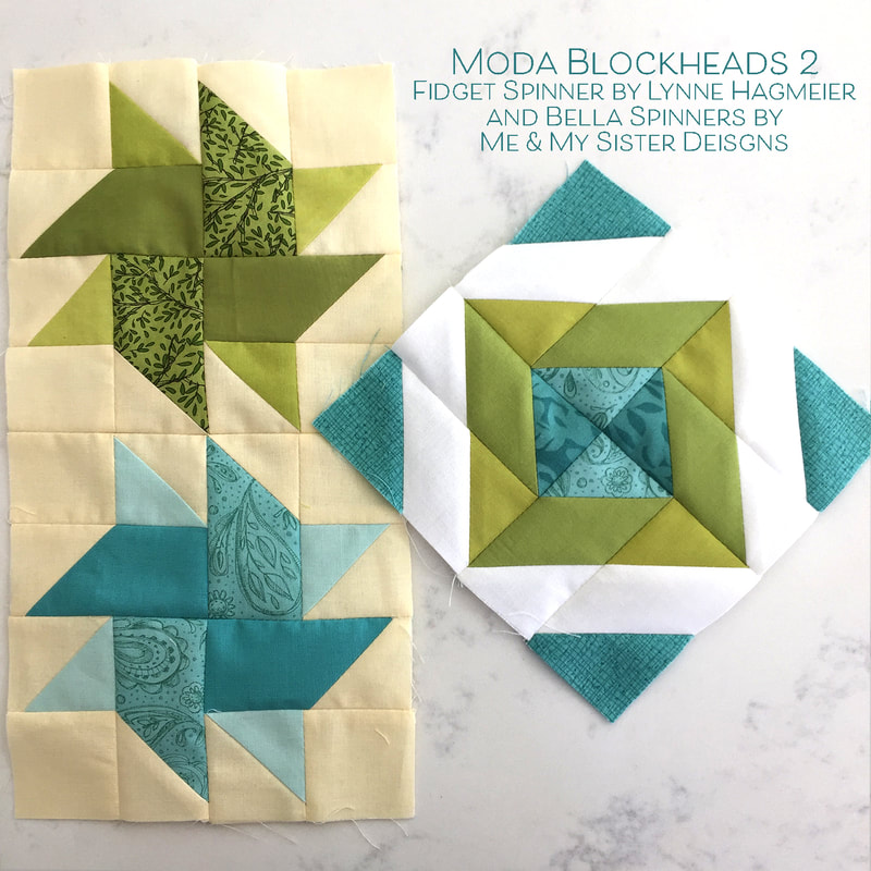 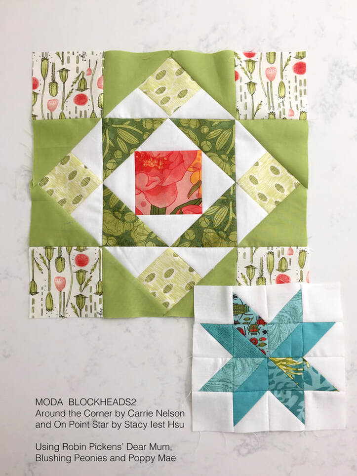 My Christmas quilts featuring my Splendid fabric came back from the longarmer, Marion Bott in Las Vegas (she's @bottmarion on Instagram). Oh I love the textures that get added to the quilts when they have the quilting done! I just want to lightly stroke each quilt and feel the patterns of the sewing. 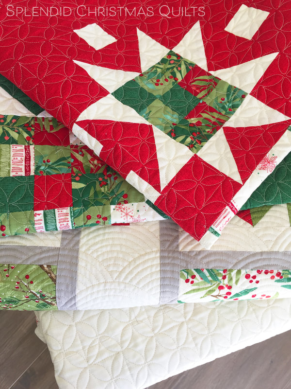 I'm excited that Splendid is in shops now so you can all work on projects with these too! My next step is to put the bindings on and also make pillow backs and add zippers to the pillow cases (or should I leave them as envelope backs?) 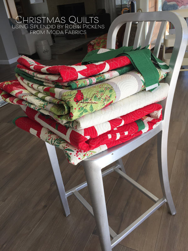 Here is the Showering Stars Table Runner as I'm sewing the binding on. I like the linear pantograph of the quilting. The direction of the lines balances out the long format of the runner and strong patchwork lines of the star trails by going the other direction (horizontally vs vertically). 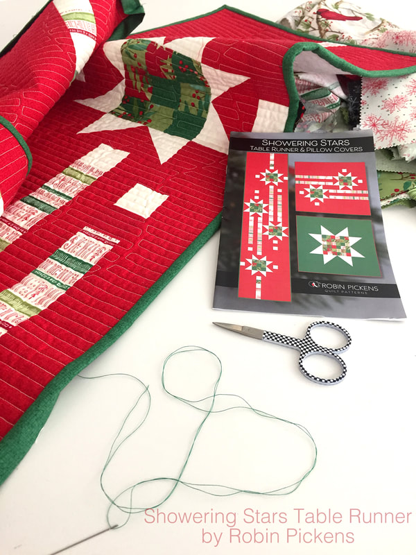 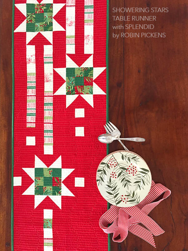 At the time that I was designing these patterns I had to pick out the binding fabric without having the actual made-up quilt in front of me. That is always a challenge for me- deciding binding recommendations so early in the process (but if it goes in a sales catalog I have to do it early). For most of the quilts in this group I wanted the bindings more subtle and just a complimenting Christmas color, so if the quilt is red, I'm doing a simple green. And in the case of Cardinal's Christmas Wreath, I felt so many prints were on the right and left side borders that a solid or almost-solid was called for. 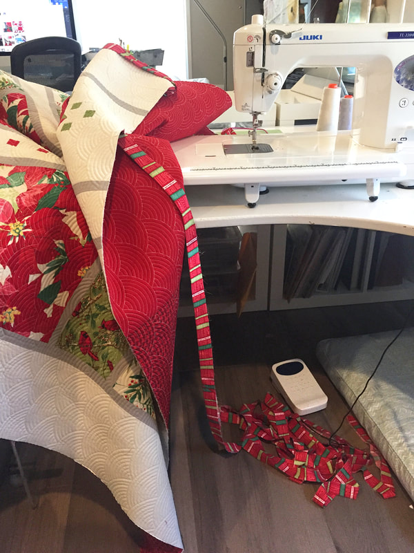 But when it came to Jubilant Song I had picked the striped fabric for binding and boy, do I love it! Now I wish I had picked a striped binding for Joy and Delight. But my green strips are cut and they are attached to the front, awaiting the hand sewing to the back. I am not going to rip off a whole quilt's binding at this point. But note to future-self, be bold with the stripes!! I recently posted some scrap bags of Splendid fabric in my online shop. There is a limited quantity so when they are gone, they're gone. And I'll be getting a few quilt kits of Joy and Delight up soon too! But for today, a-binding-we-will-sew!  |
About ROBINDesigner of colorful florals for Moda fabrics. Modern to transitional quilt designer. Illustrator, sewist, crafter. I am proud to be a designer for Moda Fabrics!

Shop Robin's Designs
 I am an affiliate for Fat Quarter Shop and may earn a small commission through my links. Thank you for your support!

Check the March 6, 2017 Episode!
Categories
All
Archives
November 2023
© Robin Pickens Inc. All rights reserved. No images may be reproduced without permission.
|
||||||
 RSS Feed

