|
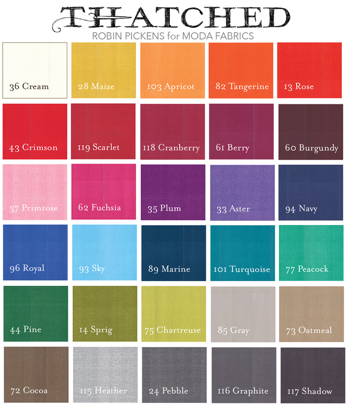
TOTAL CUTENESS this week! Ahhhhh! Jackie MacDonald of Sweetfire Road has given us the most adorable block! It is Moda Block-Berry (even the name is oh so cute!) and reminds me of a big giant raspberry or boysenberry. Take a stroll over to Jackie's blog to get this week's free Moda Blockheads4 block pattern: You can also see more of Jackie's work by following her on instagram @sweetfireroad The little patchwork blocks that make up the berry would be sweet in pinks for raspberry or purples for boysenberries or even darker for blackberries. You can play with the squares to get a feeling for light and dark in shadow to emphasize the rounded shape or treat the whole berry as a checkerboard. Background as light or dark? On the first one, I varied the darkness of the bands in the background. When I made the berry in yellows to reds to purple, it reminded me of golden, red and maroon beets or radishes. I've alternated between two colors in each row of the graduating color for that gold to purple one. Along with a golden beet, it could almost reference a peach in the warm light palette at the very bottom. One of the last images shows those background pieces as colors within the fruit or veggie shape too and then it reminds me of a plaid pumpkin! Make the outer border the same color as the background for the leaves and it drops away so the corners float. 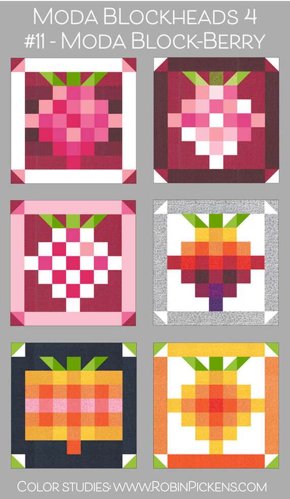 When I see this block, I think of pie and summer and jam. All good things. With so many little patchwork squares, I wanted to make this one in the 9" size and put it in my pink border. I've used pinks from Thatched, Abby Rose, Tulip Tango, Painted Meadow and Sweet Pea & Lily. 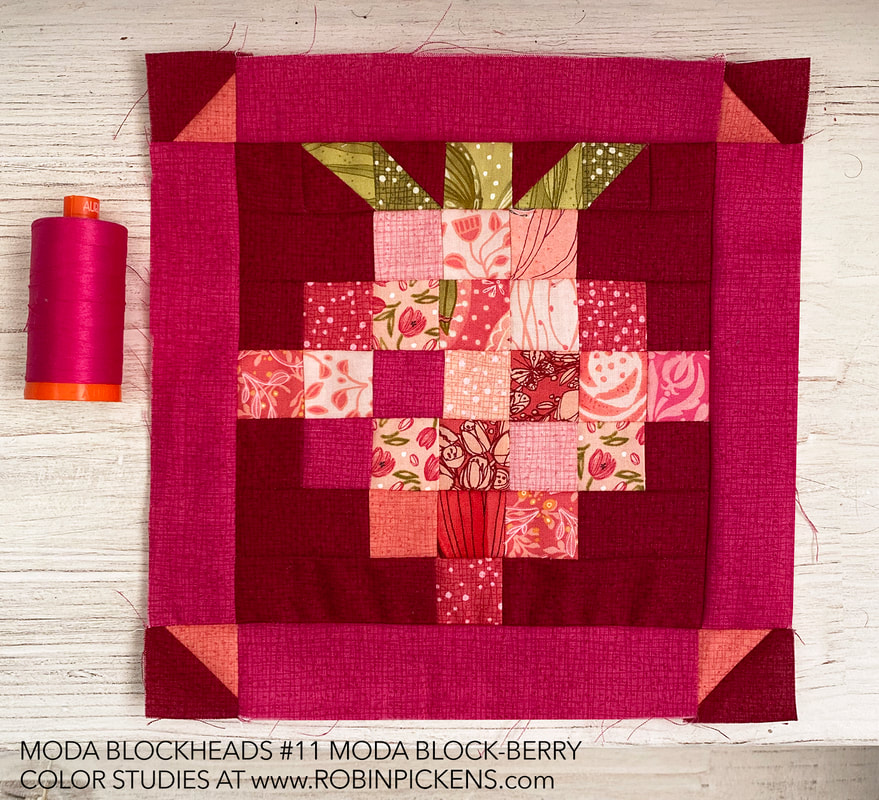 This block makes me smile and puts me in that summer mood for sweet fruit treats. I was thinking this would be so cute as a pillow too! I just might have to make a smaller one as well since I bet it would be precious in the little size. 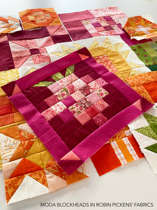 One question I've been asked is about how I go about mixing my colors and get them to work together. When I start, I pick a color palette of a range of colors, usually from my Thatched basics in some light, medium and darker shades of a couple color families. As I make my blocks I try to mix some of those Thatched colors into the blocks so the scrappy fabrics I use are paired with the cohesive Thatched colors. They act as a bridge to make the blocks look more uniform in a color sense. Since I'll be using this fuchsia color in my corner berries, I try to bring it into the blocks with the other warmer lighter pinks to add some pop and tie them together. Even though my other pinks might be warmer or lighter, it gives some saturated excitement to the palette. 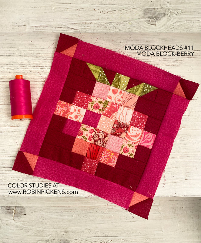 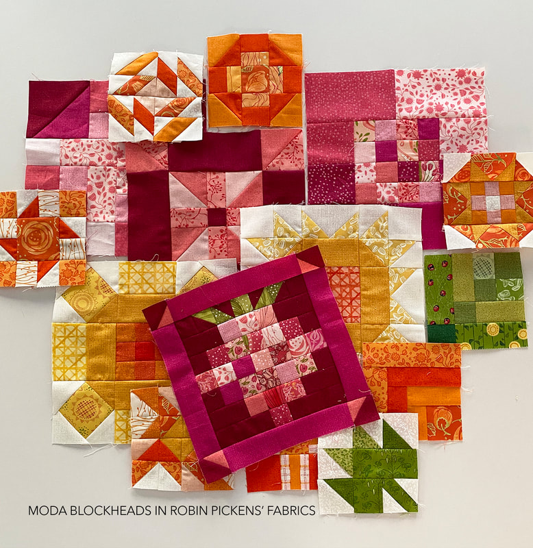 Thank you so much for this super adorable block this week Jackie!!
0 Comments
Your comment will be posted after it is approved.
Leave a Reply. |
About ROBINDesigner of colorful florals for Moda fabrics. Modern to transitional quilt designer. Illustrator, sewist, crafter. I am proud to be a designer for Moda Fabrics!

Shop Robin's Designs
 I am an affiliate for Fat Quarter Shop and may earn a small commission through my links. Thank you for your support!

Check the March 6, 2017 Episode!
Categories
All
Archives
February 2024
© Robin Pickens Inc. All rights reserved. No images may be reproduced without permission.
|
 RSS Feed