|
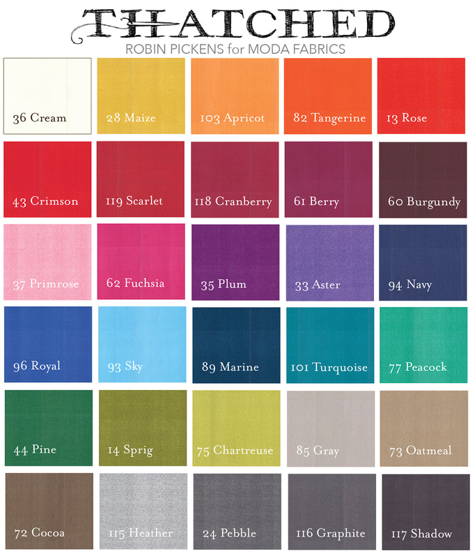
I have really been enjoying Crystal Manning's blocks that I see pop up in the Facebook Moda Blockheads group. Her fabrics have such color and energy and the mix of them together in her blocks is just stunning! I was thrilled to see her using her Garden Society collection with those adorable crickets and the table topper she showed on her blog! Visit Crystal's blog for a look at those lovely pictures and the pattern for HIGHLAND PLAID. Plaid blocks offer a great opportunity to play with those bands of light and dark. I love that this Highland Plaid has the thinner rectangles running through the middle to give contrast to size of the "stripes". I've tried simple light/dark studies in the gray version with dark center going out to light corners or the flip with darker corners going into lighter center. The third one mixes that gradation with white center lines and black center. For the color versions, I was thinking of a band of pink running down vertically through the orange, splitting the block into pink and blue (with a horizontal line of purple from the mixing of pink and blue), a ramp of lighter to darker and thin sashing and perimeter squares fading away to just leave the bold squares. 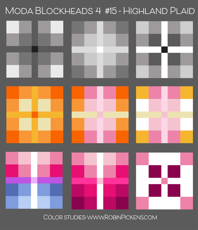 However you weave your squares together in a plaid, it is sure to be a versatile and enjoyable block. Thanks Crystal! For my own block, it is living in the small orange row. I have used all Thatched fabrics with the exception of the tiny center...its from Abby Rose. The touch of yellow thin strips will help to tie it in with my yellow center blocks. And speaking of tying in colors...did you get a chance to read the blog post I did for Moda last week about COLOR? Here is a link to it and hope it explains a little more of how I approach color with my quilts. https://my.modafabrics.com/inspiration-resources/playing-color  Yellow lines are not perfectly matched...but close enough...right? 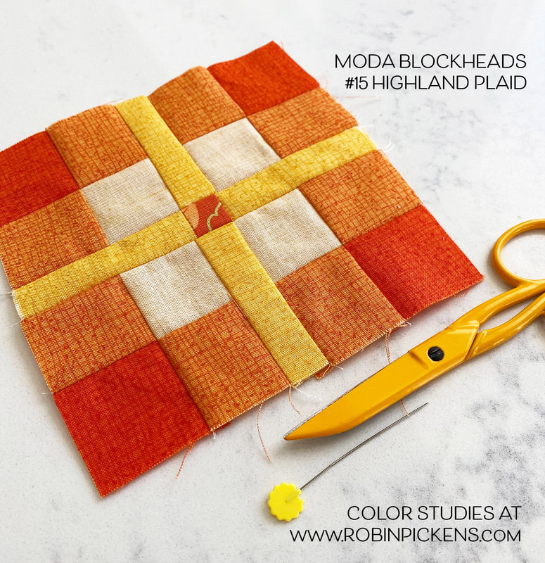 That lightest color is the yellow Thatched flipped to the backside for a subtle light shade of the color.  Happy sewing. Hope you have a colorful week!
2 Comments
Jan Patek has flown in with a cheery applique this week. This "Bird on a Branch" is a curvy bird with a couple leaves and a berry or bud, and it looks sweet in pretty red or a peaceful white on a blue background. Since I'm not playing with changing a lot of light and dark pieces this week I thought I'd just envision some little additions, like a button eye with all kinds of pops of colors on circles. You could make a a little change to the background by making an arch that mimics the arch of the branch. Or try framing in the bird as I did on the last one. 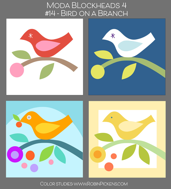 I wanted my bird for my center yellow blocks but wanted a little extra structure, which is why I added the framing in Thatched reversed to the back side. This makes a very subtle buttery color. An extra leaf and treating my circle like a flower with an orange center. 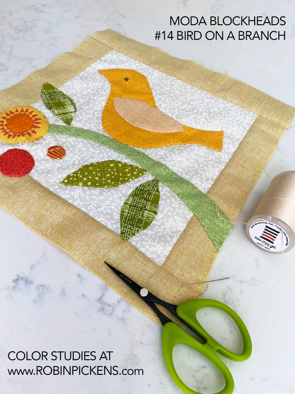 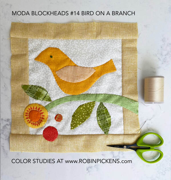 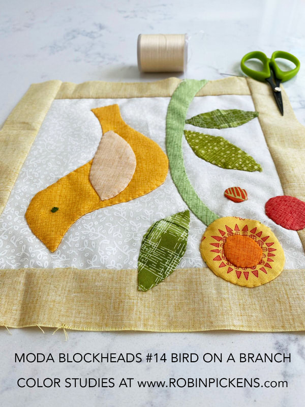 I also added a couple extra orange dots for some more accents of color. I've used the Solana fabric on my bigger flower so the rays poke out from the center as flower petals. The little white on white print is from Carolina Lilies and gives a little more texture to the light background. I made my bird eye with a little embroidery. For my circles I used Applipops and was very impressed with how they work and the range of sizes for circles. I think I may have some more circle applique experiments to try! 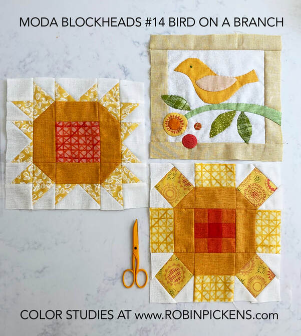 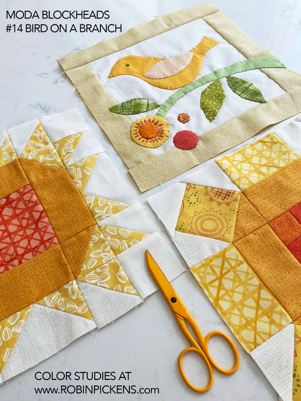 Have fun making your flying friend for this week's block!
This is about the half way point on Moda Blockheads 4 and a good time to share my setting directions and the pattern for my corner blocks. If you visited my blog post at the very beginning of this round of Moda Blockheads, you might have seen my initial plan for my "Surrounded Square Garden" setting. 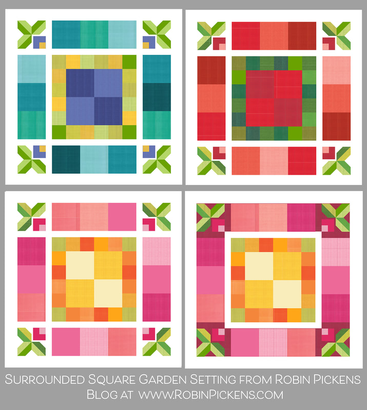 I wanted to make both the 9" size blocks and the smaller 4.5" blocks and combine them in a square structure, with each ring/row of the blocks being a consistent color family. These were some ideas with blue/green and a touch of purple or periwinkle. Or a Christmas palette of reds with green accents. Or the happy summery palette of pink, orange and yellow. I decided on this palette as my direction and I am making the very last image with a Cranberry Thatched for the background on that outer square. Here are some of my blocks so far: 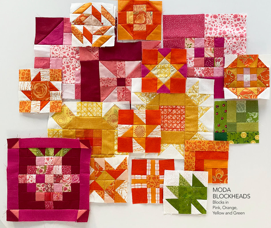 I am making small green blocks for the corner of the inner small row, just like my outer row will have leaves in each of my big outer corners. I thought my garden of blocks would be structured nicely with those consistent corners, plus it would give a pop of a few of the row colors with a blocky bud in the inner corner. 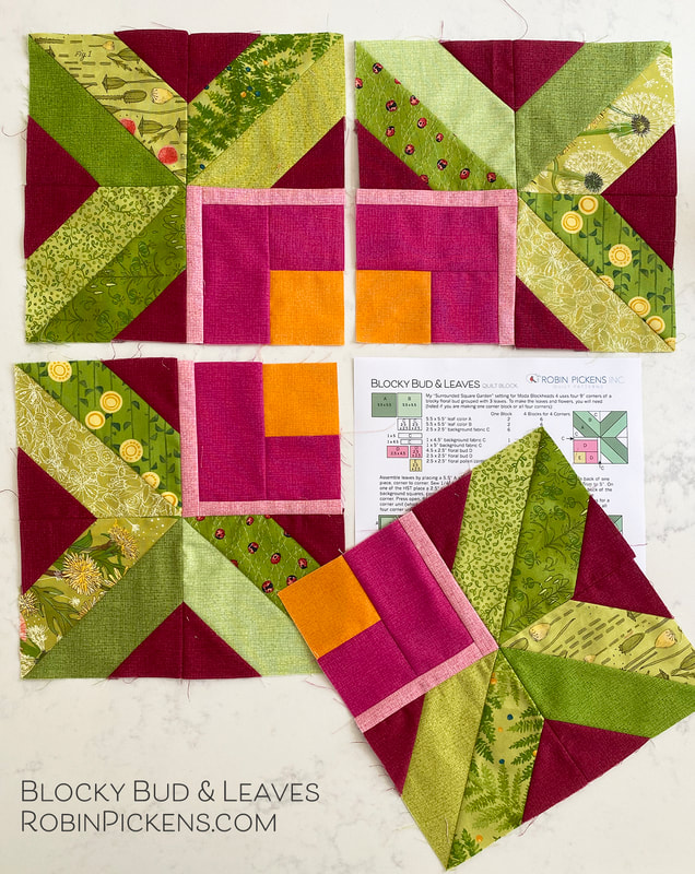 Since my outer row has a Cranberry background, I used cranberry in the background piecing for my corners. For most people, if you are using a white background, I'd assume you would want those background pieces as white for the leaves and but to stand out against. 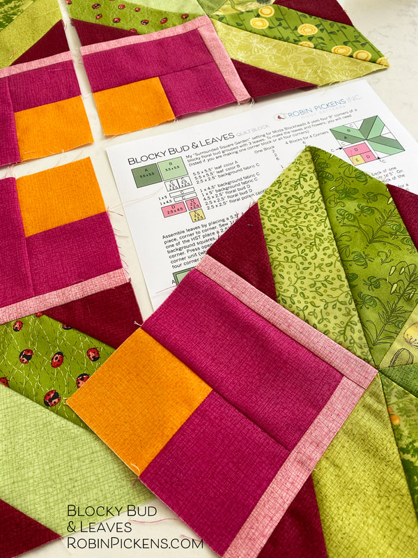 I used scraps of fabric I have from past collections. For the leaves, look for 5.5" squares to start making your half square triangles with. You can have your leaves all go in the same direction, or do as I did and make them fan out from the center point. Because I had planned to use this Fuchsia pink in my buds, I made certain to weave the color through some of my 9" pink sampler blocks. This pattern is up at my shop at robinpickensINC.com in the freebies section. There are two patterns (block and setting) but combined into one PDF document. The corner blocks are called "Blocky Bud and Leaves" and the overall quilt setting is the "Surrounded Square Garden." This bar below will take you directly to the shop Freebies section! Look for the image of the corner Blocky Bud with Leaves! For the sashings that separate the rows and the very outer border, you will need about 2/3 Yard of background or sashing fabric. This setting makes up a 53.5" square lap/wall quilt but feel free to add more outer borders to increase your size. 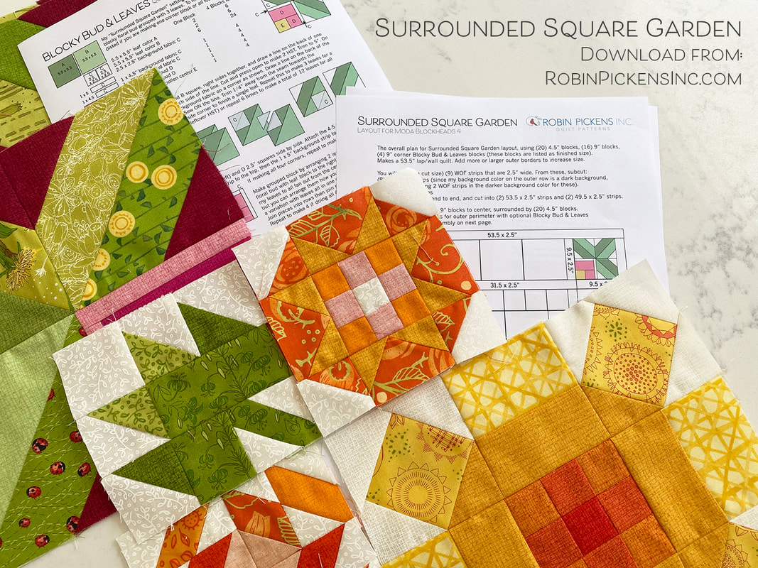 Here is where I am at so far with my progress in terms of where these will fall within the color rows. 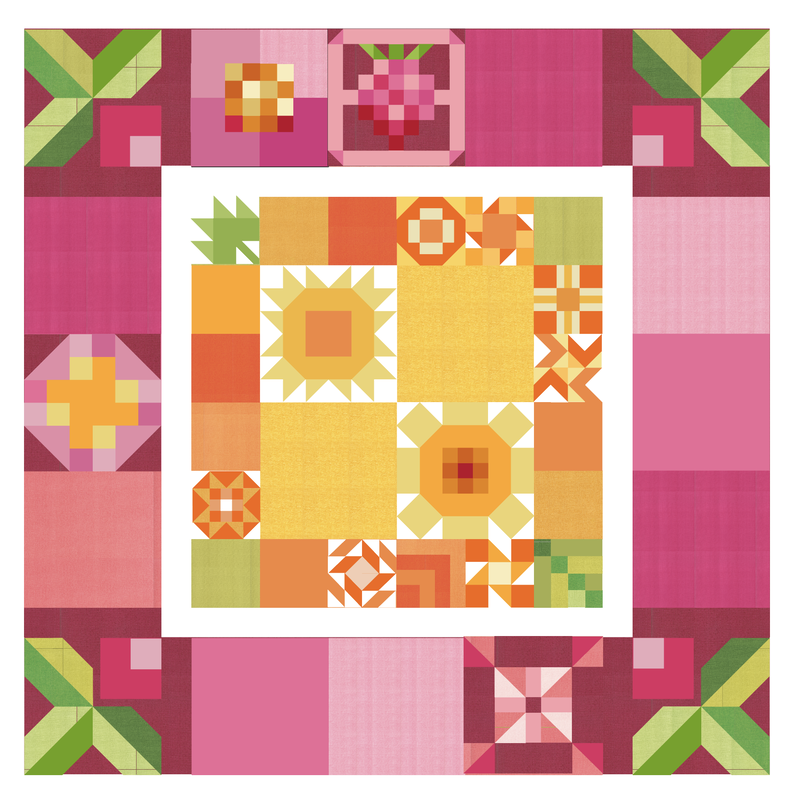 Over at the Quilt Emporium, my local shop, they are making one in the blue/green/periwinkle/purple color family and I love to see their blocks evolve each week! Lisa made up some bundles if you like these color groupings. The red/green with a touch of turquoise was with Christmas holidays in mind. This would make such a fun Christmas quilt! You can visit the Quilt Emporium website if you are interested in their bundles.  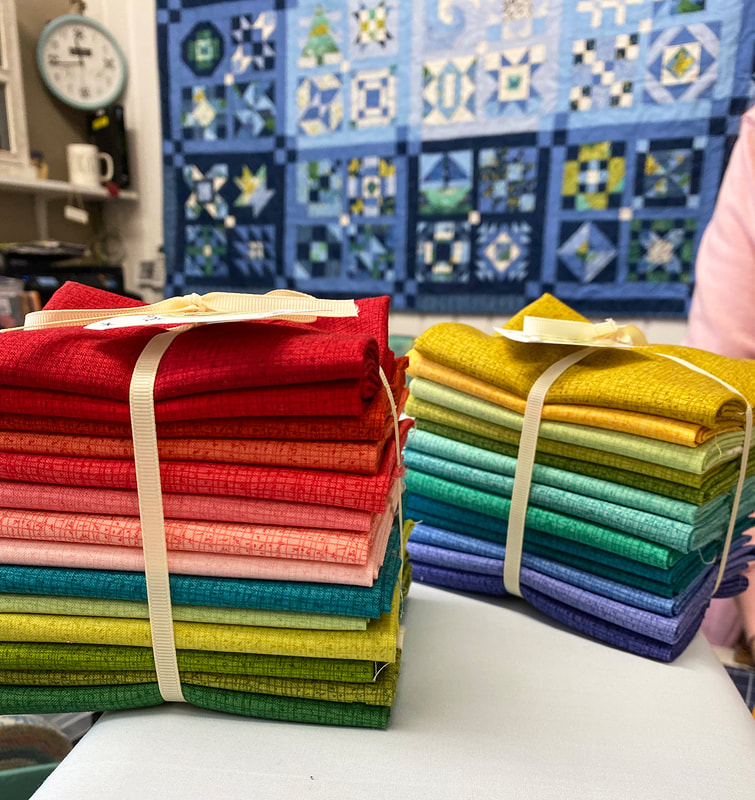 I hope you are having as much fun making blocks with Moda Blockheads as I am! If you are interested in more color explorations, I am going to be at the Quilter's Gathering in Berlin, Ohio this August, doing 2 half day workshops "playing with color" and it should be a fun time to explore color together!
Happy (colorful) sewing!! Are you ready for Evening Delight? This lovely block is from Debbie Maddy of Tiori Designs and can be found at her blog: Quarter-square Triangles make up the North, South, East, West parts of the block. If the background color continues from the center into the sides of the QST, like on the right image below, then it gets more of an oval center by visually expanding the middle vertically. 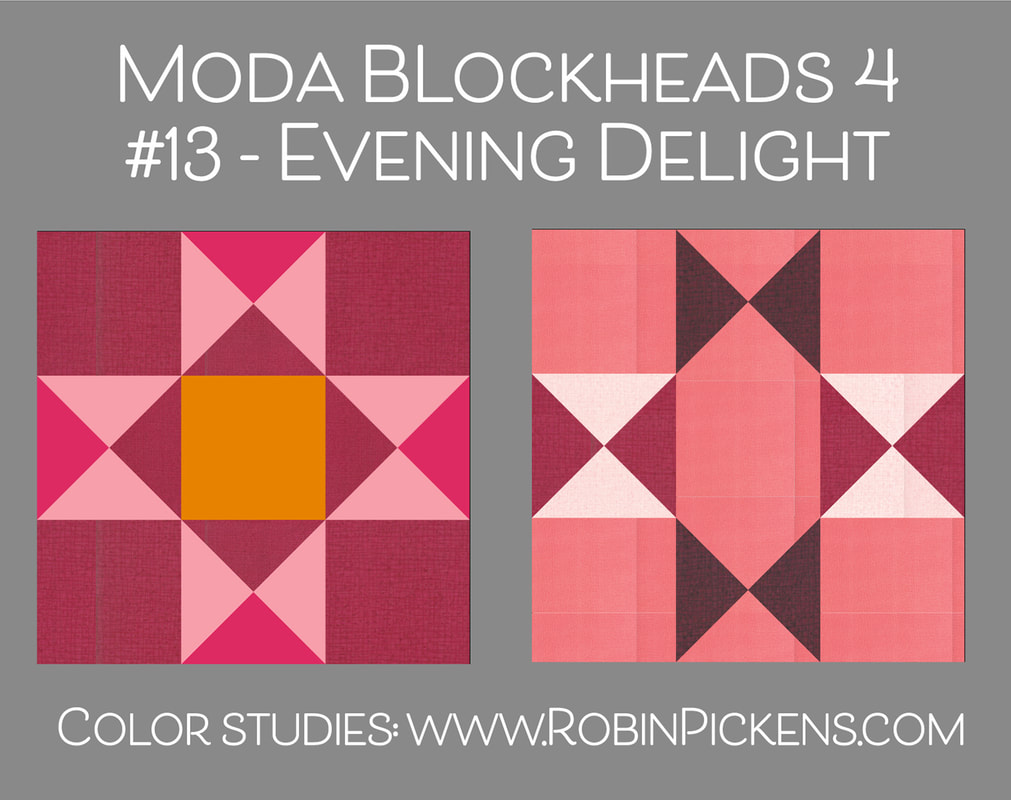 These rainbow colors would need a little change in construction. after making the first half square triangles, you would normally place two, right sides together, and sew 1/4" to each side from the diagonal center. Then you would cut them apart. With the top tow rainbow images before you would make the initial half square triangles, CUT them in half on the diagonal, THEN pair them into the new groups and sew together to make the quarter square triangles. The cutting stage is earlier so you can pair them up with different pieces. 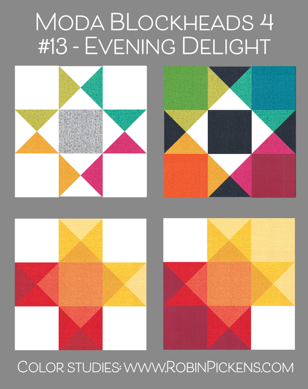 I like how adding colors into corners makes a different feel with the block. If you are making a couple quarter square triangle units with some corner colors, you can also rotate them so the background blends in to the shape to again extend the shape. I think of these as the retro space stars. Blending the corner background colors into the sides of the quarter square triangles makes this a visually more horizontal. 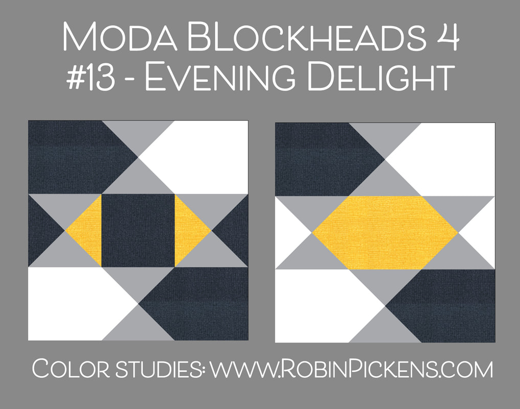 I have done a small block for my orange row but wanted to bring in a little of the pinks as accent and ties it into the bigger pink blocks and a little yellow to tie into the center blocks. 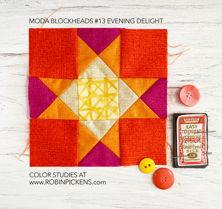 Summer colors of warmth and energy and fun! Have a lovely time with a little summer Evening Delight! 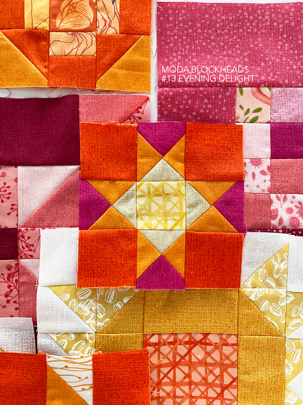 This week's block comes to us from Deb Strain and is called "Friendship Star." I've known Deb longer than I've been with Moda because we knew each other prior from art licensing and attending shows like the Atlanta Gift Show and Surtex. She makes the loveliest artwork that warms your heart and she is just as warm and welcoming herself. A block named with "friendship" feels perfect coming from Deb! I believe this week's block might be posted at the Moda blog as well as on the Facebook page. I hope you will also follow Deb Strain's work on instagram. This simple star with arms like a pinwheel changes shape with corners filled in with color. Treat the rows separately with colors to emphasize shapes. When the color from the corners is the same as the angles like the lower left, it is like an aperture of a camera and the last one reminds me of shadow and light beaming out as a sweeping beam from a lighthouse. 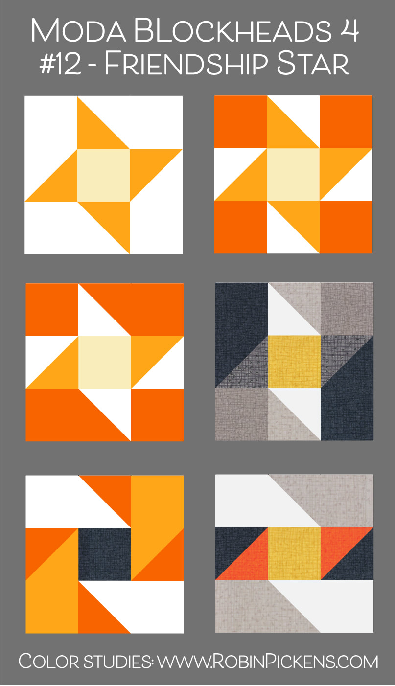 Here is my small 4.5" block with a sunshine center. Thatched colors with Abby Rose sweeping lines and a Solana flower. 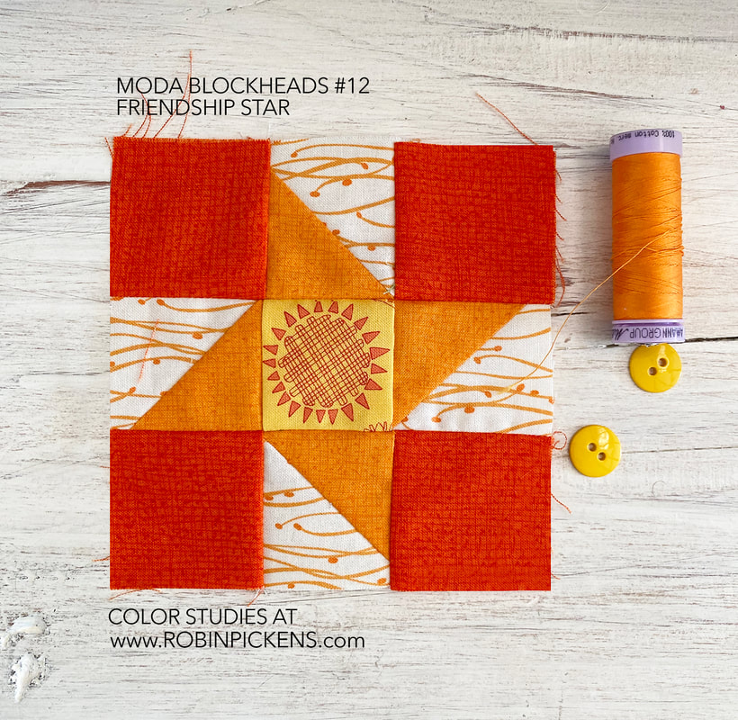 Here is the progress so far. I hope to have the leave/berry corners instructions up in the next week or two. Happy sewing! 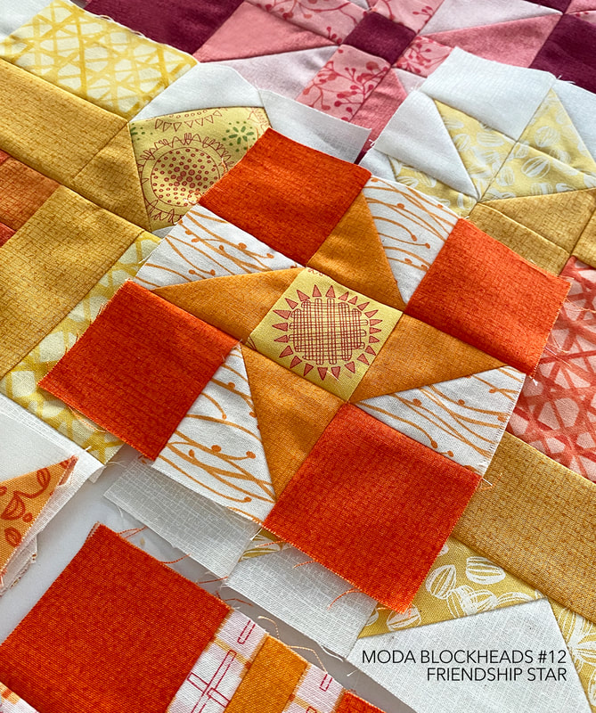 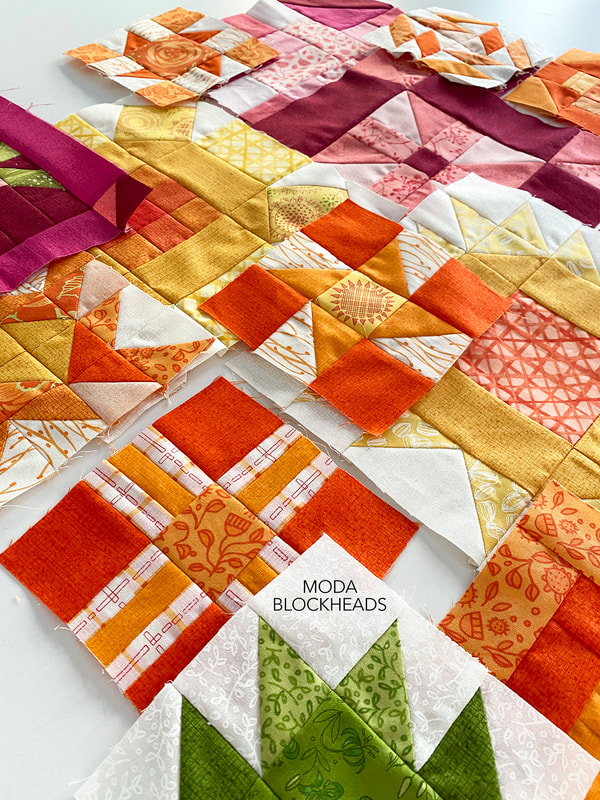 TOTAL CUTENESS this week! Ahhhhh! Jackie MacDonald of Sweetfire Road has given us the most adorable block! It is Moda Block-Berry (even the name is oh so cute!) and reminds me of a big giant raspberry or boysenberry. Take a stroll over to Jackie's blog to get this week's free Moda Blockheads4 block pattern: You can also see more of Jackie's work by following her on instagram @sweetfireroad The little patchwork blocks that make up the berry would be sweet in pinks for raspberry or purples for boysenberries or even darker for blackberries. You can play with the squares to get a feeling for light and dark in shadow to emphasize the rounded shape or treat the whole berry as a checkerboard. Background as light or dark? On the first one, I varied the darkness of the bands in the background. When I made the berry in yellows to reds to purple, it reminded me of golden, red and maroon beets or radishes. I've alternated between two colors in each row of the graduating color for that gold to purple one. Along with a golden beet, it could almost reference a peach in the warm light palette at the very bottom. One of the last images shows those background pieces as colors within the fruit or veggie shape too and then it reminds me of a plaid pumpkin! Make the outer border the same color as the background for the leaves and it drops away so the corners float. 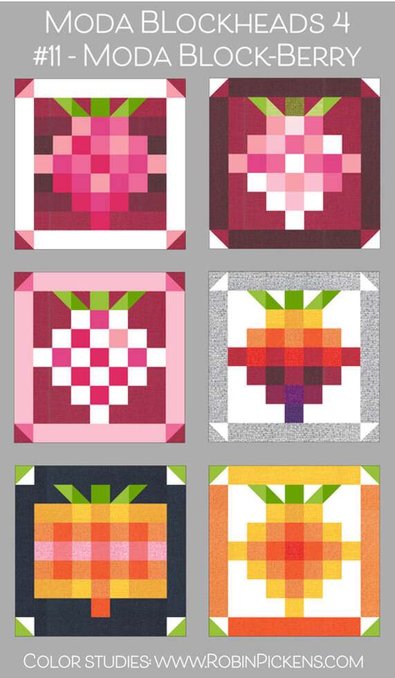 When I see this block, I think of pie and summer and jam. All good things. With so many little patchwork squares, I wanted to make this one in the 9" size and put it in my pink border. I've used pinks from Thatched, Abby Rose, Tulip Tango, Painted Meadow and Sweet Pea & Lily. 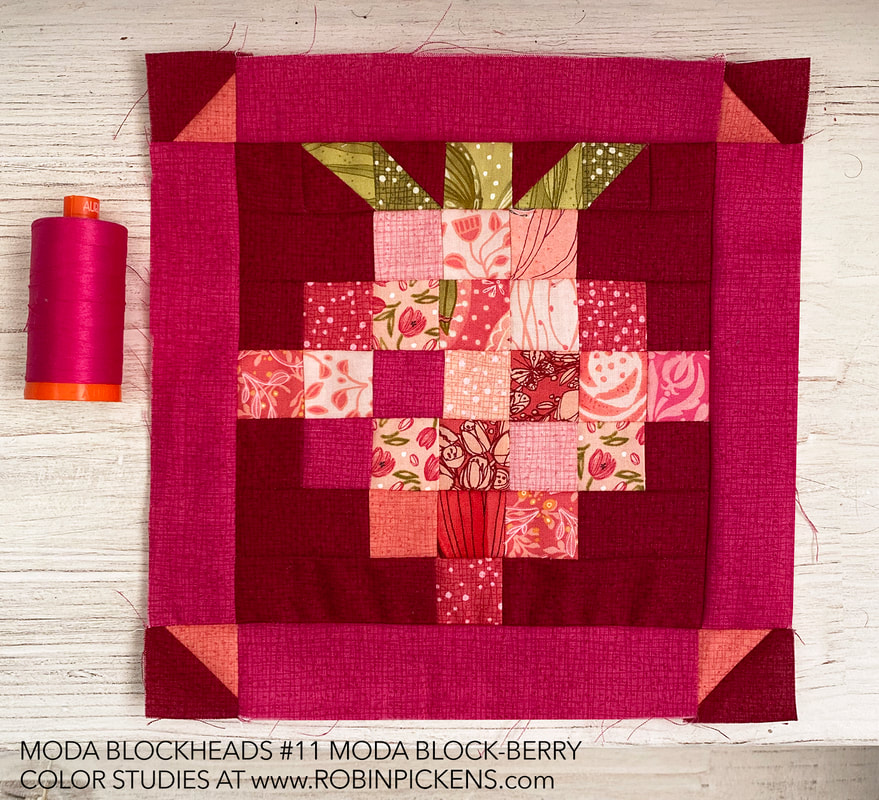 This block makes me smile and puts me in that summer mood for sweet fruit treats. I was thinking this would be so cute as a pillow too! I just might have to make a smaller one as well since I bet it would be precious in the little size. 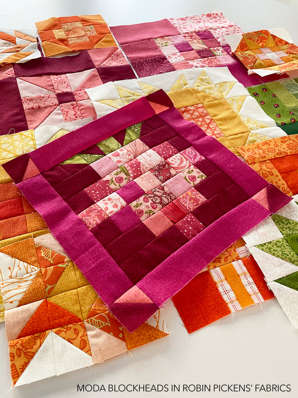 One question I've been asked is about how I go about mixing my colors and get them to work together. When I start, I pick a color palette of a range of colors, usually from my Thatched basics in some light, medium and darker shades of a couple color families. As I make my blocks I try to mix some of those Thatched colors into the blocks so the scrappy fabrics I use are paired with the cohesive Thatched colors. They act as a bridge to make the blocks look more uniform in a color sense. Since I'll be using this fuchsia color in my corner berries, I try to bring it into the blocks with the other warmer lighter pinks to add some pop and tie them together. Even though my other pinks might be warmer or lighter, it gives some saturated excitement to the palette. 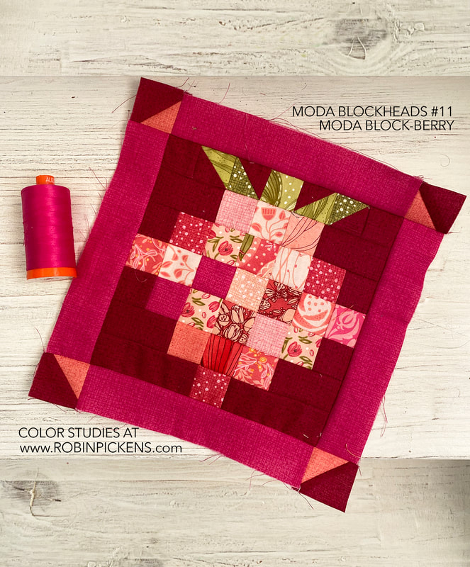 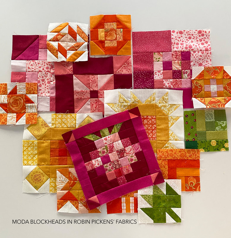 Thank you so much for this super adorable block this week Jackie!!
One of the things I shared on my takeover of Moda Fabric's Instagram account last Thursday was a little video showing two beautiful notebooks that Susan Strumpf made for me with Tulip Tango fabric. Susan made a couple samples for me with the fabric (the light version of Tightrope and the lap size of Criss Cross Kisses). She often makes covers for notebooks, using the standard sized composition notebooks that are 7.5 x 9.75" which is such a nice size to fit into a tote bag or have for notes on your desk. The insides have side panels where the cover of the notebook slides in. This is a great spot for a fun accent color or pop of unexpected color. 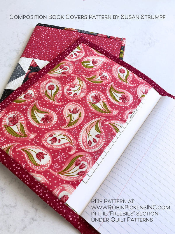 Lots of people asked for the pattern and I asked Susan about one. She very kindly suggested it be a free pattern that she would be happy to share. She doesn't have an online shop so I'm hosting the pattern at my shop. This is such a lovely project that would make a great gift for a teacher, boss, friend or as a memento to a special person. Susan has even made a memory journal out of neckties. 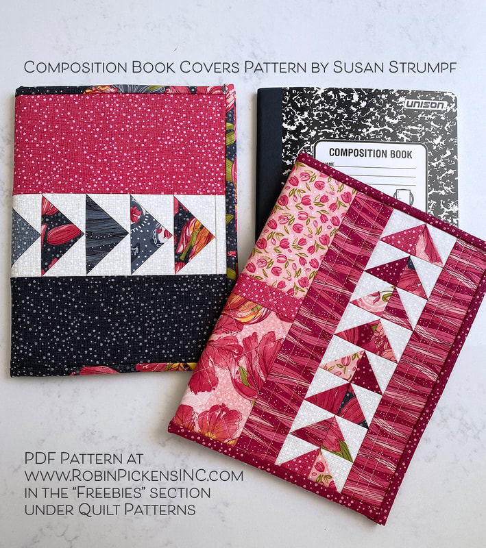 The pattern is a free digital download PDF that is two pages which can be printed out on one sheet of paper using both front and back sides. 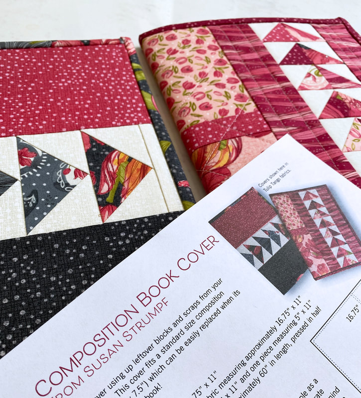 These are some other samples of previous covers that Susan has made. She teaches classes and workshops at the Quilt Emporium in Woodland Hills, California (and yes, even a class where you can make these covers with other quilters!). One thing Susan likes to do is wood applique and some of her covers feature her wool creations. 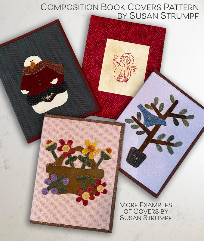 Simple compositions with striking fabrics make a sophisticated statement. 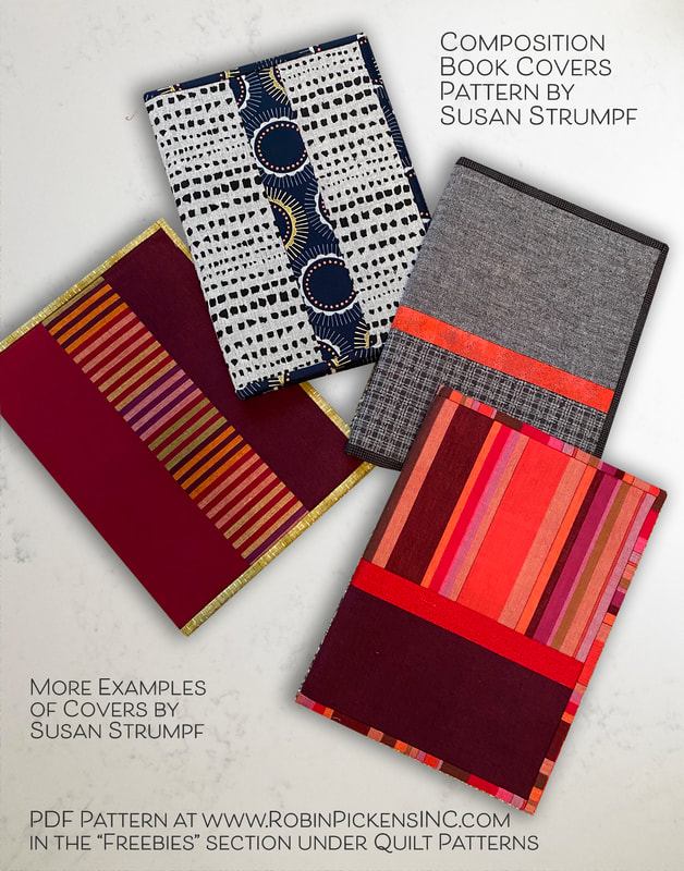 Patchwork squares and rectangles... 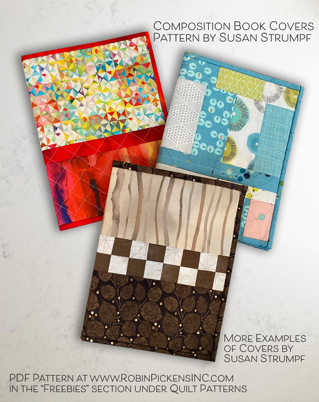 And fun with leftover quilt blocks and pieces! 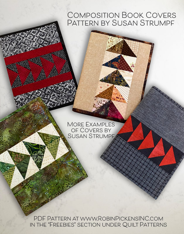 Get your copy of Susan's pattern at www.RobinPickensInc.com in Quilt Patterns, Freebies. Thanks so much to Susan Strumpf for sharing it will all of us! 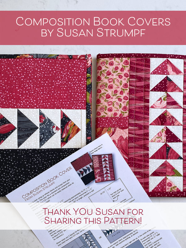 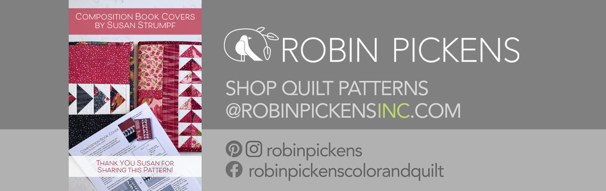 I love that pattern play with Tulip Tango has started with a couple of my favorite patterns, Ring Around the Posies (on the previous post) and MOD FLOWER BOX! I mocked this up awhile ago to figure out a kit for the Shipshewana Quilt Festival to make for a workshop I am teaching there this summer. This first one is the version they picked and I love it! The tulip fabric on cream has such a pretty look and I really love the Love Butterfly print in the collection and used that for the outer border and inner pink border. 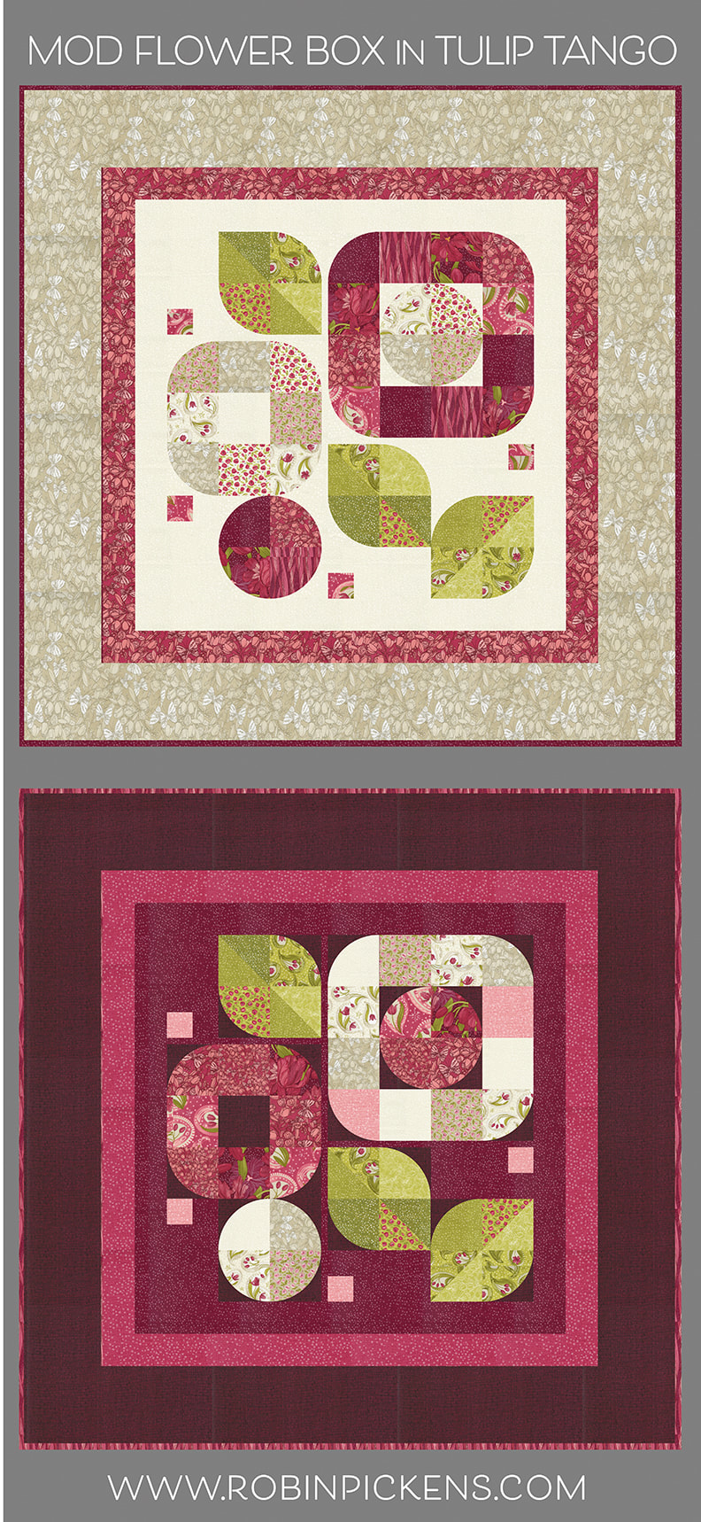 I think this version with Cranberry Dotty Thatched paired with Burgundy regular Thatched (#60) is also striking. The reds are rich and dramatic. This version is showing an option I have on the Mod Flower Box pattern, which is to put a subtle difference in the background fabric on the curves. This gives the curves that "boxed in" look, thus the BOX in the name. But how about those greens and grays? The mood of these deep colors change when paired with the Dotty Thatched in Sprig and Chartreuse. The cream center still keeps the colors crisp and clear while having that springy border or growing greens to compliment the leaves. 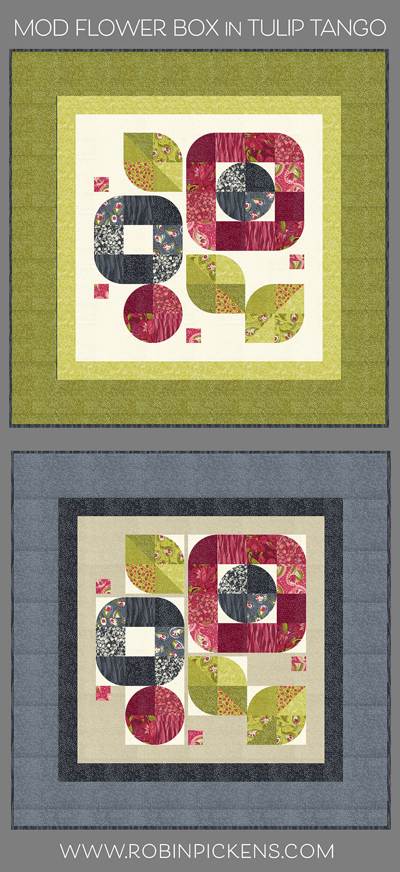 And a Dotty Thatched Shadow border is softened by the larger Gravel colored outer border. Combined with Washed Linen background and highlighted backgrounds for the curves in cream, this version feels serene and meditative. How about more prints? Those big tulips in the big border perhaps? Or the Tiny Tulips? When the outer border has a busier print, I think it is good to separate that with a regular or dotty Thatched smaller border. This gives my eye a place to rest for a moment and clearly defines the spaces without overwhelming with print on print. Another version of the "boxed in" flowers with Burgundy Thatched against the Cranberry Dotty Thatched background. 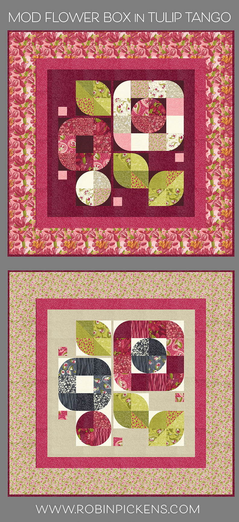 This last one has a warm energy with the earthy linen color mixed with the pinks and shadow grays. I hope you find a version that speaks to you! One of the fun things about this pattern is that it uses curves but not too many, so it is great for those who are feeling a little afraid to try curved piecing. This is an easily manageable amount of curves and only a quarter curve vs a half or full circle. The pattern includes a paper template, but I am also a big fan of the Creative Grids Circle Savvy Ruler for making my curved quilts. I'll be doing a workshop at Shipshewana this summer with the top version of MOD FLOWER BOX or the all-Thatched version. The class is sold out, but I will also be doing some demonstrations in the shop with the Circle Savvy Ruler so if you are there, please stop by to say Hi! I think there are a few spots left in the Tightrope class! 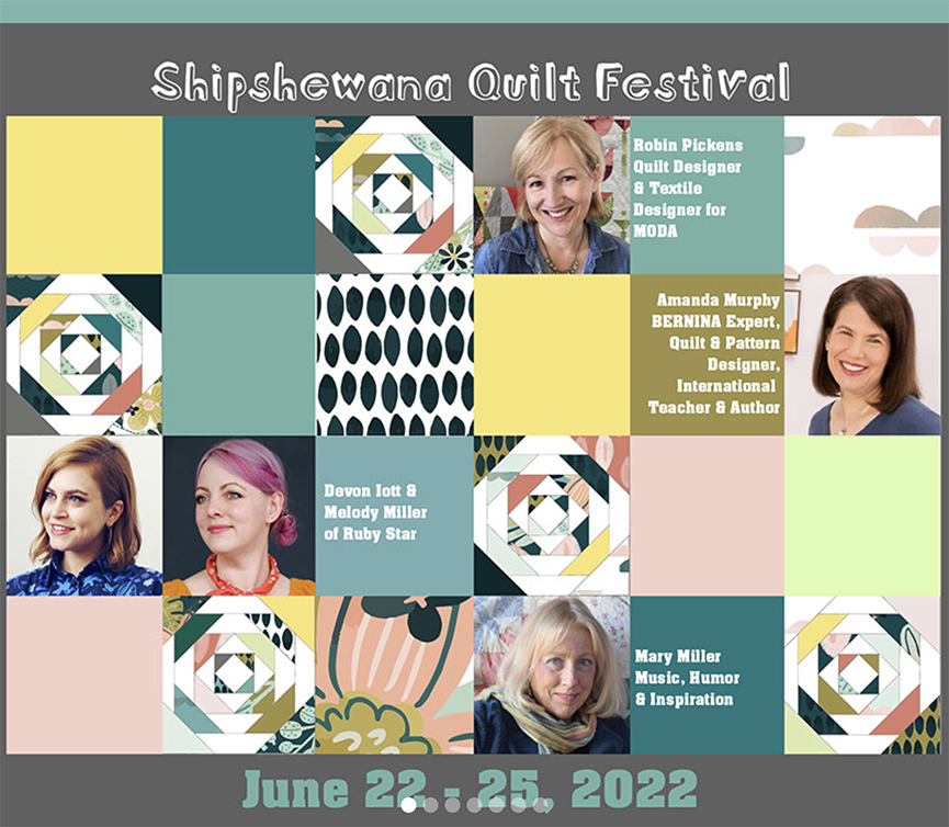 I am honored to be in the company of these other designers and quilters at the festival! I've learned a lot from watching Amanda Murphy with her Bernina longarm (which is the one I have with qmatic) and am very excited to meet her in person. I am so pleased to know Devon and Melody from my shows with Moda Fabrics and look forward to more time at this event!  MOD FLOWER BOX can be made with Fat Eighths, Fat Quarters, Charm Packs or Layer Cakes. Check your local quilt shop for the pattern or visit www.RobinPickensINC.com if they don't have it. This is the all-Thatched version: 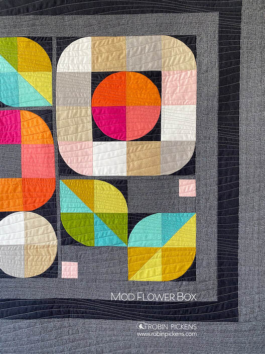 Hope to see you at Shipshewana and I hope you have fun with TULIP TANGO in MOD FLOWER BOX!
In my newsletter I asked what quilt people wanted to see mocked up in Tulip Tango and RING AROUND THE POSIES was a clear winner!! I will be showing more quilt mockups in this fabric line but here is RING AROUND THE POSIES to explore with the Tulip Tango collection. 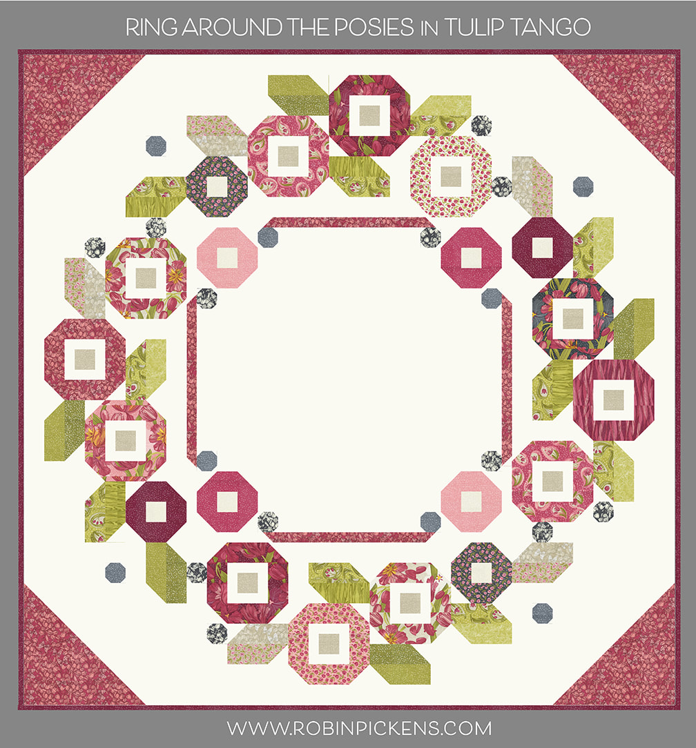 Lets start with the Dotty Thatched Cream background and Love Butterflies in the corners (in Tulip color). Classic reds on cream looks crisp and bright. When I use the Dotty Thatched background in Washed Linen with Cream corners it has a soft and romantic look. I would definitely want to snuggle up under this one! 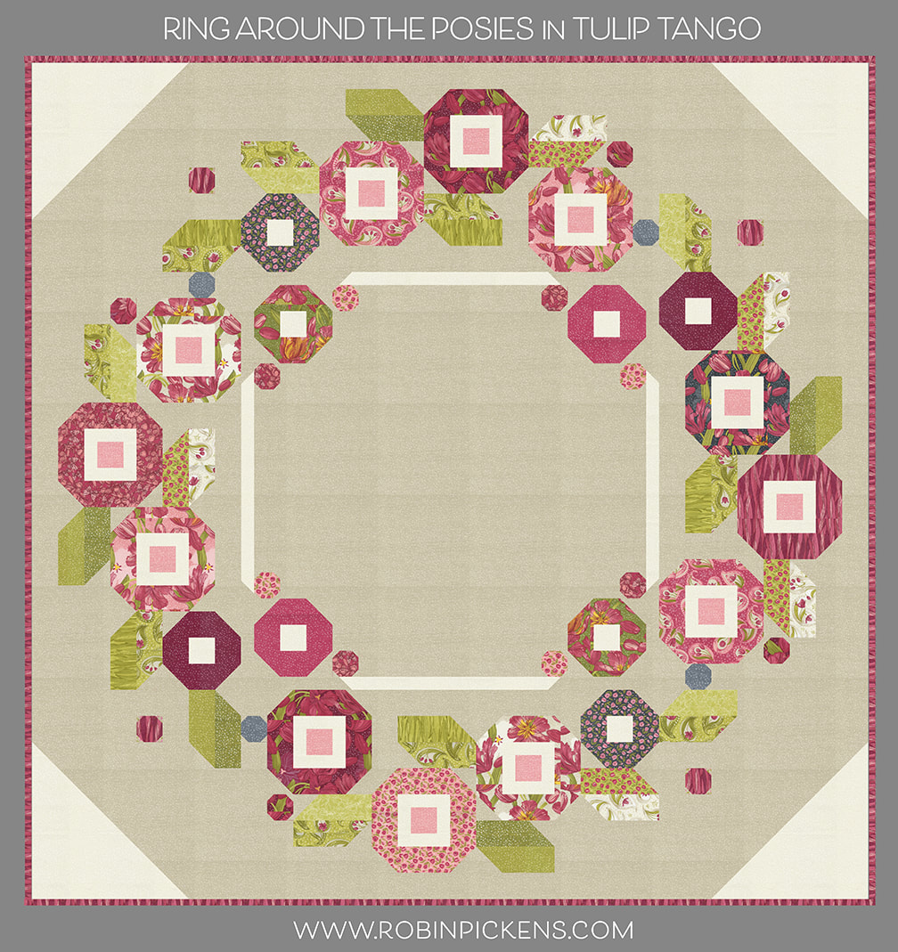 This is the same Dotty Thatched Washed Linen with more of the Grays from the collection. I've used Love Butterfly in Shadow for the corners. I've also used more gray strips for leaves and flowers with the pinks still prominent for the flowers. One thing to point out here is that I've used a different fabric for the interiors of the flowers to give them a little more pop. This is Dotty Thatched in Cream and if you use a different fabric inside the flowers like this, you need a 1/4 yard of fabric for those. 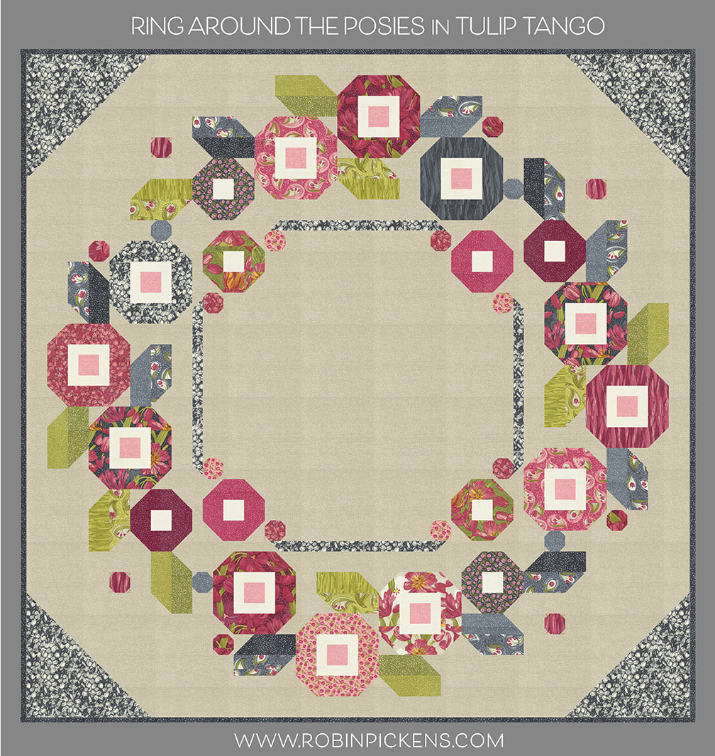 Here I've used the lighter interiors again but sticking to more reds in the collection. The background is Dotty Thatched 118 in Cranberry with corners in Dotty 202 Tulip. 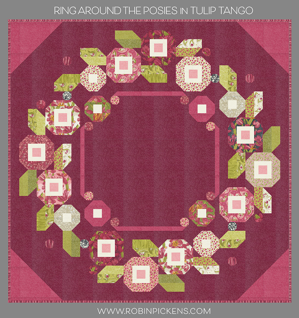 A little darker background is regular Thatched Burgundy 60. I am using the background color inside the flowers too and the main Tulip print 48710-19 in Cranberry for quilt corners. 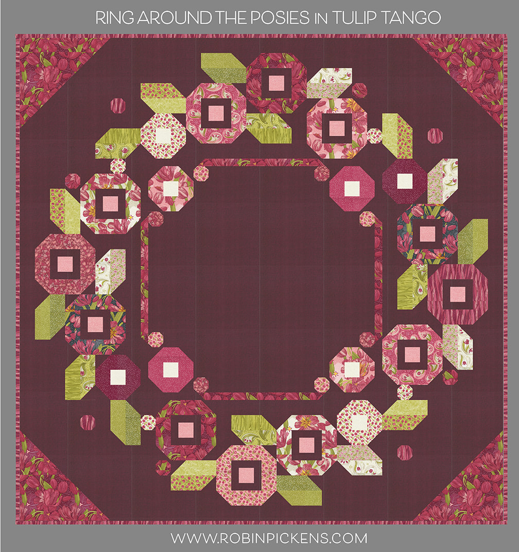 One last one...dramatic night time garden with Thatched Soft Black 152 as the background color and Dotty Thatched 48715-117 in Shadow for quilt corners. Those colors glow against the Soft Black background! I love using the Swirling Leaves print as my bindings because it gives it a free flowing striped look. 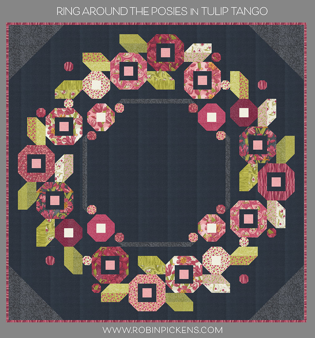 Are you ready to make RING AROUND THE POSIES in Tulip Tango? I am trying to decide between the two washed linen versions. If you are looking for the pattern, please check your local quilt shop to see if they have it. You can also find it at my shop at ROBIN PICKENS INC. More mock ups to come...how about MOD FLOWER BOX next?  Chelsi Stratton brings us block #10 for Moda Blockheads4 called "Autumnal." This free block pattern can be found through Chelsi's blog (click gray bar to be taken there). You can also follow Chelsi on Instagram @chelsistratton There are not too many color studies this week since I this block just looks so good as a leaf. Although it is fun to deconstruct the block and just see it as shapes, I prefer the leaf for my own quilt in simple greens to go with my pink, orange, yellow and green quilt. However, I'd love to see this block made up in a quilt with fall gradations like the top row with parts of the leaf being golden yellows and parts being the deep reds of fall beauties. I also gradated the background grays to black to emphasize the lighter and darker parts of the leaf. 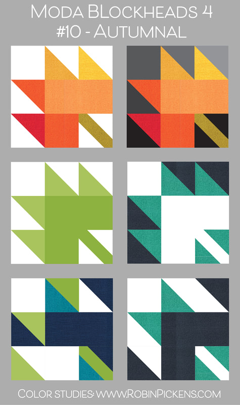 It is fun to play with the shapes and see how we can pull out an arrow, just treat it like HST color play or an angled bowtie. Looking at the shapes this way suggests more directional movement vs an object. For my quilt, this green leaf will live in a corner of the orange small row. I was hoping to have some reference to the bigger corner leaves by repeating the green for leaves within the inner smaller row. I've used fabrics from Carolina Lilies for both the greens and for the tonal cream background. 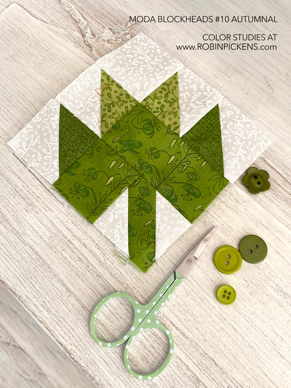 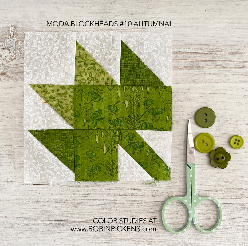 Nice to have another green block in the group! I think my bonus block of greens was feeling a little lonely and needed a friend. How fun to find it in a lovely green leaf! Thanks Chelsi for this sweet block! 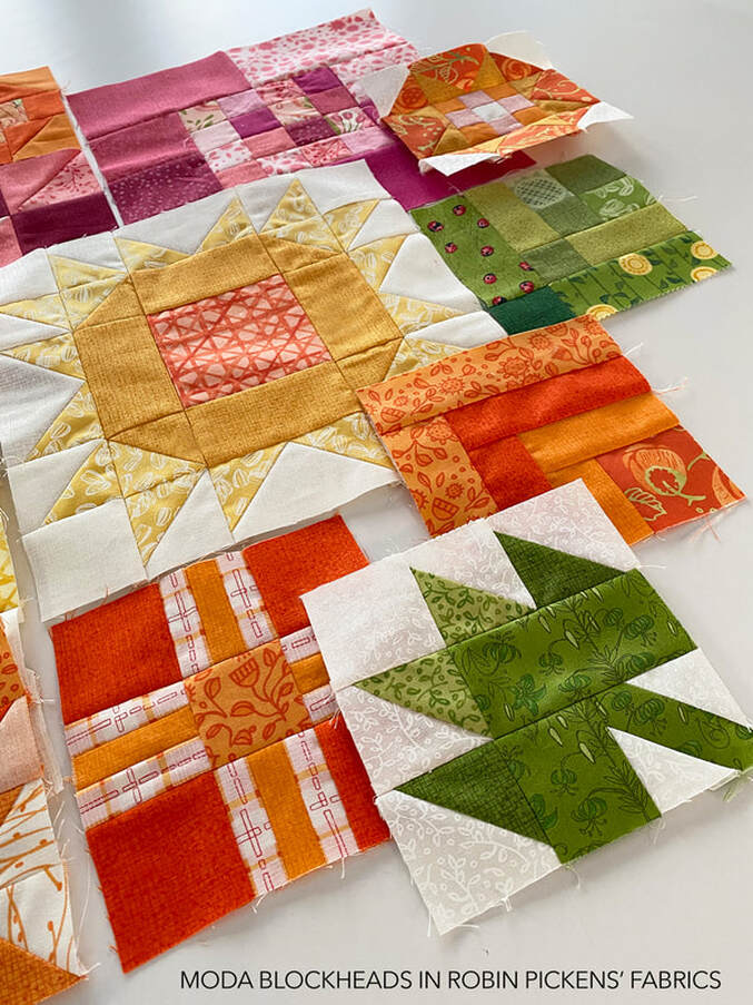 |
About ROBINDesigner of colorful florals for Moda fabrics. Modern to transitional quilt designer. Illustrator, sewist, crafter. I am proud to be a designer for Moda Fabrics!

Shop Robin's Designs
 I am an affiliate for Fat Quarter Shop and may earn a small commission through my links. Thank you for your support!
Check the March 6, 2017 Episode!
Categories
All
Archives
November 2023
© Robin Pickens Inc. All rights reserved. No images may be reproduced without permission.
|
 RSS Feed