|
Week #9 in Moda Blockheads is brought to us from Brigette Heitland of Zen Chic. The block, "Cross My Mind" can be found on Brigitte's blog through clicking the bar below. I am doing a small orange block so my color play starts there. I like how the thinner sashing strips can be evenly spaced light and dark or ramp up and down in light and dark versions of a color, like steps. You can play with different colors or white and darks in the corner squares or treat them like horizontal color bands. 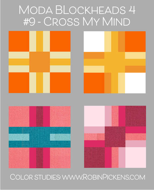 Black, gray and white with a pop of red in those side bars make a graphic abstract block where the negative space is just as important as the sashings. The color spectrum version plays with the subtle difference of white extending from center to outreaching arms or a darker center that creates a center like a receding window. 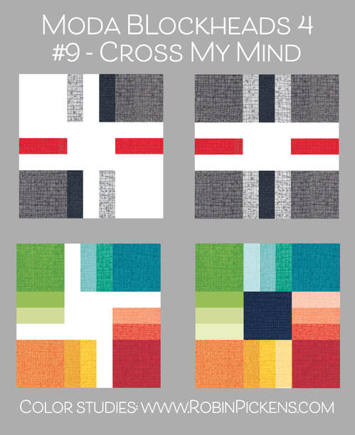 My orange block in 4.5" size uses Tangerine and Apricot Thatched with prints from Abby Rose. 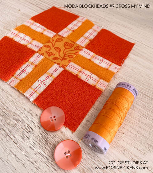 I also caught up with a couple of the bonus blocks, Star Turn and Zipper, which happen to also be in cheery oranges! 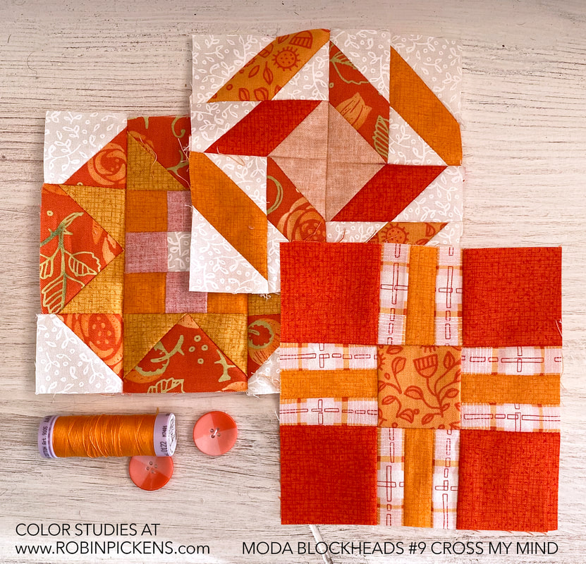 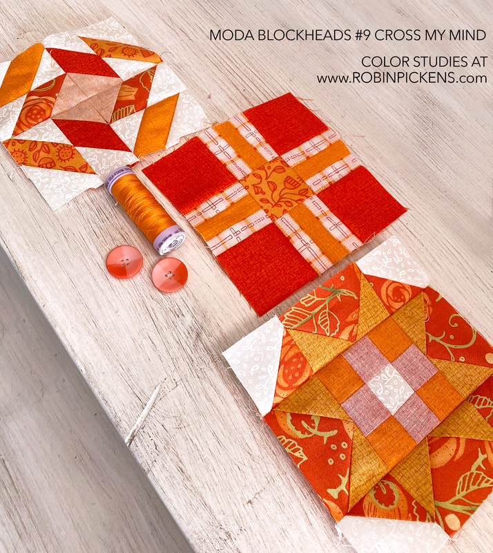 Here is how my grid is potentially looking so far! And the group of blocks all together in yellow, orange, pink and green colors. 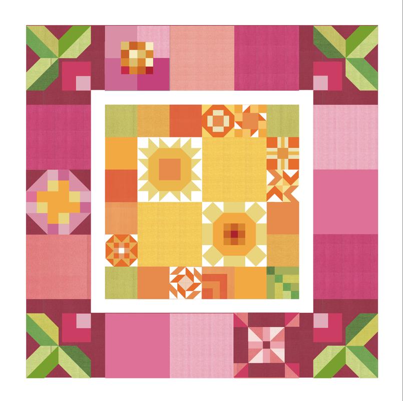 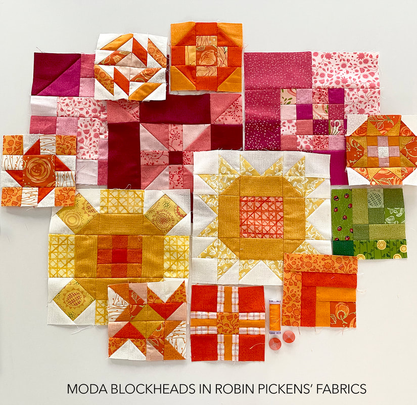 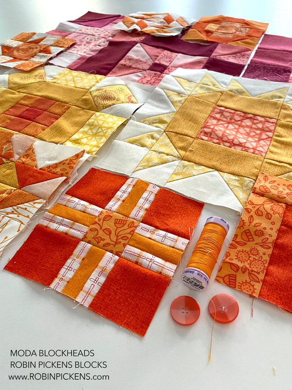 Thanks Brigitte for this week's block!
1 Comment
Free Quilt Block Pattern "Wild Geese" from Kate Spain for Moda Blockheads and Color Studies5/11/2022 Kate Spain brings us this week's block in Moda Blockheads 4, called WILD GEESE. Visit Kate's blog for the free quilt block pattern. You can also see lots of Kate's wonderful work on instagram @katespain. 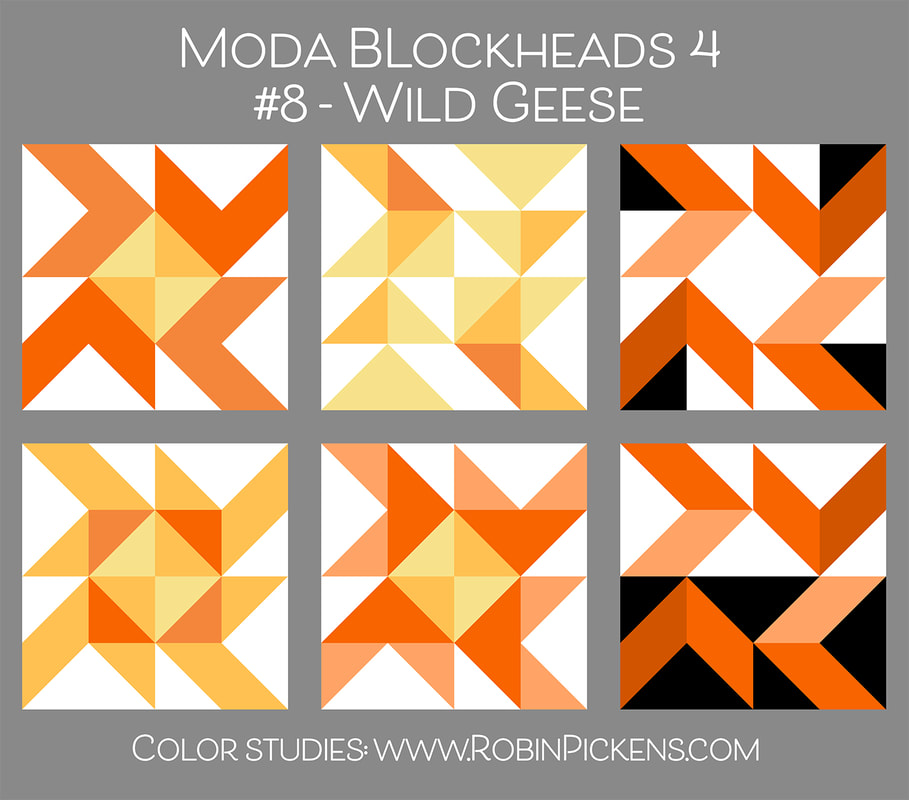 You could make these units as flying geese blocks and join them together, but the pattern shows them as individual half square triangles. I like that so I can play with multiple fabrics or shades of a color within the shapes. The center can be one solid color or a mix of colors or hues. Are the inside triangles different than the outside triangles? I flipped around some of the background white triangles in placement for image number 2- doesn't that look lively! Or spit the background white and black in sections or to divide the block. The lower left image makes an orange square surrounding the center with long and short rays. Next to it, the two tones of orange make me think of a motion trail with blades of a fan. This is such a nice block to experiment with! 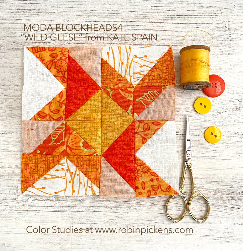 My block is the 4.5" size and I used a mixture of oranges from Thatched and Abby Rose. I liked a yellow center because it made me think of a sun or center of a flower. I am thinking of summer and bright days with this one. Happy sewing!
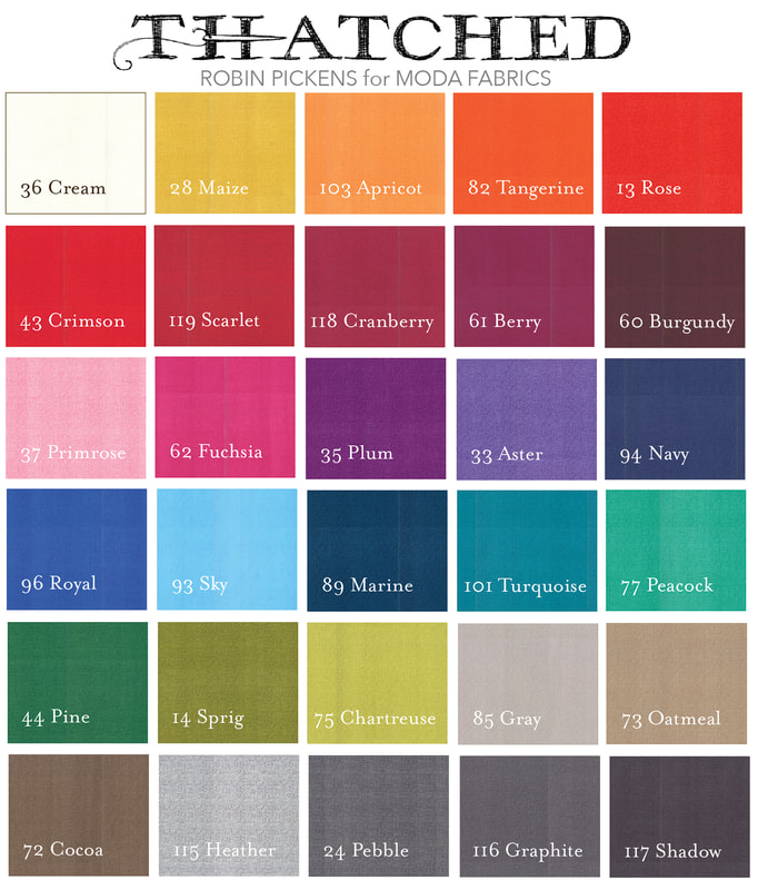
Block #7 is GAME BOARD from Lisa Bongean of Primitive Gatherings. Visit Lisa's blog for the free quilt block pattern that you can make in the 4.5" or 9" size. Along with Lisa's blog at lisabongean.com, you can also follow her at instagram @lisabongean. I was surprised to see this block from Lisa since I usually expect a LOT of little half square triangles from her but she has delighted us this time with adorable little squares. This game board gives a center space for good play with color and twinkling checkerboards. I realized the borders can be a single color surrounding the checkerboard or maybe they are a continuation of the rows and lines from the center blocks. Broken color bands, 4 corner quadrants or straight across horizontal bands. Keep the center it's own distinct place or let those blocks share background color to make the perimeter more flowing. 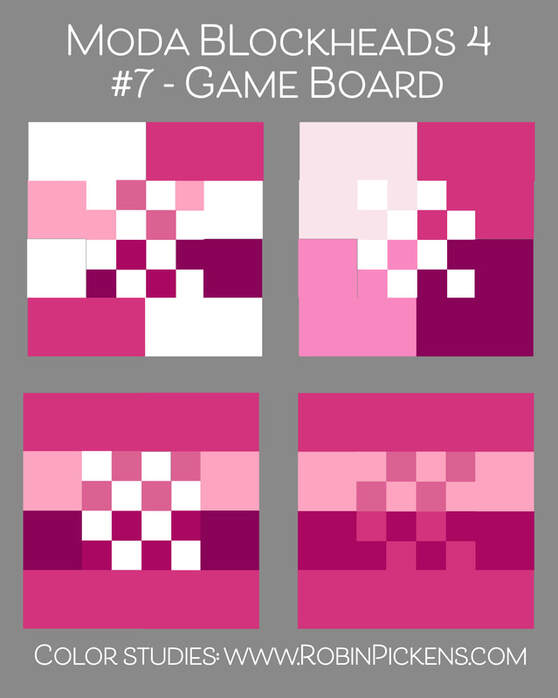 Two color families here with pink play in the borders and randomly placed orange squares in the center. Or split it vertically half and half by color groups. The bottom two have more controlled block arrangements in the center with the last one forming a square within a square by darker squares. 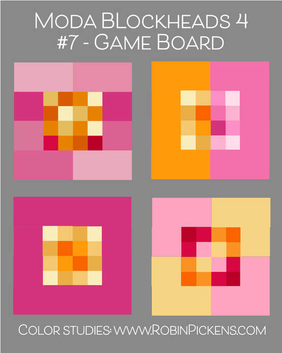 Thatched rainbow, light to dark and dark to light. And that last one is like a little butterfly or insect buzzing on its merry way. 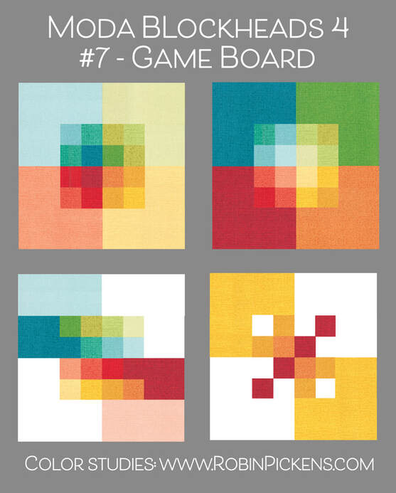 This week my block is a 9" pink version and I chose to make my 4 corners each a different print of pinks. I also used some of my new DOTTY THATCHED from the Tulip Tango line! I am loving the little dots and how whimsical and lighthearted they feel on the Thatched texture. Tulip Tango has this Dotty Thatched on cream, washed linen, princess pink, lighter pink, cranberry, chartreuse and medium and dark gray. 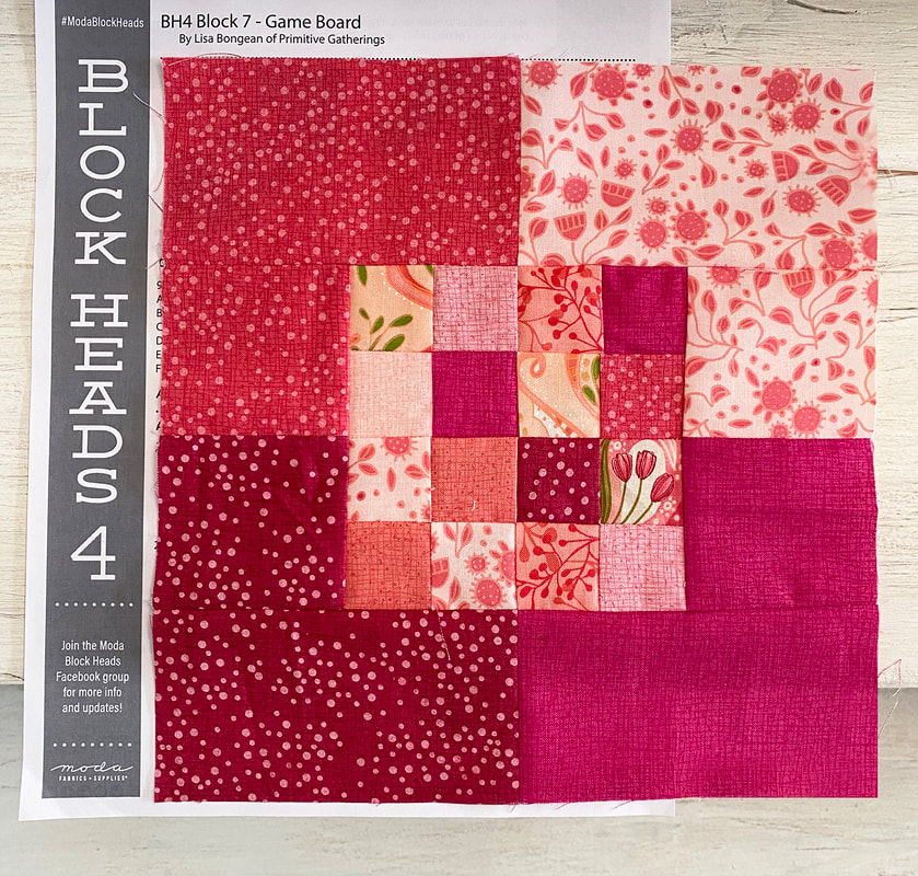 Ah, pink and vibrant...I love deep cranberry and that energy of fuchsia. What will next week bring? More orange, more yellow, more pink? We will have to wait and see. Until then, happy sewing! 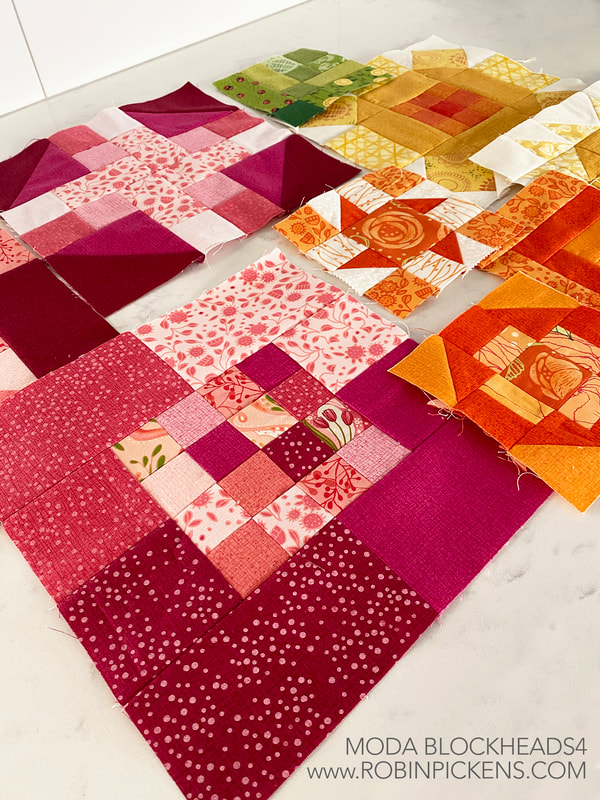 Linzee Kull McCray brings us block 6 called "Spinning into Spring" and you can find the pattern through her blog at https://linzeekullmccray.com/blog or click the bar right below: The half square triangles on this block can be shown with light and dark sides to get that feeling of a propeller in motion. They can also mix with the background color to make larger triangles. The plus sign inside is part of the windmill, or bars on large T shapes. The four side rectangles can define space by boxing in or blending into the center. 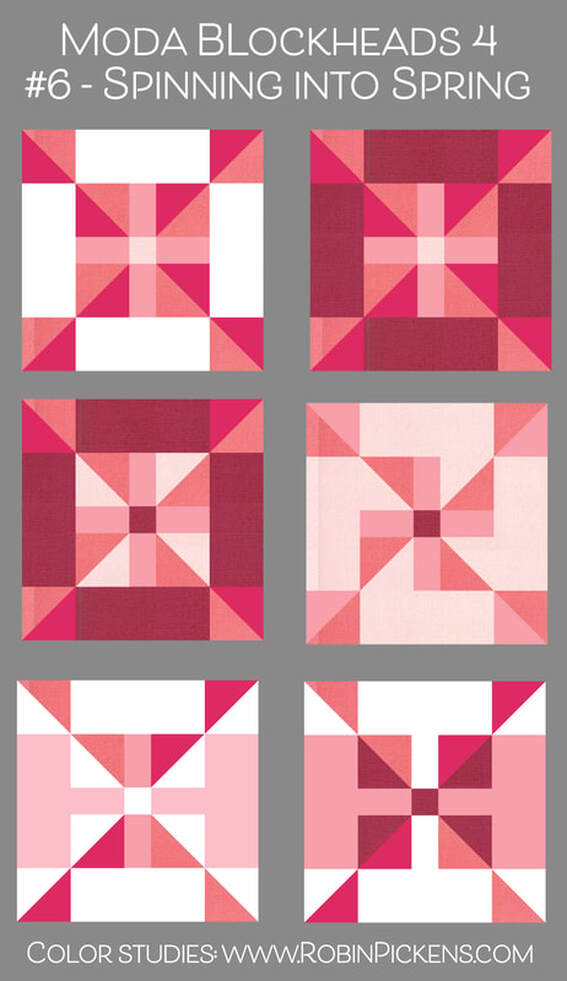 The rainbow versions plus one blue/green combo. I think of these as "Spinning into the Color Wheel" and like how the center plus almost glows out in ones with all color surrounds. 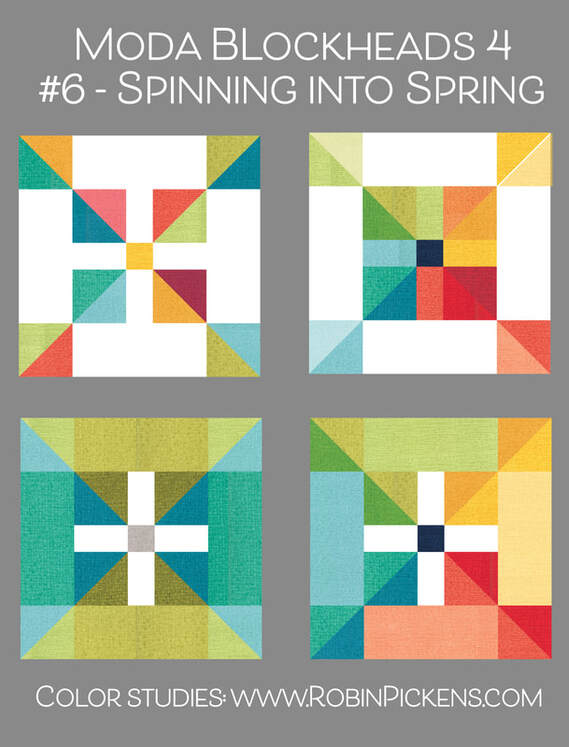 This week my block will live in my large pink border. I also made both of the bonus blocks we have received so far. I did turn one side of "Mix and Match" to have the bars go in opposite directions, thinking of leaves as they branch out from their center stem. 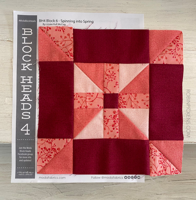  Here are all my block so far! Summery colors and happy vibes! It feels like a summer party. Happy sewing! 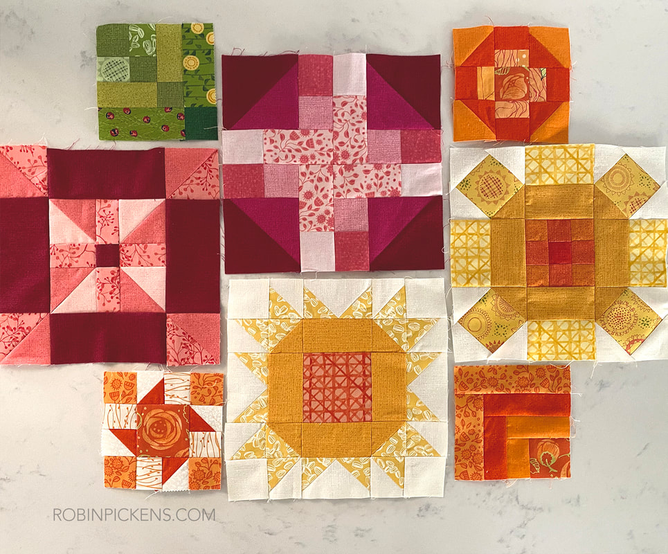 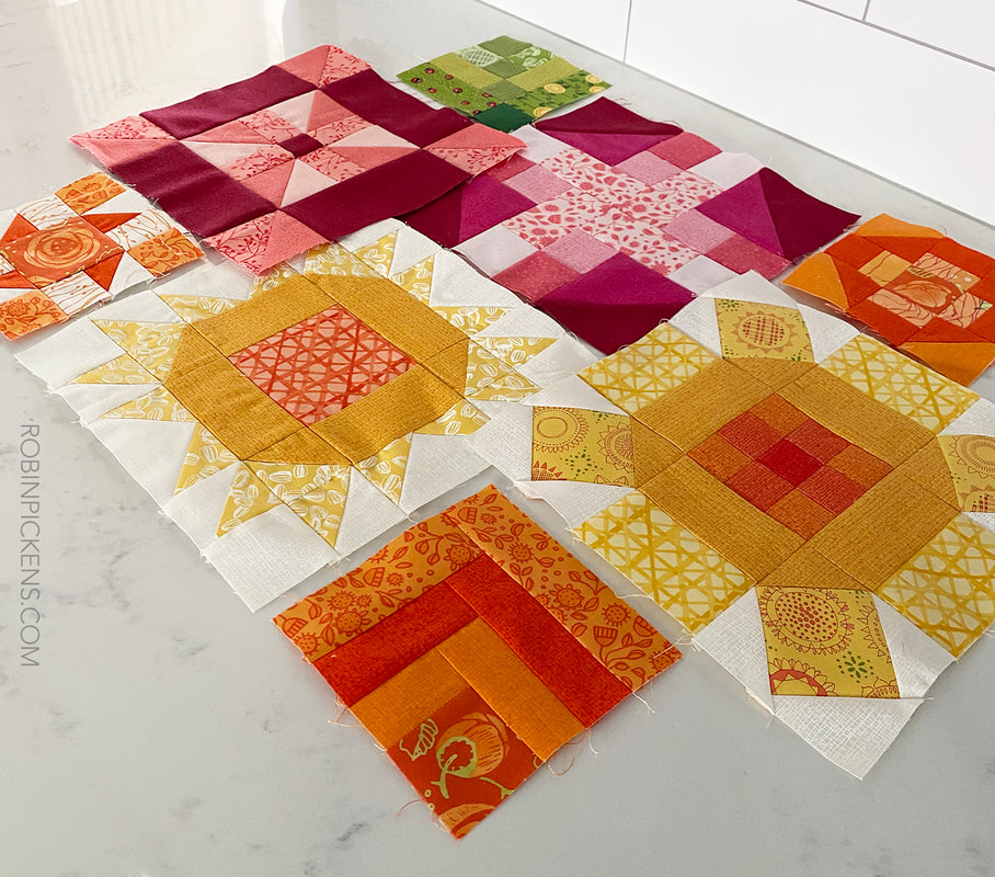 Week 5 and Barbara Groves of Me. & My Sister Designs brings us "Two of Five". I think of this as a Churn Dash but like how those HST corners can give the feeling of rounded corners, leaf points, candy in a twisty wrapping, or framing for a plus sign. 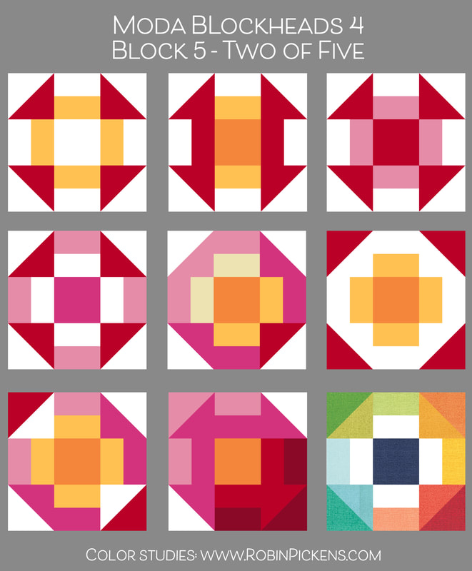 To see more of Me & My Sister Designs creativity and quilt projects (and books and cool new work space), visit instagram at https://www.instagram.com/meandmysisterdesigns/. And to get your copy of "Two of Five" pattern visit the MODA blog today in the resources section or click the bar below to be taken there: Another small one for me this week for my smaller orange ring of blocks. Still having some fun with Abby Rose and Thatched. I think my favorite of all the Thatched oranges is still this darker Tangerine. 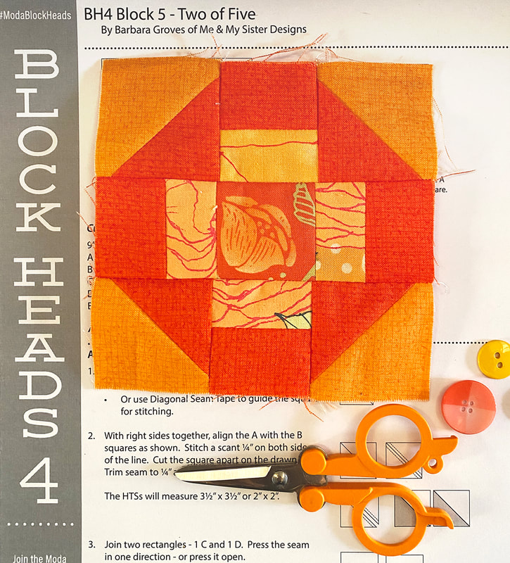 Now I'm hopping back to my secret sewing. I've got a new fabric line to show next month and two new patterns so I'm deep in sewing and pattern writing.
Till next week... happy sewing! Anne Sutton of Bunny Hill Designs supplies this week's block "Spinner." Visit Anne's blog for the pattern. You can also follow her on instagram @bunnyhilldesigns. Have you seen Anne's latest applique quilt project called "The Flower Farm"? It is SO sweet and charming! This block is pieced, and not applique, but I bet the center would be a lovely place to add an applique. 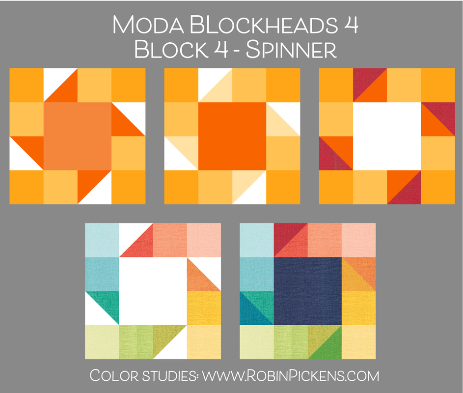 You can see the spinner shape showing up with the blades around the center square in the half square triangles. I thought it might be interesting to make the outer small squares in graduated shades of a color to give that feeling of motion or try a white center (assuming a white background fabric overall) and making the emphasis on the outer ring of blocks. Then I tried my rainbow mix of sides with both white or dark center. Another version that Moda showed on the instructions as an alternate is with 4 patchwork squares in the center vs the one large square. I used some of my above ideas with the 4 squares in center and like how a continuation of color emphasizes the blades and the additional pieces can lend nicely to a feeling of transparency. 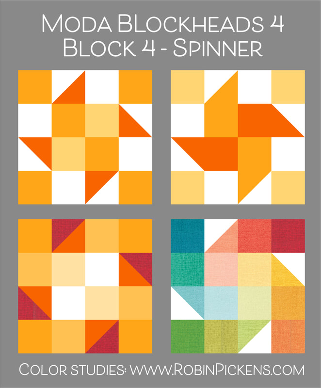 I made the 4 1/2" block so I kept my center as one piece and showed off a Bramble Rose from the Abby Rose collection in it. Oranges play in the outer pieces. This block will live in the middle small ring of blocks on my quilt.  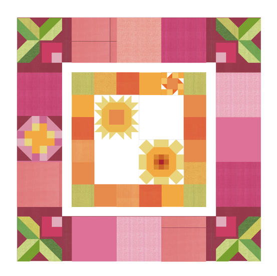 Four weeks down! I still plan on making the bonus block from last week. It will be another one of the small sized blocks. The 4 1/2" size is quite sweet. Thanks for visiting and sewing along! 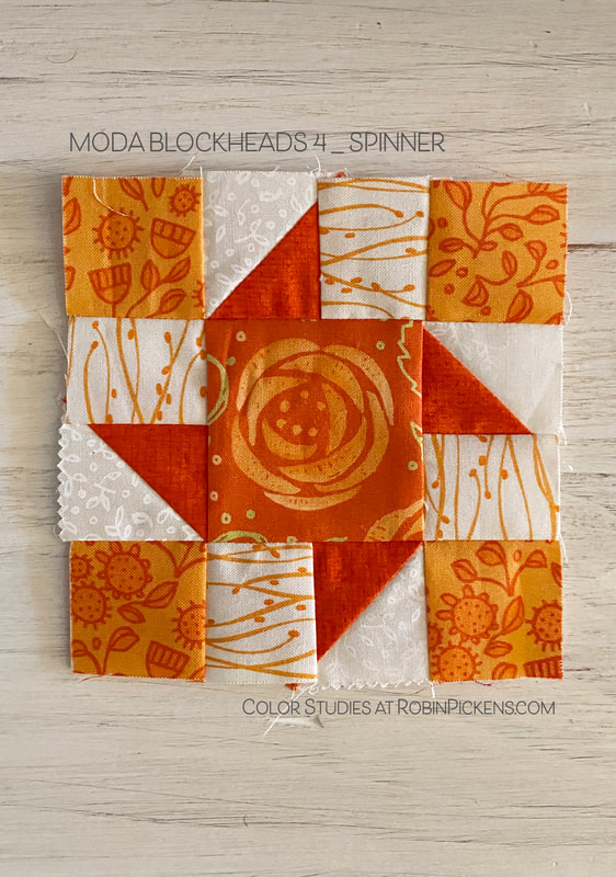 I didn't know what Kouign Amann was so I had to look it up. After seeing photos and reading the description (you can see one here from Food Network), my mouth is watering for the buttery sweet layered treat. So what might my color studies for this Kouign Amann free block design from Laurie Simpson of Minick & Simpson have to do with this pastry? My block is going to live in my yellow center of my quilt so I am thinking of the layers of golden pastry and all that yummy butter. Layers and yellow sound good, but first let's get that free quilt block pattern! (if you need it, the box below will take you to Laurie and the pattern). Triangles of yellow and orange with a big mix of white dance in and out of the shapes for a light and sparkly look. Or try more filled in triangles to make a solid shape, like the sunshine. When making the flying geese unit and the rectangles are the same color, it starts to look like ribbons with dovetail ends. The corners around them look like excited bursts or add in more colored pieces to make those corners into ribbons as well. 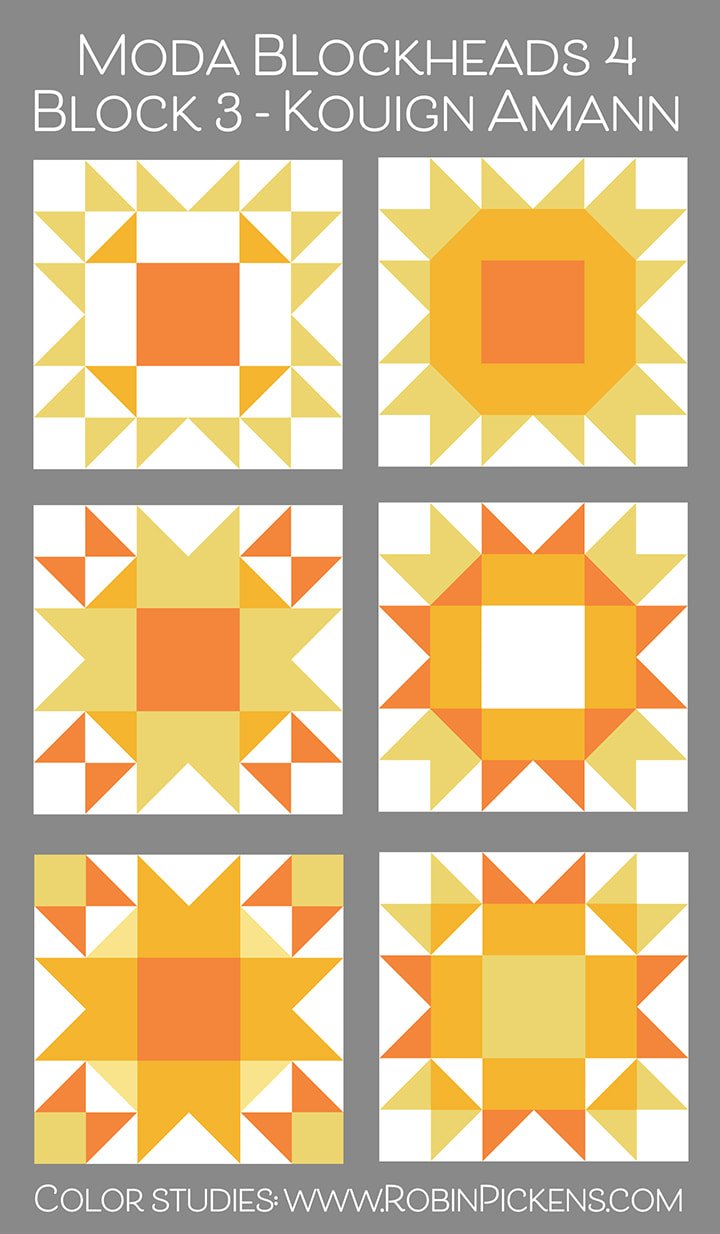 If we start to play with the background white it brings a whole additional layer of dimension to this block. The dark midnight blue makes those warm yellows and oranges pop. Adding in a gray to some of the outer HST makes the illusion of a jumping jack and really emphasizes the 4 corners. 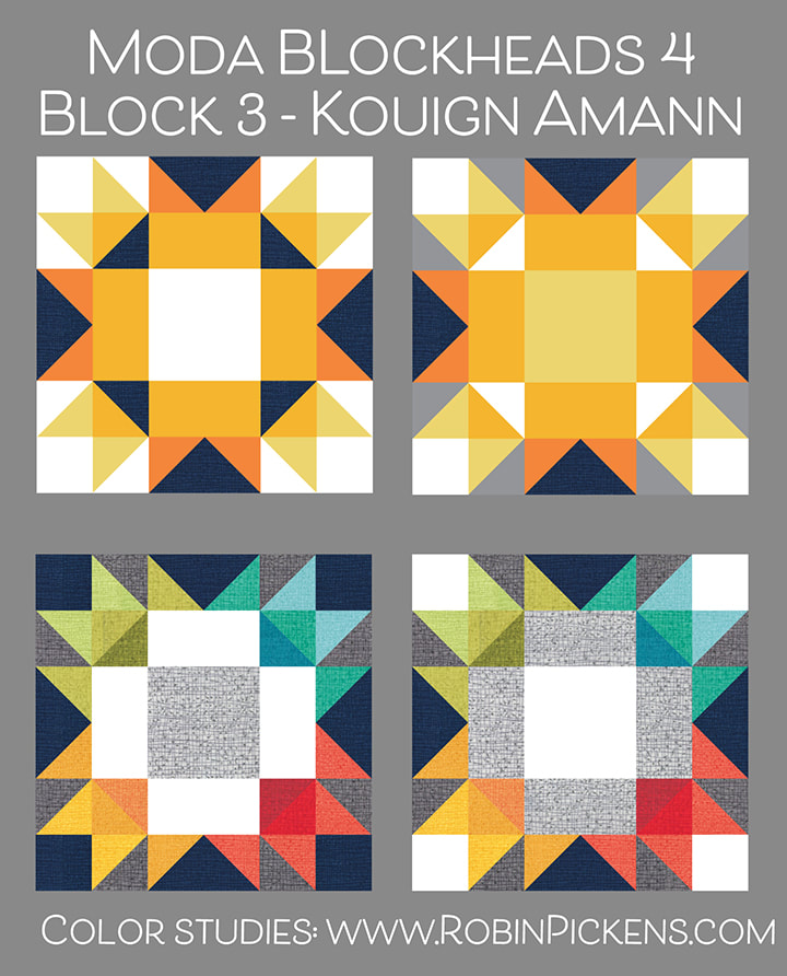 I love trying the color quadrants on these blocks and this one is calling my name in the Thatched colors. I need to make this. This block feels like it is bursting with happy energy. I love it. Thank you Laurie for giving us this new pattern. 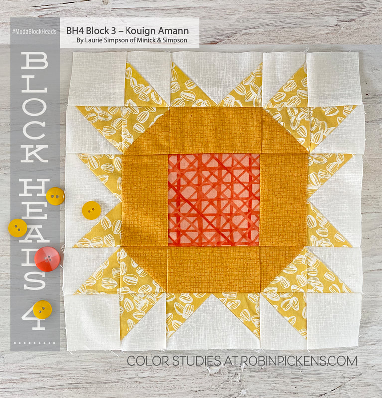 My block will be living in my yellow center within my quilt. I think the simple sunshine is perfect for my squared off garden theme. I've used Thatched and fabrics from Solana. I love the little sunflower seeds in white against the yellow background in the outer rays. 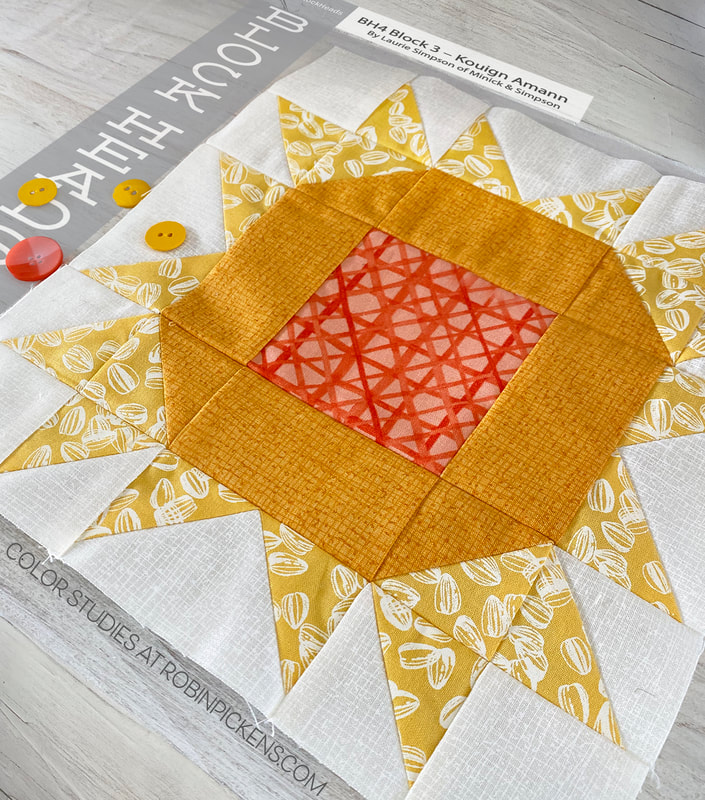 Two happy yellow sunshine/flower blocks. If you are looking for Solana, I have some bundles of blue and yellow Fat Quarters at my shop and I'll also have some precuts that should be listed by this Friday. Happy sewing! 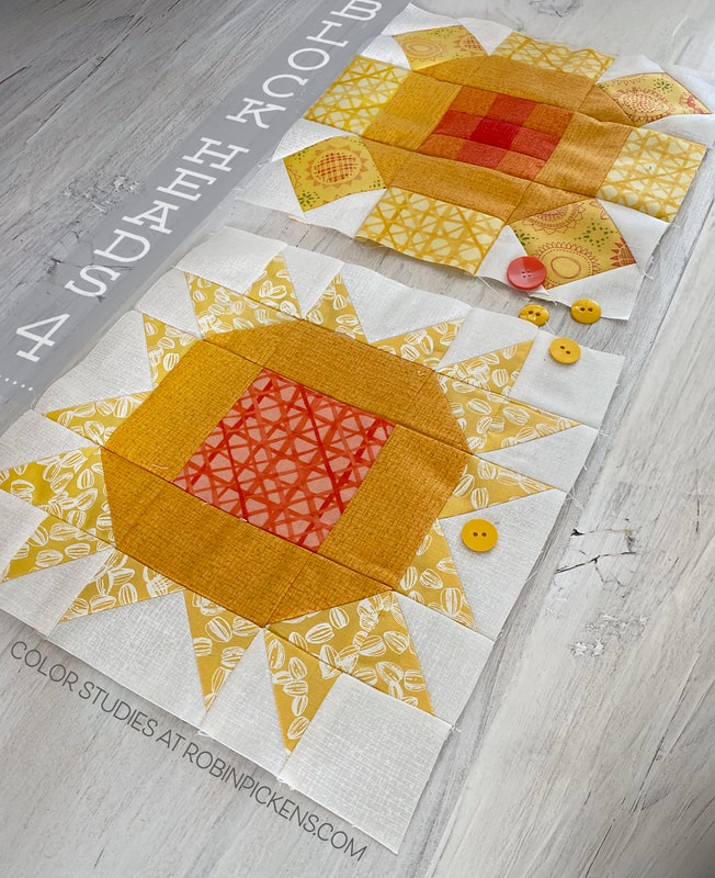 Week 2 with a new free quilt block pattern from Jenelle Kent of Pieces to Treasure and Moda Fabrics. Be sure to visit Jenelle's blog for the pattern download. I learned something new today- what Cooee means (it's on the second page of the pattern) in Australia. Are you sewing with traditional fabric or only solid colored fabric? These color studies can be applied to any prints, patterned or solid fabrics. So lets take a look at this block and have some fun with color placement in this quilt block. 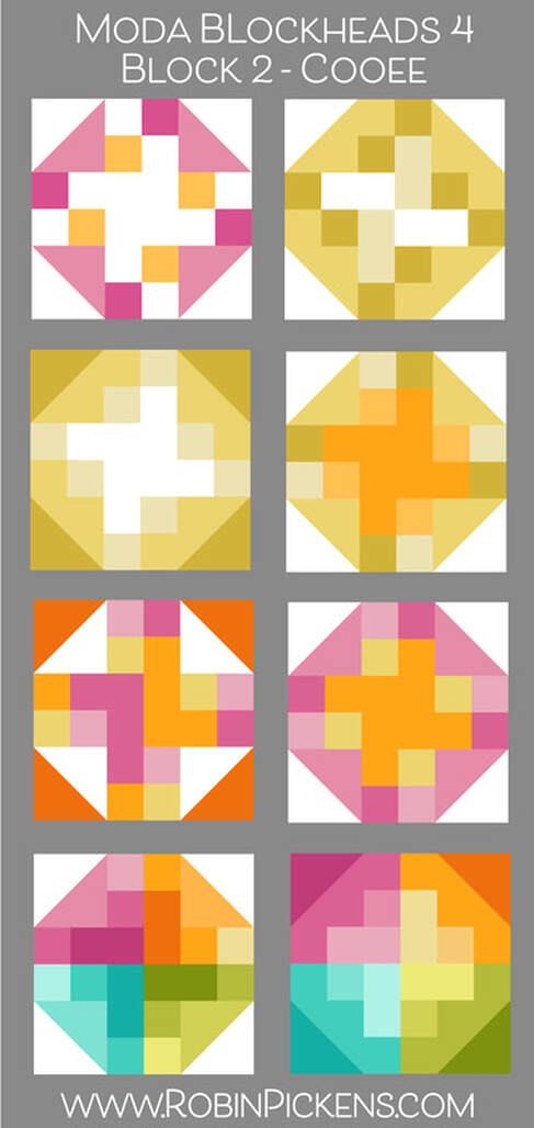 I started out simple with a white center and treating the top, bottom, and sides as a checkerboard of two colors. Then tried a subtle shade in two of the center rectangles to delineate the center meeting point. I also wanted to look at all yellows/gold with a glowing white center, or with an orange center, like the center of a flower. The one with orange corners flipped the color and white on those corner HST (third row) so we notice the diamond shape and the T within it more...or is it a T? How about big "L" letters with a shaddow side. I was thinking of using this block in my pink row so I wanted to try that next as a pink flower (thus the orange pollen center). I finished up by trying my favorite color quadrants with shades of colors in four different families in each quadrant. I love how the light and dark variations look like overlapping shading. As I was working on these, I had a thought that the ones with the orange centers reminded me of a pastry with the edges folded over the fruit filling. (And yes, I was hungry for lunch!) So I decided to have a little fun and make one a peach galette! The one to the left reminds me of braiding hair so I'm calling that "Rapunzel's Braid". 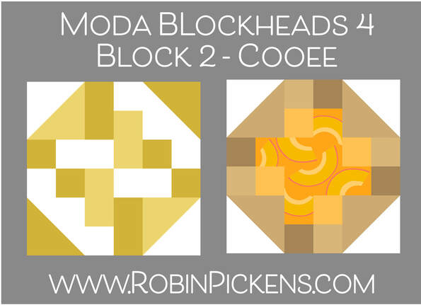 I DID decide to go with pinks for my own quilt and made it with Thatched in Cranberry, Fuchsia, Primrose and an Abby Rose print in the center. 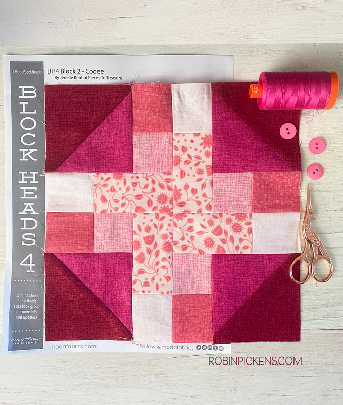 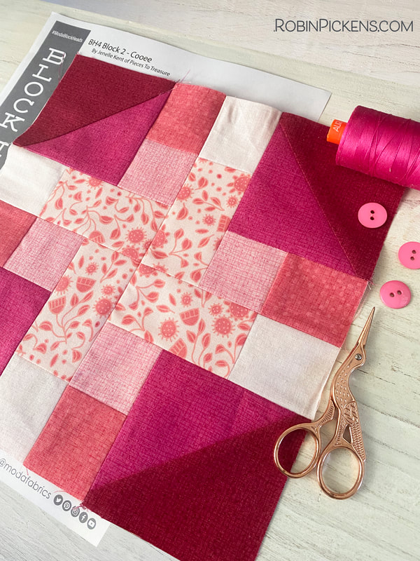 Jenelle's IG handle is @piecestotreasure where she shows all those fabulous things you can do with her beautiful toweling. Check it out!
And for other designers blogging for Blockheads, visit: Vanessa Goertzen – https://blog.lellaboutique.com Corey Yoder – https://corianderquilts.com Joanna Figueroa – https://blog.figtreeandcompany.com Janet Clare – http://janetclare.co.uk/blog/ Sherri McConnell – https://www.aquiltinglife.com Brenda Riddle – https://brendariddledesigns.com/blogs/news Vanessa Christenson – https://vanessachristenson.com/blog/ Betsy Chutchian – http://betsysbestquiltsandmore.blogspot.com Crystal Manning – https://crystalmanningart.com/blogs/blog Chelsi Stratton – https://chelsistratton.wordpress.com Kate Spain – https://kdspain.com/thedrawingboard Lisa Bongean – https://lisabongean.com Brigitte Heitland – https://www.brigitteheitland.de/blog Jackie MacDonald – https://sweetfireroad.com/blog/ Camille Roskelley – https://camilleroskelley.typepad.com Debbie Maddy – https://www.debbiemaddy.com/blogs/musings-of-a-fiber-fanatic Anne Sutton – https://bunnyhillblog.com Linzee Kull McCray – https://linzeekullmccray.com/blog Laurie Simpson – http://minickandsimpson.blogspot.com Robin Pickens – https://www.robinpickens.com Jan Patek – http://janpatek.blogspot.com Stacy Iest Hsu – https://www.stacyiesthsu.com/blog/ Jenelle Kent – https://www.piecestotreasure.com/blog Lynne Hagmeier – http://kansastroublesquilters-lynne.blogspot.com as well as Barbara Groves, Deb Strain, Tammy Vonderschmitt and Michelle White through MODA - https://my.modafabrics.com/tags/blockheads-4 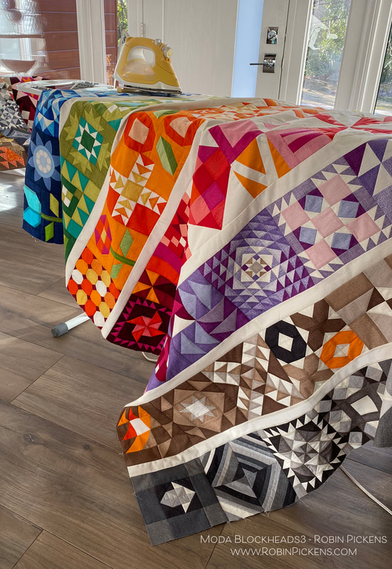 56 Weeks of sewing fun. I've been busy adding blocks together to make my rainbow colored rows. But one block was missing...that final block. Joanna Figueroa from Fig Tree & Co. is our final blockheads designer to wrap it all up. Thank you Joanna for your lovely "Star Dance" block! To get to Joanna's blog with the free pattern, click on the gray bar below. But keep reading if you want to see my color study and how my TWO quilts have come together! 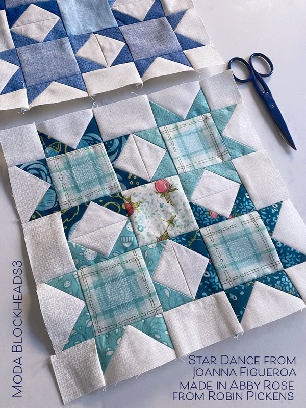 Flying geese and squares to make sparkly stars. A number of my patterns such as Showering Stars, Little Star Shower, and Constance, use stars like this. I liked how Joanna's version also played with the very center square in the overall composition in a color or print too. Let's take a look at a couple of color studies. 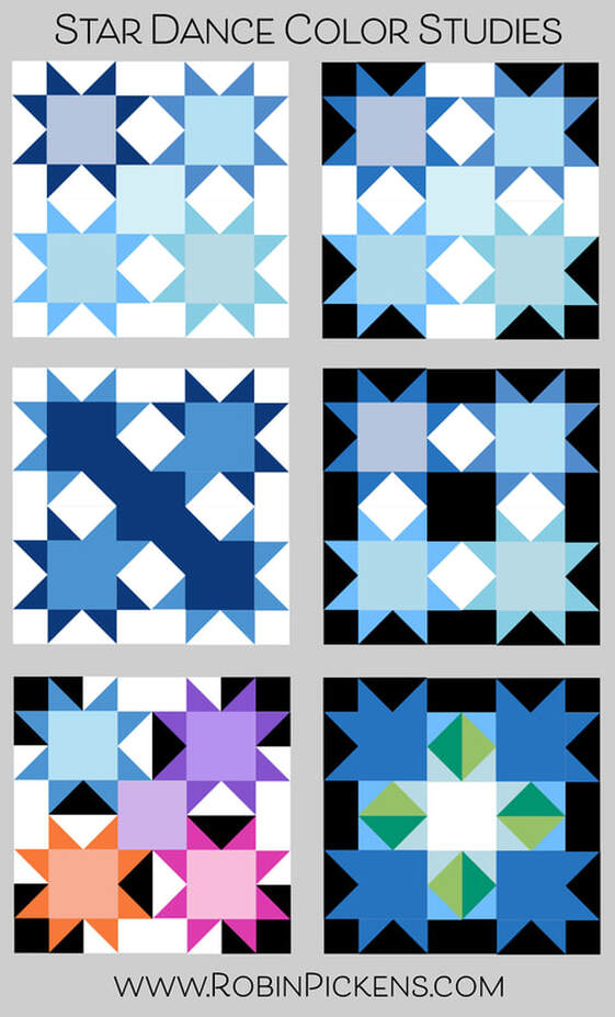 My last block belonged in my blue row so that was my starting place. Light, medium and dark blues with subtle variations between the stars. It could be fun to play with black for the background (or starting rectangle of the flying geese) and I love how the white really pops in contrast. The white and black backgrounds make new shapes within the block. The left middle image uses a mix of medium and dark blues on some of the geese corners, positioned so it looks like the colors run diagonally through the block. And the last image creates arrows pointing to a glowing center. 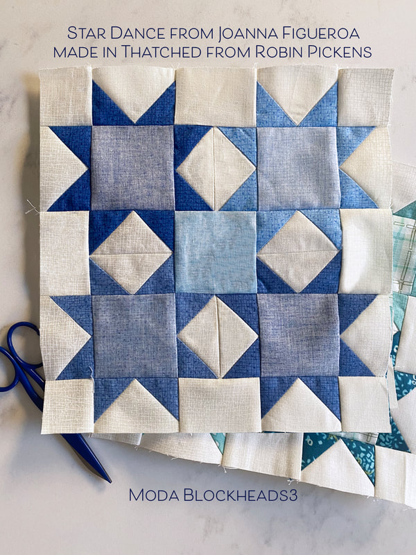 After designing Cottage Bleu (shipping in April) and adding new Thatched colors, I have more blues in my Thatched range now. I have used a few from Cottage Bleu and used back sides as well for lighter shades. When making my print blocks, I used blue prints from Abby Rose. The plaid fit nicely into the centers of the four stars and I decided to use a different print for the center with my light background and roses. 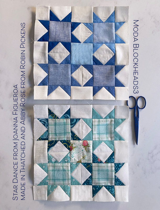 If I were to make another one of these blocks, I would try the blue hydrangeas from Cottage Bleu. For this particular print quilt, I felt the warmer blues from Abby Rose were a cohesive color group with the other surrounding blue blocks. Here is an image of the rows joined together on my mixed prints/scrappy version. For the sashings on this print/scrappy version, I've used Modern Background Paper from Zen Chic. It is one of my favorite low volume fabrics to use. 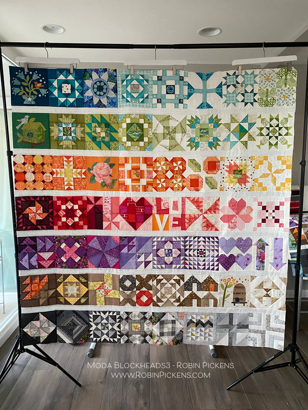 On my print version quilt, I chose to do applique on the weeks that Jan Patek and Jen Kingwell had their sweet designs. Last year I did all pieced blocks so this was a change for me. I still seem to resist doing turned edge applique and find my happy place is with the fusible raw edge applique. 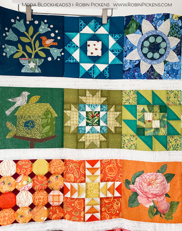 I think my favorite of the appliques is the bird on the upper left, dark blue. I added and extra flower or two and more white dots. They make me think of little white baby's breath in a bouquet. And for the "rose" applique week, I chose to cut out one of my Abby Rose blooms instead of the template shapes. 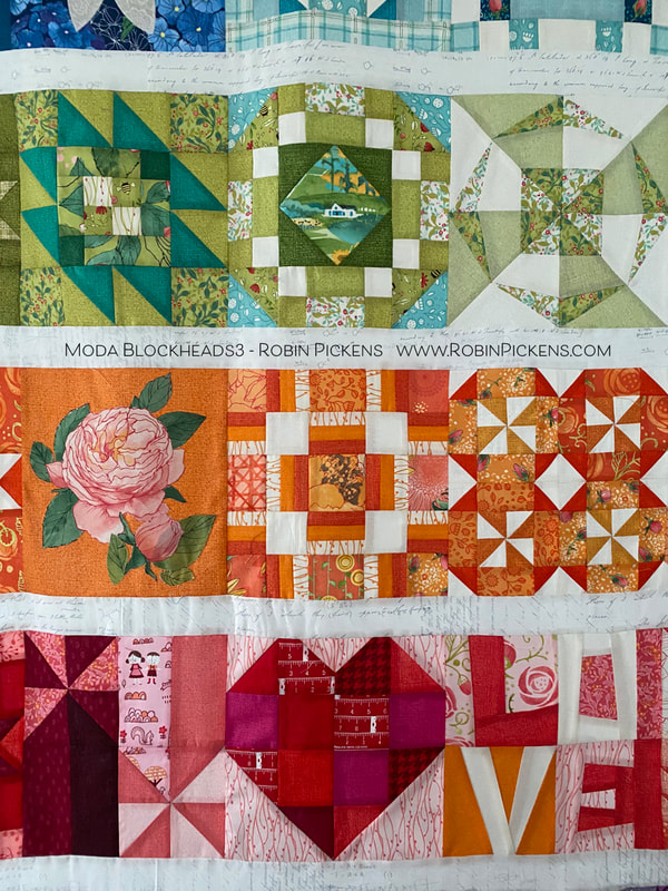 How perfect is it, that the block that says LOVE was actually pieced by my mother? She was visiting a year ago January when it was the week for that block and she helped me out. Then the pandemic and quarantines started and I have not been able to see her in person since then. So I am especially happy to have a little bit of her in this quilt! 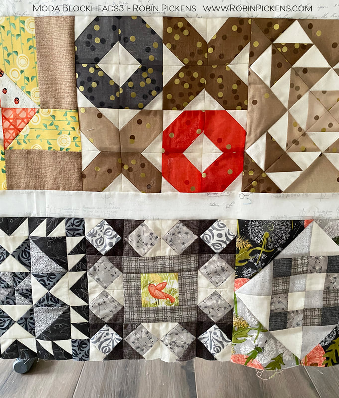 The little bird in the middle gray block is one I had not shown yet. It was a block I did late, catching up one weekend. It is the Fixer Upper block from Vanessa Goertzen and I liked it as a framework around my birdie friend. 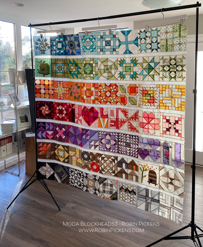 I love to see how the light comes through when a quilt top is hanging on the frame, before it is quilted. It looks like stained glass and the colors almost glow! I started this project with a few design parameters I set: 1. Horizontal rows of color (rainbow-like rows), separated by a simple white line. 2. Each of the rows would use gradations of the color to go from darker shades on the left to lighter shades on the right. 3. I would make TWO quilts, one with all Thatched basics and one with a mix of Thatched and colored prints from my collections (with some other designer's goodies added in there too) for a scrappier look. This was to see how different or how similar the quilts ended up looking by the change in prints. So how about that all-Thatched one? 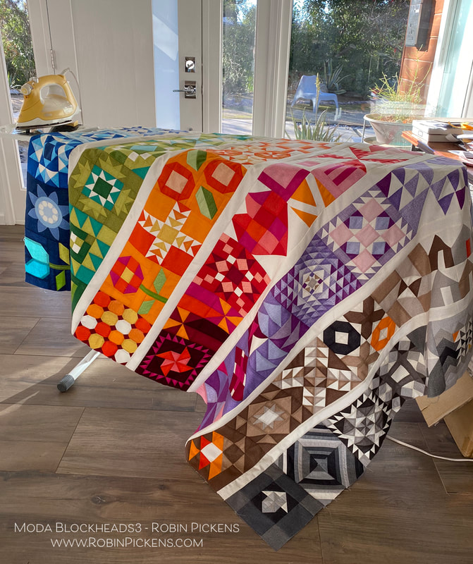 I must admit the vibrancy and saturation of all that color was surprising to me when I got it all joined together. I was glad I graduated color to the lighter right side so it was not too overpowering. I used the Thatched Cream 36 for my sashings. 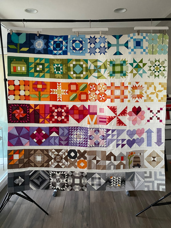 Instead of the applique blocks, I used pieced alternatives from Joanna Figueroa. The upper left has the tulip block, house block and another flower posie. I did keep two applique blocks- the Bachelor Buttons from Jen Kingwell since it felt so graphic, and the Bee Skep from Jan Patek. My sister likes bees and having this block reminds me of her. So now I have a mom remembrance and a sister remembrance in my quilt.  Its hard for me to say if I like one version of the quilt better than the other. I will keep some things different as I finish these, using different pantographs for quilting them, and I'm also thinking about adding an additional little decorative border around the scrappy/print one. I like the Thatched one being simpler with no outer border. 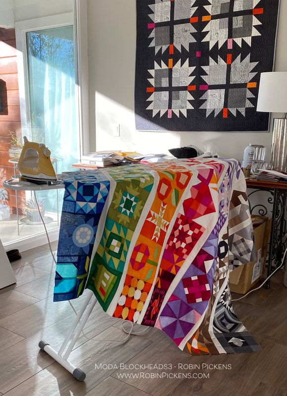 I am happy to come to this finishing phase of Moda Blockheads, but I'm also sad that it is ending. I know the connection and sewing along is so important during these strange and unpredictable times. So I made the decision to join in on sewing along with "My Favorite Color is Moda" because of course I need another project! I think the quilt design and colors they have suggested are beautiful! I hope to see you while sewing along with that! The resource link to all the free block patterns from this Moda Blockheads sew along- archived at the Moda website: Thank you for the lovely comments that you have shared each week on the block posts and color studies. You are the best! And thank you Moda for this wonderful sew along and all the organizing, writing, planning, giveaways and support. It is a BIG project and you do it with expertise, grace and style.
Let's finish up some quilts, right? Hugs to you all, Robin Wine Not! from Jen Kingwell is an easy block this week with a lovely diamond shape. This block looks great square or set on point. This is the very light end of my brown row and the soft warm colors look calm and comfortable. 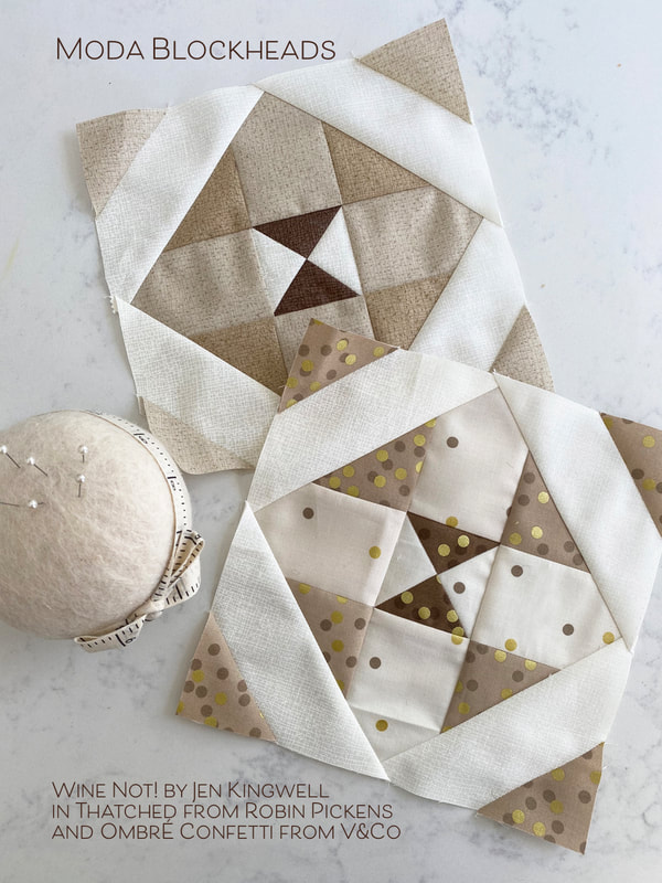 In playing with the color studies, I liked how the shapes can have a strong arrow form or emphasize the outer diagonals or the inner quarter square triangle center. The last one feels a little dimensional with the center having light and shadow as if it were a pointed pyramid triangle. 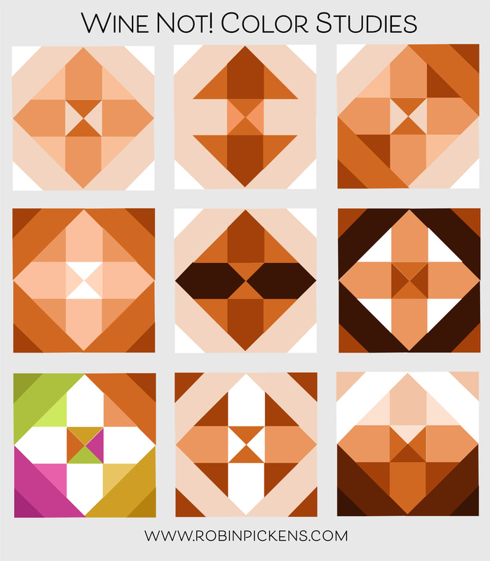 For my pieced all-Thatched version block, I used a couple of my new shades that are shipping at the beginning of February. The center dark brown is 164 Chocolate Bar and the light tans are 156 Toast with the lighter 158 Washed Linen. 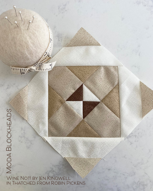 My print version uses a fabric that has been quite prevalent in my brown row, Ombre Confetti from V&Co. The ombre gradations make it easy to find the light and dark levels you want within a block while keeping the colors harmonious. I love those little pops of confetti! 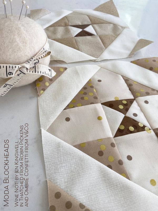 Pop on over to Jen's blog for her Wine Not! pattern. And since I'm sharing brown blocks this week, here is one I did last weekend to catch up on a missed week. It is Intersection from Stacy Iest Hsu in Thatched and Solana. 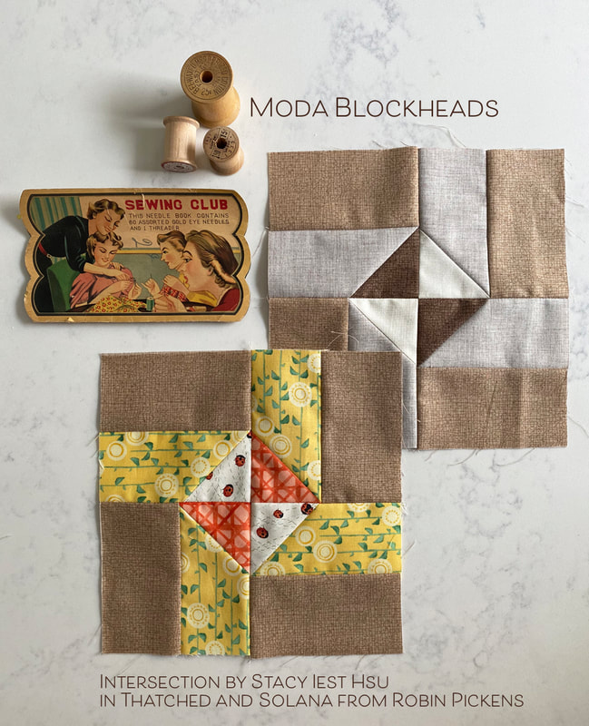 Next week is the last block and then it is time for joining and finishing. I love seeing what you all are piecing together on the facebook page. Keep sewing! 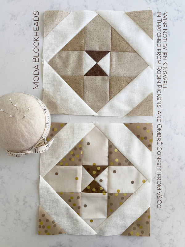 |
About ROBINDesigner of colorful florals for Moda fabrics. Modern to transitional quilt designer. Illustrator, sewist, crafter. I am proud to be a designer for Moda Fabrics!
Shop Robin's Designs
 I am an affiliate for Fat Quarter Shop and may earn a small commission through my links. Thank you for your support!
Check the March 6, 2017 Episode!
Categories
All
Archives
November 2023
© Robin Pickens Inc. All rights reserved. No images may be reproduced without permission.
|
 RSS Feed